
Christian Otten provides a detailed breakdown of his stunning “Prototype 2018” scene for us here at The Rookies. Christian decided to switch careers and enrol at Pixlvisn media arts academy in Cologne in 2016 and graduated in the end of 2017.
This was the first personal project I made after graduating from Pixlvisn media arts academy. For this project I took an older scene I had made some years ago and tried to upgrade it.
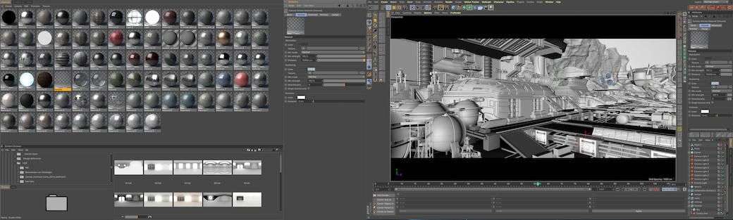
I used Cinema 4D and Corona Renderer, as well as Nuke for this scene. There aren’t really a lot of tricks or techniques used that wouldn’t work in most other 3D suites though, some of the models used were made in Maya as well.
I will concentrate more on shading/lighting and rendering for this article, demonstrating the mistakes i made on my first version and how i tried to improve on it.
I think it is pretty important, especially for scenes like this, to have a very defined vision and preferred camera angles in mind before starting to model. Otherwise it is quite difficult to know how many details are sufficient and also to get an even distribution of those details.
It is of no use to model every screw for an element that is only a few pixels wide in the final output.
Also, props that are too detailed can stick out a lot as well, when mixing them with lower resolution ones.So I definitely recommend thinking about this in detail before even starting to model. It also never a bad idea to do sketches or blocking it out beforehand.
3D Modelling the assets
Modelling was pretty straightforward hard surface modelling. The “hero starship” for example was first defined using subdivision surfaces. I first blocked it out of a standard cube until i was confident with the general shape. I then made the SubD model editable and cut it into several pieces. This made adding detail and hull creases a lot easier. I built the unfinished space ship using the same method.
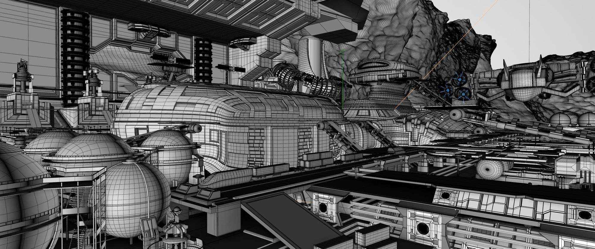
For this one I also used Booleans to carve the hull shape out of several planes, to simulate the decks of the ship. Not beautiful (at all), but quick and sufficient for what I needed. Most other models used pretty much standard techniques, many of them not being overly detailed either, due to the amount i needed.
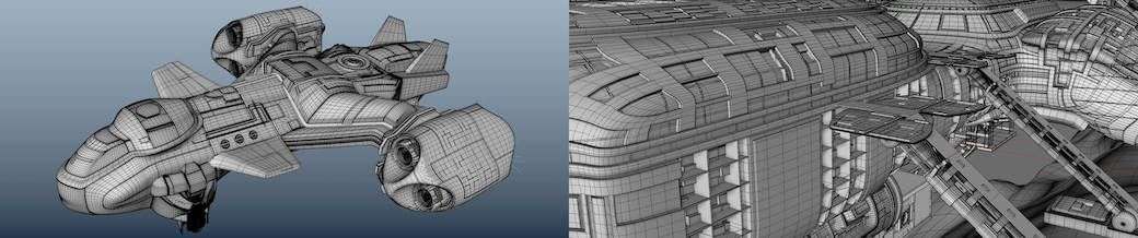
Sleek designs like the one used for the flying ship are quite difficult to do for me personally. There needs to be a sufficient amount of small details, to give an impression of size, while retaining the flowing, simple lines of the main shape. Because of this the modelling approach was more akin to modelling a car than the more common starship designs, with a lot of greeble and gizmos all over.
I used splines and loft nurbs to create the landscape, which I then converted to polygon objects. I added variation and stratigraphic detail using noise deformers, mixed with subdivision surfaces. For final adjustments I used the built in modifier brushes and the magnet tool.
A hand made landscape out of ZBrush or a landscape generator certainly would have looked better, but since the landscape is only the scene background I thought this worked well enough. Its pretty quick to set up too.
Texturing the environment
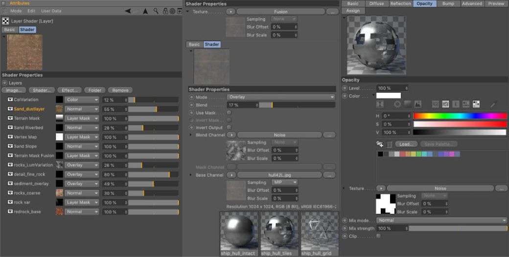
Texturing for this scene was very straight forward. Very few of the environment and static props use custom UVs and textures. I opted for several auto projection methods instead. I then used a mixture of photographic and procedural textures to break patterns up and add some dirt. Detail was often added by masking with inverted Ambient Occlusion shaders. I mixed those with procedural noises, to simulate wear and tear on edges.
A more universal approach to texturing felt necessary for a bigger scene like this one, texturing each asset individually would have been incredibly time consuming.
I also tried to severely tone the textures down for this scene, as the light/shadow contrast and the reflections are meant to be the main defining factors.
There is also a lot of finer geometry in the dock area, which I did not want to hide away with overly busy textures. So most textures I used (from cgtextures.com for the most part) were used at lower opacities or with lowered contrast values.
Many of them have an overlay of different noise types to generate variation and add a more worn down look. I also used several scratch maps and very subtle coloured noises for the reflection colour, IOR and glossiness.
The spaceship in construction has 3 layered materials assigned, a base layer with the steel grid and another one with the incomplete plating, as well as a “finished” version for some parts.
Both unfinished layers are using alpha maps to stencil out the missing parts. I used the same, but modified, alpha maps to generate normal maps, to simulate edge thickness.
None of these are able to replace an actual model of course. For a distance shot like this it was a lot faster to setup than model everything though.
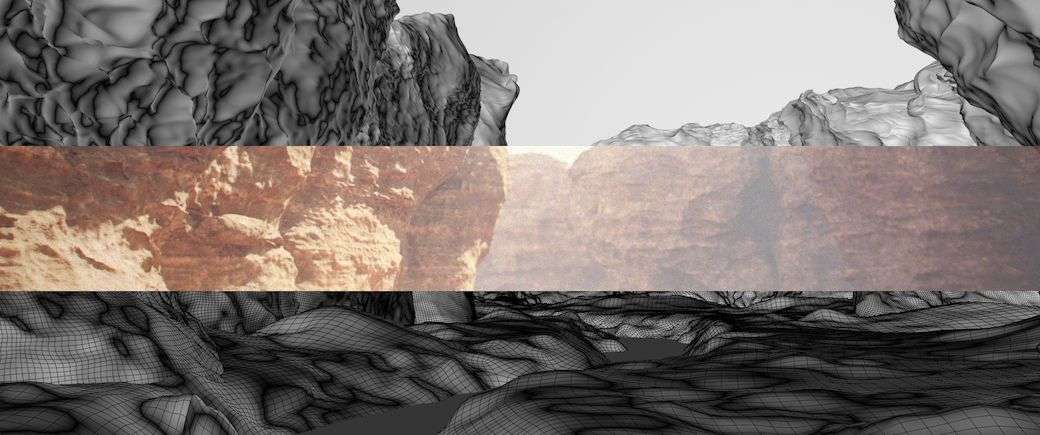
The most complex material in this scene was the rock shader. The diffuse channel was almost entirely procedural, except for a few defining red rock textures. These were broken up with noises and by masking slopes and cavities. I then randomised it using coloured noise overlays and world position based gradients. A few areas rely on vertex maps to stencil out other ground types.
In the end there were no visible patterns left in the rendering. I also used a simplified and altered version of this texture as a displacement map.Mixed setups like this, or solely procedural ones, are preferable over dedicated textures for landscapes i think. No area will look the same and it is also quite flexible when adapting settings for different light setups and camera distances. This material would have worked for much closer shots as well.
Lighting the scene
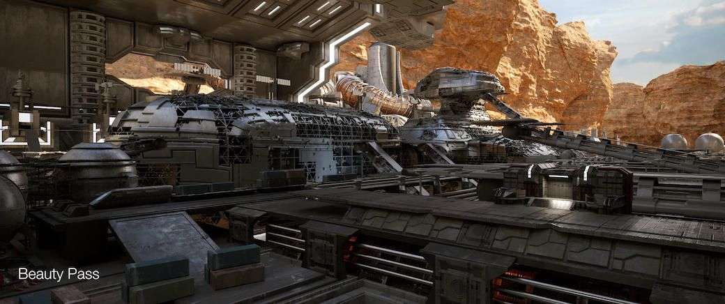
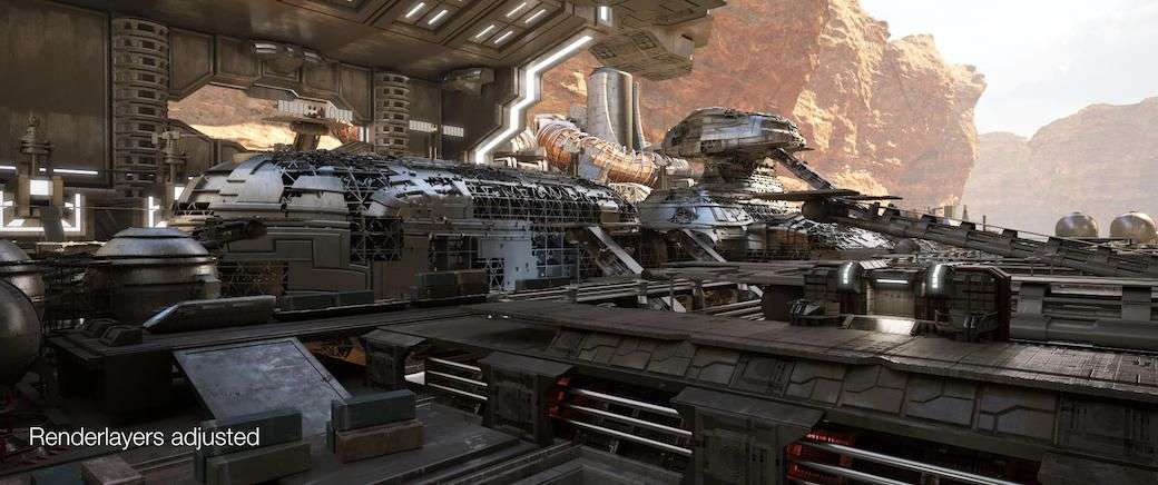
Were the real fun begins (for me at least), but let’s shred the original version first! A lot of decent components but the lighting is terrible. There is a strong sun, yet it doesn’t distinctively contribute to the lighting. Ugly lensflare: Check.
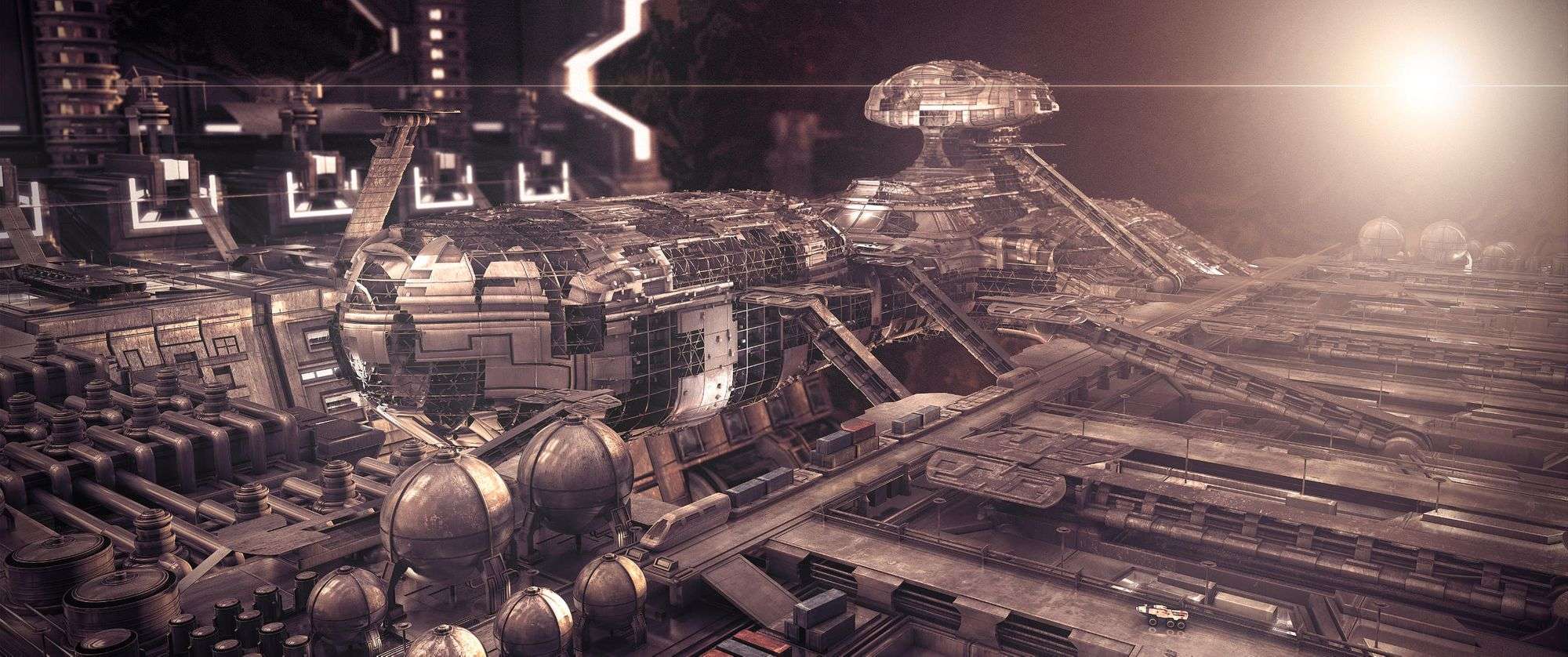
There are a lot of small light sources that don’t emphasise or suggest details or structure but distract instead. Everything has the same tone, shadows and highlights alike, and none help to discern foreground, middle- and background. Instead it is so overlit that the shadows start to look like ambient occlusion.
The focal point should be on the ship but instead the sun and the glowing hangar side are the first things a viewer would look at. Materials are mostly grey without a lot of variation, further leading to a hard to decipher mess of details. The whole picture looks too busy overall. The red tint was the result of it being one of three related images, in retrospect it looks awful on all of them.
Lots of flaws and a lot of potential for improvements. That’s why it is fun to revisit old projects once in a while!
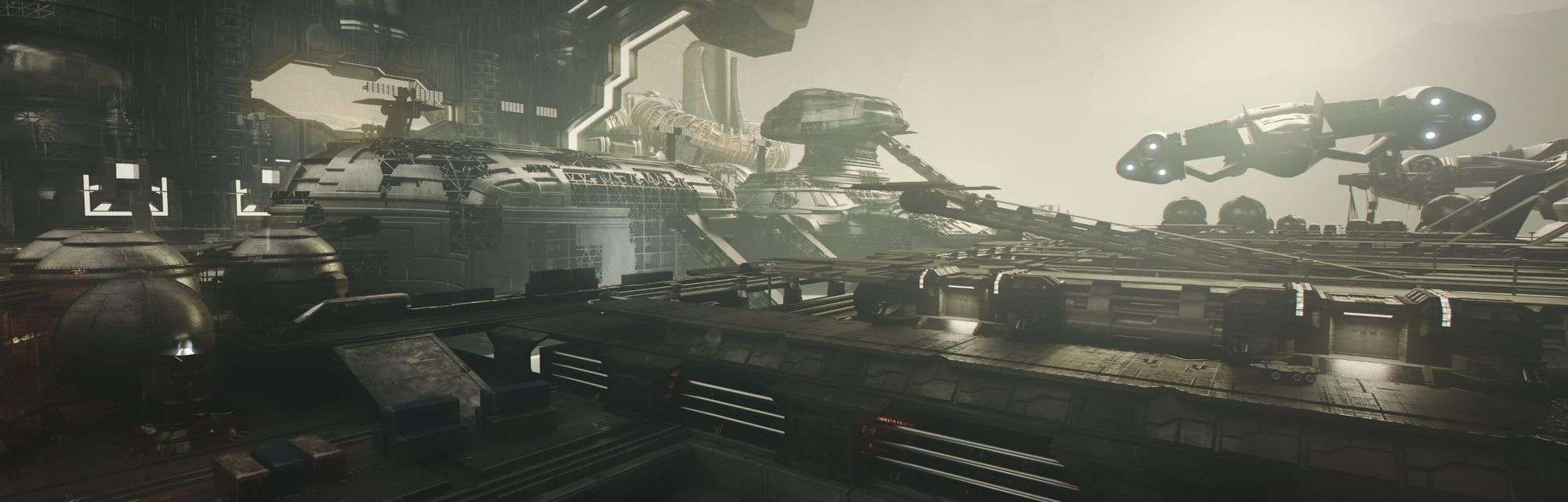
I knew right from the start that I would switch to a terrestrial environment for the remake, it helped to clearly define fore- and background areas.
The most important aspect for scenes with outdoor environments is to give a proper sense of depth and scale. Adding believable blueshift/atmospheric dust in the distance is crucial. At first I was all set on using a volumetric fog material for this, but due to render time constraints I finally decided to just use a modified depth map to add the atmosphere in post.
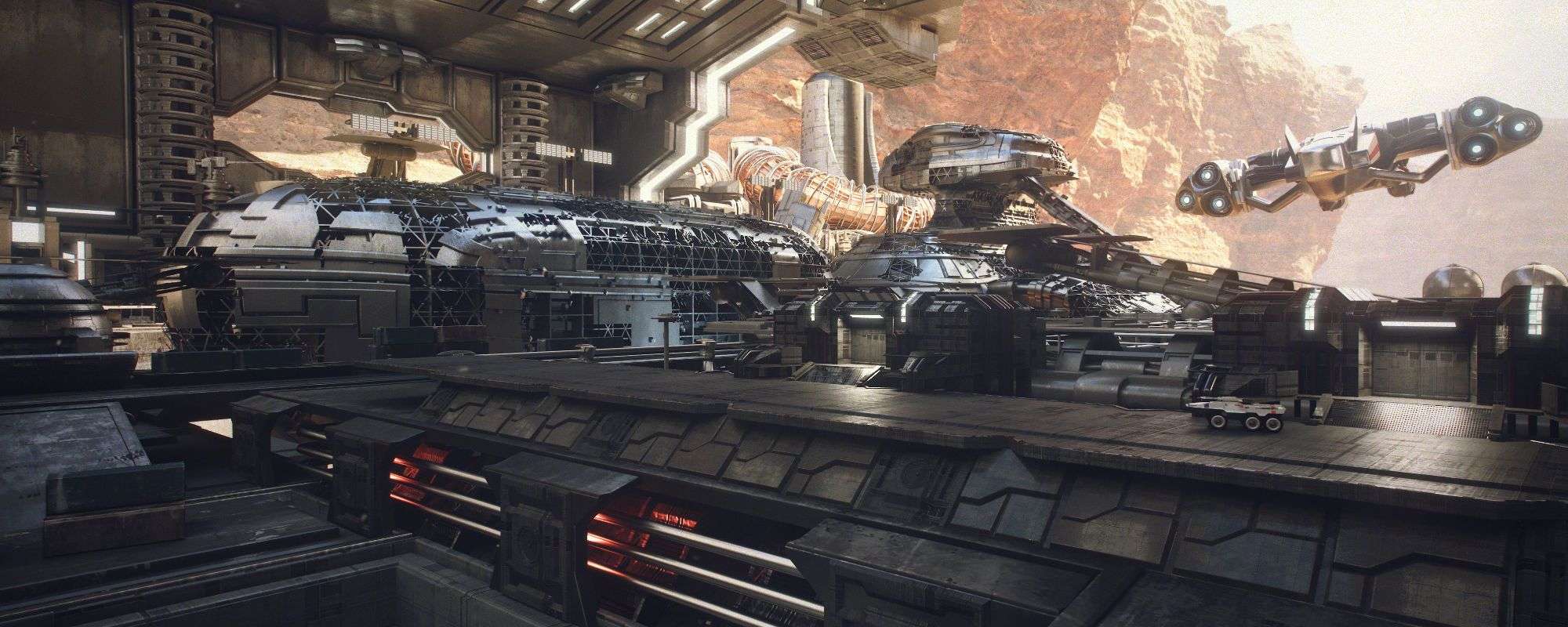
I usually like to experiment with different moods and lighting setups before deciding for a final one. This for example was an earlier version that I liked a lot. The dusky atmosphere and softer, lower light conditions changed the mood considerably. The rain falling down through the ceiling opening, reflecting the light coming in, would have added a nice point of interest.
In the end I decided against using this one. Render times where somewhat higher and I liked the burning bright sunlight in the final version. The stark contrast with the blue tinted darker regions made for a more interesting image as well.
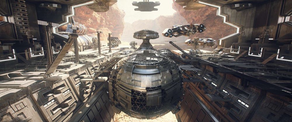
Generally i wanted to have a very defined main direction (the hangar gates) for the light, with the foreground being the darkest and the background the brightest area.
I kept this through all iterations I tried. The shape of the ships and interiors should be visible as a silhouette against the brighter sky. Alternatively they should also be recognisable by the reflections traveling along their shapes.
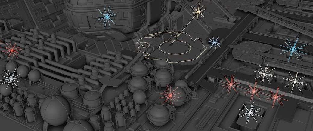
So I toned down most of the “in-scene” lights quite a lot and disabled many of them entirely. This included lights along the train track and on those crane structures for example, as well as lights in the depot area and others. I wanted them to only contribute very locally to the general lighting setup.
Coloring some of them in pretty strong red hues helped to add depth to the foreground structures. A more standard, realistic artificial light colour would have blended more into the sunlit regions and concealed the shapes.
Even slight variations in light colour can help avoid blending different lighting regions.
Everything else was mostly lit by either the sky or the sun. I added a few smaller (neutral coloured) fill lights in the front area for the first shot though, to get a bit more definition in this area.
Rendering with Pathtracing
I decided for a 2.39:1 aspect ratio because it works great for science-fiction scenes like this. It allows using very wide-angled lenses and gives a nice scope to the whole scene.
I wanted to keep the render times at below 30 minutes per frame, so render time optimisation was very important (well, it always is).
Pathtracing render times strongly depend on ray travel length. Therefore it is very feasible to reduce the maximum sample intensity globally, at least for strongly sunlit scenes like this one. Similar to reducing the diffuse depth and so on in Arnold for example.
This reduced the dynamic range of the final images considerably. It helped a lot with reducing noise and anti-aliasing artefacts though, giving cleaner results with less render passes. Since the main light source was strong enough it didn't influence the final look too much.
I also tried to find a good balance for the displacement settings, so it doesn’t add a ton of useless geometry, while still adding enough detail. Since the cliffs were really just background elements I kept it as low as possible.
The final animation renders were exported as 32bit OpenEXR. I didn’t include a full set of base render elements since i was pretty happy with the raw render already, so I mainly added mask layers, my custom depth channel for environment fog and a few render elements i know i would use, like the emission and reflection passes.
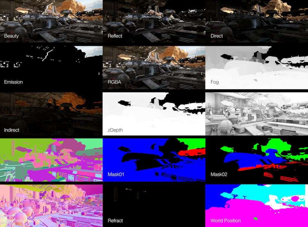
I also included world position and surface normal passes but didn’t end up using them. I always like to have them as a backup though, in case id like to to some quick relighting in Nuke.
The lens flares/engine glare were custom built using C4D visible lights. Those are somewhat old fashioned substitutes for material based volumetrics. They render blazing fast though and they work very well for applications like this.
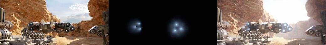
I rendered a “lens flare pass” using C4Ds standard renderer. A second one included a black and white version of the same visible lights. I made these bigger, with animated (wavy turbulence) noise in the visible spectrum. I then used this pass to add very subtle heat distortions in Nuke.
Postwork
In Nuke I usually start with the base render and merging in fixes, if any are needed. For this camera I added two re-renders for areas with AA flickering (after optimizing the render settings a bit too generously) and I changed one element that I didn’t like (the gangway in the front). For this I did region renders of selected objects with adapted settings and merged all layers in Nuke.
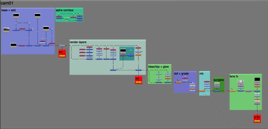
Up next I usually work with the render layers I set up, for example adding in subtle AO. For this i used the inverted direct light pass as a mask, to prevent it from darkening brighter areas.
Next I emphasised the reflections and GI a bit and added the atmospheric dust depth pass with a slightly blue tint. (just slightly since there probably would be a lot of dust particles in the air). In an interim step I added a bleach bypass to get some more harsher contrasts and a bloom layer.
Final adjustments were the standard post processing techniques, like adding a filmic LUT, depth of field, lens distortion, chromatic aberration, motion blur, final grading adjustments and a fine film grain. I only kept the grain in my still images though, to avoid bloated or blurry mp4 web exports.
Thats pretty much it. Thanks for reading and I hope I gave some good insights!