
This article aims to answer a couple of big questions - Why is Clash Royale so popular and does the UX have anything to do with it? I think UX is a neglected topic in many areas of game development because it's not as obvious as the character or environment art you see on screen. A game with a great user experience lets a player immerse themselves in a new world without really knowing how or why - it is the subtlety of UX that delivers a great experience, or not.
I see user experience as a design philosophy that focuses on combining science and empathy toward end users. Part of that is generosity, but it doesn't mean making the game easy. It means understanding your audience and creating the game tailored to them. That is why I want to write about games that care about players in an interesting way.
Clash Royale
Clash Royale was released in March 2016 by Supercell, one of the most successful companies on the mobile market, earning well over a billion dollars to date. Clash Royale is a competitive arena card battler. The game is characterised by small scope, great UX, deep gameplay and high-quality graphics.
Clash Royale is not a perfect game, but UX-wise it does a pretty good job. It suffers from common live product problems - live games need to meet player expectations, so developers add new features and content. The game grow and consequently, the UX suffers from it. But I would like to start with the basics, so let’s start from the beginning.
Simplicity, Minimalism
Being moderate in game development is really hard, we developers always want to add more features to our games. When crafting UX, being moderate is always a struggle. Minimalism and simplicity is the key element when it comes to creating fantastic user experience. I'm going to try and defend that statement, so bear with me.
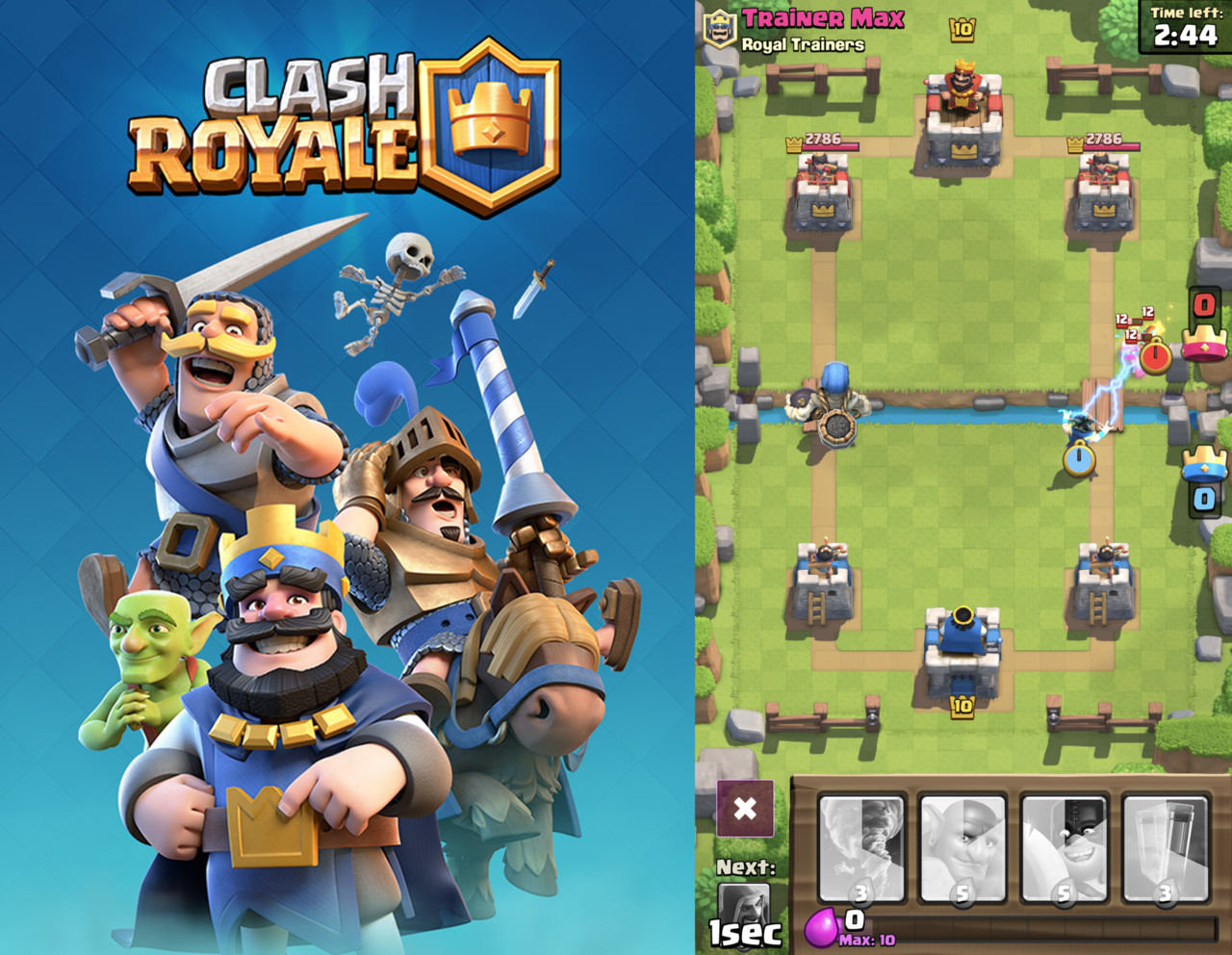
One hand interface
One hand interface might not be a "must have" feature for every game, but it definitely improves user experience. It allows your players to play the game in more situations and places. And that can help you improve retention in your game.
Imagine a player that play games traveling home, in a bus, standing holding handhold.
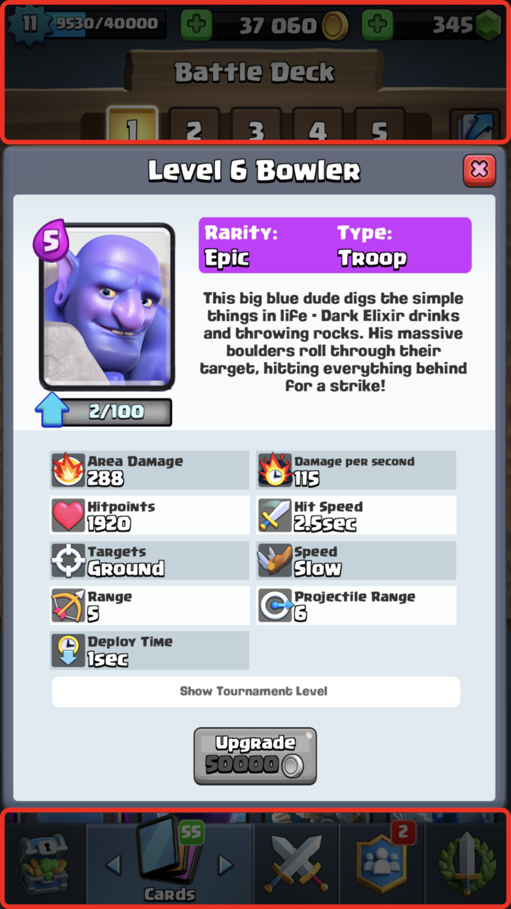
Nowadays, phones are part of the social element, so lowering "requirements" is key to make this experience better. Developers of Clash Royale made sure that all key elements of the interface are within reach of your finger, while using phone with one hand. I need to point out that I don't take into account "Reachability" feature on iOS that allows to reach top of the screen without using second hand. For the sake of the article, we can ignore it since it's not part of the game.
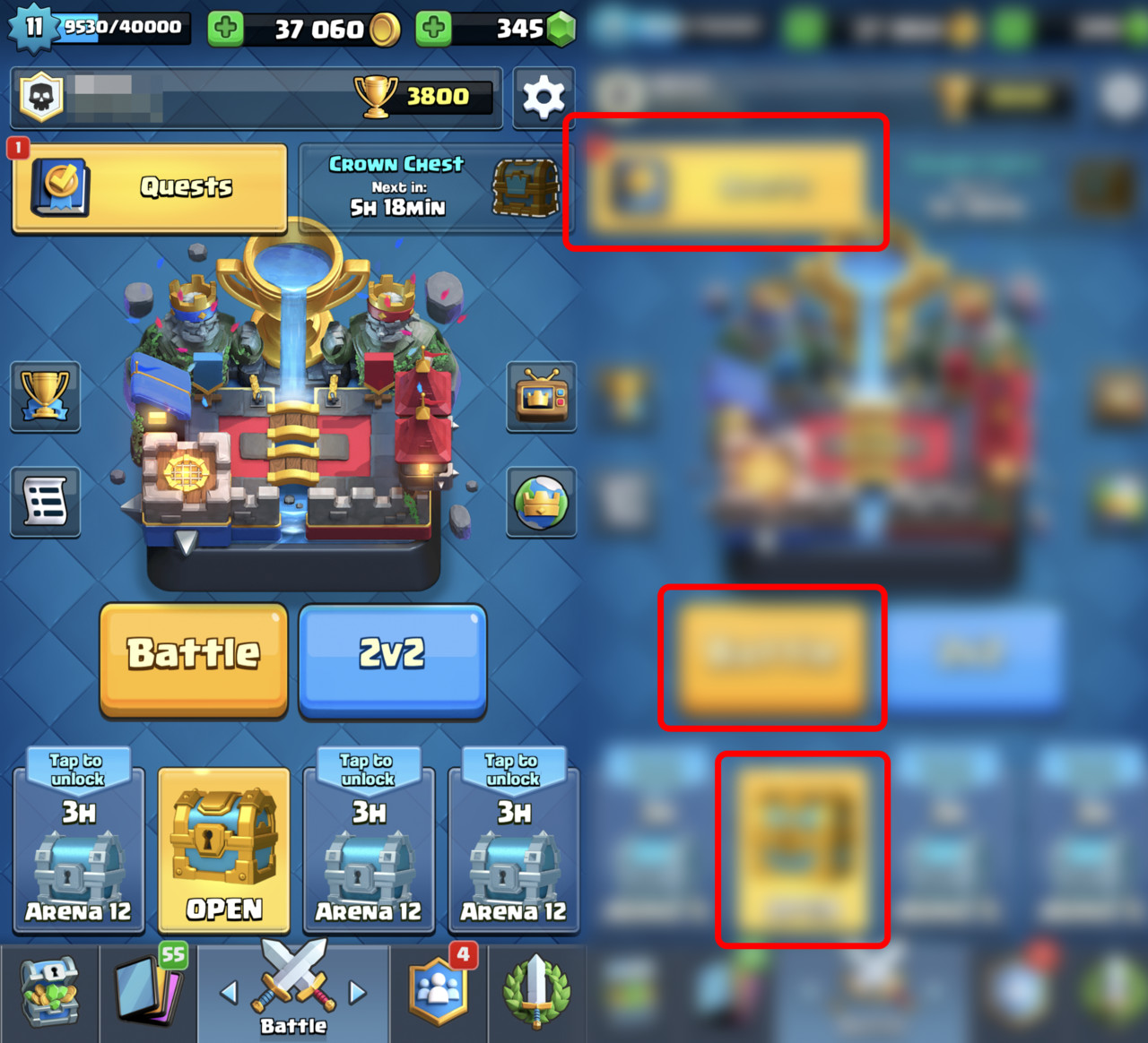
I highlighted with red outline key functionalities in the game, all of them are positioned within lower 50% of the screen.
All main functionalities are available when using one hand
- Menu bar is on the bottom
- Card donation feature is on the bottom
- In the battle, card deck is on the bottom. Dragging/Tapping is initiated from the bottom of the screen
- Chest area is on the bottom
- Popups are never full screen and tapping on the background closes them
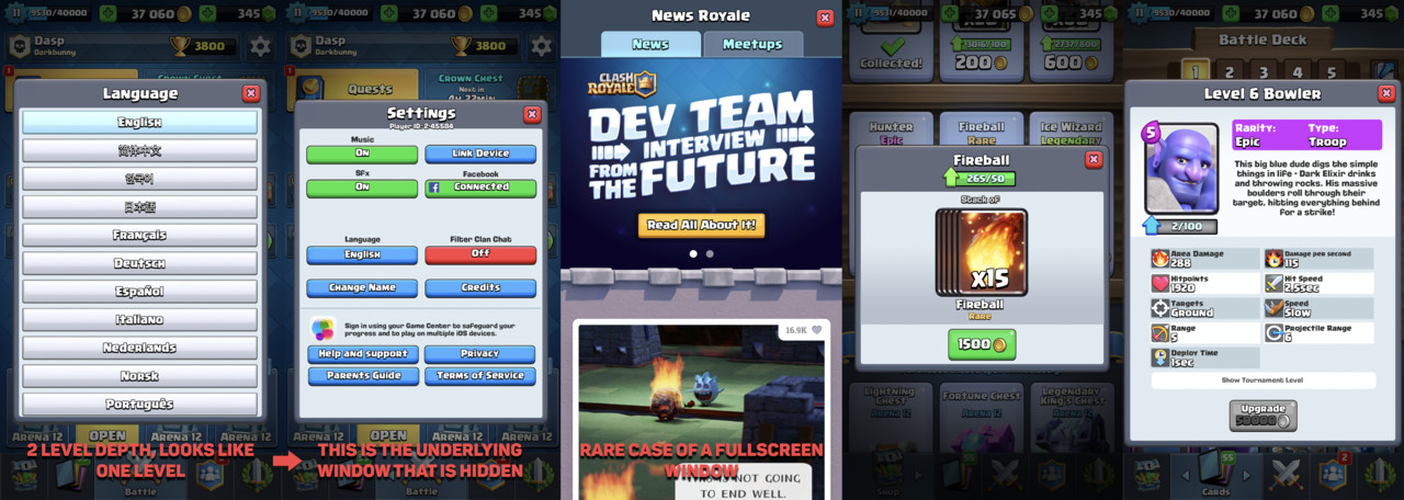
UI depth
There is something interesting with CR interface. The deepness of the UI almost never goes more than one level, and in some special cases when it does it is cleverly hidden to look like one level. On top of that most of the popups are not fullscreen. Why are those things important? Few reasons:
People get easily confused when going through multiple windows. They forget how to get back, they lose track and interface can overwhelm them. This is frustrating and that hurts their experience.
There is something called Mental Model which is a representation of the surrounding world and their relation in user’s brain. It’s important to create an interface that user expects and knows how to interact with. Showing a popup and not fullscreen window helps the user to orient himself. He can see previous UI behind popup window. It’s a detail, but with UX details are everything.
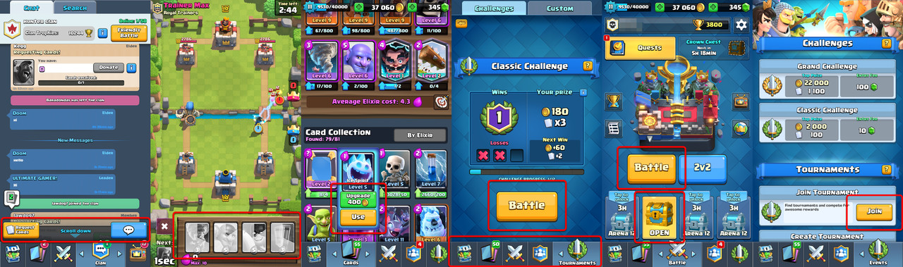
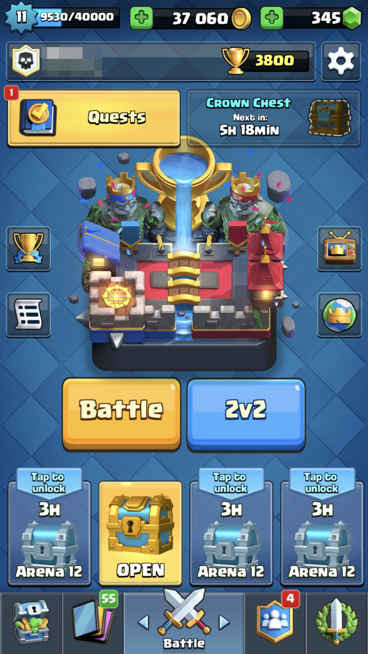
One menu to rule them all
In the main menu, bottom of the screen is occupied by shortcuts that allows navigation between different screens. Having menu always visible in the UI is really convenient for navigation. Users won't have problems with orientation and they would feel that they are in control of the interface. They can always come back to the place they need to. Division of the shortcuts is intuitive because it’s based on different categories of needs that players might have.
- Social, everything about communicating and interacting with other players
- Battle, functionality connected to core gameplay
- Shop, items and currencies available to buy
- Cards, deckbuilder with all cards and upgrades
- Events, tournaments and special events
Cognitive Load
This part focuses on the limitations of the brain. Humans can process limited amount of information at once. After certain point they start to get overwhelmed and confused. UI needs to be designed with that in mind.
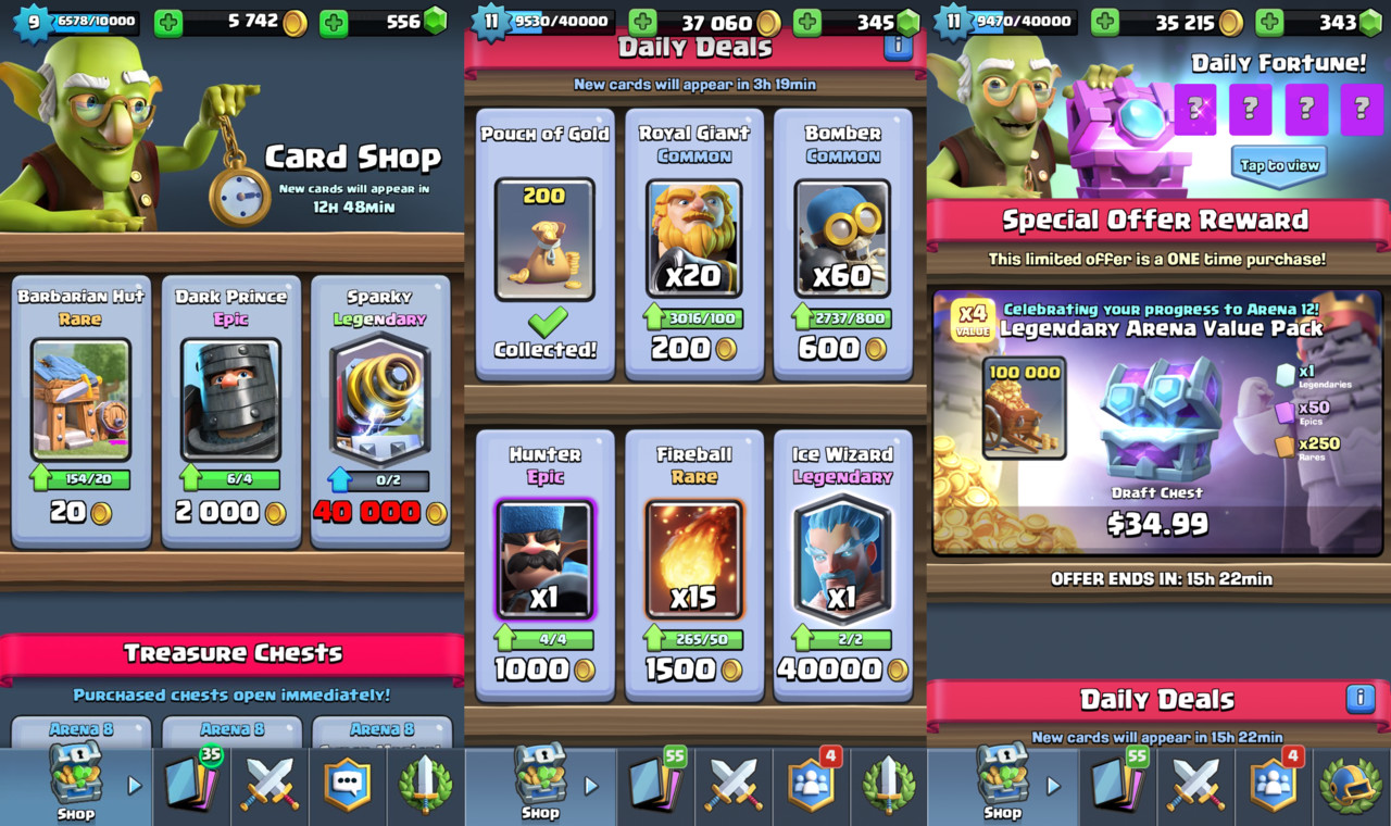
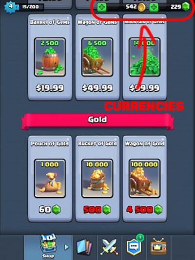
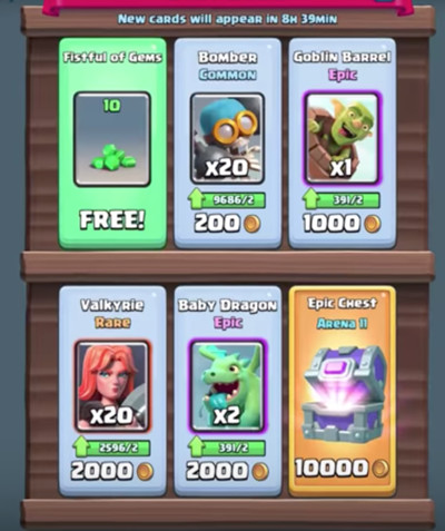
In-game shop
When analyzing the in-game shop we can see that it's very minimalistic. Usually, we have up to 6 items on the screen and no more.
There is something called The Paradox of Choice, in short, having too many options to choose from creates anxiety. Our short-term memory can hold up to 7 items -+ 2 depending on the person. Forcing people to memorize big amount of information or making them do calculations in memory can create a bad experience for our customers.
Putting all that information together shows us why it's so important to be conservative with the amount of information we show to players. Clash Royale shop is a really good example of that:
- The shop has small number of items to choose from
- Clear distinction between items
- Special offers are clearly highlighted.
- Discounts are explained with one line of text
Some might say that making shopping experience great doesn't create a better player experience. That in the end, they might spend more money that they don't want to spend. I believe that players should be treated with respect and they should have the freedom of choice. That’s why giving all information needed to reach a decision without creating anxiety makes it best environment for them to decide for themselves.
I'm personally a fan of previous in-game shop version that was in Clash Royale. It was simpler with less information on the screen. I also understand the reasons to change, which are tightly connected to game economy itself. However, the shop is still one of simplest ones that you can find in the mobile game market.
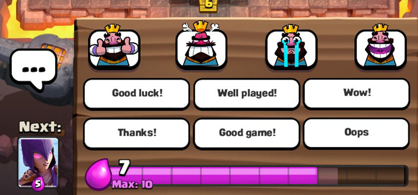
Modesty with notifications
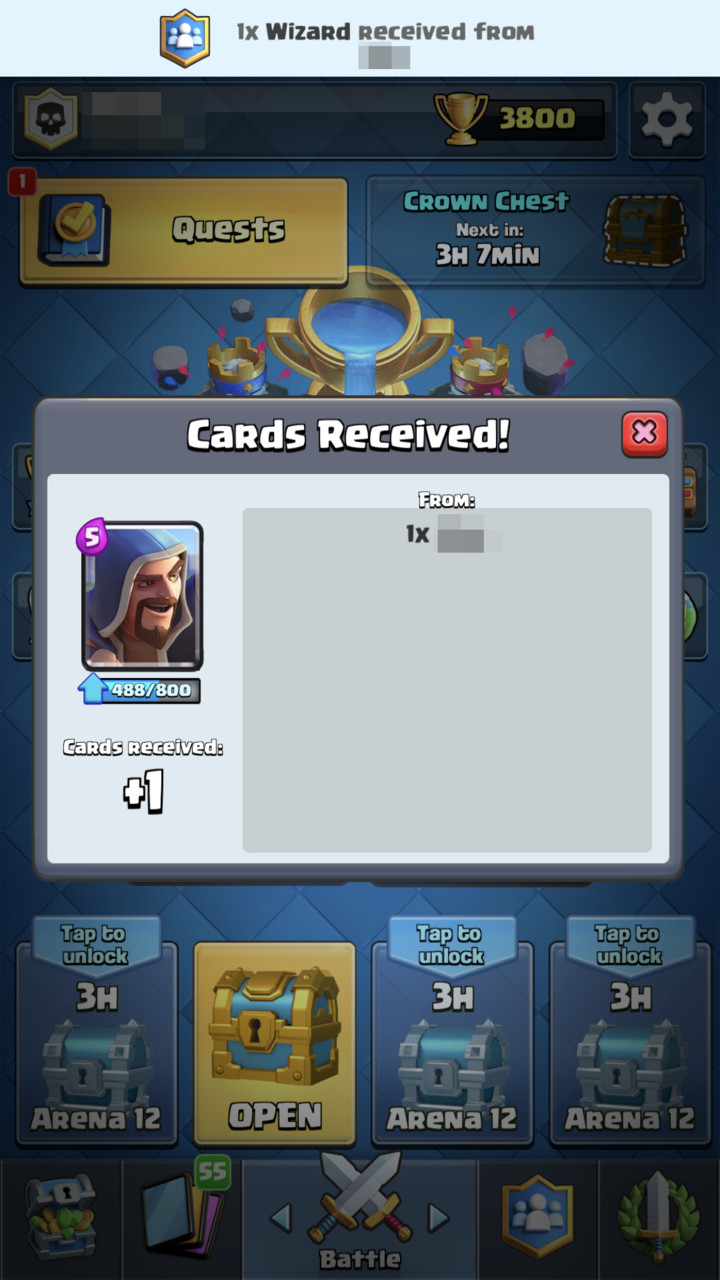
I'm really passionate and emotional about this one. Every game that has more than one popup at the beginning of the session should burn in hell. Game session length on mobile platforms is about 2-5 minutes. Forcing player to go through multiple popups (even 2) after opening the game is waste of players time. Usually, players won't focus on the information delivered to them because they enter the game with a specific goal. Much better option is to limit those popups to a maximum of one or having notification bubble somewhere in the UI. Clash Royale uses both options with great respect for players and I think unconsciously, players are thankful.
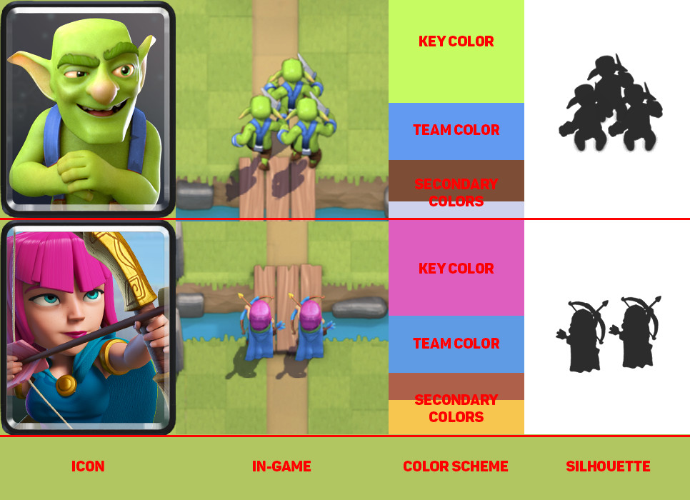
Key UI elements need special treatment
It's already really common in games to use unique and bright colors for important UI elements. It's no different in this case. Clash Royale uses yellow color (which is first and last color that people see in their life) for most important buttons. Enter Battle, Request Cards, Use Card and Invite Friend are colored yellow. Usually those bright elements have also special visual effect like animated highlight.
Secondary color that highlights other less important functionalities is green. It's used for functions like Donate, Buy and Upgrade Card.
The red color is used as notification color. Dominant color of the UI is blue and it's used in the background and other less important elements.
Emphatic Design
I'm a strong supporter of user-centered design in games. In the end, we are making products for people to enjoy. In Clash Royale, we can find many examples of this approach.
There are many benefits of emphatic design. When you take care of your users they respond with loyalty. That leads to better retention and this leads to higher conversion rate into paying users.
Emphatic design has also long term effect on players. The chance of player coming back, after leaving our game with negative emotions is low. In contrast, player leaving with positive emotions often comes back to check on new updates. When developer is releasing new game it's much easier to convince players to try it, because of those positive memories.
User Acquisition cost for mobile games grows every year. So when we acquire that player to our game, we should put his well-being as our top priority.
I will mention few things that we already covered and they are important for user-centered design.
- Properly implemented notifications. Players know what they want to do in the game, don’t force them to spend their precious time on other things.
- Minimalistic shop with a clear description of items. Most people don’t spend money (~5% users pay). But the ones that do, want that experience to be good. So, don’t force players to hate that experience because they won’t go to the shop anymore.
- Portrait mode greatly helps with one hand interface. Mobile games are all about experiencing game while you are mobile. Many players don’t want to sit and spent 100% of their focus on a game.
Interactions
People often have different habits when interacting with UI. Changing user habits is really difficult. Best-case scenario is creating UI that can be used in few different ways, and reach as many users as possible. Obviously, it takes more time and analysis. Clash Royale developers thought about it and gave players the ability to use parts of the interface in few different ways.
Gameplay is a key part of the game and in this place, we have that ability. In Clash Royale, gameplay is all about dropping cards on the battlefield, so developers gave us 2 ways to do it.
- Drag&Drop – You drag card from the bottom part of the UI to destination.
- Tap&Tap – You can tap on the card to select and tap to place it on the battleground.
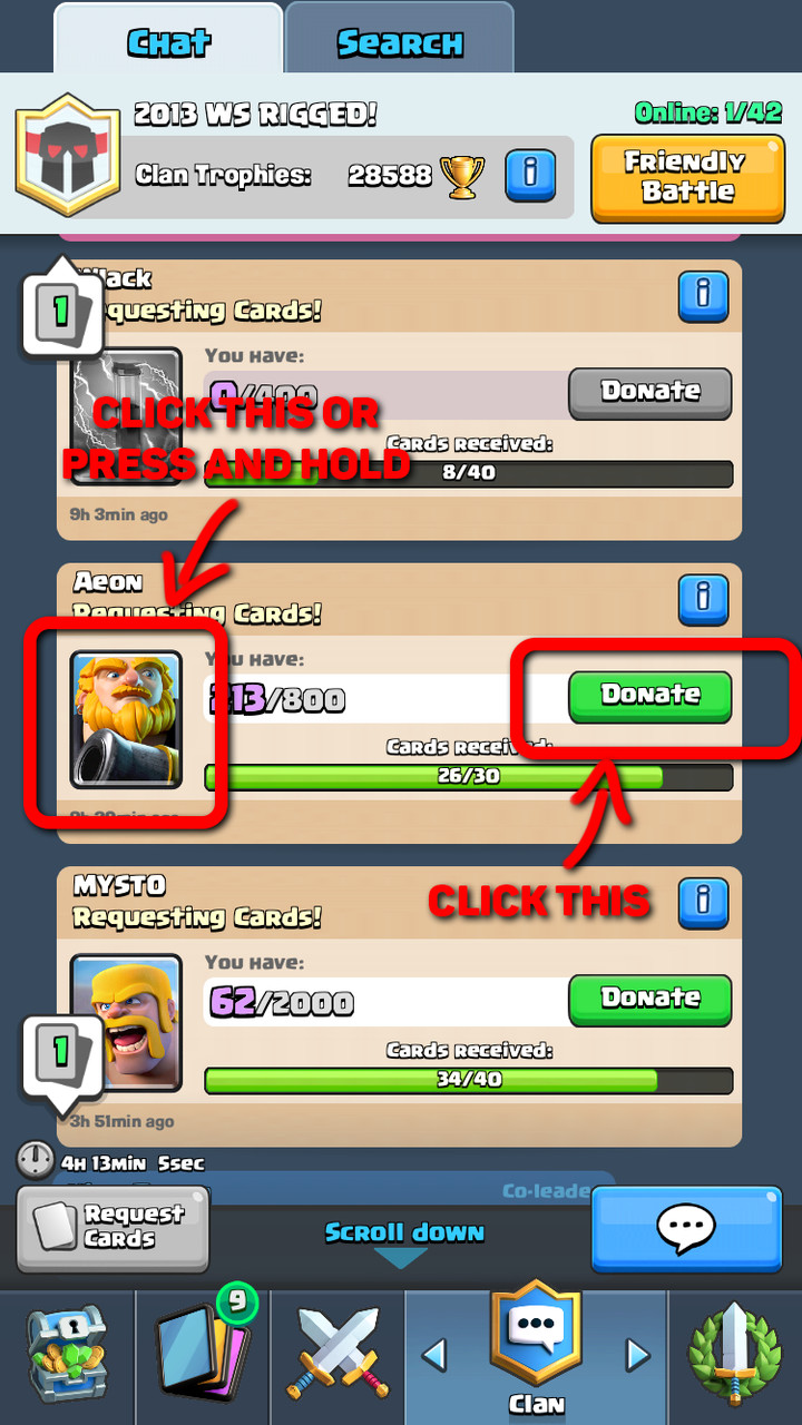
Main menu of the game has also many improvements in this area. We can donate cards to other players in two different ways:
- Tap "Donate Button"
- Tap or Hold (To donate multiple cards) card image on the donation request
Menu navigation:
- Swipe left and right to change view
- Tap the icon on the bottom to change view
Opening Chests have also two modes. Slow and fast opening, it's a small improvement but after having to open 100+ chests it’s a huge time and anxiety saver.
User Interface
Tooltips
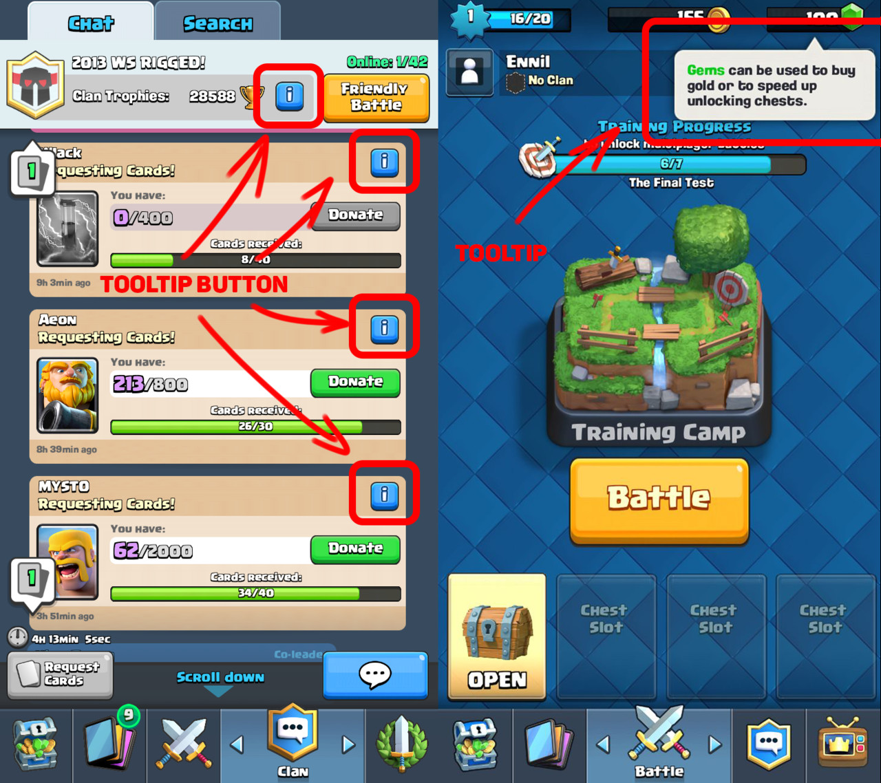
Clash Royale uses tooltips in confusing places, so player can always learn through interaction. Look of info button is always the same, so players quickly learn meaning. It's important with minimalistic UI's to sometimes have those "guides". It’s a fine balance between not enough information and too much of it. Tooltips are a cheat that allows to widen this fine spot.
Economy
Economy in the game is based on two currencies, soft and hard. This is at least a bit less confusing than having 4 currencies like many other games. One currency for everything would be perfect but there are important advantages to using dual currency in free to play scheme. Main advantage is that having premium and soft currency allows for better control of in-game economy. If developer fails to control economy everything starts to fall apart. In-game prices are growing rapidly and often players have too many items. On a high level, game economy resembles real-life economy.
Going back to empathic design. It's easy to forget about being empathetic toward our players. Introducing 4+ currencies into our game won't make it easy for players to understand relations between them. Also, having 10 categories in your in-game shop because of the amount of currencies will not help either.
Overcomplicating this part leads often to decrease in revenue and user experience instead of the opposite.
Gameplay
Gameplay is what games are all about, this is where players spend most of the time. It's vital to focus on user experience in here because it will define your game.
Gameplay interactions
When interaction is well matched with user expectations it doesn’t bother players. Otherwise, it might happen that they will complain about broken game, horrible gameplay and other things that are likely not the core of the problem. Player feedback is valuable but needs to go through person that interprets that feedback.
Clash Royale developers focused on clear and understandable gameplay by limiting distractions. Because of that, players can focus on the gameplay and game supports them by providing all needed information. Key gameplay interactions that we can find are:
- Spell range, visible with red or blue based on the team
- Unit drop available area. Some units are able to drop on the enemy’s side
- Deployment time varies between units
- Damage visual effect to indicate that units are giving damage to enemy
- Visual effect when units get statuses like freeze or poison
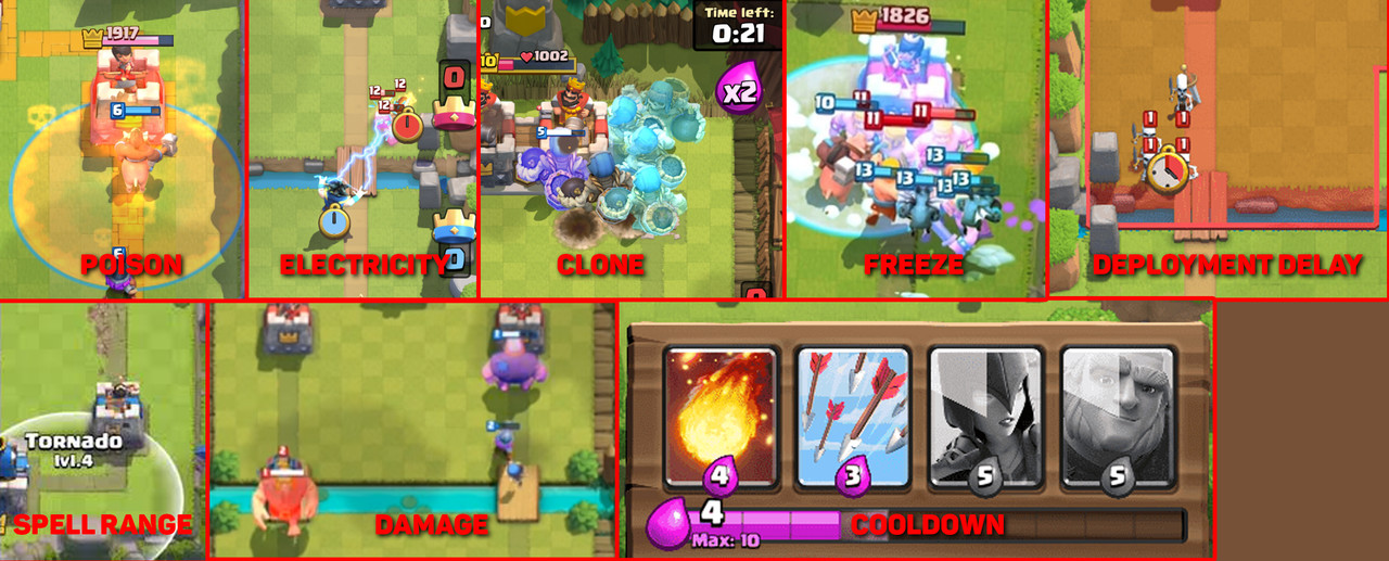
Different visual cues.
In here, I want to stress that consistency with interactions is elemental. Players need to create a habit when reading information and doing interactions. When those are consistent player can develop mastery. That improves their immersion in the game and allows them to enter flow state much easier. Clash Royale is a real-time competitive game, so interactions are win or lose condition for players. The importance for this element should be clear.
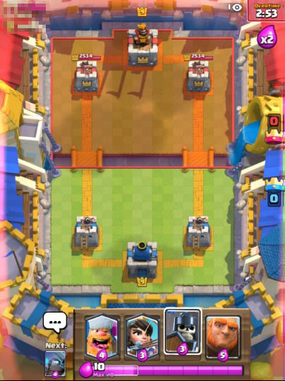
Placement importance
Clash Royale gameplay is all about timing, positioning and resolving mini skirmishes around the battlefield. I already mentioned that each unity has unique deployment delay and some units can be deployed on the enemy side. We have also a grid of equal rectangles so when we are placing unit, game algorithm snaps them to that grid. Placement is important because it affects unit target. Depending on the placement unit can target tower, building or number of enemy units.
By introducing grid, developers improved user experience in a big way. It allowed them to have clear definition of a unit. Character description can specify attack range for example, Archer has range of 5 tiles. It allows players to quickly measure distance in the heat of battle. Without grid and unified measurement, players would have hard time doing that in real time.
Different deployment areas.
Tutorial
Tutorial in games is usually one of the most underfocused part of the game. And yet it's the key element to engage players in first few minutes. You might lose even 10% of your user base by having bad UX in tutorial.
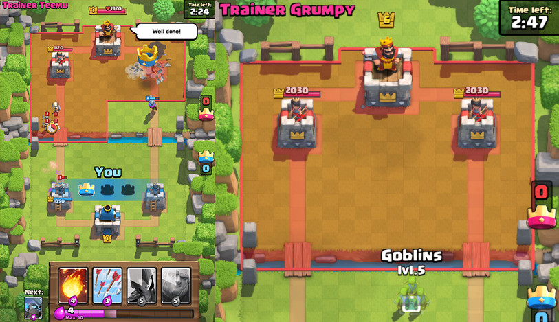
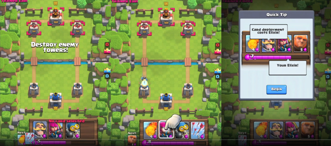
In Clash Royale, tutorial throws you in first second straight into the arena and tells you to defeat the opponent. It doesn't treat players like idiots. It suggests what to do but doesn't limit your movement. You still have the freedom to do whatever you wish. Tutorial mechanic doesn't break the flow of the game by forcing specific actions.
It also doesn't end after the battle. It continues the same as if you would play a normal game but with guides. The only moment that tutorial limits your movement is when upgrading card for the first time. This part could be done better, so it doesn't limit user, but the key element in the tutorial is to engage user as soon as possible. This is achieved by throwing player into the arena in first seconds after starting game. The implementation of the tutorial allows players to get immersed. First few games are against AI and they might be tailored but it's hard to tell without knowing the implementation. After 7 wins you can participate in PVP battles. So tutorial allows users to learn the game with AI and then they are thrown into online battles.
Guides in the tutorial.
Player Communication
A common problem in online games is in-game toxicity. Many top titles have that problem like League of Legends, many MMORPGs, and mobile games. Supercell cut most of the toxicity from the game. They achieved that by not including global chat and limiting communication in the arena to predefined emotes and texts in the gameplay. You can still freely chat in the clan but players can control that by themselves so it doesn't affect toxicity as much.
I am personally in favor of limiting verbal and text interactions in games. Instead, I prefer focus on interactions between players in the gameplay itself. A good example of that approach is Journey made by That Game Company. Forcing people to interpret different signs or emotes we allow players to create their own world of communication and usually, it's more positive.
One of the most common reasons why people play mobile games is to relax. For this group of players emotes in Clash Royale can evoke negative emotions. They are not offensive but players often dislike some of them (laughing emote). But it's hardly toxic. In the CR community, there were many voices to implement permanent mute for in-game interactions. Developers responded that they believe that interaction is part of the experience. If they are right it's hard to judge, I'm personally split in the opinion.
In-game communication.
Technical
I've created this category to show that not only art and design department can improve user experience. Many things in here are common knowledge but paying attention to them and pushing to limits is extremely important. In smaller mobile teams, everyone is a UX designer if you want it or no.
Fast loading times
Self-explanatory title. Usually achieved by having game that loads small amount of data into memory. Clash Royale is a small scope game and developers paid attention to asset optimizations. They use multiple tricks to improve memory consumption. To name few, they have used sprite mirroring or optimized number of frames for character animation. Thanks to that, game itself has really good loading times, on iPhone 7s Plus loading times are around 4.5 seconds.
Of course, not every game will be able to optimize loading times to that level, it all depends on the goals and type of the project.
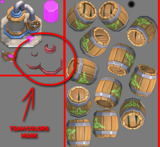
Two examples of how textures are packed inside Clash Royale. On the left we have Elixir Collector and on the right Goblin Barrel. You can spot how developers are changing team colors on units, probably by placing circled elements onto the unit/building itself.
Loading screens
As we just discussed, loading times are a common bottleneck. Every second that player sits on the loading screen increases the risk of him switching game or going to a browser. It takes away the pleasure of playing the game.
There are 2 loading screens in Clash Royale. We have one when entering the game and second one before entering battle. That is really conservative and works really well for UX.
Battery Drain
Another common problem while playing games is battery drain. Pushing the performance out of your device makes it drain battery. Many games have problems that phone is out of battery in 2h. Especially games that have real-time 3D graphics and require internet connection. Supercell's original art style has few advantages in this area. The art style is based on 3D prerendered sprites so it's basically a 2D game.They are lighter on GPU so it allows playing CR for longer period of time. I assume that is only part of why Clash Royale doesn't consume battery so fast but I don't want to speculate too much. It's good to be aware of those things. Players care about that and developers should also.
Disconnecting from game
Clash Royale requires players to be online. Like with every online game there is a possibility that you might lose internet connection, especially while traveling. Clash Royale allows players to rejoin match after they lose connection or close the app. In this case additional advantage is having an app that starts really fast like it is with game from Supercell.
Having ability to reconnect minimizes anxiety for users. It might not be their fault that they lost the connection. So being able to go back to your important tournament match after being disconnected it's just empathetic.
There is one situation that might show us how Supercell cares about users. Few months after game went live, developers noticed that players are pushing much stronger after opponent gets disconnected with hopes to gain advantage while player is trying to reconnect. So, they introduced a fix that removes notification that your opponent got disconnected. Now if you get disconnected it looks like your enemy is thinking a bit longer what card to play. It's a small change but gives players time to reconnect and makes it fair play.
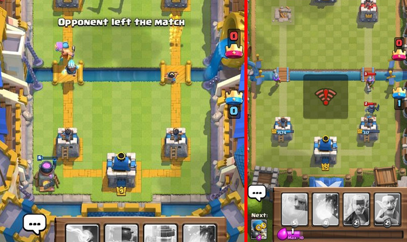
Left image is the old notification for opponent loosing internet connection. On the right is for player when he lost connection.
Ordered randomness
Often when people talk about randomness they have something specific in mind. Players don't like to hunt for 1% rare drop and after 100 or 200 drops they still can't find the item they are looking for. That is why randomness in games is in reality pseudorandom, it's fully deterministic but appears as statistical randomness.
In Clash Royale chest drop has predefined order to imitate randomness. Everything is about mental model. If the player thinks its random and they like it, that is enough.
People discovered the order of chest drops in Clash Royale and it's publicly available so everyone can look it up. Adjusting randomness is interesting practice and shows that developers thought about making the game experience good from every point of view.
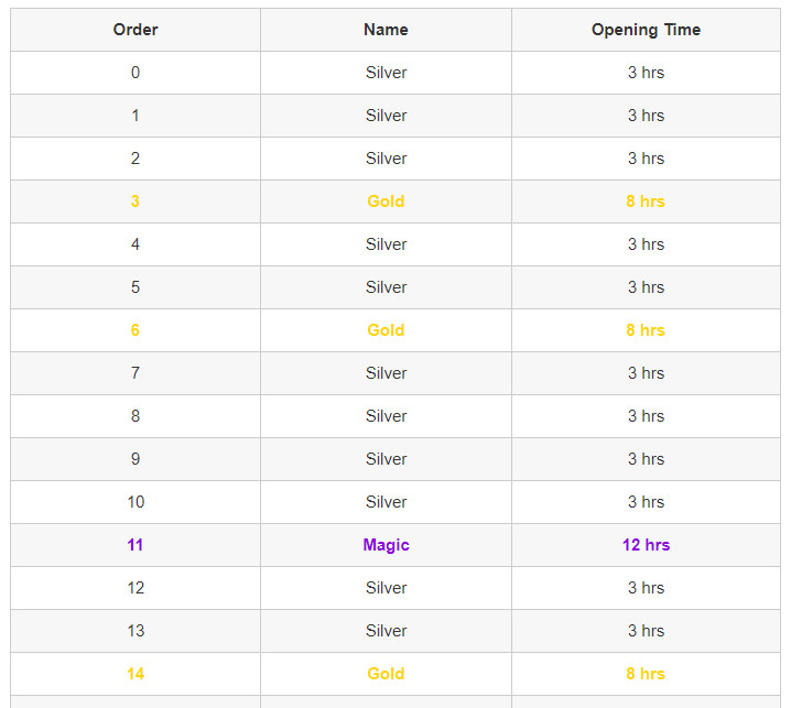
Screenshot from clashroyalearena.com where we can find full chest drop order. This is only part of the order.
Aesthetic
Aesthetics is one of the main weapons of UX design. With proper aesthetics, user experience can be incredible or awful.
Art Style
Supercell created their own unique style. We could describe it as prerendered 3D Pixar-esque look adapted onto mobile platforms. It works really well on mobile because it has strong contrast, bright colors and distinctive silhouettes. That makes the style readable on the screen of your phone.
Gameplay Colors and VFX
Colors are of great value when used to emphasize gameplay elements. Clash Royale developers use colors to improve readability and clarity of information. Examples of that are found:
- When time is running out, screen starts to blink with red outline
- When units get damage, it blinks with brighter color
- Full elixir bar glows and has animated effect
- Cards have radial progress until elixir reaches the point when they can be used
- Each unit has their own characteristic color theme
- When units have statuses like poison, freeze
- Blue and Red colors to differentiate between teams
All that improves experience and help players understand gameplay without spending too much time on understanding the situation on the battlefield. Consistency is important factor with visual style, especially when it's part of the gameplay. As we can see art is tightly connected to game design. Interactions and visual style are often combined. It's important to understand this combination because this is the only way that our games can reach next level.
When game goes into overtime player sees reddish frame around the screen to indicate that.
UI Colors
I already mentioned a bit about colors in the UI. Developers used yellow, green and blue for UI elements. Yellow is used with most important functionality, green is of secondary importance and blue is a background color or sometimes used on buttons.
Properly used colors provide clarity for the UI. They direct player eyes to specific places.
The Bad in Clash Royale
Clash Royale by no means is a game without flaws. But developers successfully minimized those problems to the point that interacting with the game is a pleasure. We need to remember that improving user experience is an ongoing battle.
Biggest UX problem that we can encounter in the game is input delay.
Input delay
This problem is treated by many players as a bug. Unfortunately it's by design, reason for it is that Clash Royale is an authoritative game. Authoritative means that whole game logic is calculated on the server. Usually input needs to travel from both players to the server where gameplay calculations happen, after that server sends back the data. My assumption is that developers made hard-coded delay of around 500ms to make sure that server receives all data and is able to send it back on time. It might take more time if the connection is slow but most of the time it's a really stable system.
We might want to ask a question, why use system that cripples gameplay experience?
The reason for that approach is to remove most of the loop holes for players to cheat. It's common in online games that we can find users not playing by the rules. Calculating outcome on the server removes most of the problems with cheating. Everything is controlled by one server so the result for both players is always the same. I think most of us had experience with cheaters so we should understand the importance of solving this problem not only from UX standpoint. Developers sacrificed gameplay experience to improve overall user experience, it's a common situation that we as developers encounter on daily basis. Not always everything is black and white.
Live Game
Games as a service is a fairly new concept in game industry. Supercell focuses on creating games that players can play for years. Supporting live game for long time after launch has many side effects. Players need more features, big features and shiny features. With every new feature our game gets more and more complicated. For UX that is a problem that increases over time.
Even rather new game as Clash Royale has saw decline in UX. It's inevitable but we should prepare for it so we can handle that better over time. Long term planning is one element that can help us with it.
Updates
October 2017 update to Clash Royale introduced many changes to the game. One of those changes concern shop items. Every few days shop offers players ability to buy Epic Chest for coins. It's unique opportunity and usually it's good idea to buy it. With newest update developers changed visual look of the button that holds that item. Now it's yellow. Why is this a problem? Well, up until now yellow was associated with key functionality and rewards. Rewards are always for free in Clash Royale, no soft or premium currency involved. This change can create confusion, because it breaks consistency, especially because it's related to in-apps.
In the same update developers removed red font color when you lack resources to buy an item. That is another change that breaks consistency. UX suffers from it because it tricks player into tapping on the item thinking that you have enough resources to buy it. If player is not paying attention you might try to buy that item.
Fortunately developers listen to players and they brought it back in the following update.
Summary
We know immediate effects of better UX in games, players feel more immersed, they enjoy interaction and want to come back. But there is also long-term effect on our audience. Fairness and empathy toward our users create special bond between developer and players. If we care about the user they will reward us with loyalty. But if we do the opposite, players will react accordingly. I think now we can easily see why Clash Royale is a popular game and why other developers should follow their path.