
During our recent Annual Survey we received some very honest feedback about how we could improve the user experience at The Rookies. Thankfully we've already been working on a bunch of features that were mentioned. We are super excited to announce our development team and design team have been working hard to release a bunch of great changes recently. It's our biggest update since the revamped launch earlier this year so read on to find out more.
Improved Layout to Profiles
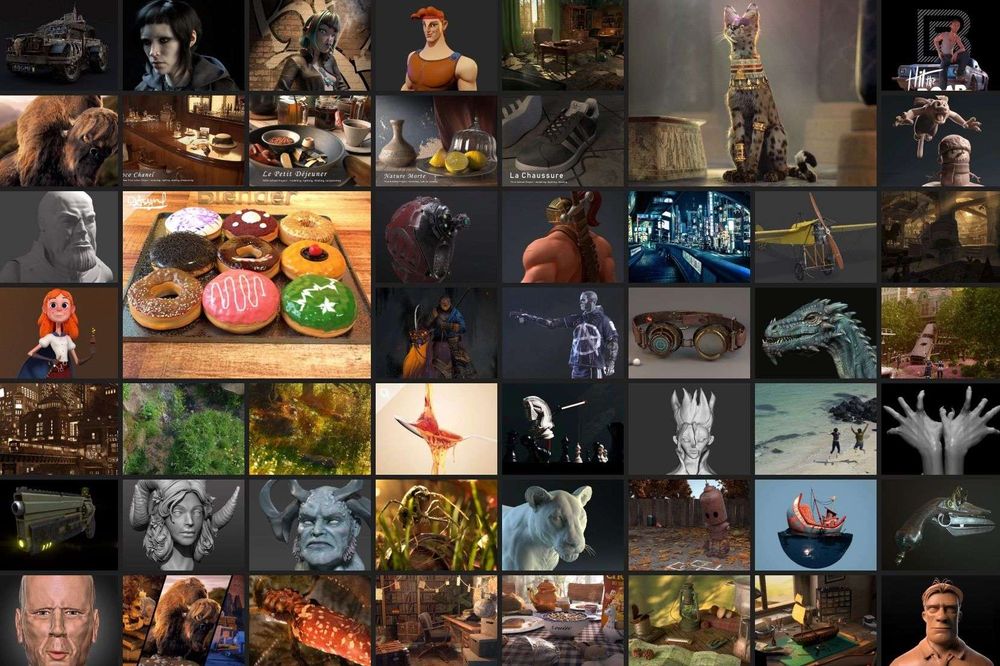
This was pretty consistant across the board. Even though people loved the profile pages, they wanted people to see more of their work from the moment they arrived on their profile page. When you visit a members profile page now, you will be presented with projects rather than information about the artist. We have added an About Me menu item and also brought the Achievements to the navbar.
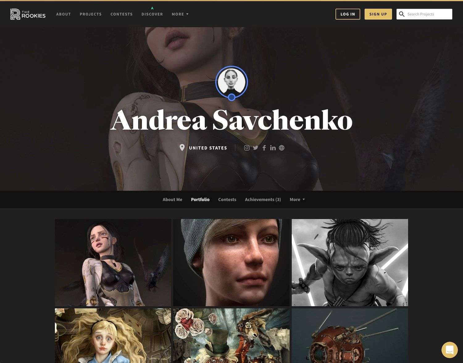
Featured Videos
A lot of members have a Demo Reel and use them regularly to not only show off their skills, but to apply for jobs. To help members showcase their Demo Reel we have introduced a Demo Reel feature that allows you to easily embed a Vimeo or Youtube video at the top of your profile page.
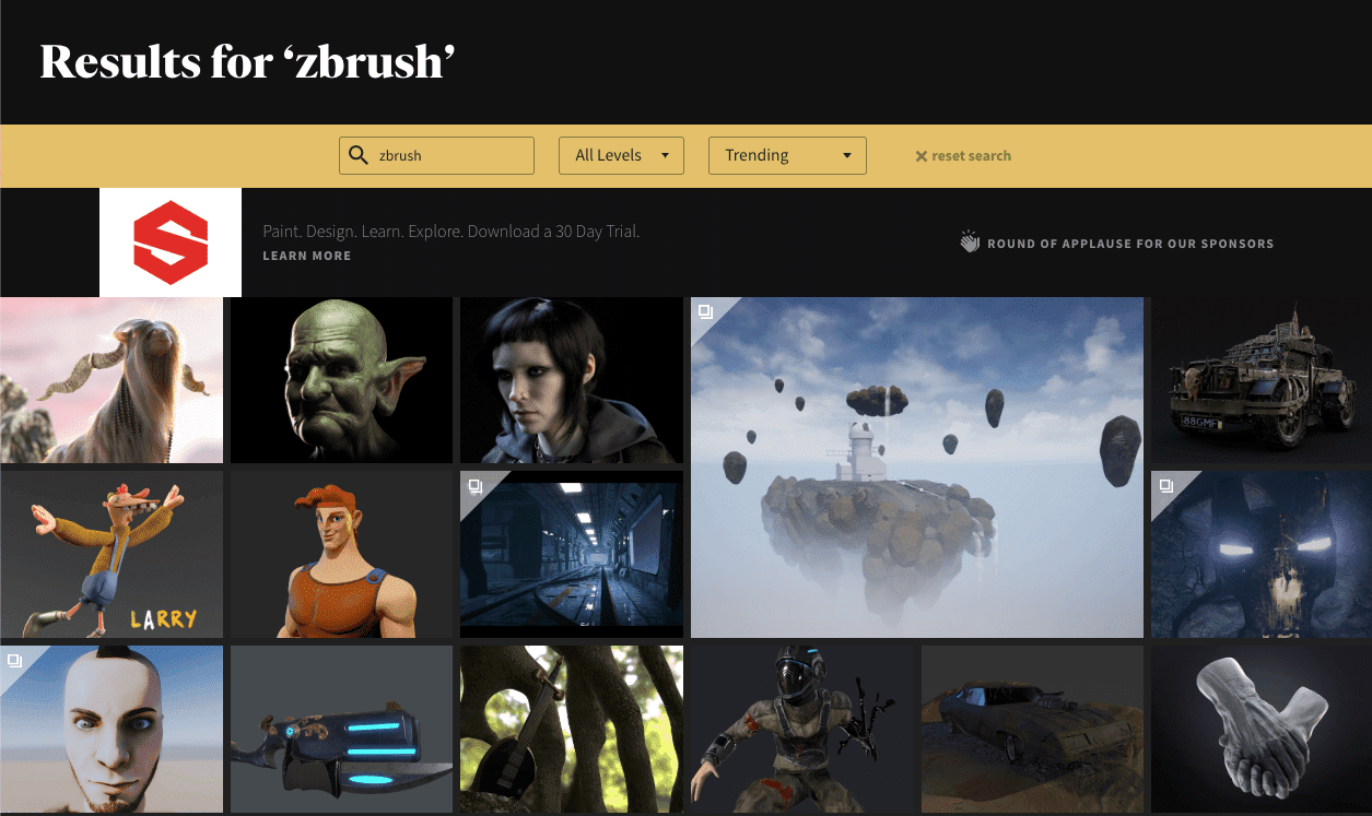
Search Upgrades
To help you find inspiration faster, we have upgraded the project search and member search. It might not look too different at all, but there is a lot more going on under the hood. Rather than add a dozen new input fields, we opted for a single search field that will allow you to find projects based on: title, description, tags, software used, location and even school name.
Improvements to Main Navbar
Many of you will have already noticed a few interesting tweaks to the main navigation system at the top of each page.
Community has gone.
We have removed the 'Community' menu item. There was a little confusion with this one from members. The button was originally designed to show off projects and members in one menu item. We have now replaced with with a 'Projects' menu item which shows everything you want to know about, you guessed it, projects. There is now a 'Find Members' menu item located in the 'More...' dropdown.
Quick Search
You will also see a Quick Search located top-right of the navbar which will allow you to access content much faster, no matter where you are on the site.
Notifications
Members will be familiar with the in-built live chat system. We use this to share notifications and handle support tickets. To help announce super important news or features, we have added a notifications bar at the top of each page so you don't miss anything.
Less Clutter with clean Project cards
Another common bit of feedback we received was that people wanted us to remove the overlay which contained avatars, text and other information on the project/entry pages. We thought it was a great idea, so we actioned this one quickly. You can check out the new look cards here.
More rows, More projects
As you can see from the image below, we have also increased our column count. Things are feeling a lot less bloated now and you can enjoy loads more images while viewing on your phone, laptop and massive desktop screens. Go check it out!

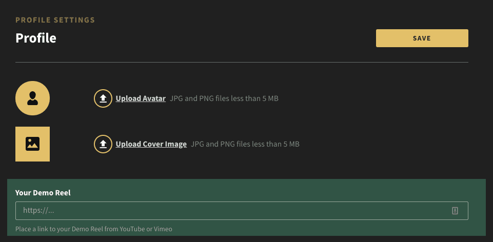
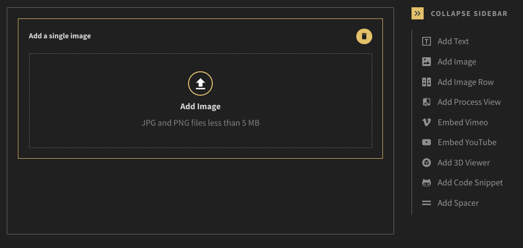
Image upload limit increased
Thanks for your patience with this one. We initially restricted this to 2MB in order to help test server loading and capacity. With everything running smoothly we have increased uploads to 5MB so we can see all your pixel perfect images.
Just because you get more size, doesn't mean you need it though :)
Tips for exporting perfect images
The Rookies' convert images to JPG at 90% quality. The compression done on The Rookies should be very minimal. We are using Lanczos resampling which is pretty much the highest quality option out there.
To get the best quality, we recommend exporting your images as JPG, 100% quality, at 1920px width. At this resolution, generally what you upload is going to be what you get on the site.
PNG images should only be used for graphic images that have large patches of the same colour. Uploading photographs/renders with high pixel-density detail will not help when it comes to web. Keep those PNG and TIFF files for printing.
If using Photoshop, please remember to use Image > Export > Export As... This will result in much better images when compared to Photoshop's default Save As option.
Check your resolution
We often see image uploaded to The Rookies that are 300dpi. Since the web is 72dpi this is wasted resolution. Save the large resolution for printing, stick with 72dpi for web and keep everyone happy.
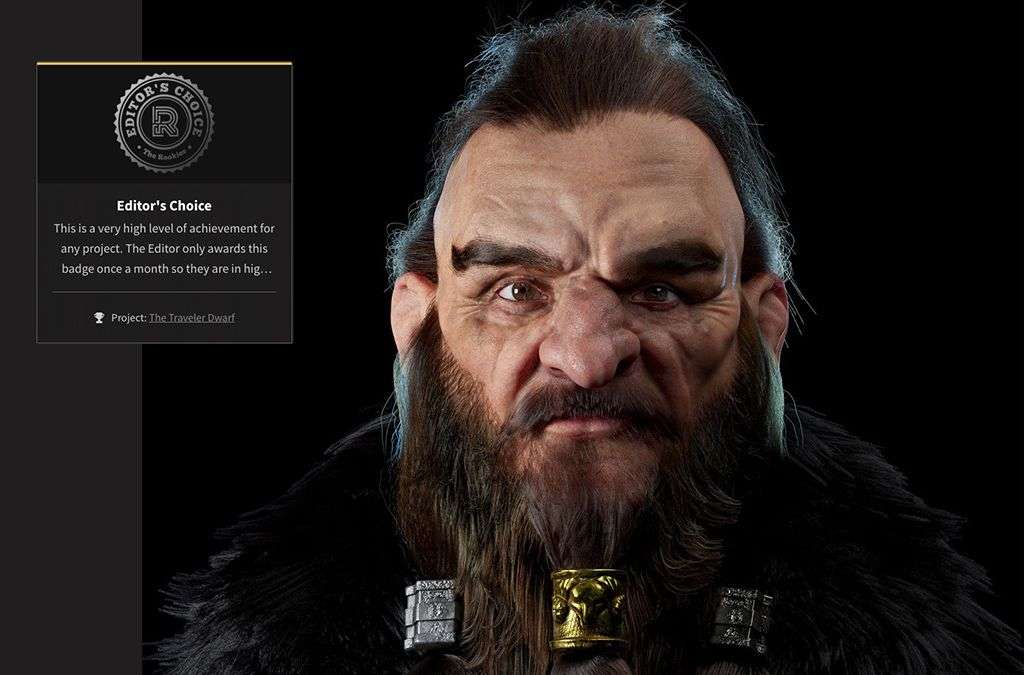
Editor's Choice Badges Released
Our team has been quietly handing out Editors Choice badges to their favourite projects recently. Four of these badges are handed out each week: 1 per member level (Debut, Player, Contender, Rookie). If you want to get your hands on one of these badges here are some tips:
- create a great project for your portfolio
- get people to high-five your project
- share your project with friends to increase popularity
- ask people to comment on your projects
All these things help bring the best projects to the Editor's attention. This will no doubt increase your chance of impressing her and getting awarded a shiny new badge.
Better Contest User Experience
The good news is that our design team has simplified the contest pages. We have pulled back on all the large text headings, multiple action buttons and generally made the experience easier to understand. We've also made improvements to the way our smaller, single category contests are displayed. You can now enter directly from the main contest page to really speed things up.
Our team is currently working on ways to improve how you view and search contest entries. We will be releasing something soon, so stayed tuned for that long awaited update.
Wide Layouts and Narrow Layouts
Everyone likes things a little bit different. Our design teams loves seeing images full width in project and entry pages. However, we totally understand that this isn't always the best way to view media.
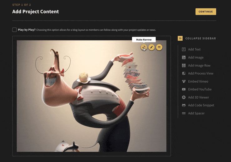
To help with this, we have gone ahead and updated how the narrow layout works. By default when you add any widgets to your project/entry pages eg: image, image row, process view, video... the widget is loaded full-width.
In the past when you select narrow, the widget would be reduced in width to a smaller size. This was great, but we found that it made more sense to set our widgets to match your screen height. This means that when you set a widget to narrow, the widget will adjust it's size so it fits perfectly in your browser window and you can see the full widget without scrolling.
Tip: Don't forget to click on images in project/entry views. This will activate our full window viewing experience. From here you can scroll around the image at full size.
More focus on member levels
Members have always been in control of setting their member level - Debut, Player, Contender or Rookie. Our goal has always been to help members move to the next level with tutorials, contests, industry feedback and more. What we realised though is that we were not celebrating the amazing artwork uploaded by each member level.
Our social media channels are going through an overhaul right now to make sure we share work from all member levels. Our debut members are so talented and we are the first to admit we haven't been promoting enough of their work. This is changing and we can't wait to showcase everyone much more.
Newsletters
For those of you registered for our newsletters, you will have noticed that things have changed quite a bit. Not only have the newsletters gone dark, we have split the content into two distinct messages.
Member Showcase
This newsletter shares the very best projects from members that are submitted every week. For each member level, we share a Featured Project and two other projects that impressed our Editor.
To get your work showcased, make sure to create projects for your profile. Don't forget to be creative with the ways you use the project builder and include headings, text, images, videos, 3d viewers, process views and more.
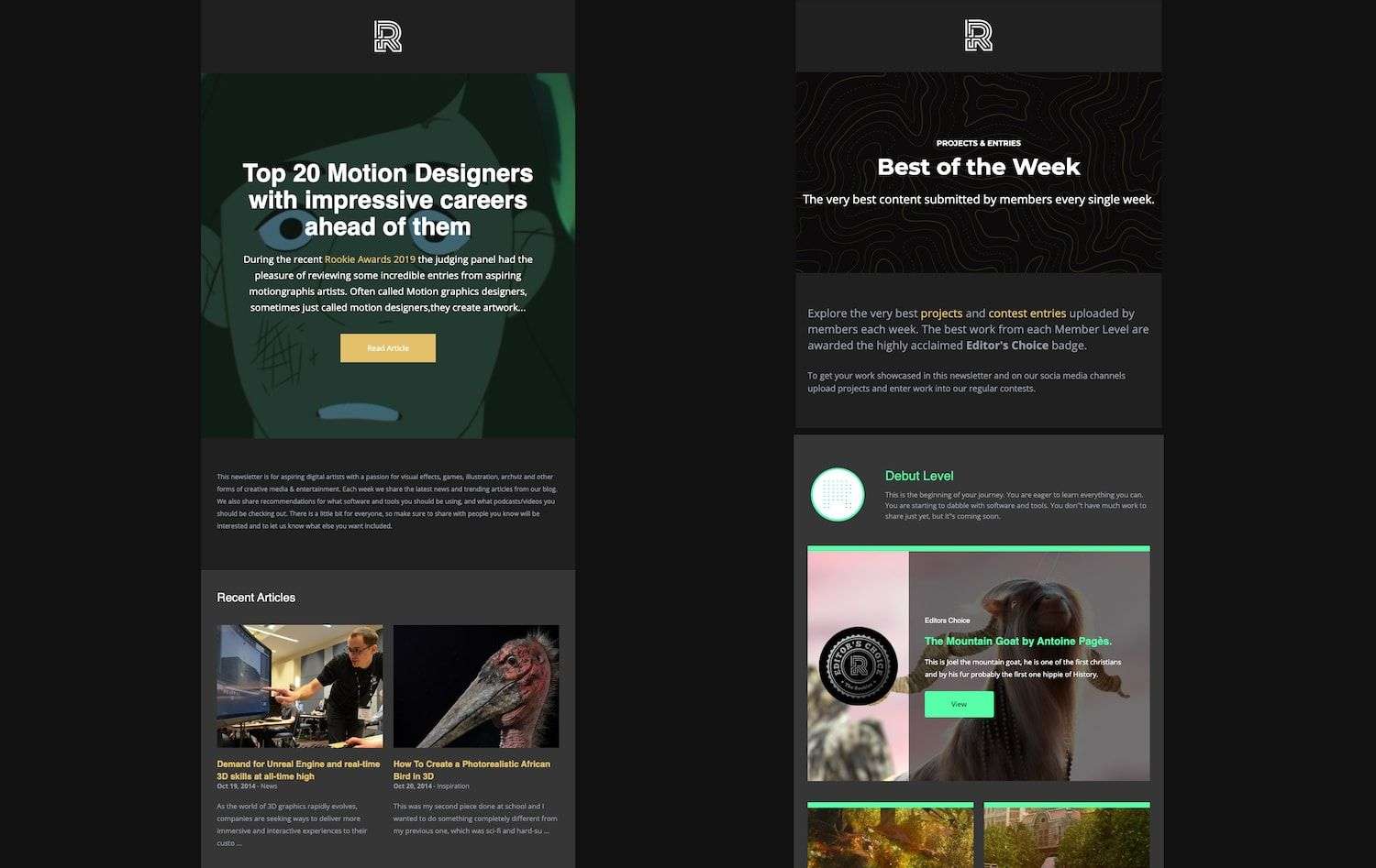
Discover Everything you Need
A big part of The Rookies is helping artists learn how to turn their passion for creative media into a successful career. To help artists learn new skills and really push their creative and technical skills.
To reinforce this goal, the second newsletter is filled with the latest articles from The Rookies. You will also find recommendations for tools & resources, tips from professionals, featured schools and studios, industry highlights and some off topic content to round things off.
Coming Soon
Some things to look forward to:
- featured top row for projects
- new homepage with a quick overview of everything going on
- new entries main page and search features
- more contest upgrades
- more profile upgrades