In my opinion, it’s important to collect real-life references even when designing in stylised and fantasy-inspired styles. In the end, this kind of art is a simplified interpretation of realism. Good photos are fundamental to any project, while bad references can lead to bad results.
The Vast Jungle is a worldbuilding project initiated Howest DAE. In this article Veerle Zandstra hopes to illuminate and break down her creative process.
The goal was to assemble an art bible: to establish the visual language of the setting. Key aspects of this were: a prop, a character and an environment.
In the Vast Jungle, I began with the setting, because the story prompt wasn’t very complex. Simply put: a small creature explores an expansive world. This meant that I wanted the story to flow forth from the setting naturally.
Creating a visual library
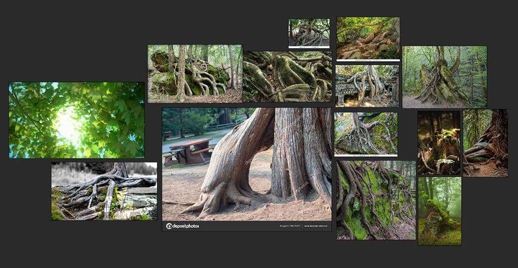
Because The Vast Jungle was a project with a wide scope, it was important to establish a visual library. I knew I wanted to create a big, lush and green world with lots of plants and organic shapes.
I started by collecting photographs, though I admit sometimes it’s hard to stay focussed! Suddenly I went from finding images of trees to DIY home decoration ideas (we’ve all been there.) After I managed to whip my attention span into shape, I had a solid collection of imagery.
In my opinion, it’s important to collect real-life references even when designing in stylised and fantasy-inspired styles. In the end, this kind of art is a simplified interpretation of realism. Good photos are fundamental to any project, while bad references can lead to bad results. This is why I try to rely on real-life photographs. While other artists’ work can be amazing for inspiration, it’s not the best source of reference, because you’re essentially retranslating their views. If not cautious, you can end up copying other people’s mistakes.
Thumb-nailing
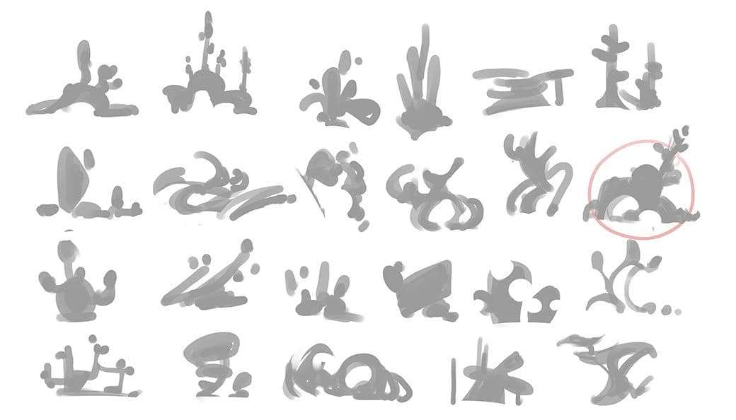
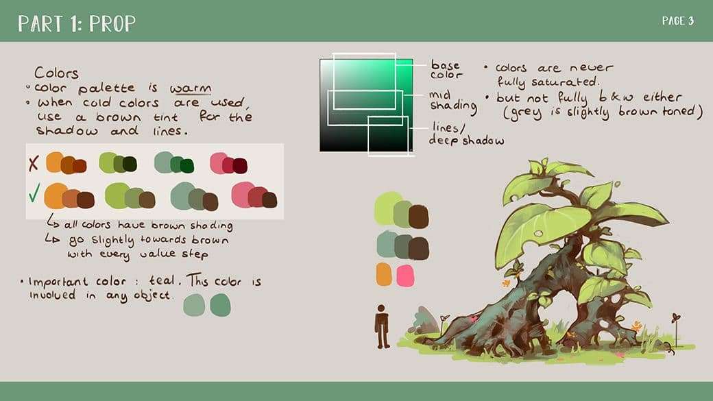
Next, I addressed the prop. This was important, because even a simple item can tell the viewer a lot about a setting, and also allowed me to settle on the art-style before moving onto the more challenging design aspects.
I start making simple thumbnails. I keep them very small and don’t spend a lot of time on them individually. A rule of thumb (pun intended) is to take around thirty seconds for each. Sometimes I make up to fifty of these before I’m satisfied with one.
Silhouettes are a very quick and intuitive way of designing. They allow me to see the overall shape, as the form of an object describes the “personality” of an item. Roundness will make an object feel friendly, while sharp angles carry connotations of aggression. I quickly settled with bold, round shapes. I wanted my world to feel big and voluminous, but not scary.
Artistic direction
Next I needed to settle on an artistic direction. I tried out six different styles, all with varying colouring, lining and shading techniques. I also altered the shape of the prop to match the feel of each style.
Personally, when I pick an artistic direction for a project, I rely on the one I had most fun playing with. For me, this is a good indicator that I’m on the right track, as my enthusiasm for a style really shines through in every aspect of the project.
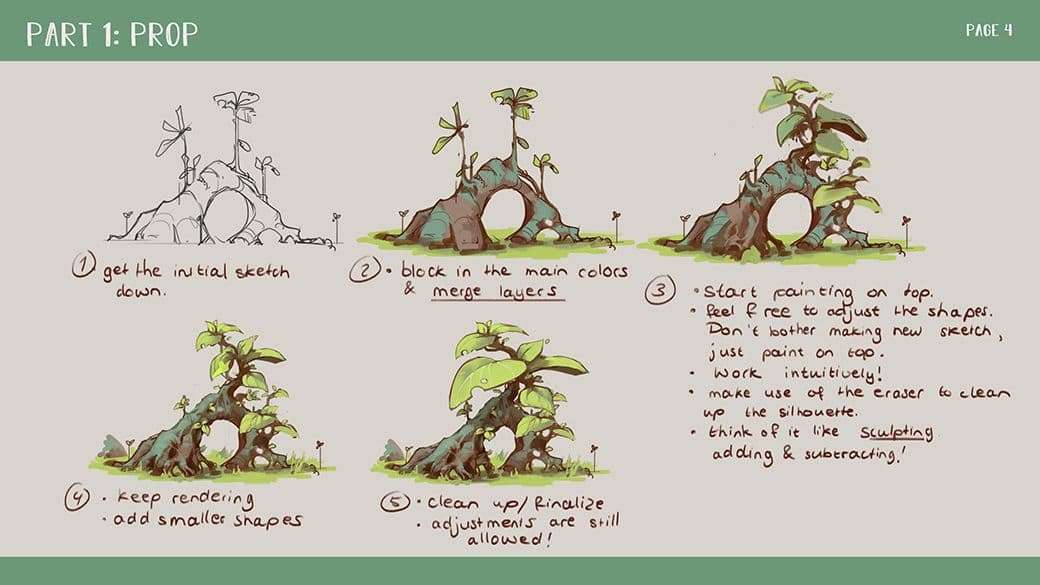
My favourite drafting technique involves sketching out a rough line art, then filling that in with some simple colours and shading. After that, I merge the layers together and start applying a painterly approach. I declutter my Photoshop files by putting my old sketch layers in folders and merging the ones I am currently working on.
On these I use a painting-and-erasing technique, much like sculpting. That way, I compel myself to keep a relaxed approach, preventing me from fiddling with clean lines or perfect shading. I see beauty in imperfection.
The images below explain this approach and how I achieve my personal style.
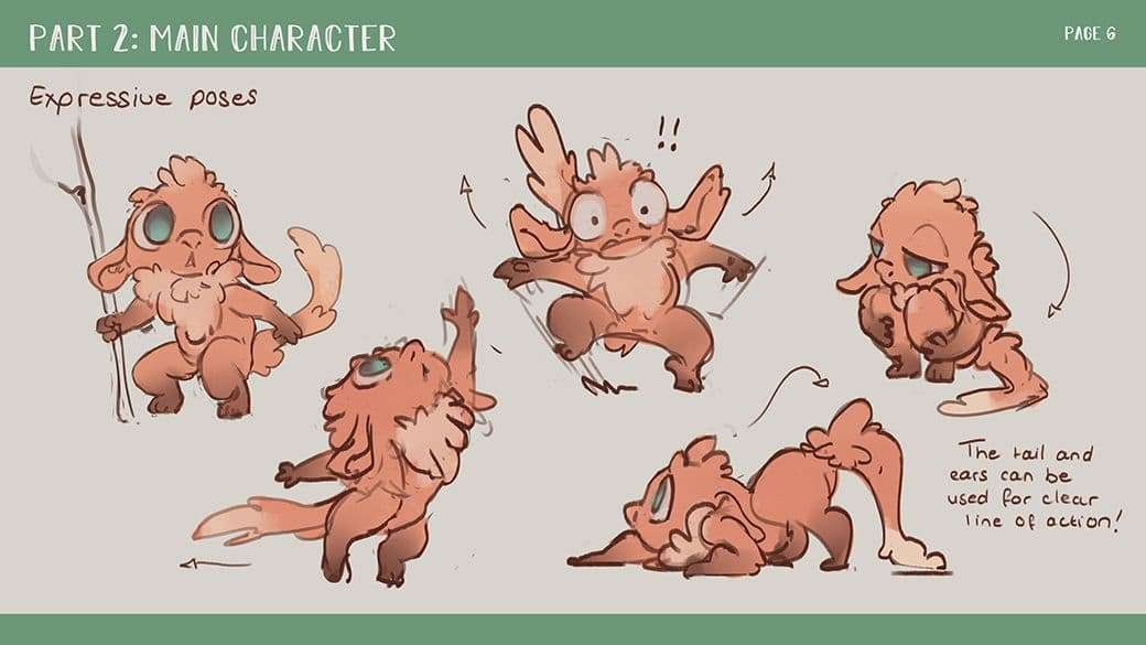
The main character
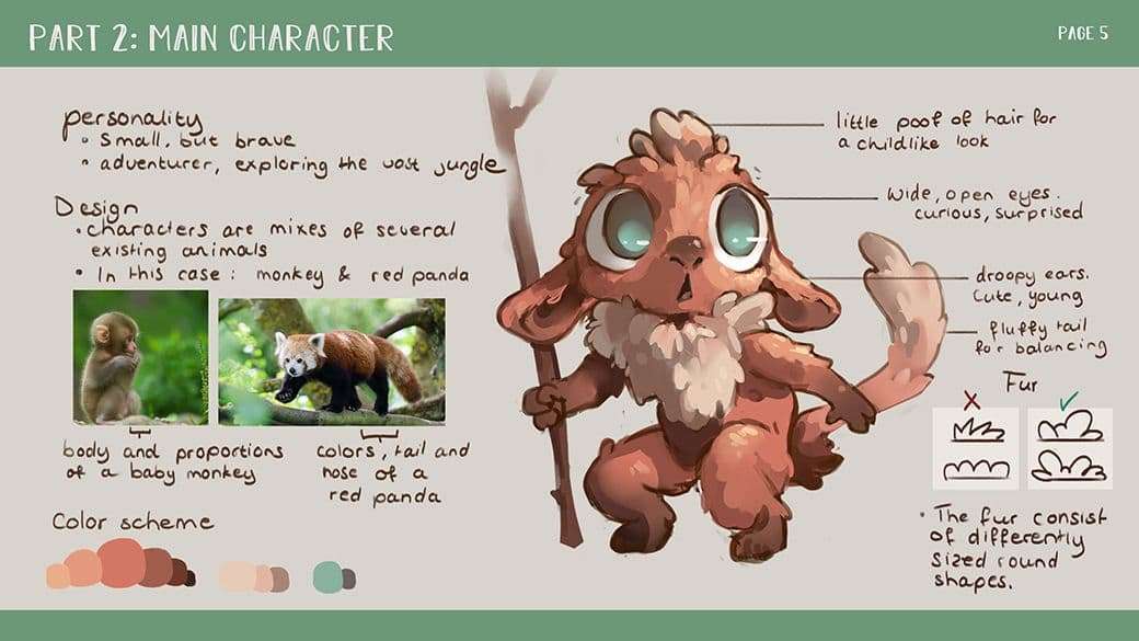
Imagining the main character in context with the world, I was immediately drawn towards the idea of something small, cute and innocent. Perhaps they could be an inhabitant of the jungle, or the reverse: a vigilant traveller in unfamiliar, alien territory.
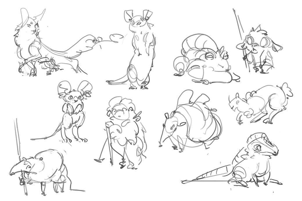
My approach to designing creatures is different from props. Quick silhouettes are still essential, but I will move quickly to the line sketch part of the process. The character’s face is an important design aspect, something which is not readily visible in a silhouette.
I make sure to have a wide variety of unique poses, proportions and details. I can always decide too hybridise or swap aspects later. For example, I might find myself liking the body of one critter, yet the head of another. These kind of chimeras don’t always work out, but it’s always worth trying.
Sometimes I end up with so many designs it becomes hard to settle on a final choice. This is where I like to enlist the views and opinions of other people, because it’s all too easy for me to lose myself in the world I’ve created.
An outsider’s perspective is always valuable, even if that person isn’t an artist themselves. In fact, artists tend to have an insider’s view when it comes to visual language, so asking someone who is less versed in this makes sure that my idea communicates clearly.
After deciding on the definitive direction, I’ll usually make a couple of alternate versions, just to see how far I can push it. I might change up the proportions or try some different faces and ears or such. I often find that my initial idea is the one I tend to return to, albeit with some minor tweaks.
Making a sheet with a bunch of different expressions really helps me understand the character on a deeper level, because defining a character’s personality changes the way they interact with their environment.
The bigger picture
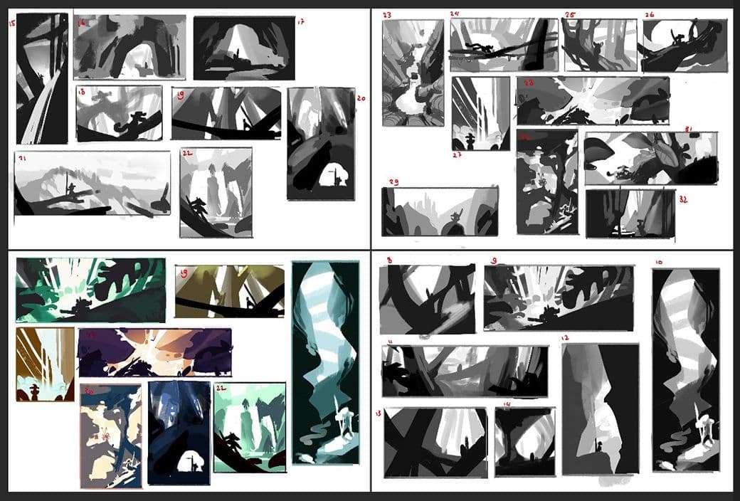
The final part of the project: the one where all of my previous work melds together! I wanted all my design elements to harmonise to tell the character’s story. I already visualised the environment to be a vast jungle, complete with soaring trees, lush plants and overgrown roots This made the subsequent thumb-nailing pretty fluid, as I already had a solid idea.
I wanted to truly emphasise the scale of the place in relation to the tiny character, so I tried different angles and wide shots. I quickly noticed a low or a high angle worked best to get this feeling across.
When making environment thumbnails, I like to look at existing photographs and try to figure out why they work. What’s their structure? Coming up with completely new and original compositions is hard (and why reinvent the wheel?), so I often use landscape photos as reference.
Sometimes, I get inspired by images that aren’t even directly related to the topic at hand. For example, I might see an interesting rock formation, but use it as the basis for the shape of a tree. This injects some great freshness into a project, and keeps the designing process fluid.
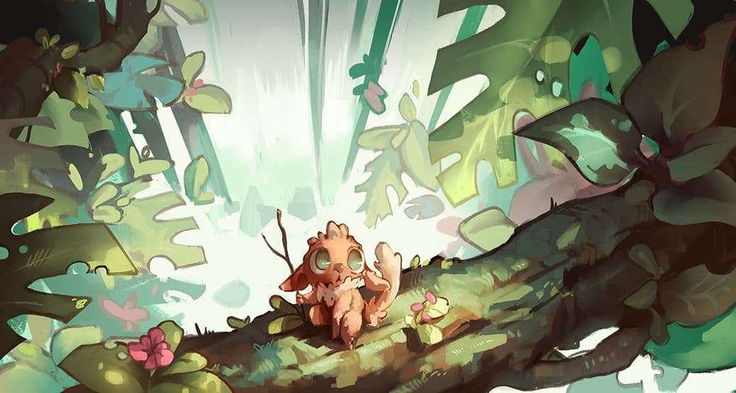
After a couple of thumbnails, I work on some variations to figure out the colour scheme, as each set of colours conveys a different visual shorthand. For a warm afternoon, green and orange work well. They’re in direct contrast, which really helps to put focus on specific areas of the painting. In my case, this was the main character.
The final piece is where it all comes together. Every prop and shape in the painting leads the eye to the main character, which emphasises the feeling of vastness I’m trying to convey. The waterfall adds an extra dimension of directionality and helps make the creature’s silhouette stand out. The leaves around the edges add a kind of natural vignette, making the jungle feel more wild. Together with the light rays, they help to put the focus on the image’s centre.
Conclusion
I hope you enjoyed an insight into my process! As you can see, there is a lot of preparation that goes into even a small-scale world-building project. Yet as much as it seems: with the creation of an art bible, you have a support structure from which every subsequent part of the project flows forth naturally. Imagine a dark gloomy swamp in the same world. I immediately have a good feel for what this would look like! Focusing on what each aspect of your work communicates is essential to make it a coherent whole.