Concept Design Tips for Emerging Artists
Emilio Robero is a Concept Artist currently pursuing his BFA degree at SCAD shares his concept design tips for emerging artists.

Emilio Robero is a Concept Artist currently pursuing his BFA degree at SCAD shares his concept design tips for emerging artists.
Emilio Romero is a Concept Artist currently pursuing his BFA degree at SCAD. Emilio loves to create concepts in both 2D and 3D, and has a special interest in vehicles, machines, environments, and all things hard surface. Emilio shares with us his concept design tips for emerging artists.
As a concept artist, redesigning can sometimes be more difficult than designing. Not only does your concept have to feel fresh and unique, but it also has to do so within the parameters of a pre-established design. So how do you take something that has been done a thousand times before and somehow make it have a lasting impact on the viewer? The answer lies in utilising the viewer’s limited attention span to your advantage.
I’d like to elaborate on this point by breaking down a recent project of mine. In this article I’ll focus on the design aspects of this concept and less on the technical process that went into crafting it in 3D.
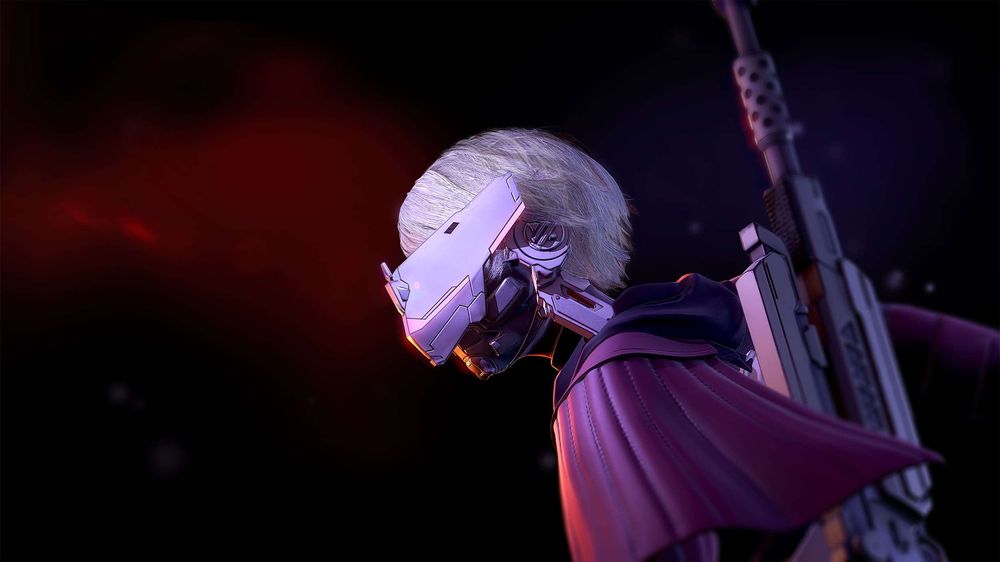
This is Ravenbliss.

Ravenbliss is a character concept for an elite mercenary in a sci-fi inspired setting. My initial objectives with this project were to create a concept that was visually interesting and unique in some way, would translate well to 3D, and was most important of all memorable.
My love for sci-fi and hard surface designs led me to pick “space mercenary” as my basic prompt. Yet by picking this trope I was essentially setting up an uphill battle for myself. There is certainly no shortage of sci-fi mercenary characters out there, and making mine stand out would take some heavy thinking. I was instantly aware of this, so I threw in an unconventional element to my prompt: “space mercenary riding (not piloting!) a spaceship.” My thought process was that there are tons of different examples of this type of character, but there aren’t many that are standing on top of a flying spaceship.
One upside of working with a tired trope is that I was not at all hard pressed to find references. I didn’t realise it at the time because it was buried in my subconscious, but my main source of inspiration for this project was this scene from Star Wars: Rebels.
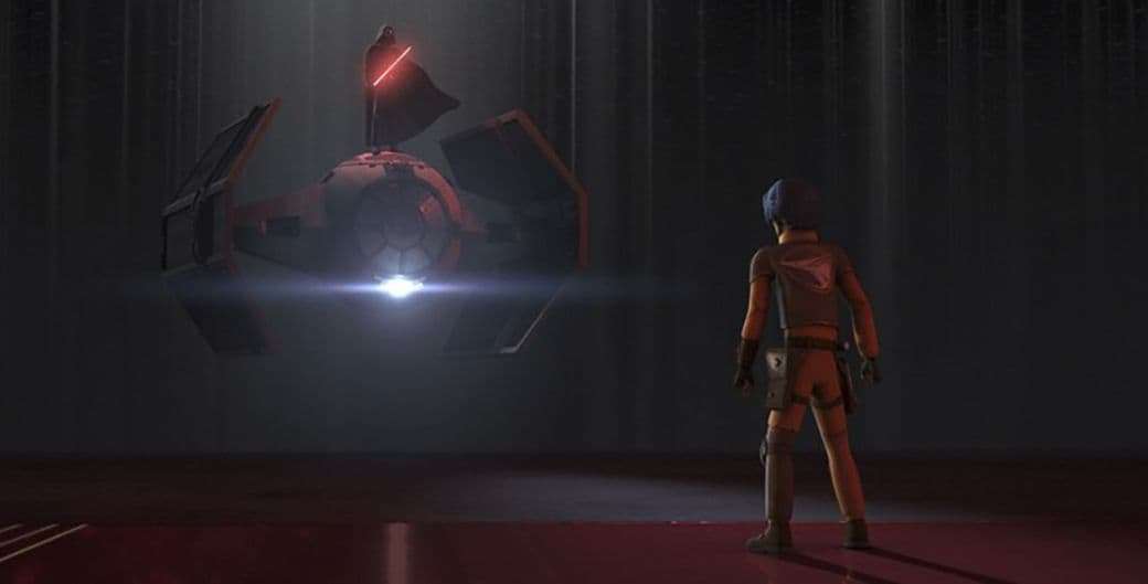
After tracing back my idea to this scene I realised that the reason I remembered it was because it combined two elements that I already recognised (Darth Vader and a TIE Fighter) in a way that I had never seen before. I likely would not have remembered it if the ship was unrecognisable or the character unfamiliar.
I don’t have the advantage of having such an iconic character at my disposal, so I would have to rely on other tools to make mine memorable. The main one I chose to make use of was simple shape design.
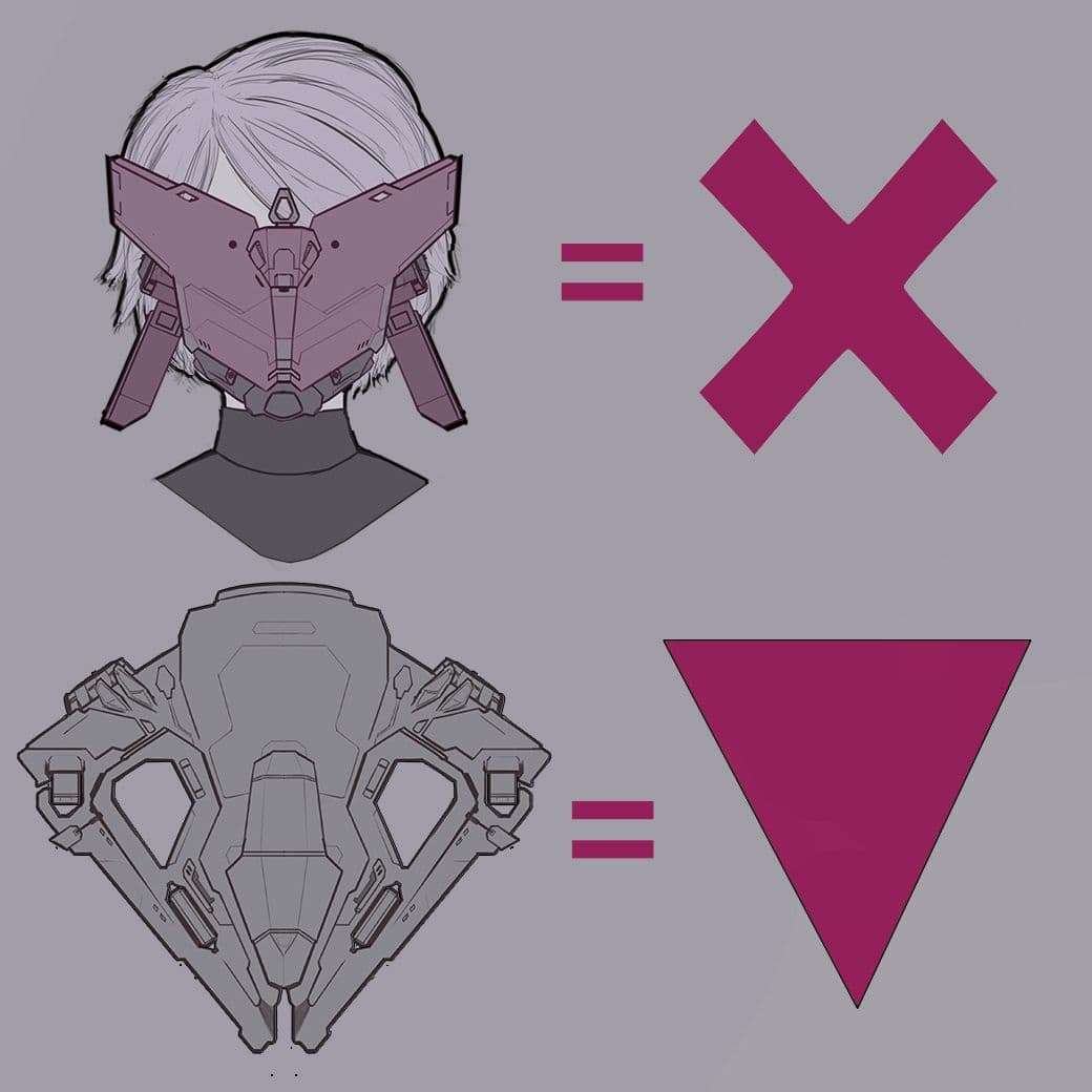
For my design to work, the shapes needed to be both simple and unique. That might sound contradictory at first, but a simple shape can be unique within the design that it belongs to. Depending on its placement, it can stand out not because it looks complex but because everything else does. An “X” is by no means a unique shape but it stands out when surrounded by more complex things, and it has the added bonus of being familiar and easy to remember.
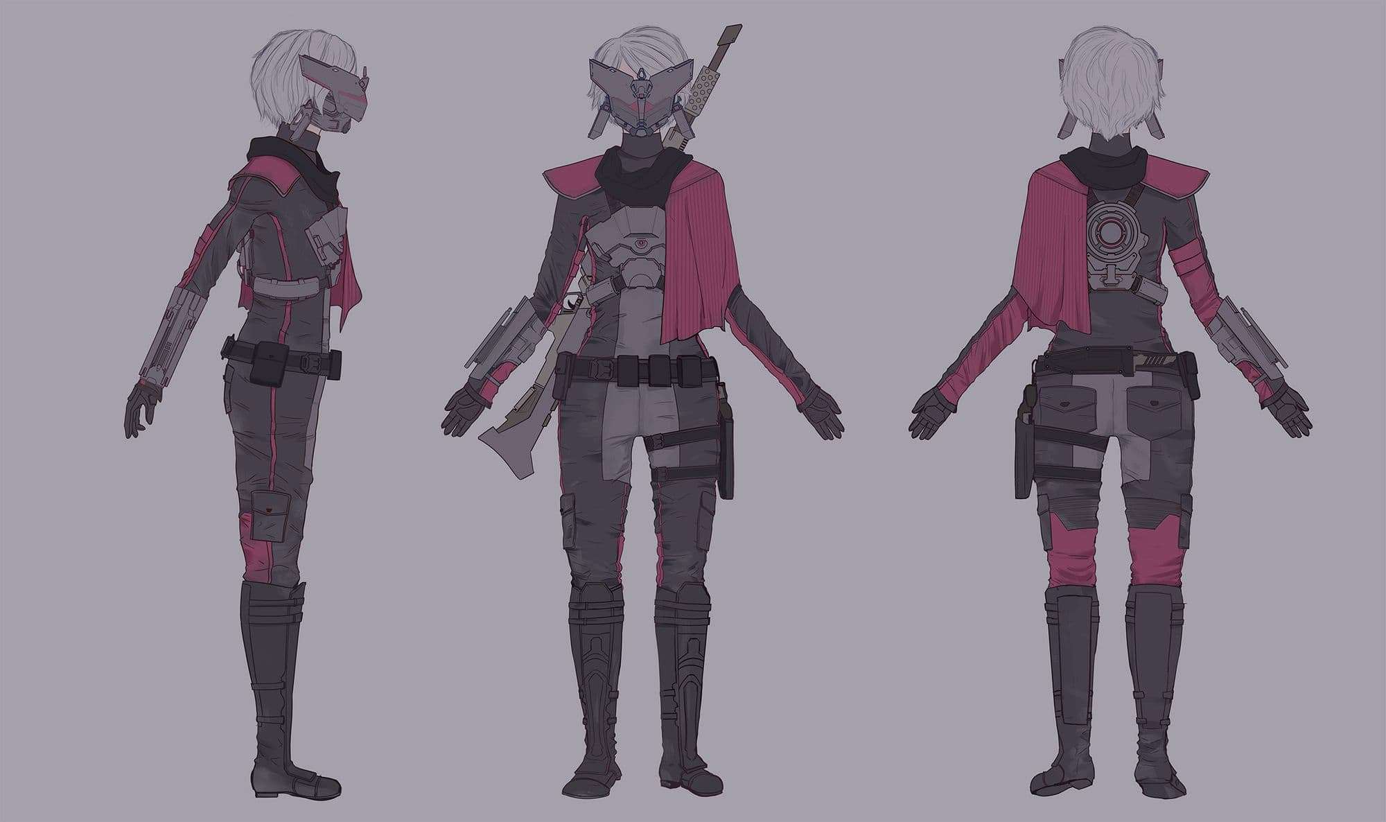
You might have noticed that I only use the simple shapes technique in a few places of the character. This is because these points are what I chose to be the focal points, with a particular emphasis on the helmet. As a quick side note, it is entirely possible to achieve focal points with tools other than shape such as lighting, colour, amount of detail (or lack thereof), proportion, placement, etc.
But what about the other elements that don’t have memorable shapes? Won’t the viewer forget those?
The other elements almost don’t matter in the grand scheme of things due to the fact that the viewer’s mind will always fill in the gaps. This is a situation where making use of an oversaturated trope actually works to your advantage. Someone who has been exposed to this trope a lot will have a fairly tangible image of what a sci-fi mercenary looks like, and they’ll subconsciously use that image to inform what the rest of your character looks like. This way their limited attention span is spent only on the aspects of your character that are iconic while still retaining the bigger picture.
You only need to be unique in your focal point(s). Everything else is background noise.
That’s not to say that the supporting elements are unimportant. They should still reinforce the narrative of the character for the viewers that stop to analyse the concept piece closely.
After designing Ravenbliss I moved on to her spaceship.
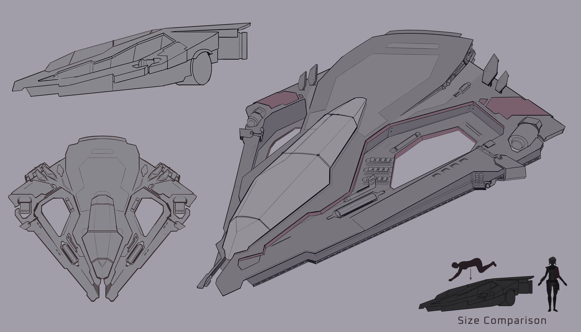
Designing it was particularly challenging because this project was ultimately and above all a character piece, meaning that the ship could not overpower the main focus. I couldn’t make the ship too large because it would draw attention away from the character, and I couldn’t make it too small either because it had to look like it could fit a human inside. The solution I came up with was to orient the cockpit of the ship horizontally instead of vertically. So the pilot would lay on it as opposed to sit up straight. This allowed me to maximise space and keep the scale of the vehicle small. Looking back on it I think I could’ve sold the believability and functionality of the ship a further by doing more research on how real life space shuttles work. But as a supporting element of a character piece I think it does its job.
I also used less saturated colours and detail density on the ship so the viewer’s eyes would go directly to Ravenbliss. Yet I still kept the silhouette of it a simple triangle shape so it would be easy to identify.
Next in the concept sheet were the props and small details.
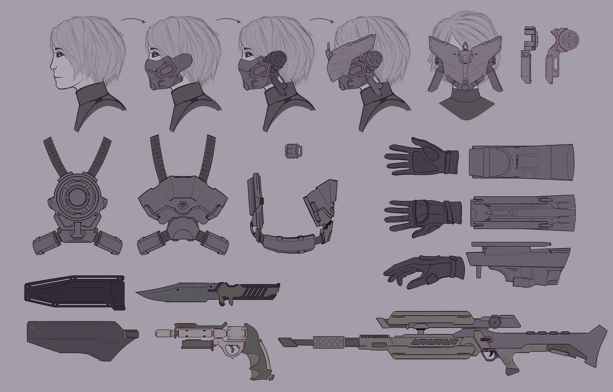
I developed clean orthographics that would make modelling easier for myself later down the pipeline. I put a lot of focus on making sure the helmet could work in 3D. Not everything in 2D translates well to 3D, so as I was building it I was meticulously considering how it would wrap around a human head. I found that breaking it down into simple parts that I could then layer on top of each other helped me visualise it in 3D space. It also mirrored the order in which I would model it in later.
Excluding the helmet, this is the part of the concept sheet where I could be slightly looser with my shapes and focus more on detail and visual interest.
Lastly I included a callouts sheet to inform texturing. I mostly drew from real life in order to get a final piece that looked realistic.
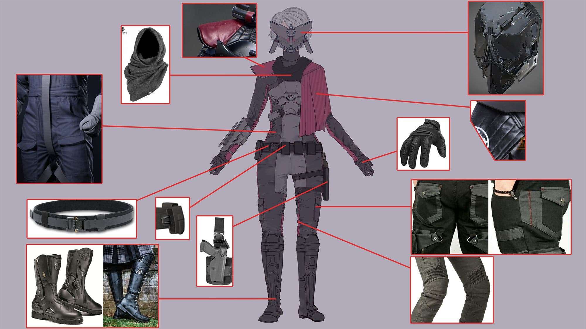
Having crafted a pretty clean concept sheet, the rest of the process went smoothly.
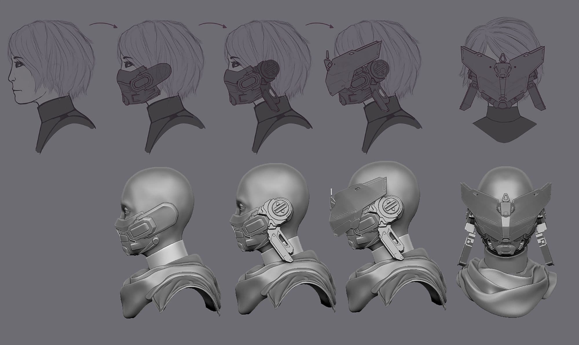
I referenced the orthographics directly in Zbrush to get an accurate result. Building the helmet was definitely the most challenging part, but thankfully I had the foresight to break it down into more manageable parts in the concept art. This greatly helped me in the long run.
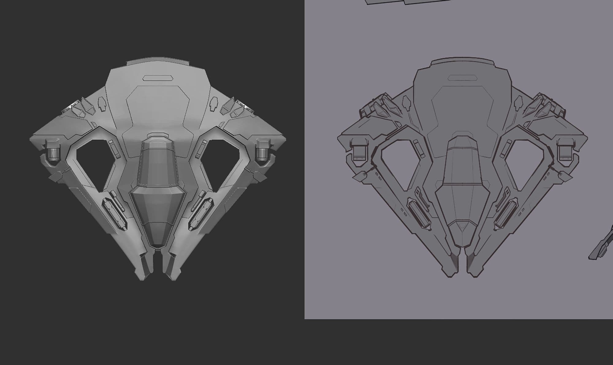
For this project’s shape language, I relied on triangles to make Ravenbliss come off as dangerous and sleek. However I always beveled and cut edges so that I would never have any “spikes”. As a mercenary, I needed her to appear neutral, not villainous. This is most notable in the shape of her ship: It’s a triangle, but you couldn’t impale yourself on it.
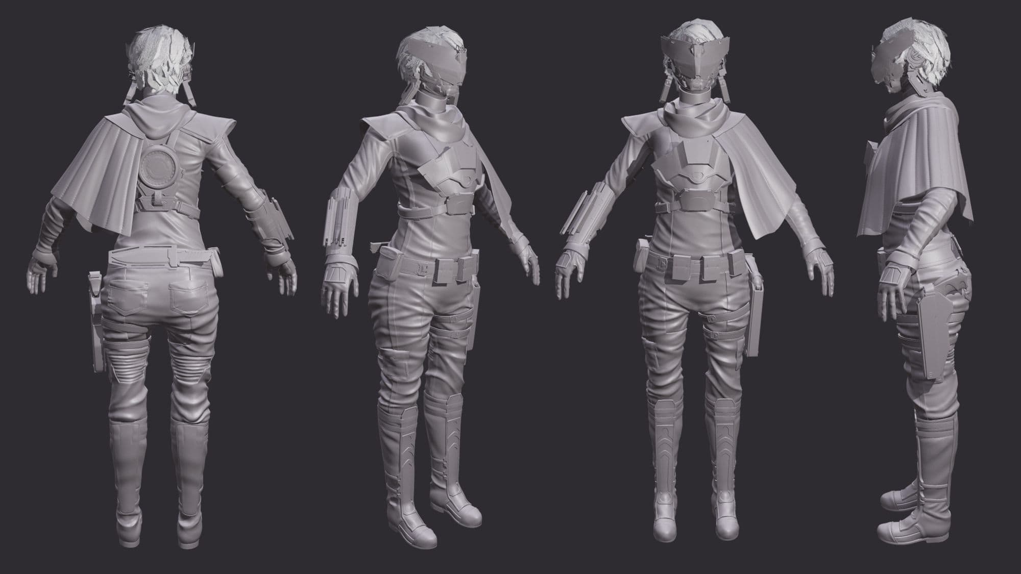
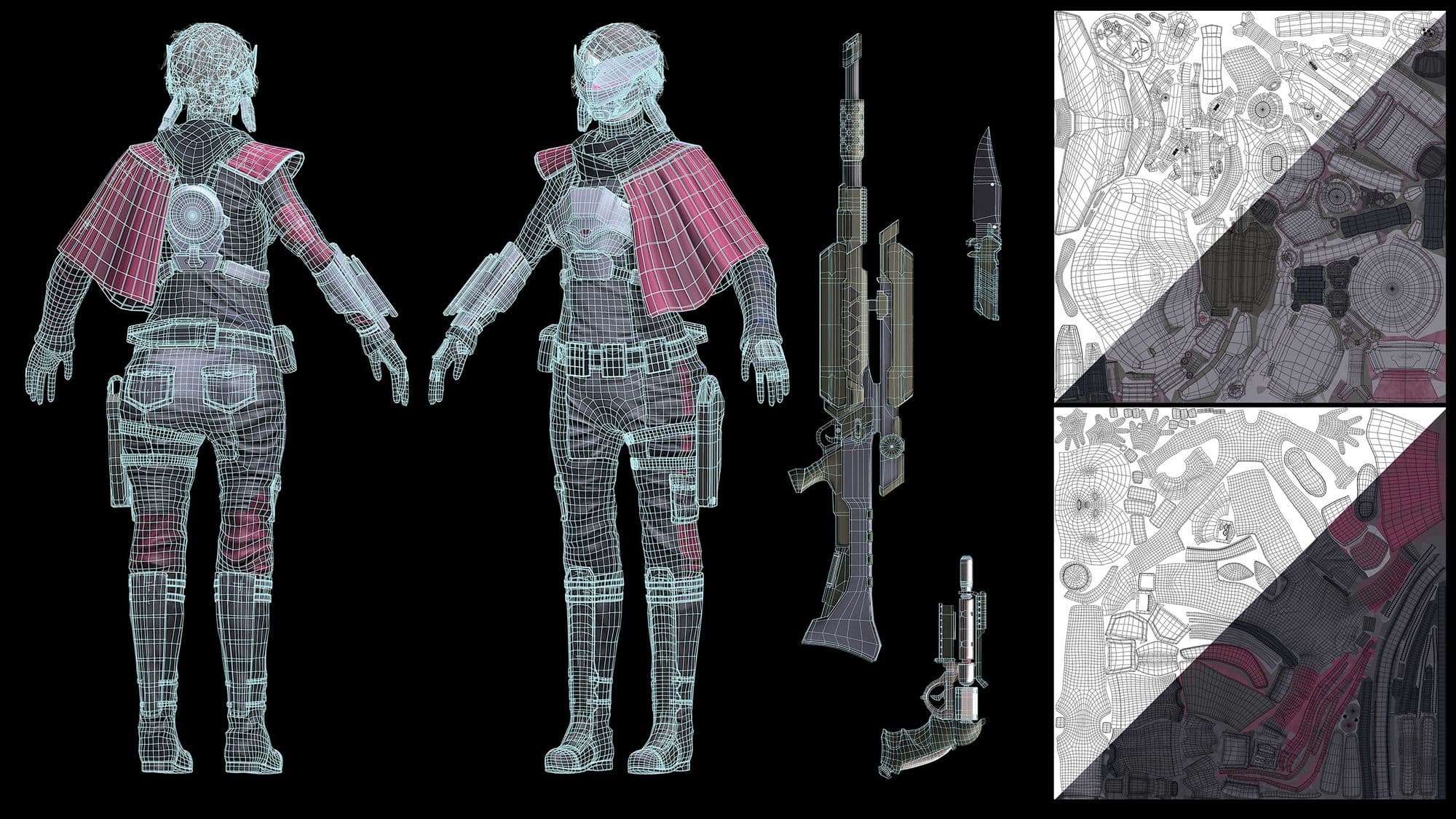
Since I haven’t touched on my thought process for the colour palette I’ll briefly go over it. I chose a desaturated almost magenta red to be my main colour and sprinkled it throughout the design to add some personality. Seeing as I was going for a realistic style with my scene I kept my colours fairly desaturated and used shades of grey and black to populate most of the surfaces. The reds are there to emphasise detail that may otherwise be missed and make certain elements pop out. For instance the seams on the clothes are highlighted by a red streak.
Once the modelling and texturing was complete I brought everything together in Marmoset Toolbag for final renders.
Before writing this article I wanted to make sure my concept piece indeed had a memorable design. Not just for me but for other people, and I wasn’t tunnelling on my own biases. So I asked a friend to do a sketch of it from memory. I wanted to see which aspects she could remember and which aspects were lost in translation. Much to my surprise and despite her claims that her memory isn’t the best for this kind of thing, she got very close to what my character looks like with her sketch. Even though a lot of the detailing was lost, all of the main elements were there. And the shapes I chose for my concept were accurately represented in what she drew. It gave me some confidence in being able to say that I had created a successful character design. I’m still a student so I’ve got so much to learn, and I’m aware of some of the shortcomings in this project. But hopefully this glimpse into my thought process was somehow beneficial.
Here are some takeaways that should help in designing a memorable project even when working with an overused trope:
Thank you for your time!
You can find me on TheRookies or on Artstation and LinkedIn. I always appreciate receiving feedback!