Hanging Gardens: Creating a Semi-stylized Environment
Maria Martinez a graphic designer from Spain, explains how she created a Semi-stylized Environment in Substance Painter and Substance Designer
Maria Martinez a graphic designer from Spain, explains how she created a Semi-stylized Environment in Substance Painter and Substance Designer

Hi! I am Maria Martinez, a graphic designer and 3d environment artist from Sevilla, Spain.
My professional background has always been related to art. Due to the absence of a game dev-related degree in my city, I studied a graphic design degree in Sevilla. I started my professional career working for around 2 years as a graphic designer, in which I learned a great amount of basic composition/color/light theory knowledge that would really help me get a better critical view of my own art.
I have been passionate about video games since I was very young, I would enjoy playing video games such as The Legend of Zelda, Spyro, Ratchet & Clank, Diablo III, and also WoW, Ragnarok Online, and many other MMORPGs. I knew since then that I wanted to, someday, create those beautiful worlds by myself. As soon as I got the opportunity of studying a game dev degree abroad, I decided to go for it, and that has been what I have been doing for the last 3 years in Belgium.
My daily inspirations for work come from my close artistic friends, from my very talented classmates, and from the great artistic peeps of the Experience Points Discord server. Also, the beautiful work of some game dev artists such as Jasmin Habezai-Fekri are also among my latest inspirations, and every lovely and colorful environment either 3D or 2D I see on Artstation.
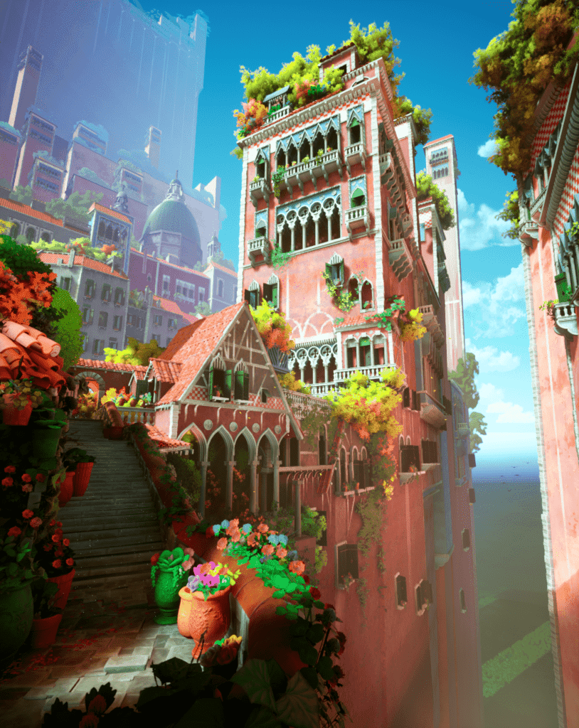
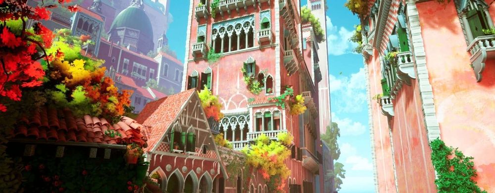
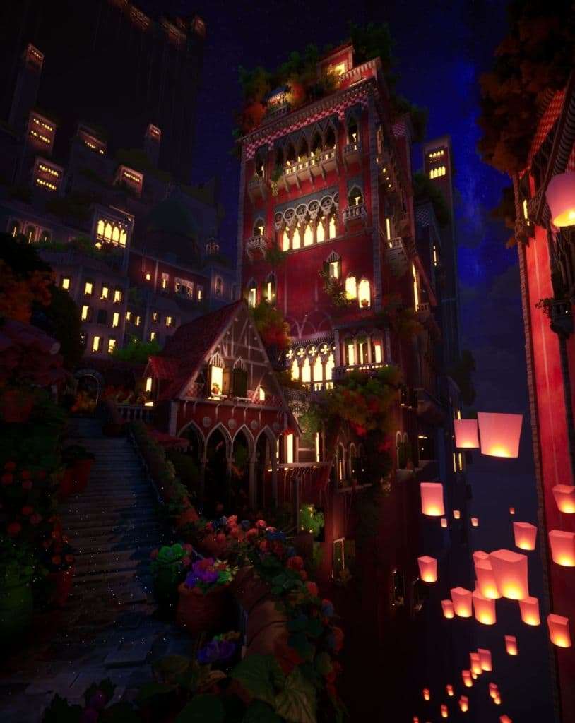
The Hanging Gardens environment project started as a final semester school assignment, in which I wanted to go a step further with it and challenge myself to improve my environment art skills, using for the first time a more stylized approach. This project is based on the beautiful concept art by Hyunsu Cha on Artstation, called Hanging Gardens. I saw his artwork at the beginning of this year, and I absolutely fell in love with the colorful, painterly, and vibrant mood of the project. At that point, I thought how wonderful it would be to see such beautiful colors, vegetation, and great details in a 3D real-time environment such as Unreal Engine. What I really loved most about this artwork is the fact that the aspect ratio was vertical, and the extreme perspective, which gives lots of information about the gigantic size of every building and of the scene in general. The vertical aspect ratio of this artwork is something that can be unusual for a 3D environment, but at the same time quite original, so I really wanted to give it a try and match it as well as I could with my 3D environment.
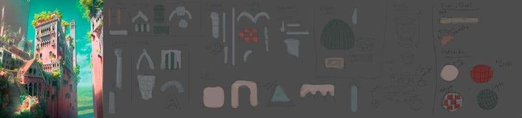
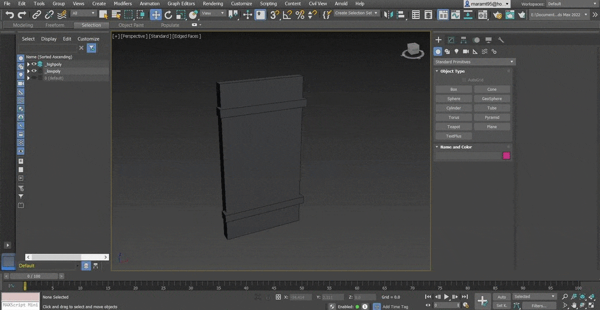
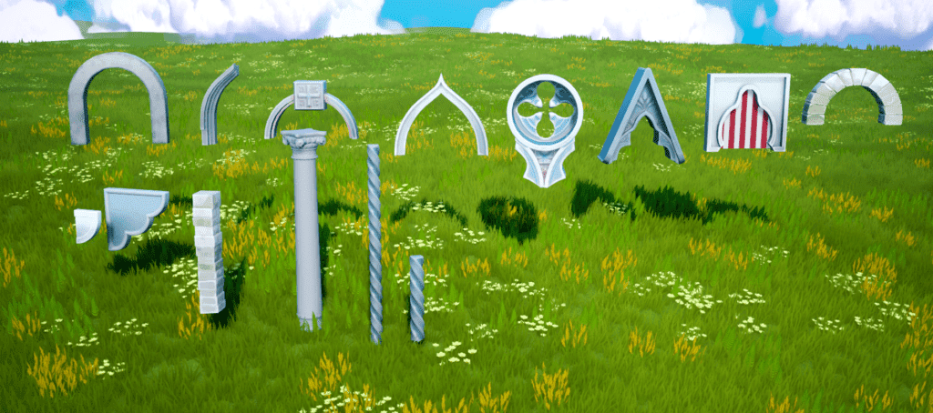
For this project, I decided that the best approach would be creating modular pieces that I would then assemble inside the engine itself. Due to the huge number of details that this environment has, such as columns, different types of arches and windows, I started by creating a quick sketch-planning to have an overview of which and how many modular assets I needed to create. It didn’t need to be very detailed, just clear enough for me to understand how the architecture of the buildings works on the concept art.
After this, I started modeling and unwrapping the low poly version of each of the modular assets in 3ds Max. I then exported each one of them to ZBrush, in which I created the high poly version of them and added some extra small details such as cracks, wood patterns, and/or decorative borders. I then used this decimated high poly version to be baked in Substance 3D Painter on top of the low poly version I created before. At this point I already knew I wanted to use Painter, using my high-poly model, to automatically generate every texture map and then use each one of them to help me get a nice result during the texturing process. I then imported each one of these assets inside Unreal Engine and I started replacing my UE4 early blockout by the final assets.
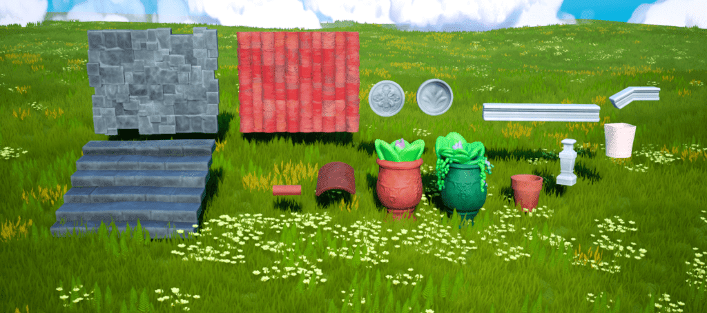
In the sketch planning above I also included how many tileable materials I would need in my environment, in this case it would be 4: the pink walls, the red rooftops, the green rooftops for the dome building in the back, and the red and white tiles. These 4 textures were entirely created in Substance 3D Designer because it was by far the easiest way of creating patterns for my walls and rooftops in a procedural way.
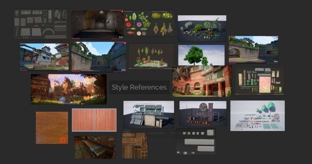
To tackle the semi-stylized direction, I first gathered a great number of references of the style approach I wanted to get into. This was an important step for me to have a clear idea of how to tackle the texturing process and not deviate into something too realistic or too stylized.
I decided I wanted to try and get as close as I could to the stylized PBR approach using the PBR method inside Painter. To me, this style could be summarized as a physically correct type of stylized texturing, meaning that the materials themselves are not realistic, but they still act kind of believably under different lighting types. It is basically a mix of hand-painted texturing but at the same time keeping some material fidelity such as metal looking like sort of metal, even if it’s cartoon-like, basically behaving in a more realistic way under light.
So, essentially a mix of hand-painted texturing keeping more physically accurate materials applied to my assets, plus the fact of modeling my props towards the stylized but without making them too wonky is the reason I called this project “semi-stylized”.
Some parameters that I tried to keep overall the same to get this PBR-stylized feeling were the Roughness values, which were around 0.6 in case of the columns/arches which in real life would be the marble material, and around 0.8 for every rock type asset, like the pots and the stairs/floors. Also, including some small roughness grunge-noise details in some areas can really improve the aspect of the asset a lot by just letting the reflection of the light do its “magic”.
Moreover, for this kind of style it is great to give a vibrant and colorful palette to the textures of every asset, but at the same time keeping an overall range/palette of colors that looks consistent enough to not distract too much the view out of the focal point.
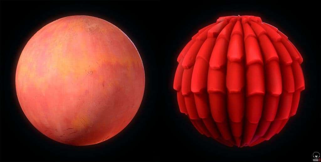
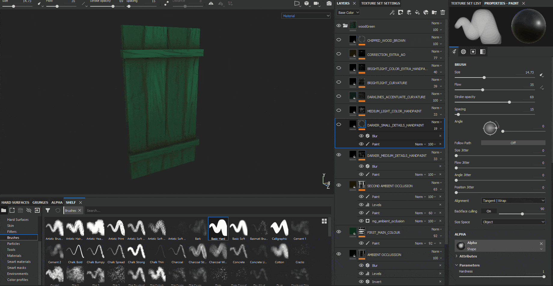
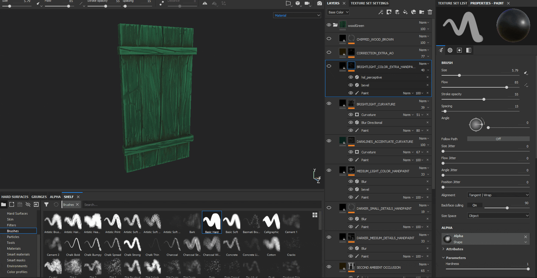
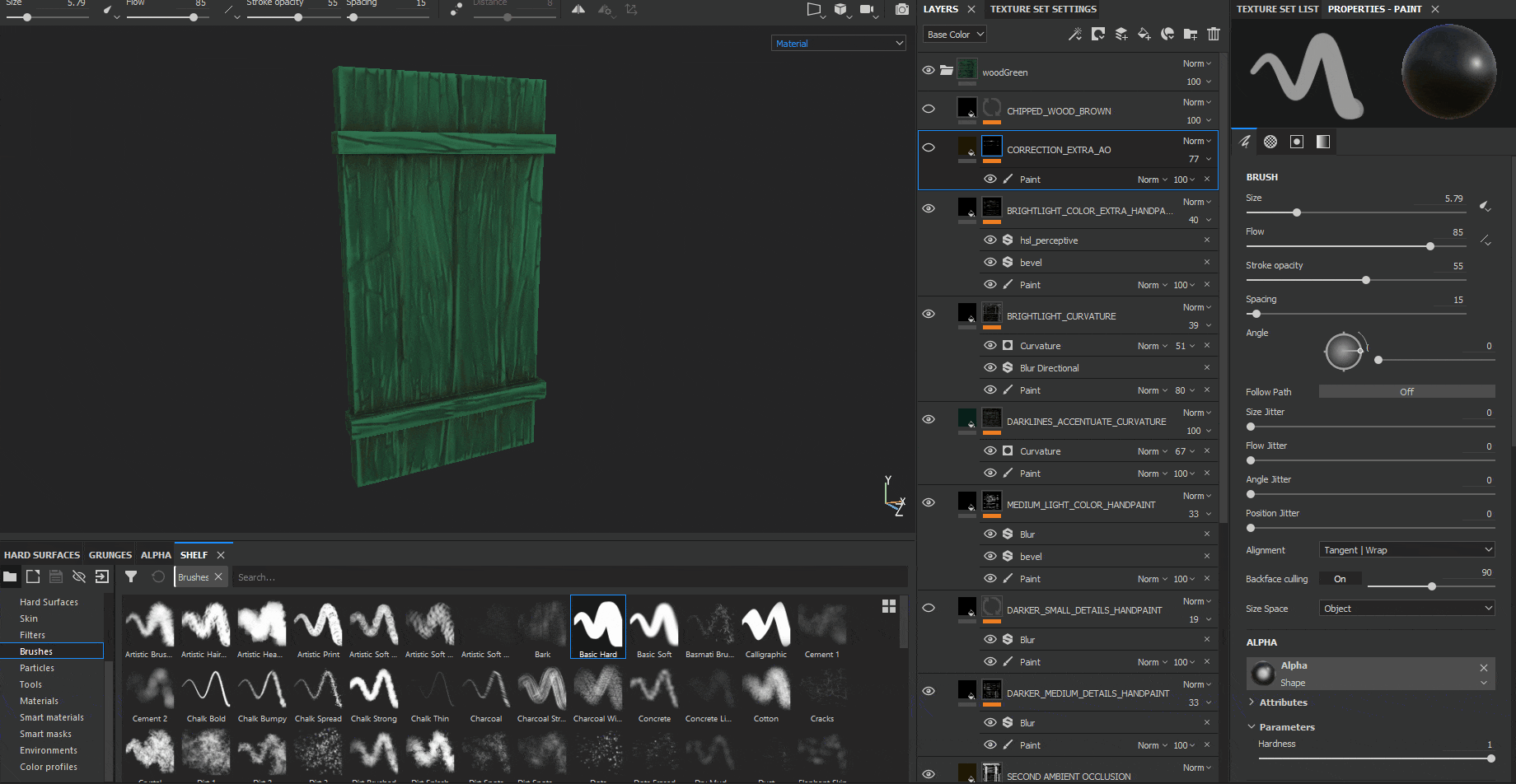
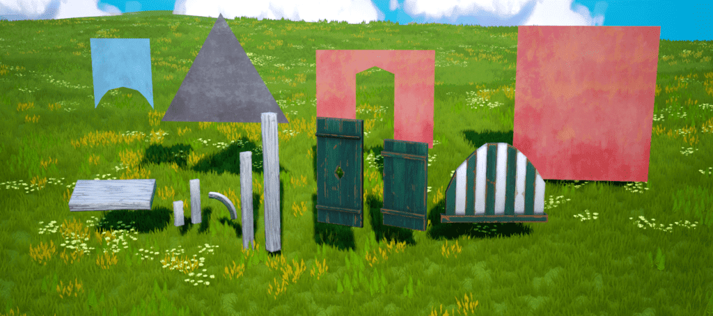
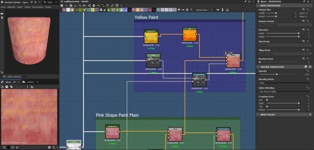
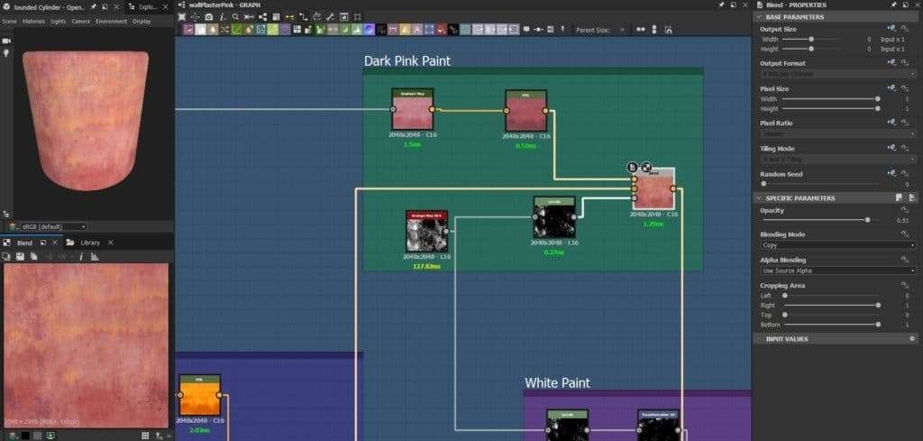
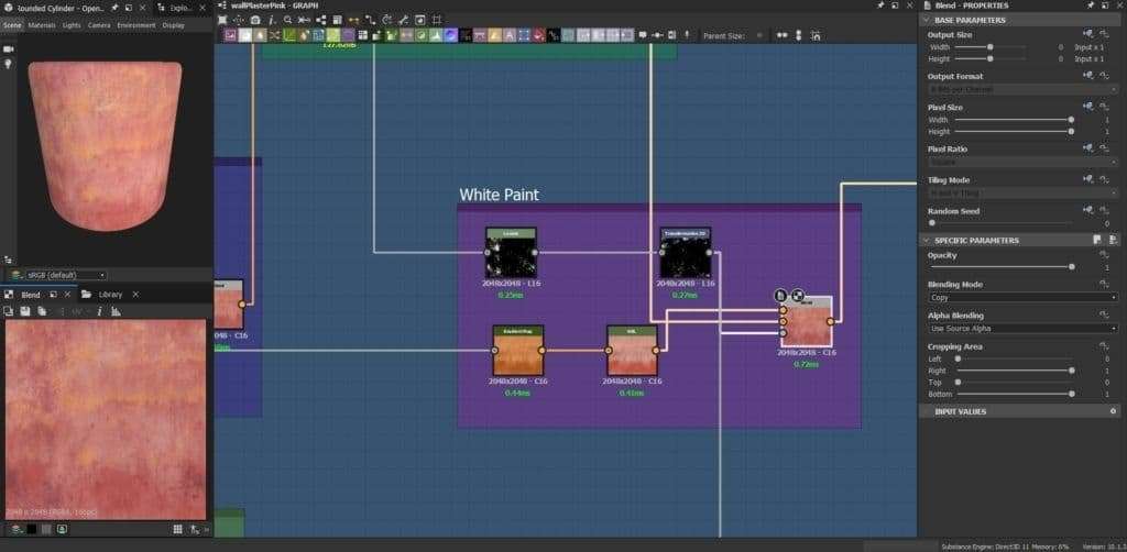
I worked using two ways of texturing, my go-to normal texturing process for PBR-stylized texturing, which is the one I used for every asset, and the hand-painting process, which I used in some cases. Sometimes, I combined both ways, like with the wooden window assets which I will explain down below in this article.
MY GO-TO TEXTURING PROCESS
I started by creating a base layer with a uniform main color. I wanted to add some color variation to this asset, so I added a second layer with a gradient of a darker grey color by using the 3D Linear Gradient generator.
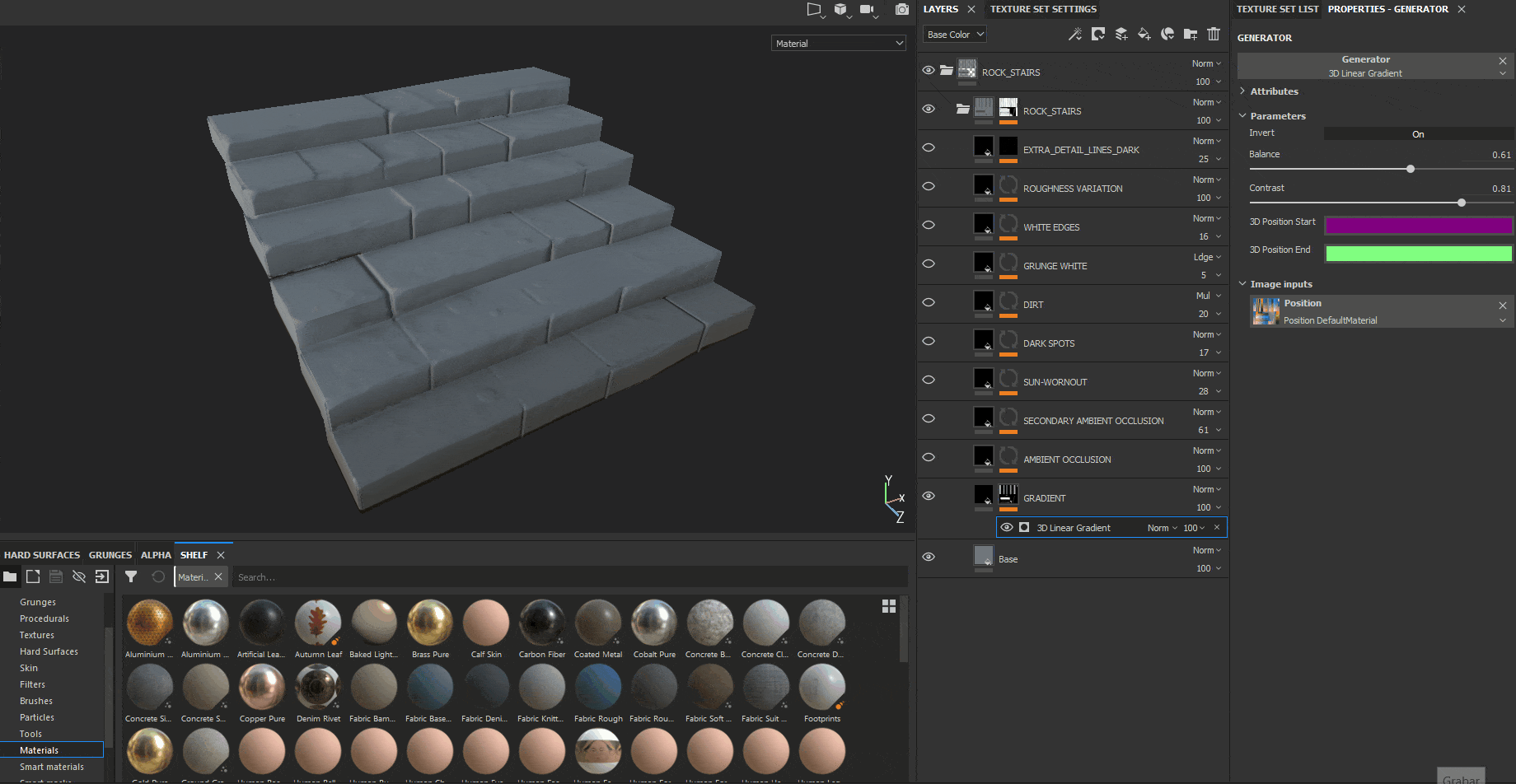
I then added 1 layer of ambient occlusion, which is great to give more cleanliness and readability to the model itself, by just adding some extra “fake” shadows everywhere.
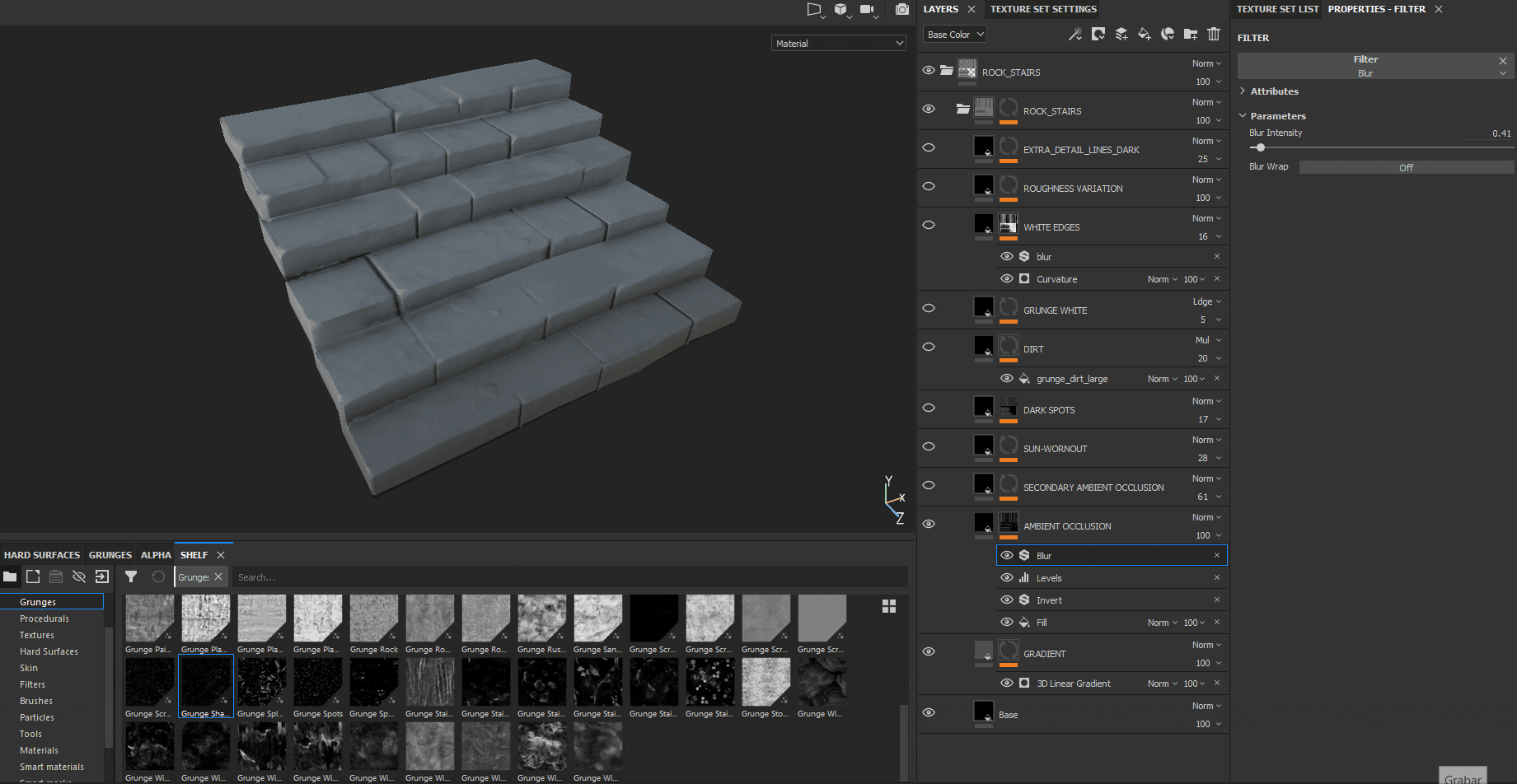
This AO is basically created using a Fill sub-layer with the ambient occlusion generated on the baking process explained before. I then inverted it, added a Levels sub-layer so I could control the amount of AO in my asset, and added a Blur sub-layer to remove a bit of the noisiness created by the Fill layer.
In order to have even more color variation on the AO, I added a second AO layer with a different hue, following the same process explained before but tweaking the Levels layer so it’s less noticeable than the main AO.
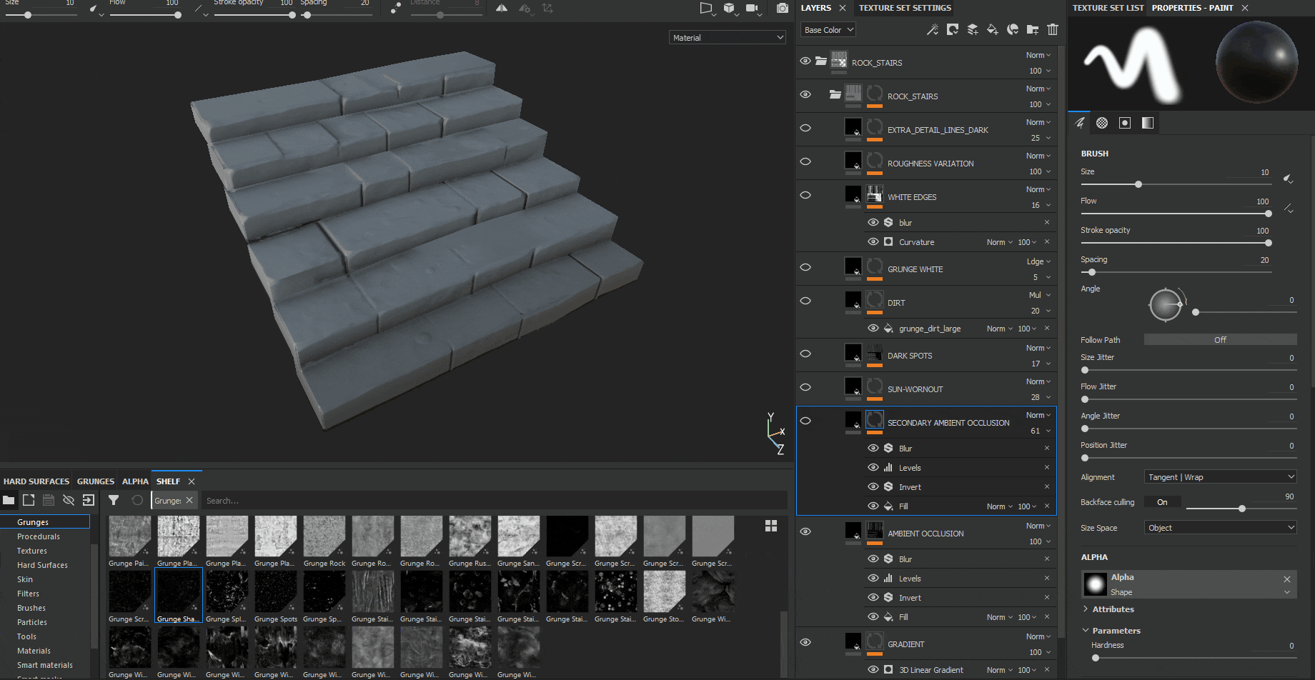
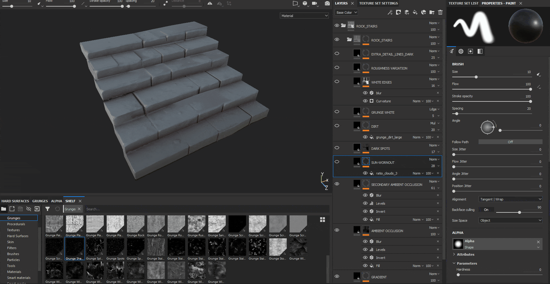
I also wanted to add a feeling of being worn out by the sun to the rocky texture, so I included another layer with a white, grunge material, keeping a low opacity to make it more subtle.
Done with the big details, it was time to add the medium-small details. In this case, I added a layer of small darker spots by just creating a grunge texture, and another layer for a more irregular bigger grunge dark dirtiness overall over the asset. I also added another layer for white dirtiness, but in less amount than the 2 other layers, only on some specific areas.
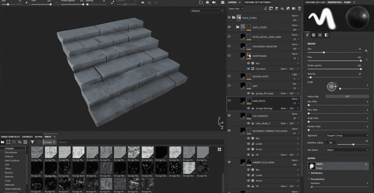
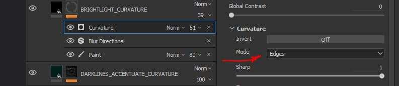
By using the curvature map generated on the texture bake I did before, I also added another layer, which would create a white worn-out stylized feel on all the edges of the asset.
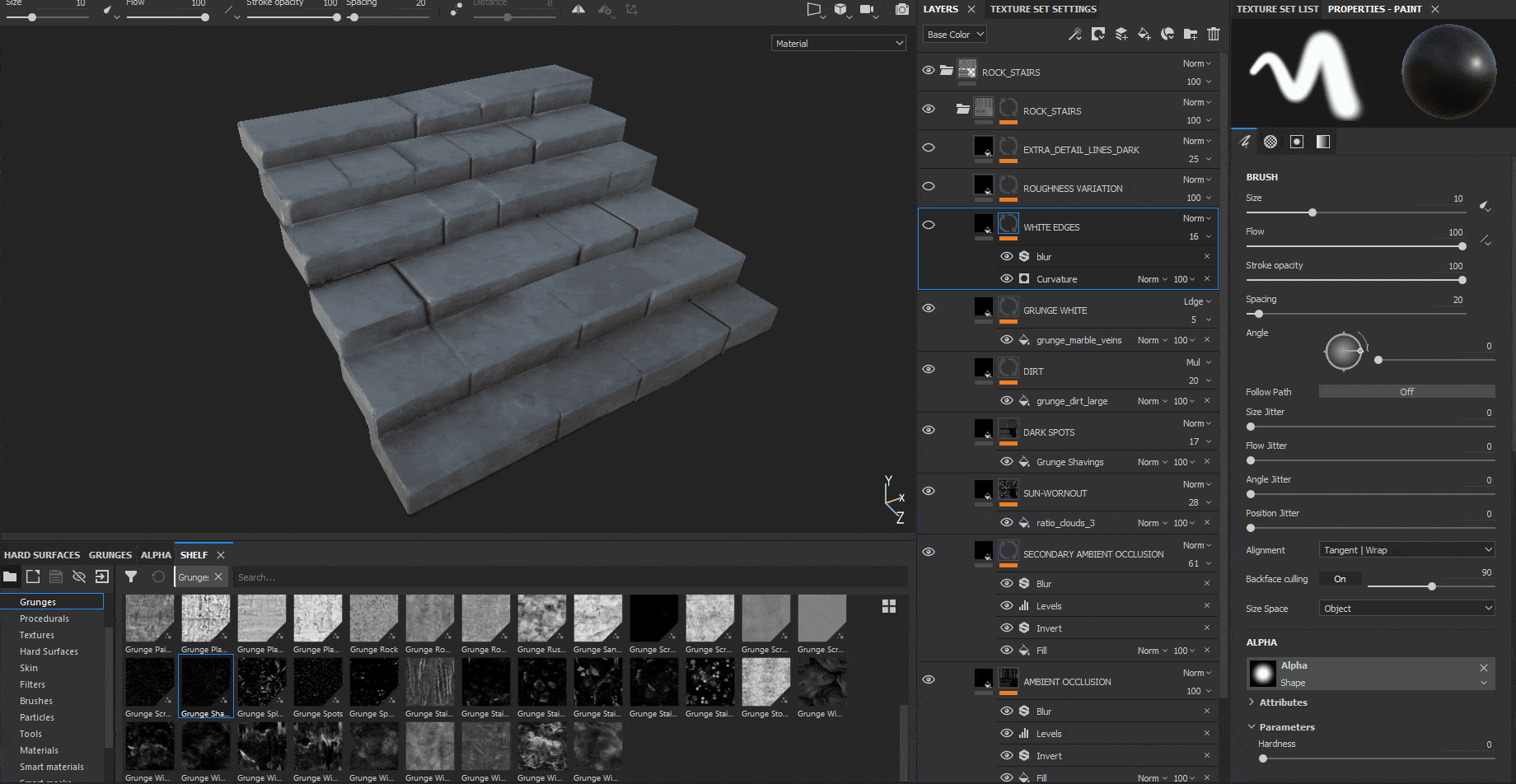
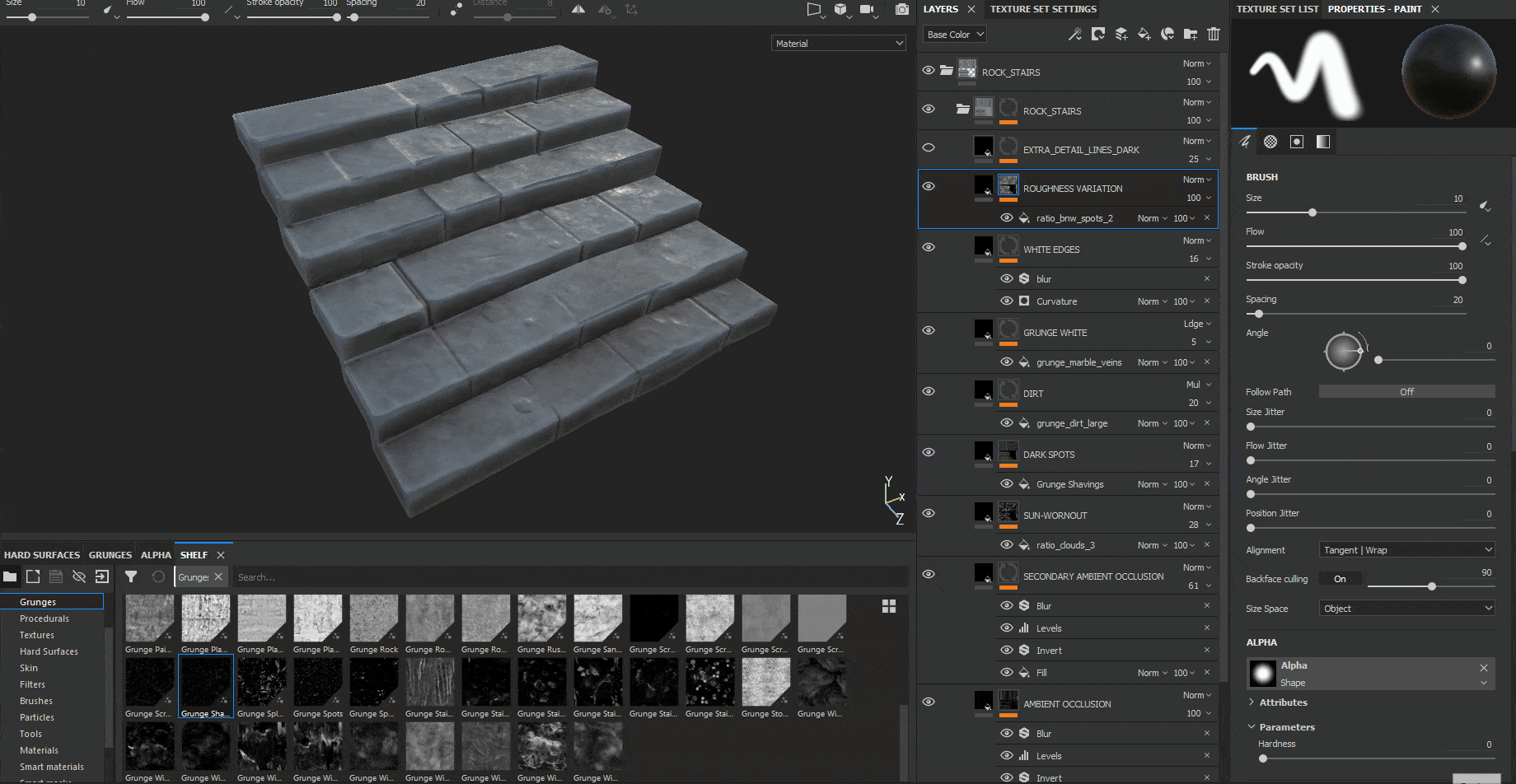
Finally, I also added another layer with some detail roughness which would give a rocky slightly wet feeling to the texture overall.
This was basically the overall texturing I used for every asset. However, to this standard way of texturing, there were a few exceptions, like the texture for every wood asset, in which apart from applying all these steps, I also added some traditional hand-painted texturing.
EXTRA HAND-PAINTED PROCESS
The 3 first steps on this window wood piece are like the ones I made for the other assets. Firstly, adding a base color, secondly, adding a layer color with a darker value than the one before, to be used as a gradient for the bottom of the window, and adding 2 different layers of Ambient Occlusion with slightly different hue values following the same procedure as mentioned before.
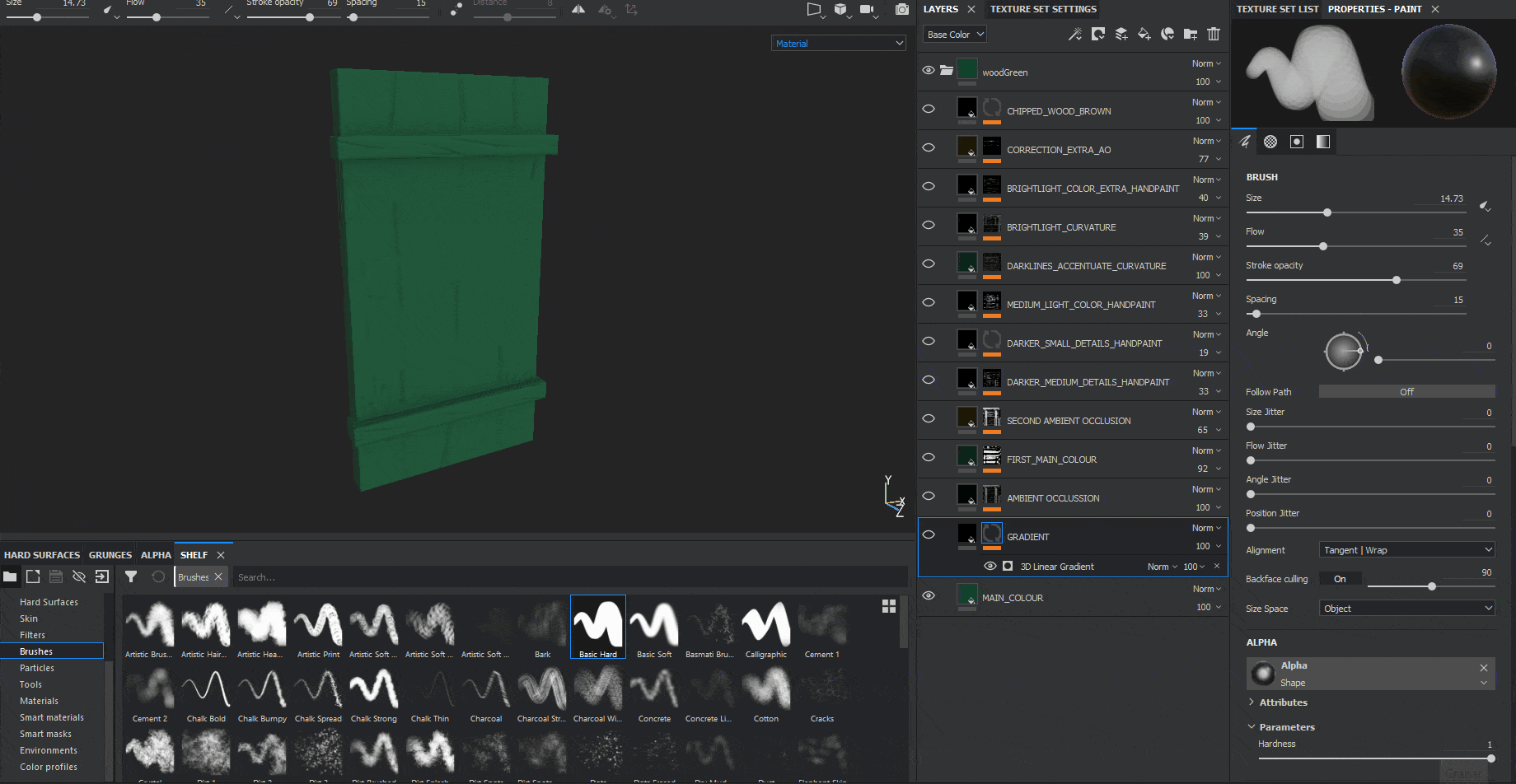
From this point of the texturing process onwards, I basically used a combination of layers with slightly darker and lighter tone values which I hand-painted myself onto the texture itself, plus some curvature generators which give extra readability to the asset itself.
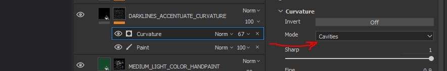
After this, I used the Curvature generator with the Cavities Mode activated to get some more tiny shadows and definition on the small wrinkles of the window.
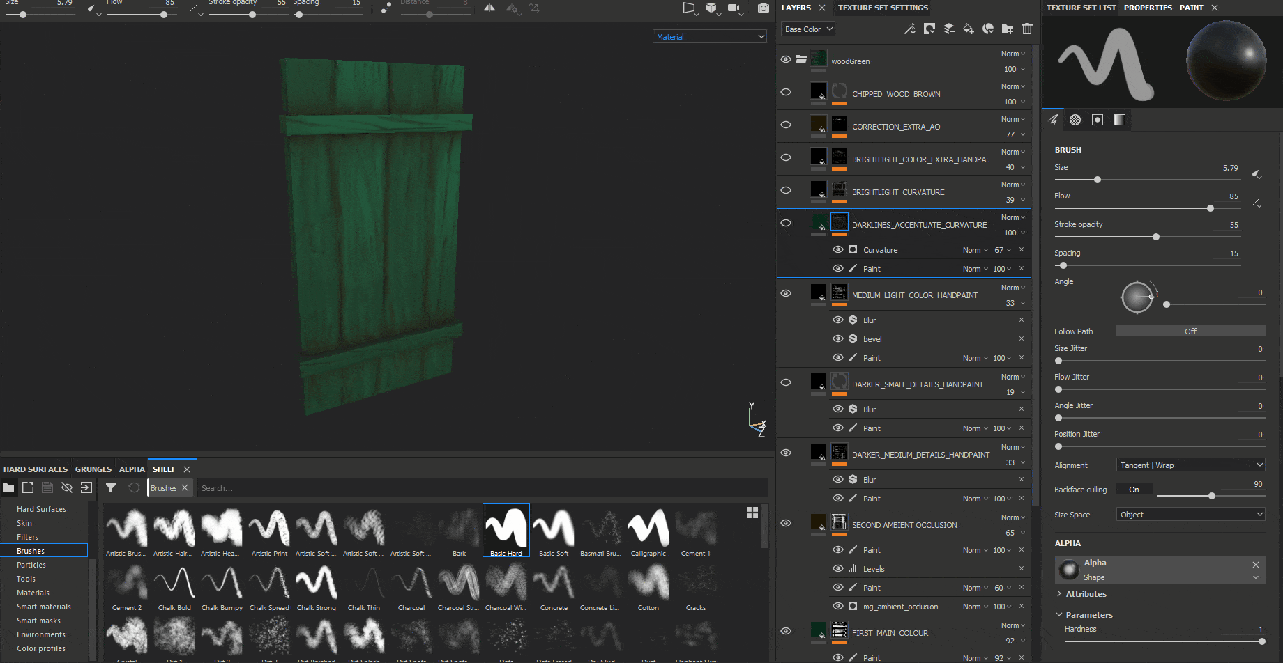
I also used the same process on another layer with a Curvature generator, this time using the default Edges Mode instead of the Cavities mode of before, to give some interest to the lighter areas of the wood.
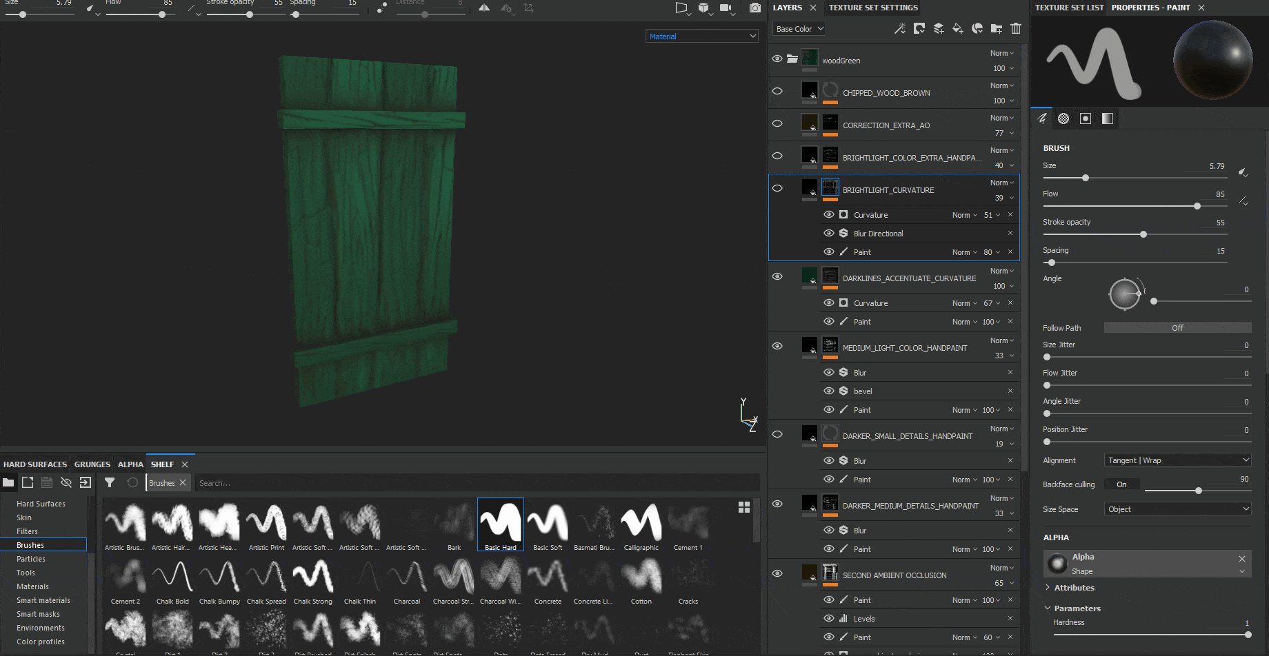
On this next layer, I added some extra hand-painted lighter wood wrinkles:
I also added some extra hand painted dark wrinkles to some areas in which I felt it needed some more ambient occlusion.
Lastly, I also added some peeling or chipping paint generated with a noise pattern layer which gives the feeling that the green paint and the wood itself is old.

By using these 2 types of texturing processes I was able to come up with the following set of game-ready modular assets:
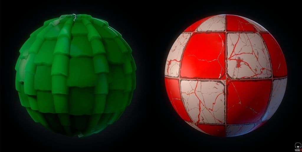
Wall Material
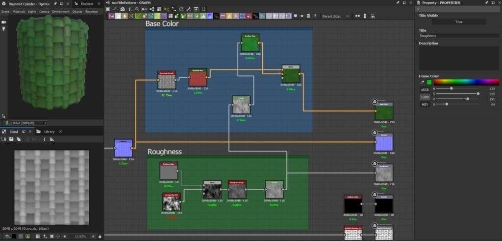
I would like to do a breakdown of the procedural wall material I created which I then used inside Unreal Engine. It was quite a simple material, I worked mainly with nodes that would give me a good main texture set ready for UE4. I then used these textures inside Unreal Engine to create a custom material with it, which I then mixed with some noise textures in order to create a set of different tileable wall materials.
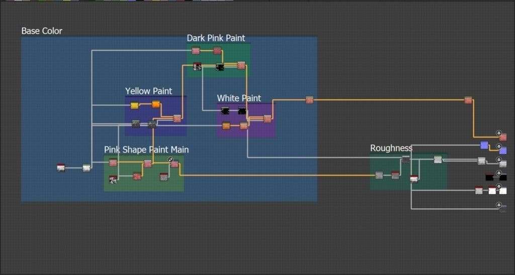
First, I started my texture by using the Grunge Map 006, I added some pink color to it and then I mixed it with the Grunge Map 013 in order to get a noisier texture. I then distorted it a bit using a Directional Warp plus a Perlin Noise.
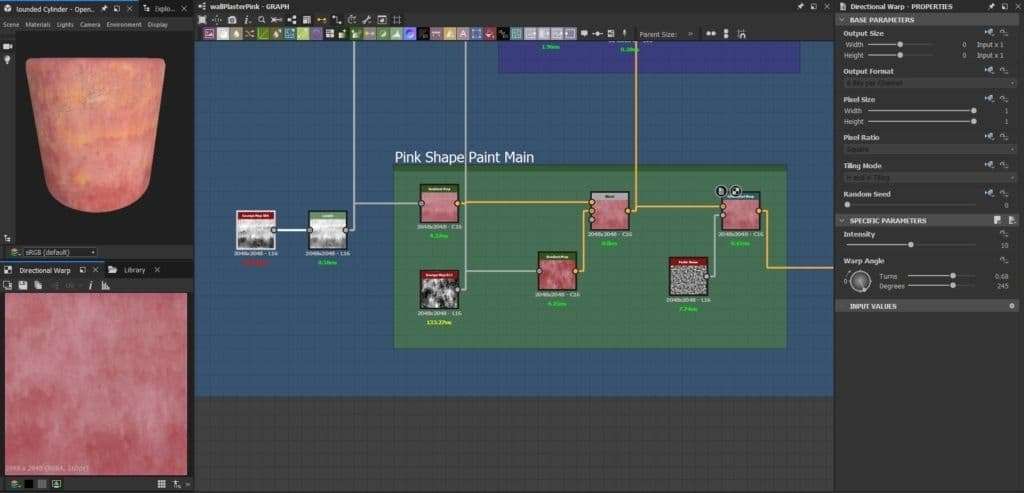
Then, I took the main Grunge Map 006 and I created a “mask” from it by using a Levels node, I distorted it by using again a Directional Warp using the same noise as before. I used this mask to connect it to the Opacity input of the blend node to get some yellow noise patterns on top of the pink texture.
The same process is repeated but this time using a different texture, in this case, the Grunge Map 014, to get a little bit more of noise pink darker patterns on top of the main pink one.
I then took the input of the Grunge Map 014 and I connected it to a Levels node to get another black and white mask, and I used it to be connected on the input of another Blend node in order to get some white splatter paint in certain areas. This final node is then connected to the Base Color output.
For the roughness map, I took the mask generated by one of the nodes I used to create the white dirt paint before, and I blended it with the result of the directional warp of the pink main wall color, converting it to greyscale before. I then blended this result with the Grunge Map 006, and I included a Levels node to control the amount of roughness I want for my wall.
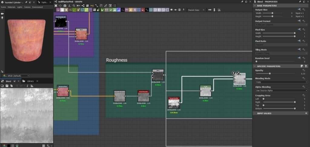
For the Normal, ambient Occlusion and Height outputs I took one of the nodes I created for the Roughness output, and I connected it to each final node.
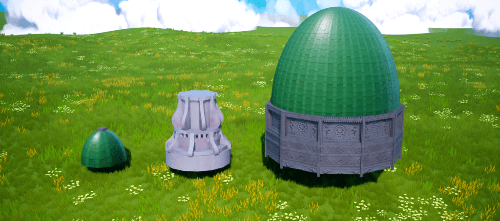
Green Rooftop Material
I would also like to do a breakdown of the green rooftop material I made for the building dome in the background of my environment. This was basically made by height blending 2 different types of roof tiles, a flat one and a curved one.
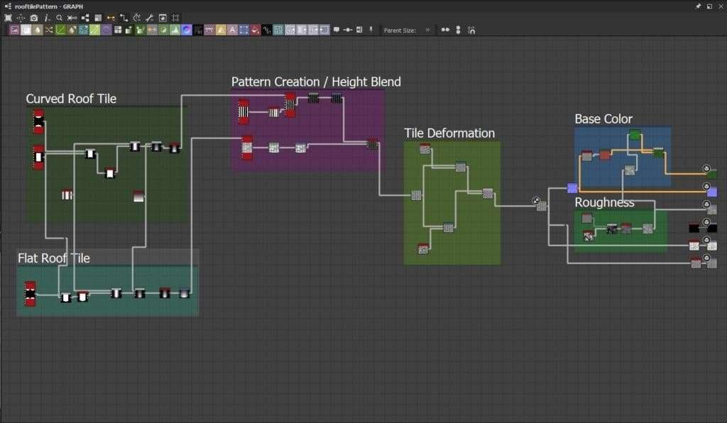
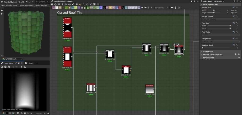
To get the height map, I first made the curved roof tile by just combining two different shapes with a blend node in Subtract mode. I then added a Bevel node to it, so I give an edge-bevelling effect for a smoother transition. I then blended it again with a Gradient Linear node which will affect the height of the overall tile. The darker part, on the top, will be pushed more inwards than the bottom part, which will be pushed outwards.
Similar process for the other type of roof tile, the flat one. I used a tile sampler to get 4 Discs, which, combined in a Blend node with the same square I used for the first tile and in Subtract mode gave me an irregular shaped rectangle. Same as before, I also added a gradient node to get the same height difference at the top and bottom of the tile.
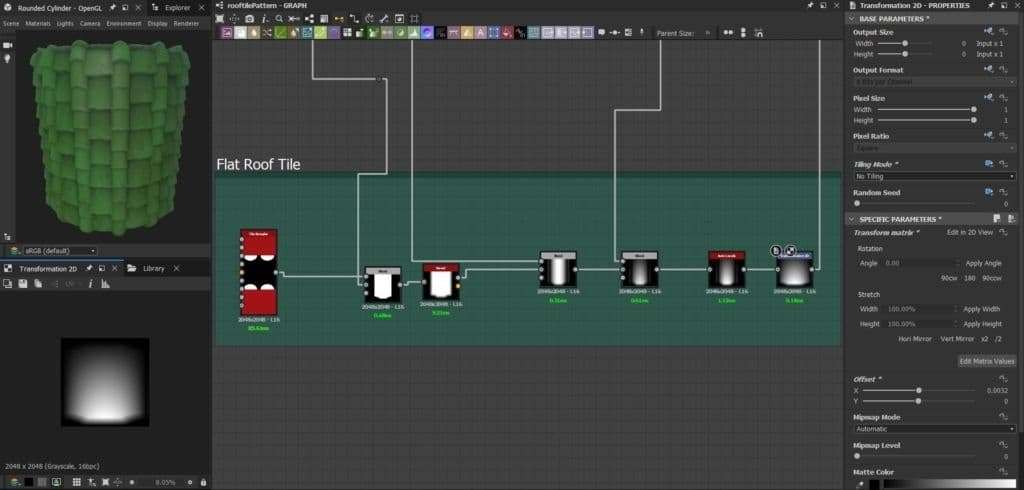
I then added each type of roof tile with its respective Tile Sampler to get a pattern of each roof tile. To enable flat roof tiles in between the column of regular roof tiles, I created a tile sampler with a few vertical-rectangular shapes that would work as a “mask” that I would input on the “Mask Map Input” on the curved roof tile Tile Sampler. I added some Levels nodes to match the height from the curved roof tiles and the flat roof tiles, and I used a Height Blend node to combine these two together.
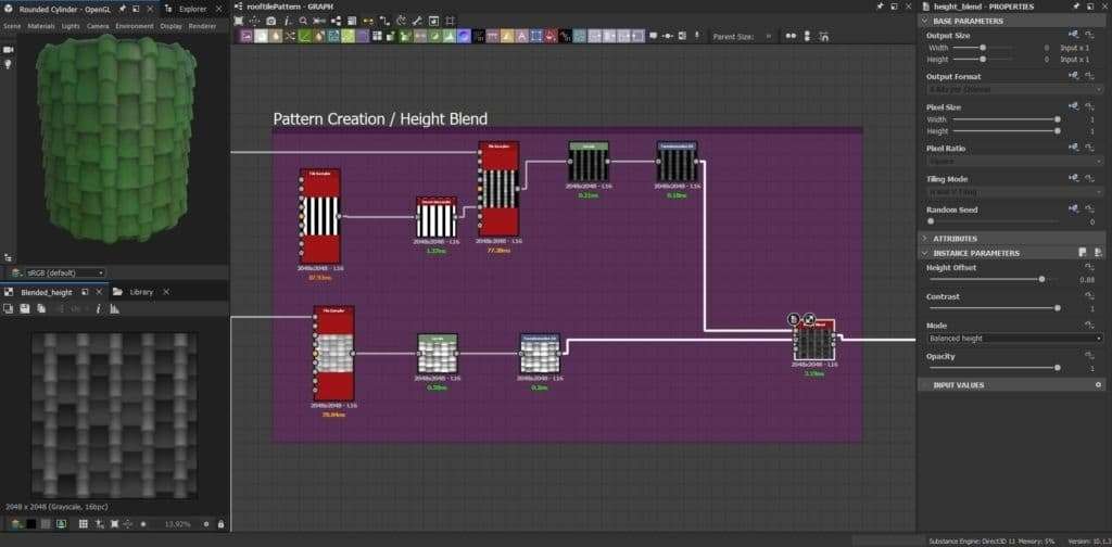
To add some more irregularities and variations to each roof tile I connected it to a Directional Warp with two Perlin Noises with different scale parameters.
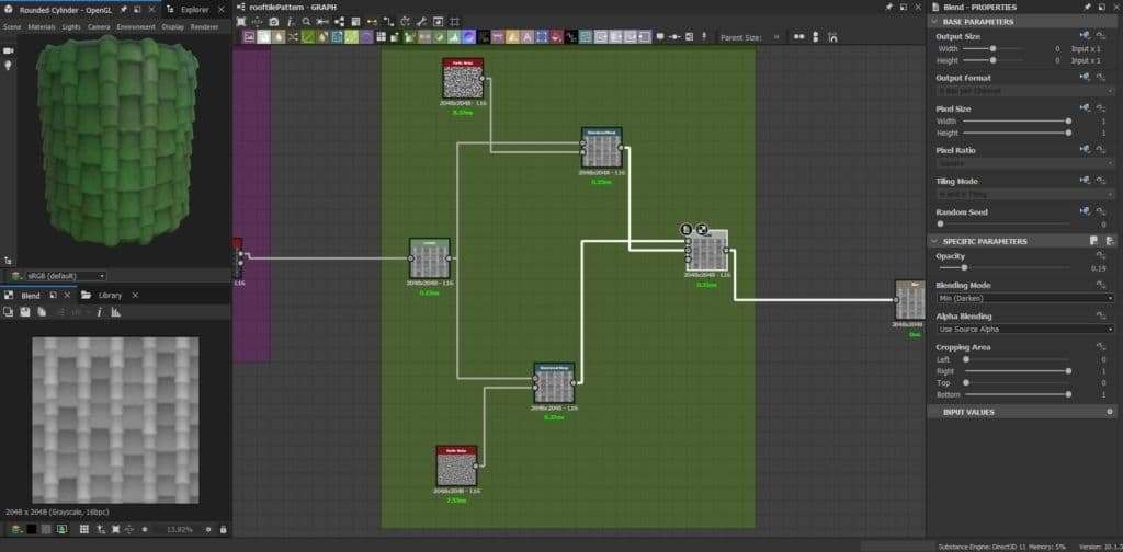
Lastly, due to the fact this texture would be seen from quite far in my environment, I did a very basic Roughness texture by combining a few grunge textures plus a Histogram Range in a Blend node, and I used this same output to create a basic Basic Color out of it, to be connected to the final texture outputs.
Conclusion
This project was a challenging journey for me due to the fact I had never tried to create an environment following a more stylized approach and it was also the first time I did hand painting inside Painter.
I learned how important it is to make a good planning sketch of what needs to be done in terms of modularity, especially if it is a large scene like this one. The larger the environment, the more time should be spent on planning about it with quick sketches before any actual modeling whatsoever. 2D sketching can be great in order to have a clear idea of how to tackle the environment modular assets.
Something that is also important is creating a good blockout inside Unreal Engine and iterate on it as much as I want before I start adding the final detailed assets. This is because when these large amounts of final assets are added, it gets more and more complex and time-consuming to make big changes on the scene.
I also learned how important it is to prioritize asset detailing whenever modeling, this way I could finish an environment like this in an optimal amount of time. With this I mean, the more visible the asset on the scene, or the closer the asset is to the camera, the more time I should spend working on it, and vice-versa.
Finally, I would like to thank the Substance 3D team for giving me the opportunity of sharing my personal, student view on how to tackle this environment artwork, and I really hope this breakdown can be useful to anyone interested in this subject.