Wet Olive Saloon: Creating a Wild West-Steampunk Scene in 3D
Ana Barrós Calvete, an Architect and 3D Artist from A Coruña, Spain, aims to inspire other 3D Artists who would like to challenge themselves by creating intricate environments and visualisations in 3D.
Ana Barrós Calvete is an Architect and 3D Artist from A Coruña, Spain. When she was studying architecture, she discovered she loved designing imaginary spaces, transforming them into reality thanks to 3D. From that moment on, she focused on training as a 3D visualiser artist, at first on her own, and then with butic The New School and the Official Master in Architectural Visualisation from Autodesk and Chaos Group.
In this article Ana aims to inspire other 3D Artists who would like to challenge themselves by creating intricate environments and visualisations in 3D.
Introduction
At a time when I wanted to learn a lot more, I tried to focus on personal projects that I knew I wouldn't be able to develop in the working world.
Some friends had told me about ArtStation and suggested that I should make a portfolio there and take a look at other artists' projects on the website. That is how I discovered Challenges and the amazing things people were doing. At that point I made up my mind, that I had to take part in one.
Time went by and it was announced that the Wild West Challenge was about to start, and I was so anxious to participate! Over the days, I looked at the participants' entries, but it was clear to me that I didn't want a scenario designed by someone else, I wanted to make my own space.
Even though I could not finish the Wild West Challenge project on time for various reasons, I kept working on it until now, when my school told me about the Rookie Awards 2021 contest and I knew it was time to finish it. You can find my entry for the contest here.
When faced with a scenario like this, you have to be very sure about what you want to do and to do this it is essential to look for appropriate references. In my case, I haven't had much interaction with audiovisual products with a Wild West theme, except for the show Westworld and similar, so it was even more necessary to have good references.
First of all, I had to focus on the time period I wanted to capture: the early 19th and 20th centuries. Also, I wanted to mix it with a Steampunk style, so the Victorian era was a perfect match. And most importantly, I had to know if the period was a good match for me to include electric lighting in the scenes.
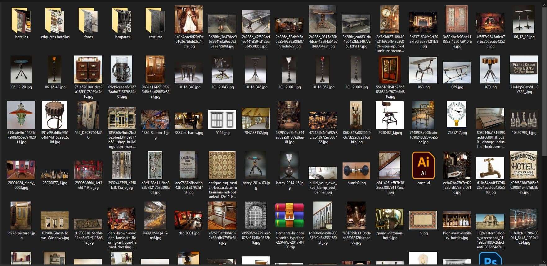
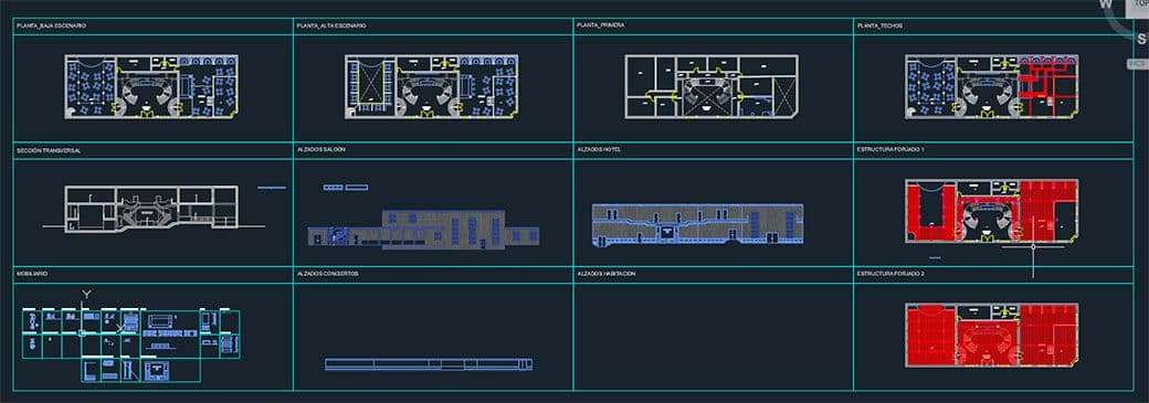
Once the ideas were clear, it was time for the references. I spent several days looking for references for almost all the elements that I wanted to form the scene. Bear in mind that, although this post focuses only on the Saloon, the complete scene is also composed of the Hotel, Rooms and Show Area.
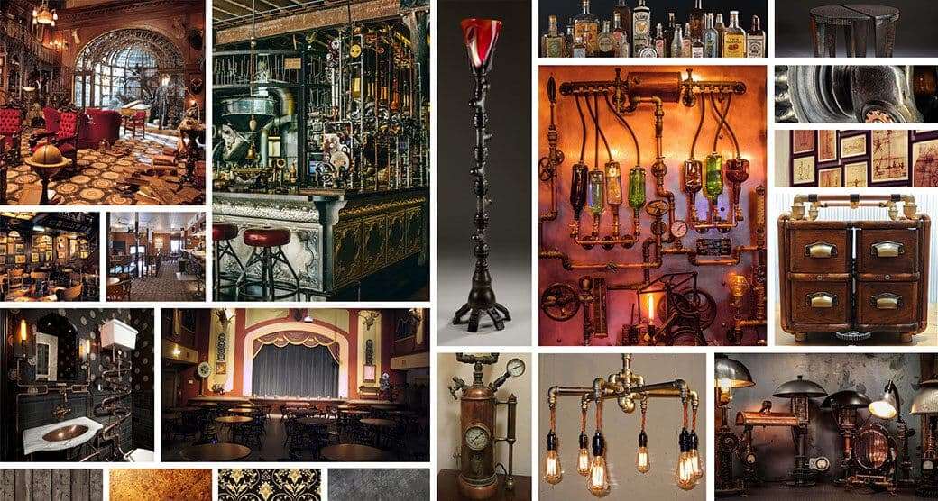
Once I've collected the reference images, it is necessary to organise them which can be done by means of mood boards, by zones or by elements. In my case, I made a general one of the environment and another general one of the furniture elements. That was enough for me to start designing.
Colours have great importance for spaces. I tried to associate each of the spaces I was designing with a colour: the Saloon with red, the Hotel with blue and the Show Area with yellow/gold.
Why red for the Saloon? Well, because to me it seems like a colour with a lot of dualities when it comes to the sensations it gives us. It is the colour of prosperity and vitality, but at the same time, we associate it with danger and aggressiveness; perfect for a Wild West Saloon!
The Design
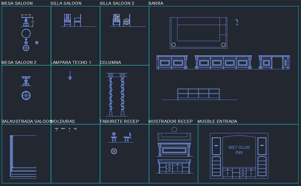
In my case, I have to say that I don't feel very comfortable making sketches of my designs. Mainly due to the fact that I think with measurements and in drawings I am not able to see it well. Thus, I use AutoCAD to design all the space and furniture elements. I needed all the elements to be dimensionally credible, although I could be more creative in some elements, like for example, the columns.
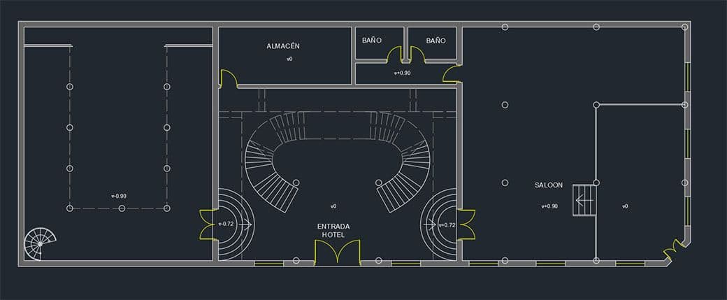
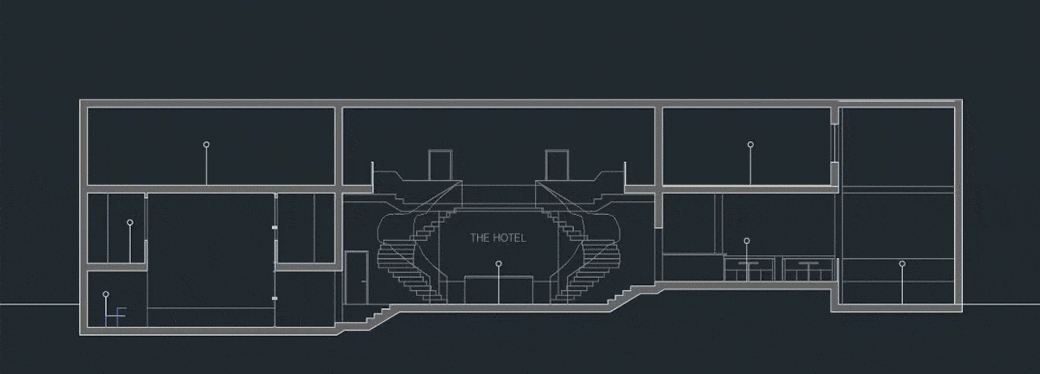
The first thing was to think about the different heights of the space: do you have double-height areas? Tarses? Basically, I want to play with the different heights of the sections, so that it looks like a fluid movement between zones. An environment with different heights is more suggestive. Also, it is important to make sure that all the rooms have the right heights (the dummy is equal to a person of 1.70 metres in height).
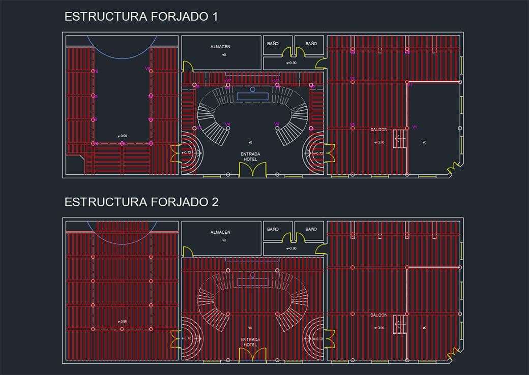
Once I had defined the height curve, it was time to dimension the space itself. To do this, I proposed a basic module of 4 metres on which the columns (both the central ones and those embedded in the walls) would be arranged. When I had it ready, I made the distribution of beams and joists to make the grid of the slabs, as they were going to be seen inside the environment and it was something relevant to the design.
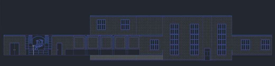
Then I started to think about what I wanted the enclosures to look like: elevations, doors and windows. To do this, what I find most comfortable is to make unfolded elevations, so that I can also see the movements between different levels that I talked about before. So, therefore, I defined all the elements: whether there are skirting boards, panelling, if there is wallpaper, where columns coincide, etc.
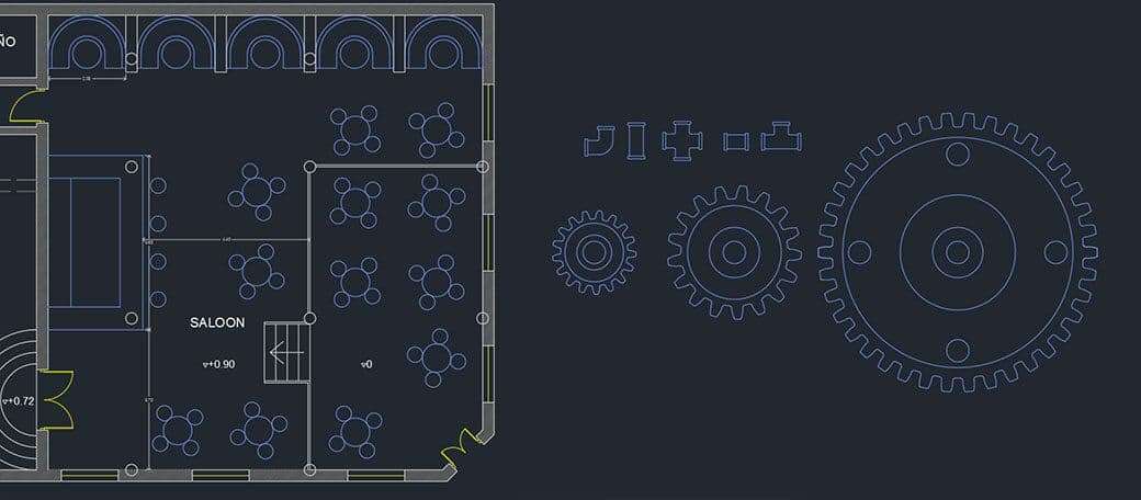
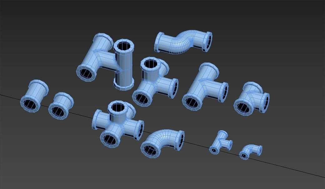
The next step is to design the furniture and its layout. To do this, based on the references, I designed some AutoCAD blocks of pipe elbows and gear plants, as these two elements are going to be predominant in the designs I had planned to make.
Once that's done, it's time to dimension the furniture. To do this, I divided the AutoCAD file into sectors to indicate what I wanted to design. This way, if in the future I had doubts about where to continue, I had it indicated in there. Here I also made designs of sections of the mouldings for doors and panelling.
Environment modelling
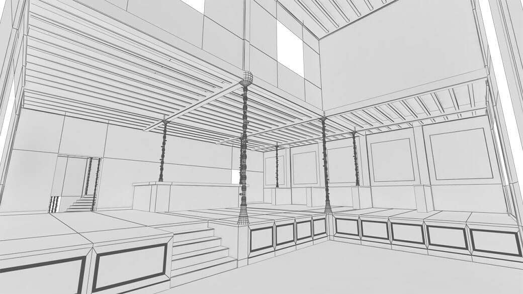
When it came to modelling the environment, I first started with the enclosure of the Saloon: floors, walls, roof and wooden structure. Since I already had everything designed in the plan view, I had to start modelling from there.
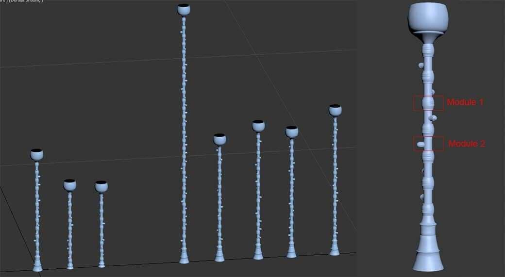
Once that was done, I started to design the columns. As I already had them ready in the drawings, I made a base column to see how the design would look. Then I made the variations corresponding to the different heights that we found throughout the space. I made sure that they were modular so that I didn't have any problems when it came to adjusting them. I rotated module 2 randomly so that each pipe node would face in different directions.
When the columns were ready, it was time to put them in place. This was also the perfect time to add some extra details to the enclosures, especially with regards to the mouldings.
Assets modelling
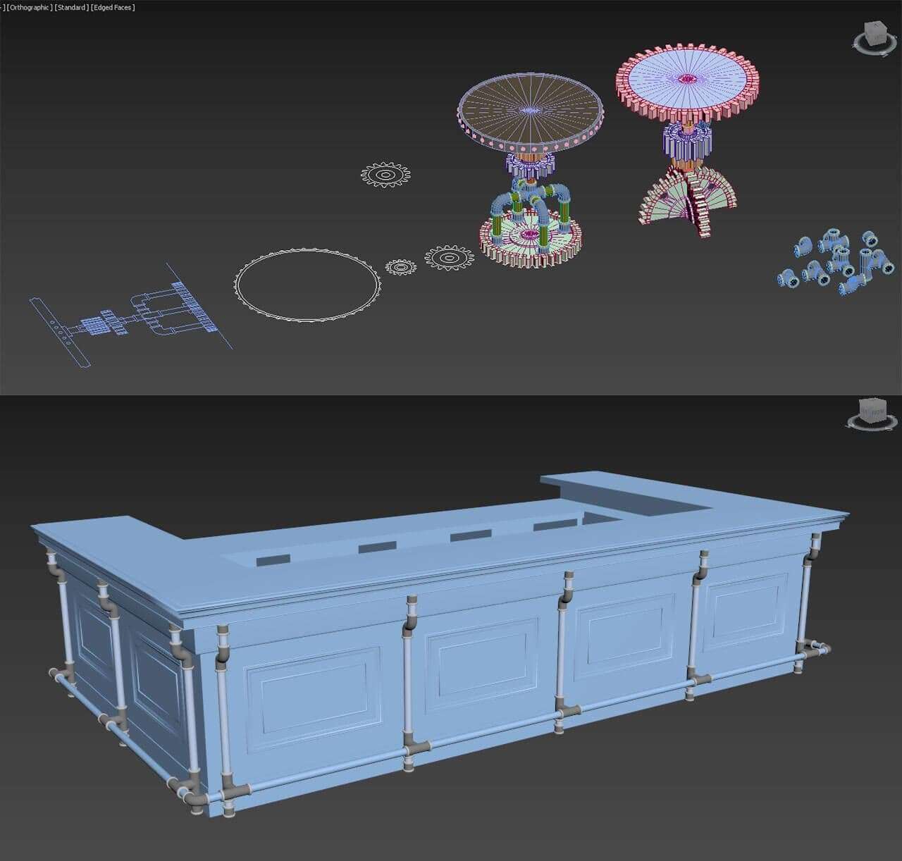
In other circumstances, it would be more complicated to start thinking about how to model the furniture. You would have to be very clear about the references and think about the measurements as they are modelled. In my case, this part of the work was advanced because I had already designed everything with AutoCAD, so at this moment I only had to think about modelling what I had previously designed.
Seeing how all the furniture looks like, with pipes and gears, I did exactly the same as when I started in AutoCAD: I modelled all the pipe elbows in various sizes (with their UVs already made, of course) so that I only had to copy and paste each one to assemble the furniture.
Having the designs done in AutoCAD also allowed me to import the DWG file into 3ds Max and work on it. For example, when it came to making the gears, this became really useful. I had the diameters and the divisions and the only thing I had to think about was the inside heights. Again, having ready-made gears allowed me to duplicate it in the rest of the furniture.
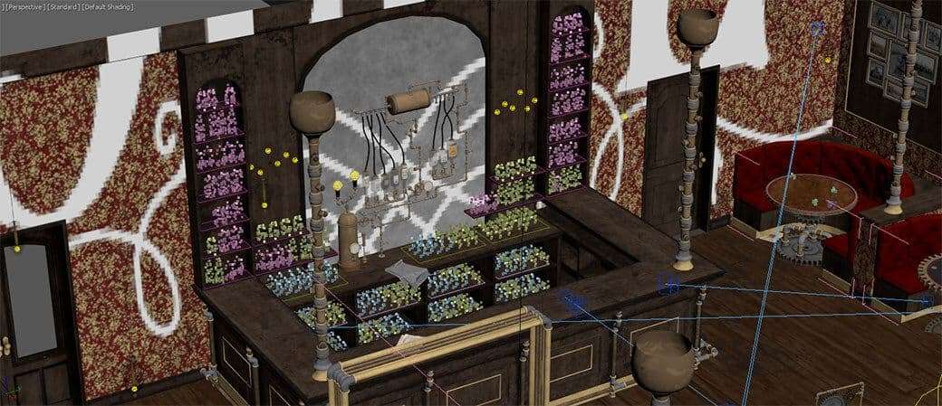
One of the most representative elements of the bar area is the drink dispenser with a piping circuit. Having both the design in one of the AutoCAD elevations and the elbows modelled in 3D, it was very easy to create the whole system. As long as the various pieces of gear and spanners were instantiated, it was a piece of cake.
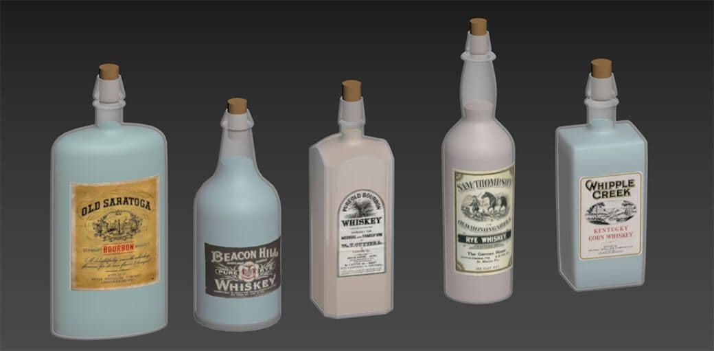
The only thing left to do was to design the different versions of bottles (which I would also reuse later) to be placed upside down and to adjust the cables to their dimensions. Above all, I had to remember to turn the drink upside down to simulate the effect of gravity.
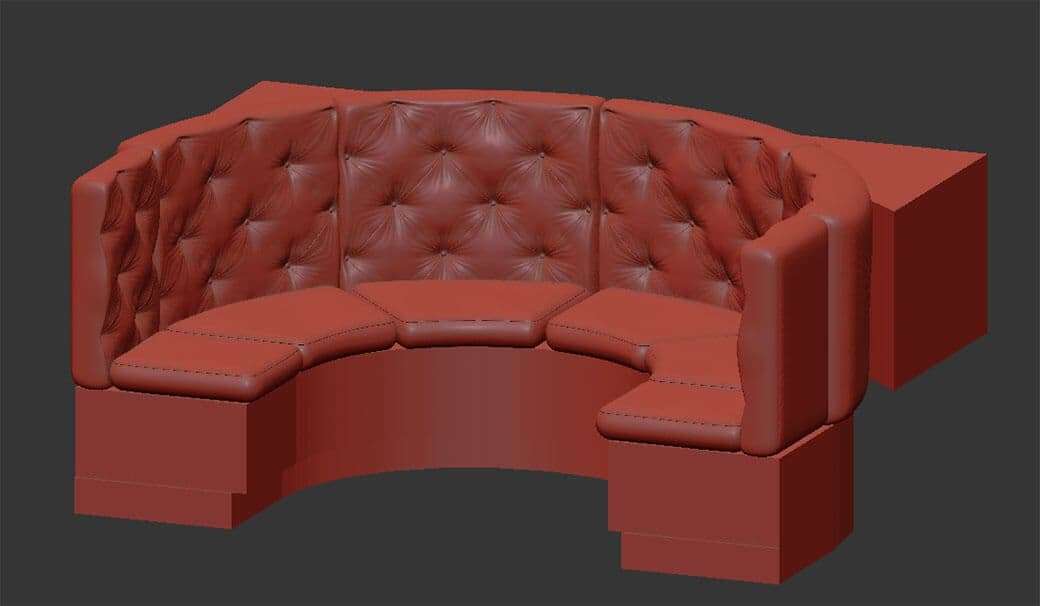
Perhaps the part I had the hardest time modelling (and the reason why I didn't finish this scene before) was the padded sofa in the "reserved" areas. The truth is that I didn't really know how to do it, and the first tests I did, lacked quality. It was thanks to a class I had during the master I am taking at butic The New School with our teacher Federica Asaro on padded modelling, that I was finally able to finish it. And even so, it didn't turn out as well as I would have liked.
Texturing
I started this project at the beginning as a way to force myself to learn software that I didn't have much practice with. Two of them were Substance Painter and Substance Designer.
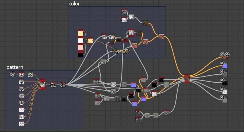
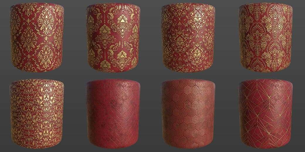
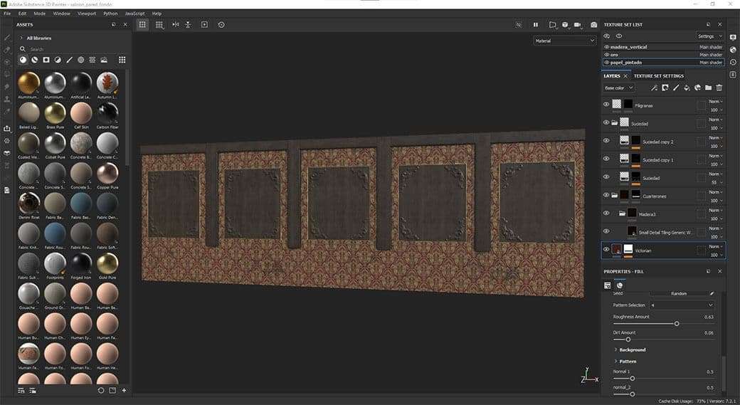
The first problem I encountered when I started texturing was that I couldn't find any material that adapted well to what I wanted to achieve on the walls. Thus, I made my own material in Substance Designer, designed to be used in all the rooms of the project: Saloon, Hotel, Show Area and bedrooms. So, it became a very configurable material to which, in the beginning, I added 8 different patterns to be able to use in different situations. In addition to the possibility of being able to change the colour of both the pattern and the background, I added the variation of the amount of dirt that the surface would have.
The texturing itself was not complicated. I started first with the enclosures of the Saloon. As mentioned earlier, I decided to associate this space with the colour red because for me this colour represents violence, hatred, aggressiveness, danger, but also power, prosperity, vitality and dynamism. Thus, a colour with a lot of bipolarity, like a Wild West Saloon.
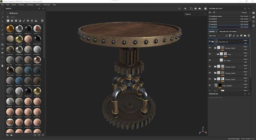
For the furniture, almost all the elements used the same materials. I have to say that Jonas Ronnegard's Metal Smart Materials helped me a lot, as they have beautiful materials and perfect for what I wanted to achieve. My intention was to make the pieces look worn, with metal being the predominant material, to emphasise the Steampunk style that characterises the whole space.
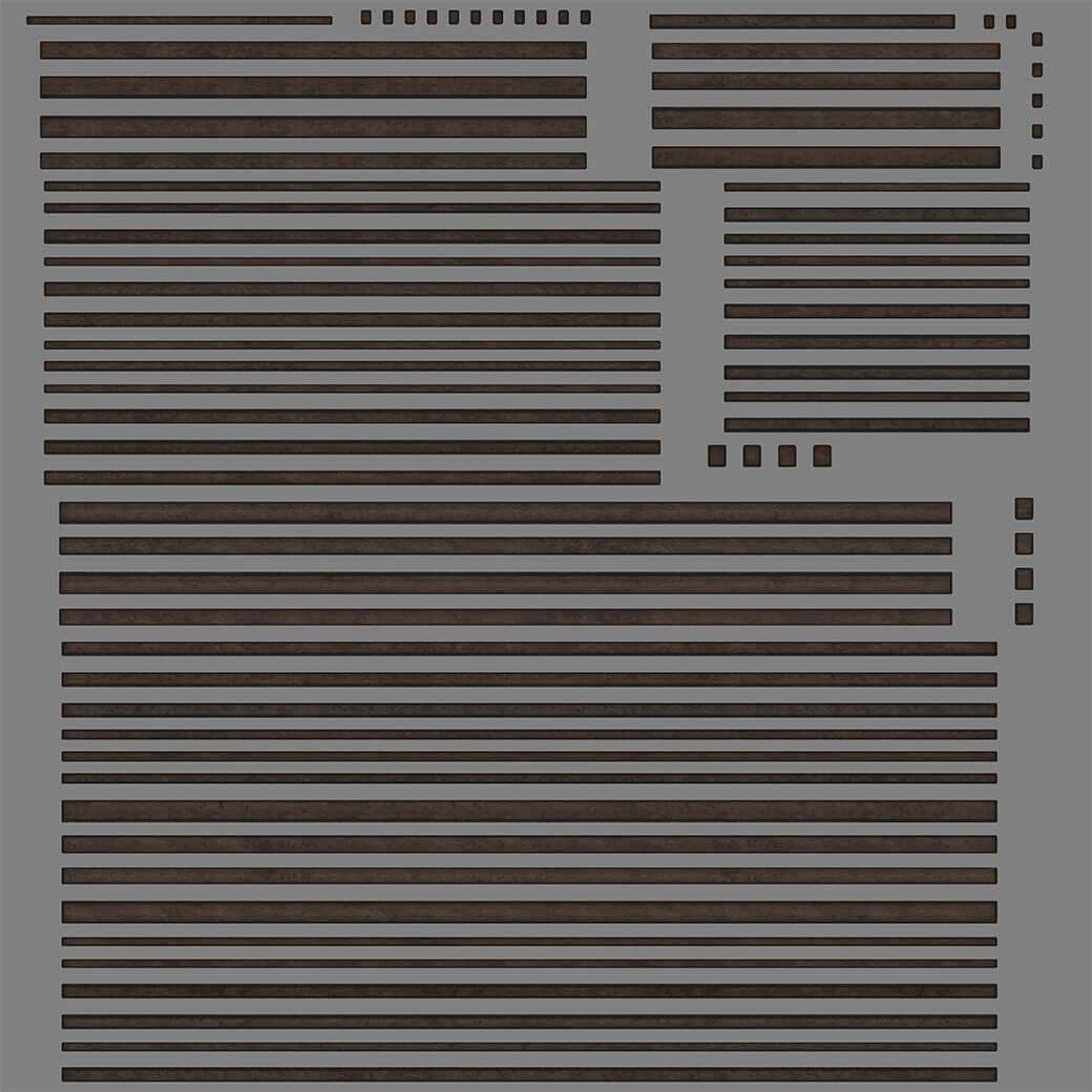
The use of wood, both in enclosures and in furniture, requires knowledge of grain orientation. Wood cannot just be laid in any direction. For it to work optimally, it has to be arranged in the right direction (not to mention that, if the project is carried out, factories are limited by the size of the boards and not everything can be done). The easiest way to do this is to organise the UVs correctly, i.e. put all the corresponding islands in the same direction, so that when we take the model (or models) to Substance Designer we indicate that the material should be applied as UV Projection and so everything fits correctly.
Once all the textured elements were ready, I exported the maps in metal-rough and, depending on the dimensions of the objects and at what distance they will be seen, at 4k or 8k. Actually, only the walls would be at 8k, as it was very important that the wallpaper could be seen well from anywhere.
After exporting the maps of the different materials and objects, I only had to create the appropriate material in V-Ray and connect each map in its corresponding node. Of course, whilst working in metal-rough, we will have to make sure that we have selected "Use roughness" in the BRDF tab of the material.
Composition and Lighting
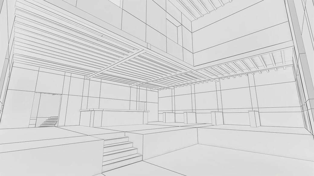
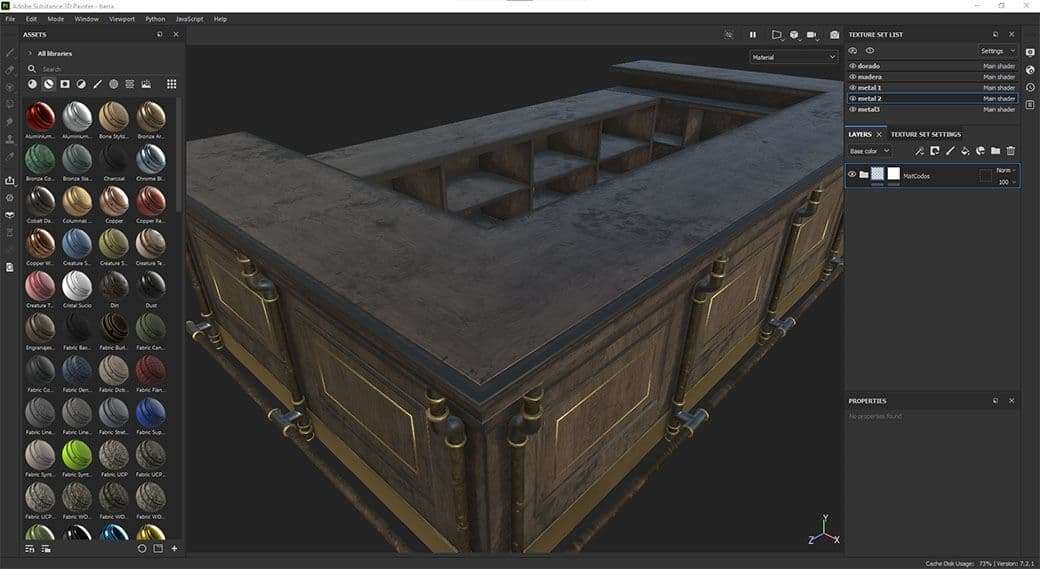
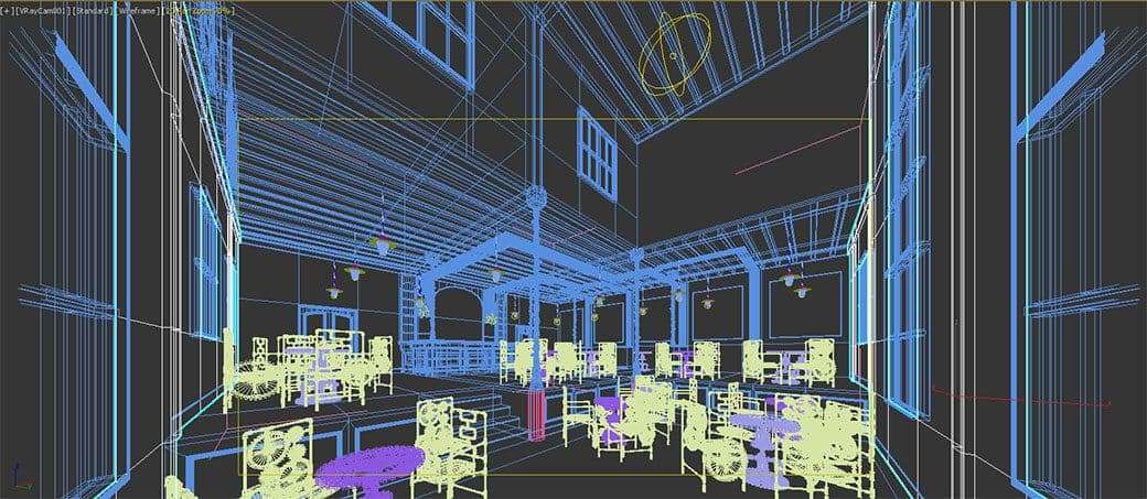
Once all the elements that will make up the scene have been modelled and textured, it is time to put them in place. Most of these elements were already distributed on the floor plan that I had drawn in AutoCAD. That way it was relatively easy for me to place them. To do so, I merged all the necessary elements in the file of the final scene and instantiated them to place them. Of course, I started with the bar and the tables.
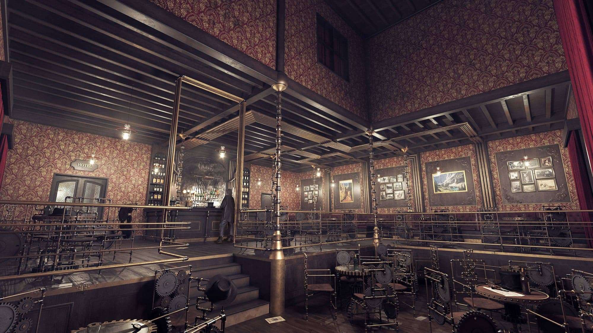
At this point, I added some lights (also instantiated) on the lamps, which I would adjust later. Also, I placed a Sphere Light in the area of the double-height to be able to see what was going on in the lower area as it was too dark at that moment.
Once all the "big" assets were in place, it was time to place the small details that give life to the environment. I started by placing the beverage server and the railing in place. As everything was already defined in AutoCAD, was very easy to place them where they needed to be.
After that, I placed the bottles, glasses and other paraphernalia on the tables and floors. In this case, I used Forest Pack to scatter the different objects around the bar furniture, tables and floor. It's super useful because you can place a lot of objects in a very short period of time.
Atmospherics
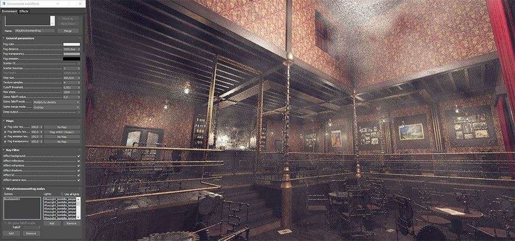
Once I finished placing all the assets (or at least the ones I thought), it was time to play with the atmospherics. For this scenery, I wanted to have a touch of fog, like dust in suspension, because I wanted it to be a dirty space. For this, I used a VrayEnvironmentalFog effect with a Noise in World XYZ for the density of the fog and that it was only affected by the lights of the lamps and not by the one I had put as fill. Obviously to see if you are getting the right effect for the density, sometimes you have to push it a bit and then adjust down the effect.
Final touches
With almost everything ready, the only thing left to do was to tweak the lights a bit to represent what I had in mind. I lowered the intensity of the light in the high area a bit to accentuate the view towards the central area of the scene.
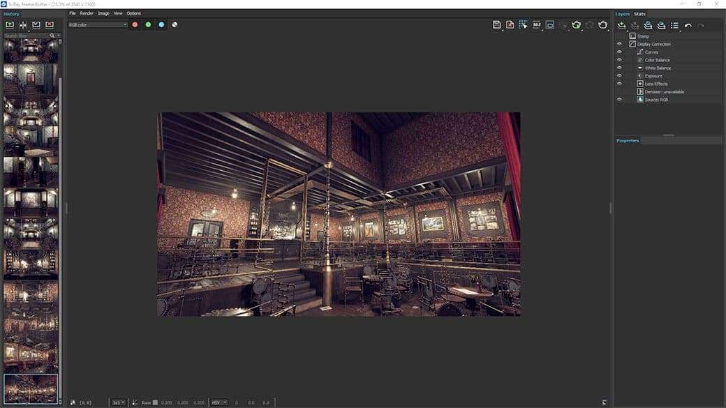
In addition, I did almost all the post-production of the image in the V-Ray Frame Buffer, playing a bit with the curves, exposure (to reduce the highlights that could be produced), colour balance and white balance.
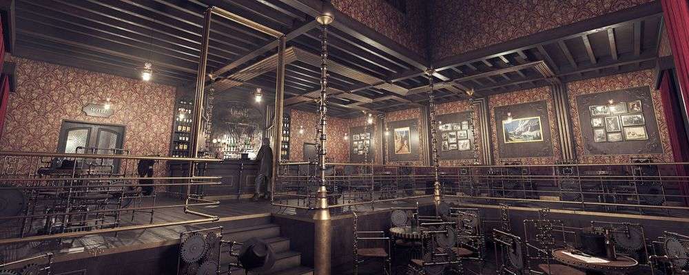
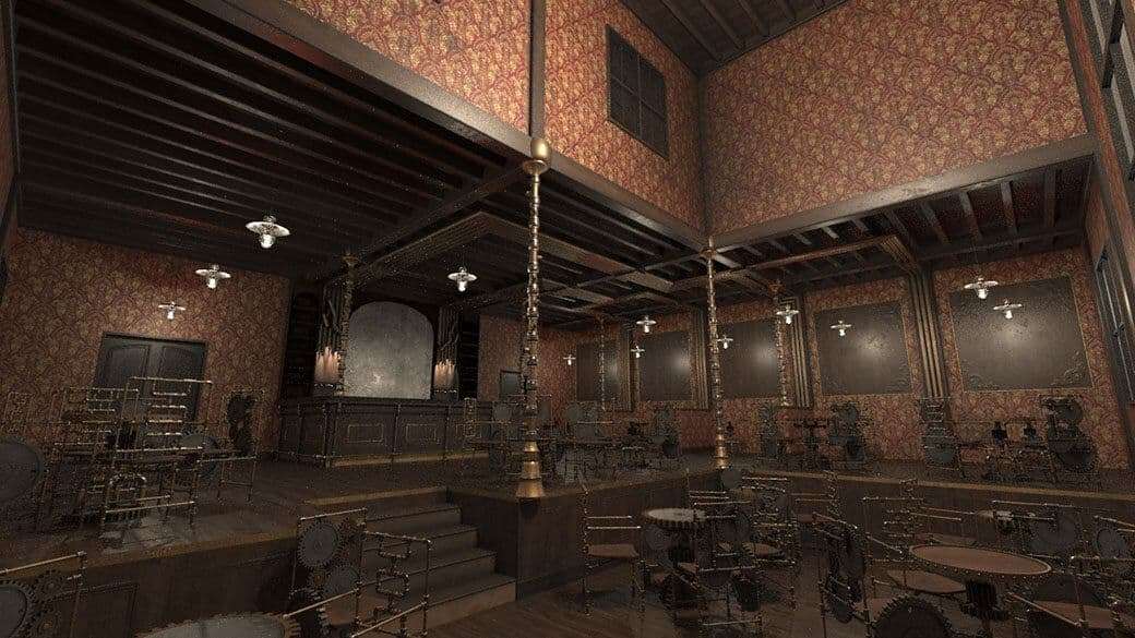
As you can see, almost from the very first moment I had a clear view of what I wanted to be the main image. This is not normally the case, as different views are usually tried out to see which one is best suited to the space. For this space, I was certain that I wanted to show its different heights. The only point to achieve this is from the door of the Saloon, where the camera is located. Yes, I tried different focal lengths and I moved the camera a bit to find the right place, but it was hardly difficult to place it because I was very sure of what I wanted.
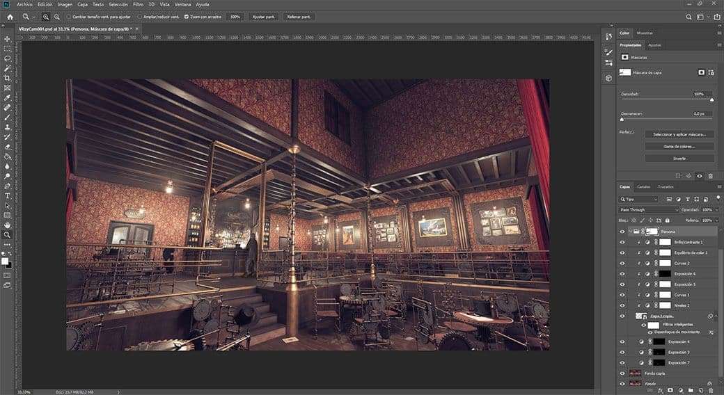
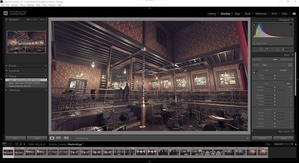
I got the final image in two ways. The first one was in Photoshop, accentuating the Atmospheric layer a little bit where I wanted, and adding a friend of mine in the counter bar. The second way was in Lightroom by tweaking the contrast, the shadows, a bit of the saturation and adding a bit of vignetting. Why do I do this in Lightroom and not in Photoshop? This is because once I find some settings that suit me, I can quickly transfer them to the rest of the images in the collection and, besides, with Virtual Copies, I can have several versions of the same image without modifying the original one. I guess it's a matter of personal preference.
Conclusions
This work is a project with which I have learned a lot, both in terms of composition and the use of work tools that I would not normally use. In a space with so many details, it is essential to be well organised from the very beginning so you don't get lost along the way.
I would like to take this opportunity to thank all the teachers and colleagues at butic The New School, my family and friends, for advising me and letting me chase them for feedback on this and other projects.
And I didn't want to forget to thank The Rookies for giving me the opportunity to share my way of working and Reinaldo Handaya from 2G Studio for choosing me as the winner of the Career Opportunities category of the Rookie Awards 2021. I hope this article can benefit anyone who wants to tackle projects similar to this.