An Example of Sophisticated Minimalism in Architectural Visualisation
Ana María Pérez Heydorn gives us an example of how proportion, framing, light, and design intricacies converge to transform an architectural visualisation into a captivating narrative.
In this article Ana María Pérez Heydorn, a recent Voxel School graduate, shows us how proportion, framing, light, and design intricacies converge to transform each architectural visualisation into a captivating narrative.
Through carefully crafted compositions and meticulous attention to detail, discover how These snapshots offer a glimpse into the fusion of technology and artistry, where the magic of architectural visualisation unfolds.
As an architect I became interested in visualisation during my career to transmit the ideas of my projects in a way that they were a faithful representation of the idea of the project, but that also had a certain "magic" and made the viewer fall in love with it.
Proportion, light and detail as keys when creating an image
It was probably the image below (00) that moved me and originated my passion for the world of digital images and creations. I created it for my project for my master's degree in architecture, for which I received an honors degree.
00
After graduating I started working as an architect but I soon realised that what was really going to fulfil me was working as a 3D Artist. Architectural visualisation was my path.
From the beginning it was clear to me that the main elements that make an image special are: proportion/framing, light and design details.
Once these elements are in control, an important part of the job is done. The human eye is trained to look for harmony, for visual pleasure. There are times when a classic symmetry can provide this effect (image 01).
01
On the other hand, at other times a slight shift in the framing can generate some interest and pleasure (image 02).
02
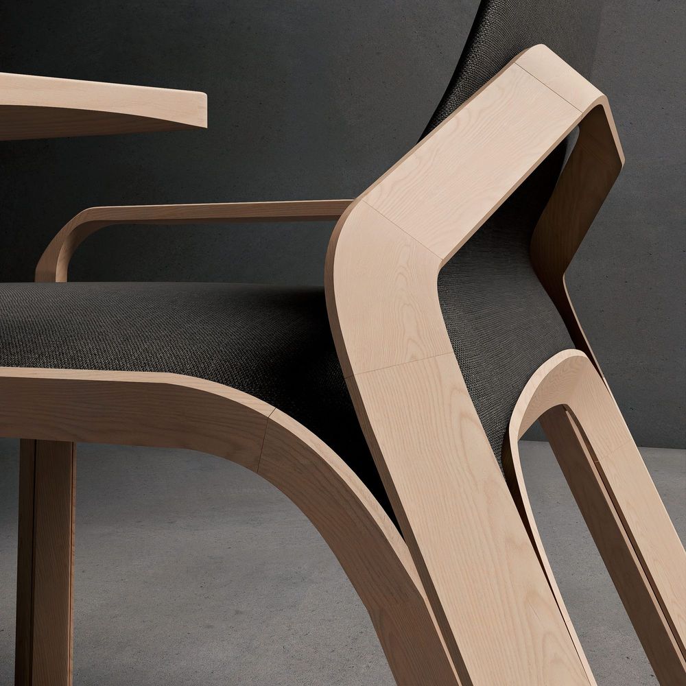
Or it can be a more artistic framing, more random and uncontrolled, which would be enough to show only a part of the element (image 03).
03
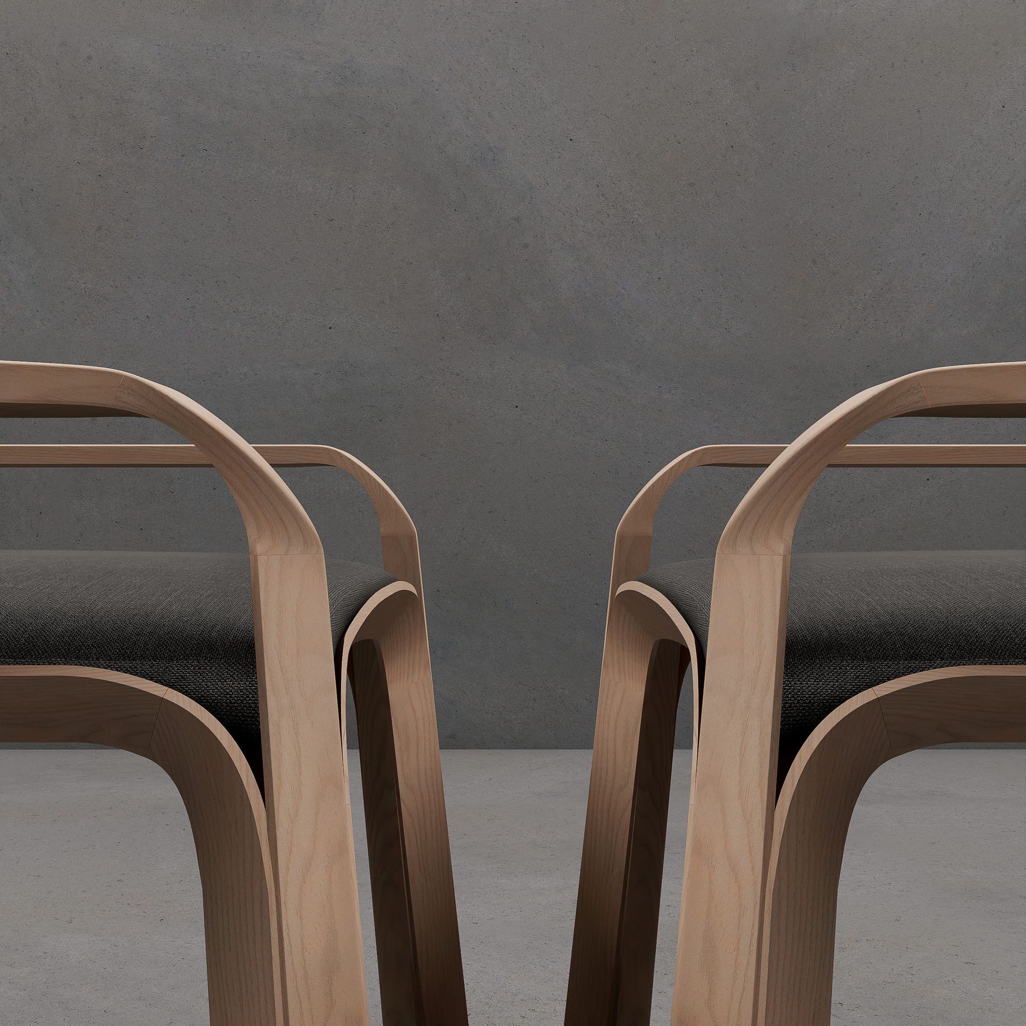
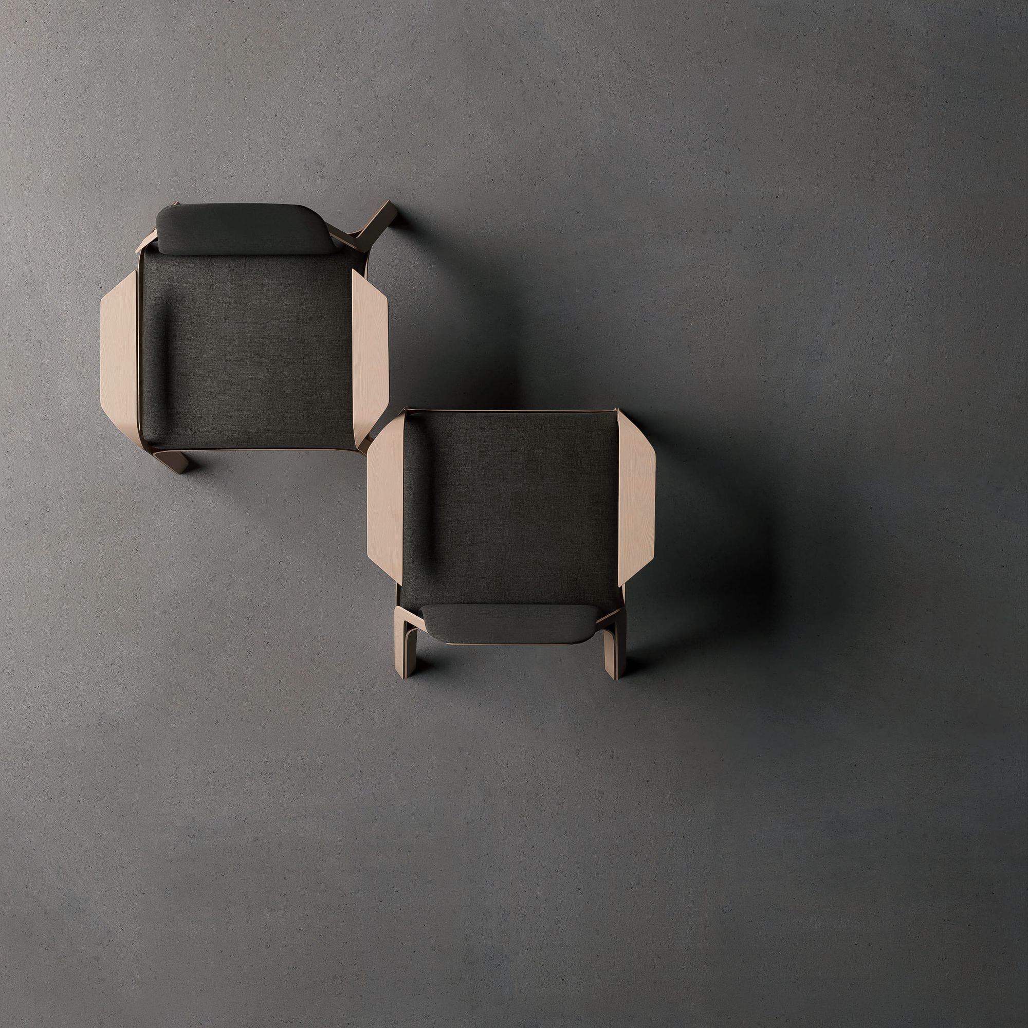
In these product images the light is soft and diffuse, highlighting the main element which is the chair (modeled with 3ds Max, inspired by the design of Magnus Skogsfjord). However there is a contrast between lights and shadows, that even being soft allows one to appreciate the details of the three-dimensional model.
The detail in these images is important. They give the visualisation the necessary realism, as they are product images that try to show just that: the design of the chair in detail. It is this element that turns a "horrender" fake into a realistic image.
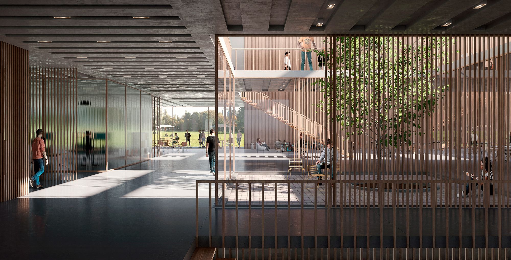
The following two images are from projects designed by me. They highlight the orthogonality of the design, which has always inspired me the most.
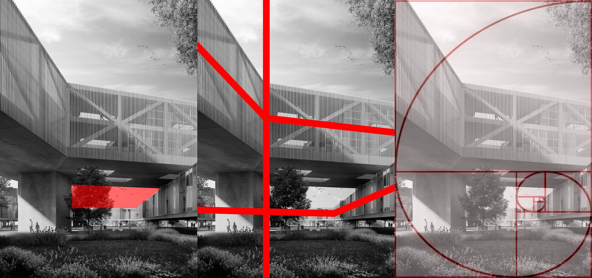
04
The framing of this image (04)combines perfectly with the design itself: frontal camera and orthogonality, which allows to appreciate the different depth planes generated in the project, and the light in turn intervenes in this effect: the foreground is dark, the following one is illuminated by overhead light coming down through the courtyards, and so on alternately, generating a contrast of planes.
The contrast between vertical and horizontal elements is also highlighted by the slats and linear elements of the design.
Different transparencies are also produced to allow spaces with different degrees of privacy. This is achieved through slats, transparent glass, and translucent glass.
Finally, subtle but important is the detail (the joints in the floor for example), which allows us to generate the realism of which we have already spoken previously.
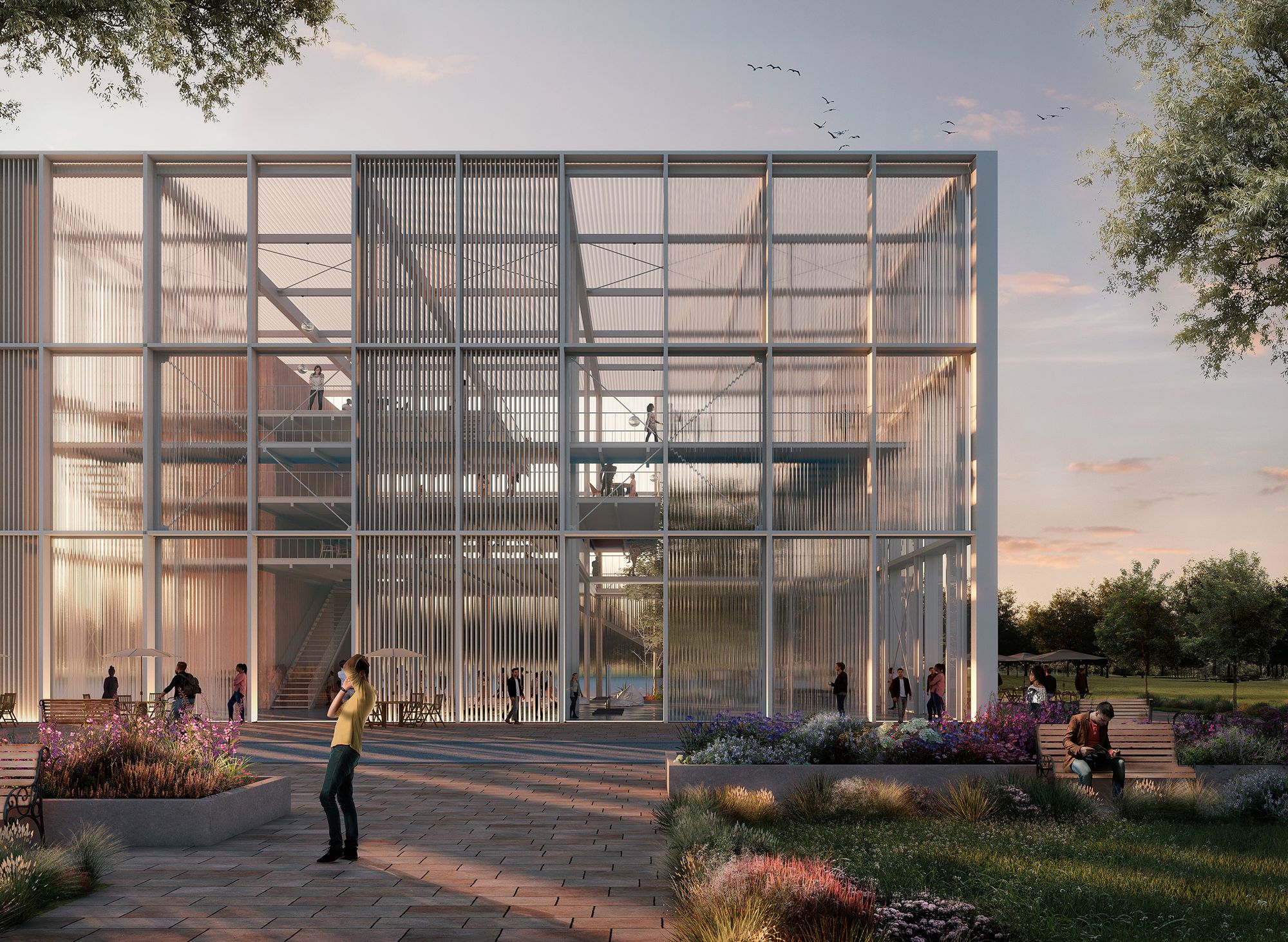
05
In this image (05) , in which the orthogonality also stands out, the most important things to highlight are:
-The framing, which does not let you see the building completely. An "air" is generated at the top and right side through which the image breathes, the building being framed by the orthogonal edges of the image (slight displacement of the camera).
-The "atmosphere". The warm tones of a sunset, playing with the orange light of the sun and the effects produced by the rough translucent glass. A perfect "harmony" is created.
06
This image (06) was created to give life to a project designed by a fellow architect during our career (Sira Rivero).
The framing and proportions are key in this image. The purpose was to show the most important feature of the project: the breaks in the design and the overlapping and differentiation of the upper and lower volumes.
The depth of planes is also generated, showing an air gap in the middle plane between the two volumes, also helped by the light, illuminating key areas and generating a contrast of lights in distant planes and shadows in frontal planes.
This depth is also achieved by the vegetation elements placed in the foreground, which always help to reference the scale of the project and of the character "taking the picture".
The materiality and detail of the project is also key in the image: there is a clear differentiation of materiality between the upper volume (wooden slats) and the lower one (metallic lattices).
Special care and attention to the materials are key to achieve greater realism: the direction of the textures according to the project, their scale…
070809
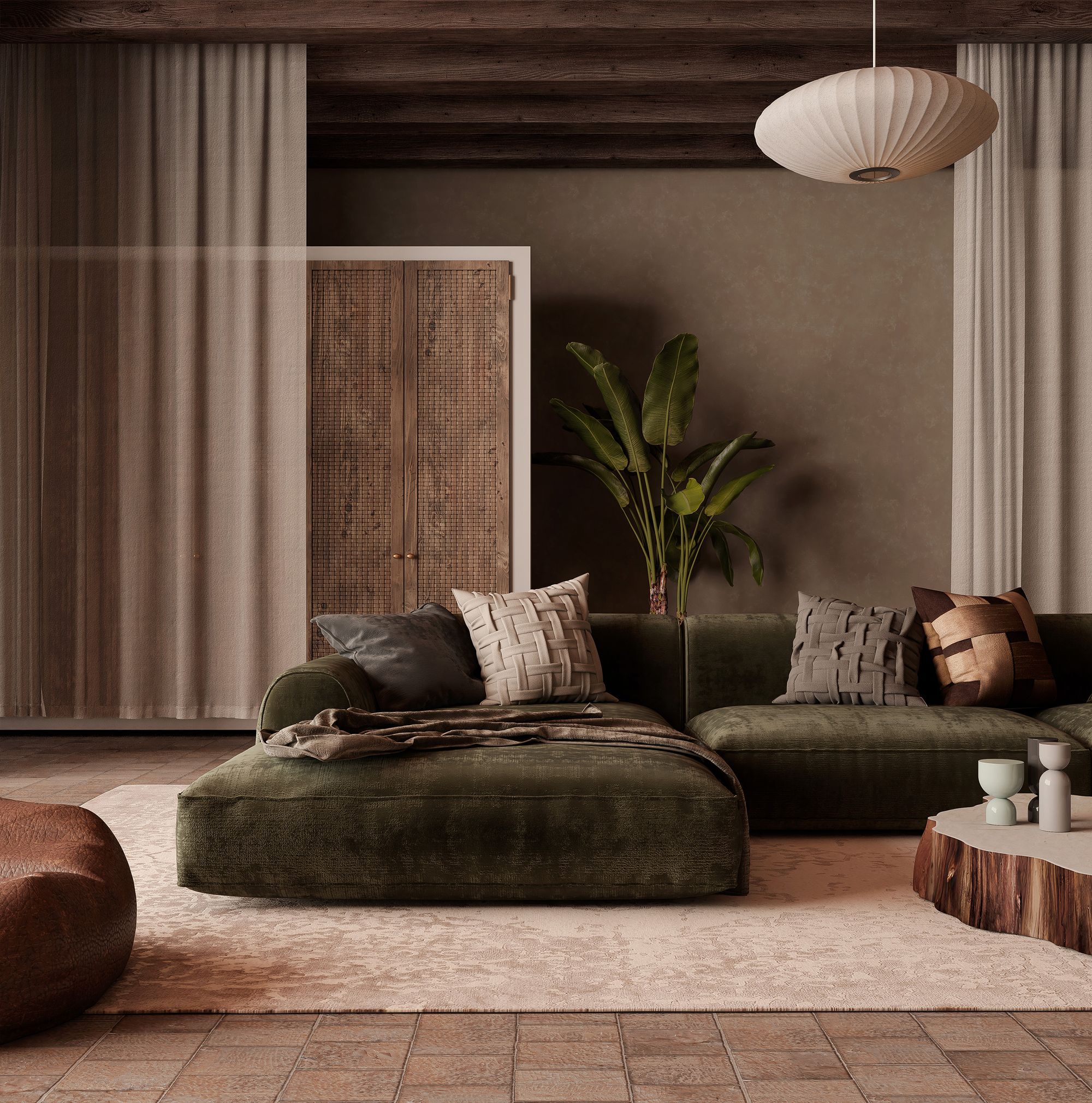
The tonalities and the light as we have already said play a very important role. These 3 interior images (07,08,09) have different atmospheres and ambiances. Obviously the design of the project and its use have a lot to do with it.
In the first image (07) a cream tone predominates, smartly combining the colours of the furniture (greens, browns and creams). The diffuse and soft light coming from a window that cannot be seen helps to generate this cozy and relaxing atmosphere.
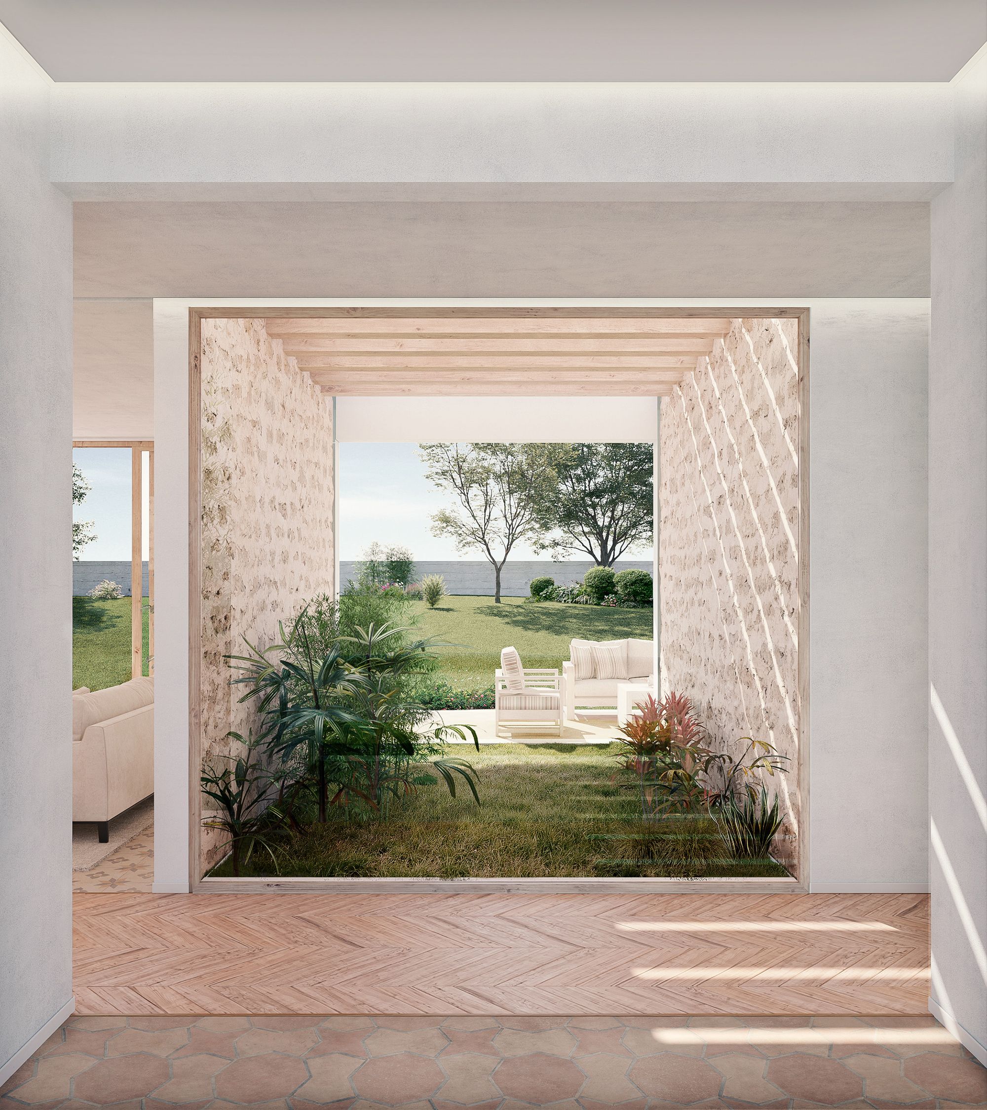
In the second image (08), light tones predominate, contrasting and combining with the vegetation of the patio and garden.
The strategic lighting of the sun helps to frame the image and to follow that orthogonality and depth achieved through the succession of planes. From a single point, we cross the house at a glance: from the entrance, the hallway that communicates longitudinally, the courtyard and the garden, intuiting adjacent spaces such as the living room. It is clear that spatial fluidity that we want to achieve in the project.
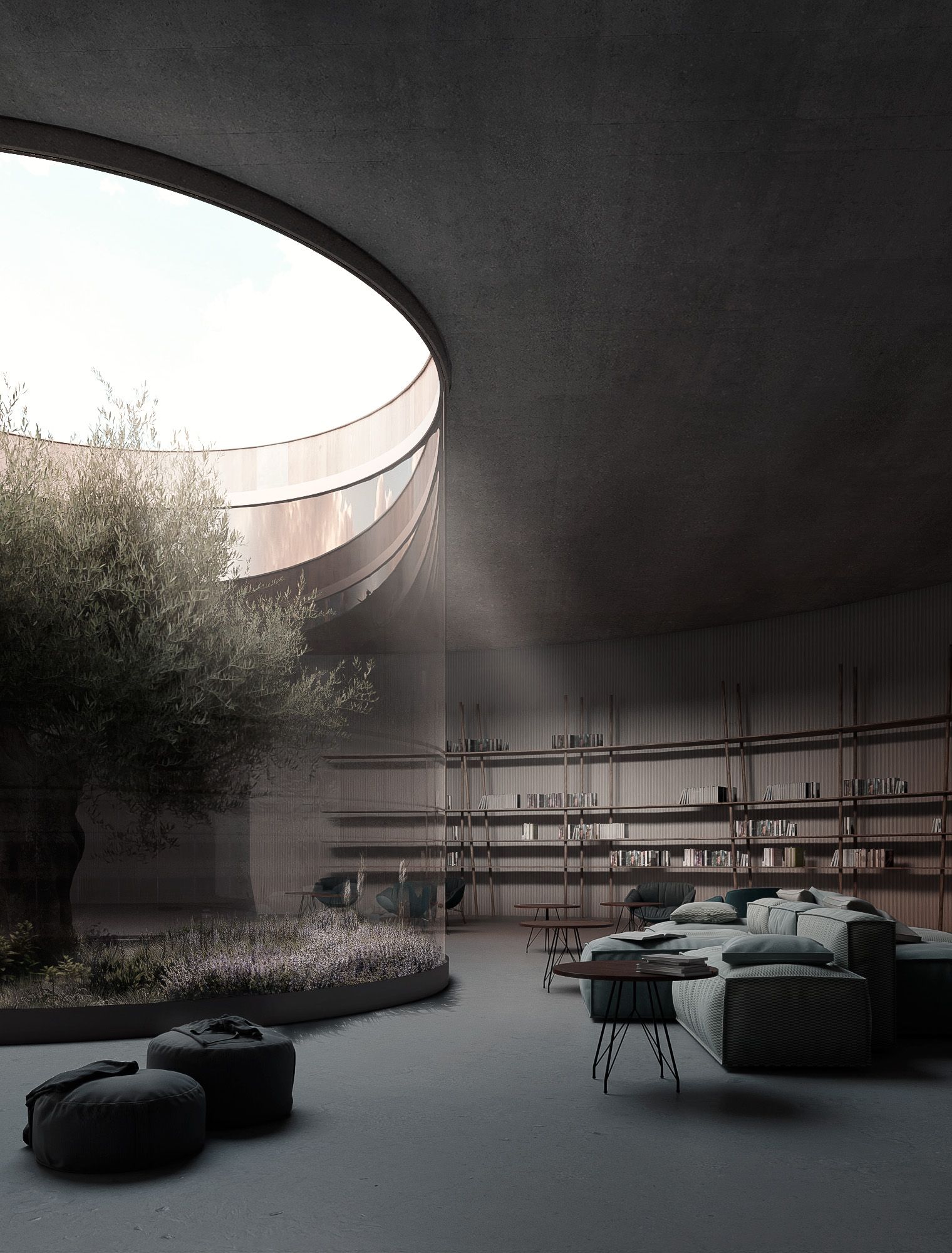
The third image (09) has a totally different nuance.
It aims to be a more "mystical" and "romantic" space, dedicated to reading and silence. This is achieved through the tonality of the floor and furniture, tending to rather dark woods, and a very soft zen lighting.
The architecture also influences this sensation: organic spaces, with the perfect and relaxed shape of the circle as the protagonist.
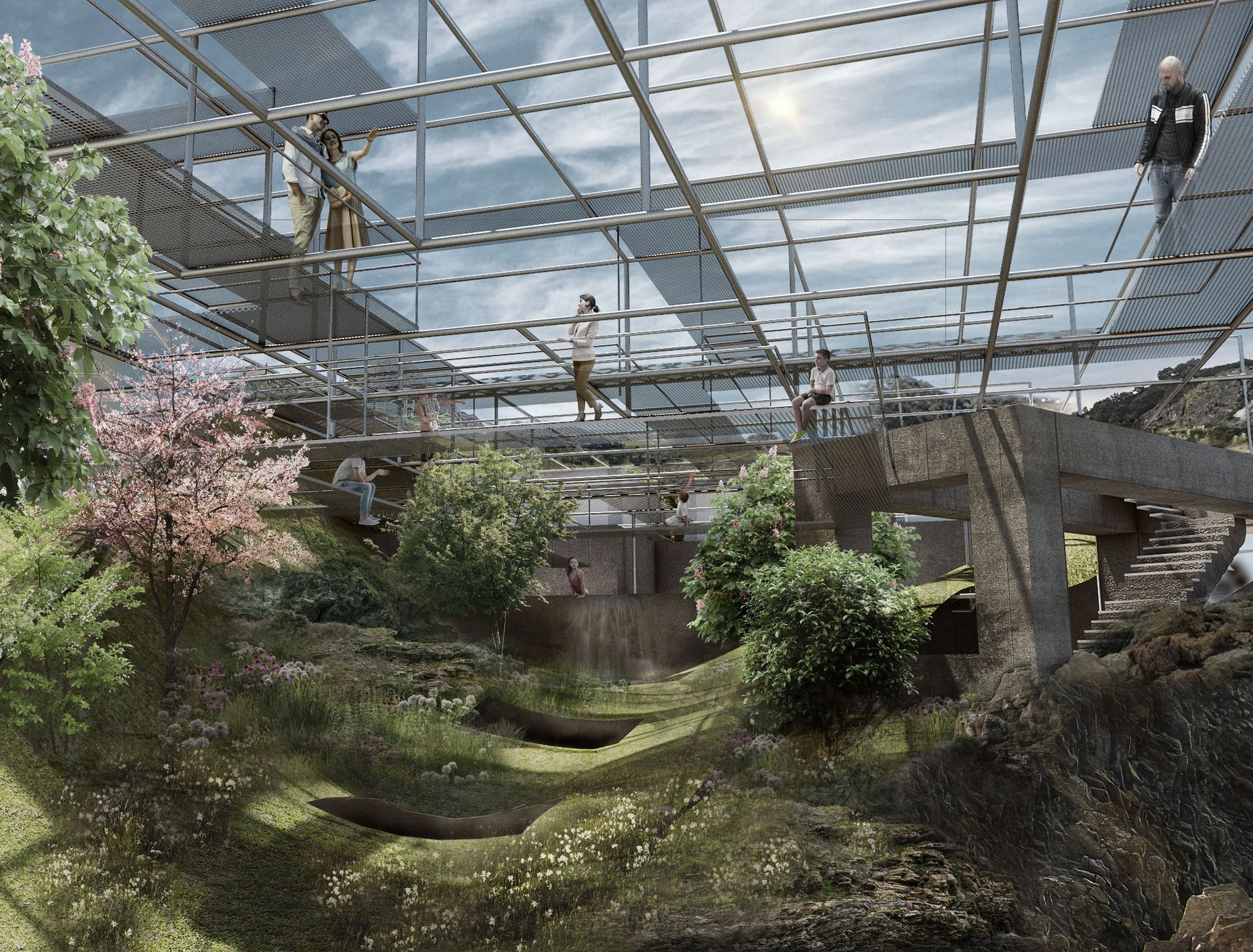
10
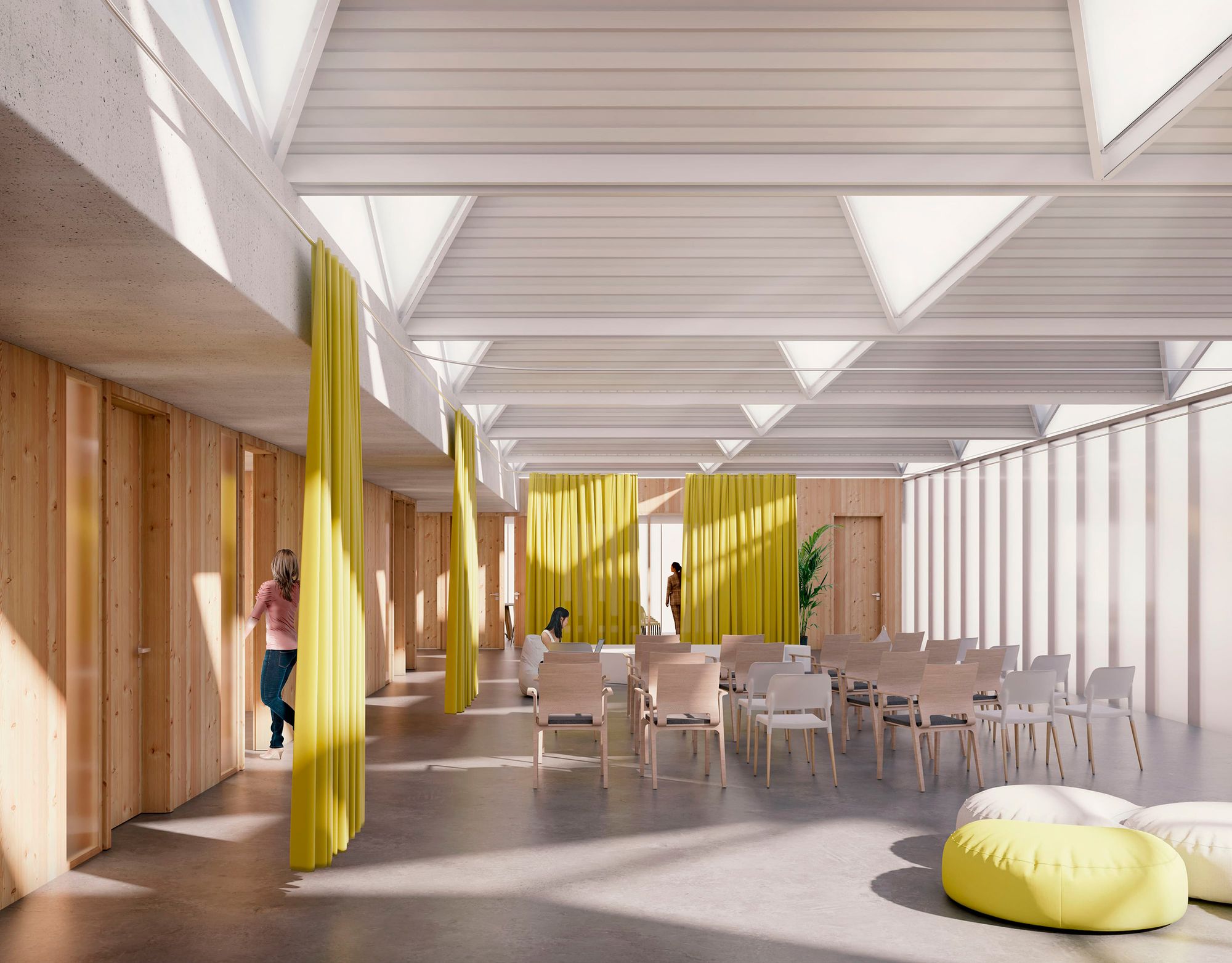
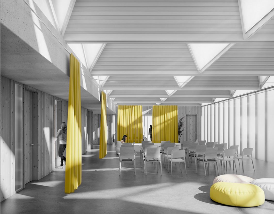
I created this image for Diaz y Diaz architects. They entered a competition with this project in which the roof is of great importance.
The keys in this image are indisputably:
The frontal framing but slightly displaced
The incidence of light: the particularity of the triangular truss roof is made latent through the sunlight that filters through the holes in the metal roof and creates interesting effects in the space.
The play of rather neutral tones, with the warm touch of wood, and the contrast with yellow, a tone that takes on a significant role in the image.
11
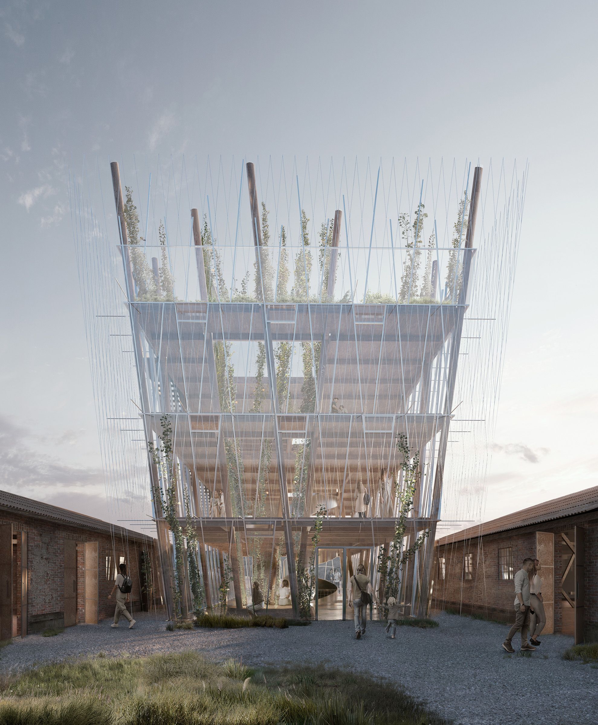
This image for Pysall Architekten advocates a deceptive symmetry. The framing is symmetrical, however that symmetry is broken by the design of the project itself.
I managed to create a harmony of soft tones, predominating two tones: brown and green. All the elements of the image are integrated with this environment without clashing.
The soft and diffused light is also part of this harmony, as it provides softness in lighting and shadows and creates a "romantic" atmosphere.
The vegetation has been meticulously integrated in photoshop, taking care of its tonality, saturation, lights and shadows.
Also important is the careful treatment of the building's glass with its reflection, the details of the metalwork and the exterior ropes that are anchored to the facade to allow the "hops", the beer plant, to grow.
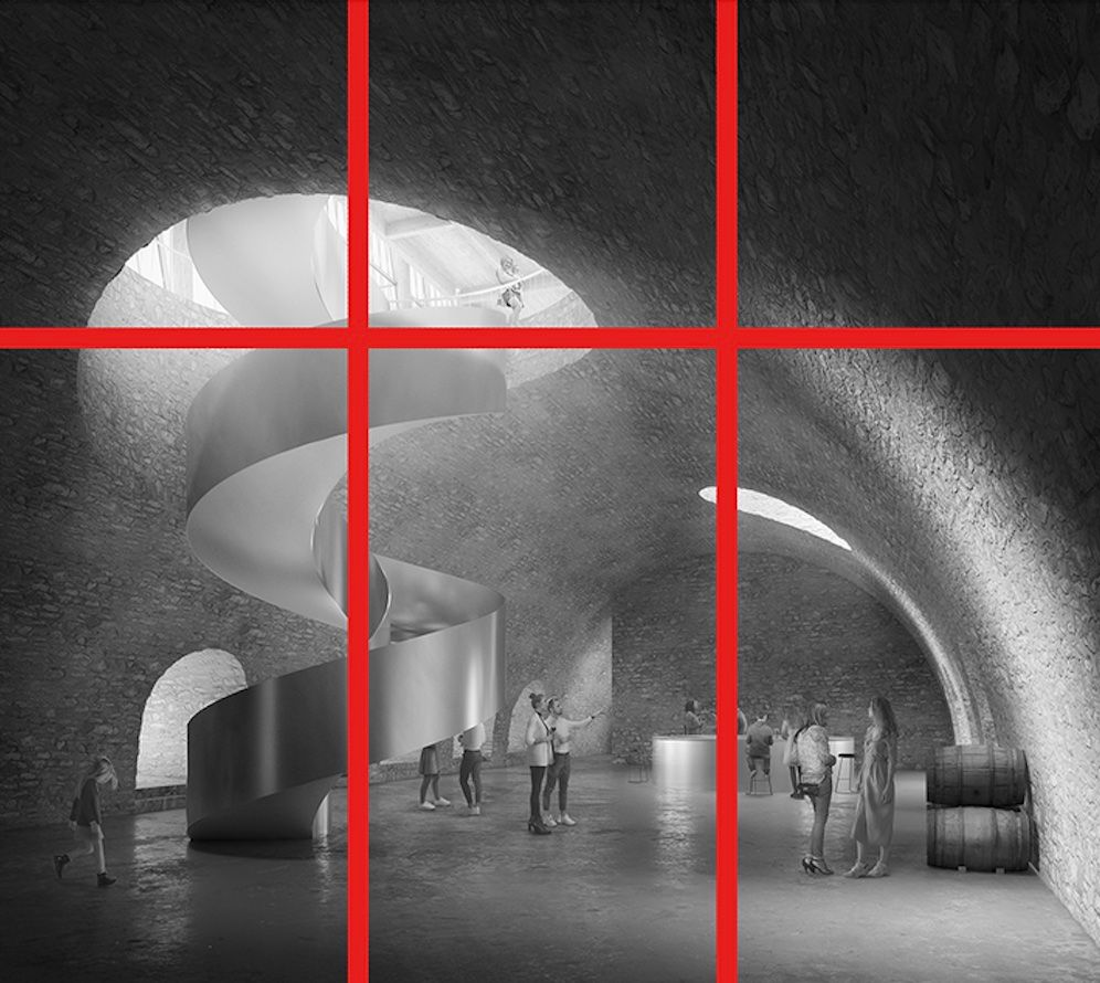
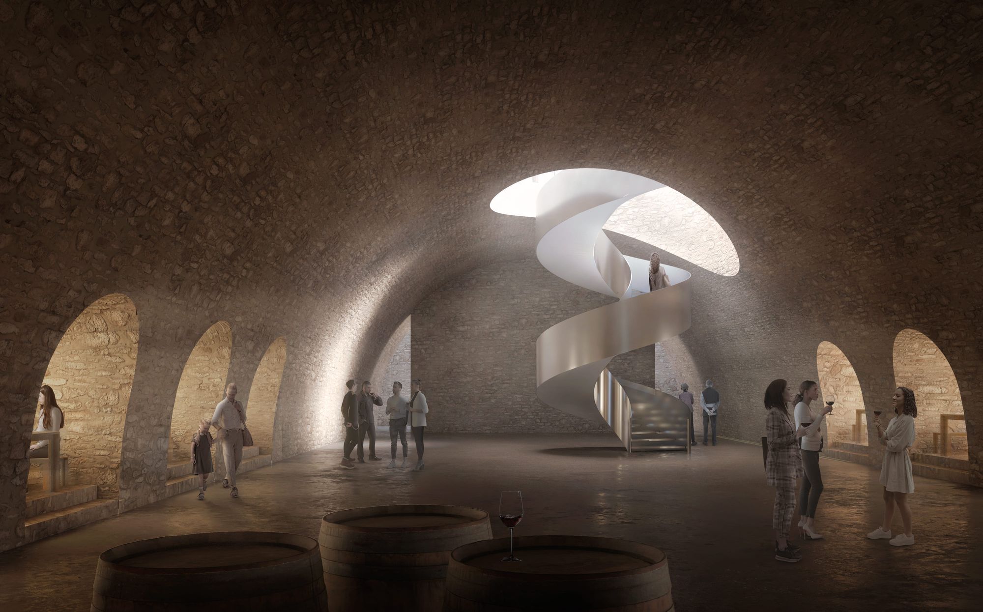
1213
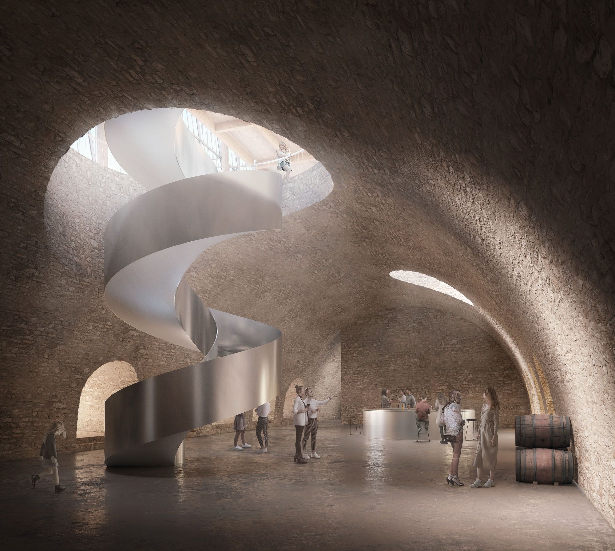
These two interior images (12,13) are part of the same project, and as in the exterior, the harmony of tonality and illumination is achieved.
As for the framing and proportion, in these cases we have opted for a clear criterion of the rule of two thirds. The most important element of the composition, the staircase, has been placed in one of the thirds of the frame.
This aspect, together with a zen-like illumination through the perforation through which the staircase emerges, makes the eye inevitably focus on this protagonist element.
Many spaces in shadow are generated, which are bathed with warm light coming through the perforations of the cylindrical wall on the sides. The treatment of light is key in these images.
The position of the barrels in the foreground, as well as the people placed in different planes generate a sense of depth and give us an approximate idea of the dimensions of the space.
Also the care of the materials is essential: the scale of the stone, its roughness, the reflection on the imperfect and rough floor…
We are born of light. The seasons are felt through light. We only know the world as it is evoked by light.
Showing visually a project is the most decisive phase, the one that enters through the eye, the one that makes someone fall in love with the idea and the form, the appearance, the one that allows you to finally imagine, as it is a very accurate approximation of reality, a «spoiler» of what it will be.
My intention and capacity are always focused on a faithful representation of the project, but also capable of transmitting and evoking atmospheres and sensations.
Reach out to Ana María Pérez Heydorn via her Rookies profile here.