Redefining What's Possible: A 3D Artist's Guide to Bending the Rules
Meet Set, an artist from Cambodia pursuing a Master's at ESMA, France. Join Set as he explores innovative 3D rendering techniques, pushing artistic boundaries.
Meet Set, an artist from Cambodia pursuing a Master's at ESMA, France. Join Set as he explores innovative 3D rendering techniques, pushing artistic boundaries.
Introducing Moniviphouset Phann (known as Set), a talented artist hailing from Cambodia and currently pursuing a Master's degree at École Supérieure des Métiers Artistiques (ESMA) in Montpellier, France, and looking for an internship opportunity. In this insightful article, Set looks at 3D rendering, offering unique perspectives and innovative solutions to come up with new creative outcomes, pushing artistic boundaries.
Hey everybody! My name is Moniviphouset Phann, but please, call me Set. I am originally from Cambodia and currently pursuing my Master's degree at École Supérieure des Métiers Artistiques in Montpellier, France. Or by its other, more widely-used/known name, ESMA.

Today, I am about to share something special with you, something a bit long and wordy but still special. In this article, I will be talking mainly about 3D rendering and how we can approach things from a different angle to find creative and innovative solutions.
I have divided this article into sections which I will list below to give you a heads-up and also in case you want to skip directly to a specific part. You would have to scroll down manually though.
So please, if you plan on reading through everything, make yourself comfortable and prepare some tea.
Without further ado, let us start.
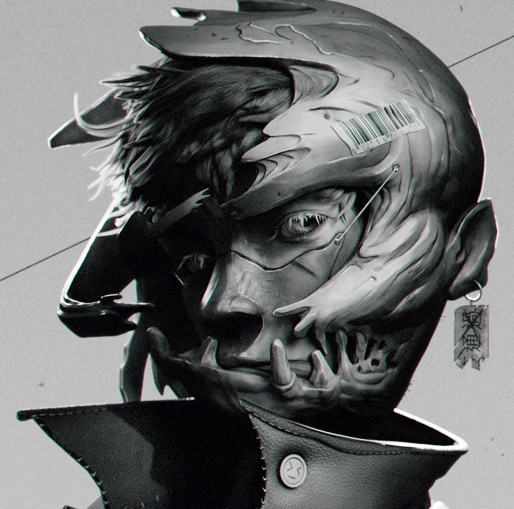
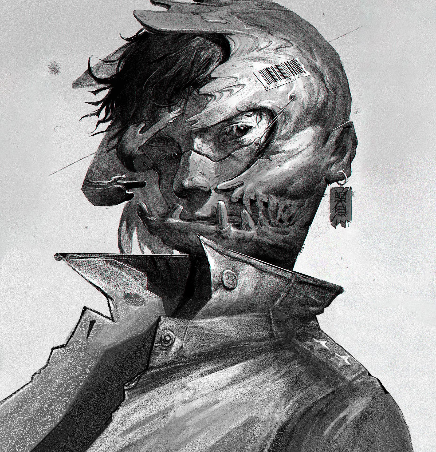
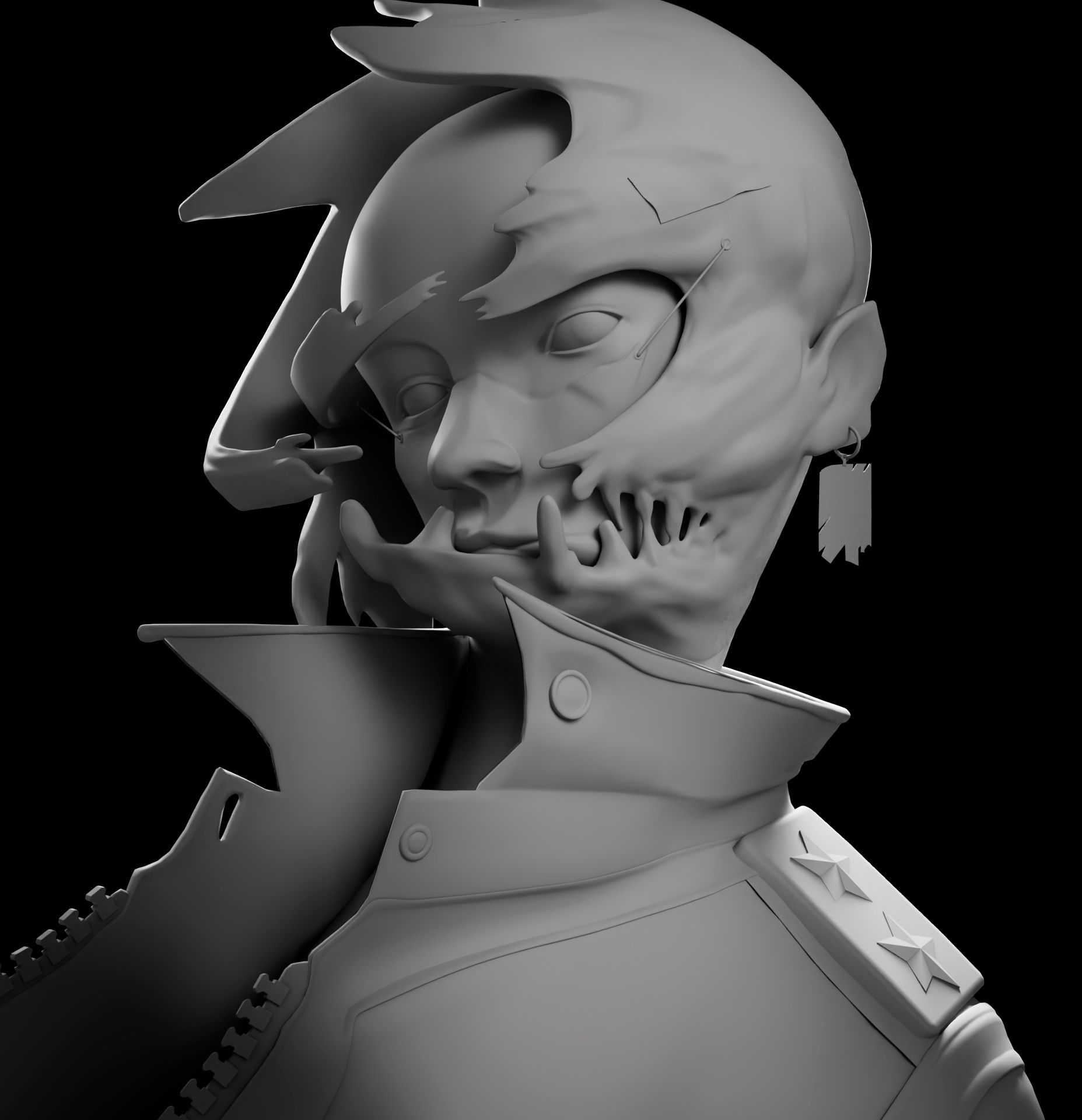
This project was part of the texturing & rendering specialisation course at ESMA. The task was to create a 3D character based on an existing 2D concept art as closely as possible.
The idea for this project came from when I started 3D years ago where I was also learning to draw at the same. I loved how clear, how detailed 3D can be and how complex it can get. In contrast, I fell in love with the simplicity of drawing. I fell in love with how you can play with form and how a few lines can change the depth and feel of everything.
Now that I have acquired some skills, it's time to go back and challenge my roots as an artist. My goal was to explore new techniques while simultaneously challenging myself. What better way to do that than to combine pencil shading techniques with 3D rendering?
When I first saw this concept, I thought to myself: "How am I going to manage this?" but I like a good challenge.
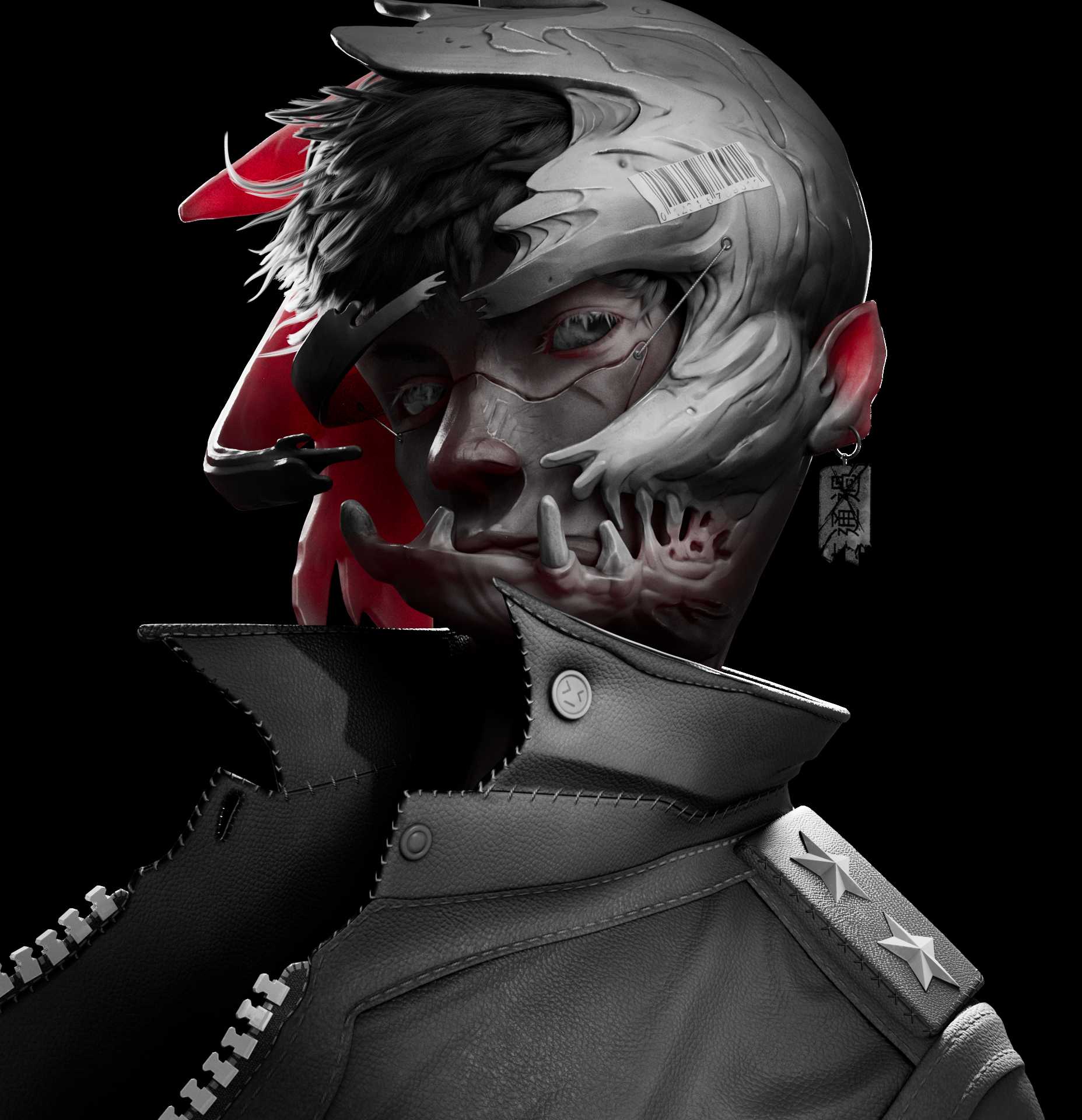
I fell in love with Shawn Lin's drawing instantly. This drawing really tickled my fancy as it embodies everything I enjoy about drawing. I was particularly drawn towards his ability to render form. The way he lightly darkened the edges to separate things. How everything seemed to fade away into the shadows.
During three to five days, I scoured the net for works that pushed the boundaries of 3D rendering. Looking for inspiration and studying artworks as I went. My favourite place to gather references is ArtStation. This site is a huge reservoir of artwork and I recommend everyone to start their search there. Also, The Rookies project area is another great place to look for inspiration!
Then, I used Photoshop to put everything together. I like it when things are clean and organised.
When I gather references, I like to keep things concise to not get lost in ideas. I use PureRef to put my references together to make a reference board.
What's the difference between this and the picture above? Absolutely nothing in the long run. I have two sets of references which enable me to quickly divert my attention. One set is for how I want the project to evolve, shown in the picture above. The other set is for things that inspire me.
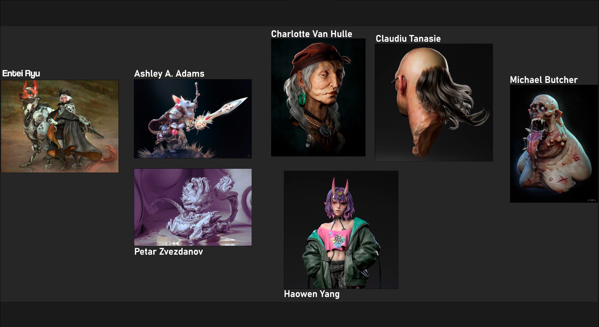
These are the artists who influenced the choices I made throughout the project.
The subsurface scattering was heavily influenced by Ashley A. Adams's work. When it comes to hair, I was inspired by Claudiu Tanasie and Charlotte Van Hulle. For Entei Ryu, I just love Entei Ryu. I love how loosely and fluidly she sculpts which impacted the way I sculpted as well.
The work of Michael Butcher opened my eyes to the importance of contrast. Meanwhile, Petar Zvezdanov showed how he used pencil shading in 3D. Finally, Haowen Yang helped shape the texturing process behind the jacket.
I began the project with a short Q&A where I asked myself a series of questions to determine the software and techniques I would be utilising. I do this all the time as the pre-production phase can significantly impact and shape how you do and will do things. At least in this case, how I did things. This is why analysing references is important.
For this project, I went with Blender and ZBrush for sculpting.
I find Blender to be a lot more efficient as I can sculpt and model as I go. I used Zbrush to add high-level details thanks to its stability.
For the texturing part, I wanted to go for something half procedural so I used Substance 3D Painter to texture things. It is pretty much my go-to software for texturing. Half procedural in the sense that I would be using baked maps, procedural noise... etc instead of projecting things.
Then I used Maya to put the scene together and Renderman to render it.
As the final step, I will composite the renders in Nuke.
I want to clarify that advanced compositing programs like Nuke are not necessary for post-processing. Although Photoshop is sufficient for still images, if you wish to learn compositing, I highly recommend checking out Blender's compositing package.
Finally, I went back to Photoshop to paint a finished jacket to give the character more... character.
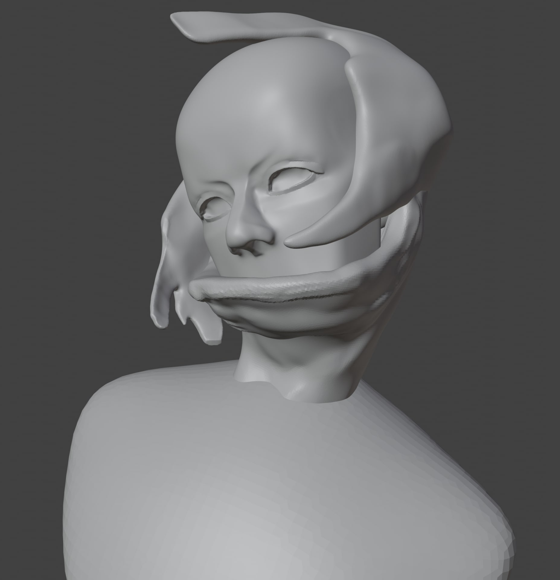
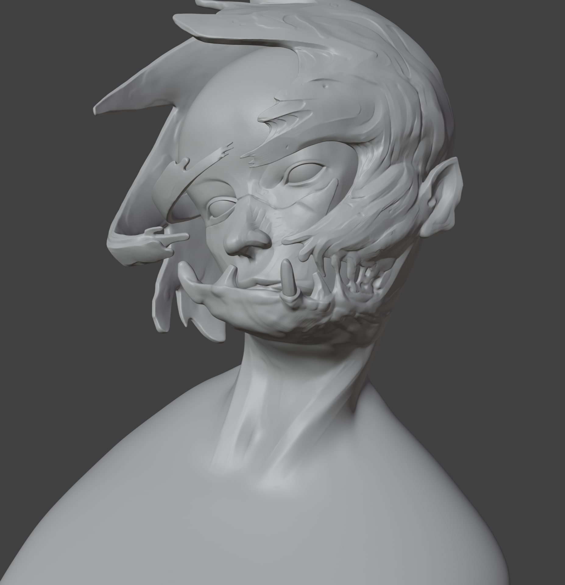
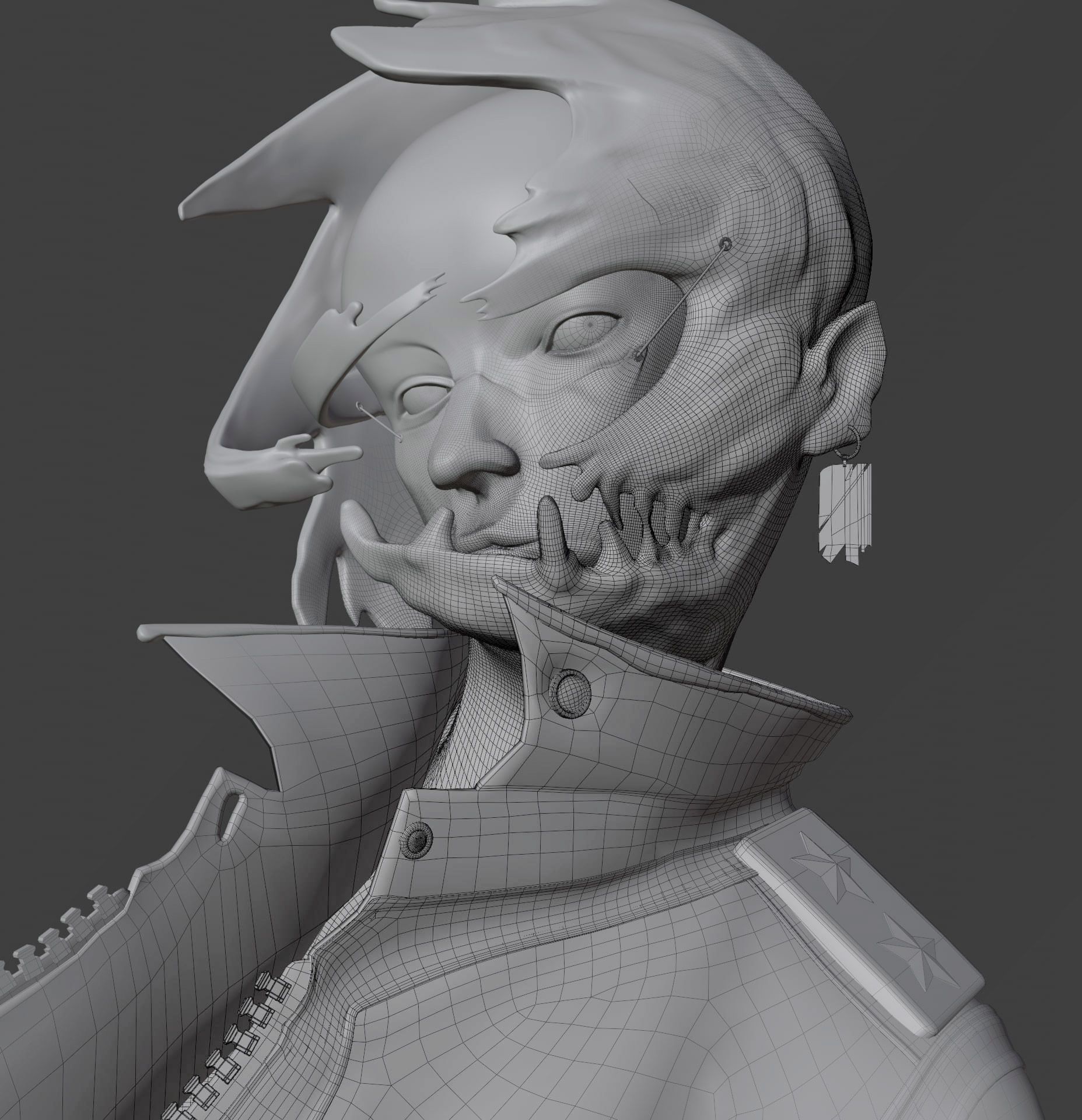
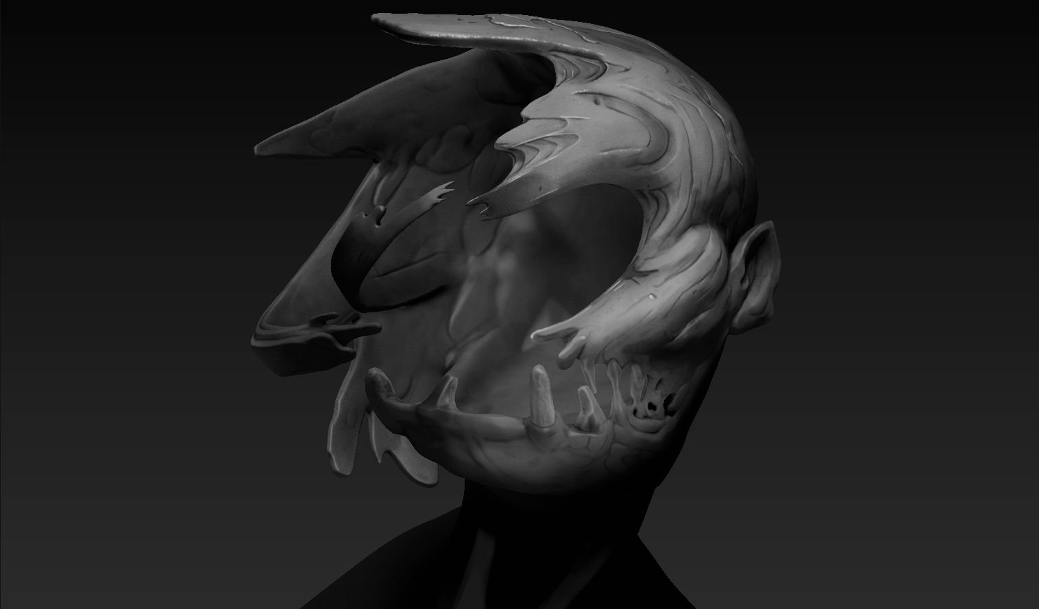
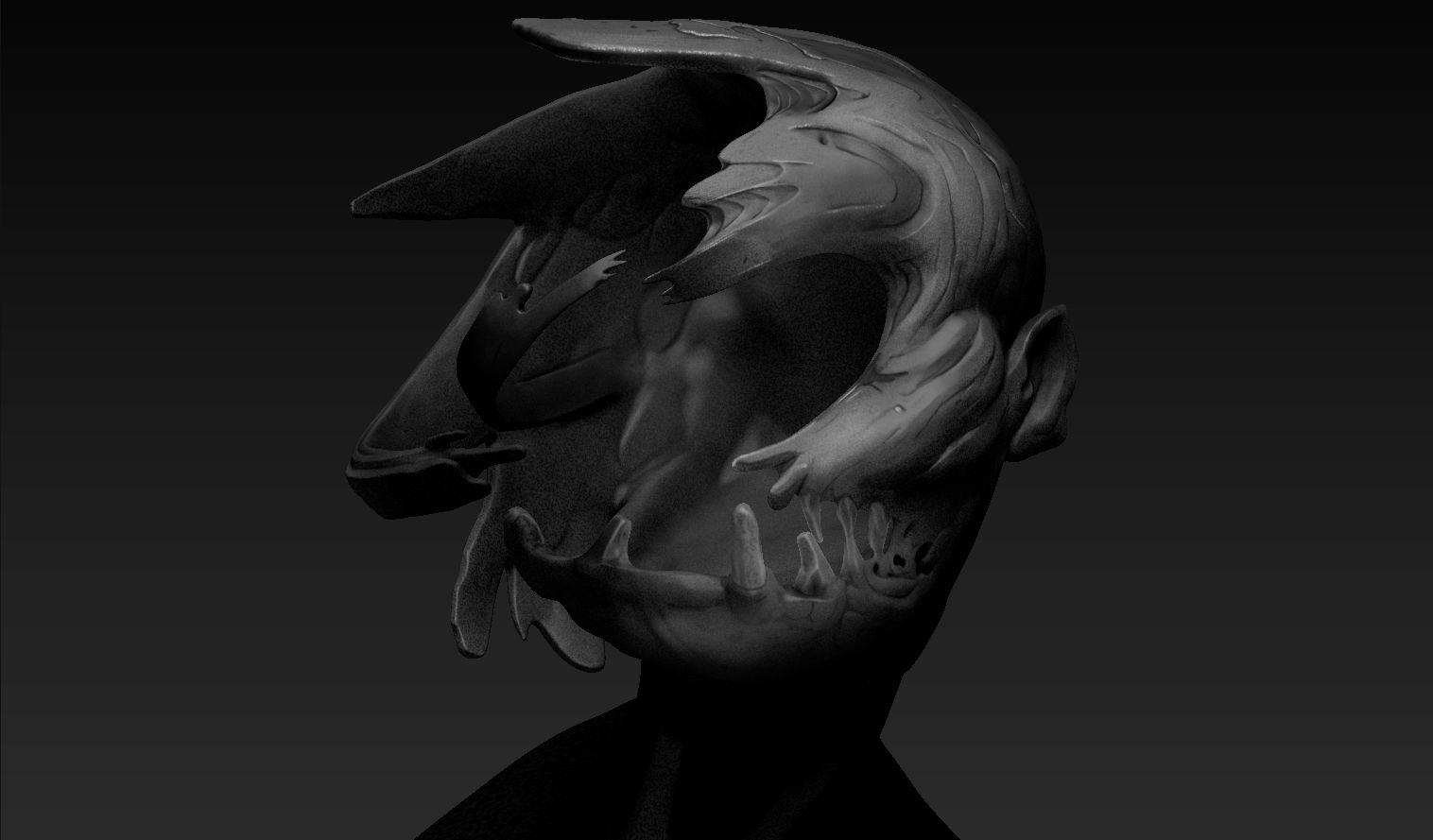
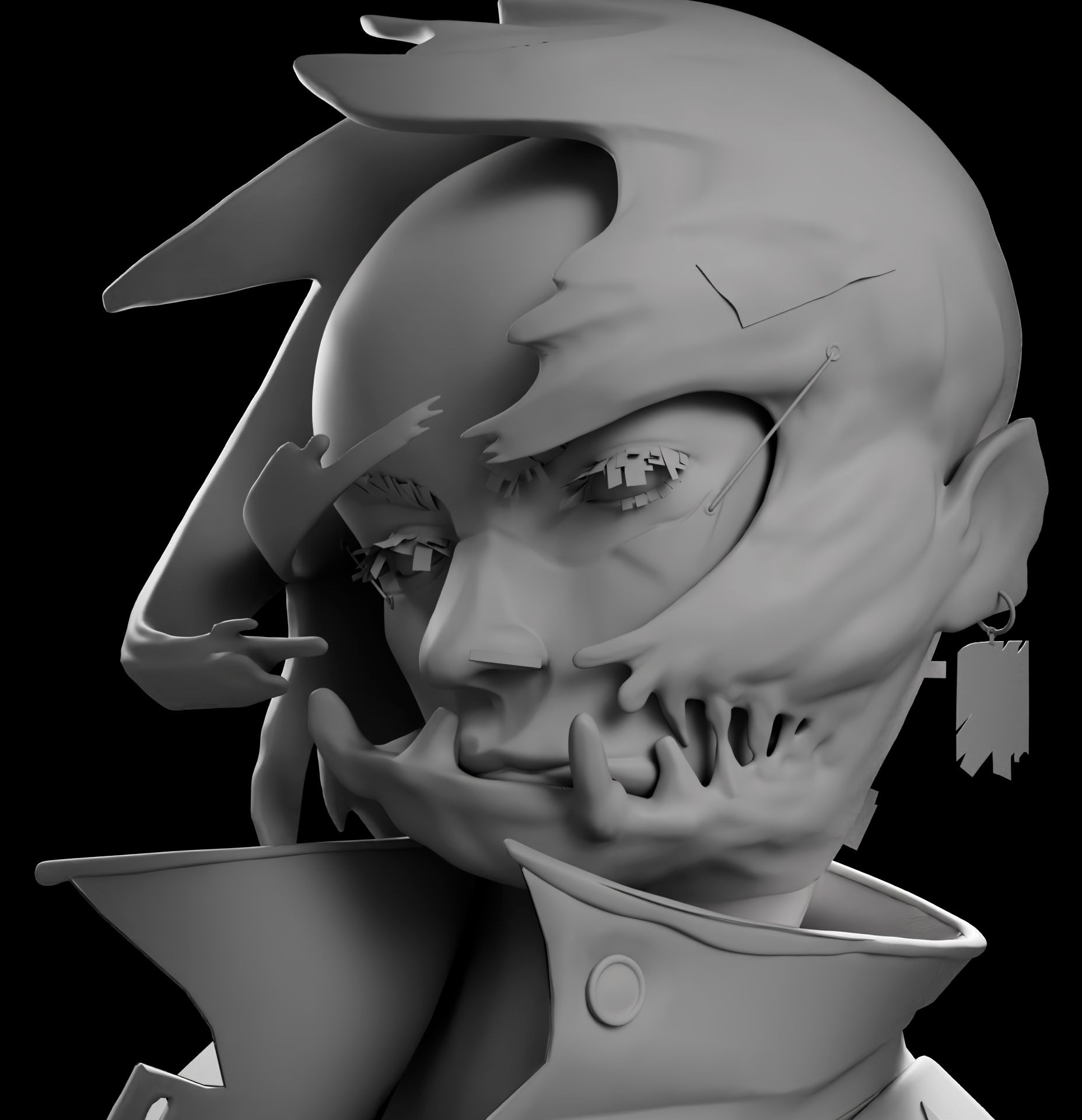
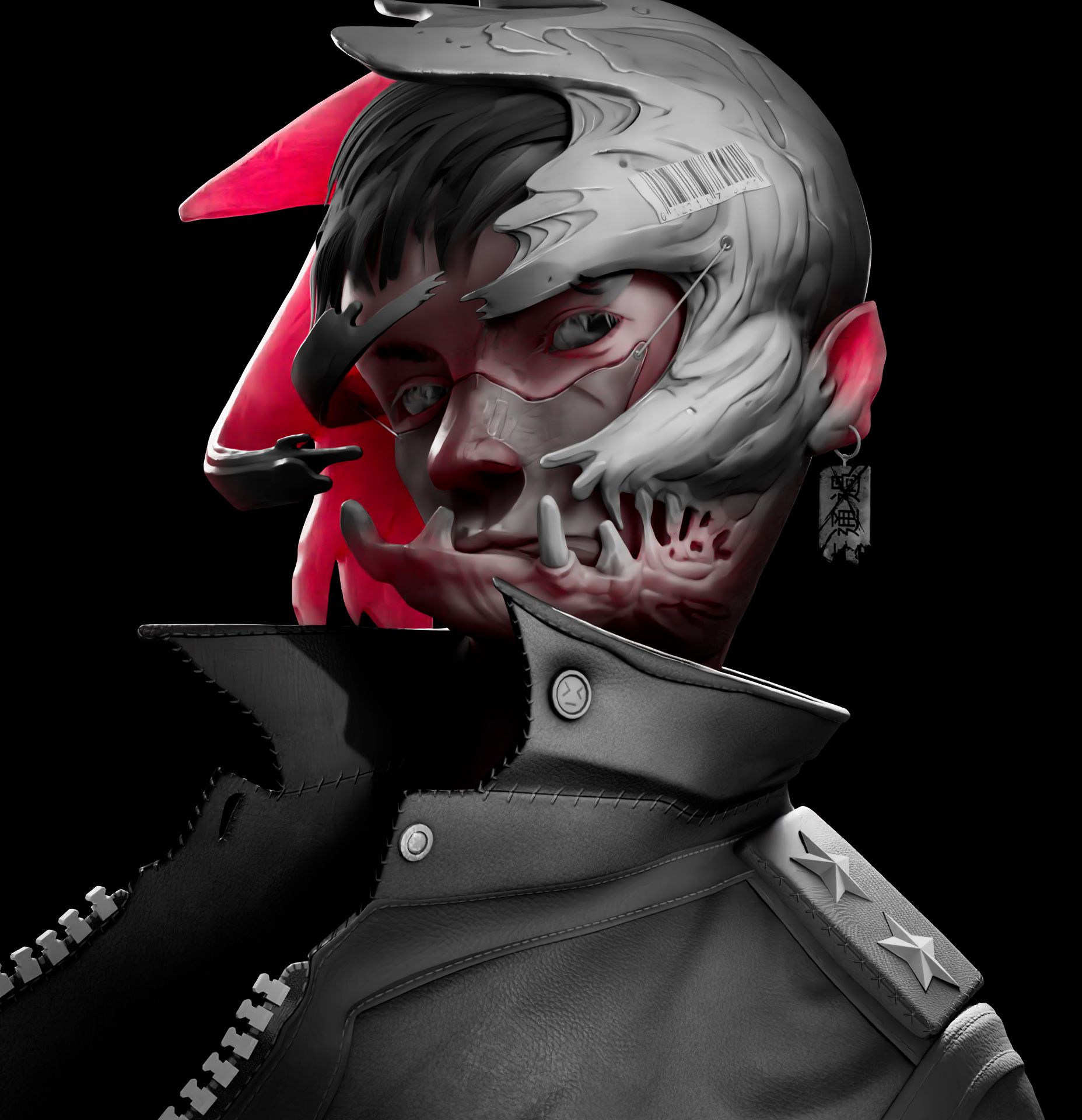
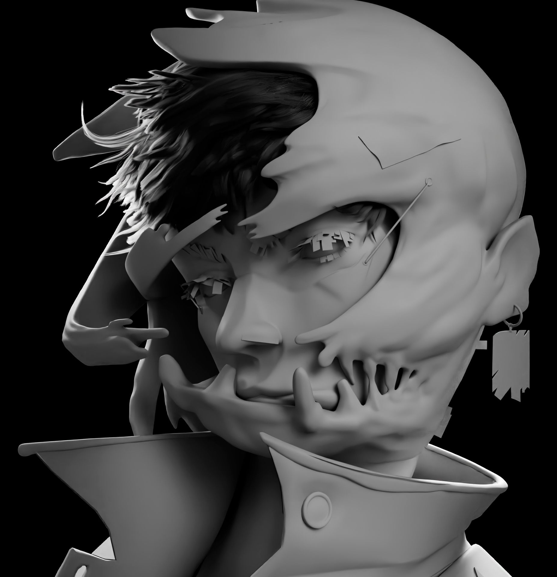
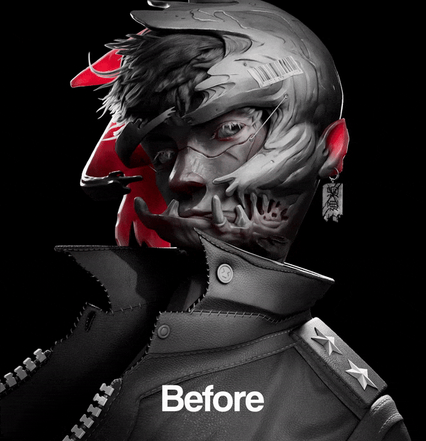
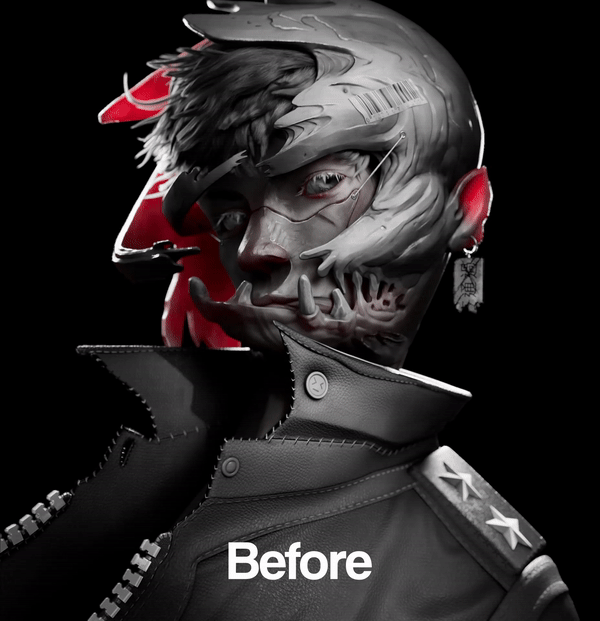
To be honest, sculpting this character was quite challenging as he had a busy design. Because of this, I had to be very careful with how I interpreted and reimagined things in 3D.
I started by blocking out the shapes to recreate the proportions found in his drawing.
Tip: Make sure to turn around the sculpt often to avoid flat and disproportionate sculpts.
When doing anything in 3D, you always have to tell yourself to trust the process. Things never look good when you've just started so rest assured because in every project, there is a glow-up.
When sculpting, it's always good practice to try not to sculpt everything in one block but to add to it as you sculpt.
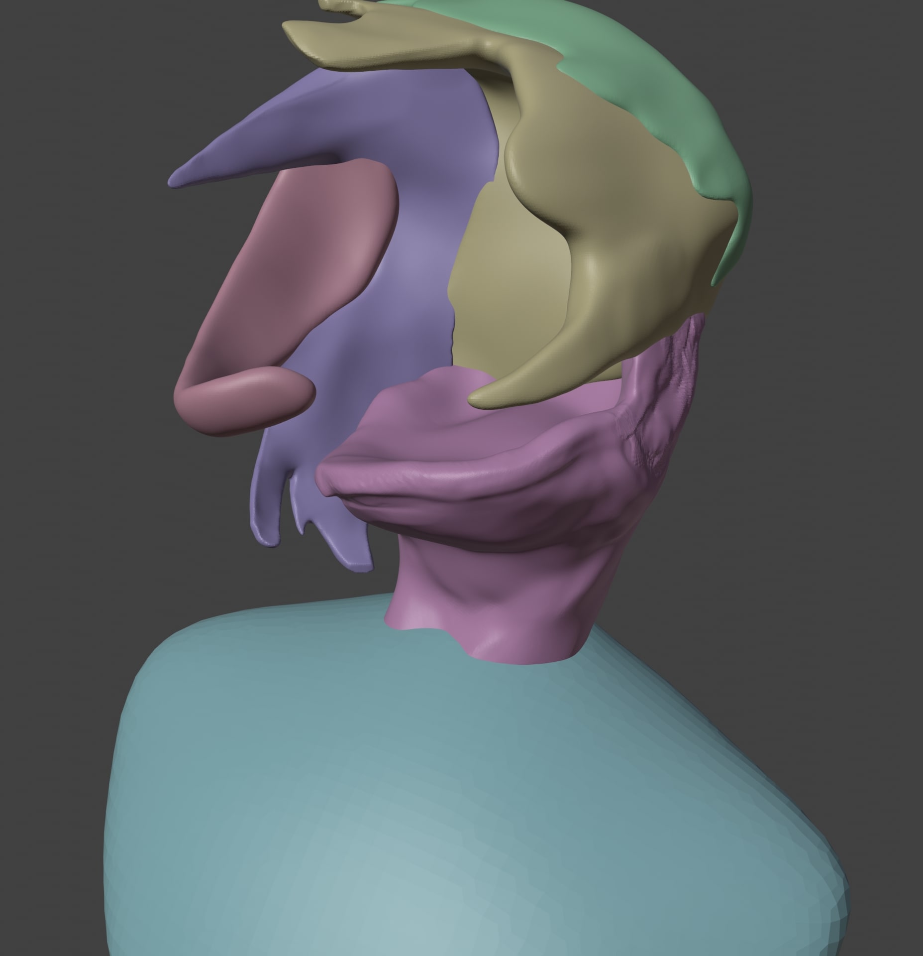
This gives you more control as you can sculpt parts of your model without having to mask things out all the time. Another advantage is that you can manually add subdivisions to parts of your sculpt.
Another good technique is to use dyntopo (if you're using Blender) or sculptris mode (if you're using ZBrush). This a very neat way of managing the level of detail as well since it allows you to add or remove topology as you sculpt. The use case is the not same though.
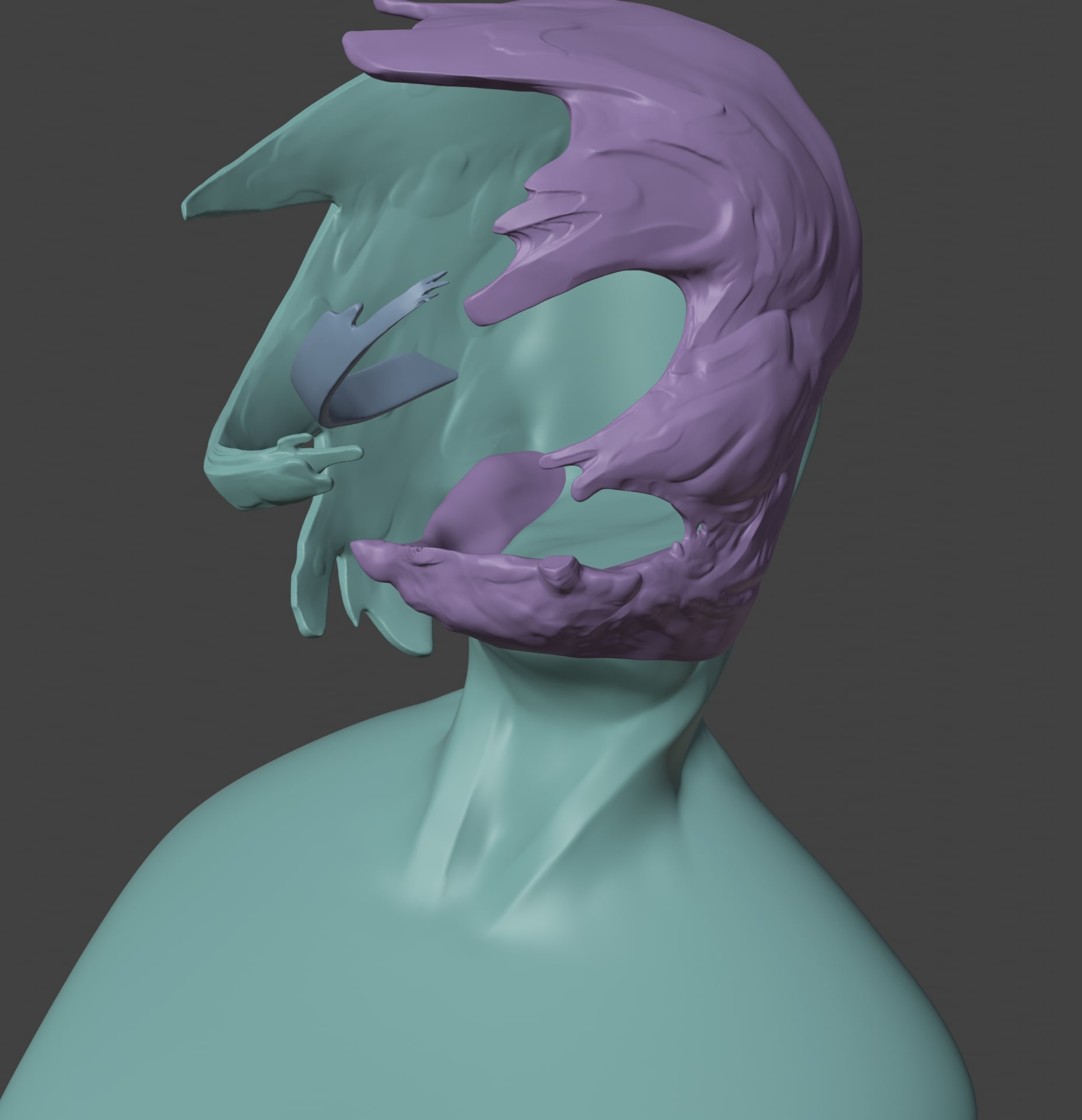
Afterwards, I combined the parts together and added more details as I continued. Of course, with the reference right next to me. Never work without references!
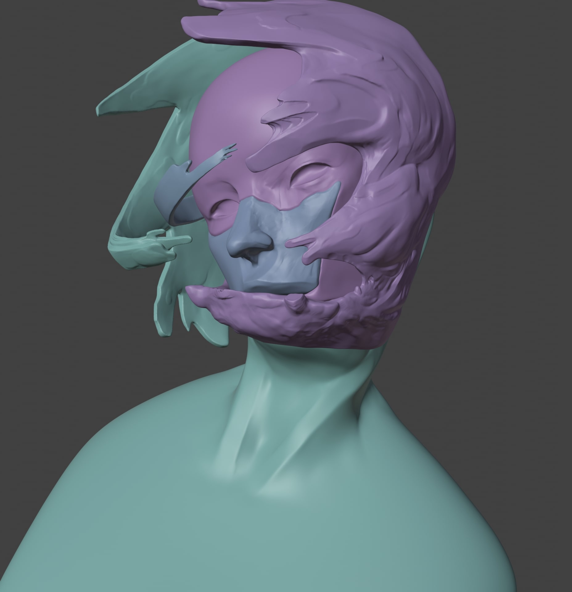
The same applied to the head but instead of separating it into tiny pieces, I separated it into two parts. The head, and the front of the face.
When I was working on the sculpt, I was torn between making something look good and logical. This is because the face of the character looks correct in this perspective. What's actually happening is that the face is melting on one side.
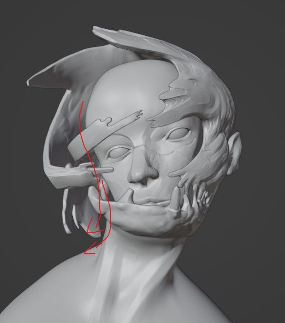
I decided to keep it like this to stay true to the disfigured design of the character.
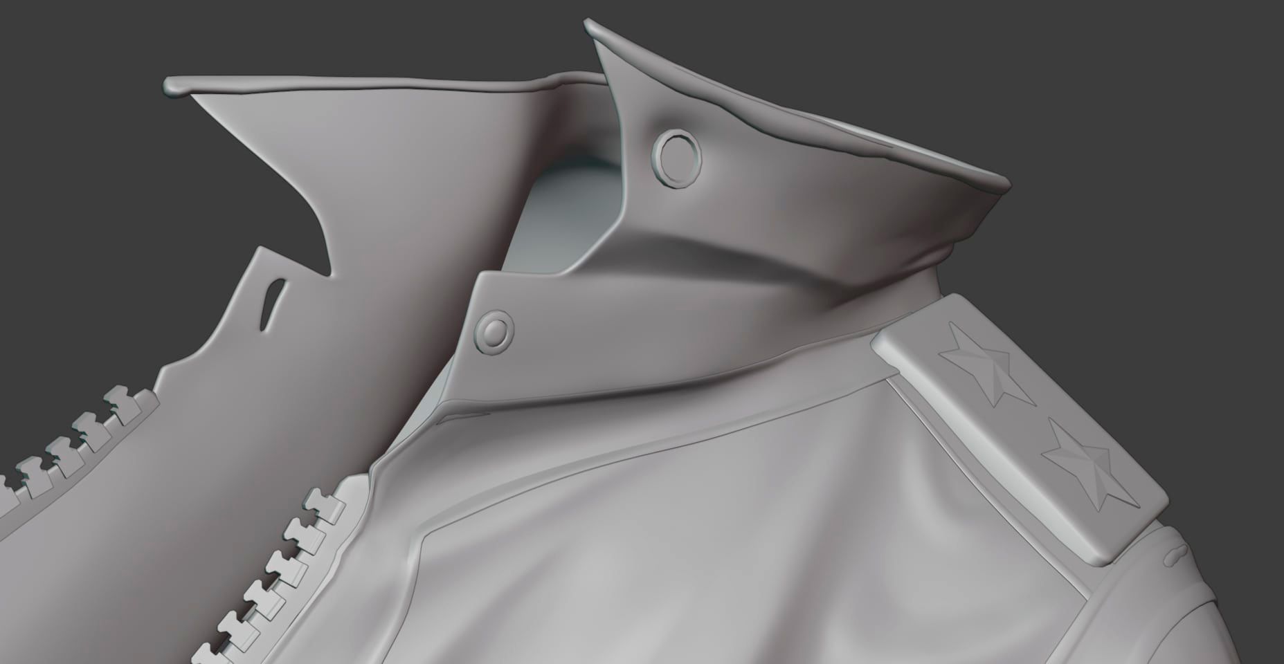
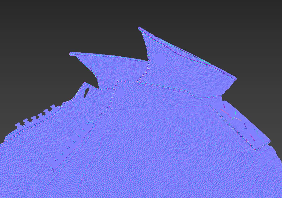
After modelling everything in Maya, I brought the jacket over to Blender to sculpt the folds. I tried to match the design language as much as possible by using Shawn Lin's other works as references.
I had the pleasure of not having to worry about the topology for this project since it will be a still image. Despite that, I still encountered problems because of the complexity of my model.
A good tip I have for retopologising humans is to use anatomy. Anatomy is helpful as it can help define the topology flow. This is because the muscles in our body work in tandem to create a movement. So if you are unsure about where to place the loops, take a moment and try to understand the mechanics of your model.
Afterwards, I used Zremesher to retopologize the sculpt by separating it into several polygroups. Unfortunately, there were areas where Zremesher messed up so I had to fix it in Maya. Despite that, Zremesher is probably one of the most powerful remeshing tools I know. The efficiency it brought to retopologizing is just too big to ignore. It is so efficient that I now always start with a base from Zremesher when doing retopology.
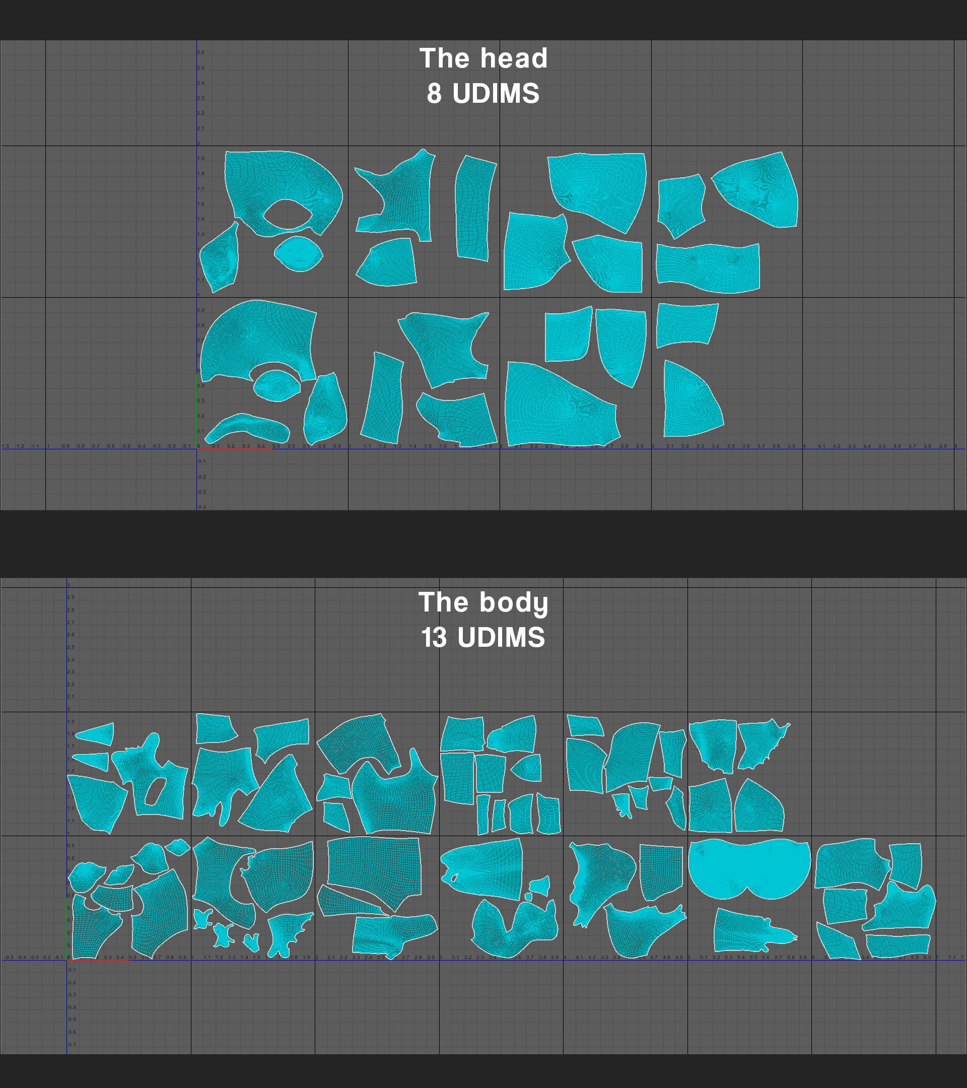
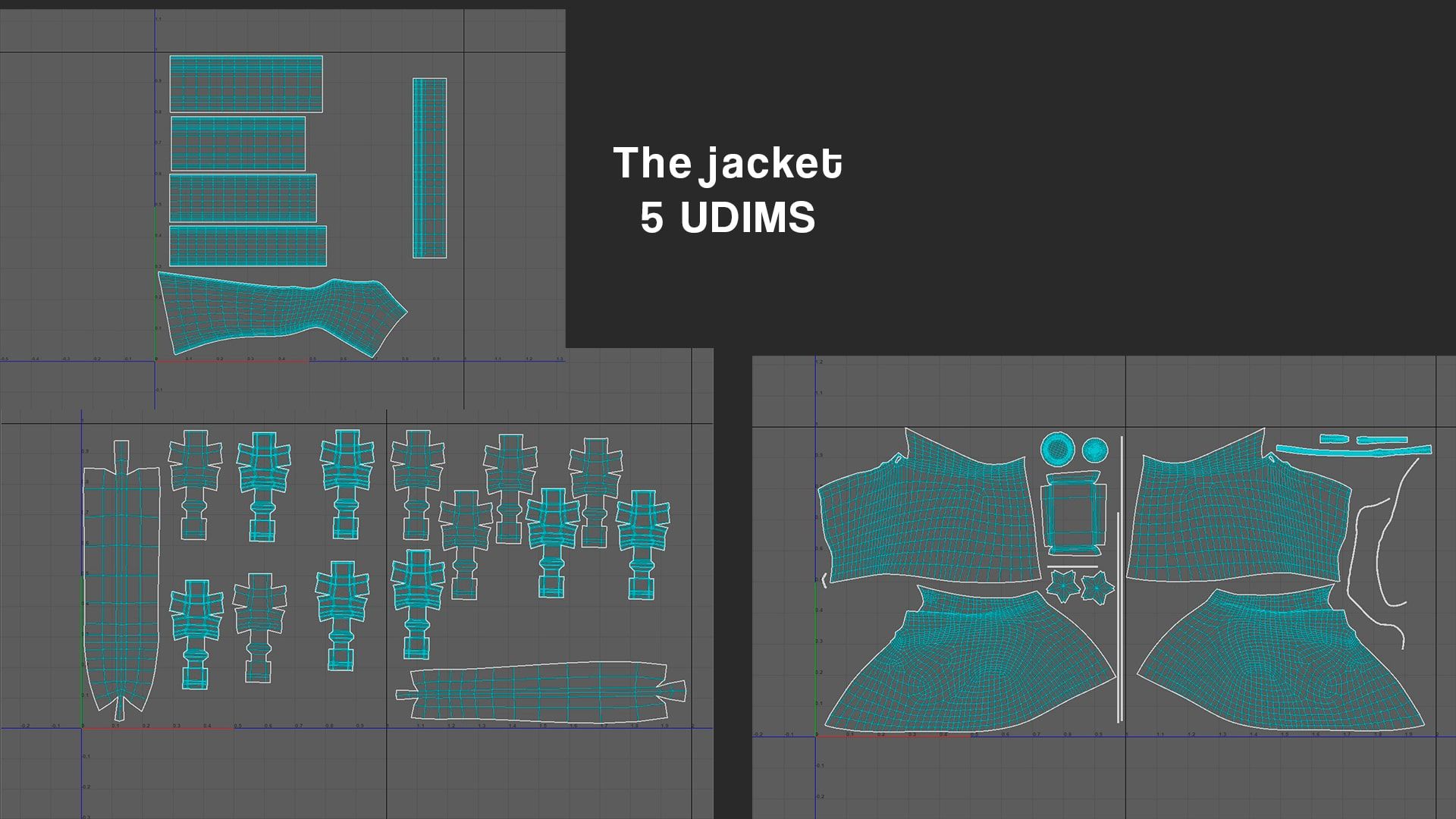
I cut and arranged the UVs of the character into several UV tiles, each tile organised by parts. In total, I used 21 tiles for the character, five for the jacket, and three for the miscellaneous objects.
It was necessary to have a lot of UV tiles as I will be using high-level detail textures such as noise and grain. On top of that, I will be baking the details from my high-poly to my low-poly which contains a lot of high-level detail such as noise.
Tip: When doing UVs, always start with an automatic unwrapping or camera-based. This helps eliminate bugs or problems such as UVs not unwrapping or invisible UV islands.
For the eyes, I simply put them on top of each other.
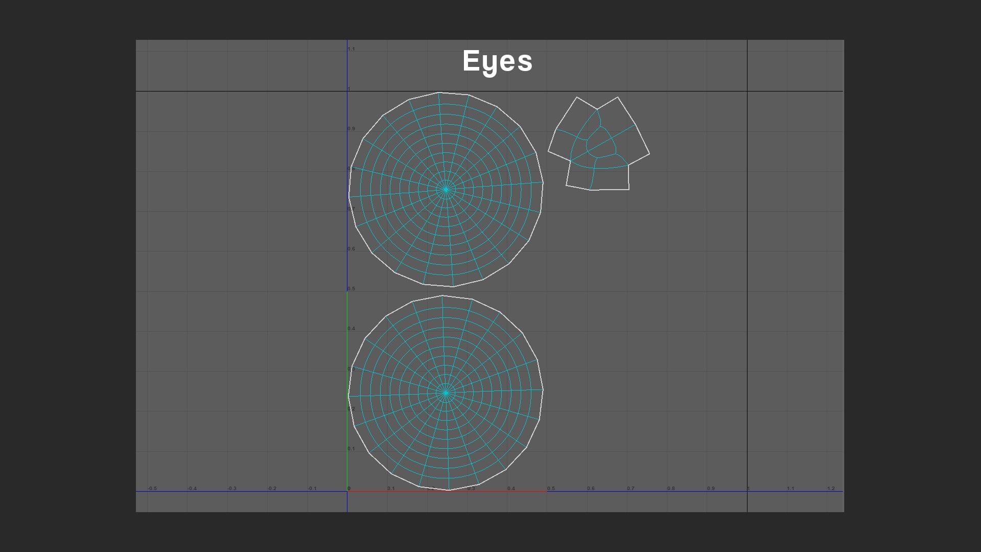
I think that was quite boring to look at. Just some boring old UVs. However, it's not over yet. I did have a lot of fun laying them out though.
The UVs this time actually made me sit down and think. In the past, it was a simple cut here and a simple cut there. In this case, I had to strategically lay out the UVs to control the texel density. It's as if I am creating myself a puzzle to solve later on. You could say that for anything 3D-related.
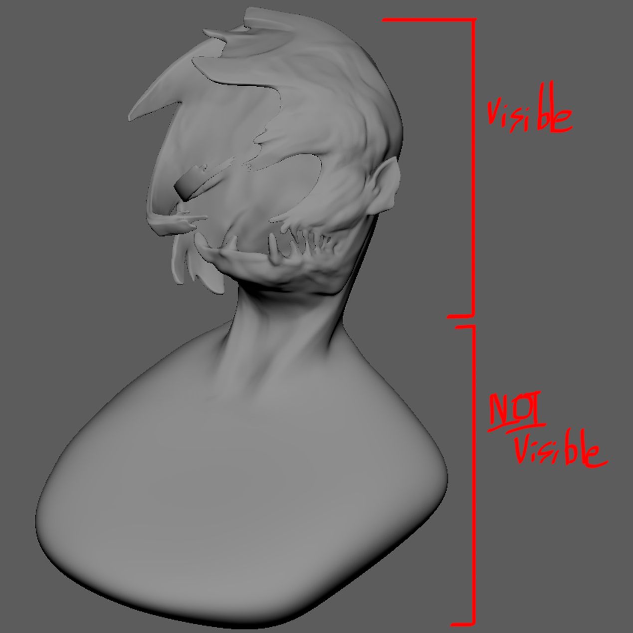
As you saw, the body of the character is practically the same size as the head. This is an issue because it will eat up all the precious UV space. It took me about eight UDIMs just to unwrap the head with the set texel density and as far as I am concerned, I am not about to add an extra eight UDIMs just for the part that's the least visible in the render.
So I devised a plan. I will just lay the body out using a smaller texel density. This is no problem since it will be covered by the jacket, it was a safe compromise. I gave the body a texel density of 4.6 instead of 25 like the rest which is about 5.434782608695652 times smaller.
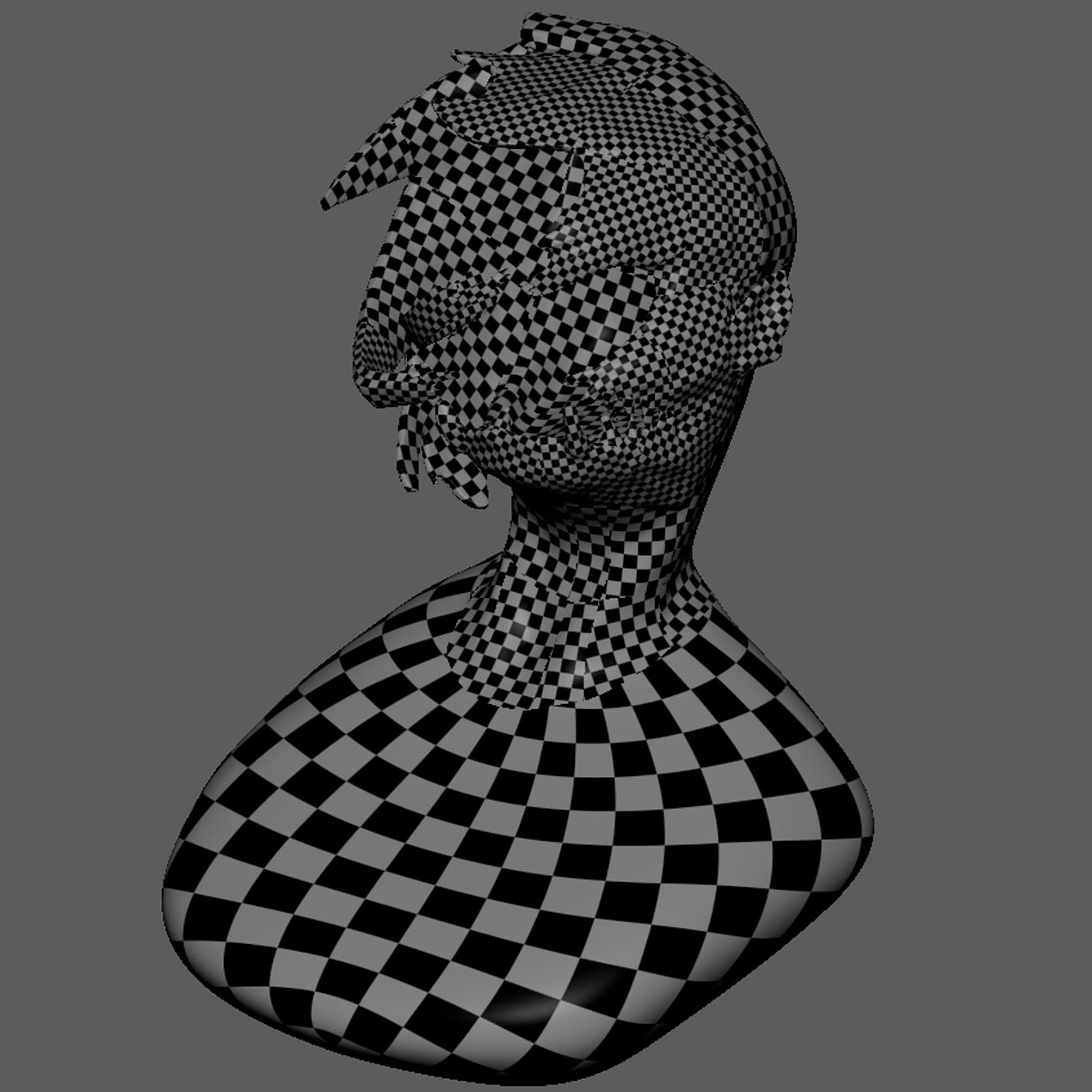
While I was at it, I also used different texel sizes for parts that are less visible to us. For example, the back of the head, the neck... etc.
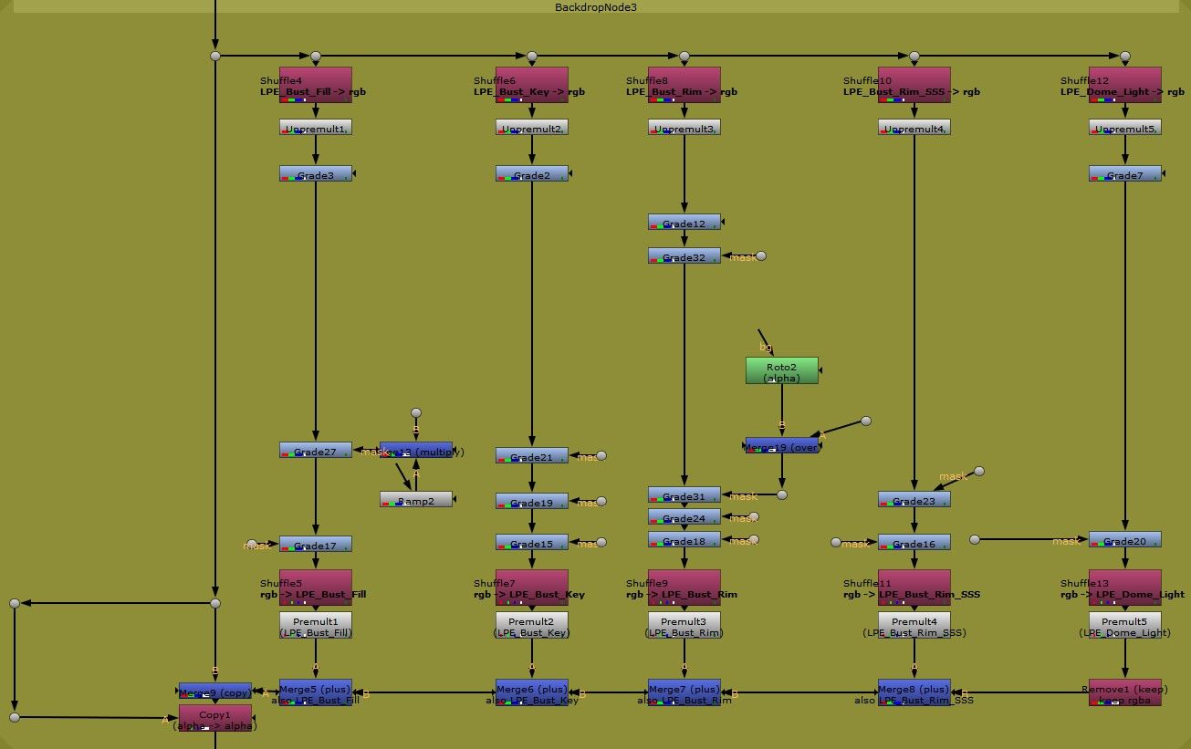
I set up a simple three-light setup based on the original concept. I added a key light to guide the viewer's gaze and further emphasise the character's stare.
Then, I included two strong rim lights on both sides to achieve a contrasted look. The rim light on the left is stronger to affect the SSS more. Having two rims on the sides helped guide the viewer as well, acting as walls to guide the viewer towards the middle.
Finally, I added one of my favourite lights, the dome light.
There are two main usages of a dome light. Either you use it as a main light source or as ambience light. In my case, I used it to control the shadows. I used a plain white colour. If I feel like the shadows are too dark, I will just increase the dome light a bit.
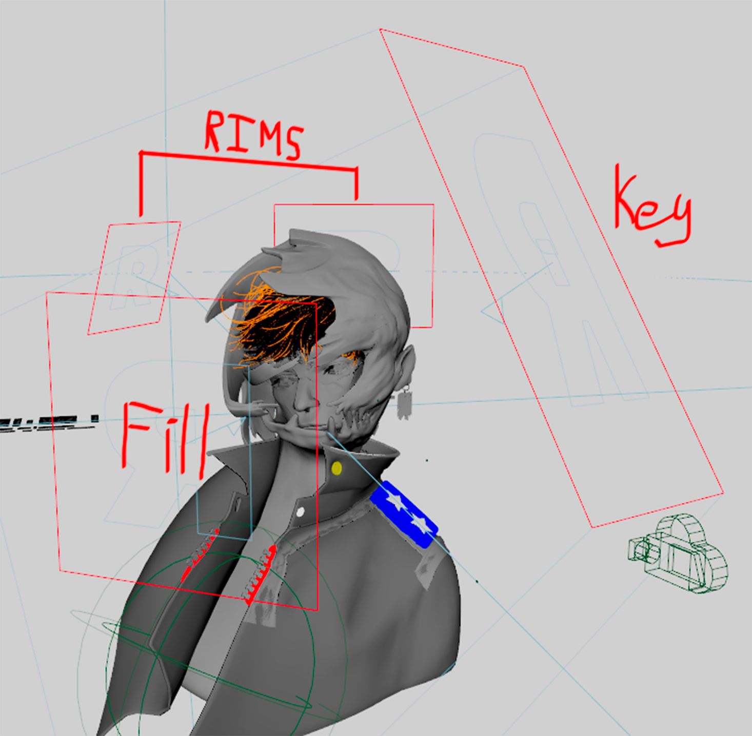
This was also where I assigned light groups to each of my lights so that I could export each of them as an AOV. This will give me control over my lighting in compositing.
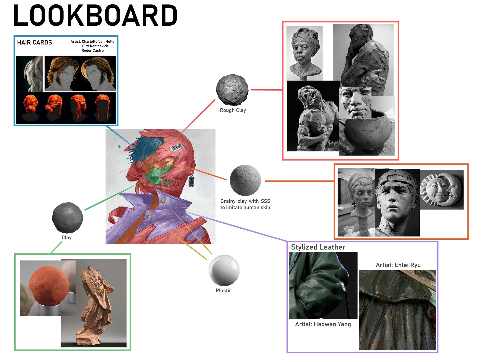
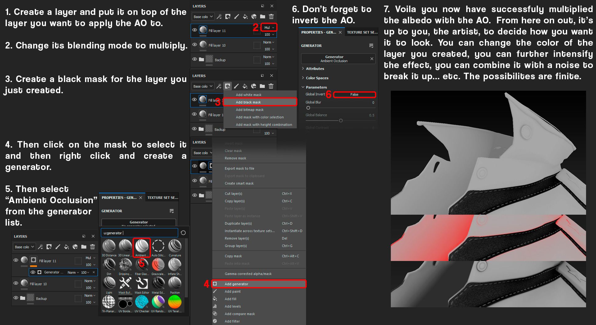
For this example, I will be referring to the part that's enveloping the head as the mask. I will use the abbreviated version of ambient occlusion as well which is AO.
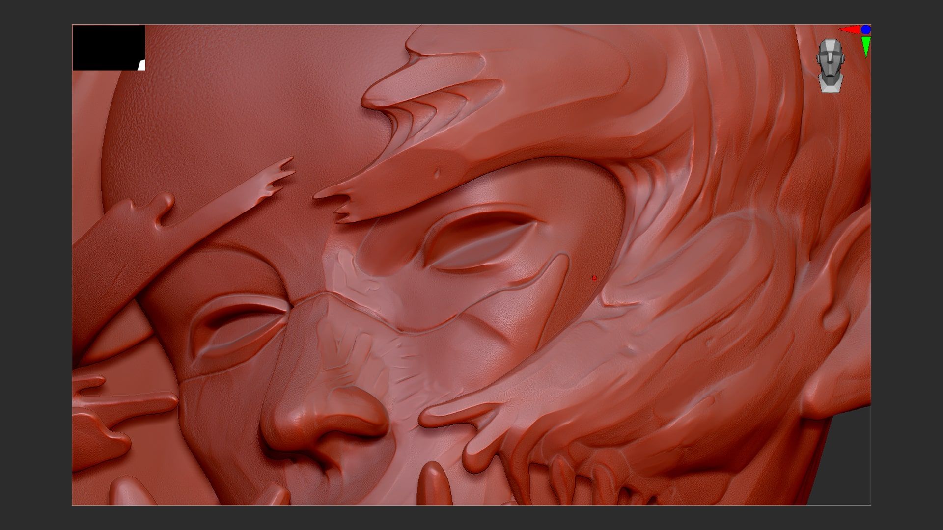
Something that I love doing when creating an albedo map is to make it appear as 3D as possible. Not too much though. This falls down personal preferences but I like the extra oomph it adds to the other textures.
First, I started by creating a base with a simple grey colour mixed with high-density noise. Then to help insinuate the cracks, crevasses, and bumps, I multiplied it with a curvature map.
Using an AO mask can yield the same result but I preferred the curvature mask thanks to its control over large and fine details.
I then "separated" the inside of the mask by combining the base albedo with the AO. This helped emphasise and differentiate what's inside and outside.
Afterwards, I refined the albedo by putting more and more emphasis on the shadows. This helps the form of the mask pop out more, creating a more moody and contrasted look.
Next, I added a "light source" to the albedo by lightening up the parts that are visible to us. This creates a separation between the light and the shadow. Then I added highlights to the edges.
To top everything off, I applied grain to the albedo to get a more... grainy look. Then I played with the AO a bit more to get a contrasted look.
Substance 3D Painter offers a variety of tools to help artists achieve the results they want. The most powerful aspect of this software, in my opinion, is the usage of baked maps such as AO, curvature, world position... etc.
For example, imagine that you wanted to darken the occluded areas of an object. You can either do this by hand which is totally possible! Or you can use the AO map. Of course, there are specific use cases so you have to know which map to use and how to use them.
Below is a quick tutorial on how to combine the albedo with the AO map.
Note that my method isn't the method but one of the many methods that exist.
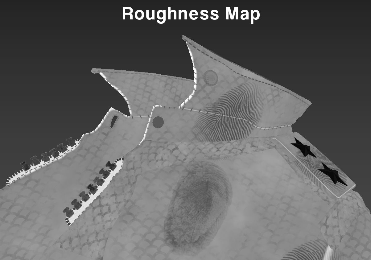
The roughness map is the most crucial aspect of this project and in any project. It is often the most overlooked aspect of texturing. Often neglected by most artists I know.
It is crucial because it is the very foundation of what makes a 3D render look good. People often mistake this with normal maps or bump maps, believing that the more they put, the better it will look. Guess what? that's not the case.
You could put in as much bump and normal as you want but if that metal doesn't shine, it's game over.
I put that in quotes to make it more powerful. Don't neglect the roughness map!
In my case, a good roughness map is an obligation. This is due to the complex design and intricacy that the model poses. Below is an exaggerated example.
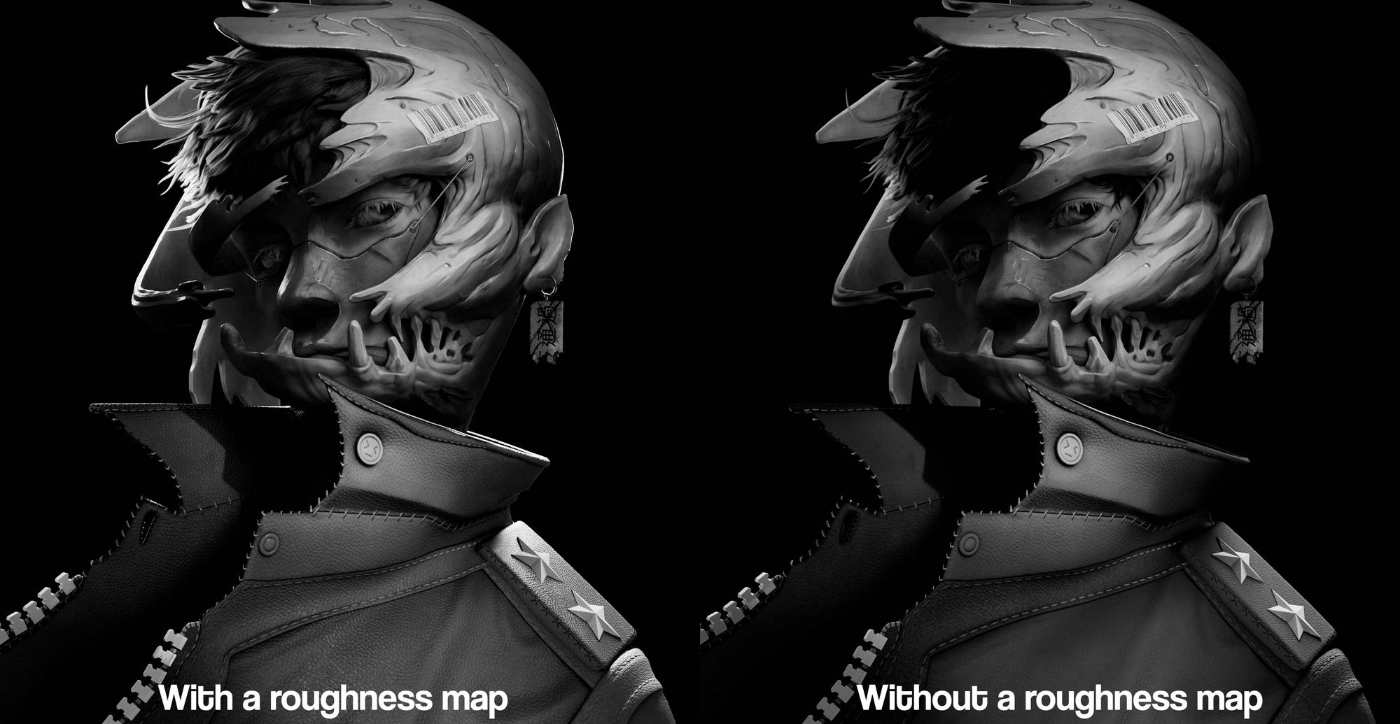
As you can see, one map can change everything. Not only are we getting more variations in value, but it helps give form to the render as well. No, I did not just show you the albedo map.
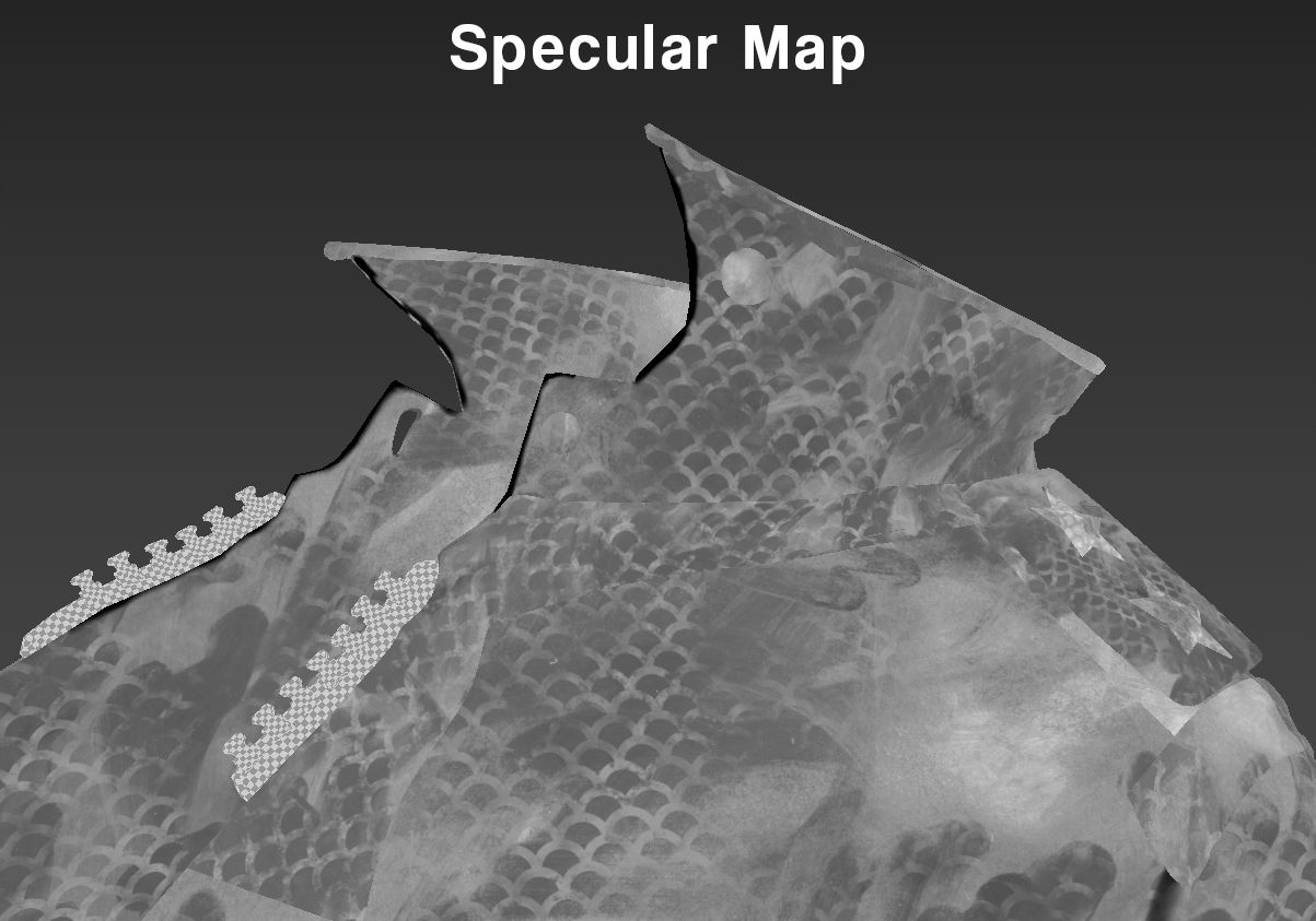
I separated the roughness into two different maps.
A roughness map that controls the general roughness and a specular map that controls how much specularity is shown. Think of the latter as an extra parameter for the roughness map, controlling how much is shown and where it should be shown.
This gives me more control over how roughness is rendered but that added control introduces some complexity. This is because you have to work with two maps that influence each other. Sometimes, you may not get the desired result right away so keep tweaking.
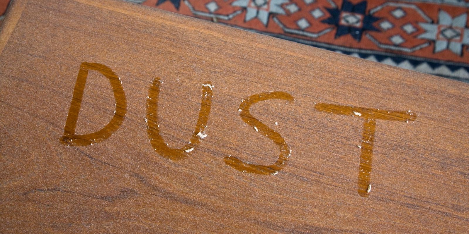
This is based on real-life because the perceived roughness of an object changes with its state. For example, if a table has collected dust, it will appear matte. It is as if the dust is hiding the original roughness of the table. Following this logic, you have a specular map that acts as the dust collected on the surface, influencing how it is being perceived.
This can be said the same with normal maps and bump maps since they change how we perceive the roughness of an object as well.
You can also use a layered material which adds another layer of logic to everything.
But that was real life, in 3D we can use and twist this knowledge to our advantage. We are working in PBR after all.
The roughness map was quite simple to make. I created a fill layer with 0,5 in the roughness value. Next, I added some more variation to the roughness map depending on how shiny or rough certain areas were.
Finally, I used a curvature map as a map to darken the edges to help insinuate the edges. This results in a more, I guess, punchy roughness because it helps create more values in the final render.
While creating the roughness map, I stuck to a rule. The rule was white for holes; weird name for a rule, I know. This is because white makes it reflect less light. In case you didn't catch it, that is exactly what a hole means.
The specular map was a tad more advanced, using more layers to create a more intricate map. I used a variety of generators to create the map, most prominently, the light generator.
This generator uses the baked normals of your object to simulate lighting on your object. Areas that would be in the shadow are darker thanks to this mask, making them show less roughness.
Lastly, I wanted to make the edges show more roughness hence, reflect more light. So, I combined everything with a curvature map to create lighter edges.
To top everything off, I added grain.
The same rule applies to the specular but flipped. This time, it's black for holes; sounds even weirder. The reason why it's black this time is to make it show less roughness.
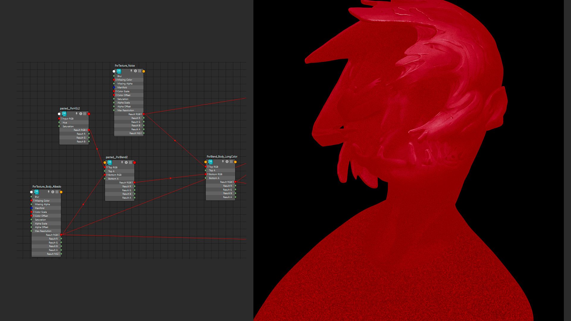
I will be referring to subsurface scattering as SSS.
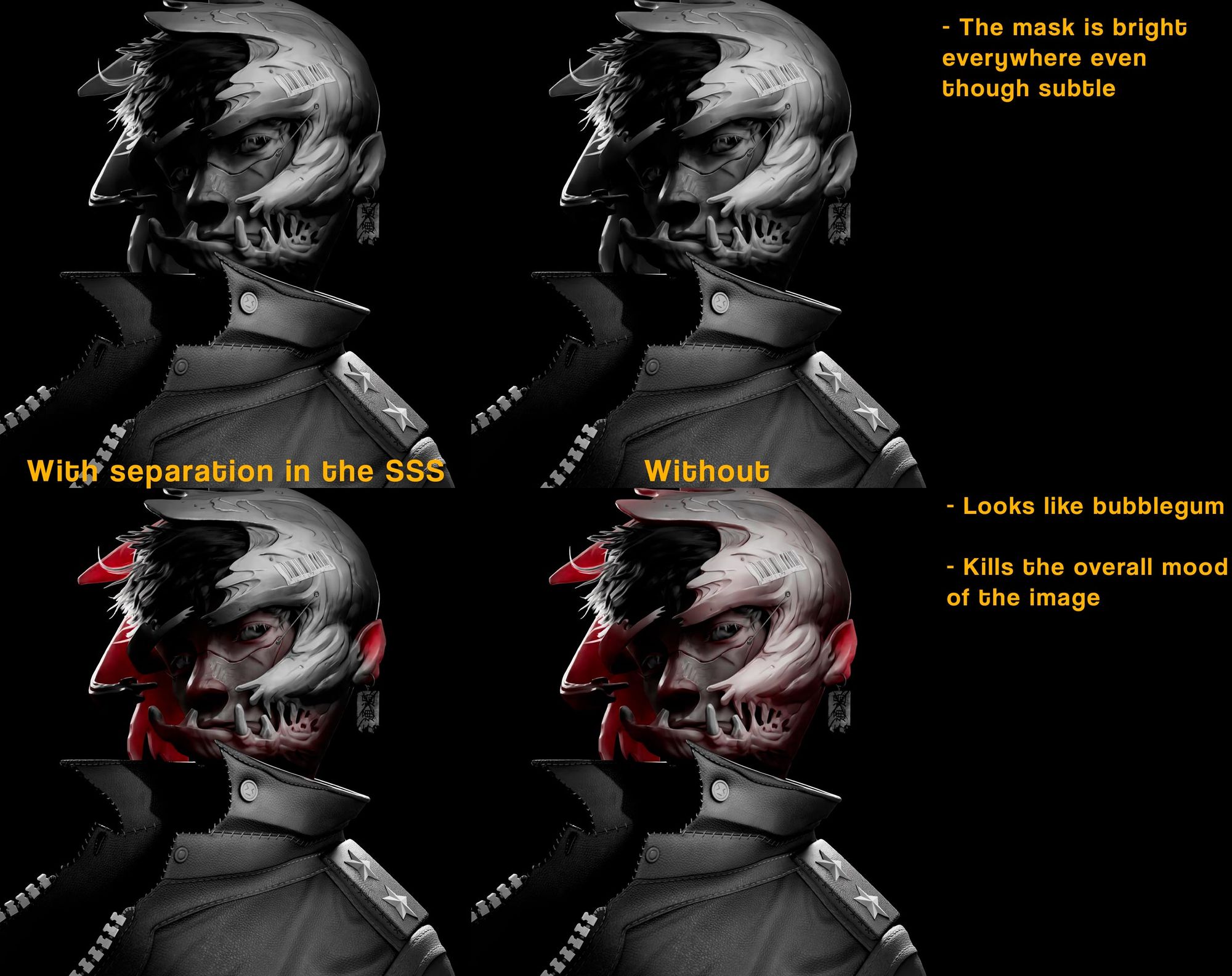
In this project, the usage of SSS was different than its normal usage. Instead of adding realism or detail, it was used to control and add value to the final render. I had a lot of fun during this process because it felt like I was starting to see my idea come alive.
In Renderman, we have several subsurface scattering models. For this project, I decided to use Multiple Mean Free Paths.
This model separates SSS into three layers: near, mid, and far. To be more specific, it allows you to control the strength, colour, and visibility of each layer. On top of that, it gave me the best results since I could directly control how strong the SSS should be in thin areas.
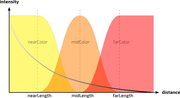
This is also great for simulating skin as we have three layers of skin: epidermis, dermis, and hypodermis.
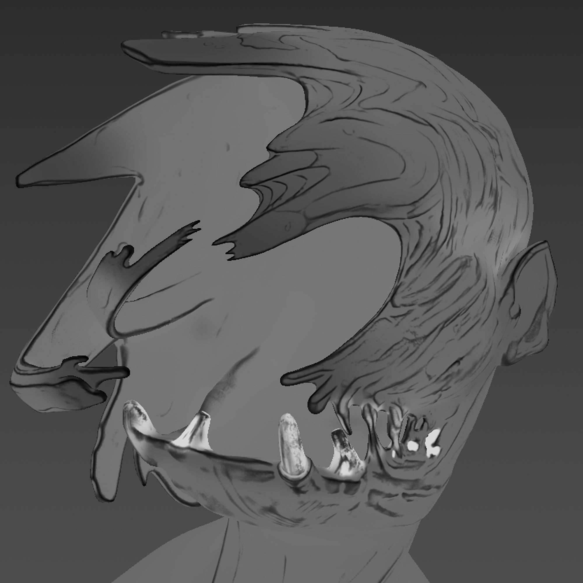
I began by masking out the thin areas of the model, such as the ear, nose, and various tentacle-like structures. Through this mask, I am controlling the value of the final render.
For the sides, I gave it a brighter value to show more SSS since it is relatively thin.
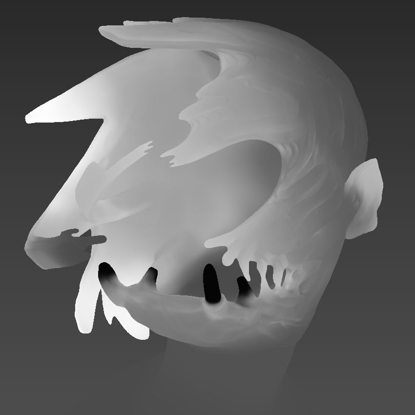
However, for some parts, I deviated from my original plan a bit. This is because, in the original concept, some areas weren't illuminated despite being in the light.
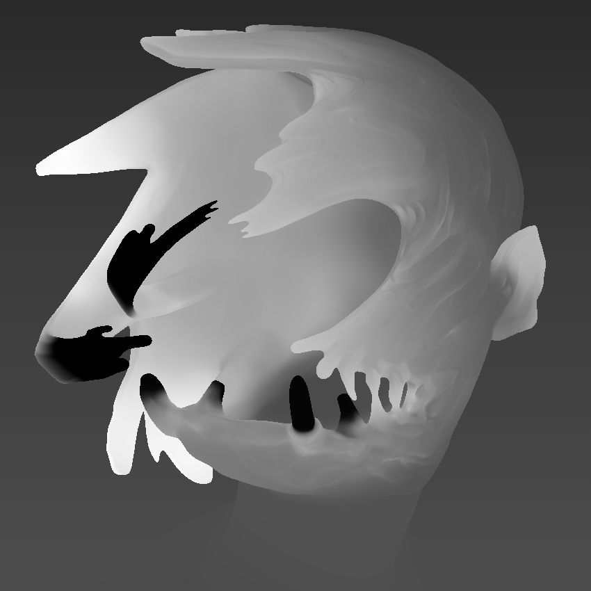
Finally, I decided to "divide" the mask into two by masking out the top section. This creates a distinction between the top and the bottom part, adding depth and character to the mask itself.
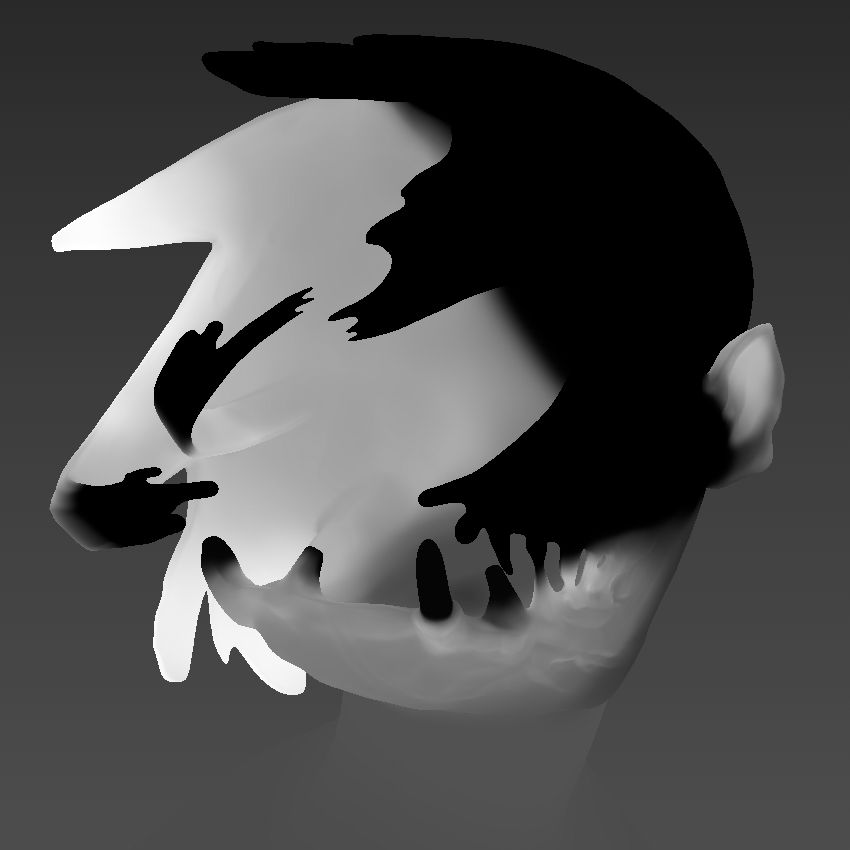
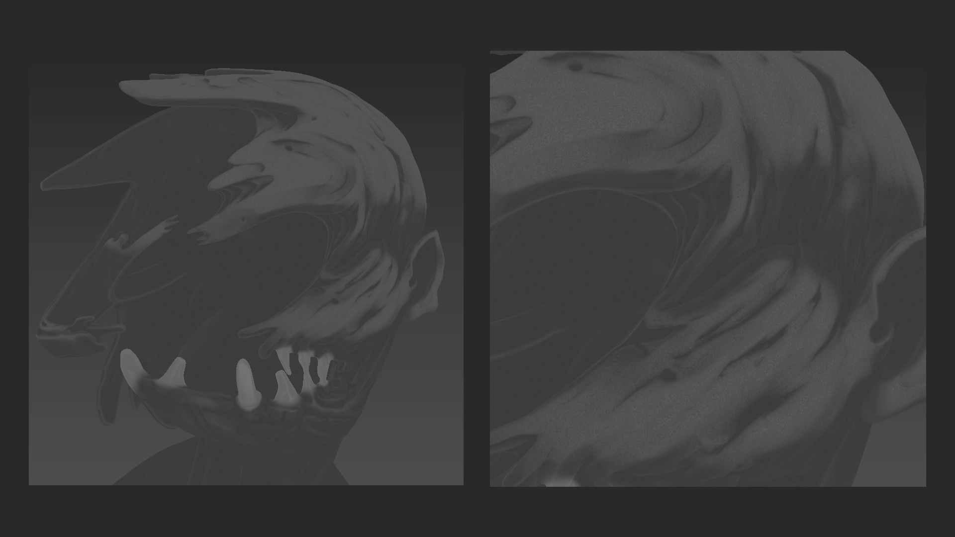
Here is a little comparison between the SSS masks. As you can see, it's okay to break logic.
For the jacket, I wanted to create something that looks realistic and stylized at the same time. At the time, I was quite stuck because I didn't know what I wanted to do with the jacket; so I just started doing things.
It took a lot of experimenting to achieve the desired result.
To create the albedo, I combined several baked maps and added procedural noise afterwards. My goal was to give it a sense of depth by making it look as though it was sinking into the shadow. To achieve this, I combined it with the AO to darken the areas where the folds create deep creases. Additionally, I painted the sides facing towards the back a darker colour.
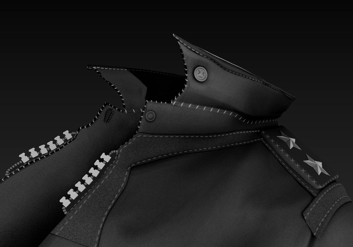
Oh, and I also used the amazing path brush in the new Substance 3D Painter update. It's phenomenal. I used it to create the stitches.
As for the normal map, it was a simple base leather texture.
For the roughness map, I decided to take creative freedom and design something that looks unique and appealing. I started with a base grey colour. Then I combined it with a half-circle pattern and a noise pattern to create breakups in the half-circle pattern. Finally, I added some fingerprints all over the jacket to add an extra layer of detail.
To create the specular map, I utilized various imperfection maps to create interesting breakups. After that, I merged it with noise to further add more details. Lastly, I added the same half-circle pattern in a light grey colour so that it would show more prominently when light reflects off the jacket.
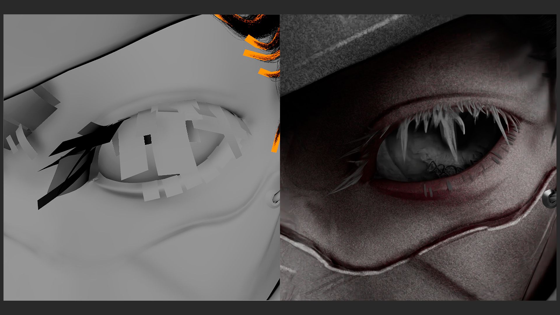
Initially for the eye, I started simple but it wasn't enough to capture the intense stare. So to insinuate that, I painted fake shadows on the iris and added more details to it with a normal map.
In the end, I was able to find a balance between stylisation and realism that fitted well with the rest of the textures.
To be frank, this was the part where I struggled the most because how exactly are you supposed to make hair look coherent in such a style?
Here, I gave myself some time to experiment with different methods of creating CG hair. I started with hair cards as they gave me the most control over the look and feel of the hair. In the end, I only did this for the eyebrows and eyelashes because I liked the way it looked.
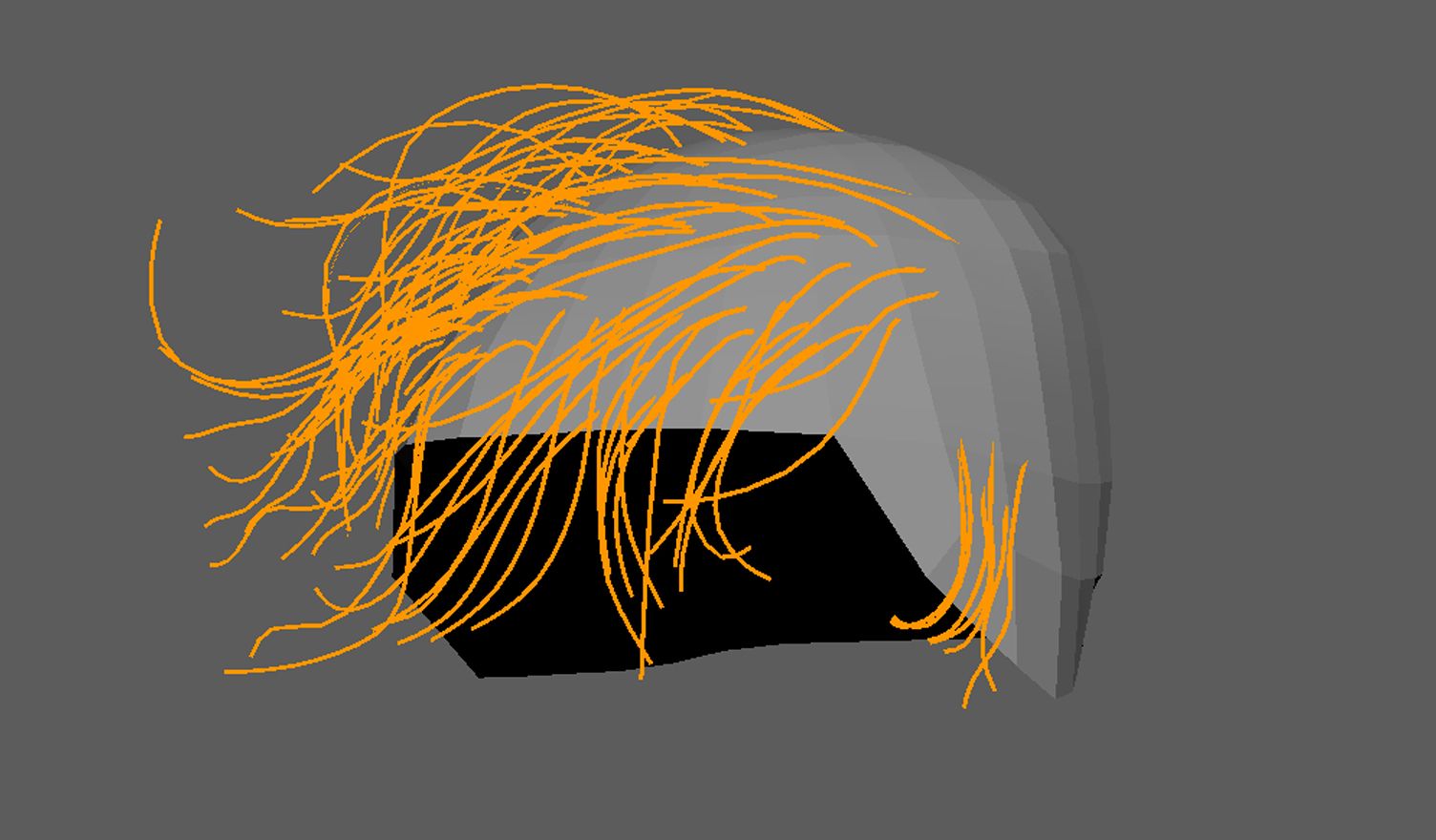
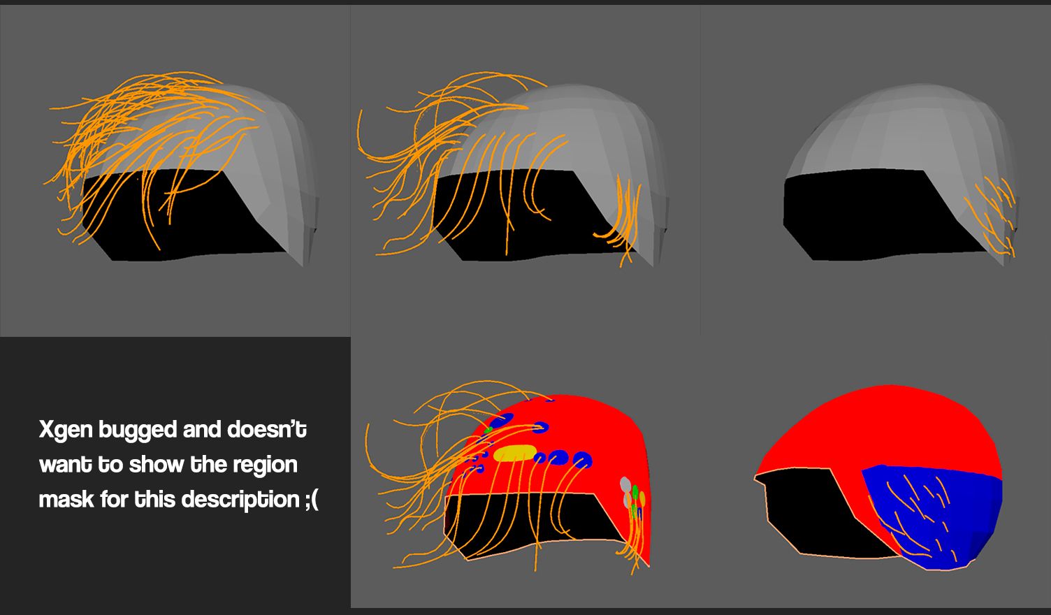
For the hair, I went with Xgen. At first, I tried my best to avoid Xgen because I thought that it would be too realistic but I gave it a try after seeing a few stylised character hairs made with Xgen.
Let's just say that I struggled a bit when I was first learning Xgen.
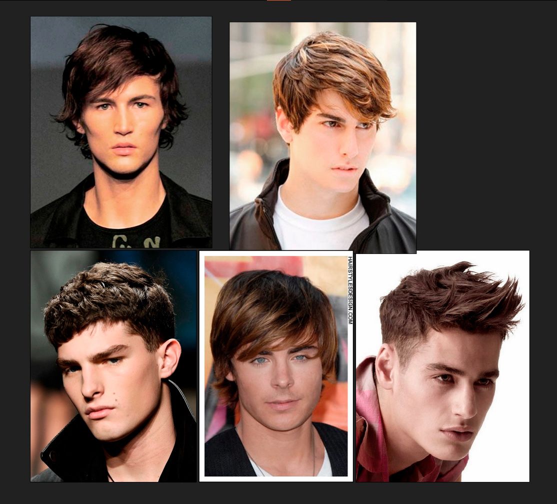
I started by gathering some references for haircuts. I tried to find something that would fit the original concept the most. I tried looking for ones that were chaotic but organised at the same time.
To better manage things, I used three descriptions for each part: base, flyaways, and sideburn. I opted for Xgen Core because of its sheer power and control. So powerful it can't help but crash every 20 minutes so make sure to save your work often.
Thanks to this strategy, things were a lot easier to control and what seemed like a walk in hell became a descent.
Tip: When using Xgen core, sometimes the strands don't follow the placed guides. When this happens, add more guides around the area and it should help the hair follow better.
Unlike Xgen Interactive, I didn't have direct influence over each hair strand. Instead, I controlled them through guides. Each guide has its zone of influence but you can also use a region mask to better separate individual zones. So it's better to have a region mask if you want to have more direct control over the guide's influence.
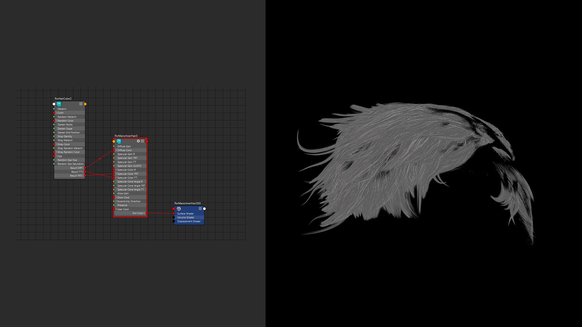
During the texturing process, I tried out various shaders but ultimately found that a combination of PxrMarschnerHair and PxrHairColor worked best for my hair.
The hair shader was simple, I added a bit of randomisation to the colours by randomly making some strands white. Lastly, I darkened the roots.
It went a lot smoother than the creation of the hair as I encountered way fewer crashes. This enabled me to work faster and more efficiently without the need to constantly reopen Maya every 30 minutes.
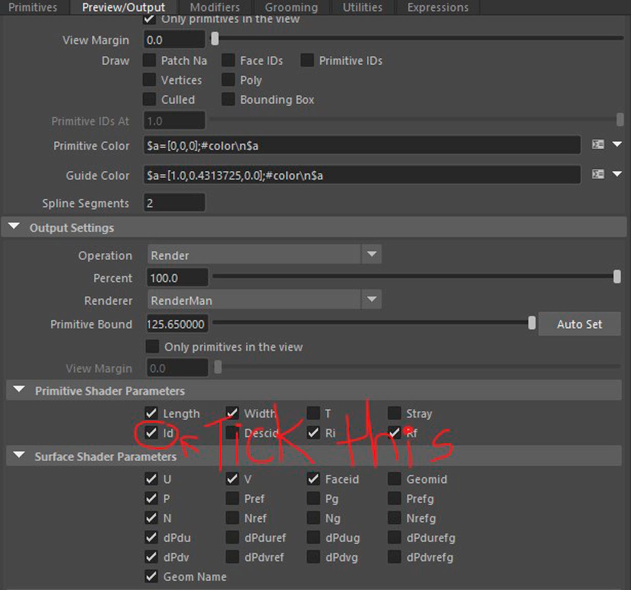
I did spend 10 minutes trying to figure out why I wasn't getting any random grey hairs though. Turns out the solution was to tick a button.
I could go for another 30 minutes explaining the differences between each hair shader that Renderman has and how everything can be used together mix-match and whatnot but I don't know enough so I can't.
Instead, just go and check the docs:
Not to mention that you could also use the PxrStandardSurface instead of PxrHairColor.
This creates a lot of combinations that you could try. Why do we have a bunch of different shaders? Because all of them render hair differently. Sometimes you don't need the overly complex PxrMarshnerHair so just use the LamaHairChiang.
After finishing the textures, exporting them and organising them neatly, I went back to Maya to set up the materials.
Here was also where I worked the SSS out. I created a map to use in the long colour by multiplying the albedo with the colour red and multiplying it with noise to create colour variations.
Something many people get wrong about 3D rendering is the waiting time. People think that with one click of a button, you will see your 3D render instantly. Albeit true for real-time rendering, we aren't doing real-time and I am sure as hell not sitting here for hours waiting for one picture.
Without going into much detail because there are just too many, I switched the integrator from PxrPathTracer to PxrUnified. I like to call them rendering models.
I opted for PxrUnified because of its "Subsurface Over-Sampling" feature, which helped brute-forced my way through rendering the SSS. Not only that but it helped cut my rendering time by about 15 minutes thanks to its algorithm.
I will try to keep things as brief as possible here because compositing is another beast of its own.
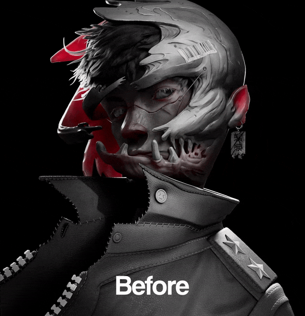
After waiting a good few hours for the renders, I imported everything to Nuke for further post-processing.
Lucky for me, the final render already looked good so I didn't spend much time doing comp. I mainly added details in comp instead of fixing things.
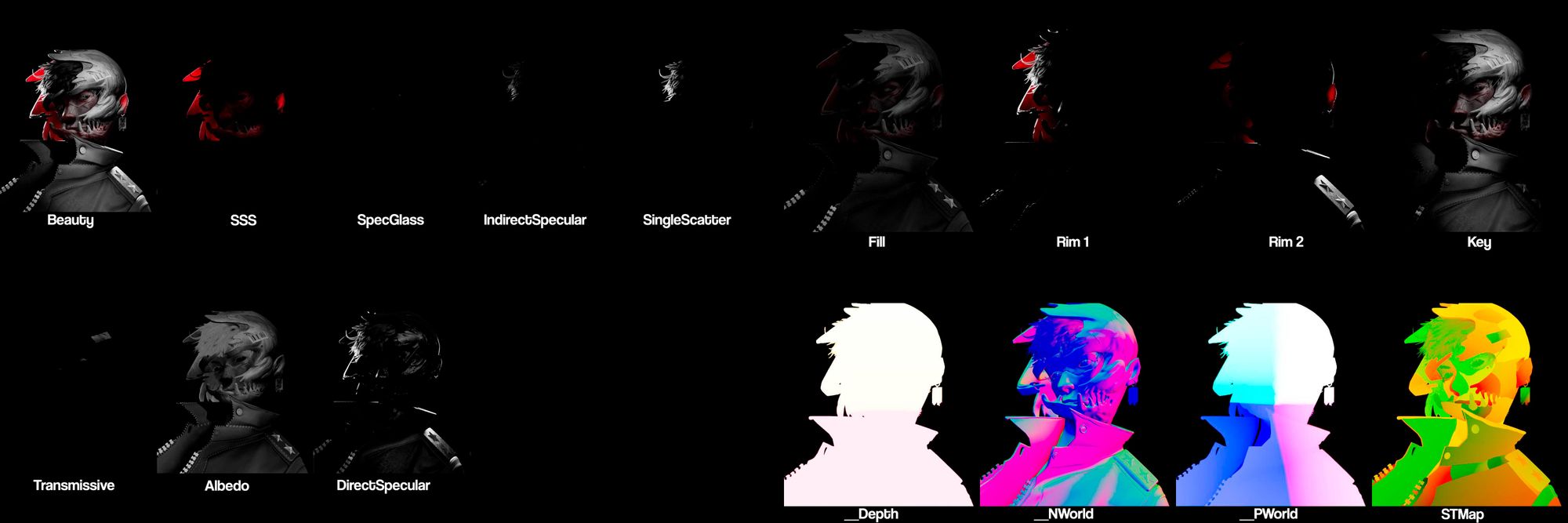
For the first part of the compositing, I tweaked the lighting a bit to make the key light and rim light brighter. I also used cryptomattes to manually light up certain parts of the render that were too dark for my liking.
To do this, you need to separate the lights into AOVs. In Nuke, you simply just shuffle out the lights just like how you would when you're reassembling the beauty.
I used the amazing plugin called aov_krakout by artandmath to quickly create a tree.
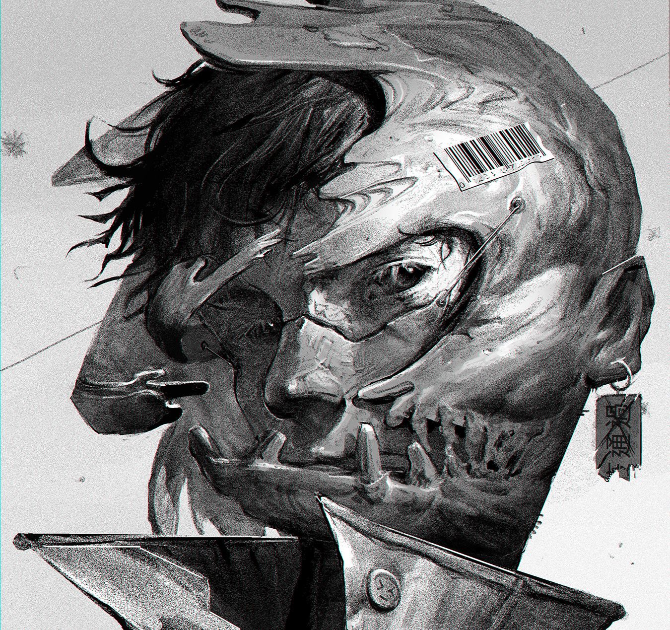
Next, I added a nice and subtle depth-of-field effect to focus more on the face. Alongside that, I did a slight degradation in values as light reaches further down and a slightly dark edge around the character.
This is done by using the position pass as it contains information on how the pixels were calculated in 3D space, hence three axes (plural of axis). So I just used the Y axis to create a mask.
To create the dark wrap, I simply used the depth pass to create a degradation in the Z axis.
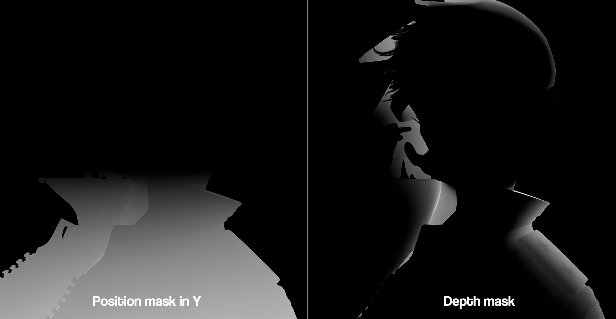
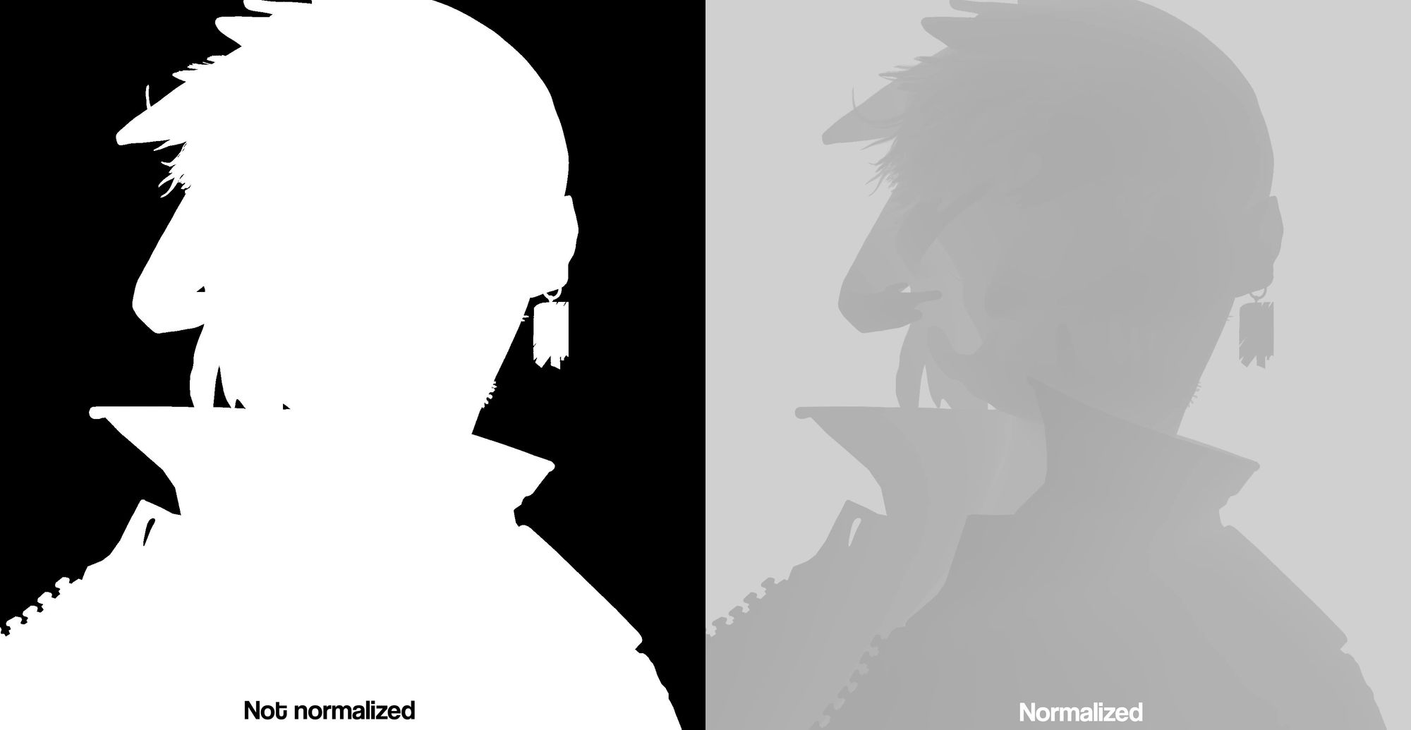
When working with the depth pass, always make sure to normalise it as some rendering engines give you values that go past one. To normalise the depth means to take the depth pass and recalculate it to fit in the zero to one range.
An easy way to do this is to take the Z and do a multiplicative inverse. So you just divide one by Z or 1/Z. This will make sure that any values past one are recalculated to fit back in the range. No matter how high the values are.
For example, 10000 becomes 0.0001. Math.
In Nuke, you can do this with an Expression node.
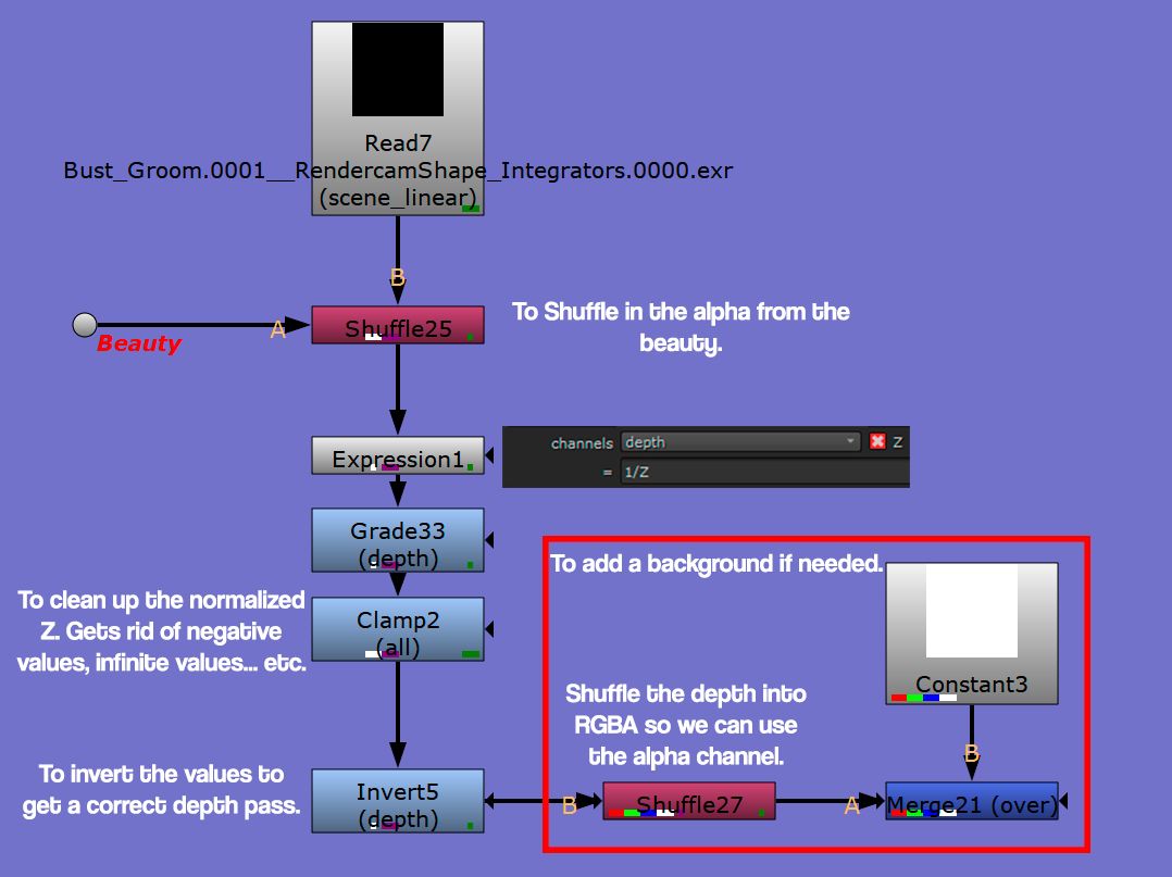
There are two alternative methods to this. One involves using a Grade node and handpicking the values yourself. The other method involves using a CurveTool node to determine the darkest and brightest areas, which can then be entered into a Grade node to get a normalised Z.
When we normalise Z with the Expression node, it inverts everything, which causes a problem. This is because depth works from zero to one representing the distance from the camera to the object. Zero being the closest to the camera. So we have to invert everything again to get a correct Z for defocusing.
Here is another problem, Nuke's Zdefocus is so broken that sometimes it works even when the normalised Z isn't inverted.
So if it works like how you wanted it to work, just leave it be.
Next, I broke the symmetry between the two eyes, letting the other eye get lost in the shadows. Despite this, I still kept the eyelashes lit up just to add a touch of stylization.
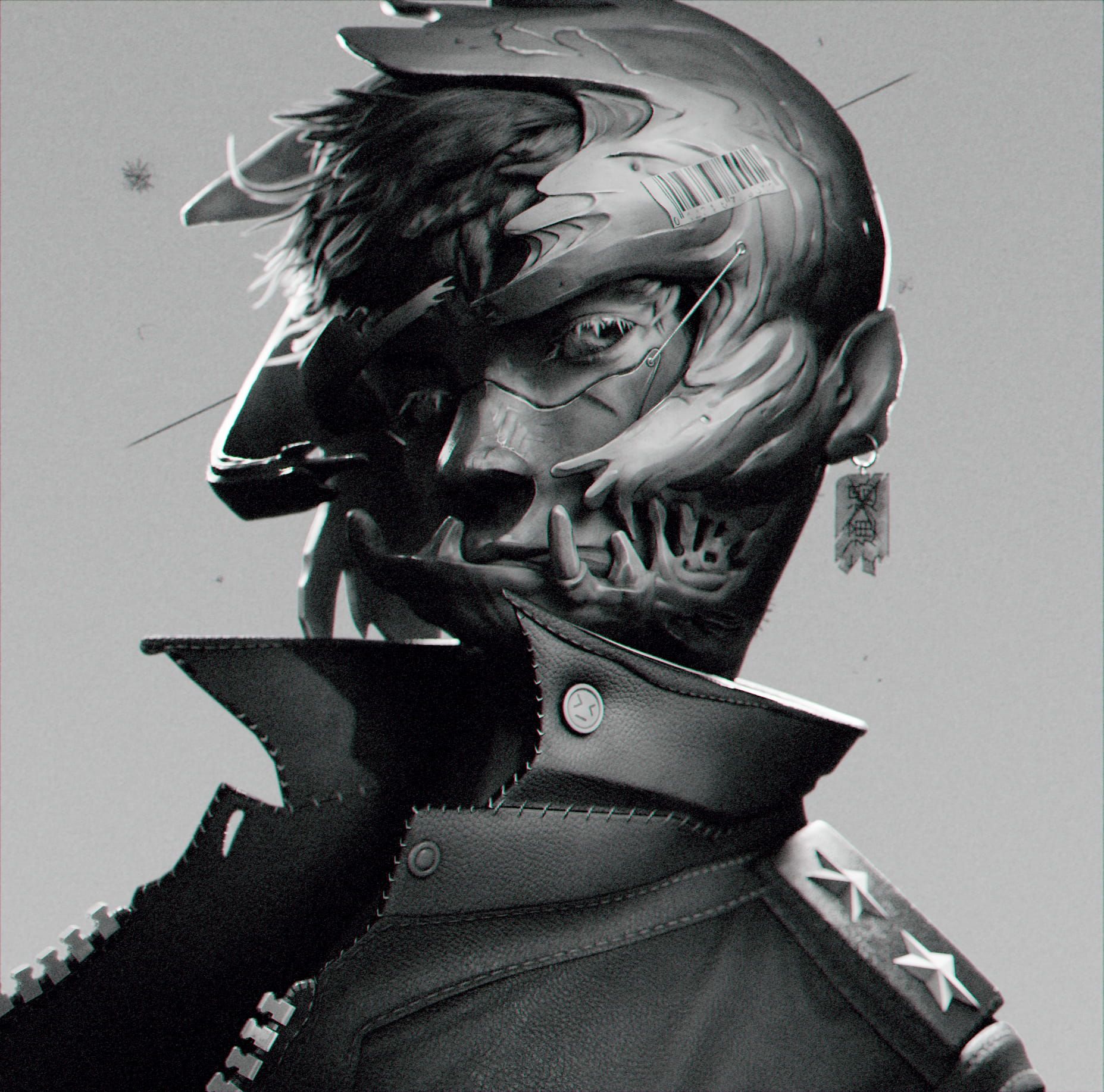
Finally, I went back to Photoshop, removed the character from the concept art, and recreated the background. Then I went back to Nuke to put the background.
As the final touch, I added grain to the image and added chromatic aberration because I love chromatic aberration and can't live without it.

I believe it is essential to take a step back and review your completed work. To find out how you did things, analyse it to see where you may have exceeded or fallen short of your expectations.
It is important to not bash yourself but to self-assess and give constructive criticism. There will always be something you want to improve in your work but instead of dwelling in the past, accept what's done. Move on and use the lessons you learnt to improve your future work.
I don't know about you but I love the final result. However, if I were to redo it, there are a few things that I would've done differently. For instance, I think the sculpt looks a bit rigid, and the hair appears a bit too messy.
I loved the way I implemented knowledge in drawing into the textures. I loved how I played with values to create a sense of depth. However, I do wish I had spent more time on the buttons of the jacket because, compared to the rest of the piece, they look a bit underworked.
All in all, I loved the way everything turned out despite the few issues. Art is a journey and now that I have created my magnum opus, it's time for me to try and supersede it.
Woah we reached the end. I would like to quickly say that it was super fun writing this article. It felt like a time machine like I was travelling back in time to retell you a story.
I would like to give a special thank you to The Rookies for giving me this amazing opportunity to share my creative process. Finally, I would like to thank everyone for checking out this article and giving it a read-through. Skimmed or not, I thank you for spending your time.
It thrills me to know that the things I will share here will be read by many people and artists alike. It's crazy to think that years ago, I was learning 3D on my laptop in my room during the lockdown, and now I get to write about my work.
This article allowed me to look back and analyse my decisions. I learnt how important it was to bend the rules of 3D and It taught me to trust myself and realize that what it takes to make a good image is not just experience but also creativity.
I hope that this article has inspired you to seek challenges and bend rules.
As they say, tools don't make an artist.
Reach out to Set and check out more of his student work here.