Insight into the Character Development Process of a Concept Artist
University of Hertfordshire student Devon Fell-Smith offers insights into their character development process, whether in original works or collaborating on 2D films.
University of Hertfordshire student Devon Fell-Smith offers insights into their character development process, whether in original works or collaborating on 2D films.

In this article, University of Hertfordshire student Devon Fell-Smith shares insights into their character development process, whether on original works or in collaboration with peers directing them on 2D films. We hope you get inspired to develop your own unique characters!
As part of my study at the University of Hertfordshire, I had the opportunity to work on a concept book for a project of my choice; I teamed up with an animator friend of mine, Yuya Yin, to create a short film and concept book under the same base concept. Under Yuya as the Director, I worked mainly as a Concept and Background Artist, using this experience to become more accustomed to working to somebody else’s art style, ideas and requests rather than my own, as is the case with many of my other projects. Thus, working on this film allowed me to become more adaptable to the needs of the artist I was collaborating with.
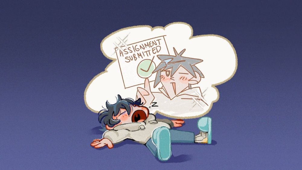
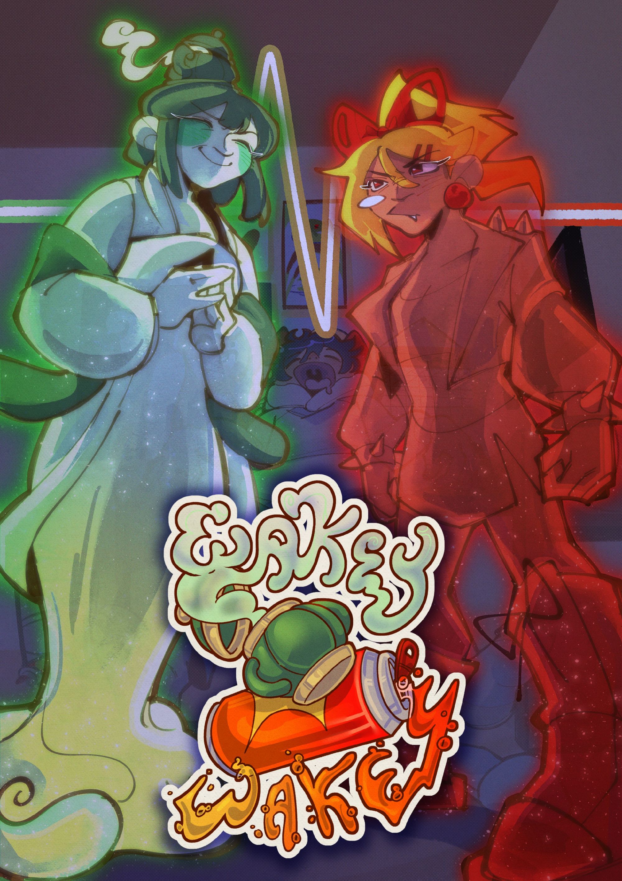
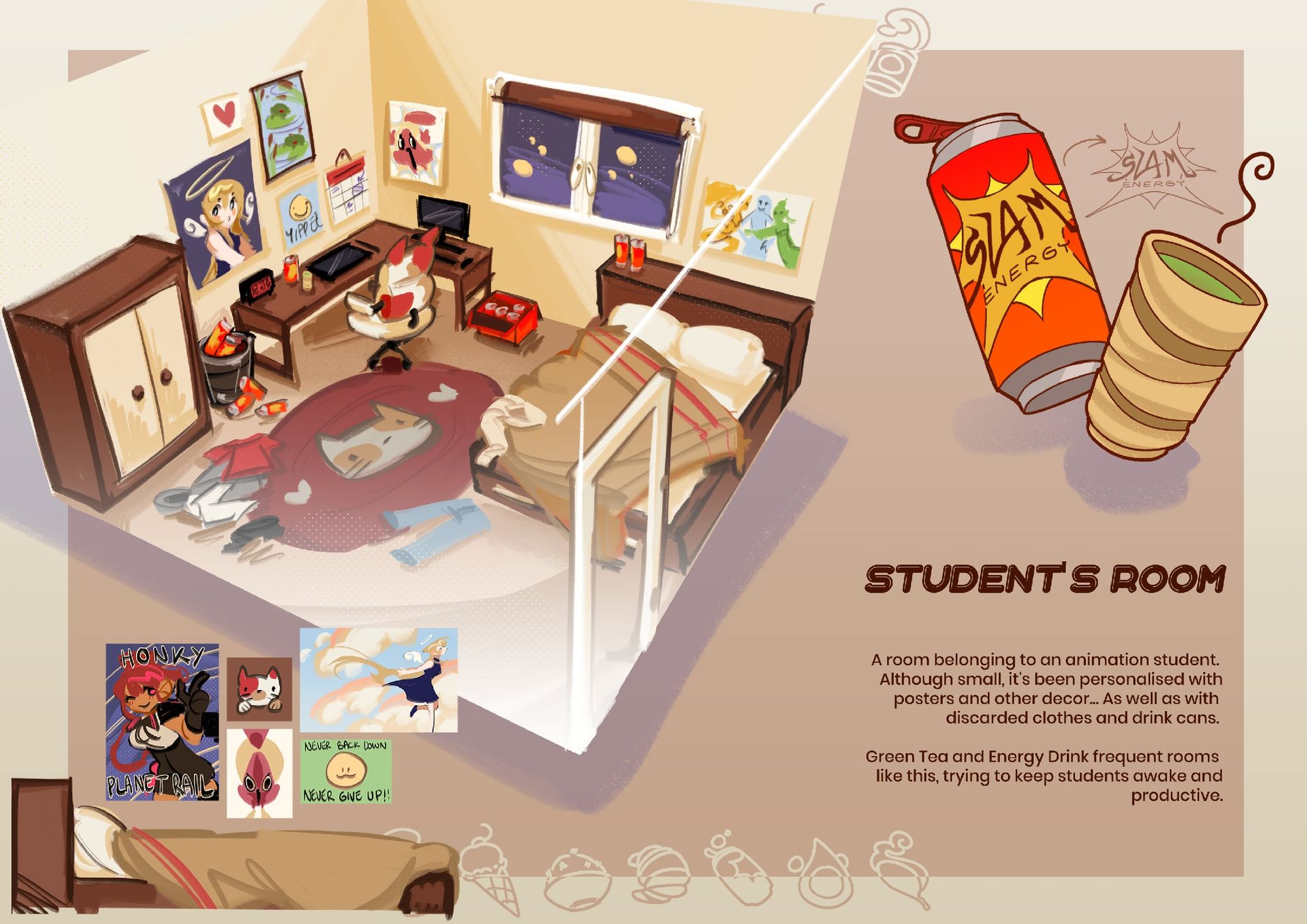
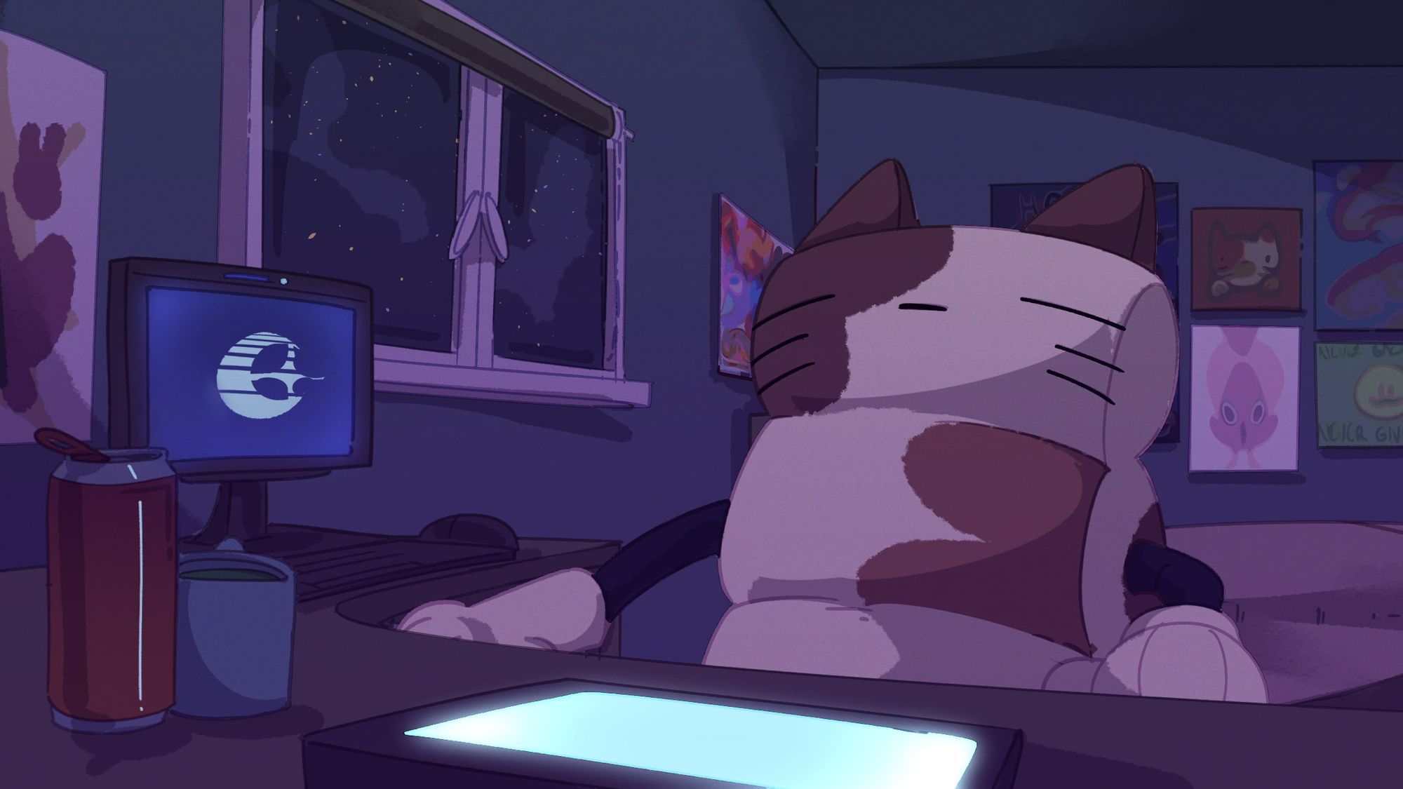
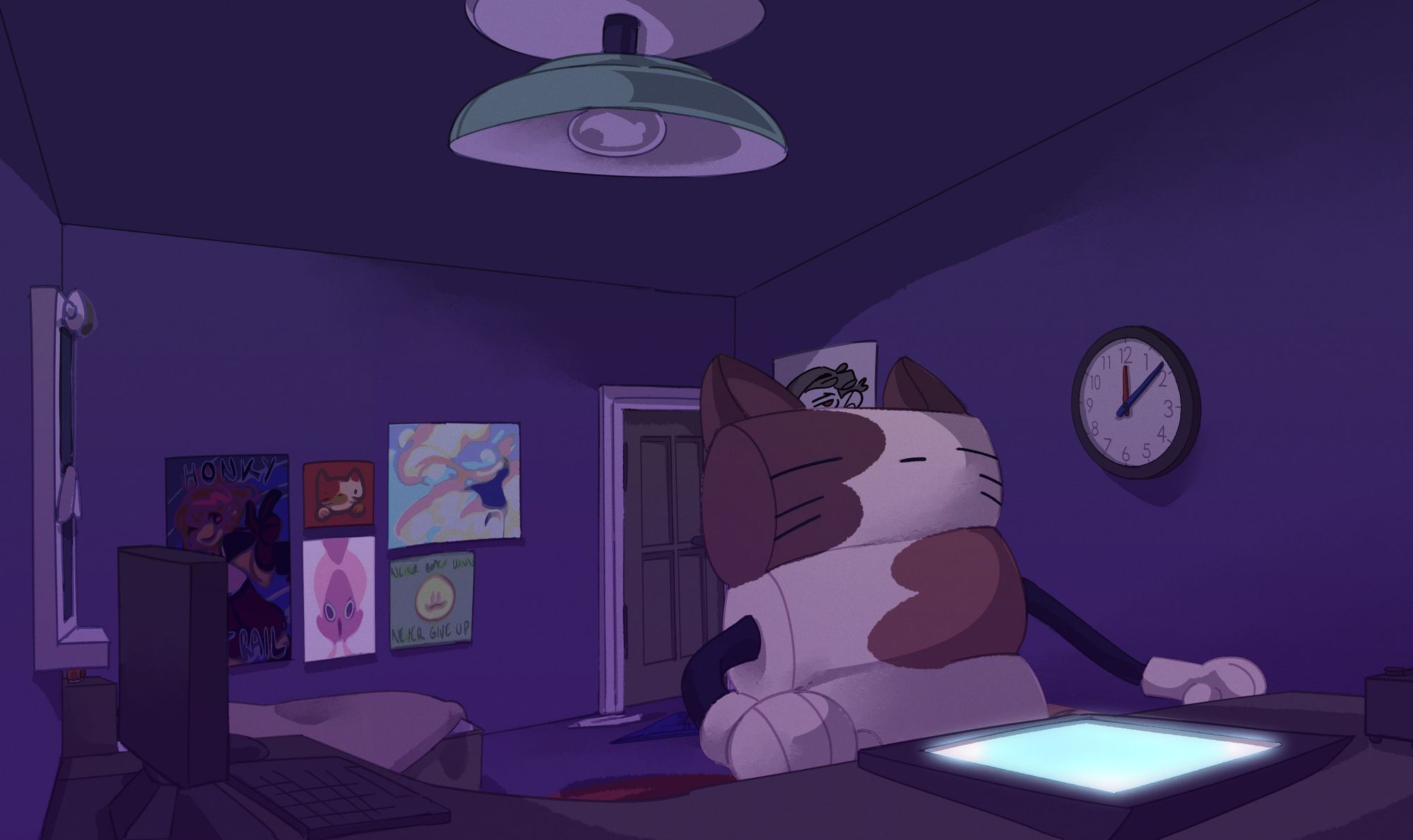
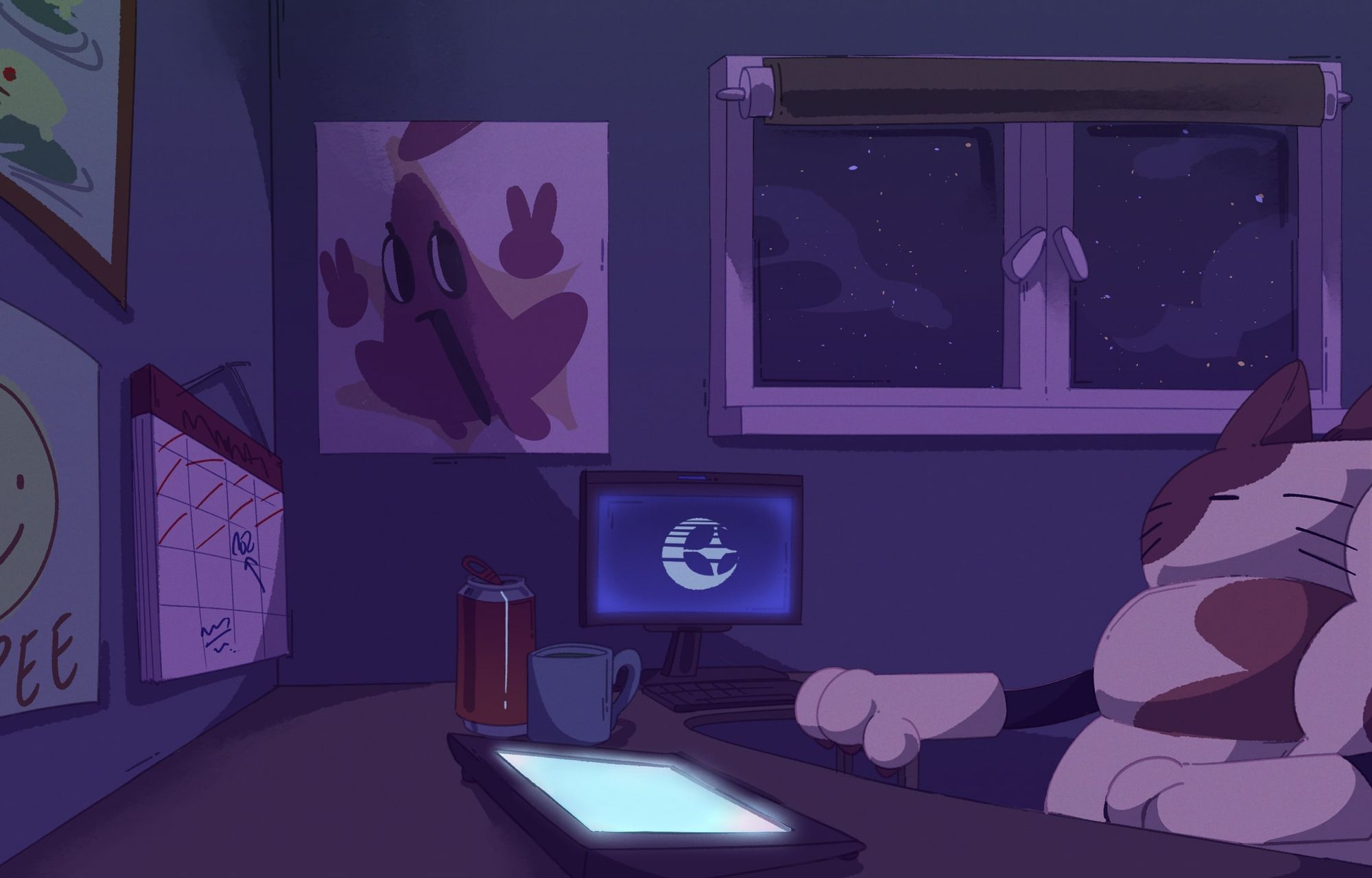
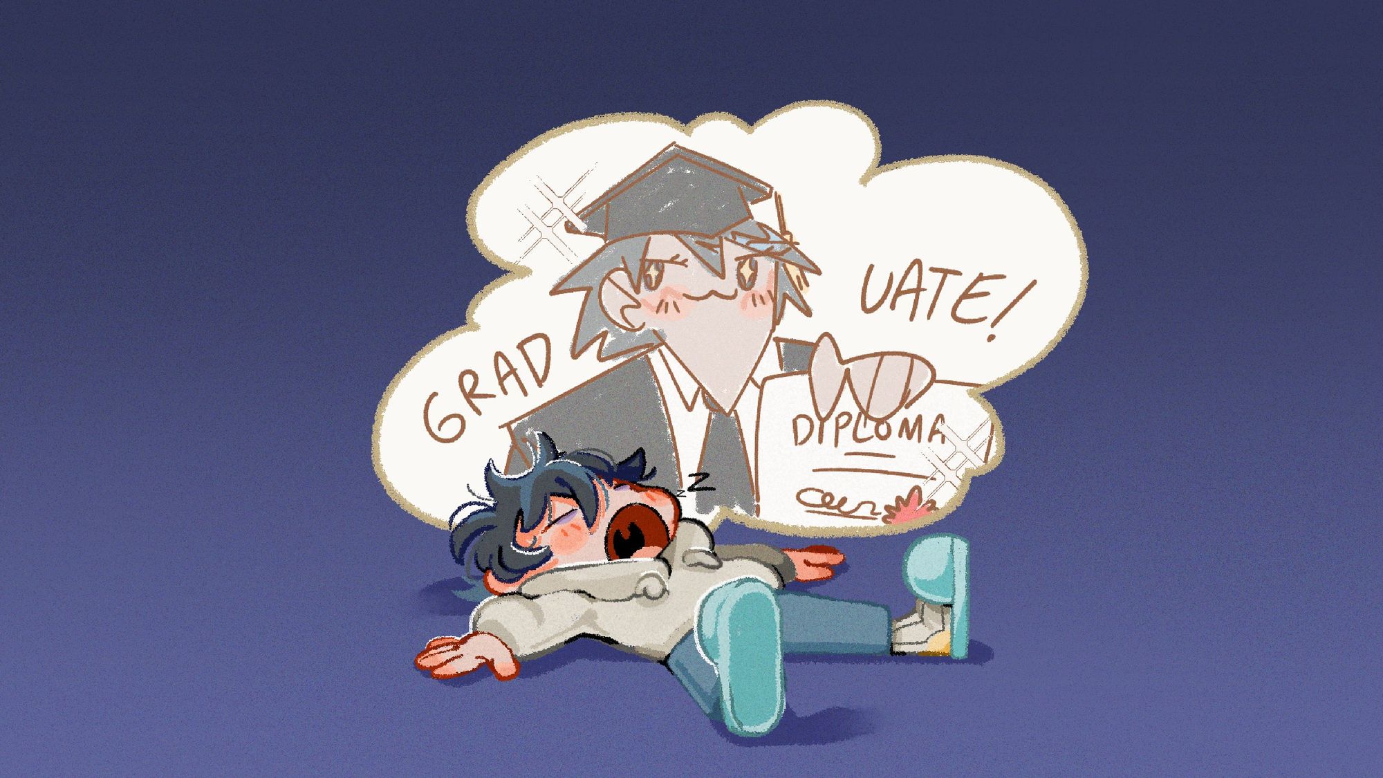
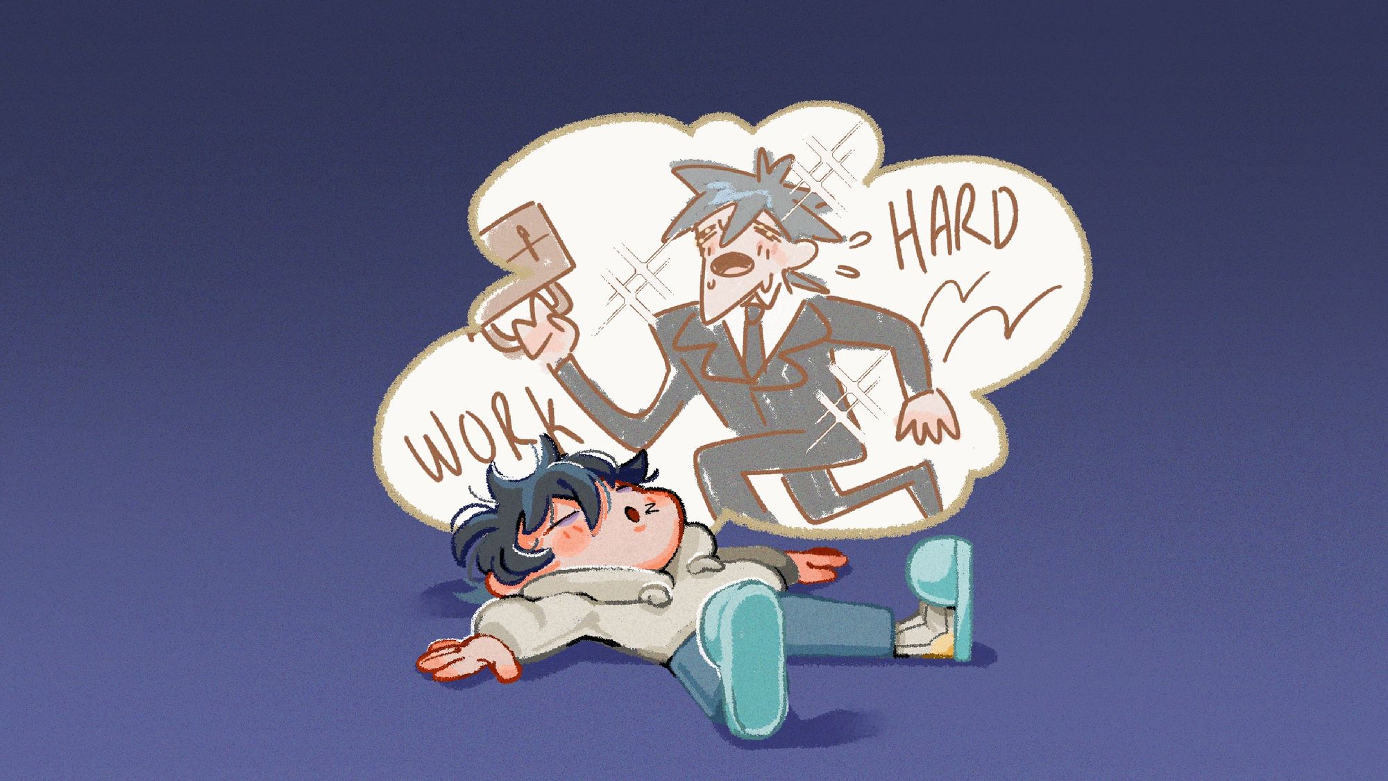
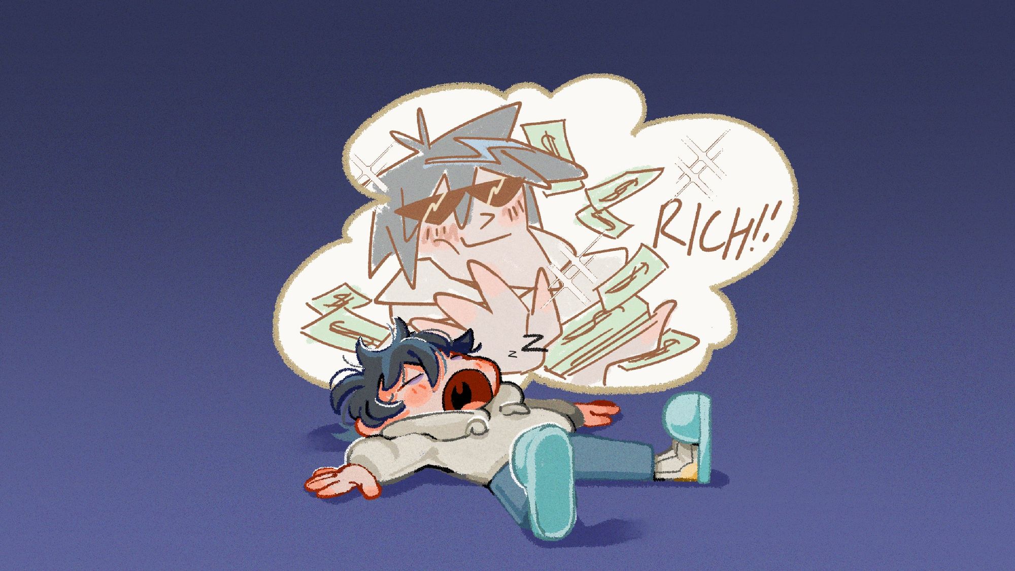
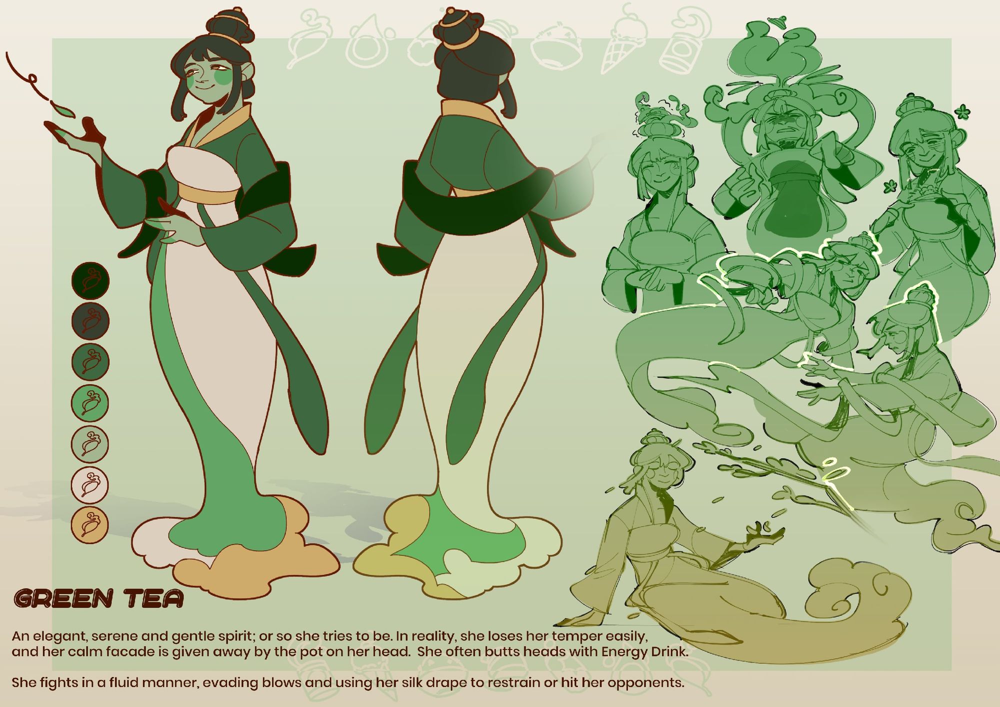
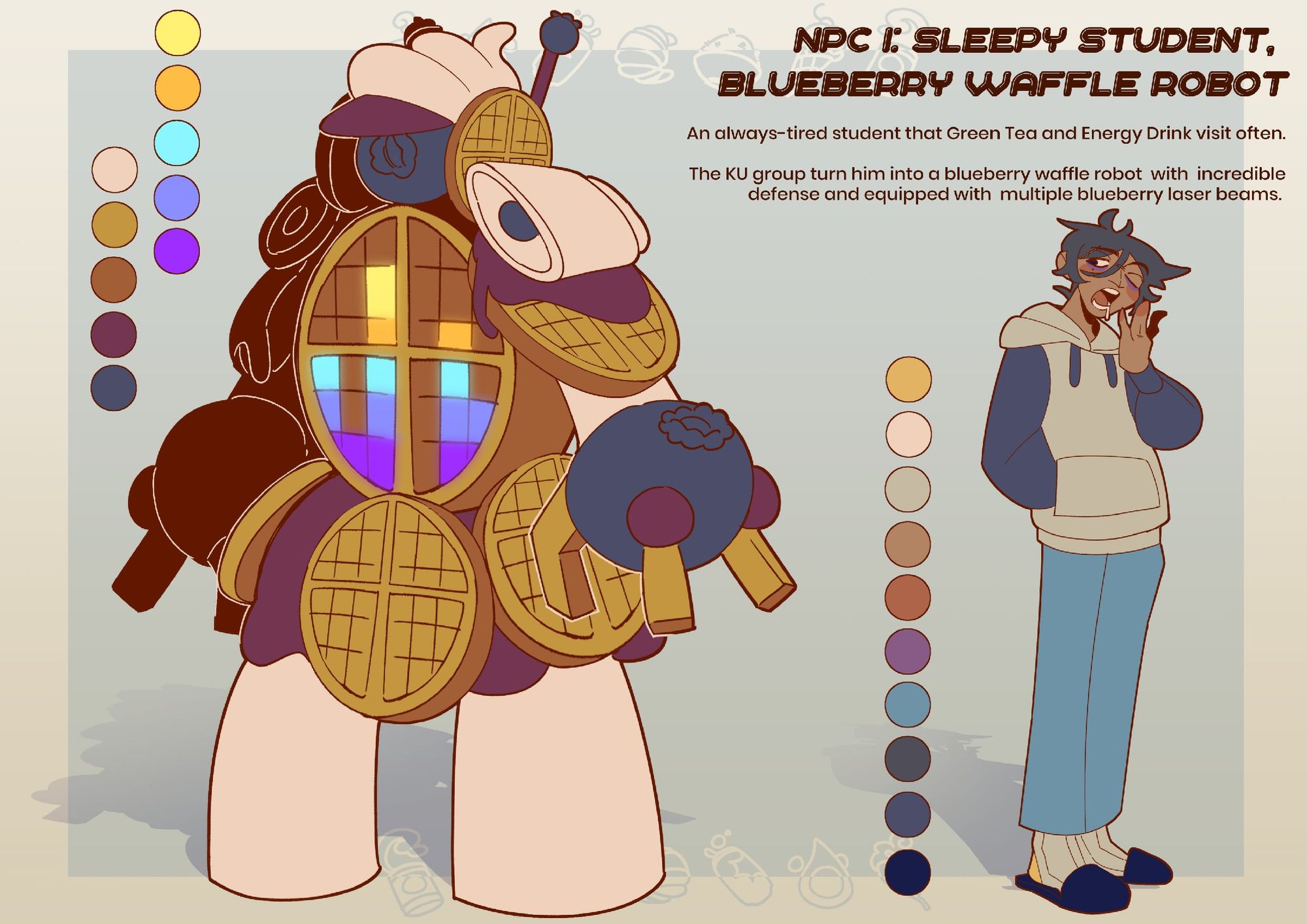
The short film, later named “Wakey Wakey”, centred around two girls that were spirits of caffeinated drinks. The first was the traditional-looking and elegant Green Tea, who despite appearing calm was quick to become angry or annoyed, a trait that was given away by the steaming teapot atop her head. Her friend and rival throughout the film, Energy Drink, contrasted this by being a spunky, punk-rock style girl with much more open emotions. Over the course of the film, they fought to keep the tired Student awake and working in the face of his rapidly approaching deadline.
My first step in this project was to design the film’s three characters; working from Yuya’s initial concepts, I began with a series of quick character sketches in Clip Studio Paint. I used one of my favourite weighted brushes, “CIRO” (ID 1917613), for the line work, and the default Turnip Pen for flat colours. The first pass of designs was more closely linked to my own art style and preferences, but as the iterations continued I shifted towards a style closer to Yuya’s through use of less cartoon-like proportions and more consistently weighted linework. For the latter, I opted for the slightly textured “するするペン” (“Pen to do”, ID 1917613).
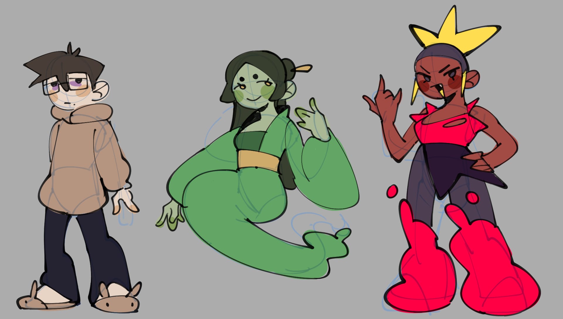
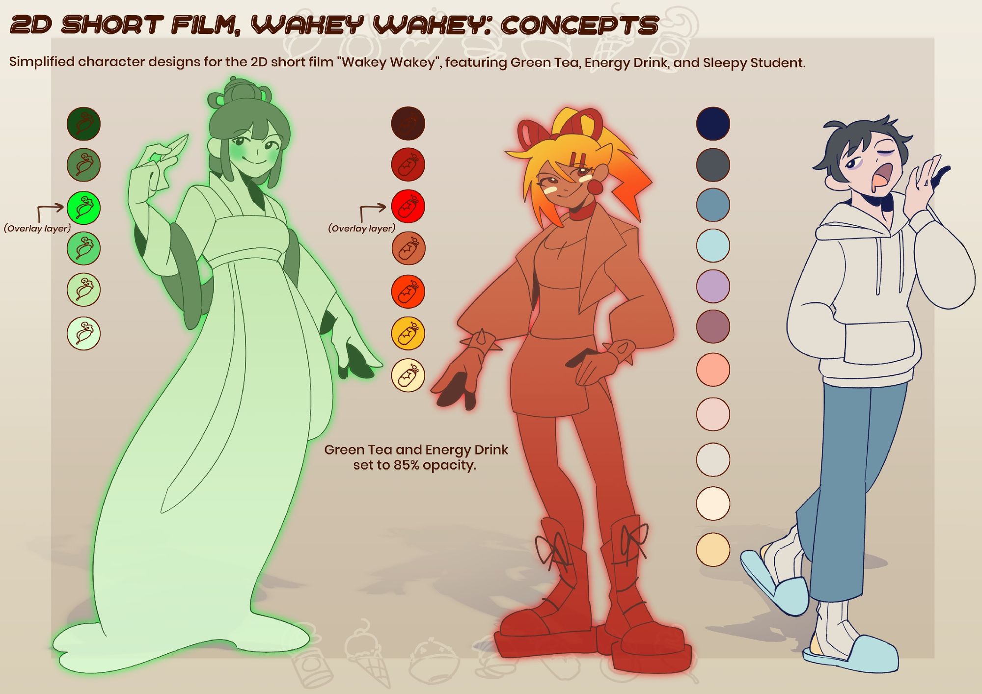
Initially, “Energy Drink” featured a more natural skin tone, however this resulted in her looking more human than her friend “Green Tea”, and so was shifted to a more saturated orange colour. Although all characters were originally fully coloured, we agreed to colour the girls with a gradient instead and to make them glow in order to emphasise that they were supernatural. Additionally, this made the colour work much more efficient with the small team size. The Student’s colour palette also quickly changed to feature more blues to distinguish him more from Energy Drink’s warm tones. In an early version, he also had a cat!
Alongside the characters, I was also given the task of designing the Student’s room, inside which the entirety of the film was to take place. Once again I worked with a sketch before beginning the concept after feedback and approval from Yuya; contrary to Student’s character design, his room was initially much more blue toned before being altered to something warmer. Unlike with the character design work, my process for the room involved a layered flat colour style, using a brush named “artemus chalkpen” (ID 2018139) and some screen tones (ID 1835931). Aside from this, many aspects of his room remained the same, although it did get a little messier! I had a lot of fun hiding a few inside jokes within the posters on his wall, including some of both mine and Yuya’s original characters from personal projects.
I was also able to design “Wakey Wakey”’s logo. Despite not having much experience with this type of design, I had fun playing around with it! One of my first designs certainly had many issues; the writing was too thin and difficult to read, and the little details were also hard to discern. Overall, I feel that the final logo came out much more fun and legible.
In addition to my concept work, I also worked a little on the production of “Wakey Wakey”, most notably on the background art. Although I planned to work with a style more similar to the concept at first, with flat colours and a pencilled brush, this clashed too much with the animated characters once they were placed into the scene. Instead, I opted for lined backgrounds with more cel shading as this was far more similar to how the characters would be rendered. For this, I worked with a combination of the aforementioned “Pen to do” and “Turnip pen” with flat colour and multiply layers, using “Lump watercolour blur” (ID 1696556) and a noise overlay to add a little bit of texture.
As the entire film took place in only one area, many of my backgrounds were for differently angled shots of the Student’s room, with a main focus on his desk. For this, an asset called “The Only Perspective Grid You Need!” (ID 1807950) helped out a lot with quickly finding the perspective for each angle I was drawing. A few were close-ups of objects such as Student’s wall clock, desk alarm, and his green tea mug and energy drink can. I also experimented with the original colour palette to sell the illusion of darkness without obscuring the room too much.
On top of these, I also dabbled a little in the animation side of things, working on the colour and lighting of a couple of shots featuring Green Tea and Student, this time in Photoshop. To match with the backgrounds, I worked with Photoshop’s own default “Turnip pen” and multiply layers to shade. I also did a short and simple animation of Student dreaming to accompany the film’s credits. Returning to Clip Studio, I worked on this animation with a brush named “うさちゃんえんぴつ” (“Bunny Pencil”, ID 1895890). It’s likely obvious by now, but I’m a big fan of working with textured brushes, especially those mimicking traditional media such as crayon and pencil!

In addition to my work on “Wakey Wakey”, I produced a concept book under this premise named “Consumabrawls” as a play on the word “Consumables”.
Set in the same universe as “Wakey Wakey”, “Consumabrawls” was a magical girl supernatural comedy, inspired by the likes of All Saints Street (2016, Lingzi) and Miraculous Ladybug (2015, Zagtoon).
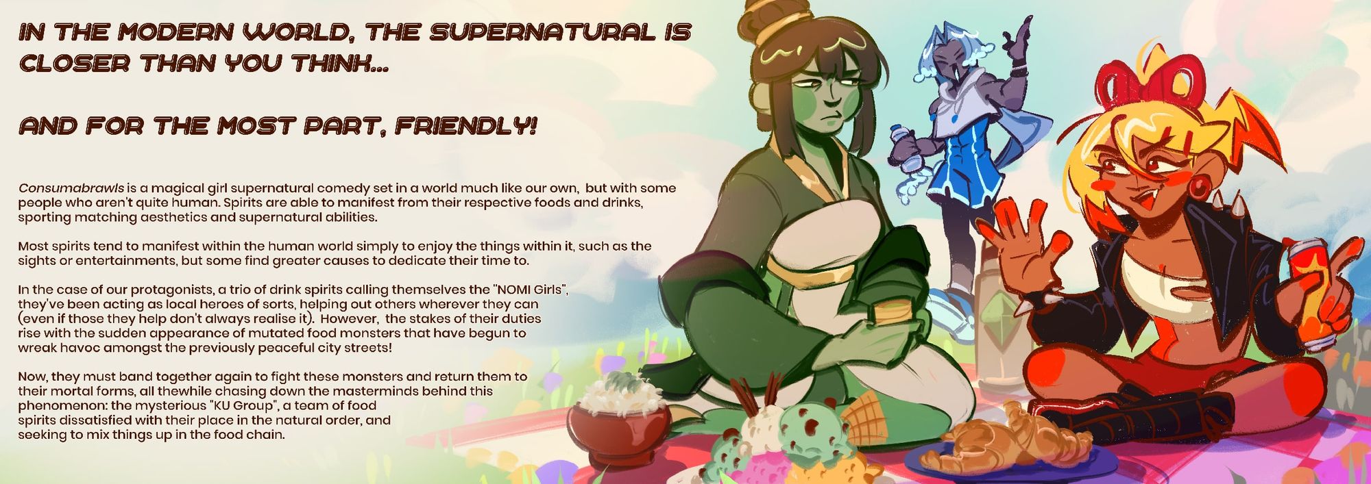
As the concepts in this book weren’t set to be animated as part of this project, I instead designed them to be part of a long-running, studio-produced series, allowing me a little more detail in the character designs as well as more freedom with my own art style, which can be seen in these versions of Green Tea, Energy Drink, and Student. Although allowing myself more freedom, I sought to keep these characters fairly recognisable as their film counterparts. I also stuck to the same brushes I used for the film character designs, however I changed the lineart to a warm and dark brown tone and thickened up the linework a little more to suit my own preferences. Additionally, the “close and fill tool without gaps” (ID 1759448), lovingly nicknamed the “ice cream tool” for it’s icon, was a lifesaver when it came to masking both my lined and sketch work for colour.

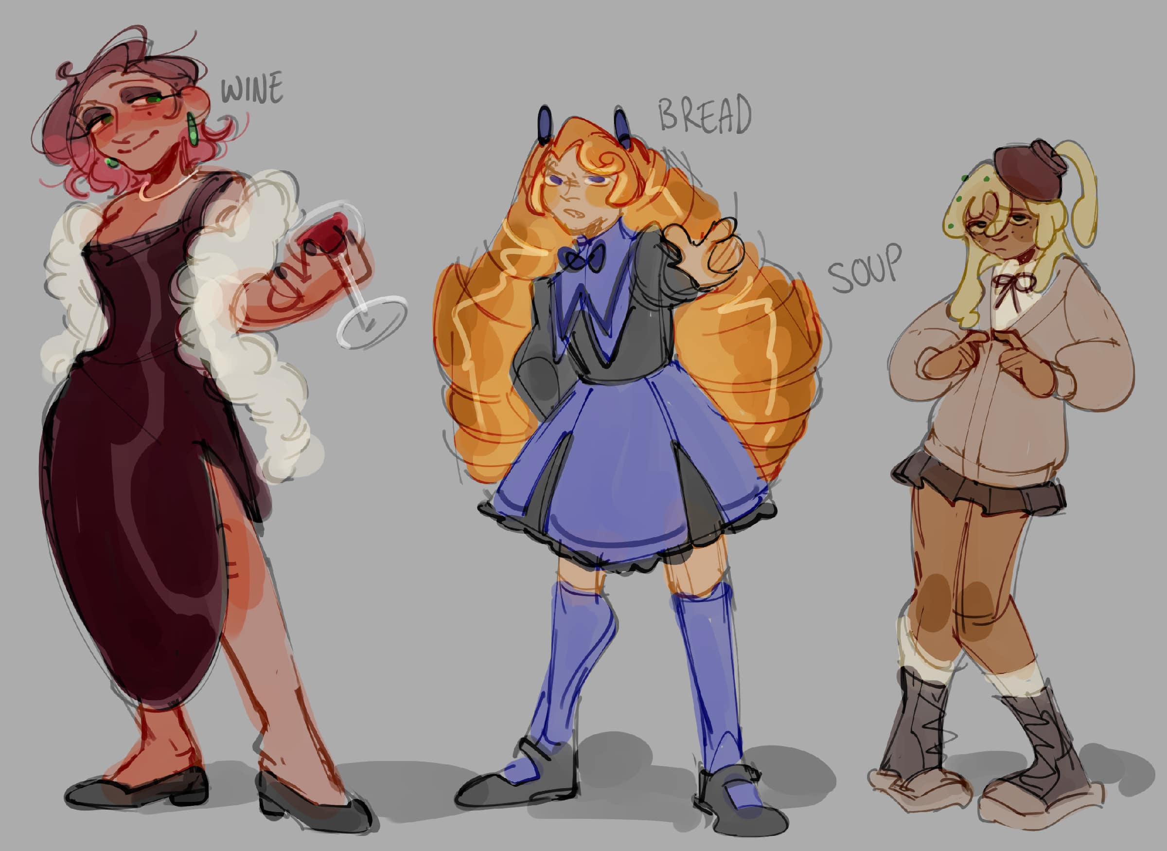
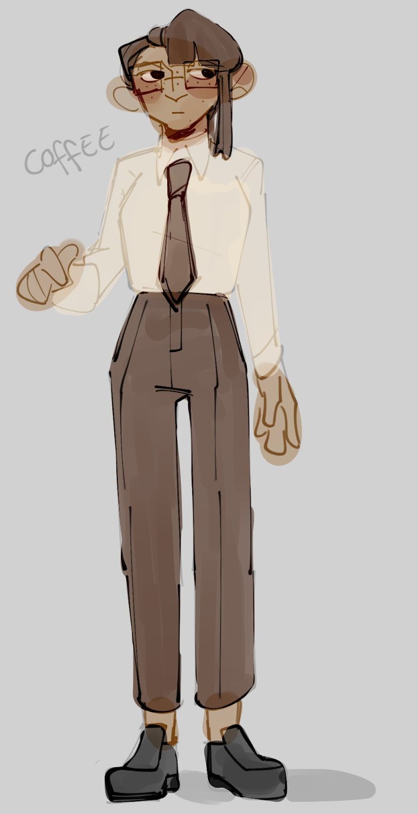
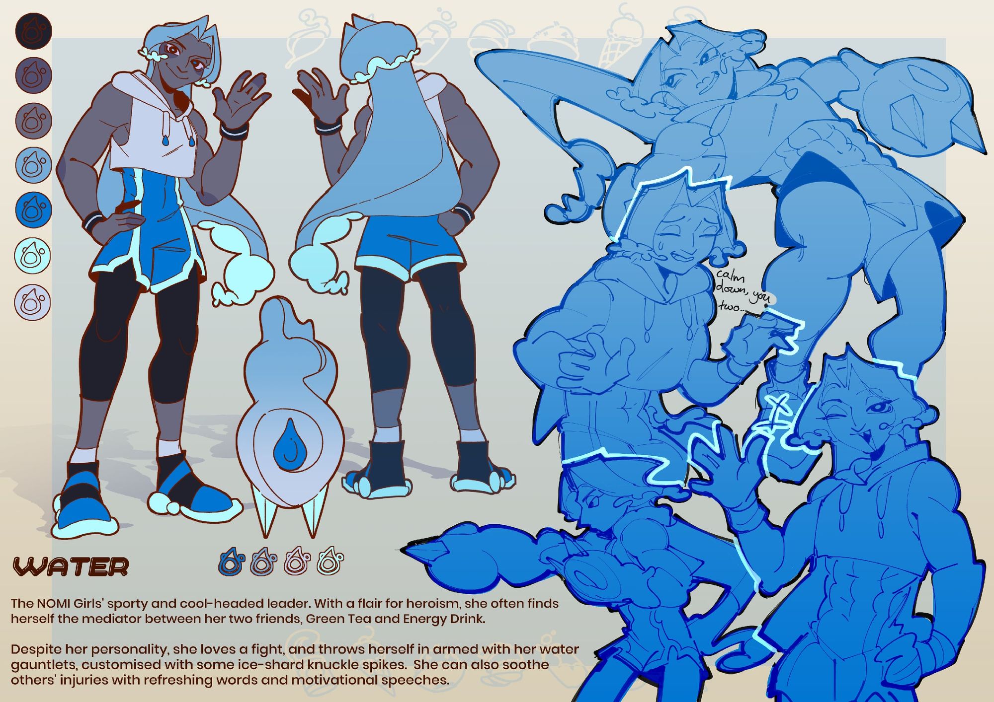
As I was already doing a fair bit of background work, I wanted to focus “Consumabrawls” on its casting, with the aim of building up engaging and memorable characters and thinking about their dynamics with one another. In some of my early work, you can see some sketches of scrapped drink spirits, Water’s first design, the largely unchanged designs of Bread and Soup, and a couple of creature sketches. Wine was intended to be a sometimes ditzy, sometimes elegant character, and Coffee a stoic and logical one, however the former overlapped with both Green Tea and Energy Drink who were already present in the lineup, and the latter too similar to Rice, a later-designed character.
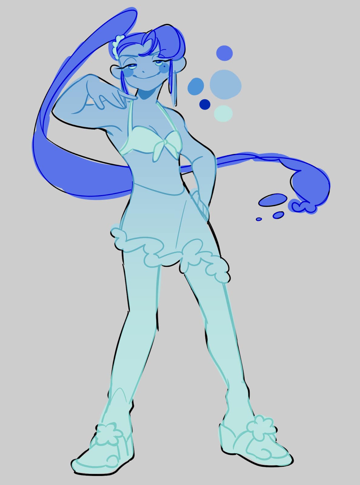
From the scrapped concepts, it is easy to see that Water was initially going to be a more “Queen Bee” style of character, maintaining the role of NOMI Girls’ (a name for the trio of drink spirits) leader. However, I was reminded of the phrase “Coffee and water are best friends and should be drunk together”, used as a reminder to stay hydrated when drinking caffeinated drinks, so shouldn’t Water be the best friend of Green Tea and Energy Drink? Thus, she became the cool-headed mediator to Green Tea and Energy Drink’s rivalry, something maintained from “Wakey Wakey”’s story, and her sporty makeover came from my desire to have a more tomboyish girl in the main cast. Like all of the props featured with character pages, I had fun designing some liquid-looking gauntlets for her.
And so, the protagonists of “Consumabrawls” were complete! Next was the issue of the antagonists, and who better to fight drink spirits with than food spirits?
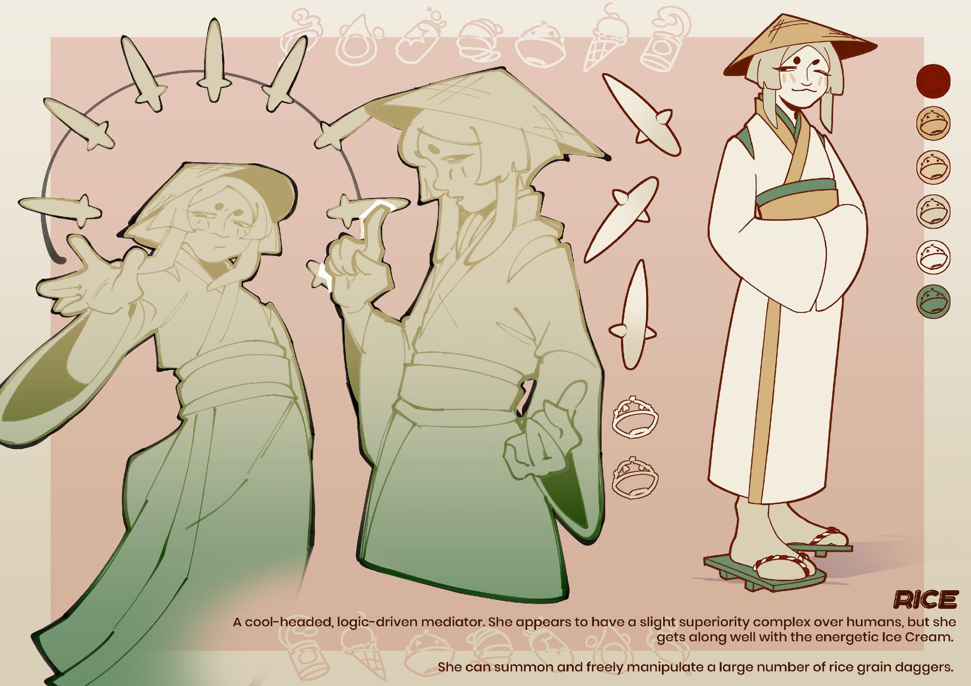
Rice, as the successor to Coffee, took the spot of the “cold and logical” character. Taking inspiration from traditional Japanese aesthetics, she sports a bamboo hat and wears geta on her feet. She serves as a parallel of sorts to Green Tea, possessing the detached elegance that Green Tea tries but fails to have.
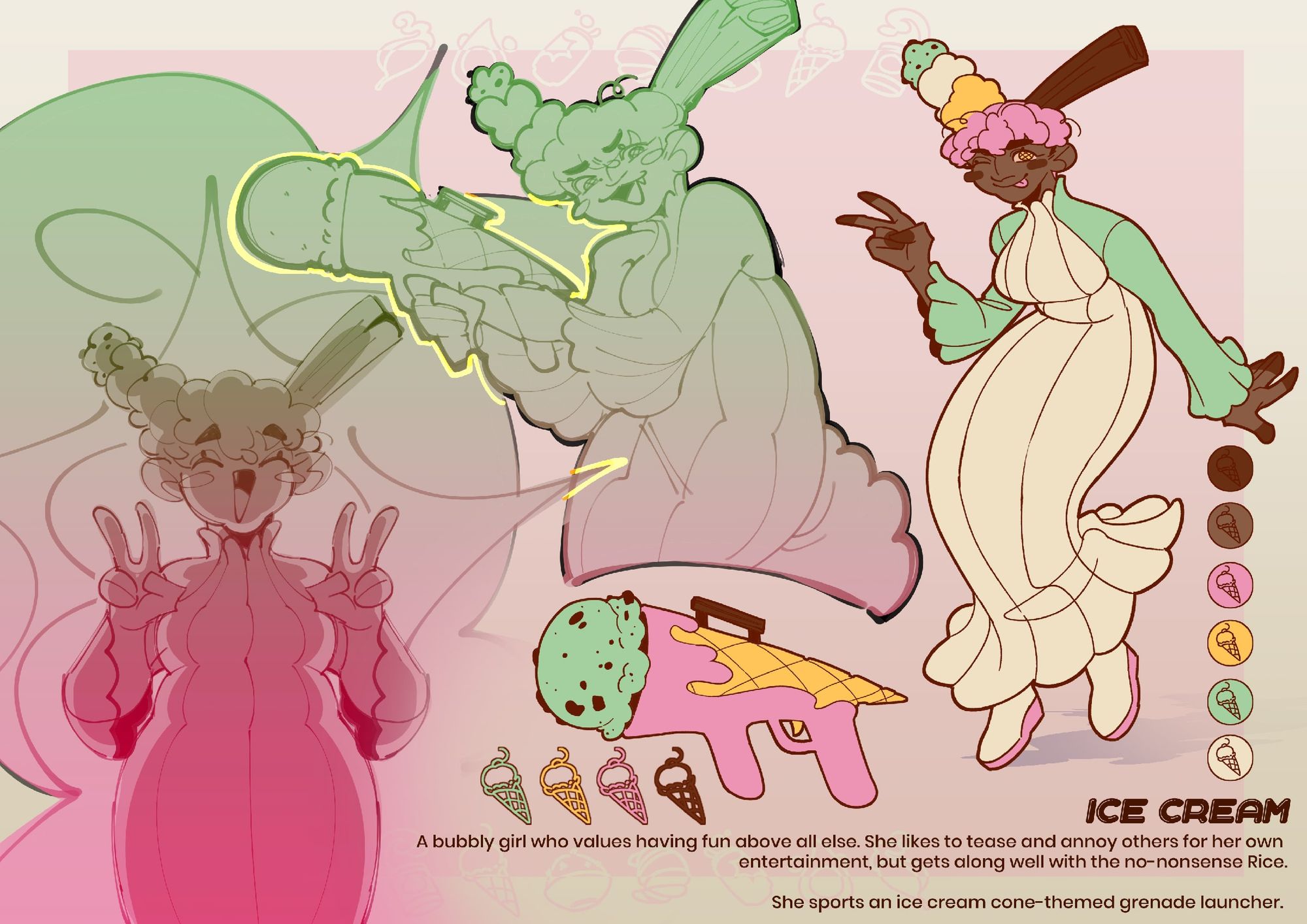
Ice Cream, in a similar vein, parallels the bubblier Energy Drink in her high-energy and emotive personality. Rather than being inspired by a certain aesthetic, I focused on mimicking the shape of an ice cream scoop with rounded shapes and flared sleeves and hems, and, mirroring the dynamics between the NOMI Girls, she was written to get along well with Rice despite their differences — This, of course, being the opposite of Green Tea and Energy Drink’s frequent bickering.
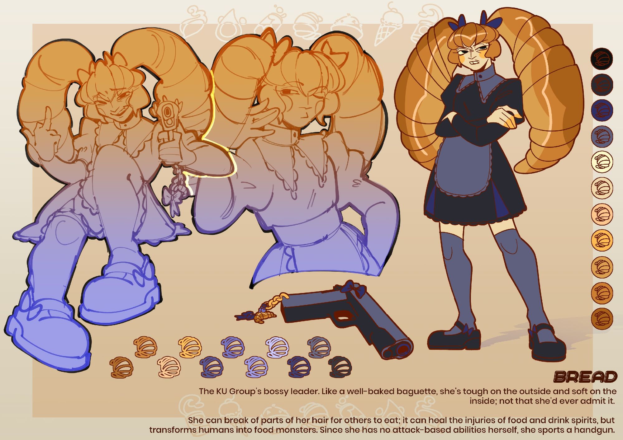
Bread, the leader of the food spirits’ KU Group, remains largely unchanged from her initial design. I wanted her to have a European, gothic lolita-inspired outfit, and to don an apron due to her frequent baking; it is, after all, her pastries that she uses to turn harmless civilians into the food monsters that her group is known for. Like a well-baked baguette and the “Tsundere” trope, she acts a lot more mean-spirited than she truly is, and unlike Water’s role as a mediator Bread is largely detached from the activities of her group members. Also opposed to Water who possesses both attacking and healing-based abilities, Bread can only heal and create monsters; as to not leave her entirely defenceless in battle, I opted to give her a (non-supernatural) gun. It was fun to put a girly spin on such a dangerous weapon with some accessories matching Bread’s own design, with the image of a girl with frills and bows pointing her self-customised gun being very entertaining to me.
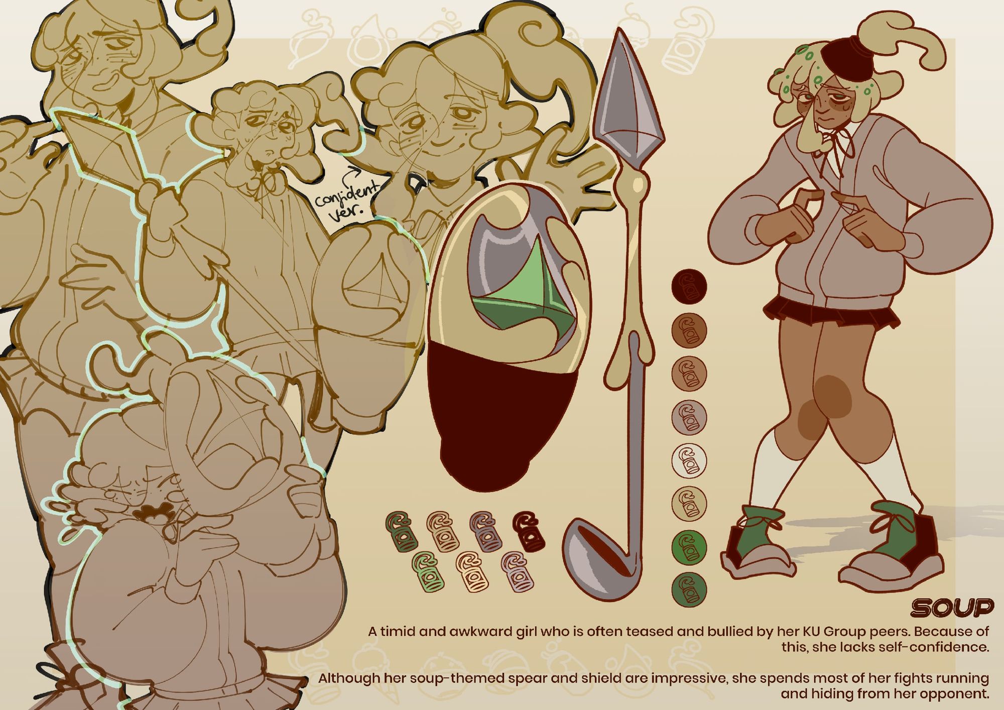
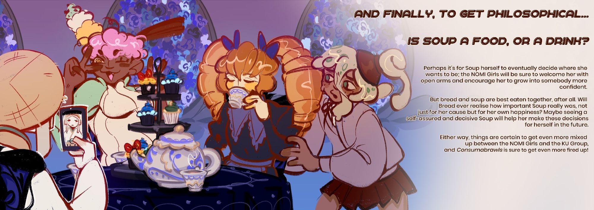
Soup acts not as a parallel to any of the other characters, but as a character intended to have potential within either group, based on the well-debated question of “Is soup a food or a drink?” Like Bread, she has changed little from her first design besides a haircut. As part of the KU Group, Soup is a timid and gloomy girl often bullied by her peers, lacking in confidence and hiding away in fights. Her intended story was to be that she eventually leave the KU Group to join the more supportive NOMI Girls, who would then support her growth as a character. I imagine the more confident version of Soup to still be soft-spoken and gentle, with a stronger side that is usually hidden away. Like Bread, Soup’s weaponry was another one of my favourites to work with.
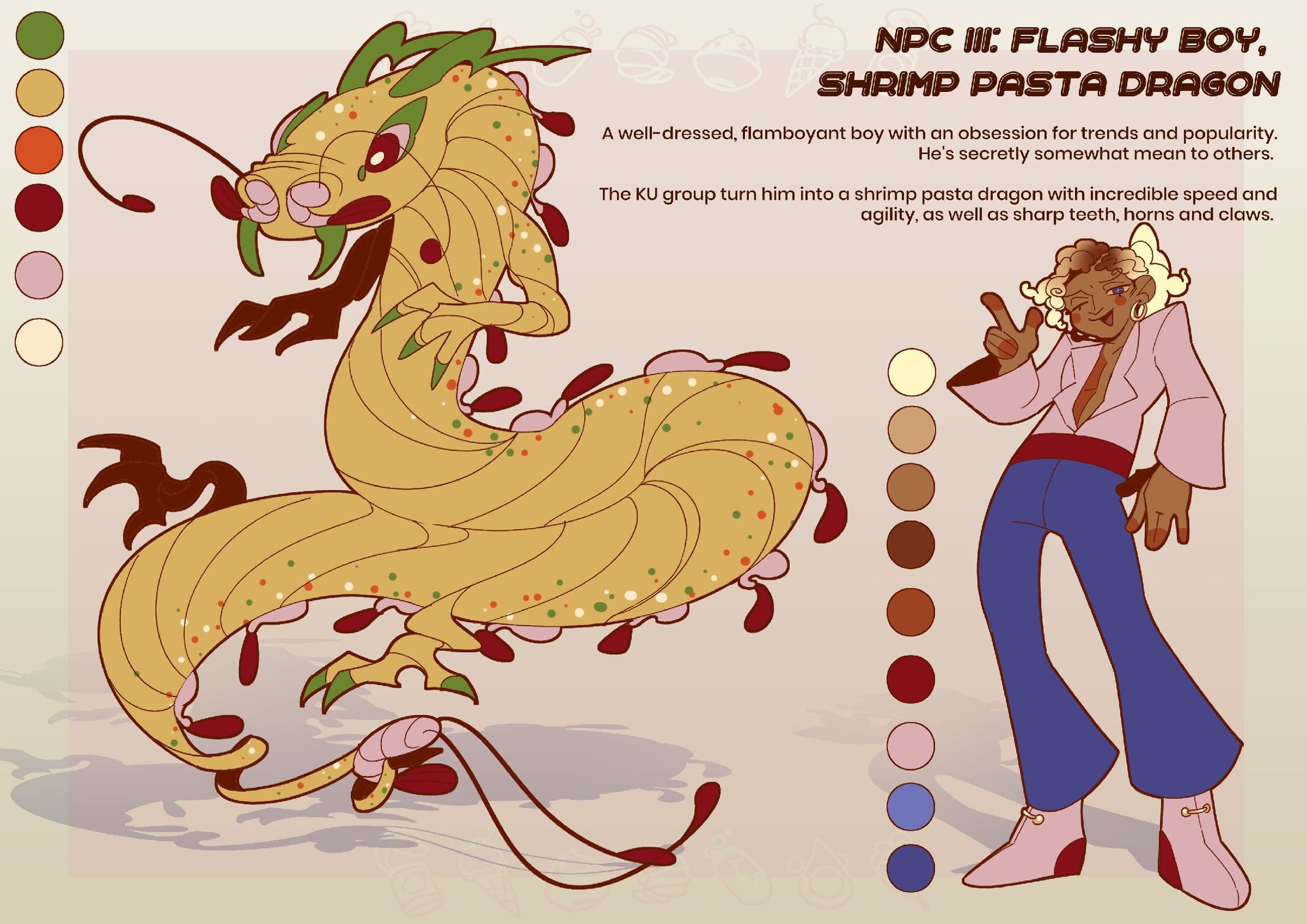
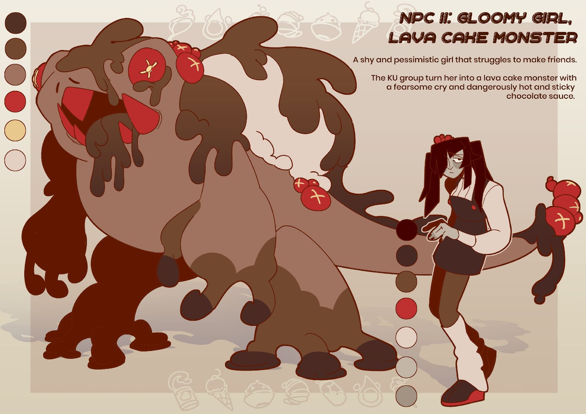
Adjacent but not directly related to the KU Group as antagonists were the few designs I made of NPCs or “side characters”, and the monsters that they would be turned into. Since Bread turns them into monsters through the baked goods she gives them, I imagine that the NOMI Girls would be able to defeat monsters by simply making them cough the pastry back up, or something similar. I also drew some group shots of both NOMI Girls and KU Group to showcase their personalities and relationship dynamics a little. The “introduction” and “send-off” pages ended up being some of my favourites due to their fun colours and more atmospheric results.
With that, both “Wakey Wakey” and “Consumabrawls” come to a close! It was my first time working on such a long-running project, but I’m happy both with the work produced and the skills I’ve learnt from it!
Check out more of Devon's work here.