
THE BERSERKER: From Concept Art to 3D Character
This Viking Berserker character, created by a team of five during the Skyup Academy CG Masterclass, is a showcase in collaboration and creativity.
This Viking Berserker character, created by a team of five during the Skyup Academy CG Masterclass, is a showcase in collaboration and creativity.

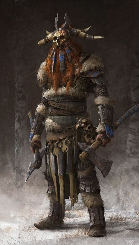
This character is the result of teamwork by five people during the CG Masterclass at Skyup Academy. Our character, a Viking Berserker, was conceptualised by Max Hugo.
The goal was to function as a small production team and faithfully reproduce the assigned concept in 3D using the software tools they had learned, within a month time frame. Check out 'The Berserker', a collaborative project from concept, to 3D Render.
This was our first team project at Skyup Academy Masterclass, and we were excited to collaborate actively with other students, grow our skills, and create an impressive portfolio piece.
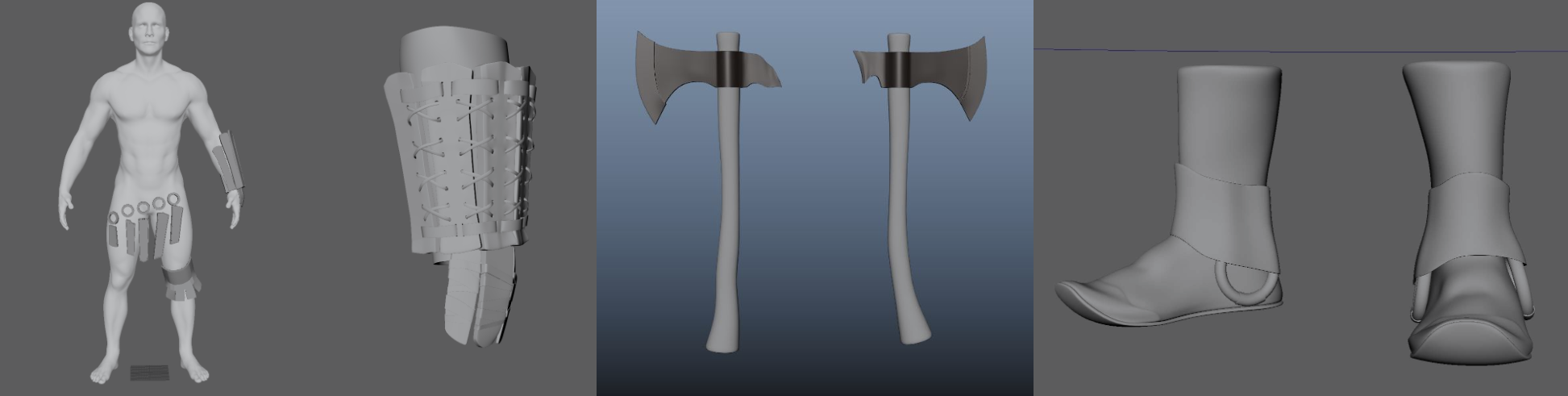
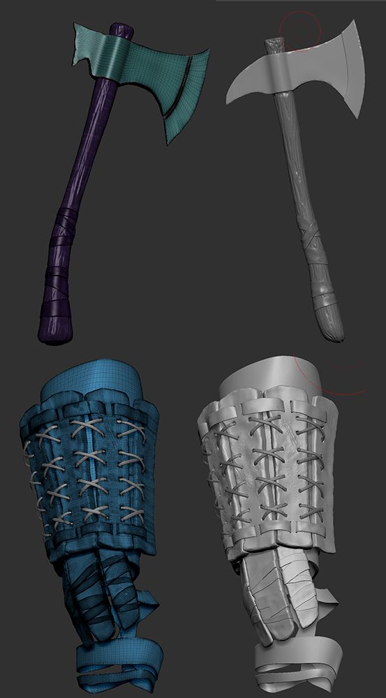
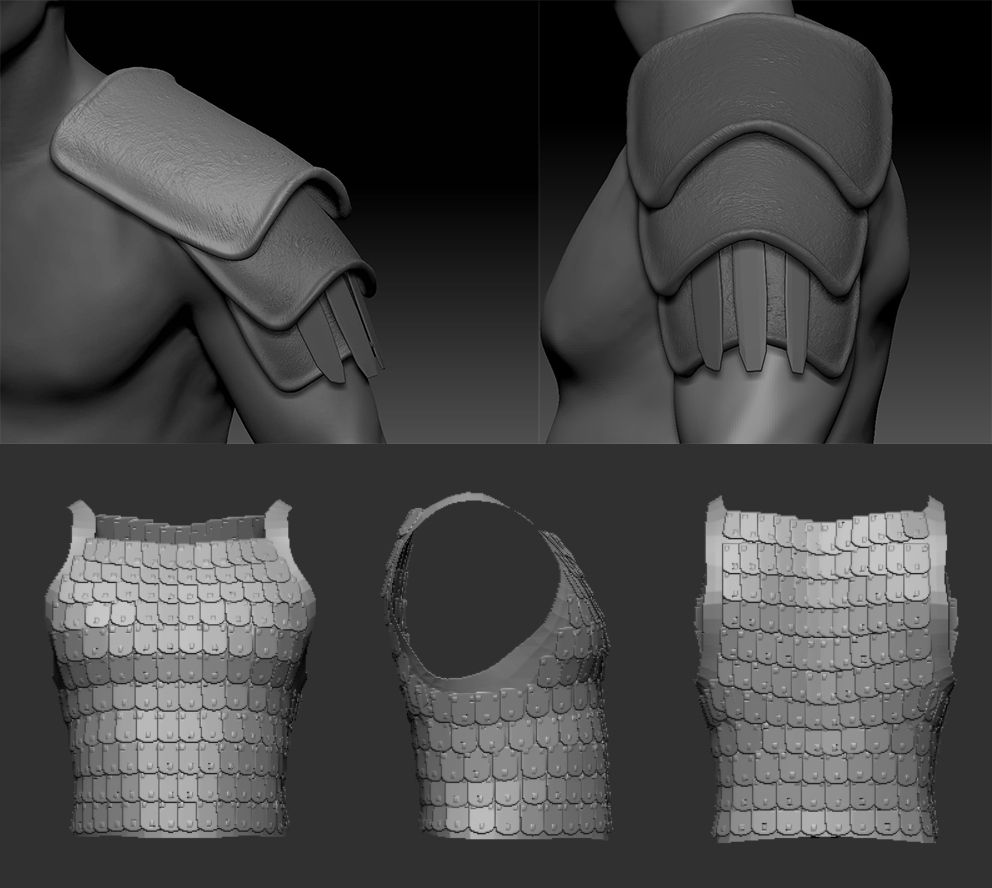
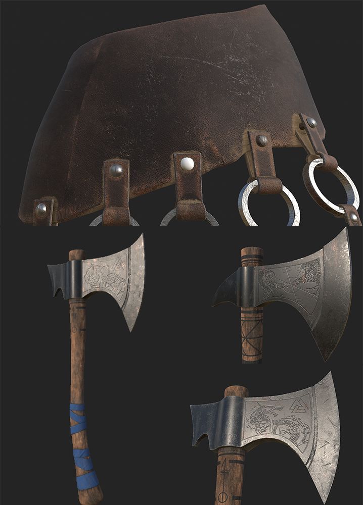
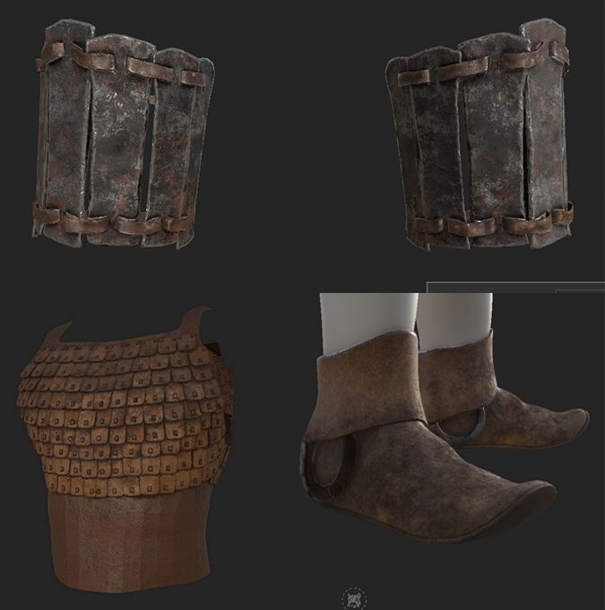
We divided roles based on our individual interests in future production jobs. Although I had broad interests, my ambition was to become a 3D generalist or an Environment TD Artist, with specific interests in shading, rigging, and animation. I volunteered for these roles and also modeled and textured some props for the character, such as the axes, forearms, and upper body armour.
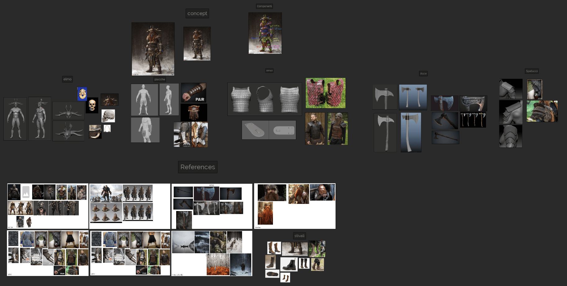
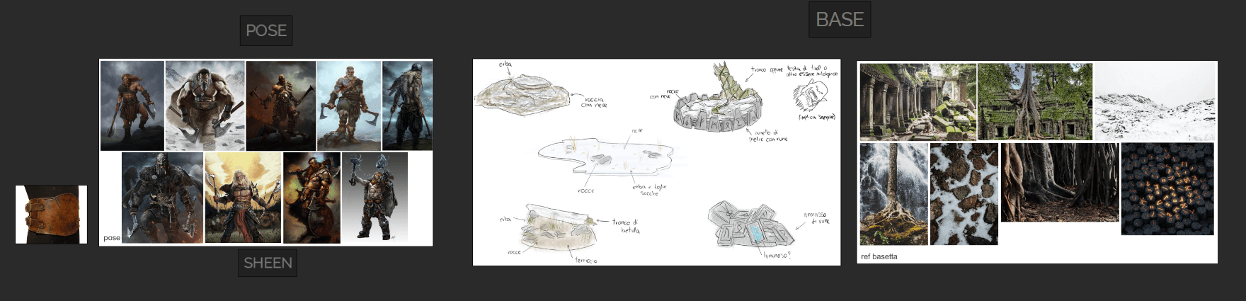
We analyzed the concept to divide tasks among group members, looking at the character's elements and gathering references to better understand the subject.
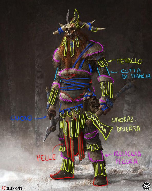
Our primary references were "Assassin’s Creed Valhalla," the "Vikings" series, "God of War," and "The Elder Scrolls V: Skyrim." We studied Viking folklore and Norse mythology for more context. Understanding the character's props was challenging, but the concept’s vagueness allowed us some artistic freedom, provided the styles matched. We used PureRef to collect and organize our references efficiently.
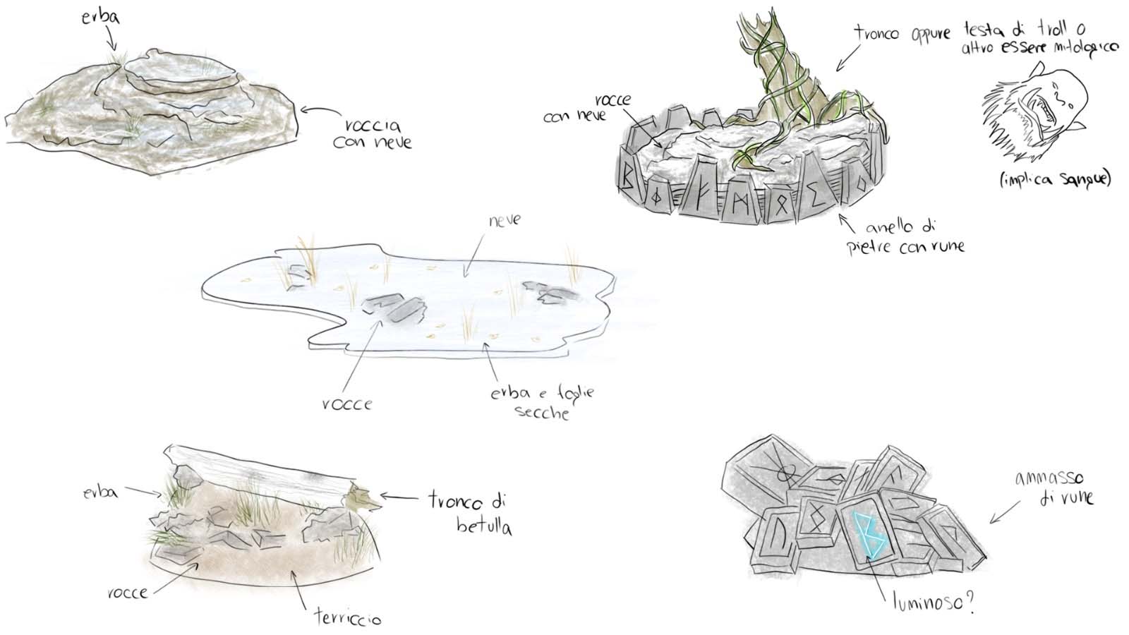
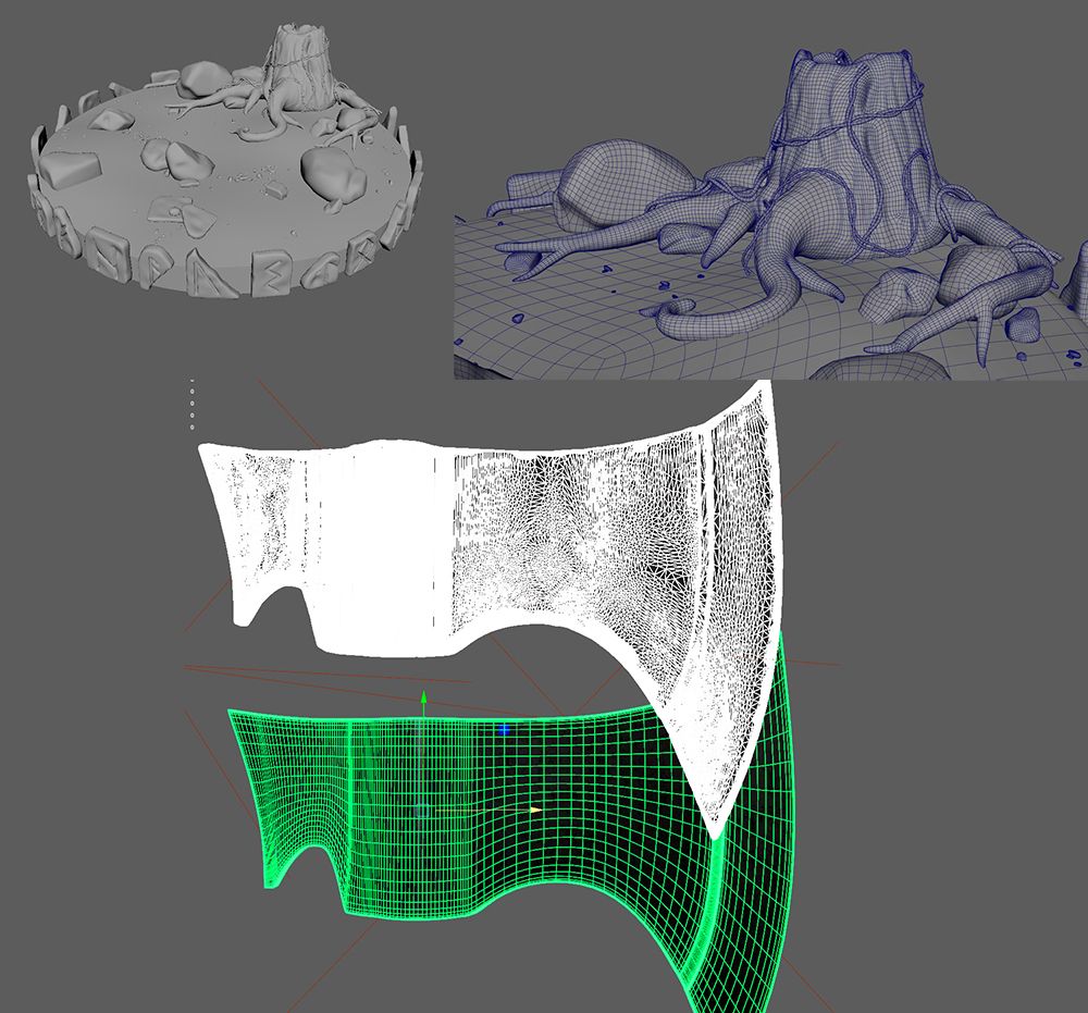
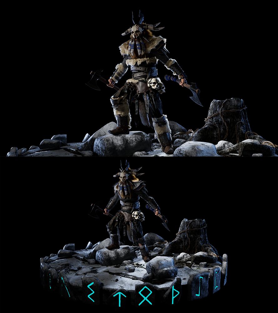
Sara, a group member and our former team leader, began designing a small environment to contextualise the character.
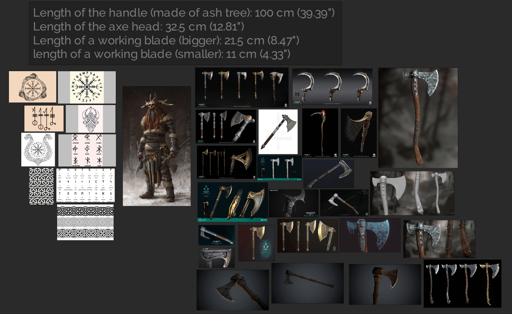
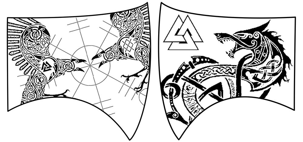
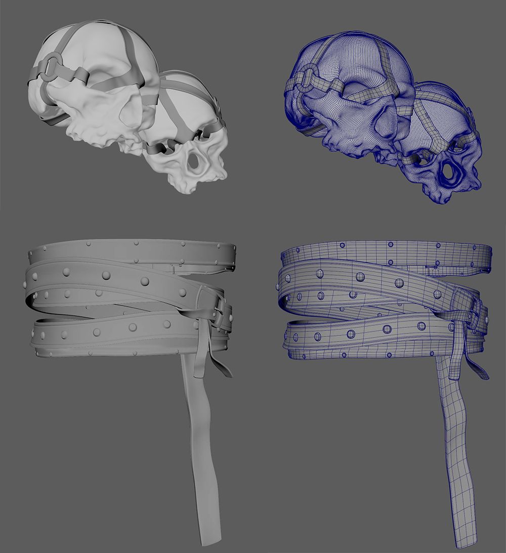
With artistic freedom, I decorated the axes and armour plates with Nordic symbols I custom-created in Photoshop. Drawing from my visits to Iceland, I included famous legends: Huginn and Muninn, Odin's crows, and the Vegvisir symbol on the right axe; and Fenrir, the monstrous wolf, and the Valknut symbol on the left axe.
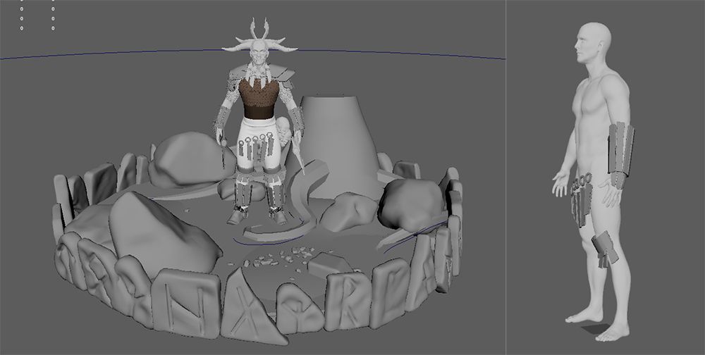
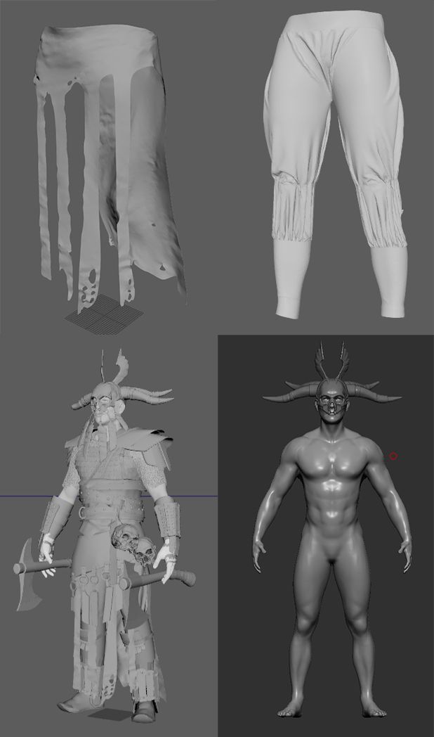
We assigned specific tasks and began by sculpting an early stage of the character’s body in ZBrush, defining the height, muscle mass, and modeling pose. We chose the A-Pose to preserve reasonable body deformation. This helped us visualise the character's 3D shape and allowed everyone to block out their props using it as a reference.
Composing the character in Maya enabled us to see how the props fit together, achieving a cohesive look. Studying and collecting references helped us understand the proportions and spatial volume of each asset.
The blockout models were simple and low poly, giving us a clear initial look and making the character appear as if modeled by one person. This collaborative effort fostered a unified team spirit, essential for the project’s success.
This was when the team started building an “all for one” mentality, seeing the character acquiring a simple but really clear shape made everyone feel that this was a challenge that must have been accomplished together.
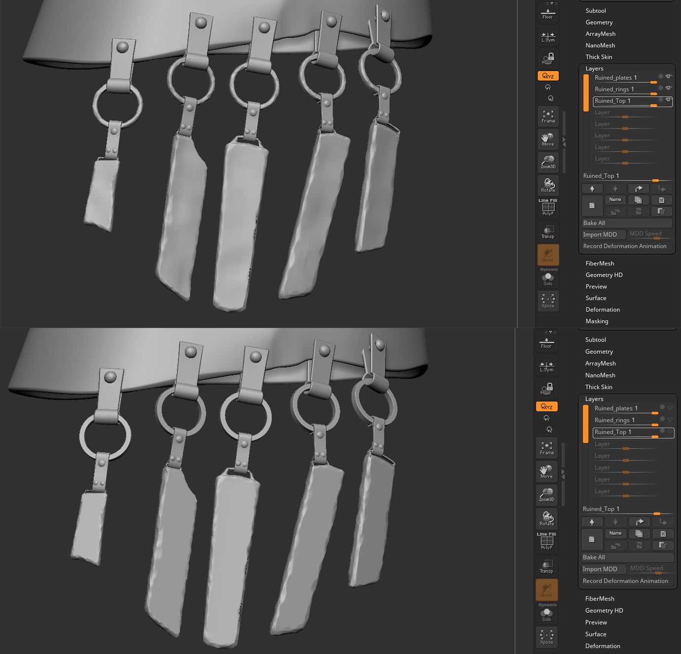
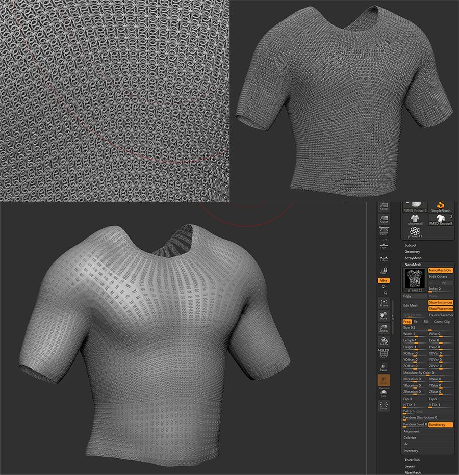
Following reviews, our teachers approved the blockout, and we proceeded to high-poly modeling in ZBrush, using brushes, layers, and displacement noises to add intricate details. The most challenging piece was the chain mail, which we created using the Nanomesh tool in ZBrush to scatter small rings on a base mesh.
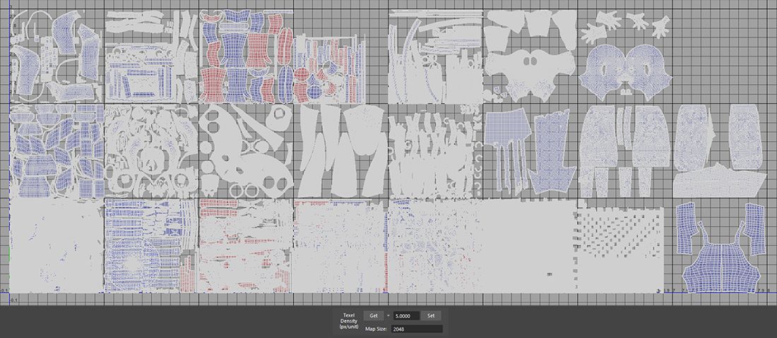
After detailing, we exported and imported the assets into Maya for retopology and UV mapping. We used a UDIM workflow to ensure high texture resolution, requiring careful planning and communication to avoid UV overlap.
Once the Zbrush details on the models were made and decimated, it was time to export and import the assets into Maya, where we did retopology using the Quad Draw Tool and UV mapping. Each asset had its own UV space, but we organized the UV space into separate UDIMs. The UDIM workflow allows for higher resolution on the textures of single models. It’s a very simple approach, but it requires a bit of communication and planning to avoid overlapping UVs. To do this, we created classic UV mapping and then moved it to the correct tile in UV space. We decided to keep the resolution of the textures and shells at 2048 and applied the proper texel density to each UV shell to achieve a homogeneous resolution for the assets. Maya was also used to properly create the hard surfaces on assets.
Marvelous Designer helped us create realistic cloth simulations for ripped cloth and trousers, a challenging task that produced satisfying results. The cloth, simulated with anchor points for realism, was imported into Maya for retopology and UV mapping. Mattia, one of my team members, was responsible for the cloth and fur.

To create the holes in the fabric and achieve a realistic ripped cloth effect, Mattia did superb work with the cut and sew tools. Placing anchor points on the belt of the imported character made the simulation of the falling cloth more accurate. The trousers also had anchor points on the belt and knees because the character had knee pads, shin guards, and boots over them. There were some heavy calculations due to the details we added, but we were very happy with the result. The exported clothes were then imported into Maya for retopology and UV mapping.
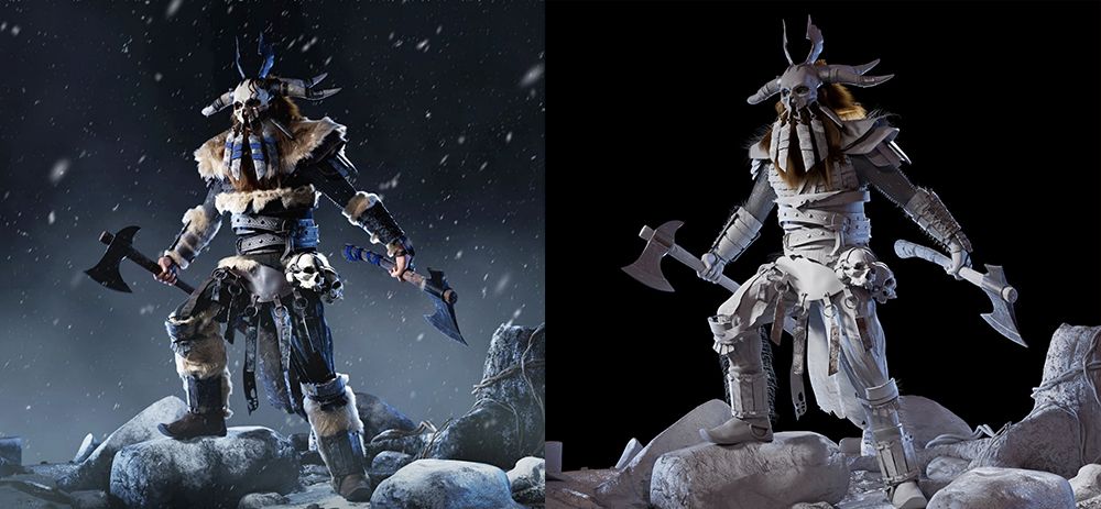
With the high poly model approved and UVs done, it was time to start the texturing process in Substance 3D Painter. We defined a visual style we wanted to achieve with the textures: Nordic environments and characters always look somewhat dark and moody, and we followed this path, adding some minor changes to the references to give each member a personal touch on the final model. Each team member textured their own modeled props.
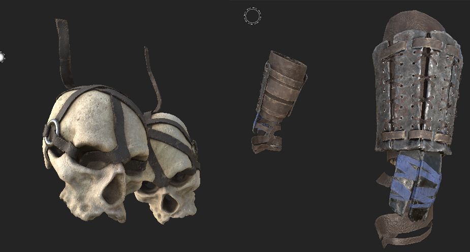
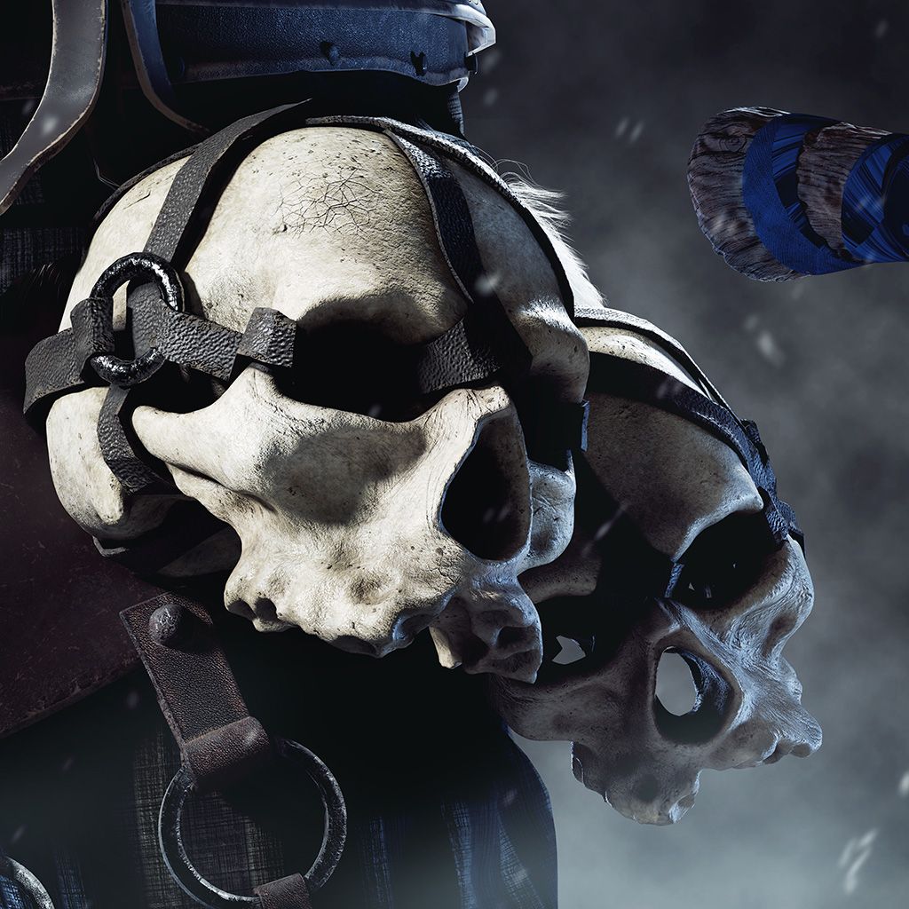
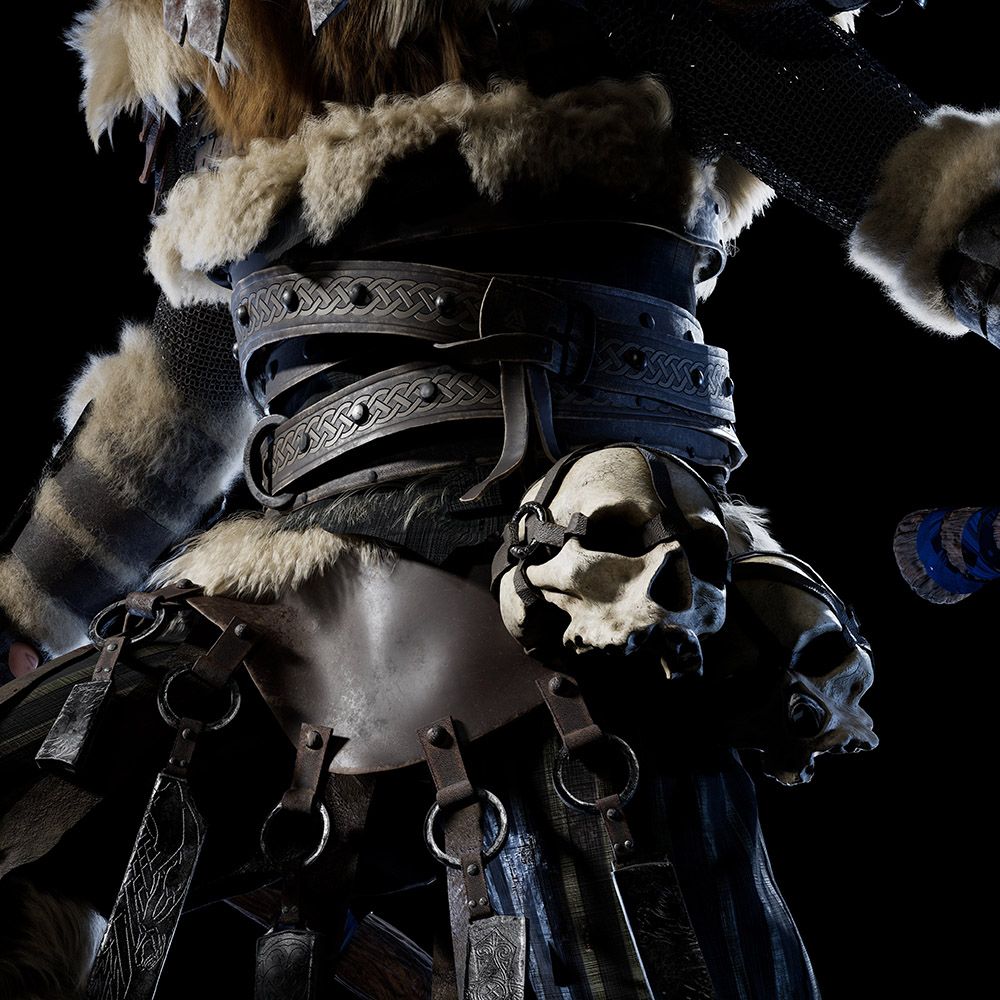
We focused a lot on bones, leather, and metal materials. I was responsible for the metal and leather, while Mattia handled the bones. Our approach was similar: we started with a base material and then added complexity by incorporating paint layers, noise masks, and grunge textures. We wanted every piece to feel alive, ensuring that each asset could tell a story about itself and the character. By organizing the UVs into UDIMs in Maya, we significantly lightened the load for Substance Painter, as it allowed us to avoid having all the UVs in a single tile.
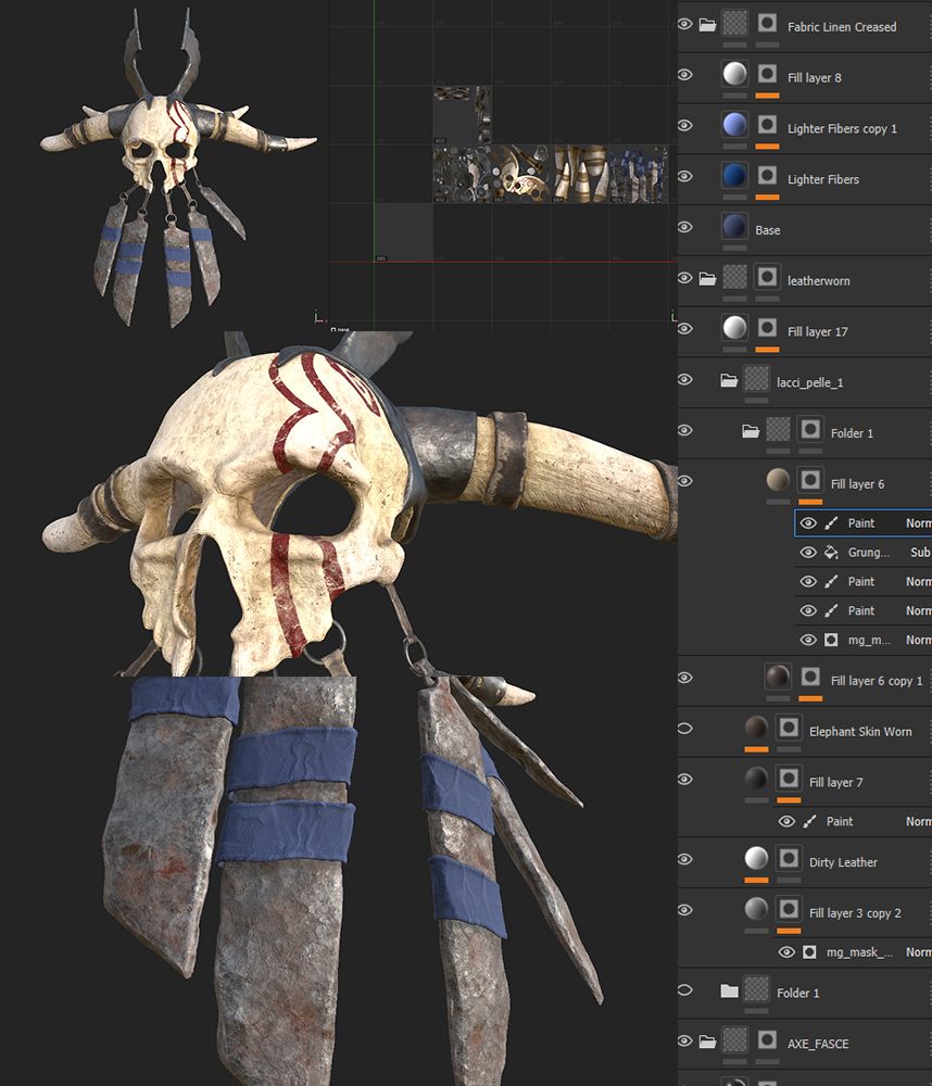
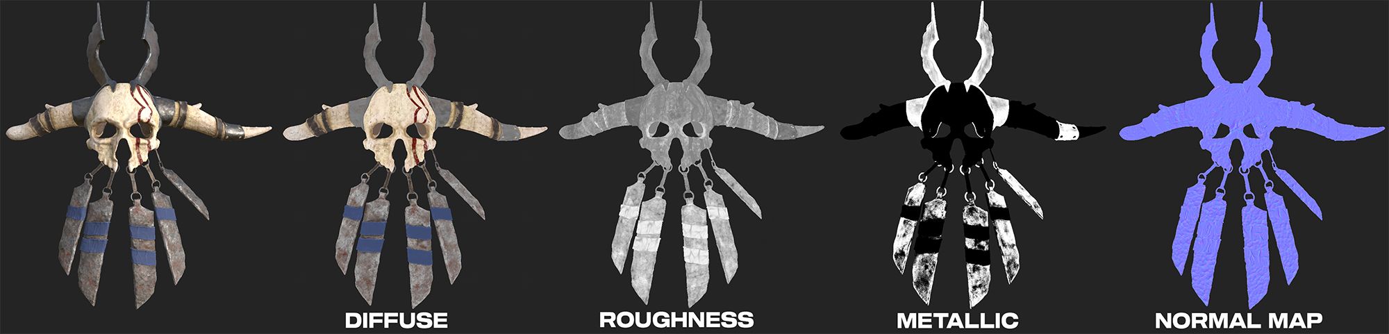
The metal needed to look like forged metal but show signs of damage from numerous battles the character had fought. It was also important for the leather to appear old and worn.
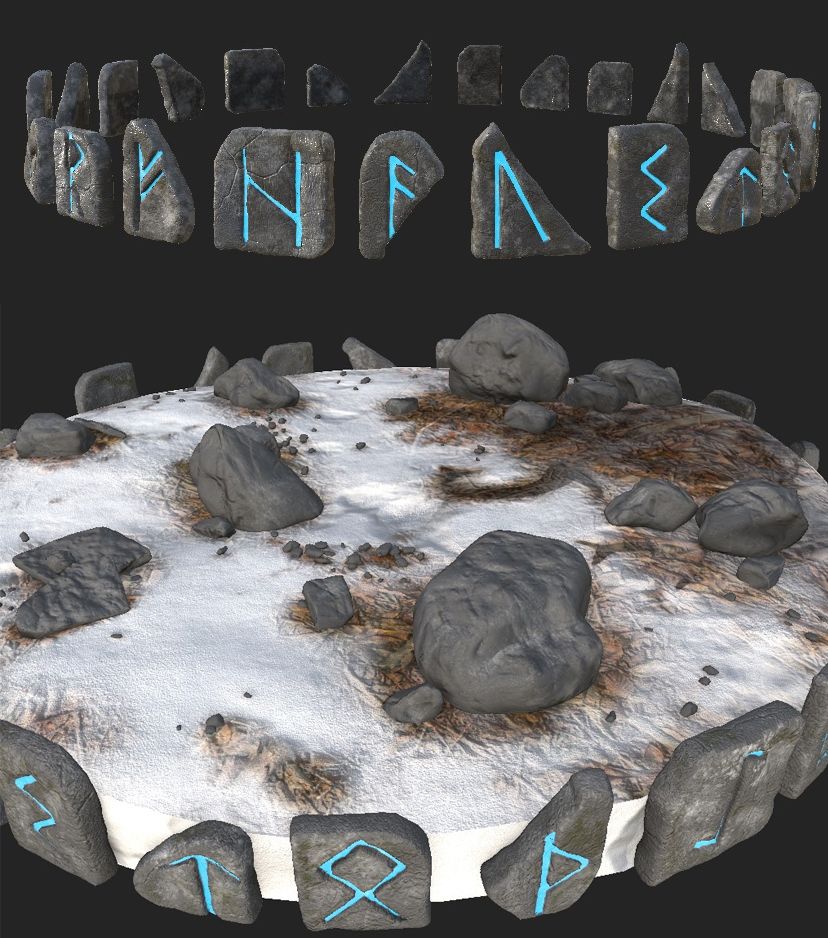
Sara continued her work on the little landscape and chose to depict it as a snowy ground with some rocks and a stump. The rocks surrounding the base represent Nordic runes, and the character's official name, FHAUSTO, a common Italian name, is inscribed on them. We added an H to make it sound more Nordic when pronounced.
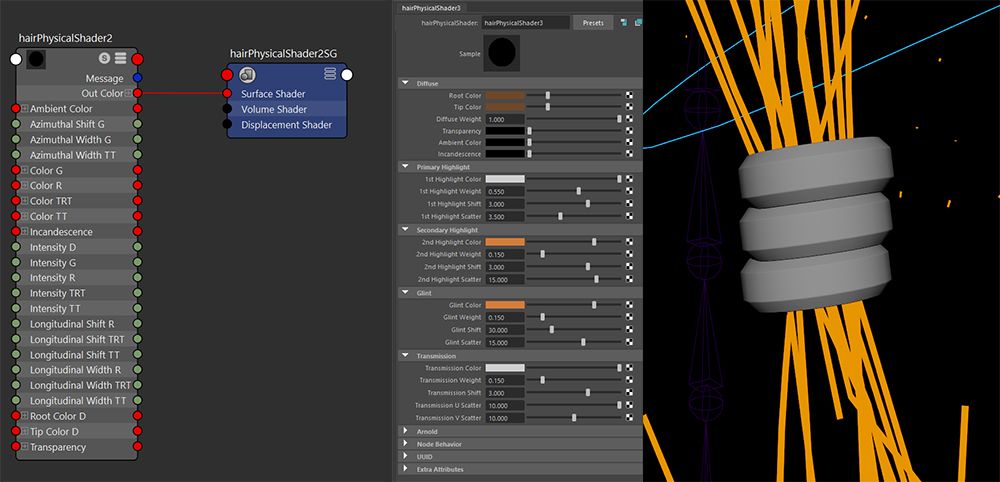
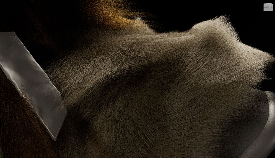
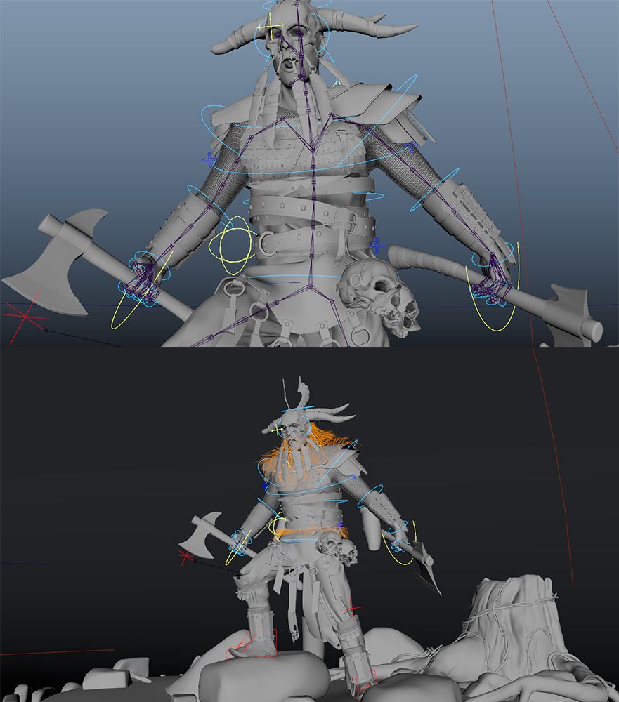
Grooming: Here comes a very fun and frustrating part at the same time—grooming. Looking at the concept, the character has a very long beard that makes contact with a fur coat all over his shoulders, consisting of two types of fur that are different in terms of shape and density. We started by analyzing and referencing the animal fur Vikings used to wear, and we ended up choosing goat fur. For the hair, we referred to real men's references to understand how a very dense beard looked in reality. We decided to create it in XGen, a Maya tool for fur generation. We created a collection for every surface that had fur on it (more than 10, including the belly and knees), defined a description, and started generating guides
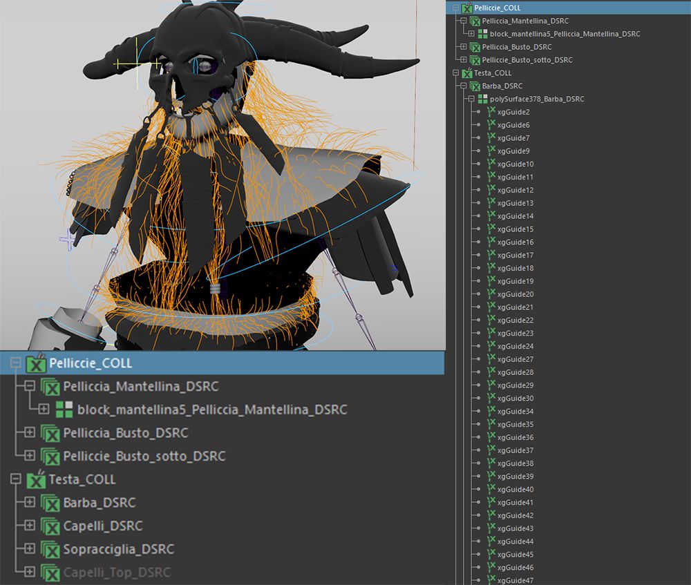
We needed to be very careful to ensure that the guides of each collection did not touch, to ensure a good result in rendering. Additionally, combing the guides to make them take a good direction was important too. We played with the density of guides and materials to achieve a proper reaction to lighting in the render and an overall good result. To increase the difficulty, there were also some rings in the beard, and we made the guides go through them.
This task was assigned to Mattia, who did a great job recreating the fur using XGen. Fun fact about this production step: the night before the deadline, all the fur stopped working in rendering, but with some magic tricks (and a rushing night of work), Mattia made it work again.
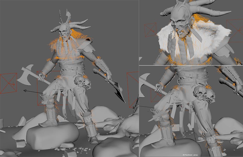
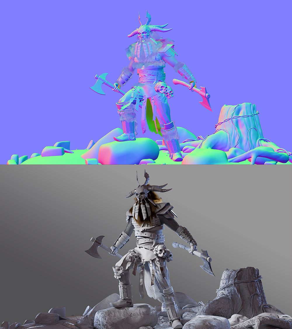
As visible in the images above, I rigged and posed the character. I created the rig for the whole body initially for potential movement, but due to time constraints, we opted for a static pose. We decided to change his pose from the original concept to better fit the background we designed and to enhance his dynamism. We envisioned him as a Nordic warrior, the last defender of his village against invaders, prepared to face his final battle. His pose conveys a desperate war cry, symbolizing his village's last stand. While we drew inspiration from various sources like Assassin’s Creed Valhalla and Viking series, a primary reference came from an image on Pinterest depicting a Viking in a pose similar to our final design.
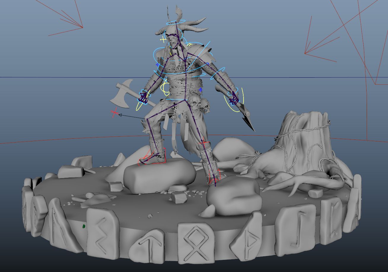
The main challenge was painting skin weights on the character and constraining the props to the rig to prevent them from breaking during the character's posing. I needed to be very careful to avoid geometry overlapping. Additionally, Sara and I decided to add a rock and place the character's leg on it to increase the dynamism of the pose significantly.
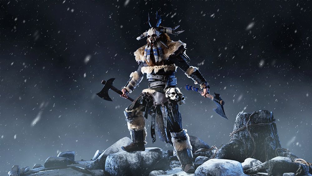
Lighting was also an intriguing task since we didn’t have any reference from the original concept. We envisioned a cold-looking image with strong contrasts and a focal point on the main character.
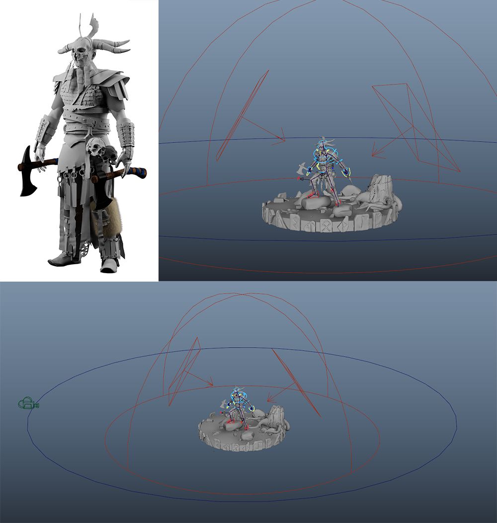
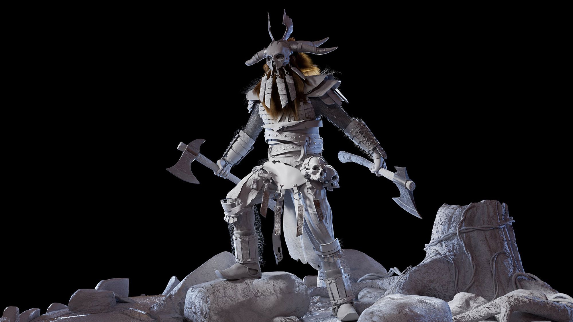
After initially setting up with a Dome Light, a Back Light, and a Rim Light, we incorporated Fill Lights to balance darker areas and introduced a neutral background to enhance the effect of the Indirectional Light and provide depth to the background. Additionally, we applied a neutral Blinn material to the entire character to visualise reflections, light impact, and colors effectively. I assisted the team in refining the lighting setup and took charge of creating the shaders and LookDev for the scene.
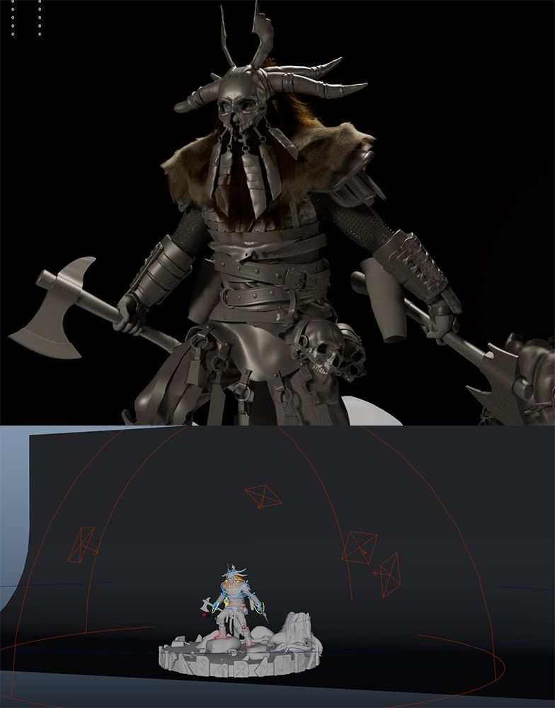
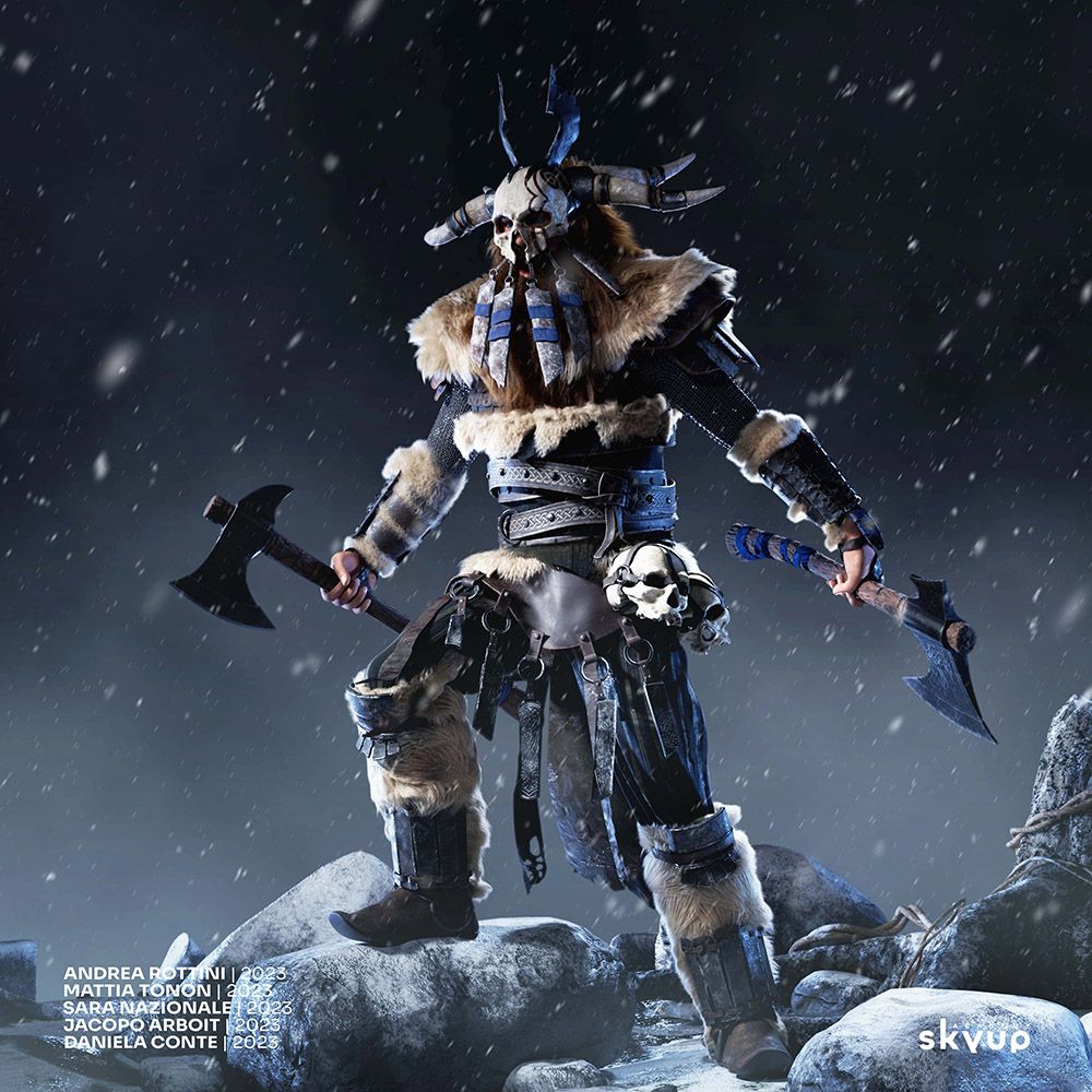
Last but not least, it's time to render and bring the character to life. We used V-Ray for rendering to achieve superior results, thanks to its excellent handling of lights and shadows. After final approval of the LookDev for the materials, we began the rendering process.
These shots really convinced us, but we were certain we could enhance the scene to make it more memorable and highlight the character's presence. We initiated some compositing in Photoshop, deciding to integrate Sara’s snowy environment with elements such as a snowstorm, a foggy background, and some color grading. Inspired by the popular book "The Winds of Winter" from "The Song of Ice and Fire" saga by G.R.R. Martin, we envisioned this "Wind of Winter" as a metaphorical wind of war, resembling a snow and ice storm, perfectly aligning with the character's story and action.
Here's the final result of this ambitious project:
We are very happy and proud of the result. Good teamwork is essential to achieve results like this, and we felt like we were in a real production due to the small amount of time we had and the seriousness of our teachers during the various project reviews. Properly dividing tasks among team members who are interested in developing specific skills was crucial. In my case, I learned a lot about rigging and lighting, but I was also very satisfied with how my texture workflow improved, thanks to the advice from Mattia and Sara. Iacopo and Daniela focused more on modeling and handled most of the props that compose the character, defining a well-done modeling workflow.
Collaboration and communication were essential; everyone supported each other to maintain a consistent workflow throughout every step of production. We prioritized the team's success over individual achievements and created internal documentation with "must-do" steps to ensure clarity and harmony. I would like to thank all of my teammates:
Andrea Rottini | Mattia Tonon | Sara Nazionale | Jacopo Arboit | Daniela Conte
This artwork is very important to me and my portfolio because it showcases the growth of all my skills in just 6 months at Skyup Academy. It also highlights the importance of learning and effective communication in the 3D world. In my upcoming projects, I plan to focus more on shading, lighting, procedural modeling, and texturing. I aim to enhance my technical skills rather than purely artistic ones, believing it to be the right path for my continued learning and development.
Thank you so much for reading this article. I hope you enjoyed learning about how Fhausto was created and found our workflow interesting, inspiring you to create something cool related to Norse mythology. I also want to extend my gratitude to The Rookies for giving me the opportunity to write this article. It's always a pleasure to collaborate with platforms like this, and being able to share my team's profiles is one of the biggest thanks I can give to them for their dedication to this project.