Skip these Design Fundamentals and you will regret it
Every artist who has discovered a passion for visual effects, animation, games and design always tend to get ahead of themselves with trying new things. It's impossible not to dive right in and start bringing your ideas to life even before you have learned the basics.
Every artist who has discovered a passion for visual effects, animation, games and other design based industries always tend to get ahead of themselves on their learning path. It's impossible not to dive right in and try to bring your ideas to life even before you have learned the basics. I believe that one of the differences between a professional artist and a hobbyist is that the pro actually took a step back and spent time learning the fundamentals of design and worked really hard at perfecting them - the other is still creating work below the level of what they are actually capable of achieving.
The best advice I can offer is to start with the fundamentals. Resist the urge to learn the latest software right away. Sure, go download it, muck around with it a bit, but don't try and create your masterpiece with your first attempt. These skills take time and making sure you start with the basics is crucial to all artists.
1. Composition
The most important aspect of art to me personally is the composition. It sets the stage for everything else. This is your way to guide and lead the viewer to make them feel as if they are actually in your picture. If this part of the process is not created and controlled properly, everything else can and probably will fall apart. That doesn't mean that you have to follow every little rule. In fact, many have broken them and created very successful works of art. It's knowing how and when to break them that will allow you to do it successfully. But before attempting anything like that, you should completely understand the following tips for creating good composition.
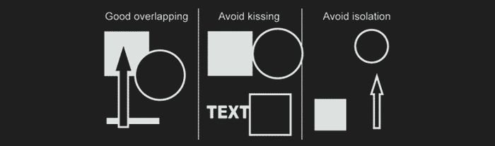
Overlap
Place objects slightly over one another. This will get the eye to move from one element to another. Objects should not be touching each other by edges ("no kissing allowed!"). Avoid isolation. Build a relationship between objects.
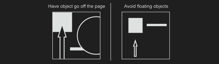
Crop
Consider having objects go off the edge of the page. This gets the viewer in and out of the picture. Avoid floating objects within the edges of the page.
Rotate
Consider placing objects at an angle. Things that are tilted create a more dynamic composition. Artwork with objects that are perfectly lined up with the edge can be boring.
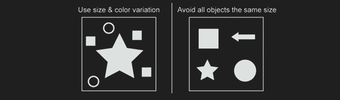
Focal Point
Create an area of importance. Give the viewer something to focus on. One way to achieve this is through size variation. Try not to have all elements the same size. Another way to create focus is through color dominance.
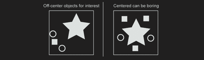
Off-Centering
Avoid placing objects directly in the center of the page. Think about placing objects slightly to one side. This will create a more interesting composi tion. Try to keep elements balanced as you do this. For example, one large object could be balanced by 3 smaller ones. (Note: this does not mean that a symmetrical design cannot be successful.)
Rule of Thirds
This is the simplest and most used composition technique, one that I use a lot myself. Because it is simple to learn, it's something that is recommended for beginners and those who are new to the fundamentals of composition. When used, it will divide the picture into 9 equal parts that are separated by two horizontal and vertical lines.
The main idea behind this is to place your most important element/object on one of the intersections where the lines converge (the +'s), as well as along or near the vertical line of wherever your focal may lie.
It is believed that when this is used and your subject/focal sits on one of these spots, it creates more interest in your picture rather than having it centered.
2. Perspective
Everything has a perspective. When standing in the street, look around and notice which side of the buildings you can see and why you see them all from different viewpoints. Then while you're at it, go ahead and look down a road, why does everything appear to get smaller as its distance is further away from you? All of these things have to deal with the perspective of those objects and your viewpoint.
Perspectives are an essential skill to learn, for architectural, environmental and many other reasons. They provide us with a way to create and build elements and objects and correctly place them within the picture plane. Perspectives rely on the horizon line (or sometimes called the eye level line) to find what is called a Vanishing Point. Vanishing points are where your perspective lines will originate (see below examples).
One-Point Perspective
This is the simplest of all perspectives to learn, but one that is not widely used a whole lot because of its limitations. That being said, it can be very beneficial, depending on what scene you are creating. In this perspective, there is a single vanishing point going back to the horizon line, which the object is receding to.
Two-Point Perspective
When more than one side of your object is receding back to multiple areas, you will need to use a two-point perspective system. When used, you will create two vanishing points, each on one side of the object/element. These points will again originate from the horizon line, and the perspective lines will run from this point all the way to the object. There is where you can really start to see perspectives shift.
Most times your vanishing point will be way outside of your picture, but don't worry. If working traditionally, you can always use extra paper to measure the exact distance. If working digitally, extend the canvas out until you find your vanishing point.
Three-Point Perspective
The three-point system is used when you really want to convey an extreme situation. It can be useful for scenes that are playful (doing a scene from a bird's or dog's eye view), exciting (action), and many more. To achieve this perspective, you will be using the exact same system from the two-point, but adding in a third vanishing point that is either above and below the object/element.
The third point acts exactly the same as the other two, so don't get tripped up by it, there's nothing sneaky about it. The only difference here is that the top or bottom (the verticals) of your object will adhere and recede back to this point. Which is what gives us that warped look and feel.
3. Color
Much like lighting, the color of your piece depends on many things; the time of day, season, location and so on. Determining the color scheme is important to do early on, even from the start if you can. Remember that things will always change and evolve, so the colors of your piece most likely will as well. As with everything, just because something looks good at one point, doesn’t necessarily mean it always will. So don’t be afraid to mix things up along the way and find something that might be better suited for what you're working on. Keep in mind that it’s very easy to go overboard with color as well, so know when not to mess with it.
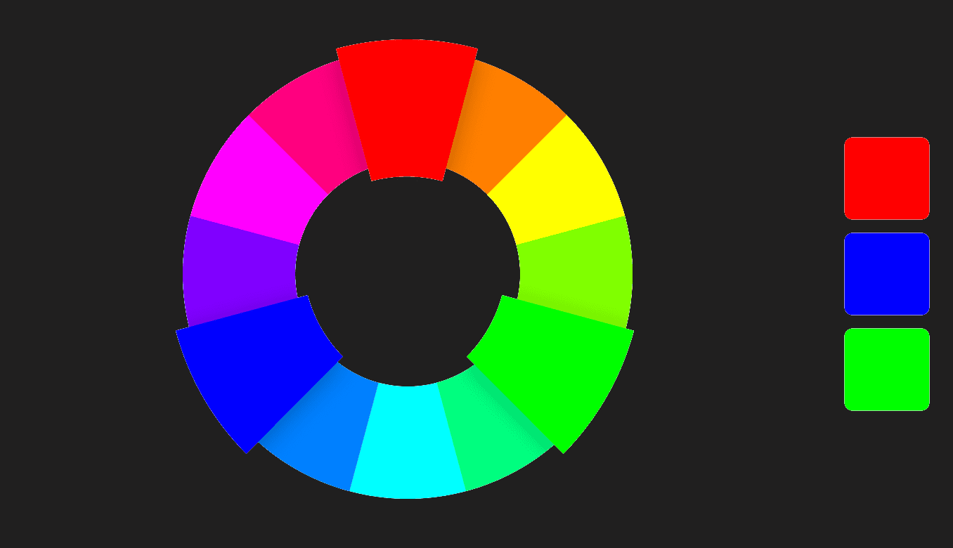
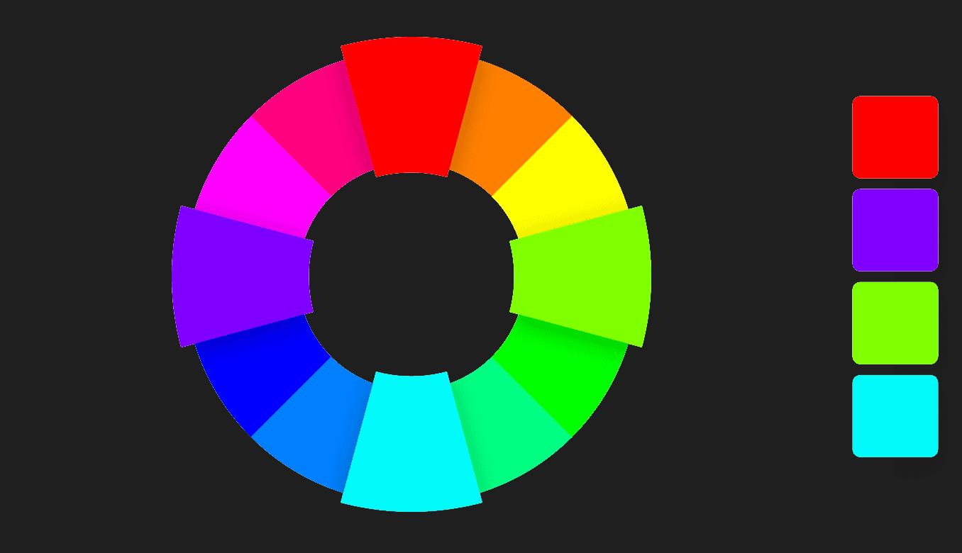
The Colour Wheel
A color circle, based on red, yellow and blue, is traditional in the field of art. Sir Isaac Newton developed the first circular diagram of colors in 1666. Since then, scientists and artists have studied and designed numerous variations of this concept. Differences of opinion about the validity of one format over another continue to provoke debate. In reality, any color circle or color wheel which presents a logically arranged sequence of pure hues has merit.
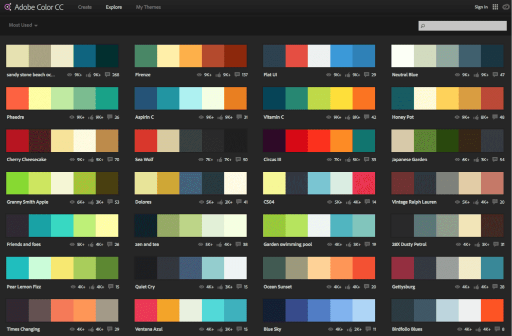
A helpful resource to demonstrate these different colour relationships is the Adobe Color CC. Here you can select various relationships in the dropdown, and drag to create different variations. As you will see, triadic splits itself at points equal thirds of the wheel. An example of a triadic relationship would be the three primary colours of red, yellow and blue.
Color combinations
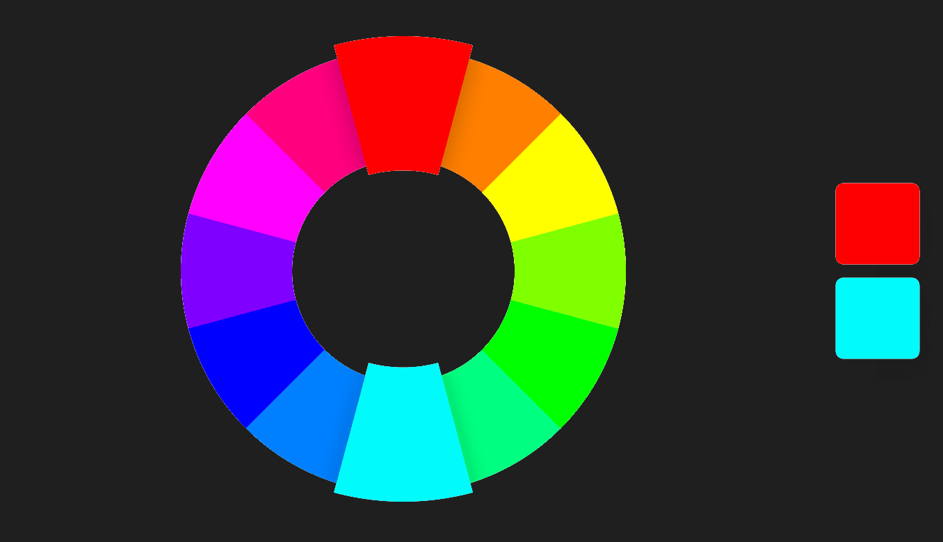
Complementary Two colors that are on opposite sides of the color wheel. This combination provides a high contrast and high impact color combination – together, these colors will appear brighter and more prominent.
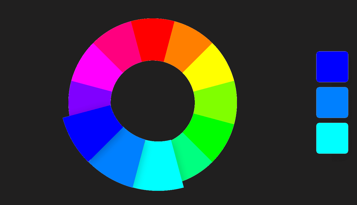
Monochromatic Three shades, tones and tints of one base color. Provides a subtle and conservative color combination. This is a versatile color combination that is easy to apply to design projects for a harmonious look.
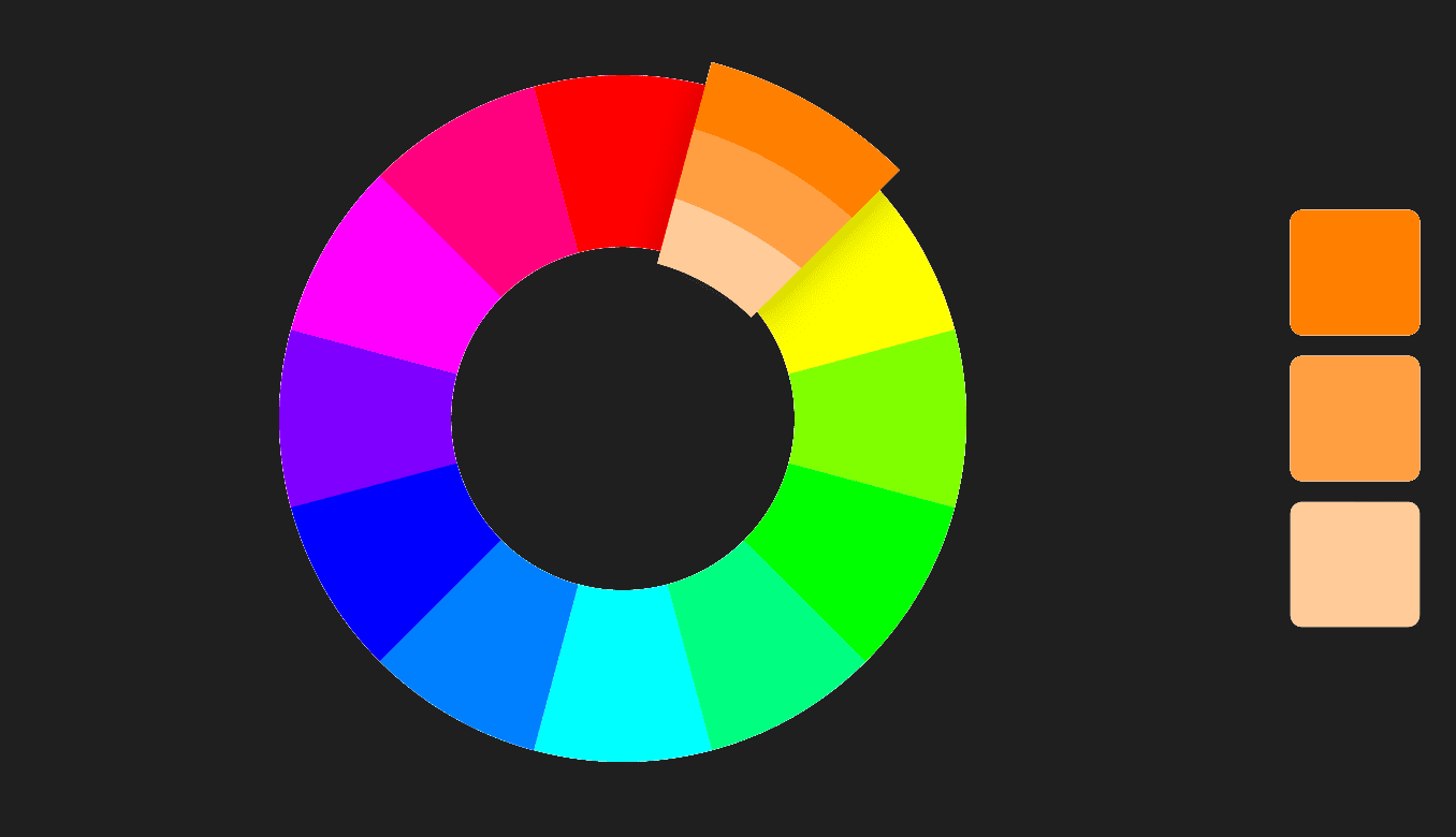
Analogous Three colors that are side by side on the color wheel. This color combination is versatile, but can be overwhelming. To balance an analogous color scheme, choose one dominant color, and use the others as accents.
Triadic Three colors that are evenly spaced on the color wheel. This provides a high contrast color scheme, but less so than the complementary color combination — making it more versatile. This combination creates bold, vibrant color palettes.
Tetradic Four colors that are evenly spaced on the color wheel. Tetradic color schemes are bold and work best if you let one color be dominant, and use the others as accents. The more colors you have in your palette, the more difficult it is to balance.
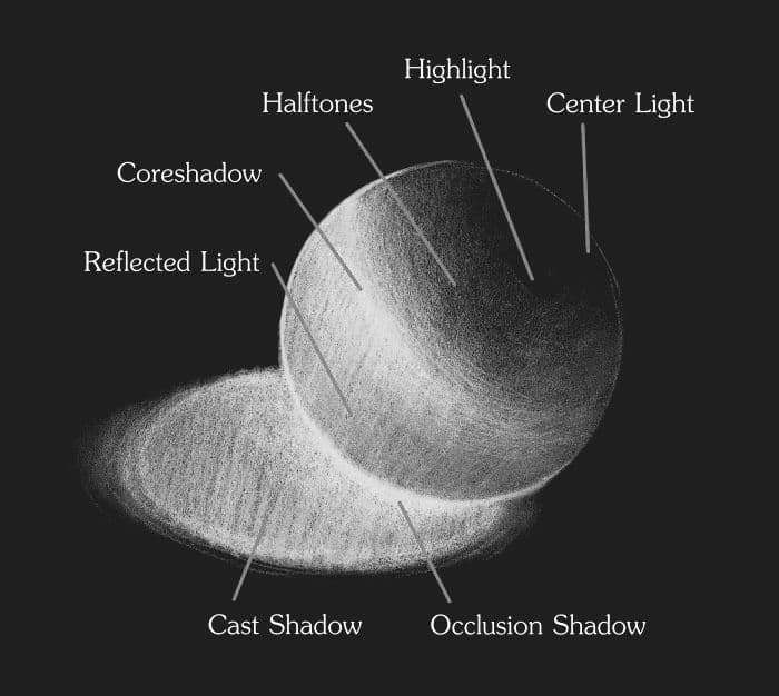
4. Lighting
Like all major elements of art, lighting is crucial. Mainly because the average viewer knows what realistic lighting looks like, even if they don’t know exactly what it is that makes it look real. They can usually tell if something is working or not. Sometimes you can get lucky and fool them, but most times it can break your shot and make all the hard work that was put into your piece wasted time and work. And that's definitely not what we want.
So, in order to know how light reacts to the environment and different materials, go outside and study it. If you are basing a piece off of something else (e.g., you’re your photographic plate in terms of matte painting or anatomy for painters), study it until you can confidently tell somebody else how it looks, feels and functions. Using photos is fine, but there’s an almost infinite source just outside those walls you are in waiting for you.
OK, it's your turn
The best advice I can give is to just start. You will not regret putting in the effort and learning these fundamental skills. Make sure to share your latest projects here and also share any interesting tutorials or learning resources you find here and here.