Creating Cohesive Concept Art Assets
It is always crucial to keep the narrative and art direction in mind when designing anything. This is even more important when you're trying to create a project consisting of multiple assets.
It is always crucial to keep the narrative and art direction in mind when designing anything. This is even more important when you're trying to create a project consisting of multiple assets.

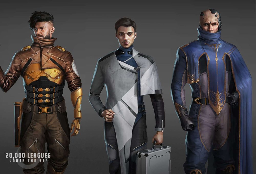
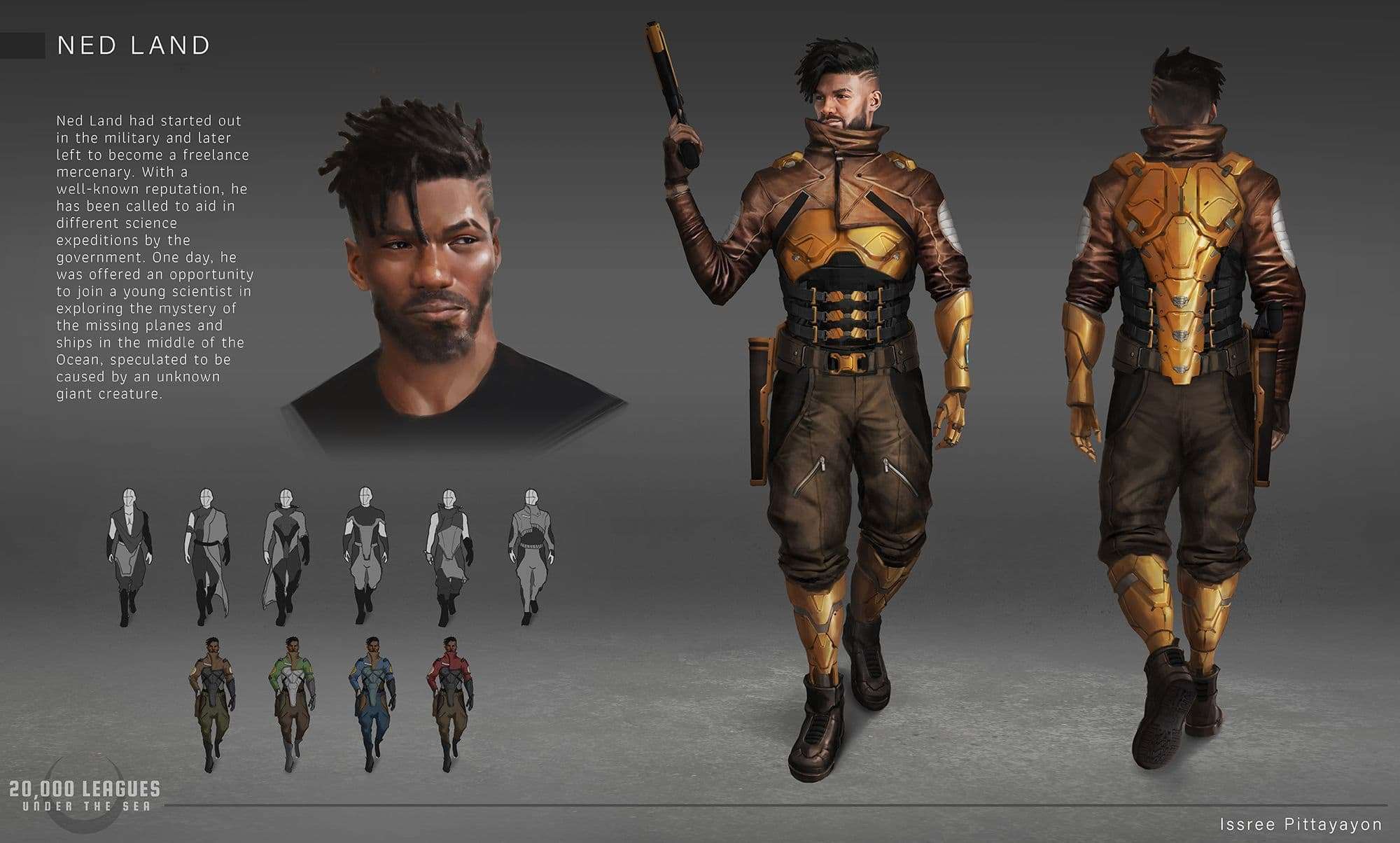
Issree Pittayayon was kind enough to give us a breakdown of her process on how she put together her redesign project of 20,000 Leagues Under the Sea.
It is always crucial to keep the narrative and art direction in mind when designing anything. This is even more important when you're trying to create a project consisting of multiple assets.
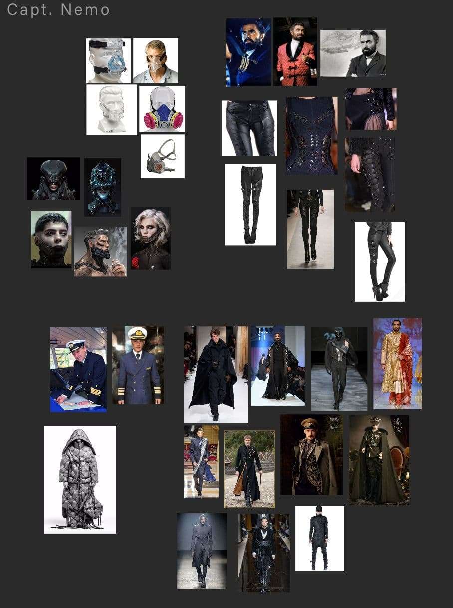
Having a solid story and art direction will lead to cohesiveness within the projects. Art directions can range from mood, color palette, styles and shape languages. I tried to gather a lot of images for influence and inspiration. Then I put them in one canvas (I love using PureRef for this) and see how different images sit together. Try to spend time in the research and writing process to nail down what you want in writing and in references. It'll save you time and headaches down the line.
It is easy to want to jump into designing the first asset right away. That's exactly what I did and it was one of the biggest mistakes I did for this project. I ended up going back and forth between different art directions and adjusting designs because I have no clear direction from the start. In the end I have to return to the writing and researching stage anyways. It was a lot of wasted time, so don't make the same mistake! Of course, you want to have room for flexibility. However, there's a difference between a happy accident versus having no clear direction and letting whatever happens happen. This can be good for a fun speed paint, but not when you're trying to create cohesive assets.
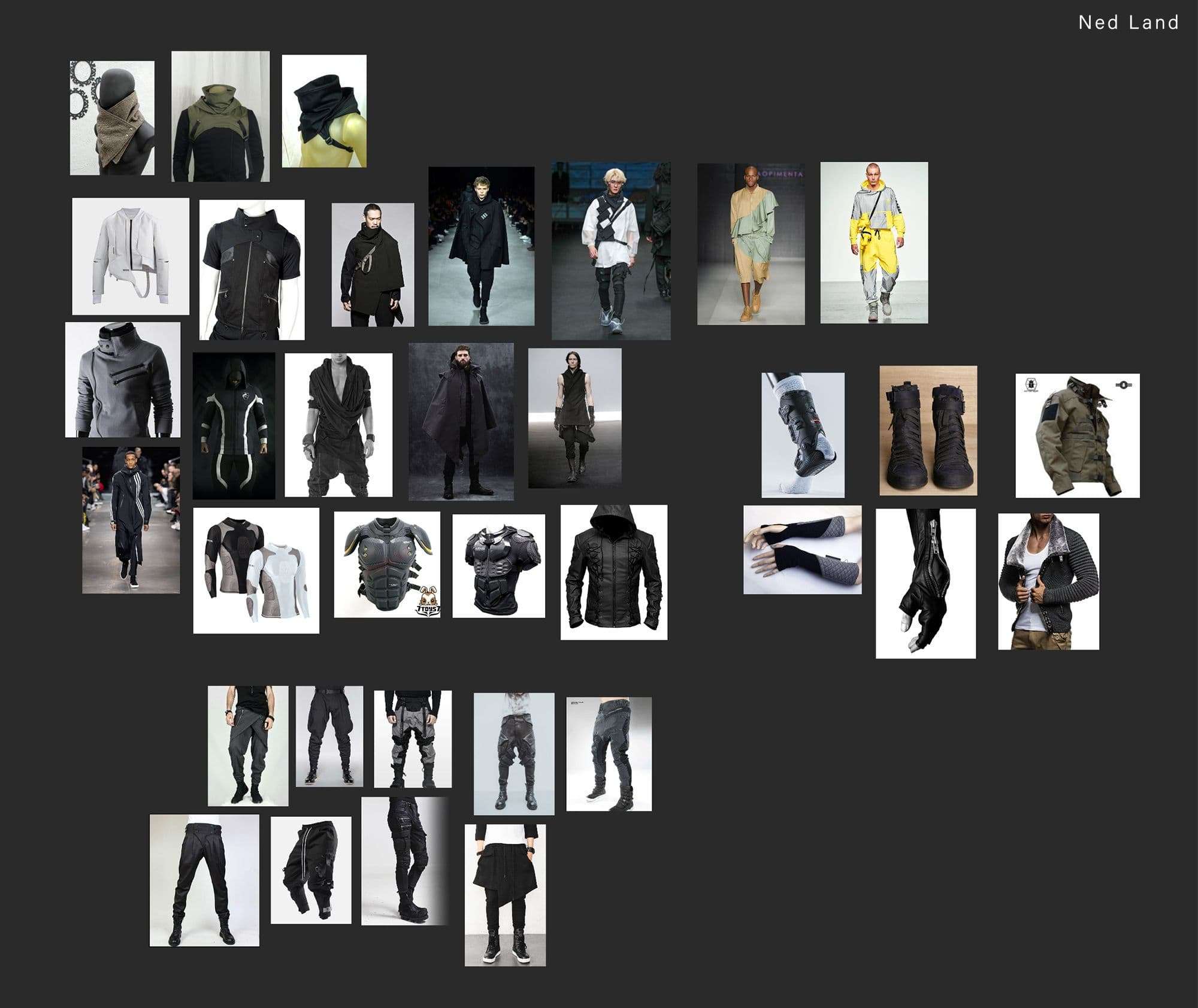
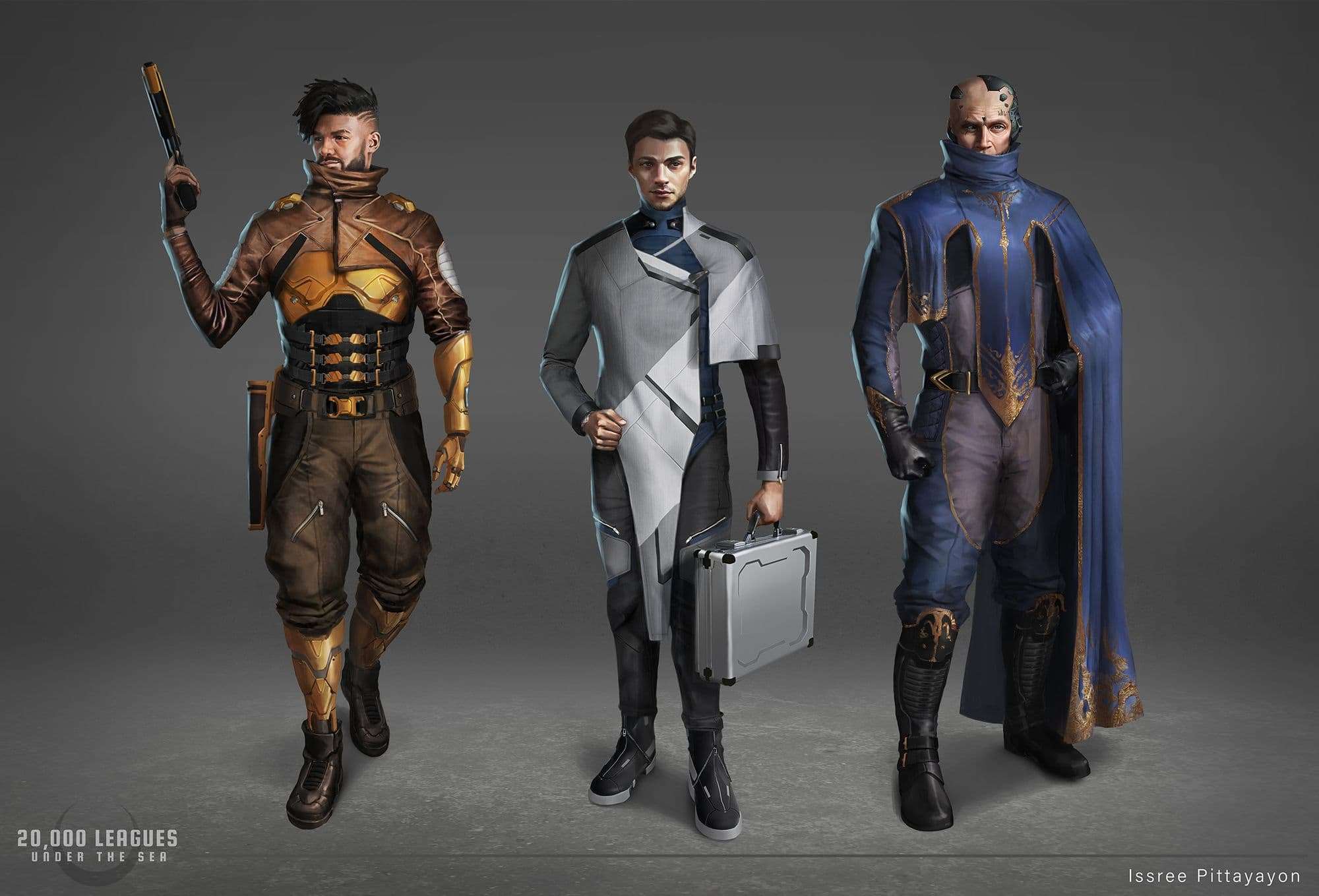
Once I have the art direction and story nailed down, I was ready for the first asset. I chose the character Ned Land first. I started by writing out the brief and I tried to be as detailed as possible. I think about his background, his role in the universe, his environment, personality, hobbies, etc. Having a detail brief helped inform my references and help me make design decisions afterward.
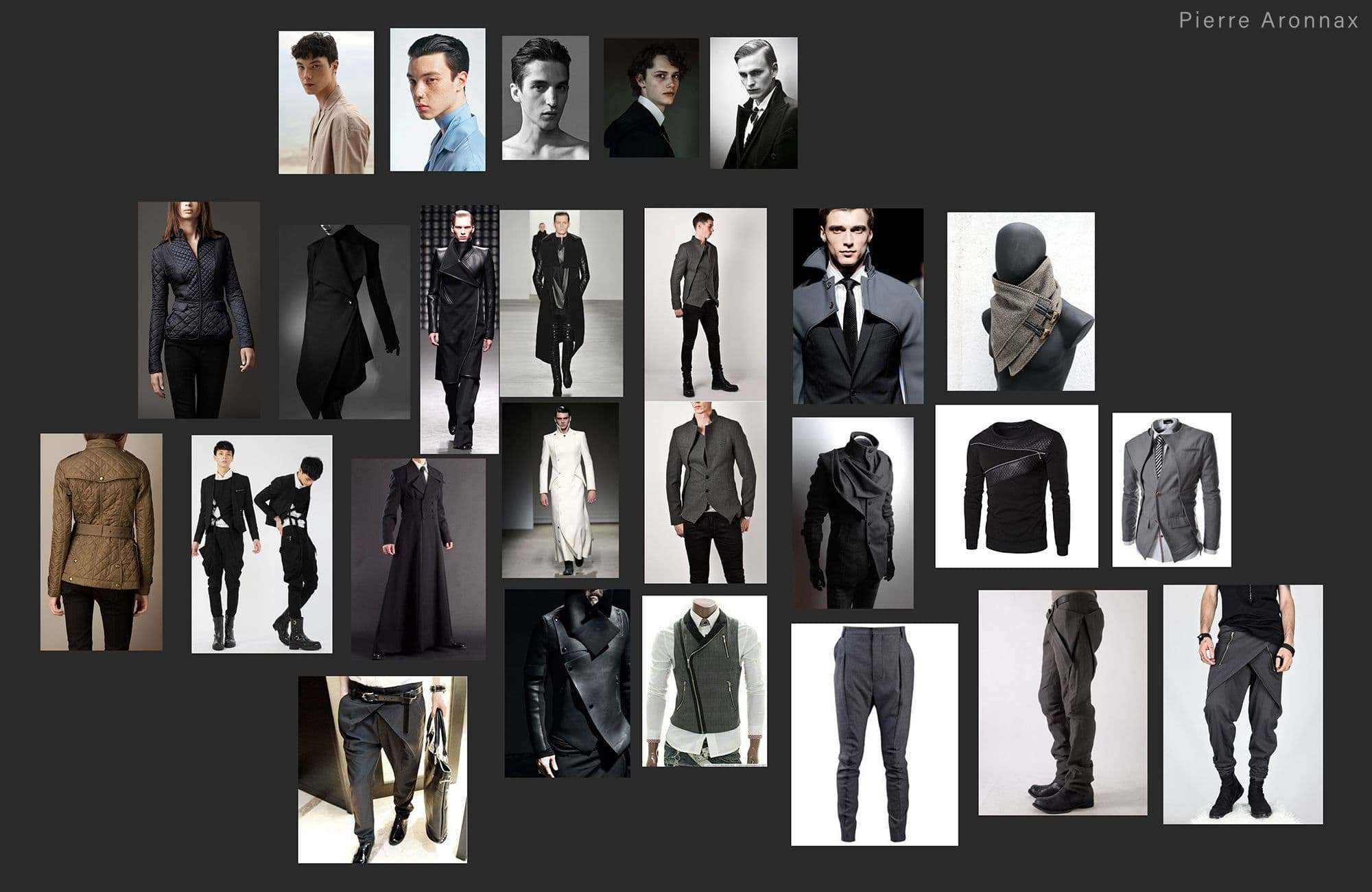
Next, I start looking for references. What I looked for was informed by the brief I've written. I want Ned to be a freelance mercenary, with a good reputation, he made a good living off of his career. He enjoys his freedom not being tied down to an organization. Moreover, due to his reputation and money, he is cocky and a ladies' man His personality informed the pose, expression and his stance. His outfit was determined his career and as well as his flirty nature. This lead to me wanting to combine fashion with practicality. I tried to balance between limiting my reference to not overwhelmed myself and having enough references to inspire me and allow me to experiment.
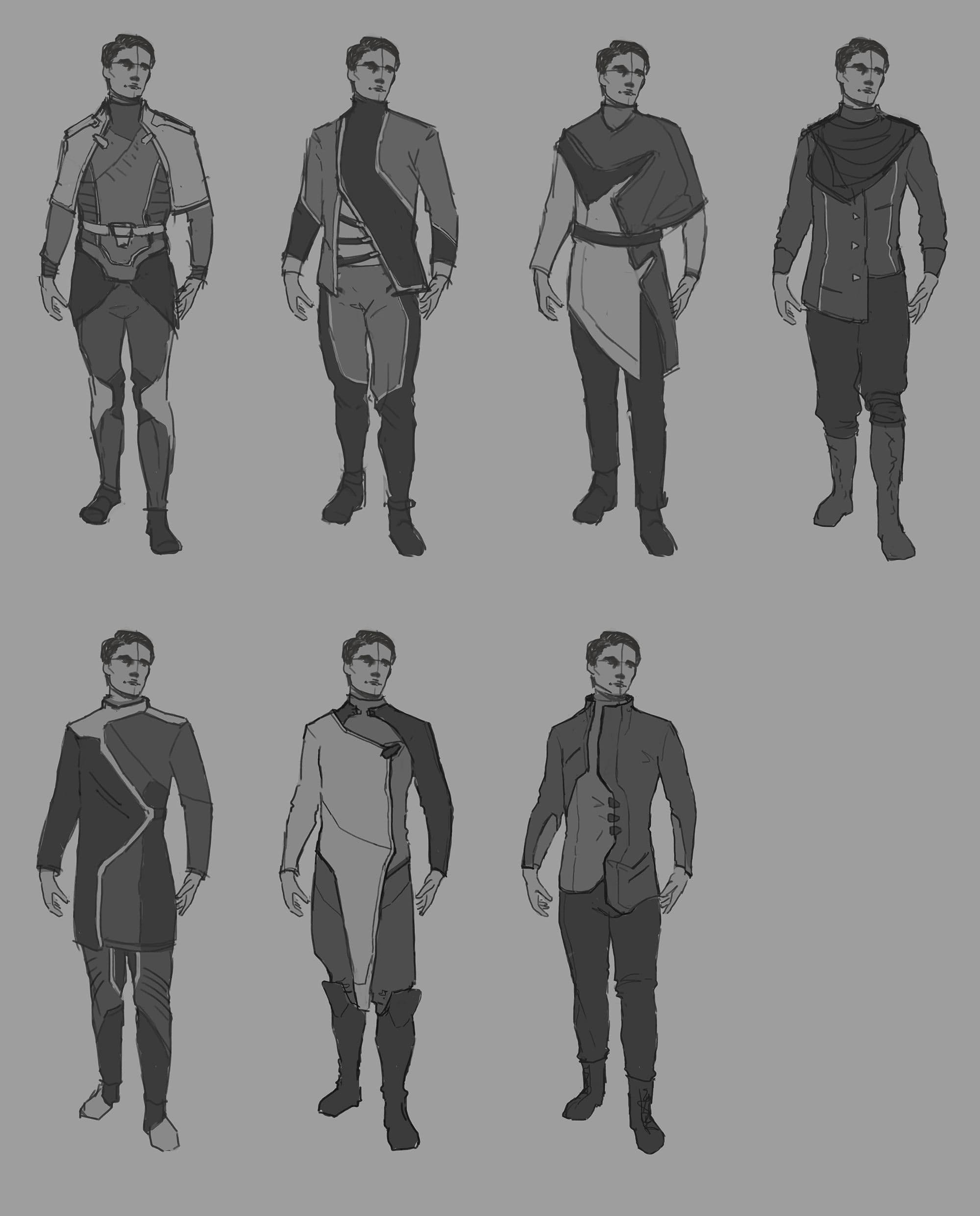
I usually prefer line sketching, but even then, I keep in mind the silhouette of the character. I tried to choose a pose that would make for an interesting silhouette. I did a lot of sketches.
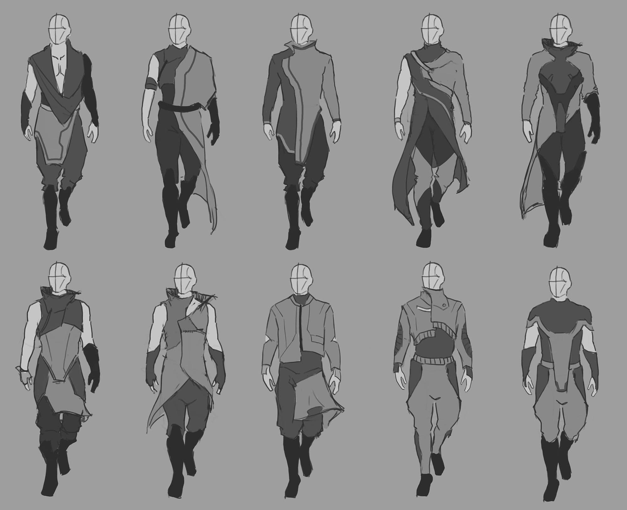
When I think I was done, I tried to combine the thumbnails to see if I can come up with even more designs. Eventually, I narrowed the design down. Say I have 15 thumbnails, I can try to narrow it down to 3 thumbnails. Then I'll work on those 3 and then narrow down to 1. Even then, I can still do more iteration for the 1 thumbnail I've picked to give myself even more options. Don't settle down with only doing a few thumbnails.
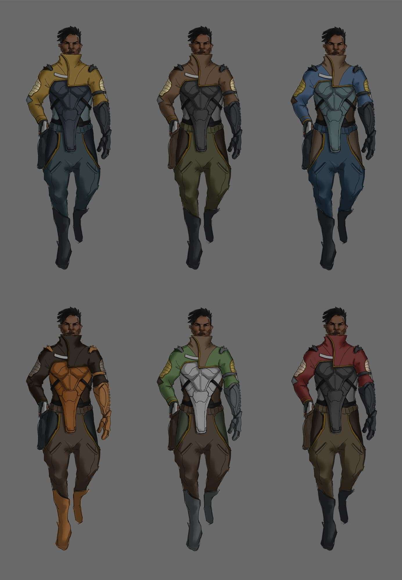
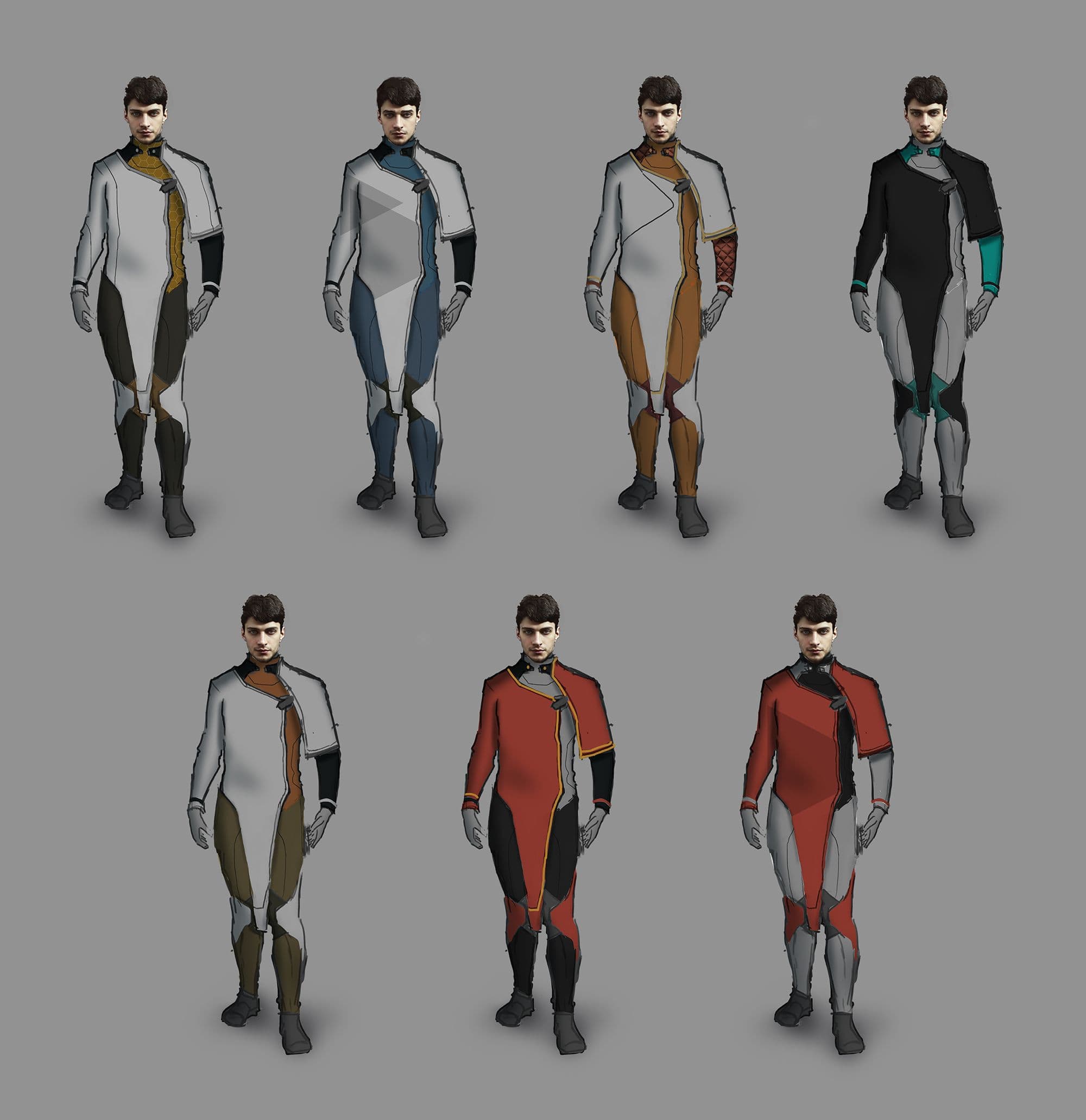
Most of the time (but not always) my first few designs are usually the most boring. Then I'll get into the zone, and that is where to most interesting designs happen. After a while, my brain will get tired and I'll go back to the more boring designs. Taking a break also helps when I tried to pick my thumbnails because I'll come back with fresh eyes. I will also ask for a second or a third opinion on the thumbnails. When I have the thumbnails that I like, I start doing color variation on them. For some people, they combine colors with their thumbnailing process.
I personally still have a way to go on my art journey, so I separate them. I usually stick with 3 colors scheme. Keeping in mind the 70/30 rule - I want one color to be more dominant in the design. I always want to avoid distributing different colors equally within one design as it'll flatten the design out or make it look a bit 'unnatural'.
This is pretty straight forward. My process for this character, because I wanted to go for a more AAA game style, I chose to incorporate a lot of photobashing. With my sketched thumbnail and color comp, I went in and put shadows on the character to establish the overall form and lighting direction.
After that, I'll start adding in photos, warp them into the correct perspective, adjust the value and color to match the sketch underneath. Then, I'll use a new layer with photoshop blend mode to add light and shadow to the photo texture. I usually use, multiply blend mode or curve adjustment layer(and paint in the alpha) for shadows, screen for lights, overlay for color variations. For small photo texture details like folds and wrinkles, I used lightened and darkened. After adding photos, I always make sure that I go back in and manually paint on top certain parts.
I follow pretty much the same process for the other two characters as well as my props. So, I'll talk through my thought process on how I try to keep everything cohesive.
I always have a finished character open while working on a new asset. I will compare each assets to each other during different part of the process to make sure that everything is going in the same direction. Instead of making a regular brief, I also think about how I want certain asset to feels like in relative to other assets. This will help when I put the character together I'll know what to look for.
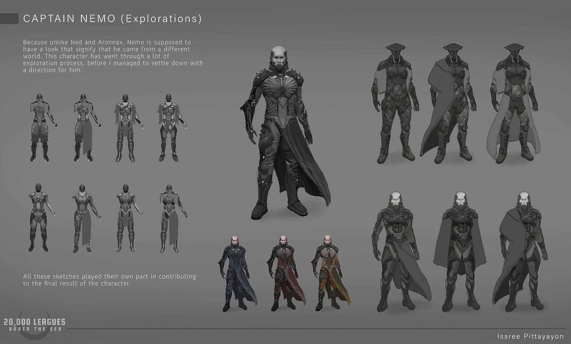
For example, I want Captain Nemo to look more imposing compare to Ned and Aronnax. I want him to look like he came from a different world from them, possibly more Alien. I want him to look 'quieter' and mysterious motive-wise compare to them. For, a character like this, it is even more crucial to compare his designs and rendering style to other character throughout the process to make sure that even though he looks like he's from a completely different factions, he still belongs in the same universe.
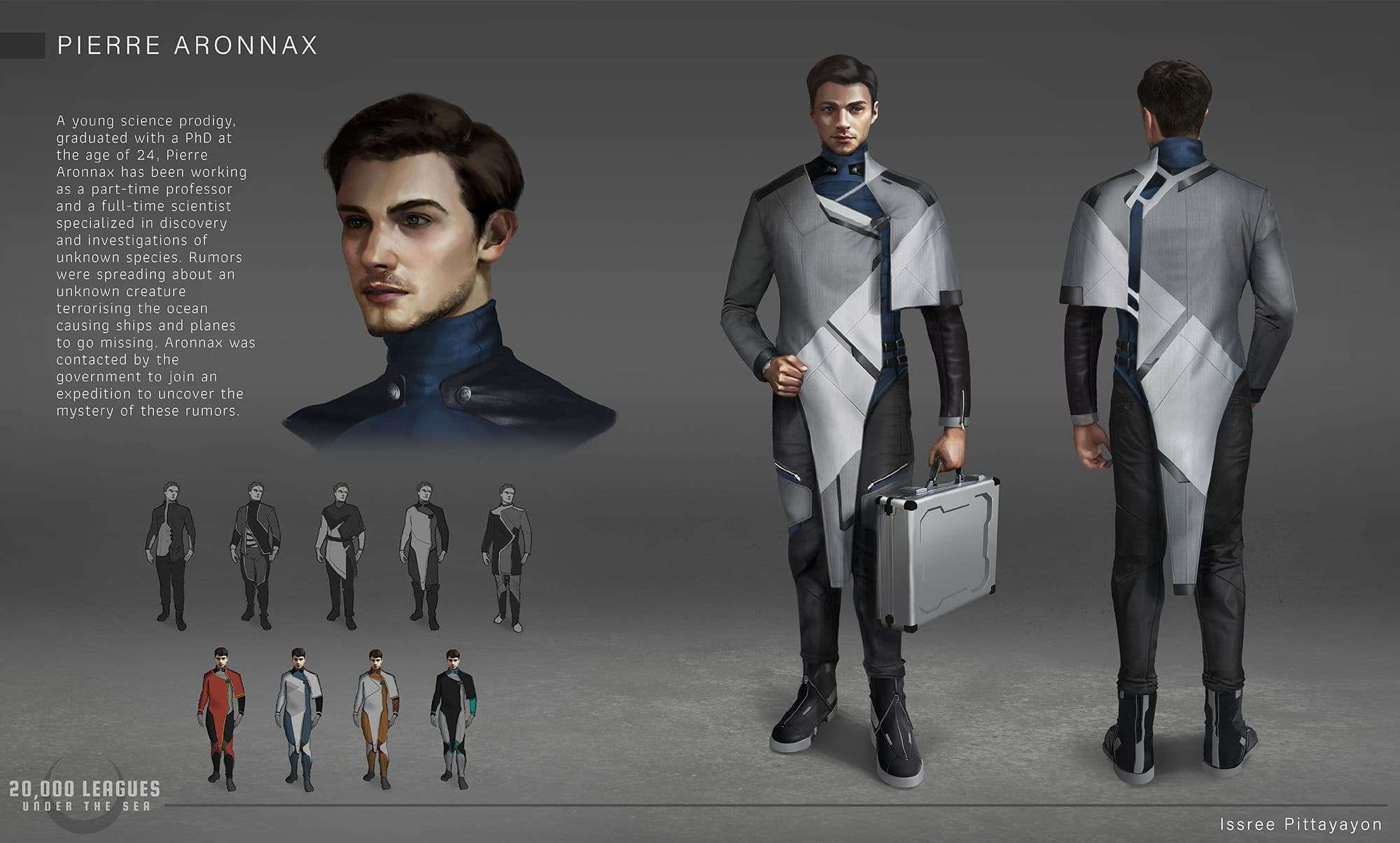
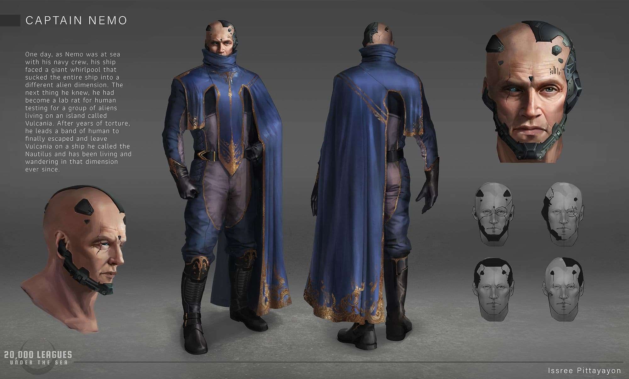
I also compare the shape languages. The triangles on Ned's plates are pointed in more dynamic directions compare to the more rigid pattern on Aronnax's robe that seems to be going mostly in same direction. While, Nemo's overall outfit feels less symmetrical as well as more organic - thanks to the gold embroidery - compared to the more manufactured, 'earthly' look of Ned's and Aronnax's outfits.
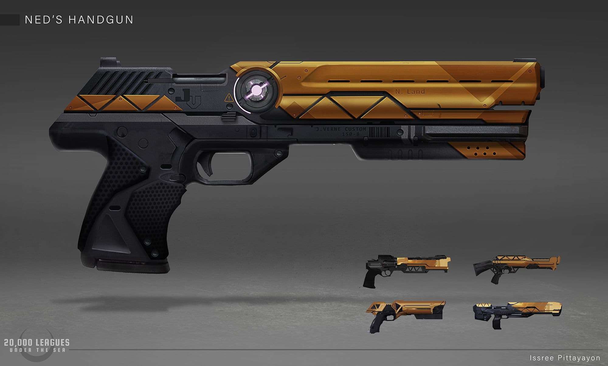
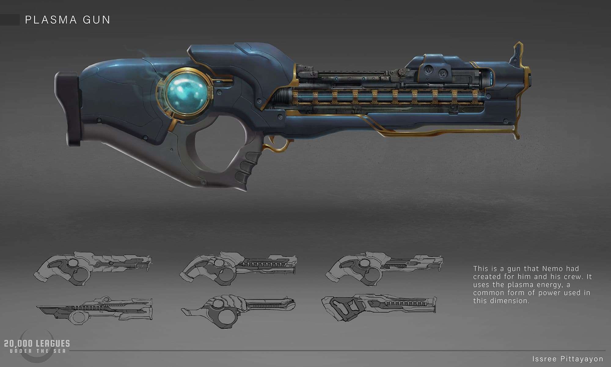
I tried to apply the same visual language of the character to their respective props to give audience the right visual cues.
Ned's Gun: I make the gun looks more grounded, but I added the layer of orange metal on top for some extra flair to match the color to his character. I wanted the gun to feel practical, but at the same time, custom just for him, to match his brief of being a freelance mercenary. I also added darker triangles pattern within the orange metal part. This made it feels even more designed and extra, just like his outfit that looks practical, but also fashionable and a little unnecessary for his job.
Nemo's plasma gun: I want to combine the prestige look with the manufactured sci-fi look to match his character. I repeat the use of gold accents and combine large areas of the bluish metal plate with the more manufactured gun look showing through. This is just like on his character, where he is covered mostly with his robe, but on his head there are some tech part being incorporated.
I hope the article will be somewhat useful to you. Feel free to reach out to me via my Artstation, Instagram and The Rookies.