How To Light and Texture a Scene in Unreal Engine
Alahyla M. Rivera from Puerto Rico gives us a comprehensive breakdown on her 'Detectives Office', one of her projects she completed while studying at the Art Institute of Tampa.
Alahyla M. Rivera from Puerto Rico gives us a comprehensive breakdown on her 'Detectives Office', one of her projects she completed while studying at the Art Institute of Tampa.

Alahyla M. Rivera from Puerto Rico was kind enough to give us a comprehensive breakdown on her 'Detectives Office' scene. This was a project she completed while studying at the Art Institute of Tampa.
I wanted to be an animator but fell in love more with the creation of 3d environments. After that, I’ve been working on refining my skills, learning new programs, and updating my portfolio.

The original idea was to have an afternoon scene. The idea changed when I was in the post process setting in the unreal engine and changed the saturation to gray scale. I liked that effect better because it gave a mysterious feeling you could say it was a happy accident. I did ask for feedback in this project having someone see it can help a lot. Sometimes some details can be passed out of sight and new eyes can see stuff you didn’t see.
For reference, I use Pinterest where I just create a board that I added a lot of photos for inspiration and props that I would like to have in the scene. Also, I used PuRef for stuff that I need a view for all angles, for example, radio, telephone, sofa, coffee table, etc. Some of the PureRef I had but I didn’t save it.
Never losing motivation from the beginning is important because sometimes it can be frustrating when something doesn’t go the way you planned.
The scene is very simple and I use the following modules: wall, corner wall, Door wall, a wall with a window, ceiling, and floor. The ceiling mesh was a duplication of the floor. I use 3ds Max to model everything. I always try to work modularly for the main meshes so I can have fewer of them and easy to reuse if necessary in the level. .The only thing I didn't model was the plant and coat.
Those assets are from Quixel Megascans and the Unreal Engine Archviz level. I use a plain background of a city that you can find in the Unreal engine Archviz level , this helps give the illusion of building outside.

The assets did take more time because I modeled each asset except the plants and coat. Even if I made a list of the stuff I need, I had to model some props after. Some assets were duplicated in the scene and moved in different places that can break the repetition of the assets. I try to have some variant on the size of some stuff that I know was going to be duplicated a lot. I made 4 variations of the cabinet where some doors are open, and others are closed, even changing the size of each one. This helps to break the similarity so is a little harder to see the duplication. Having like 2 to 4 variations for me was enough to break the similarity as seen below you can see all the assets used in the scene.

The animation of the fan was done in 3ds Max. I divided the fan blades from the base and just added rotation in the frame to the fan blades. Remember to have the pivot point of the fan blade in the center. There is a good tutorial for doing simple animation in 3ds Max it is very easy to follow. Some good tutorials that help a lot are: Polygon Academy, in youtube.
The other one is a website and it has so much information it is called World of Level Design. Unreal Engine has good documentation in their page too on how to use the sequencer and so much more. When doing the Cinematic camera, remember to add in the camera sequencer the fan blades animation, it’s something very simple but I was taking hours trying to find why it wasn’t working on my cameras.
I created all my texture in Substance Painter. I used a Substance Source plugin in the Unreal Engine for the tillable of the floor and ceiling. I created each texture of the wall on the Substance Painter paying attention that they lined up to each other. Every time the assets are finished I like to test it in Unreal Engine.
At first, the scene looked too clean, too perfect. I used some decals from Quixel that help a lot to break the perfection of the walls. I used a decal that was leakage and lowered the opacity of the decal. It helped to make the wall look dirty.
Some decals like concrete patches broke more the walls. For the books I created in Substance Painter like 3 variations and tried moving them so it was a little hard to see they were duplicating.

This project is the first time I worked with ray tracing and this made the reflection pop more and more realistic. This project was just for my portfolio so I didn’t check for performance, I activated a lot of the ray-tracing functionalities so be careful when doing it. The ray tracing can be struggling for the graphic cards that aren’t optimized for this. When working with the light it has a lot of iteration where the first passes were very saturated and unrealistic.
Lighting was very hard for me and I was changing the light with every new revision. With feedback, it gradually changes, until it gets to the final revision. The image below was the first version and you can see how saturated the color was. I wasn’t afraid to make mistakes.
I learned every time, so in the future I would not make the same mistake twice.
The last picture is the final pass you can see the colors are less saturated and have a cooler feeling to the atmosphere. The lighting is very important and is one of the steps I would say that is hard and can take a lot of time to fix.


For the main light is a Directional Light and RecLight. These two together are the major factor that gives the atmosphere and base light coming through the window. The others are just 5 point lighting, which are making the scene brighter.
The exponential height fog is another that gave that effect of fogginess that the noir effect has in movies. This effect is in volumetric fog so it can affect the lights that are in the scene mostly affecting the directional light.
The image below you can see I had used decals that helped to make the wall worn out.


When I was working with the Post-process here is where the scene changed drastically just like changing the scene color tint, it can give another feel to the scene. At first, my scene was very warm but adding a desaturated blue in the scene color tint in the post process changed the scene to be cooler.
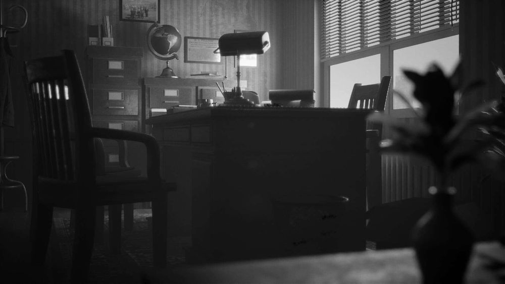
At first my scene was in color but the black and white have more of the feeling of noir that I wanted. Just working with the post-process can give so many ways of different feels for the scene. Below you can see the color and the final version that it black and white. I added chromatic aberration with a lower intensity of 0.25.
Adding a little vignette intensity can help too. I added a little grain intensity that helped to make it look as a Noir Hollywood movie. I added a slope effect in the post process to have less contrast.


Finally, when my scene is done I begin to add the camera that will be used for cinematic or screenshots. For me it was very important to take the time when working with the lights and always try to get feedback on the work, it can help to push a project a lot.
This project took a lot of time where I had to begin from scratch because of the fact that my document had been corrupted many times. Never losing motivation from the beginning is important because sometimes it can be frustrating when something doesn’t go the way you planned.
I hope this was helpful for readers, it was a pleasure to share my experience with you!