Valuable lessons to learn about 3D Composition and Lighting
This is a brief material focusing on the artistic nature of 3D, which, I believe, is harder to master as opposed to the technical side of thing. I analyzed my scene, took a deeper look at my renderings, and broke down what mistakes I made, what I might have done differently.
A fantastic article written by Balazs Domjan that goes into detail about all the mistakes he made while creating his award winning game scene. From basic composition concepts through to lighting principles.
I entered The Rookies 2020 contest this year and ending up as a Runner-Up in the game development category is an insanely crazy achievement to me which I’m still trying to process. However, even though I produced an award-winning piece, no perfect artwork exists. That’s why I felt that it would be a great idea to make a breakdown of my scene, and showing what I learned, what mistakes I made and what I’d do differently if I was about to make the whole thing again with my current spellbook.
This scene was an entire learning journey, both from an artistic and technical perspective. And while I feel that the latter can be learned faster, mastering the former requires practice to such an extent that it might be unthinkable for those who are just starting out. I, personally, have a long history with pencil drawings, and even making those for 2 decades as a hobby, transitioning to the colorful world of 3D art was a bigger challenge than what I was expecting. No wonder why artists are learning about the craft for years and honing their skills throughout their entire life.
When I started working on this piece, I barely had any experience with composition, lighting, and colors (not mentioning the technical side of things). I was just a simple dewy-eyed artist who wanted to deliver something meaningful. Consequently, there’s a hefty list of mistakes I made. However, as I was gaining more knowledge and experience, I was progressively trying to fix those. Although, no matter how meticulous we are, there’s a point where we need to call our project done. It’s not going to be perfect, no artwork is! Perfect art pieces don’t exist, but only finished ones!
Let’s take a look at my renders, analyzing the compositions, and exposing my weaknesses!
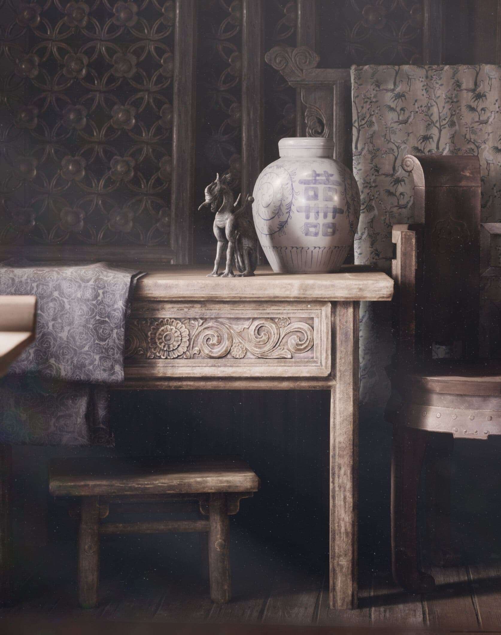
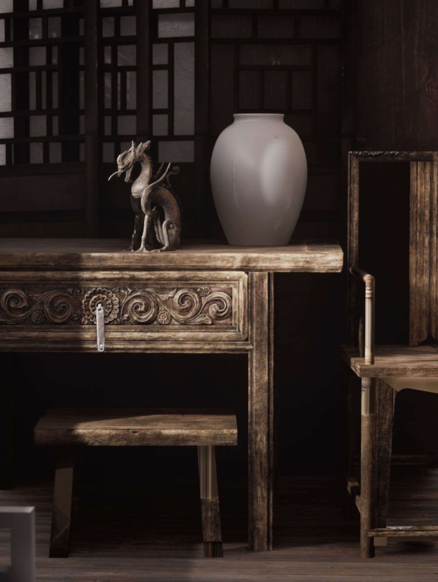
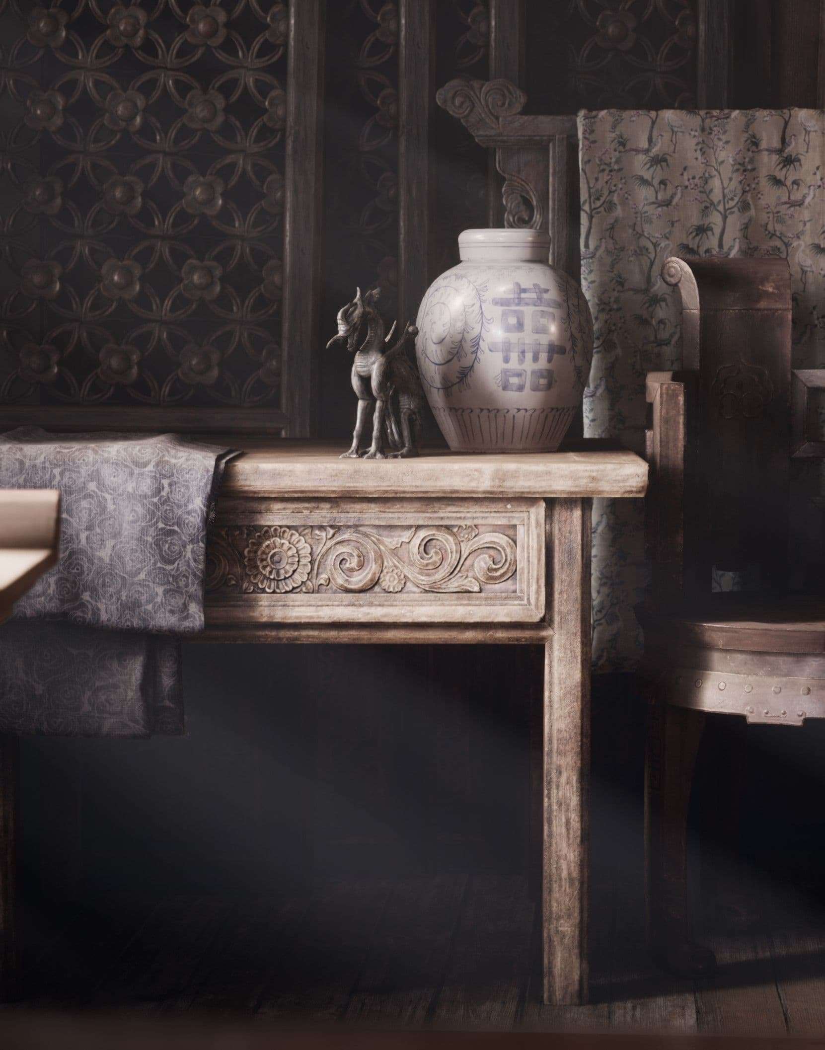
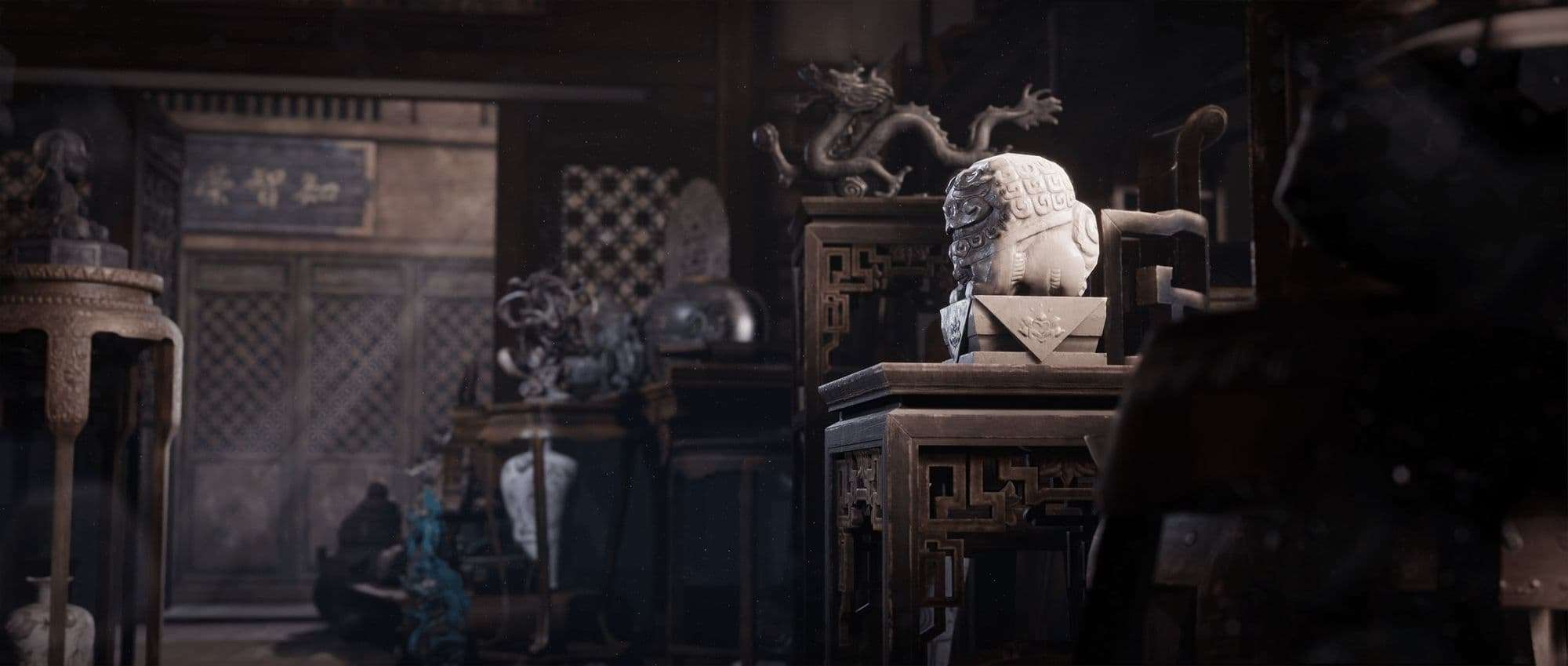
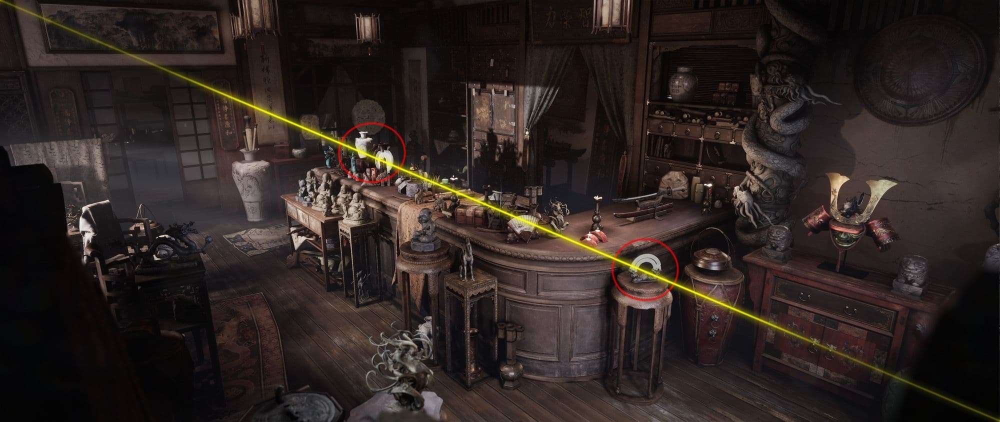
The way of the dragon
I wanted to begin with this shot because perhaps this is the only one I would not alter at all.
The number of iterations I had to do to get this result would be hard to even guesstimate. I wanted to maintain a realistic feel, but with this one, I purposefully went a bit further: I wanted it to look like a painting! I loved the idea that almost everything is made of wood and their uniform brown colors are broken up by the sheets and the two small objects.
This is something I’ve learned while making this project: we never cut the image at the joints!
Even though this contrast is subtle, it’s enough to make the viewers' eyes to gravitate there at first glance. Blue and brown are contrasting colors, as we can see that on the color wheel below.
The shapes also have a huge importance on this shot. The dragon adds value with its shape, and the vase draws the attention with its colors.
The dragon has half of its surface lit, and the rest of its body is dark. That instantly makes us curious and want to observe it a bit more to explore what’s hidden. Right next to it there’s a giant vase (as opposed to the dragon’s size) that stands out as a big bright spot.
The furniture have fairly simple forms in general, but they also have some ornate details which make them more interesting. That, however, must have been used minutely and not too often, simply because the objects in the focal point have fairly exciting appearance too. Therefore, those ‘noisy’ areas complement the picture, and it was crucial to decide where to use them.
I also made the upper half of the image noisier as opposed to the bottom. That was intentional because I loved the idea of transitioning from a more detailed look to a cleaner one as our eyes move from up to down.
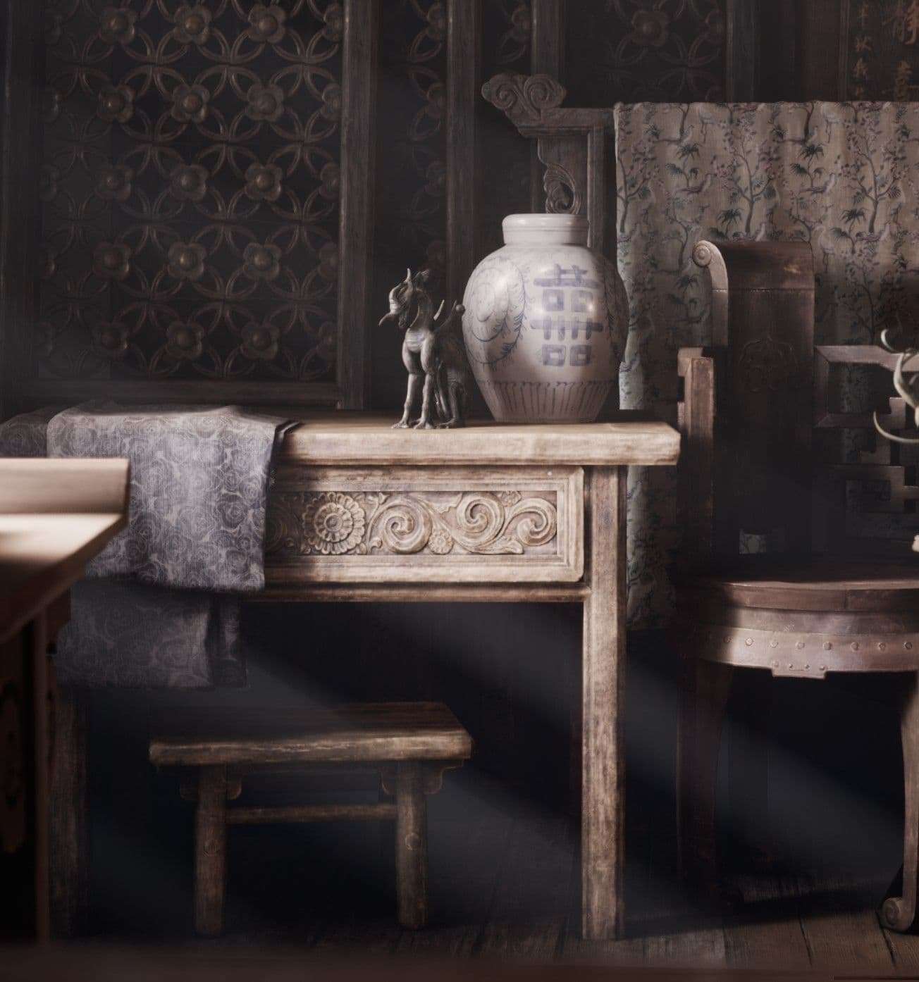
The cropping of the image is also an important aspect here. I’ve used a fairly wide method across all of my renders, and this was the only shot that actually benefited from a narrower one. This is the aspect ratio I was using for a long time:
I really liked this shot, but I have always been feeling that something was not right. I felt that trimming the sides a little bit would improve on it, and it definitely did!
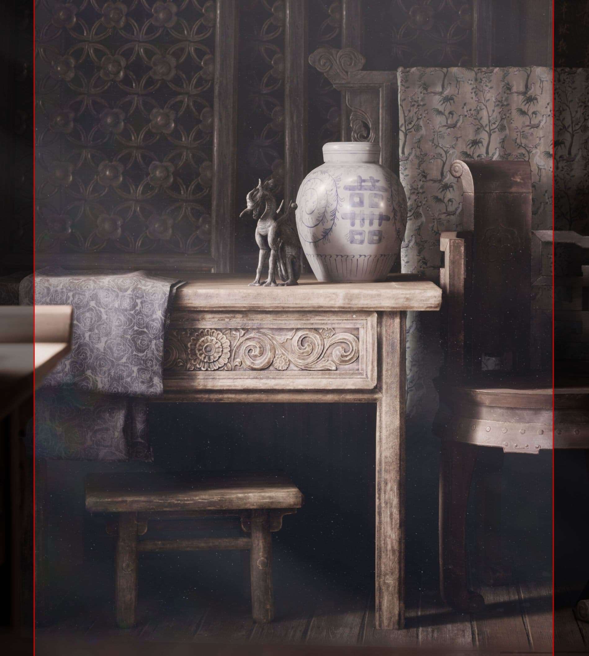
This is something I’ve learned while making this project: we never cut the image at the joints! When we’re taking a photo of a human being, we should never have wrists, ankles, elbows, knees, or waist at the frame of the image.
This can be applied to everything, and this is what happened here: you can see that I chopped off the leg of the chair on the right, and something similar was going on with the main table too. Also with this wider shot, the dragon and the vase lost their importance a tad bit, because other objects gained more space in the image. Therefore, making the picture ‘thinner’ fixed this issue too.
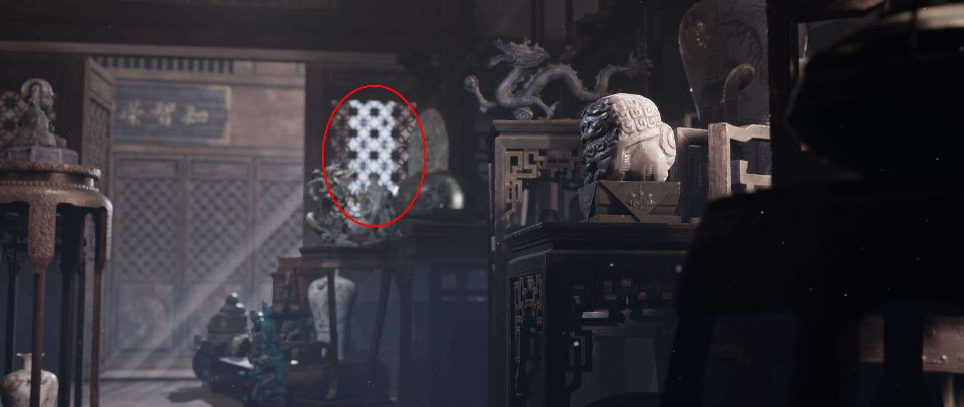
The placement of the objects is something I wanted to mention too. This is a very early shot I made while I was trying to nail the composition:
We can immediately see how different this image is as opposed to the final outcome. The dragon and the vase were placed further from each other, and the vase was more in the center of the image. That in itself, however, is not necessarily a problem: if I wanted the image to have suspense, and have two focal points, then it could have been a solution (with minor changes, of course). But I wanted to create balance and harmony, so grouping those guys and pulling them closer to each other fixed that.
Also, all the objects were placed precisely with a 90-degree angle, and the whole thing felt rather stiff than natural. Rotating them slightly and sliding them either closer or further to the camera instantly made it look better. I also decided to remove that metal handle that was hanging on the drawer of the table, and add the two folded cloths. The former was a small but bright spot, which ‘snatched’ the attention of the two main objects. Whereas the latter helped to balance out the picture by filling in those dark spots with their charm.
At a certain point I accidentally deleted that small stool under the table, and here’s what difference it made:
We can instantly feel the predominance of the huge dark spot in the bottom left corner, can’t we? This was an example when I was not trying to follow any basic compositional rules, but I felt that something’s missing. I had a goal in my mind, I knew what mood I wanted to have in my image, and erasing that chair from existence did not do any good in that perspective. My point is that if we knew what we wanted to achieve with our final shot, we would instinctively be heading there. I felt that that stool needs to be there, because the image felt imbalanced, and not because I broke the law of art.
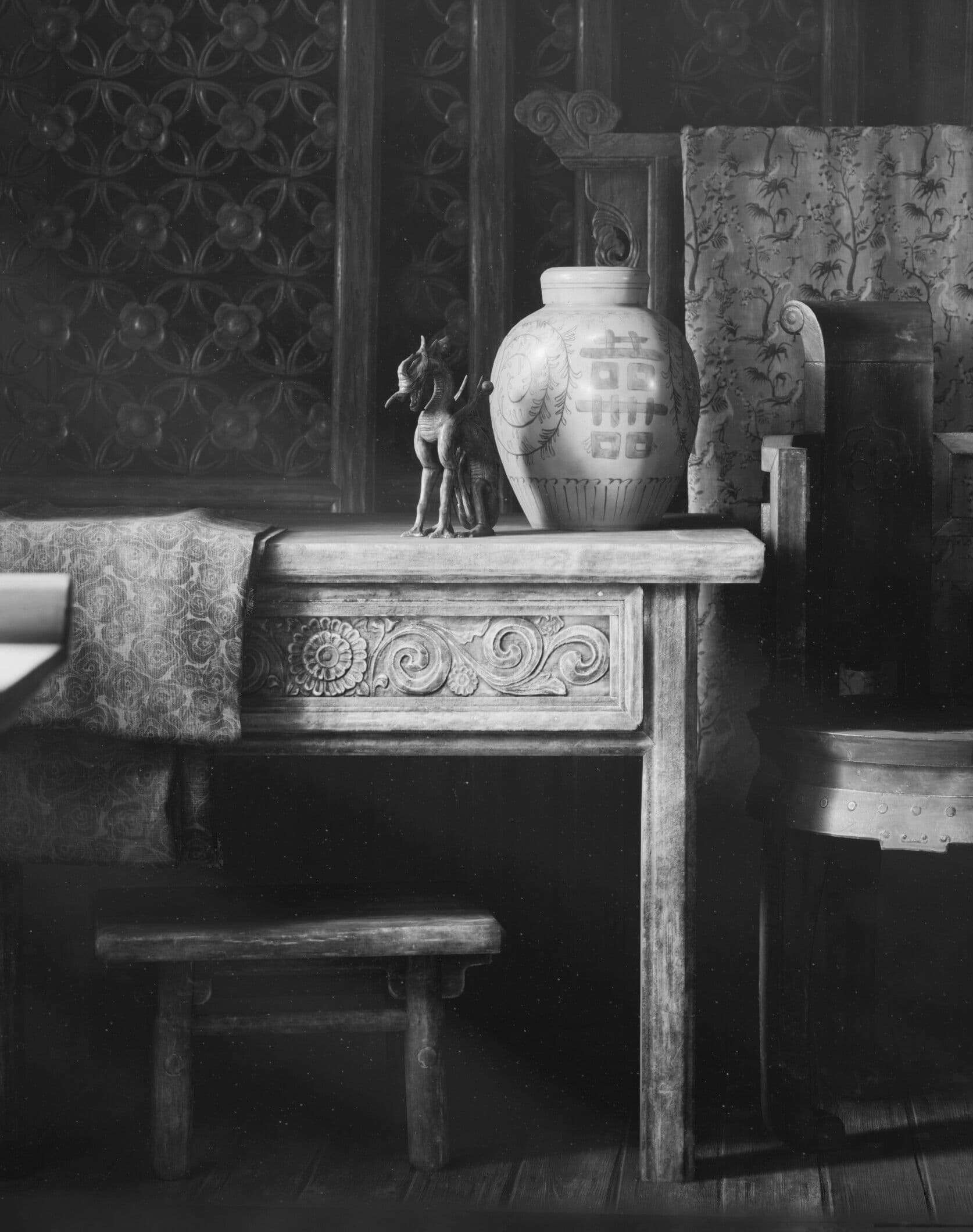
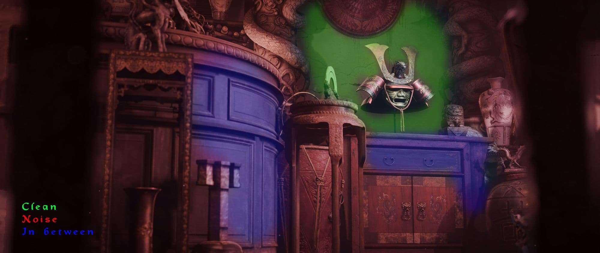
I would also like to mention a few points on lighting. By turning the image into grayscale we can see values:
The center of the image is the brightest point. The vase provides the composition with a consistent and flat bright spot, whereas the dragon breaks the light and makes the values more dynamic. The table is somewhat in between. This is the point where the position of that small stool is influential: pushing that further would have resulted in it not getting any light, but pulling it closer to the camera would have brightened it up too much. I had to find the perfect balance because that spot needed more light to balance out the composition in general.
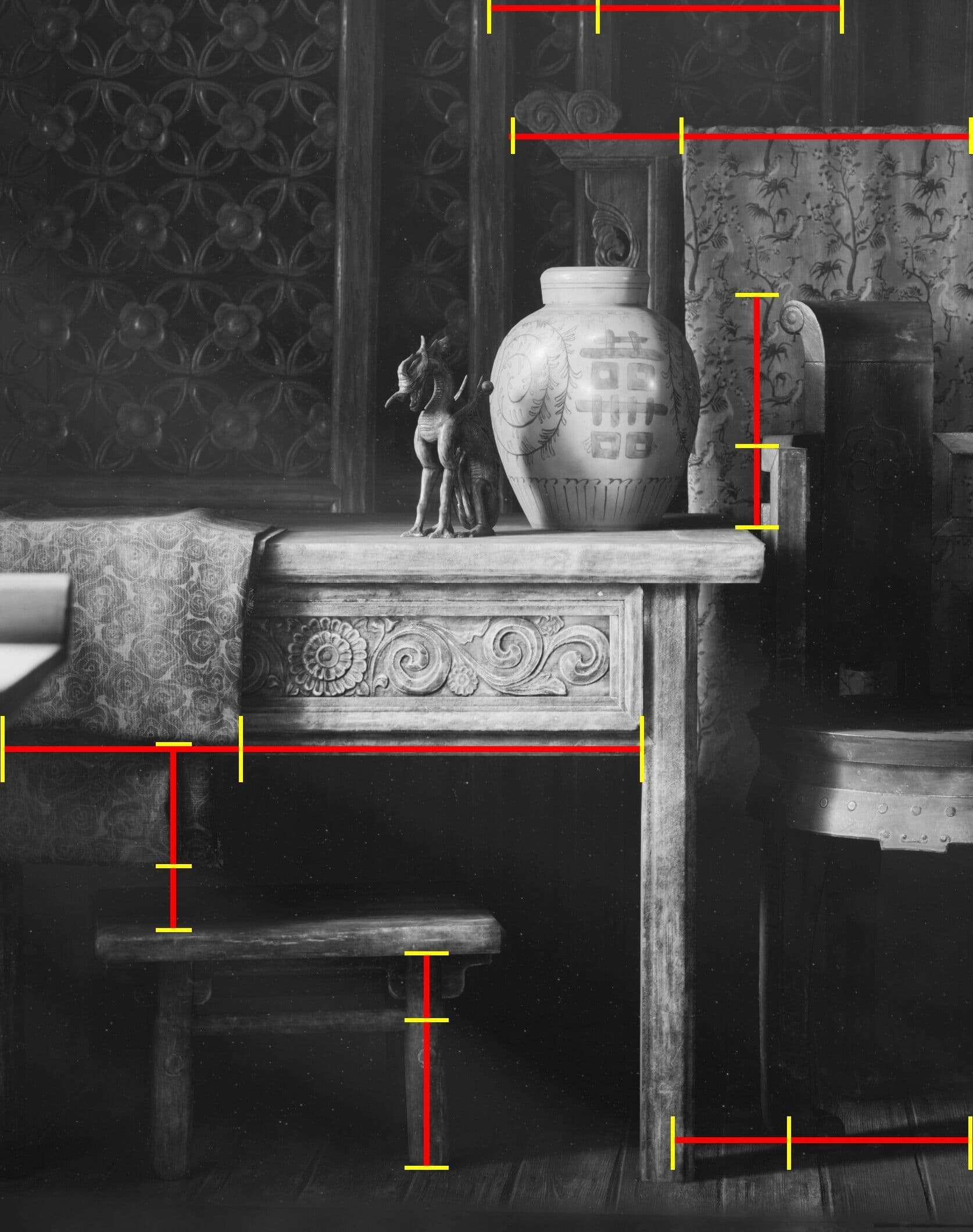
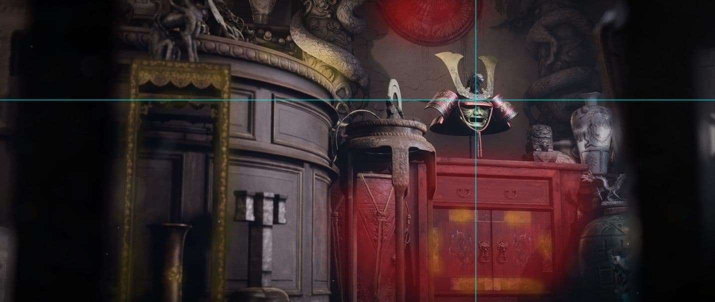
The last thing I would like to highlight is the placement of the objects. It’s almost never a fortune solution to arrange them in a way that they are at the same distance from each other. They feel stiff and unnatural. To illustrate my point, I drew a few lines in the picture:
You can see that those distances are never equal. I tried to keep the ratio of the smaller distance being the 2/3 of its longer counterpart, but it wasn’t always accurate. And it shouldn’t be! I came to this conclusion after reading about Da Vinci’s study on the proportions of the human body. You can find interesting info if you analyze his famous “Vitruvian Man” drawing.
A happy accident
When I was gradually building this scene up, I was flying around with a CineCamera actor a lot, because I wanted to make sure that everything looks good from all possible angles. I had more than 10 cameras placed for still shots, and syncing those was one tremendous challenge, that required me iterating a lot. Consequently, the end result is completely different from what I had planned in advance.
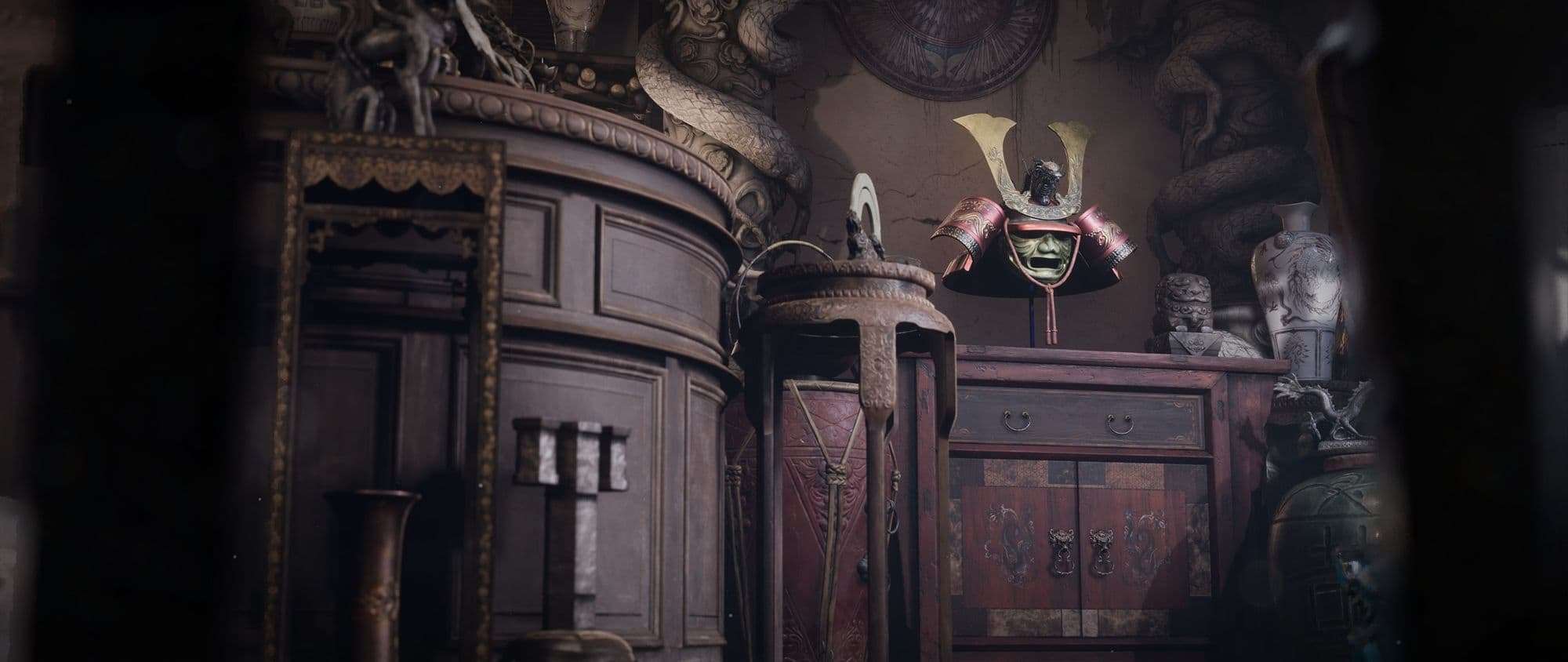
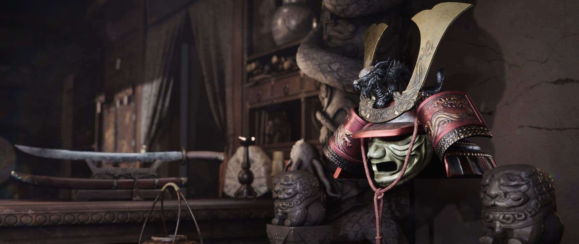
In addition to that, while I was traveling around in the shop with my camera, I accidentally found a few nice frames. One example is this one:
This was a very important lesson I learned that not all the shots can be planned at the early stages of a project: we’re going to be iterating a lot, moving things around, changing the lighting, etc. That forces us to come up with new ideas, which opens up new opportunities (and potential issues too). I was very that I bumped into this one and definitely wanted to have it at the end. The stone pillars and the furniture around it gave it a nice framing, and the noisy and the ‘rest-for-the-eyes’ areas are well-balanced.
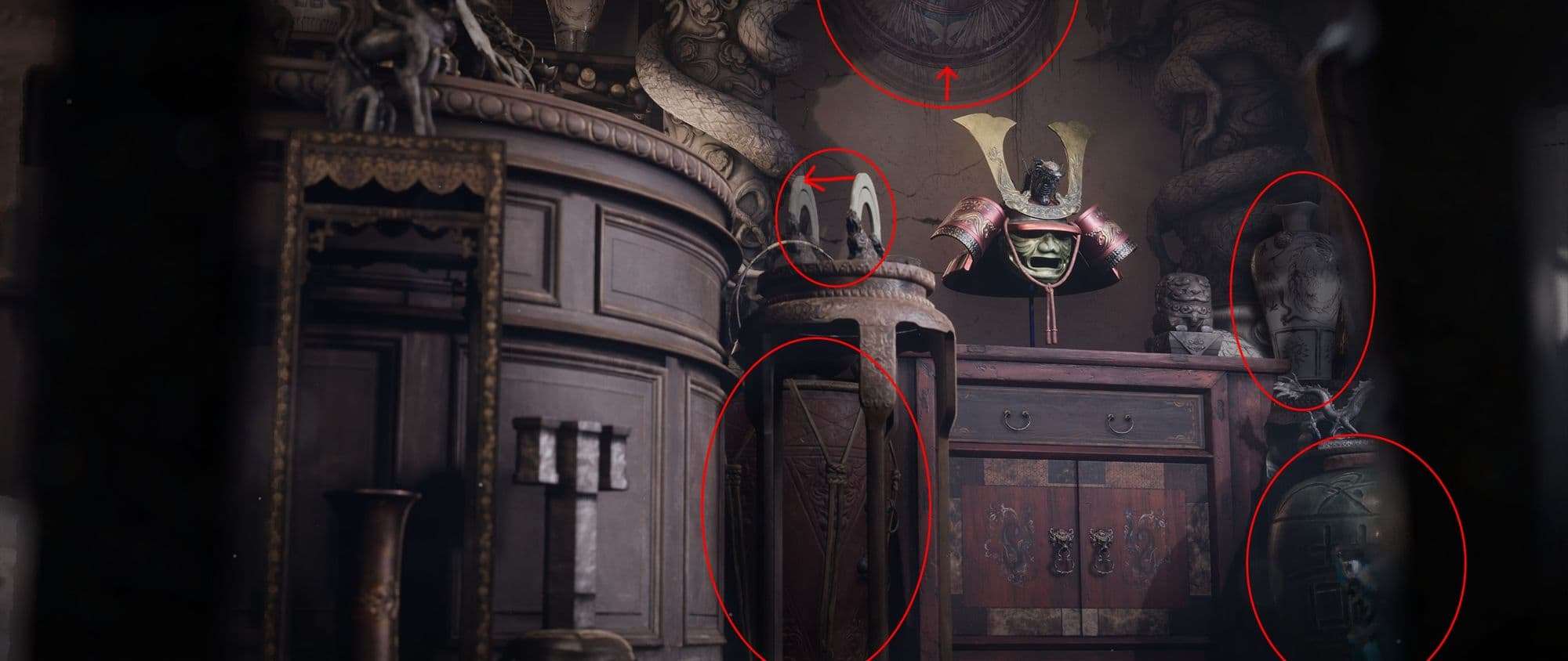
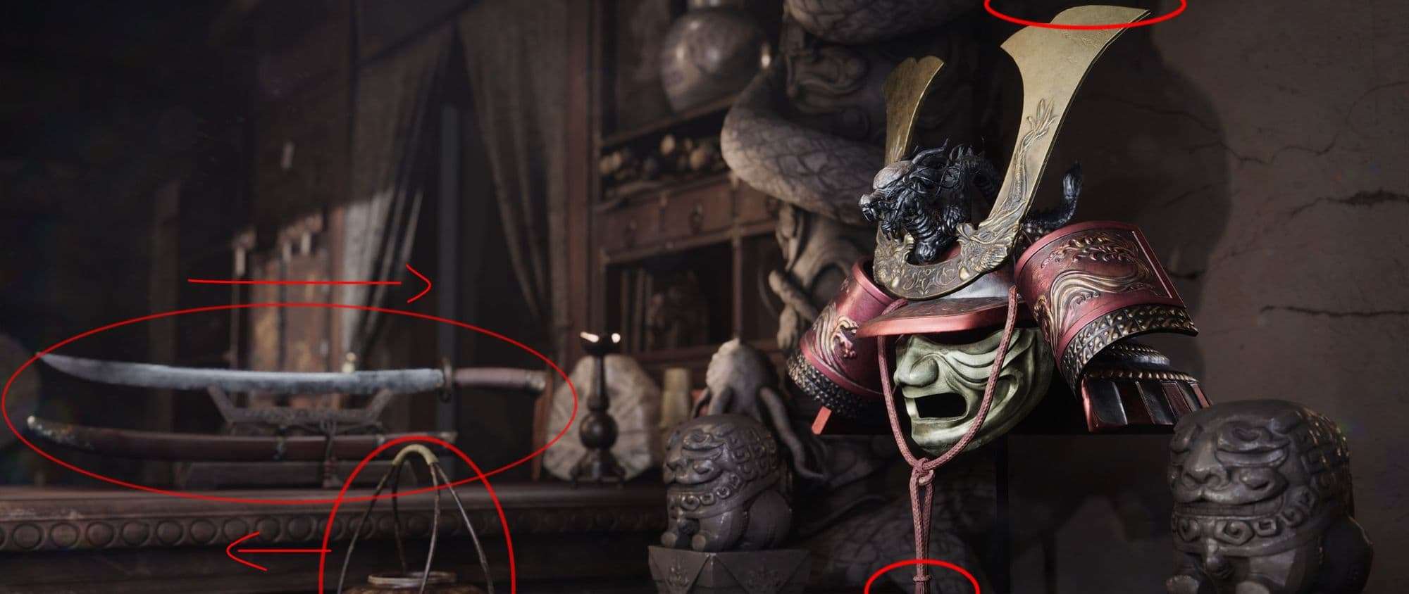
The helmet is the focal point of the image, and I placed on the top-right intersection of the thirds. We can see that it pops out of the other objects that surround it, has a more detailed surface, more interesting shape, and a tiny bit more vibrant colors. We can also observe that shapes of red and yellow/gold are generally populated around the helmet. However, I feel that I scattered the latter a bit more than I should have: the ornate details on the chair in the left are competing with the helmet itself. Although, it can be argued that it helps with balancing the image because it gives ‘counterweight’ to the left side. And the fact that it’s in the left third of the image makes it even more acceptable.
Among other things I might have done differently I would have done something with that red drum because it feels too bright to me; maybe place something between that and the round table. I feel the same way about the white vase and the white curved object, which are ‘cuddling’ the helmet from the sides. The former would be better off with a darker tone, whereas the latter would have been enough to push it to the left a bit. Moving the samurai hat slightly higher wouldn’t hurt either, and I’m genuinely not pleased with seeing that big green vase with that vibrant blue statue in the bottom right corner. Those are strong contrasting colors that are not ideal in this situation. We do make mistakes, after all, I’d assume…
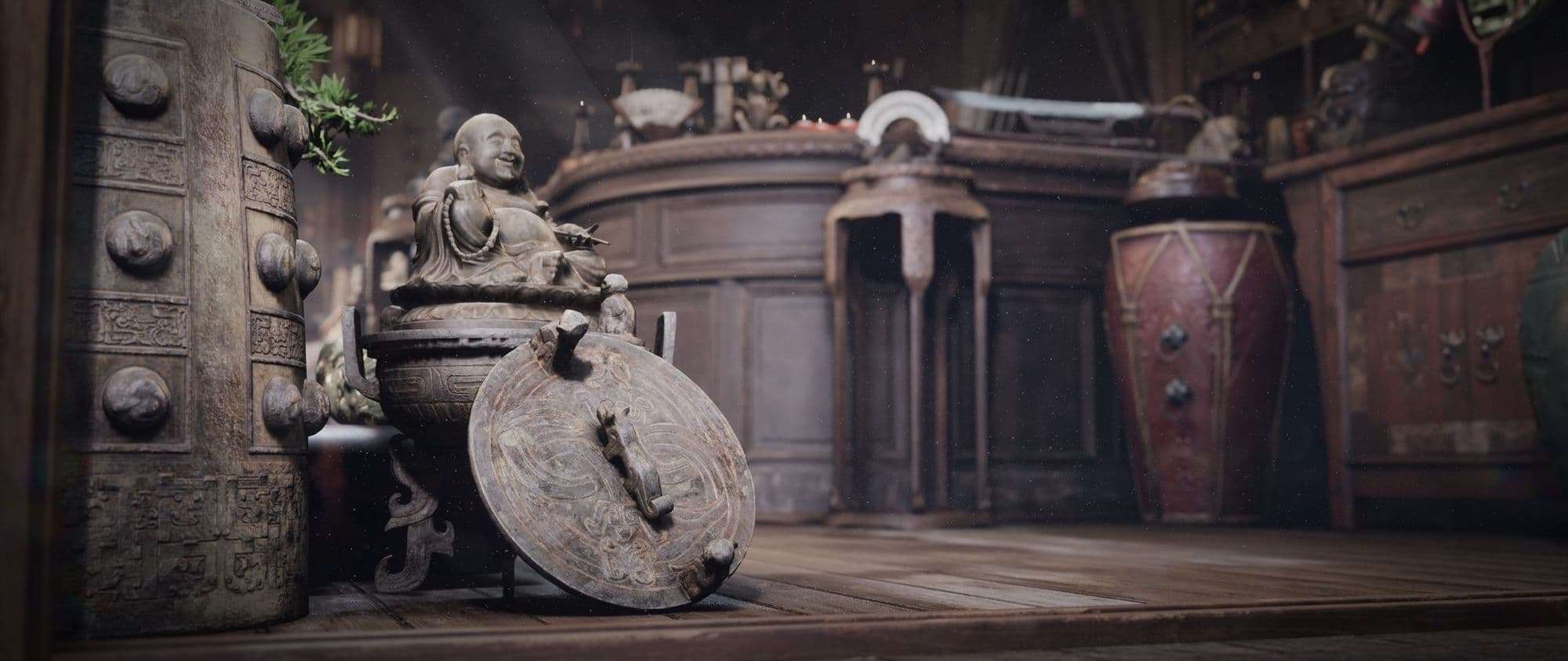
Buddha saying hello
I love this shot! Just wanted to put it out there. This is a perfect representation of combining composition with the story and authenticity of the scene. This statue serves as a ‘Greetings!’ message to the customers. This is the first thing that they can spot even before entering the shop. If I had a store, I’d probably do something similar to make people curious and lure them inside. At a certain point, I even wanted to hang a sign on him, which would say ‘Welcome!’ in Chinese. Although, that would have felt a bit too much.
This is an earlier version:
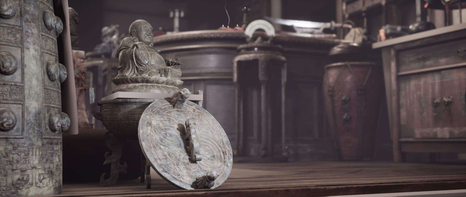
I don’t have a shot predating this one, because it was another frame I found accidentally. At this point, I was still trying to compose this shot. There was a ton of missing objects and textures at this stage, but I already felt that it’s going somewhere that might be worth it. A bit later it progressed to this design:
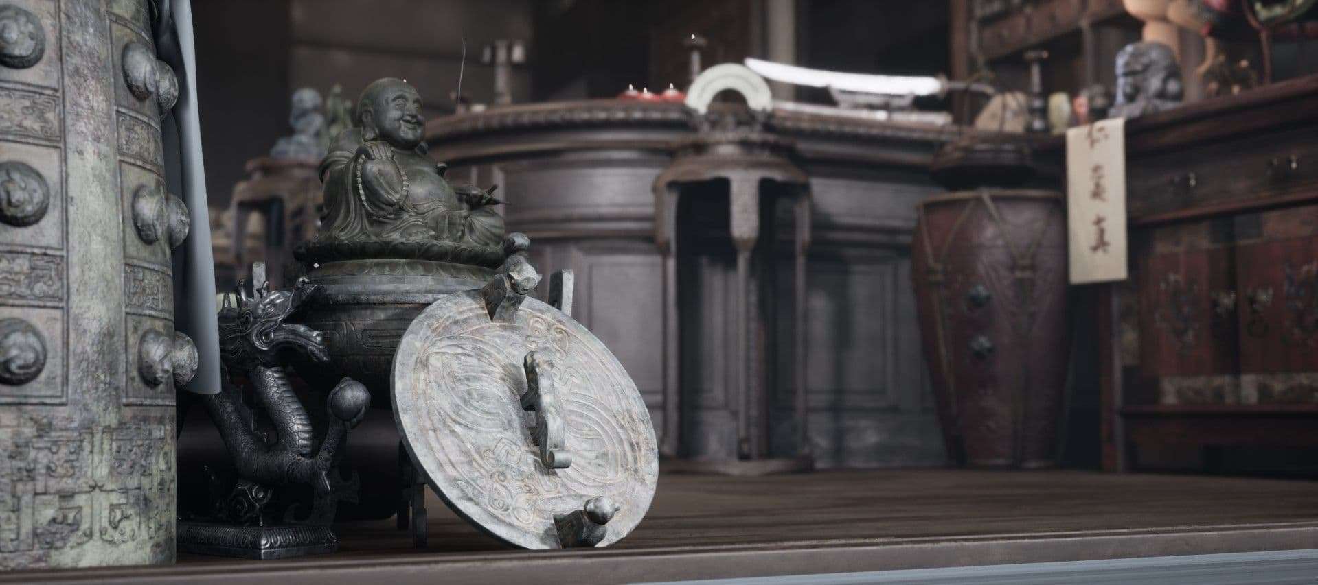
This created multiple issues I had to solve here. First of all, it felt too cluttered, and there was no clear meaning of the image. I wanted to make the Buddha the ‘star’ of this render, but there was too much noise around him that stole the show. I had to get rid of the dragon next to the Buddha, the bright cloth that was hanging on the sideboard on the right, and move the camera a bit.
Lighting was also another factor I didn’t benefit from with this setup. The Buddha was too dark, only that handcrafted lid received light. The sword and the surface of the counter were also lit way too much, both competing for attention. But the most annoying thing was that the threshold cut the bottom of the lid and the big bell. It might sound like a minor issue, but this is the same thing that I mentioned about cropping at the joints.
I can’t clearly remember how I solved this, because pulling the threshold closer resulted in it entered the image on the right side, but not reaching the left side. When I pushed the Buddha a bit further, however, than it didn’t receive enough lighting, and the big bell next to it became too dominant. I was thinking of putting something underneath it to lift it up, but fortunately, that wasn’t necessary.
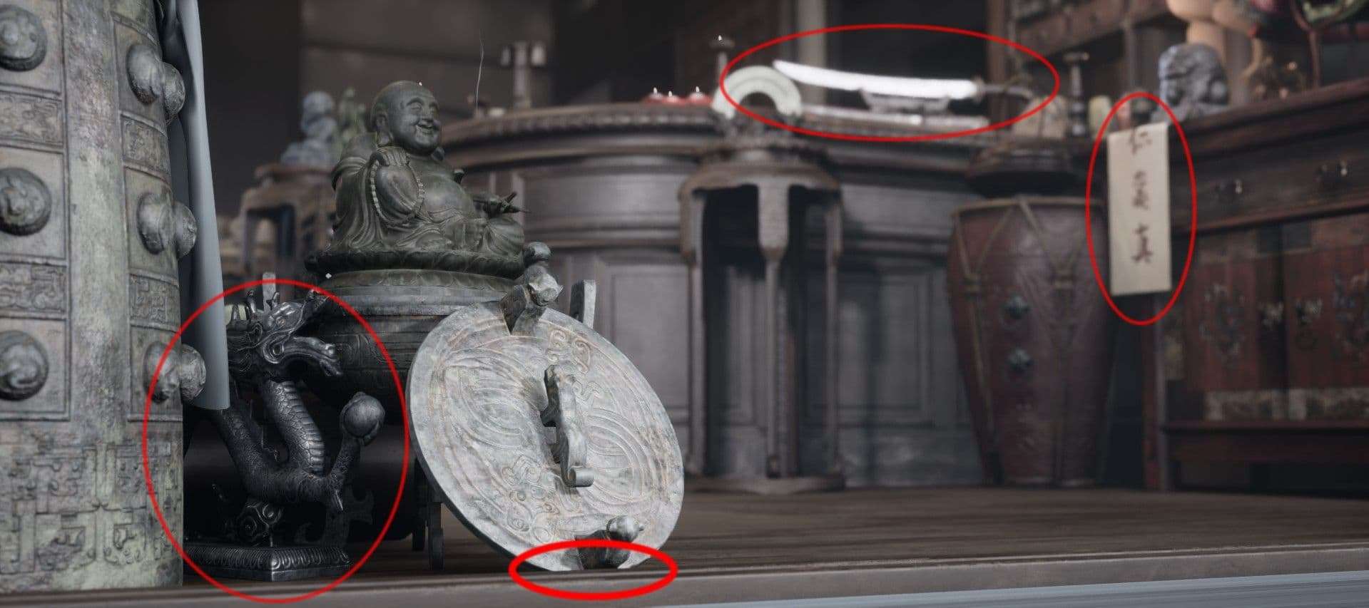
The final turned out in a way that there’s barely anything I’d change. The bonsai tree’s branch’s green tone is a bit disturbing because that’s the only contrasting color I have there. I might do something with that, but in general, I love that it’s leaning above the Buddha, like some sort of a levitating crown.
The curved white ornate object in the middle of the background is also a bit too bright. Moving it to the right and swapping it with the red drum might have improved this render. That would also change other shots though, so it still leaves a question mark.
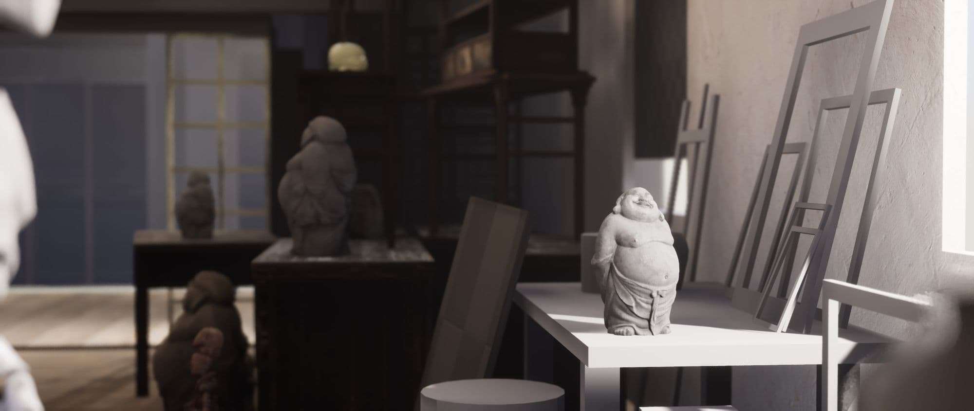
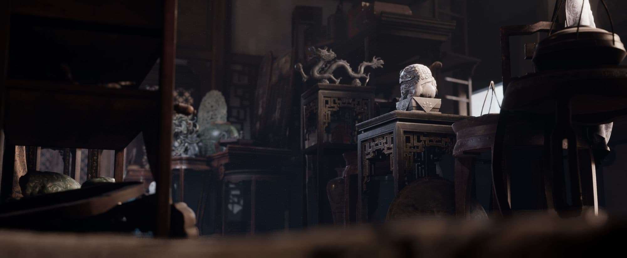
Building the space around something tiny
This shot is by far my favorite.
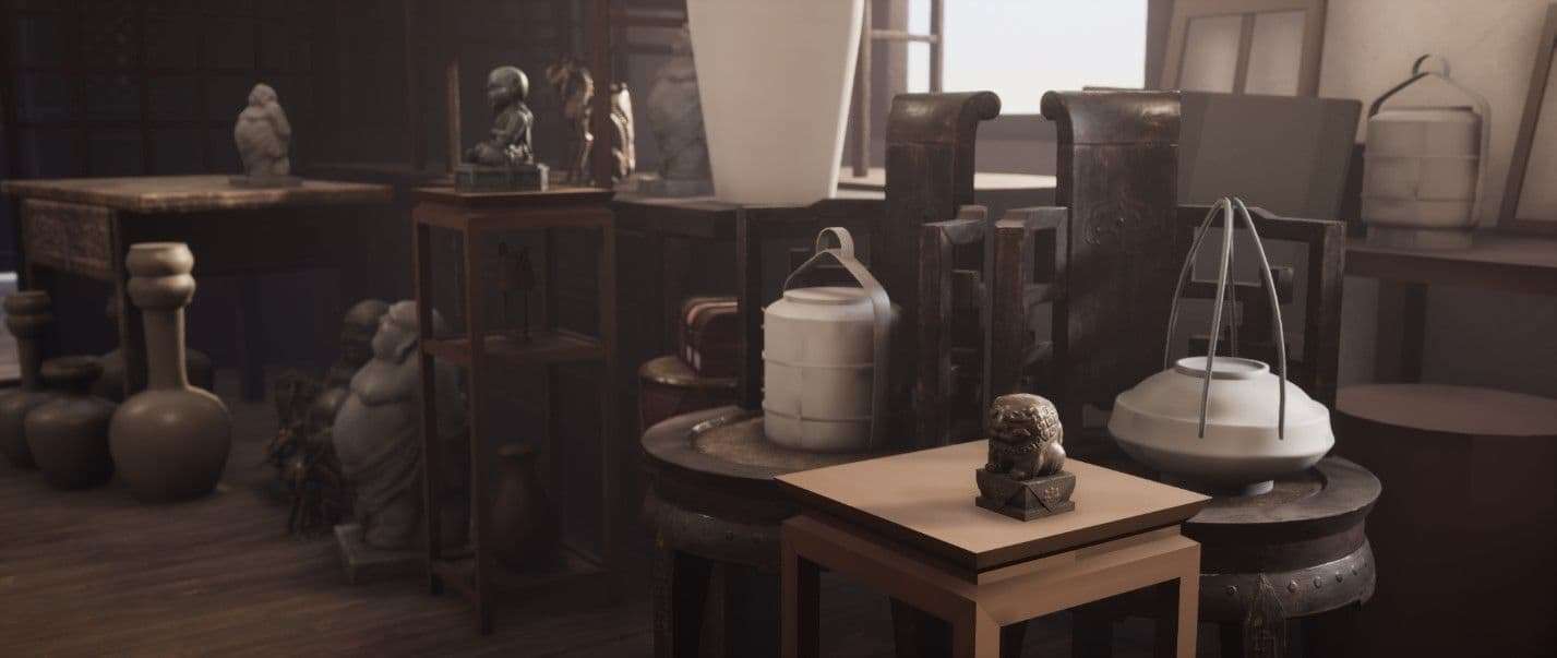
This looked drastically different in the early stages. Here’s an ancient screenshot:
I wanted to have more space there where now there’s a lot of objects because I felt that it would have been too constricted. That table on the right would have served as a storage for damages things that Mrs. Croft doesn’t want to use or just doesn’t want to place at the forefront because of their low value, things like broken pottery or frames of old paintings. That Buddha statue, by the way, was my idea that later on turned into that picture with the dragon and the white vase in the middle.
Our goal is to lead the viewers' eyes so that they explore the picture and let the story unfold as the artist would want it to.
As time passed by I populated the space with more objects and made the corridor narrower. This resulted in having this table in the background and more or less hidden. So I started caring less about this area and focusing more on the foreground.
I also found an amazing sculpt (by Zhelong Xu) of that little chubby dog, and I just wanted to have it in my scene. It fitted the theme so nicely.
It was a tiny object in the grand scheme of things, but it was important because I had a camera angle that centered on it. So while I was gradually making more and more props, their placing became more and more challenging. We can see on this early iteration how much polish it needed in order to arrive at the final result.
Overall, this was a process where I just found an object I really liked, I wanted to place in the shot and make a close render of it. In order to do so, I had to design and build the space around in a way for it to accommodate my plan. I couldn’t place anything taller on its right but needed to have taller things on its left. I wanted to make the background around it noisy, but gradually cleaner as our eyes would be moving further.
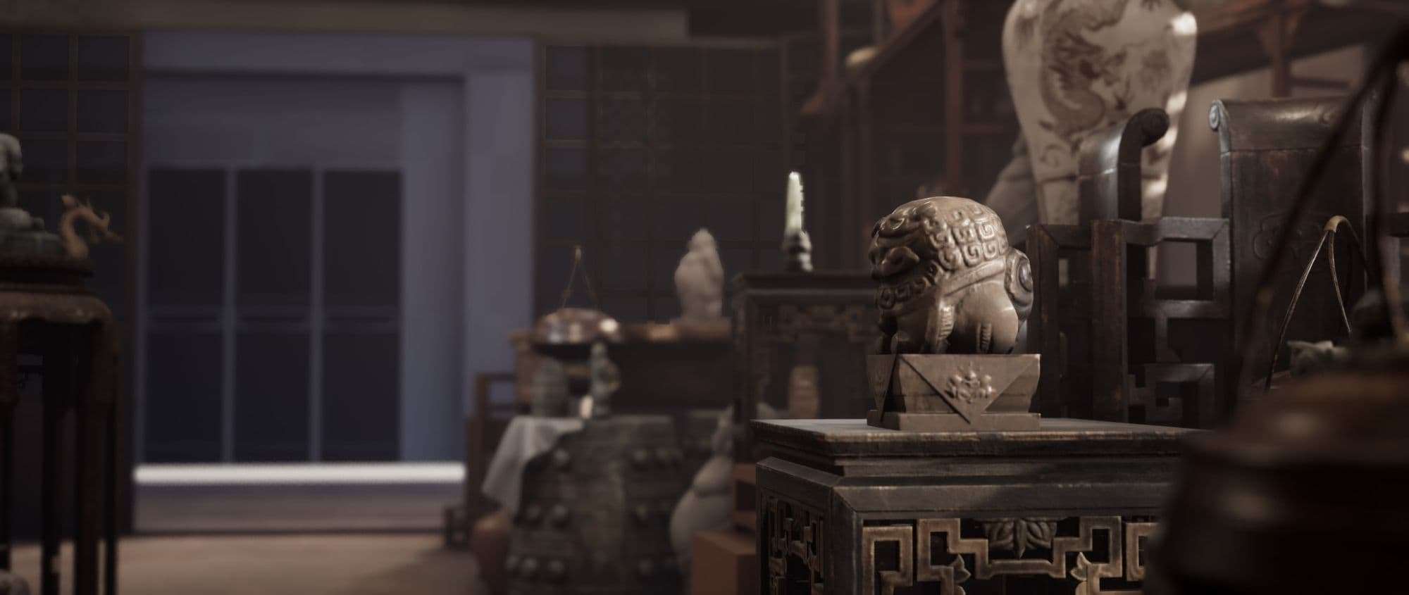
I felt that I was done when I had this result:
Although, the front of the lion statue wasn’t lit enough, so I placed a dynamic light source there. Also, I only later noticed that very bright spot in the background, coming from through the window. I fixed that later on, but I still have this version in my videos.
The warrior came in a bit weak
This close shot of the shogun helmet feels a bit weak, in my opinion.
The cropping of the image is not too fortunate, because I fell into the trap of trimming at the joints, because the end of the red braid has slid out of the frame. The same scenario happened with the top of the helmet too. The lighting helped a lot because it made the centerpiece shine more.
However, the image around it feels too noisy, especially because of the interesting surface of the dragon pillar in the background. That makes the helmet less readable. Although, if I removed that, then it would change a number of other shots too, so it’s hard to judge it.
The sword in the background is another thing that makes me frown. The idea of having both in the image is nice, but I might have positioned it a bit more to the right (just slightly). The tip of the sword is very close to the frame of the image, and it creates tension and uncertainty. The handle of that pot is also coming into the picture in the wrong spot, I might have pushed that a bit towards the left side.
This is an example where I felt that the asset itself turned out well, but the presentation ruined it. Lighting and composition should always improve on the prop, and I missed the mark with this one.
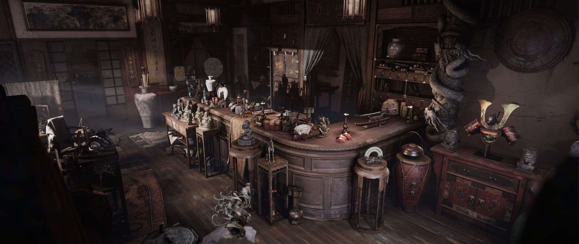
The main shot
The main/establishing render, where the whole shop is visible is somewhat notorious for being a bit cluttered. I’ve heard countless times that ‘there’s too much going on, and there isn’t a clear focal point’. I can agree with that to a certain degree. However, we need to keep in mind that this is an establishing shot of an environment that frames everything.
I’ve had a story behind this place, and I hid multiple elements to tell that. In this picture we can see all of them, that’s why there isn’t a singular focal point. Those can be found in the other renders, each of them telling their own pieces of the story.
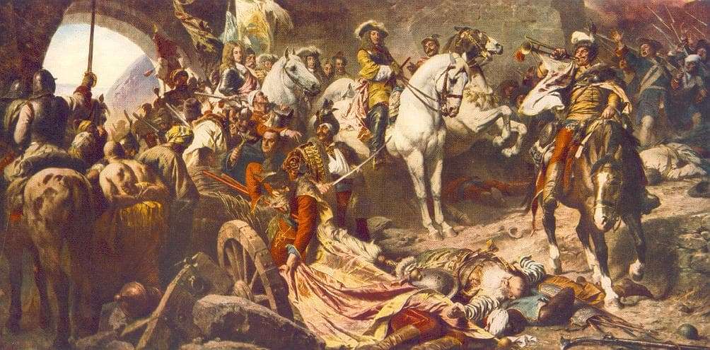
From my personal standpoint, not all images need a focal point. I’ve studied various traditional paintings during this project, but mainly afterward. If we take a look at this piece (Recapturing Budavar by Gyula Benczur) what do we see?
The short answer is chaos. Our eyes might gravitate immediately to the white horse, but the picture itself is jam-packed with bigger and smaller ‘events’. There’s an insane amount of interconnected compositions here: staring out from the horse, for example, our eyes travel to right to the trumpet, then to the horseman, then down to his horse’s head, then to the fallen man who’s lying on the ground, then we’re climbing up on the flagpole, and that warrior’s sword points back to the white horse. Masterful setup!
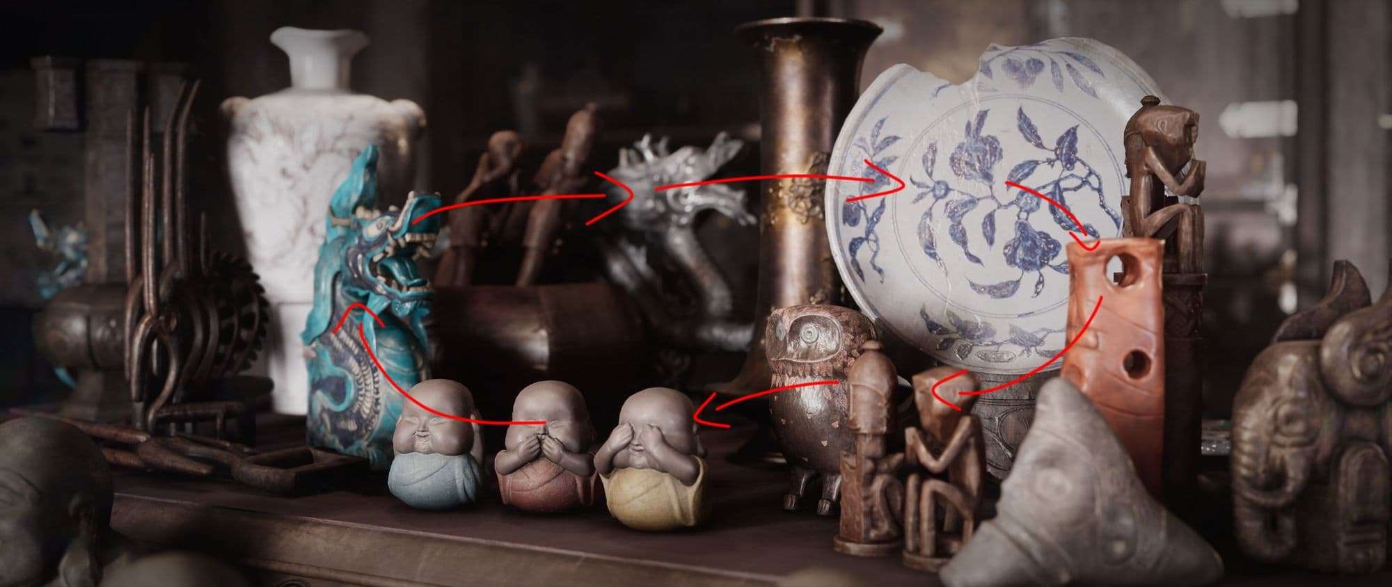
I did something similar with this shot, by the way: starting out from the white plate, we travel to that bright brown object, then arrive at the other guys on its left, continue our journey to the baby Buddhas, then we spot the turquoise dragon who’s looking to the right, and we return to the plate by going through the other dragon in the background.
The purpose here is not about focusing on a focal point and highlighting an object or a certain area of the image. Our goal is to lead the viewers' eyes so that they explore the picture and let the story unfold as the artist would want it to.
Obviously, I didn’t as much of an amazing job with my main shot as Gyula Benczur did with his painting. I wanted the whole counter area to be kind of the protagonist here, and I should have given it a bit more spotlight, and darkening the rest. Something like this:
It’s slightly been achieved, however, because the counter is a bit brighter than its environment, but giving it a bit more contrast would have given it the extra punch it needed. Although, that would mean that other things surrounding that would lose some detail. So what I did instead was that I placed bright objects at the two ends, in order to reinforce the diagonal compositional line, set by the counter itself. I also loaded up its top with objects to give it noisy and details to explore, and tried to keep its immediate surroundings cleaner.
Another thing where I feel that I’ve failed is that the second dragon pillar on the right is only visible a tiny bit. This is another example where I fell victim to the ‘cutting-at-the-joints’ phenomenon. That’s why the right side of the image feels there’s more there, but we cannot see what, and it feels unfinished.
Things that didn’t make it into the final cut
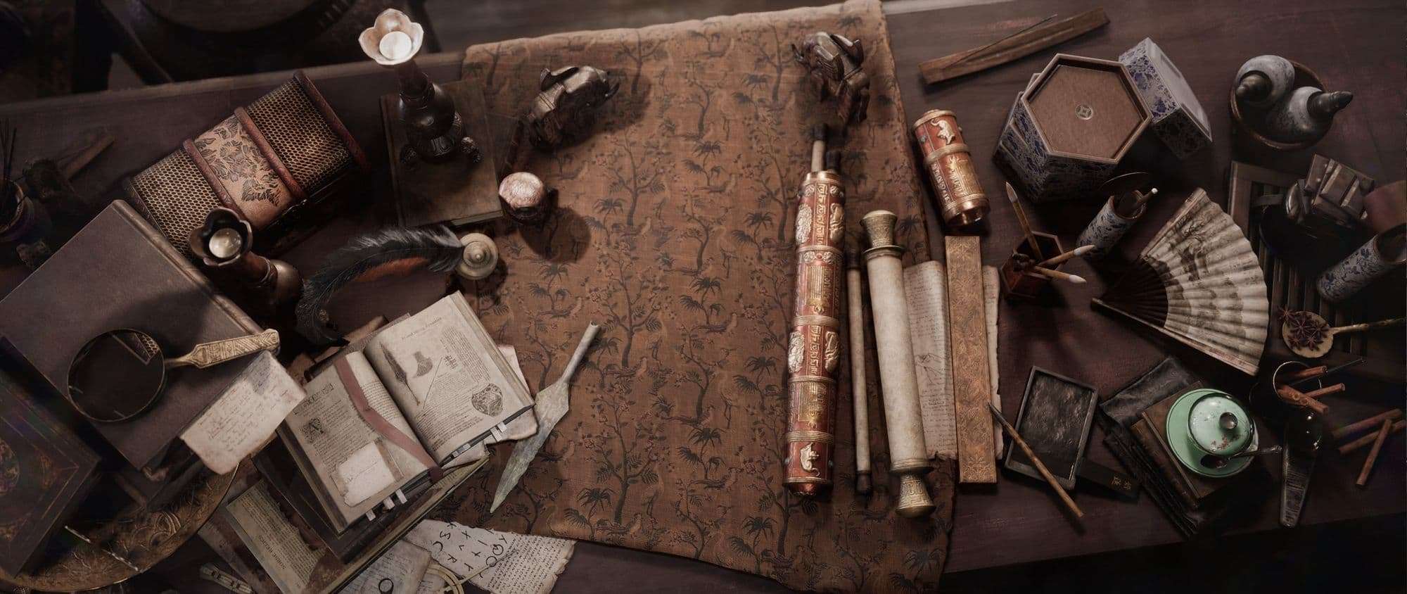
The final product looks vastly different from where I started out. I had different plans at the beginning, but as I moved forward and placed more and more assets and materials, I had the chance to iterate more on the composition.
As i mentioned earlier, this scene was an entire learning journey, and I was very inexperienced at the beginning. I just looked at the concept art and figured that I was just simply going to make a shop. At first glance, I cowered at the sight of the baffling amount of props, but I was also very intrigued by them. They were almost begging me to be crafted.
Also, writing my own story of this place facilitated the creation process immensely. This shot, for example, had a completely different purpose during pre-production:
I wanted to have an old working table somewhere as a place where the shop owner fixes those items that are broken since everything’s pristine among those ancient artifacts she gathers. Some of them are damaged, so there’s would have a few of those on this table, and one which was in halfway of getting repaired. I would’ve also placed the tools she would use to fix those items there. So, this table must have been older, dirtier, and a bit shoddy, as opposed to the furniture that she uses for showcasing her articles. That is apparent to a certain extent, because this is not the fanciest table you have ever seen, and the stool would still fit that purpose perfectly.
Also, my first idea was to make only statues (because of how much I love sculpting) and populate the whole shop with them. However, after making 2 different Buddha sculptures, this seemed to be a very time-consuming process. Also, the shop itself would have looked less interesting, since all the items would feel very identical. They would have had similar shapes and materials, so it provided me with very little wiggle room in how to make the place feel engrossing.
I wanted to have ornaments too, hung from the ceiling. I found images of very nice traditional Chinese bells and wind chimes that looked so amazing. But I couldn’t find the right place for those and ended up ditching the idea.
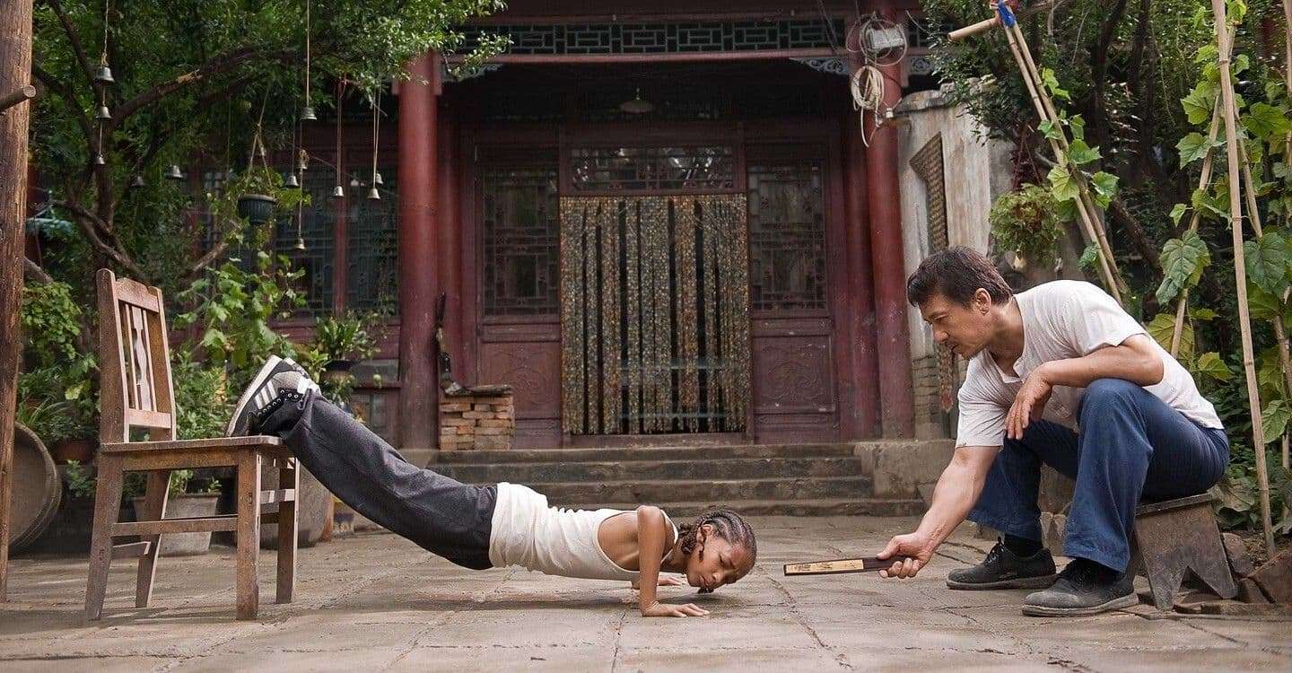
In the beginning, I wanted to make the outside of the shop too. I imagined it being situated in a mid-sized court whose entrance would have been a big traditional door or gate. I found a good reference in the 2010 Karate kid movie, where Jackie Chan was training Jaden. I loved the atmosphere of that place, and it would have been a nice addition to this shop.
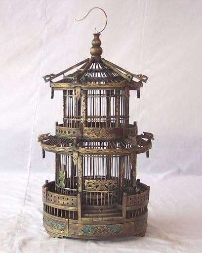
I don’t know why, but I also wanted to make this Chinese birdcage so badly. I just couldn't fit that in anywhere. And after a while, the idea itself felt less and less valid.
I had also wanted to have a shot from this angle, but I believe the reason why I didn’t at the end is that I didn’t feel it strong enough. In addition to that, I already had a fairly similar render with the tiny chubby lion in focus.
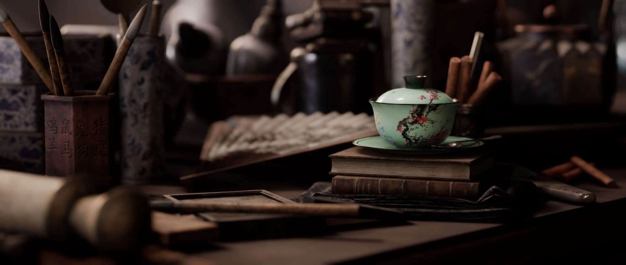
Here’s another render that I didn’t use eventually:
I just couldn’t flash it out as much as I wanted to. I loved the idea of framing this teacup with the cinnamon sticks, and its color helped with putting it in the spotlight. But the rest of the image felt very poorly put together, messy, and just simply unclean. Trying to light it decently was a nightmare, because it was such a tiny area of the whole space, but was still affecting other renders. After a while, I just gave up on it and started focusing on the bigger, most significant shots.
Consistency is key!
As you can see, I had a whole bunch of plans at the beginning, some crazier than the others. Many of them sounded great on paper, but when I started actually making the scene and stepped out of the planning phase, I had to take a step back.
My goal was not to make a cool looking environment, but rather something authentic. Of course, I wanted it to have a certain artistic charm, but I also wished for making is realistic.
In order to achieve that, I had to cut the ‘cool’ ideas. I have mentioned this in my previous articles, but it’s crucial to keep focused and not add something to the project just because it looks ‘cool’. If I've done so, this scene would have ended up looking like a jumble sale and no one would believe that it can actually exist. I set the boundaries of this scene for myself: I wanted it to be grounded in reality.
A very important thing was to imagine the history of the place itself, what might have happened there an hour ago, yesterday, a week ago, a year ago, ten years ago, and so on. Approaching the scene from this direction helps me to find answers to many of my questions. I fantasized about this place as if it had been an antique furniture store before Mrs. Croft has bought it. It immediately gave me a reason for having way too many old movables in there. When she was about to rearrange the space, she pushed the oldest, uninteresting pieces behind, and piled them up behind those which were still valuable, and perfect for putting her artifacts on top of them.
As I imagined Mrs. Croft traveling around the Asian continent, all the artifacts must have been originated from there. That's why you can see Buddha statues, dragons, Indonesian and Indian relics, but nothing outside that realm. All those pieces of furniture are all Chinese since the shop is located there. Although, she doesn’t speak Chinese, so that’s why we can see English books on the counter.
It was essential to think of the mind of the shop owner herself. I tried to imagine that if I had this shop, how I would arrange it and place the items. That’s how that sitting Buddha got placed at the entrance, as I mentioned before. I also intentionally placed the most exciting items close to the entrance: the shogun helmet on the right, the sword on the counter, and that dragon statue with tentacles on the left. These formed a trinity because they are the stars of this shop (and they were the only assets that took me multiple days to make). And as we are moving inside to the end of the counter, the vibe factor of the articles progressively drops (we can even see a broken white plate).
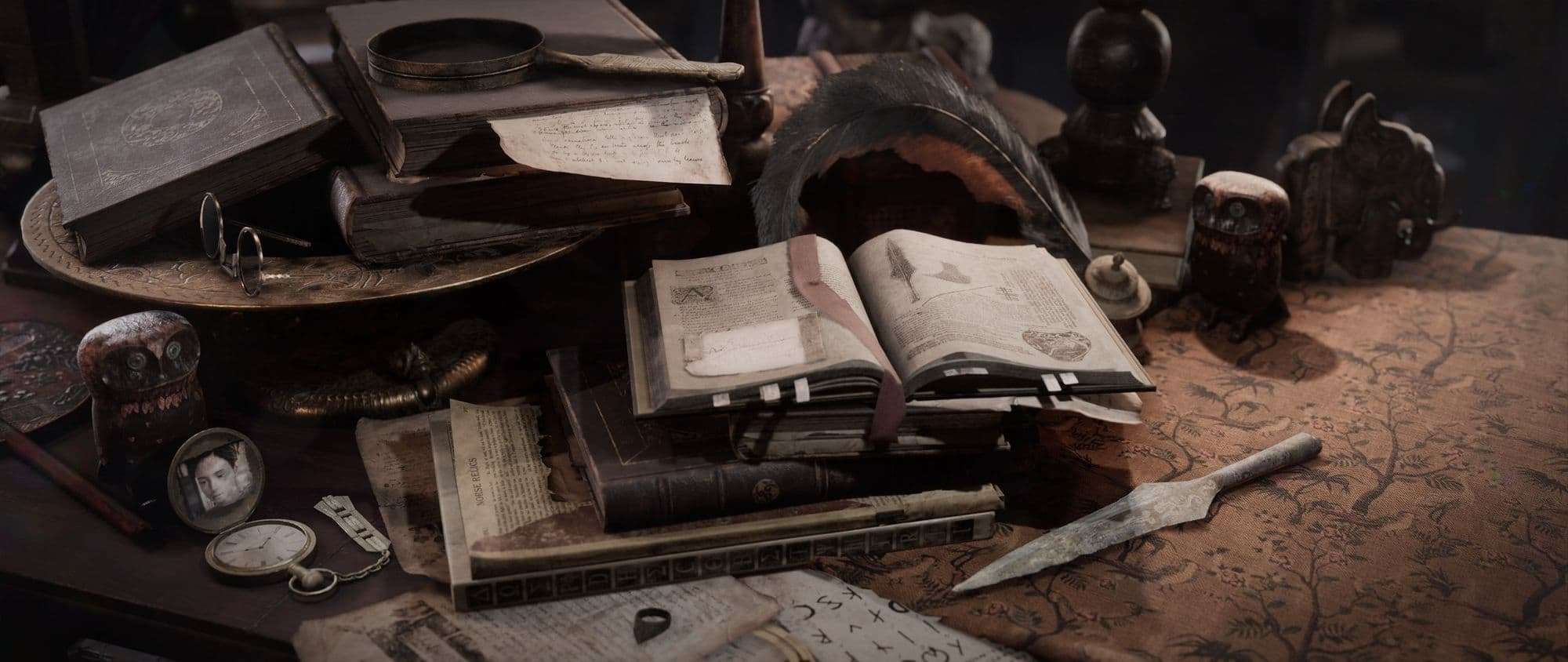
The central area of the counter-top is more about telling about the persona of the shop owner. We can see chocolate, cinnamon, star anise, and tea, so we know what she’s indulging herself with. There are books and scrolls scattered around which tells us that she’s been doing researches. They have ancient calligraphy, drawings of objects, which all make us assume that she’s looking for information about something ancient, long lost, but valuable (at least to her). There are also notes stuck to certain pages of the open book because she keeps tracking of the things she’s after the most.
The sense of clutter emanating from this area is also because she just got back from her most recent journey. She found that arrowhead (nope, that’s not a dagger), and she’s been probing those books for information. She first tried her chances with those scrolls, but after a few failed attempts she just pushed them aside. One of the printed works even says ‘Norse relics’, because she is not sure where that relic came from. But she ultimately finds a chapter of it, so that we can see the illustration on the main right page.
My favorite Easter egg, however, is that pocket watch you can see next to the book pile. That is essential to notice in order to believe that the owner is really a Croft. That photo is one taken of the young Lara herself, her name can even be read, although very vaguely. And putting that owl figurine behind her was a symbol as if it was a guardian protecting her.
Final thoughts
From my standpoint, it all comes down to using proper reference and combining that with your imagination. I didn’t want to make a carbon copy of the concept art I had found, I only wanted to use that as inspiration. I believe that what makes an artwork stand out is to add your own idea to it. Interlinking the story I had with the reference turned this scene from just a regular shop into something more. And I cannot stress how important I think this is, because I learned it the hard way.
For the first 2-3 months, I wasn’t thinking of adding my own twist to it at all, and I felt lost. And while it can be very difficult for many to deal with the creative part, it’s your own ideas that guide you, help you solve the creative things, and make the whole process fun! It’s like leveling up in a game, and when your finished piece looms on the horizon, you’ll remember that all the hardship was only supposed to define the journey.
If you made it this far, that means you have read through all my ramblings. Thank you so much for that, and I hope that you have found some value in it!