Setting Yourself Up For Success: Pushing Boundaries with your CG Art
Belén Amat Perez is a current student at Think Tank Training Centre. She shares a technical breakdown of her 3D scene, as well as how to push your own boundaries with your CG Art, to set yourself up for success.
Belén Amat Perez is a current student at Think Tank Training Centre, specialising in Character Art for Games. The project she shares with us today was created for a submission as the final project for her Foundation term.
Belén focussed this blog not only on the technical breakdown of her 3D scene, but on the process of working around her limitations as a student. She shares with us how to push your own boundaries with your CG Art and to set yourself up for success on your journey.
Knowing your limitations
As students, especially new students like me, we need to figure out early into a project what is probably going to be done fluently, and with what we could struggle with. It is important to know what is far from our reach- be it due to time constraints and not being able to do research or if a technical approach is too advanced for our level.
Don’t get me wrong, it is great to try to learn new things, but you must also think of the time you were given. Knowing that time is so important in this industry you must know if you will or will not, be able to fit the learning into the process.
As for time constraints, I originally had 4 weeks to do this piece, but due to some schedule changes we were given 5, plus the 2 weeks winter holidays. In my case, I decided to work sparingly on holidays (around 40% of the days). I've been told a lot of times that free time and resting is as important as the time spent doing hard work, something I feel that is missing for most people. Sometimes we need time to recharge and come back stronger.
The schedule I sketched out. I had the privilege of having enough time to take days off if I neded.
So, what are my limitations? The first thing I can think about is this: I love creating characters, but still haven’t gotten around to learn a proper XGen workflow. This limited my options. It meant that I needed to create a piece that, if it had a character in it, would have sculpted hair and fur. I knew I didn’t have the time to learn XGen enough so that I could make sure that it wouldn’t throw my whole schedule to the ground if something went wrong.
I am also still struggling with realistic textures. I have a background in Fine Arts and painting, so being able to paint textures, or a mix of stylised hand-painted textures and realism would be a far better fit for me than a fully realistic concept art (even though I plan to get better at both!)
You might be the contrary. Maybe you are great at realistic texturing but haven’t painted ever, or you are great at sculpting but have a hard time with hard-surface modeling, I recommend you know these things when you set out to do something when limited by time.
So, with those things in mind, I threw myself into Twitter and ArtStation to choose a concept art. It had to be a piece that I loved, that I wouldn’t mind spending hours on it, and that would fit my limitations.
Choosing a Concept
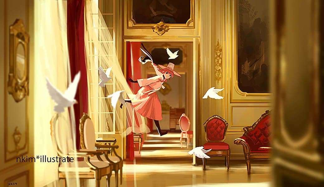
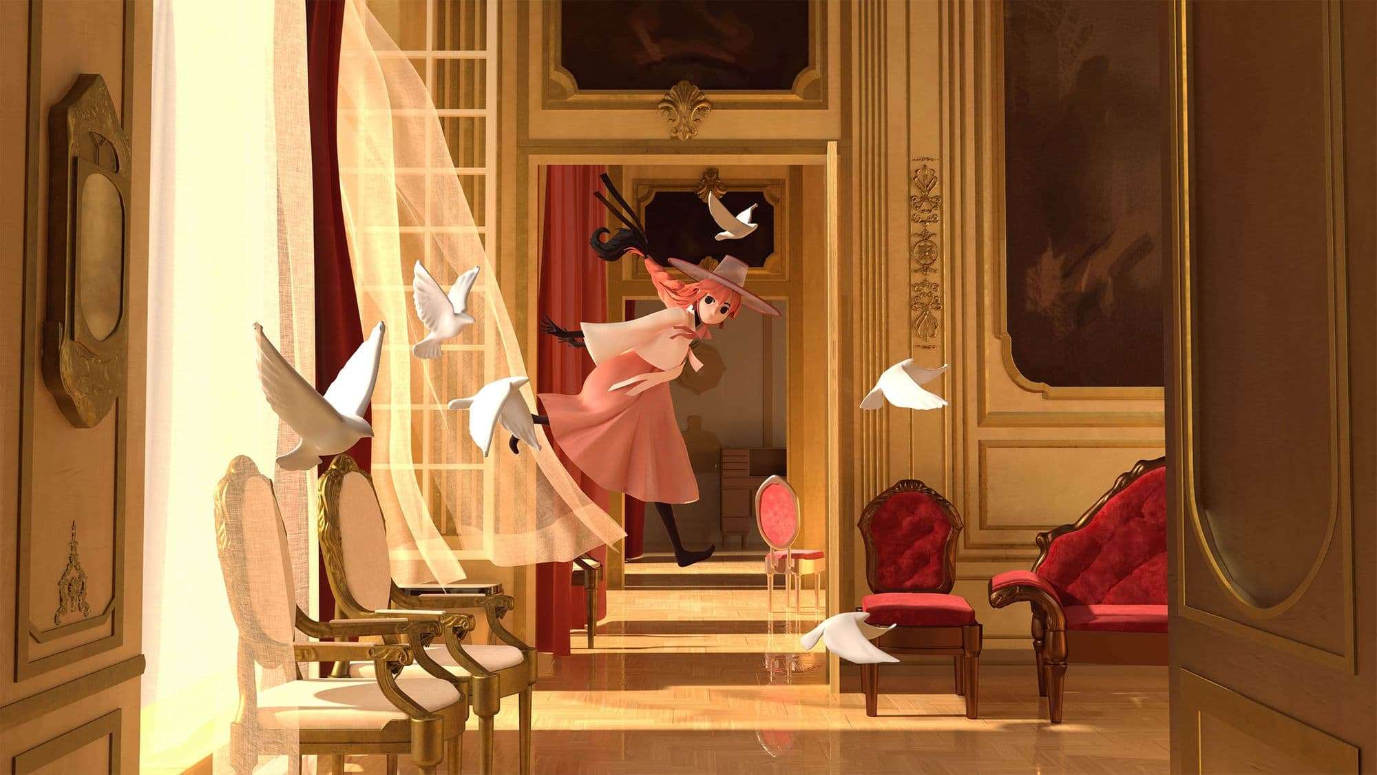
I chose Nadia Kim’s Flamingo Witch (go check out her art, it’s amazing!) after much searching. The first reason was that it had both things I wanted to work on and get better at: assets and character.
Concept Art I chose, by Nadia Kim. Always remember to ask the artist for permission before using their art!
The beautiful atmosphere of the piece also attracted me to it, and would be a great exercise in lighting and post processing on Photoshop later. The only thing that would make the process a bit difficult was the fact that it wasn’t a fully realistically rendered piece, but had loose strokes here and there. Yet, the fact that it's stylized also worked in my favour. After asking the artist for permission, I decided to go for it!
Having chosen the concept art, there was another checkpoint that needed to be done before starting: what will the art style be? I couldn’t use fancy shaders with toonline since I didn’t know anything about them, so I needed to go with classic VRay materials and shaders.
After thinking about it and asking my supervisor, he pointed me to one fact. Most CG Pixar-Disney films, even if they had stylised modeling, also had realistic textures and lighting. This showed it wouldn’t be a problem to incorporate both if done carefully.
I knew I wasn’t going to get the same result since I am still learning, but it would be a great exercise from an artistic point of view.
Shot from Frozen II, by Walt Disney Animation Studios. I've always loved the mix of realism and stylization.
Once I had my schedule, my style, and all my references gathered, I set out to work!
Setting Up Your Scene
First things first, the usual stuff most people already know. You set up the camera with an Image Plane, lock that camera so that you don’t move it and curse yourself for not having locked it 3 hours later, create the walls, floor, cubes for setting up the objects in the area, all that jazz.
I decided to get an early look at the lighting. I chose the VRay Sun since the image had an orange-yellow tint and the sun seemed to be setting, or rising. I could see this looking at the angle it made with the walls and curtains. This choice was later a bit of a throwback, since I realised the concept had a ‘yellow-er’ tint that I first thought. I was able to work in Photoshop after the final render, so it didn't push me back a lot.
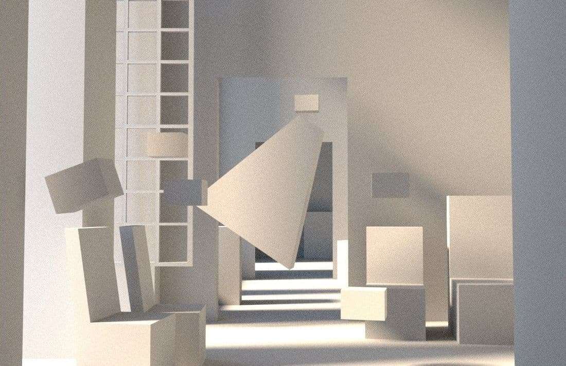
A day 1 render of the scene, with basic primitives for all the objects and lighting preview for later.
The key of the blockout process was working on one object at a time, but all at the same time. I created little by little the rough model of every object in the scene (remember to keep a list of things so you don’t miss anything!) and seeing it come to life. At this point, I wasn’t afraid to still move objects a bit to better fit the concept and the lighting.
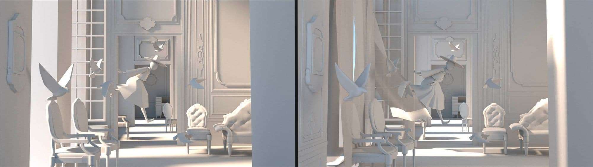
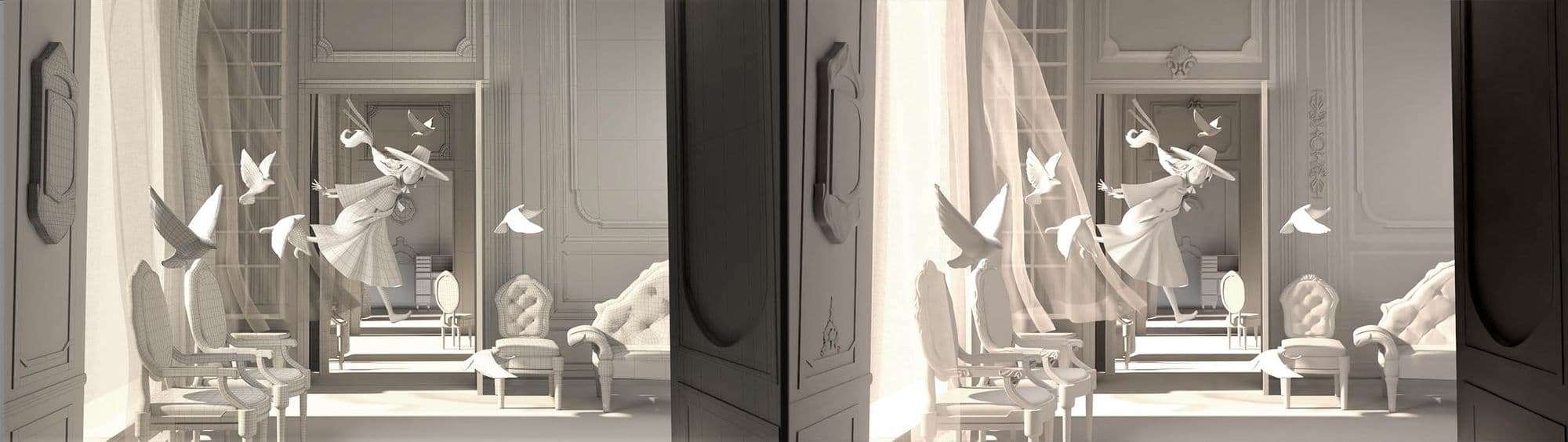
Rough blockout (left) and after the modeling stage (right).
For the chairs and furniture that had complicated shapes in them, I decided to make the general shape, with a very square-like grid. I would later do those decorations in sculpting and add them with a displacement map.
The curtains changed a bit later on, since I saw that the flow wasn’t correct. The simulation I tried doing in Maya ended up being a bit too straight, so I quickly put them in Mudbox and sculpted them a bit to get the shape I wanted. It was a bit painful, since I had spent the time trying to learn nCloth, but it made no sense to keep that if it wasn’t going to look good anyways.
During this process, I had to triple check that I hadn’t missed any object. Even then, close to the ending of the modeling stage, I realised that I hadn’t set up all the curtains the concept had. There were some hiding in the back and it was making the image look completely different in test renders.
When it came to the sculpting and setting up displacement maps, I followed the usual approach. Importing the low res mesh into Mudbox or Zbrush, sculpting until I was happy with the result, and then creating the displacement map.
The choice of working with both Mudbox and Zbrush was because I realized that Mudbox was giving me some artifacts in the maps when the model became too complex. When that happened, I reimported the low resolution and high resolution mesh into Zbrush, projected and then extracted the displacement maps. I followed this handy guide to set up VRay Displacements in a swift manner.
Wireframe view of the modeling stage (left) and final sculted version with displacement (right).
After all that back and forth was done, no time to rest, time to start texturing!
Texturing
I started with plain materials with colour and a test of reflection and glossiness values. After that, I began texturing the floor and walls in Mari, since those were my main concern. In the concept I couldn’t properly see what the floor was made of, so I did a bit of research. Most of the Versailles palace is made of very reflective wood. For the walls, they are white, slightly worn-down and with a bit of grainy texture. Not too much, not too little.
I did all the texturing in Mari and the materials are not too complex when set up in Maya, I wanted to keep it simple and understandable. The material that I did completely in Maya was the velvet chair, which needed a VrayBlend material with 2 different shades to create that sheen effect.
The texturing of the gold decorations on the wall was hard, not because they are difficult to make, but because the feeling they have on the concept with all those different reflections and glow was not possible to create for the render without going hard on the light-linking stage (and I already had 15 lights set up at that stage!) I decided to make do with the closest material I could create, and then give them a bit of life in the compositing stage.
There is a lot of back and forth creating textures, importing them, and fixing them after a quick render. Having met the deadline for the last day of texturing, I created some simple render elements (Object IDs, ZDepth and reflections), and let Maya do the rendering for its sweet 5-6 hours.
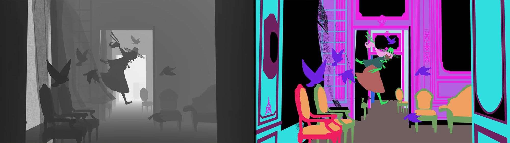
The two render passes I used the most, ZDepth (left) and Object ID (right).
This was the render pass I got, it is close, but could be way better looking. Luckily, I was able to import this render with its other passes to Photoshop and start painting!
I toned down the lighting so that nothing overblew too much and I was able to have more control in Photoshop.
Compositing
I started fixing the values from the biggest to the smallest elements. First, the overall hue of the image needed to be more yellow. Then, I set a Luminosity layer to identify the differences in light and shadows. This way you can touch them up without being confused about the colours and not minding them at this stage.
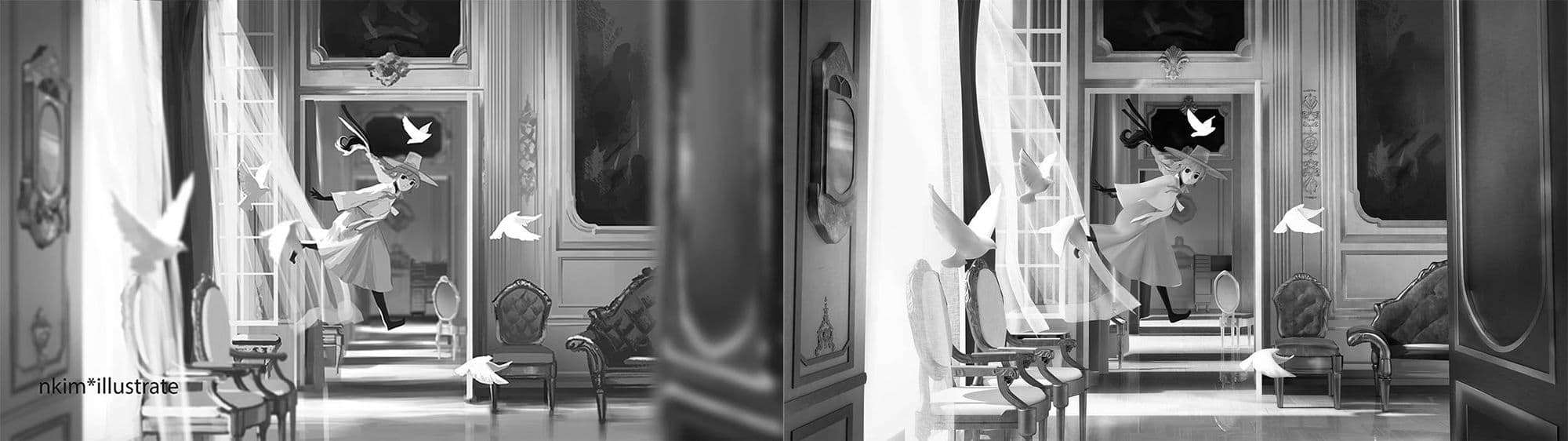
A luminosity check I did. At this stage, I had already worked on the background elements, but was missing the chairs and character.
I did this process for all the objects. The Object ID render pass helped me to quickly create selections and mask them. You can end up with a lot of layers and folders, but if you keep it all named appropriately it shouldn’t be a problem. The reason I didn’t use any more fancy render passes was because with this process I was very comfortable and worked quickly, so I decided I didn’t need to do something unnecessary.
After spending a lot of time fixing the values and hues, it was time to start painting! I had turned down the lights on the final render with the purpose of later having more control on them. Lighting up an area in comp is easier than fixing a blown-up light. The concept had a lot of areas that had harsh highlights which I needed to have control of.
With a simple airbrush and patience I could give the image all those pretty highlights the concept had. I specially focused on the character, since the hair and hanbok had a lot of highlights in the concept, bringing attention to it. I used mostly an Add layer, and Overlay for the yellow glow that is created around the highlight due to the light getting overblown.
This is the difference of the original render and the final image with no depth blur:
Original render (left), and after compositing (right).
When I was happy with the result, I added the blur the concept has with the ZDepth render pass. I created 2 layers of blur, one for the back and another for the very front objects. Making 1 pass didn’t create a strong blur on the objects close to the camera. I also added a bit of motion blur to the birds, something that is not too noticeable, but it adds a bit of motion to the image.
Once I had that, I made the finishing touches, fixing values that I hadn’t noticed, until I hit the due date.
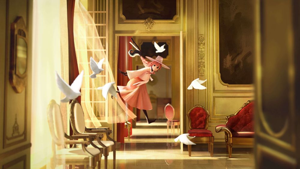
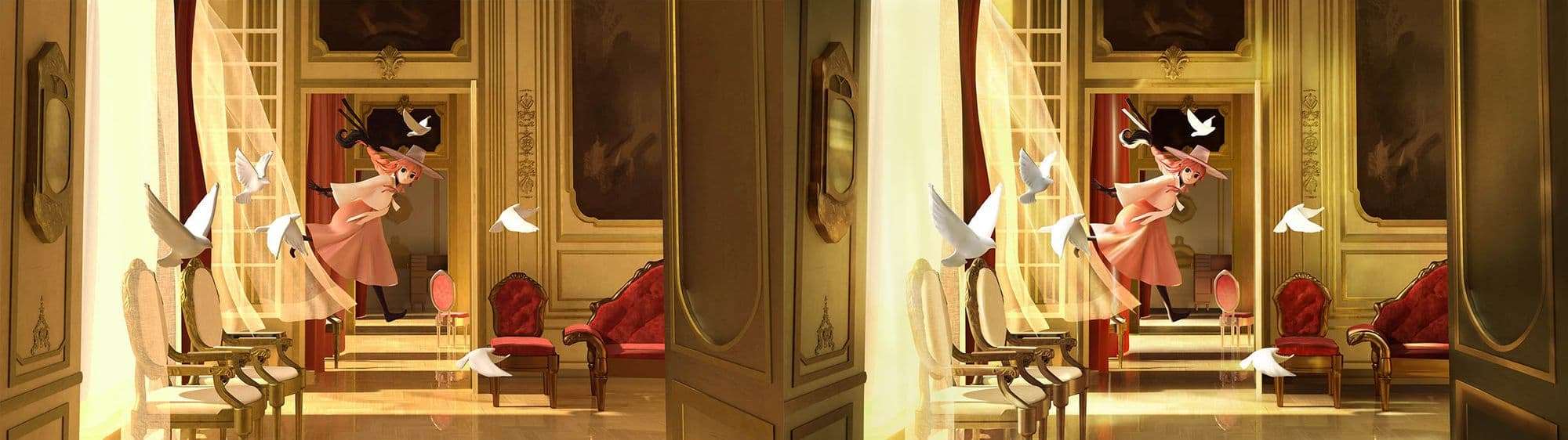
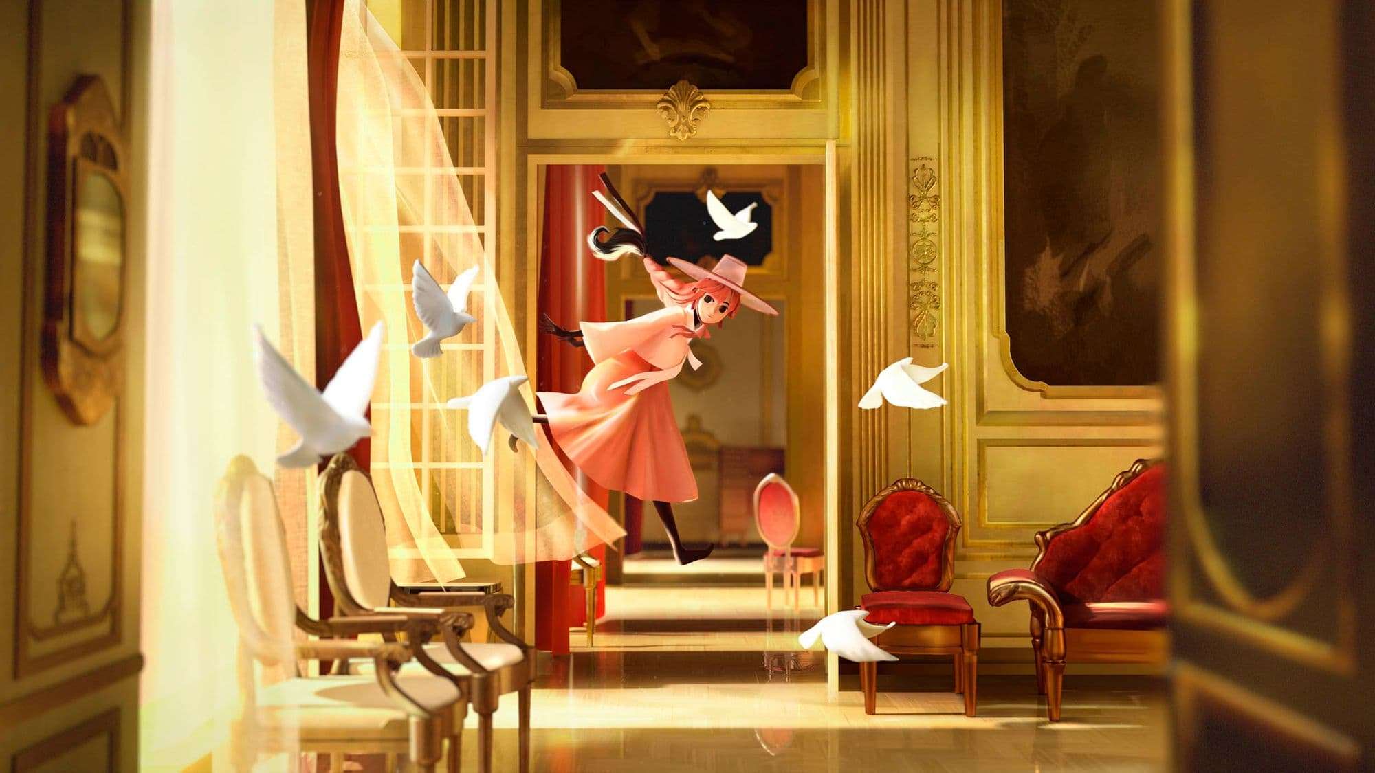
Final image, adding the sharp highlights and glows made the image pop a lot more. I also added some subtle effects like a bit of dust and motion blur.
And that is it! It wasn’t a very fancy or new process, but it did made me realise my limitations and how to work around them to create the best looking image I could do. I decided to make this the main topic of this blog.
I hope everyone that reads this (and has made it to the end) realises that looking objectively at what you can and can’t do is helpful to keep yourself on a schedule, and still create a great piece while learning a lot in the process.
Thank you, and I hope the best to all Rookies in their art adventures.