Creating Photorealistic Props for Next-Gen Games
Mohamed Elbouhy explains in-depth, his process of creating photorealistic props for next-gen games.
Mohamed Elbouhy explains in-depth, his process of creating photorealistic props for next-gen games.

After 3 years in medical school and 2 studying computer science, Mohamed El Bouhy studied game design in Paris, where he specialized in 3D game art. Since then, he has been practicing his modeling, sculpting, and texturing skills. Learning, and improving. His goal is to land his first in-house job as an Environment Artist in Games.
Mohamed has taken the time to share his workflow for creating detailed and photorealistic props for next-gen games.
I have always had an admiration for wood and woodworkers. I was born and raised in Egypt. Wooden furniture is still done by hand there, from board cutting to complex carvings. At some point of my childhood, we were completely refurnishing our house. I used to visit the woodshop we engaged to build the models we had in mind. I always loved watching woodworking, especially during the carving and varnishing steps.
When I was confident enough with my skillset in 3D, I wanted to create a wooden asset for many reasons. For me, wood is the most appealing material. It is hard to master due to the number of variations it can have, color and roughness wise. I also wanted to get better at sculpting in Zbrush. Finally, I wanted to establish the quality benchmark for the Fullmetal Alchemist scene I am currently working on.
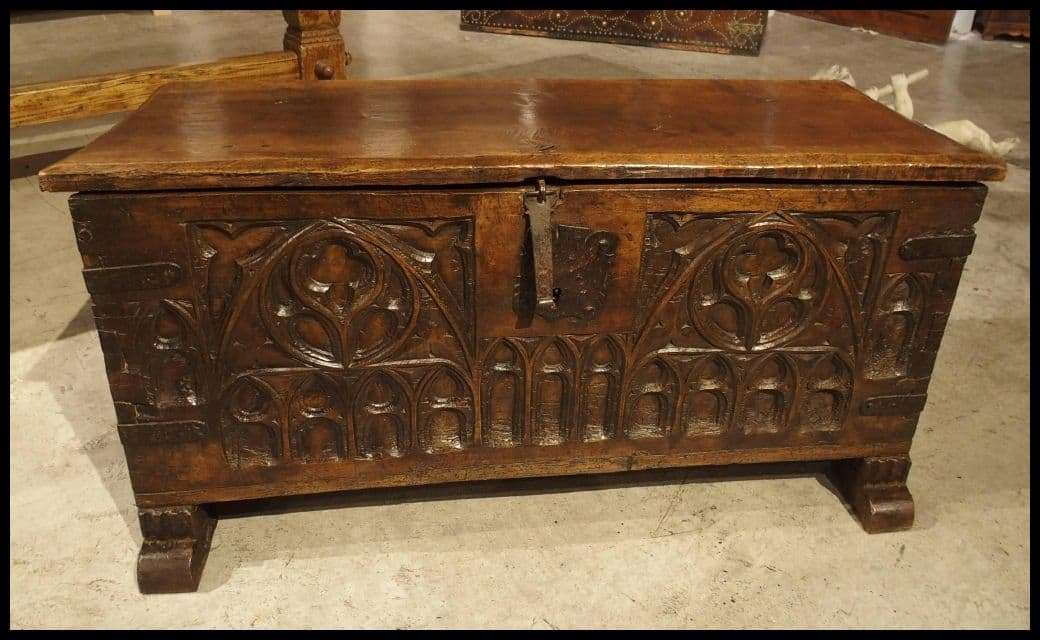
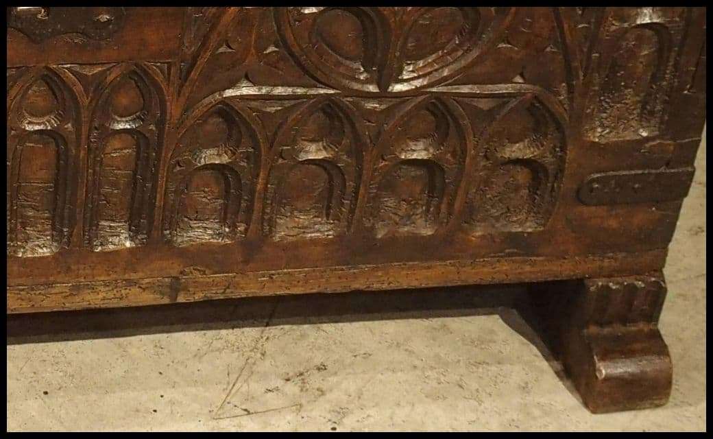
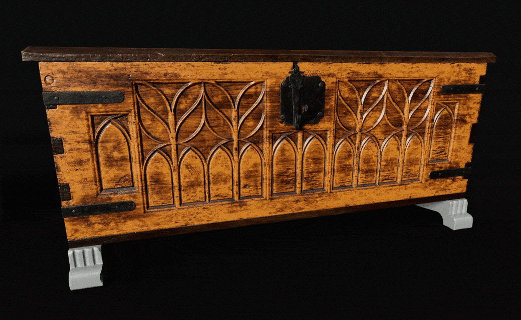
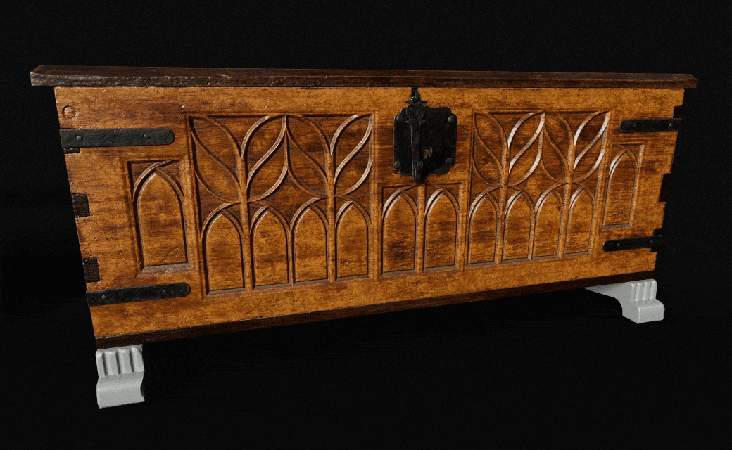
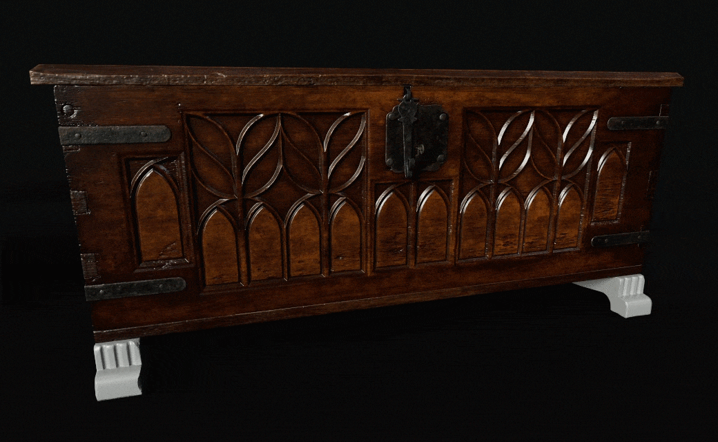
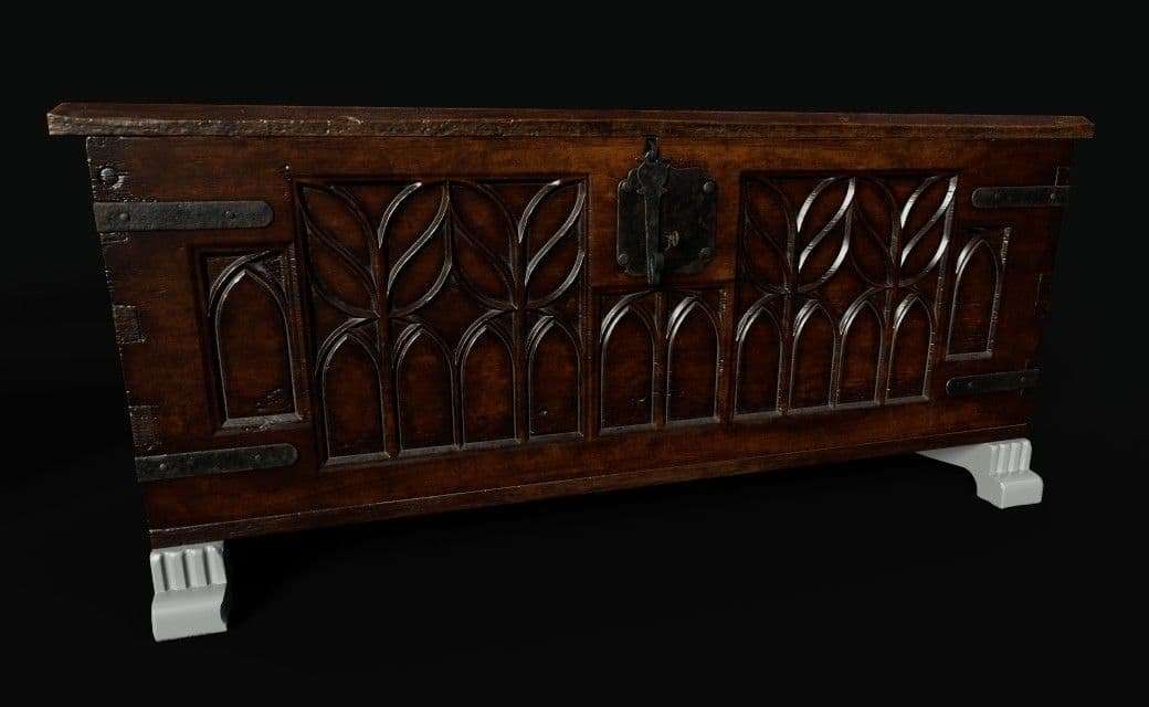
Before starting your blockout, you need to look for reliable references. The more reference images you find, especially from as many angles as possible, the easier it will be for you to create a believable asset. In my case, I was making a 17th century wooden chest. During this era, the focus, carving wise, was about Gothic architecture. I had the freedom to look for which patterns appealed to me the most. My main search engine was Pinterest. Through it, I discovered some sites that sell actual restored furniture pieces from this era. I chose this chest as my main reference.
Look for good quality image references, with many angles and close-ups. The more angles you have, the easier the blocking out will be. Also, find sites that display the dimensions for what you are trying to model. Real life scale is very important.
Then, I created a PureRef scene based on other models I found with all sorts of angles and close-ups.
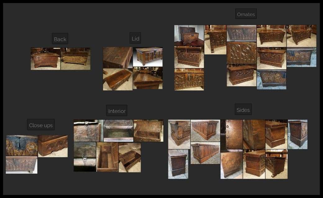
Do not limit yourself to image references. Youtube and specialised sites are full of experts showing techniques about wood creation. Also, visit some antique shops, vendors really know what they are selling and they can be a great help.
I use 3ds Max as my modeling package. It is the software I learnt how to model in. I have thought about Maya or Blender for future personal projects. But, 3ds Max’s modifier stack makes my workflow nondestructive. I can go steps back to change things without having to start over from scratch.
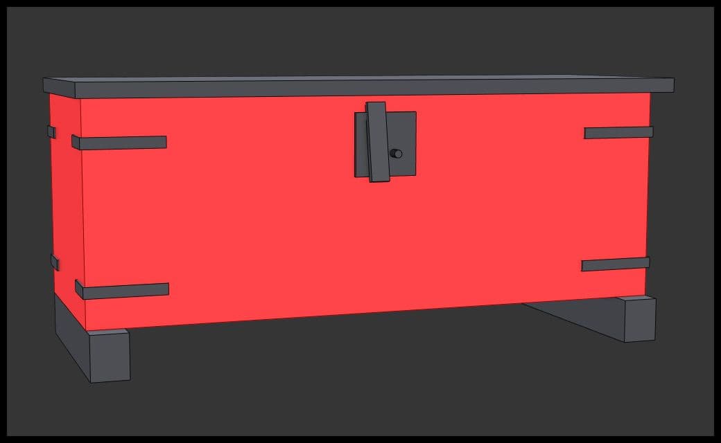
Blocking-out is the essential part of creating a prop or a scene. Making scaling or modelling mistakes of an asset will only give a non-believable result at the end. A block out is the base that you will carry on with.
In my case, I looked at many sites to find the exact dimensions of the prop. I found a good site that sells old chests, where I could find the measurement of each part. From there, I began blocking it out.
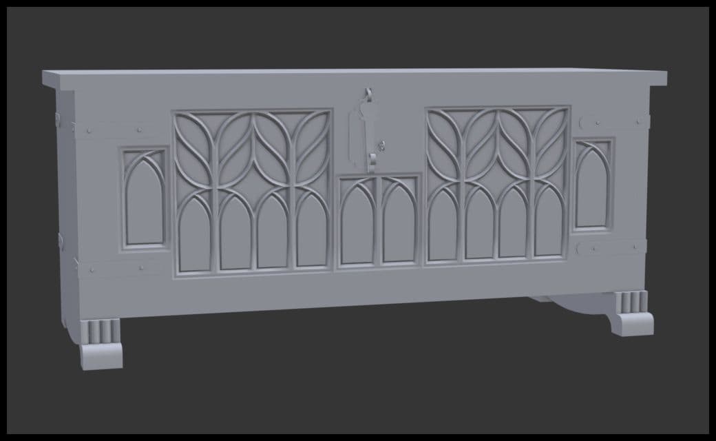
As you can see, I only used 7 basic shapes. I was happy with the silhouette and proportions. I started working on the front panel, which had the ornaments.
Do not hesitate to spend as much time as you can/need to make it look good and accurate to real life visualisation.
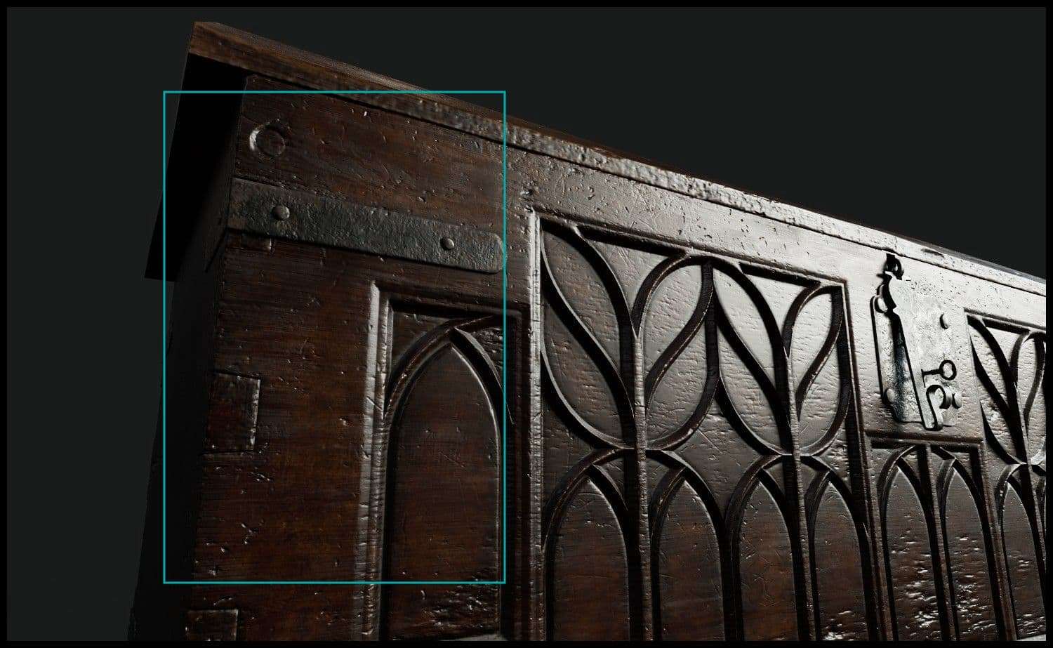
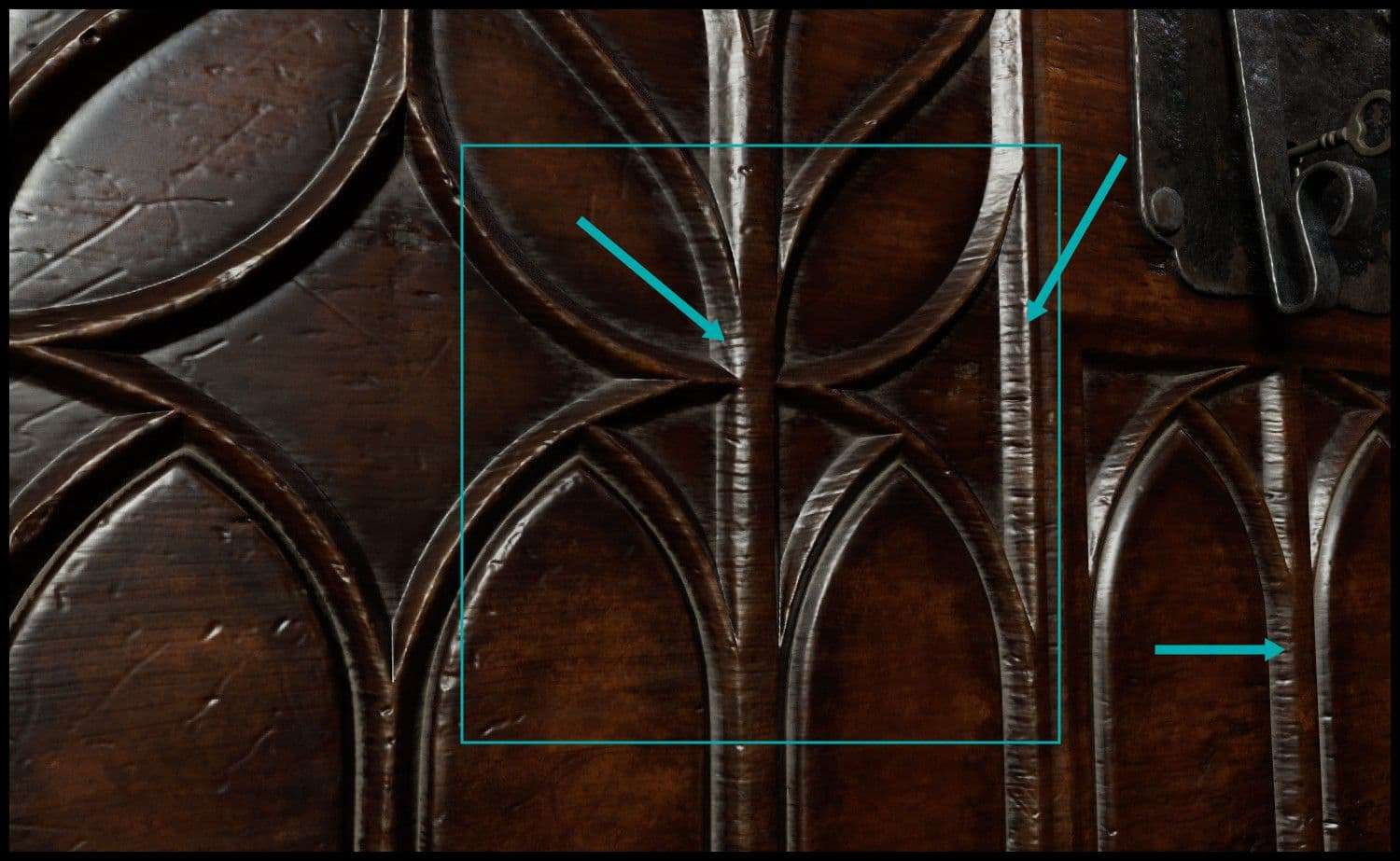
I created the ornament panel alone. This method allowed me to reuse it across the front panel without any issues. I made it in a way that makes it look like it was sculpted from a wood plank, rather than assembled into a wooden board. It was about following the main reference.
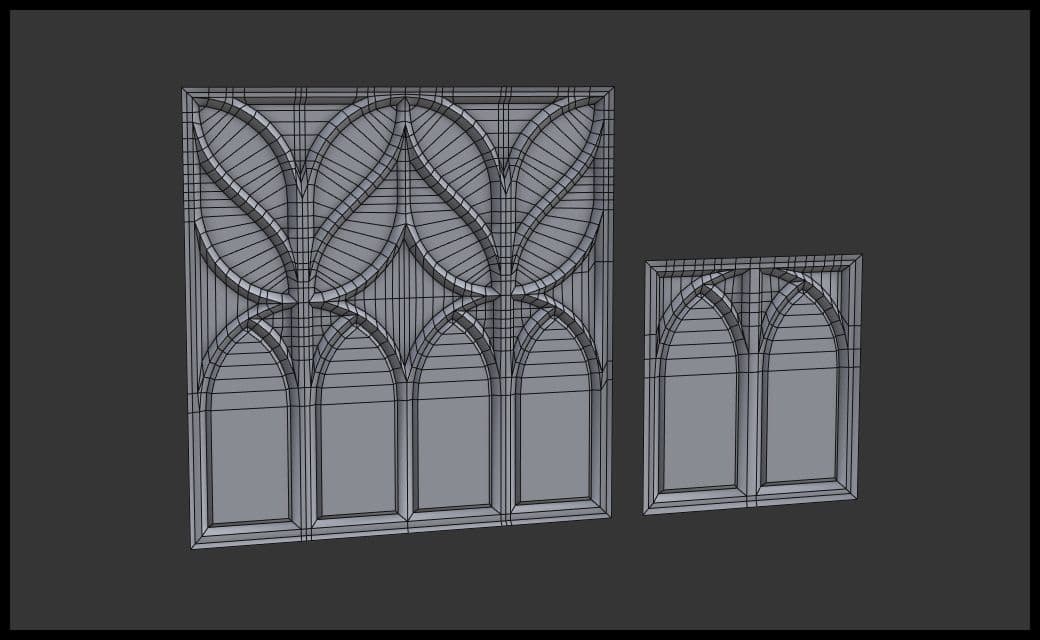
I tried to replicate the placing of the ornaments as in the reference. I ended up cutting the small one if two pieces and use them on both sides.
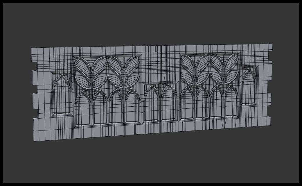
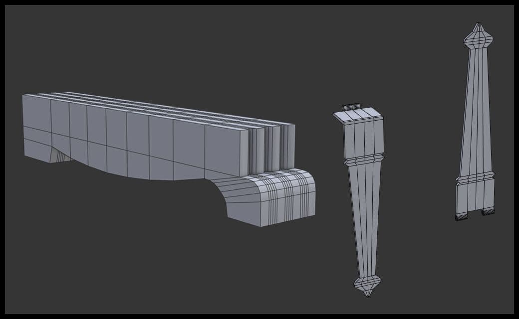
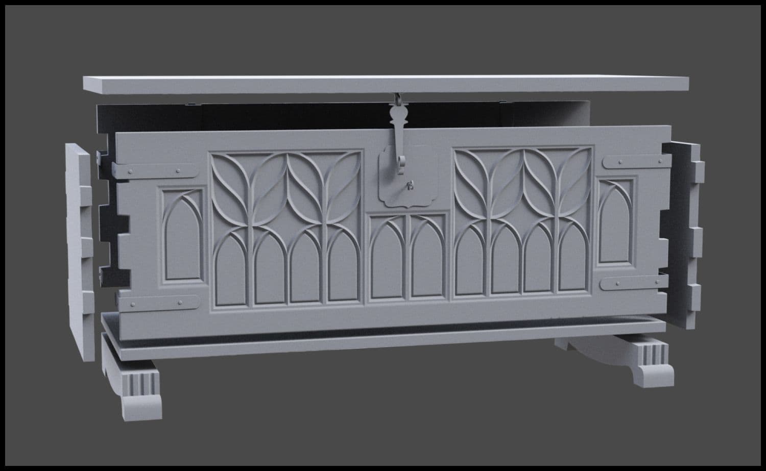
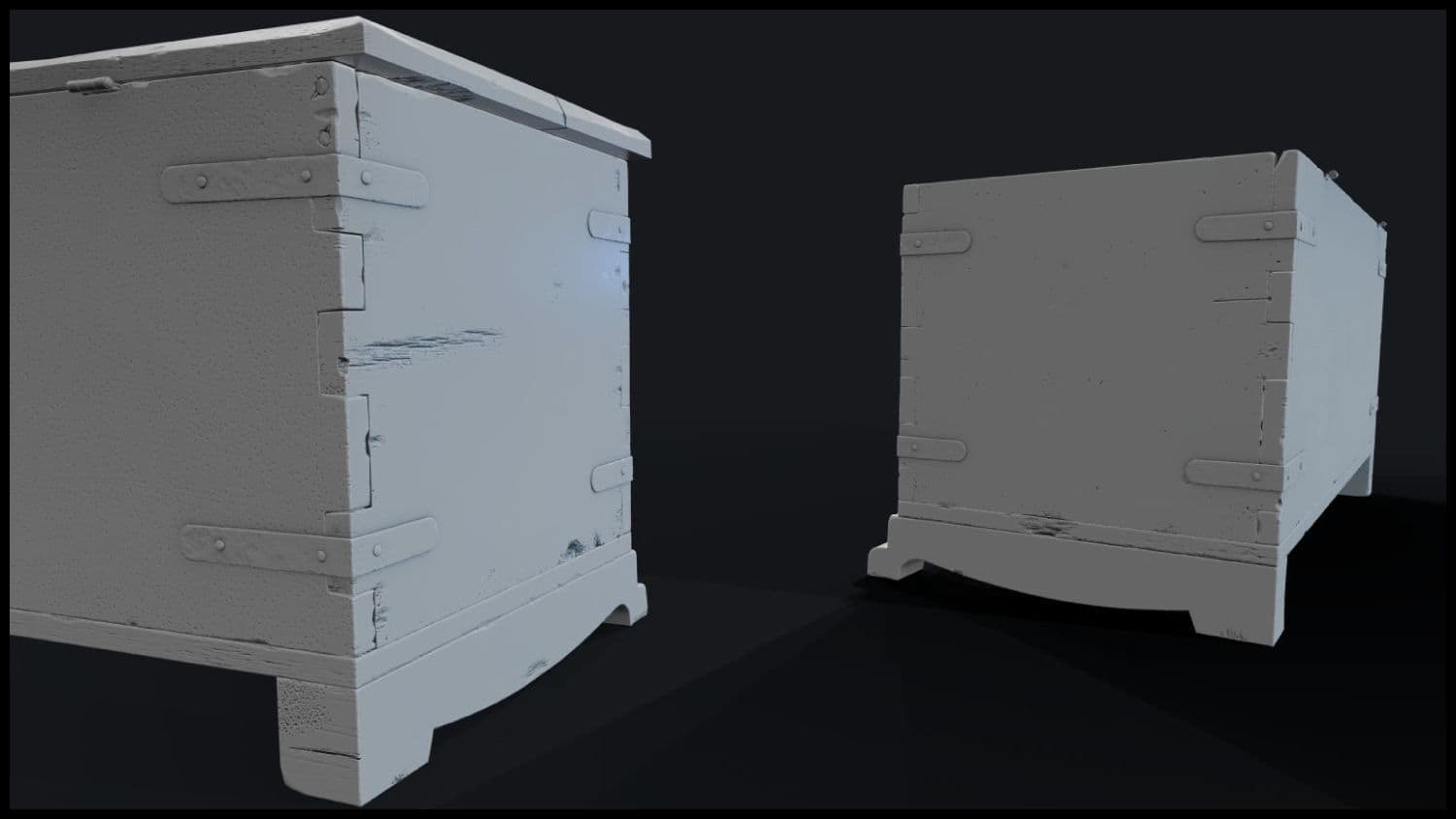
The front panel was done. I moved onto making the legs and hinges, since they were the parts that needed more work, silhouette wise. The sides, lid and back were basic shapes, so they didn’t need any word per say.
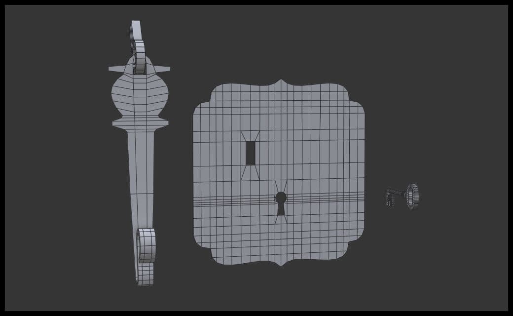
I followed by modeling the key and lock receiver plate.
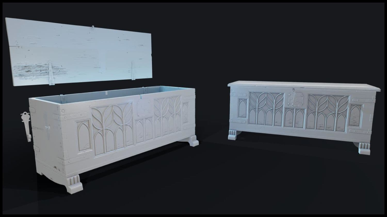
I was finally done with the modeling step.
Once I was quite happy with the model, I started working on the MidPoly version that I will use in Zbrush. For this step, I followed Ognyan Zahariev’s Tutorial
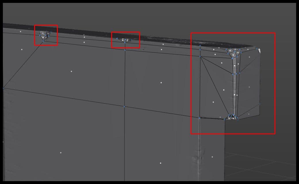
For MidPoly and HighPoly modeling, I usually stick with edge loops and Turbosmooth. That was the case for every part except the front panel. It was difficult to get my edge loops in each area without getting errors. I decided to use Crease Sets with Open Subdiv for them.
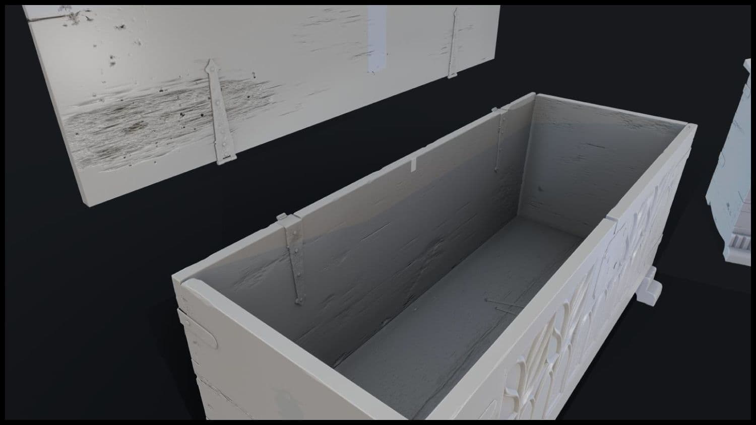
After checking for errors and fixing them, I managed to have a clean topology for the whole asset. It was time to move into Zbrush.
When you import a mesh inside Zbrush, it comes in as a single solid mesh. What needs to be done is splitting it into different parts. Go to Subtool, Split, Split To Similar Parts. Let Zbrush process the mesh and you will end up with as many subtools as what you had in 3ds Max. There are various options for subtool splitting. Choose the one that will give the result you want.
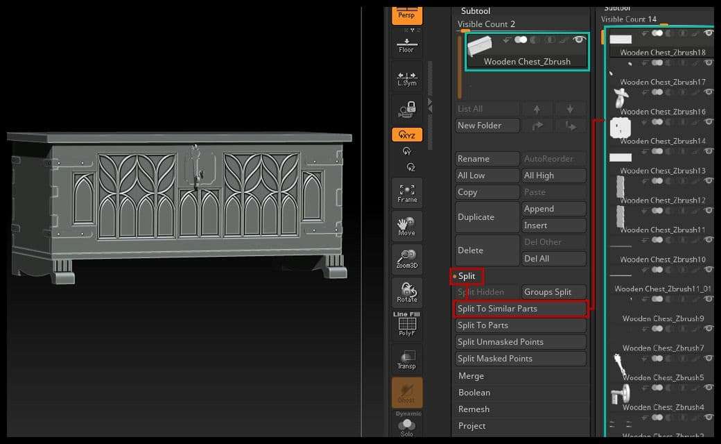
After separating the subtools, it was time to start sculpting. With the current topology, sculpting would be inconsistent, because of the uneven polygons.
I can use either Dynamesh or ZRemesher to fix this issue. For subtools like the front panel, I need to use high resolution for Dynamesh. High resolution = high point count. The first iteration was always around 6.5 million active points. If I subdivide later, I'll end up with around 25 million active points. This is bad for your PC, and for your mesh if you want to decimate it later.
I had a discussion with my friend Kevin Brunt about this issue and he taught me the Projection workflow. It’s explained well in this Youtube video. It works this way:
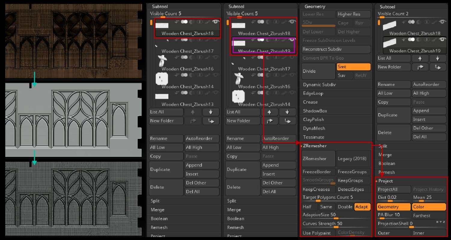
Think of this workflow as a HighPoly/LowPoly baking. What’s great about it is that you have many subdivision levels. You will have full control over the mesh, and your PC will not explode while trying to work with the mesh.
Before starting to sculpt on each part, I try to analyse my references closely to break up the layering of the asset. I ended up with 3 steps:
This was essential to define the workflow and the tools to use.
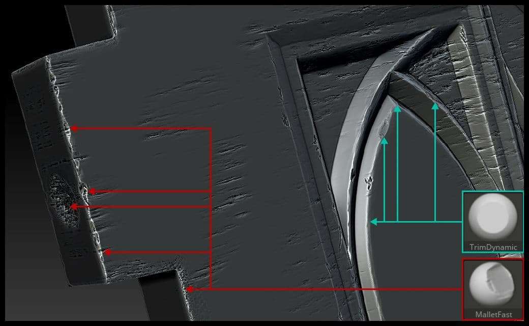
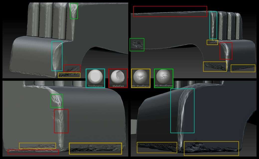
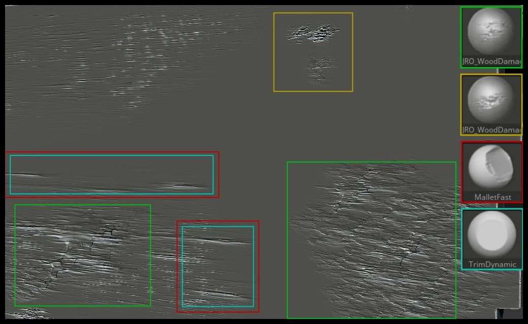
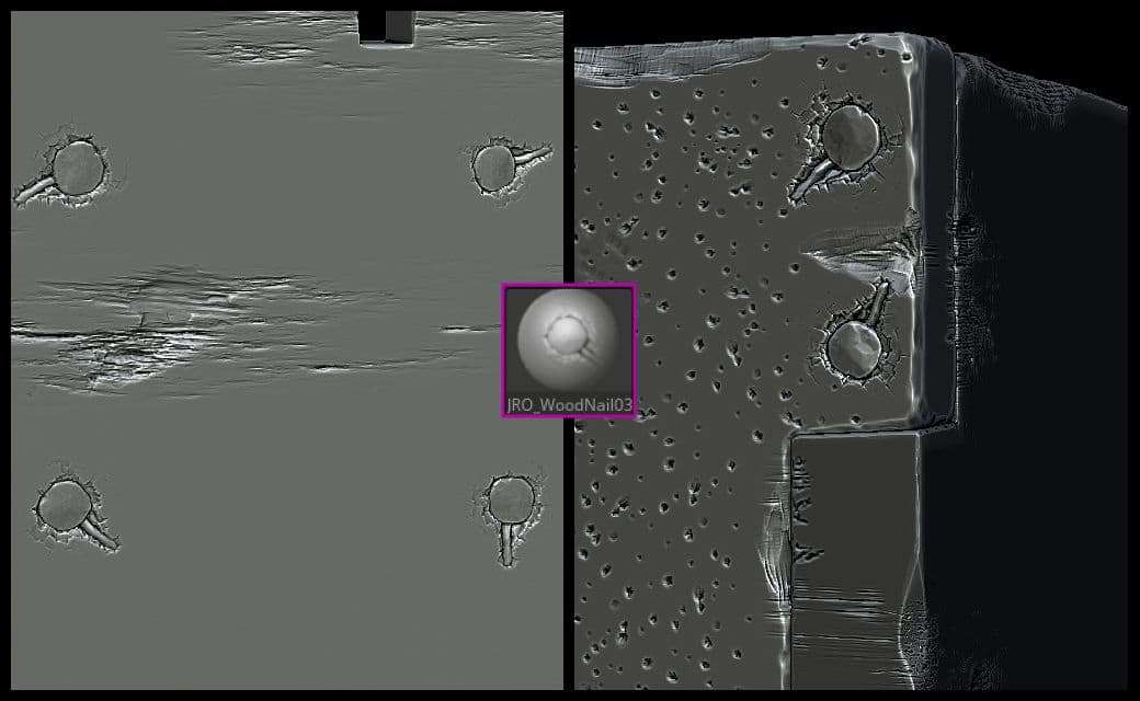
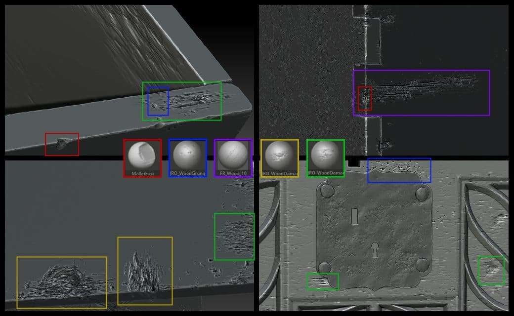
Aging: The main brushes that I used to add aging to my wood were TrimDynamic and Mallet Fast. The first thing to do is trimming the edges. I use TrimDynamic to soften them and add subtle or more visible details in areas of interest. I always follow the real life references I found to locate these spots.
After softening the edges, I switched to Mallet Fast to add some damage to the corners and to the ornaments. What I like about Mallet Fast is its versatility. Depending on the brush's intensity and the alpha used, you get various results.
This is what you should end up with for the aging phase.

Once I was happy with the aging base on the front panel, I repeated the same process on all the other wooden pieces. Then, I went over to add some actual damage to the wood.
Alter the brush intensity to add unique trimming and aging effects.
Damaging: Damage always occurs on transient or most exposed spots, like legs, joints. Or, parts always in contact with us. The main reference shows dented and scratched ornaments, swollen legs and weathering all over the asset.
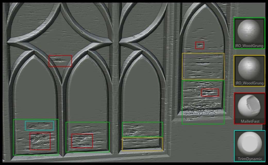
For this phase, I highly relied on JRO Wood Brushes, Mallet Fast and TrimDynamic. I modified the intensity on the JRO brushes to my liking. It takes some testing and tries to get the result you want. So, don’t hesitate to take your time. Experiment by combining different brushes together to get interesting and unique results.
Do not forget to enable BackfaceMask when using dragged brushes/alphas, to not add details on both sides of the subtool.
After this step, I finished the exterior of the chest. It was time to work on the interior.
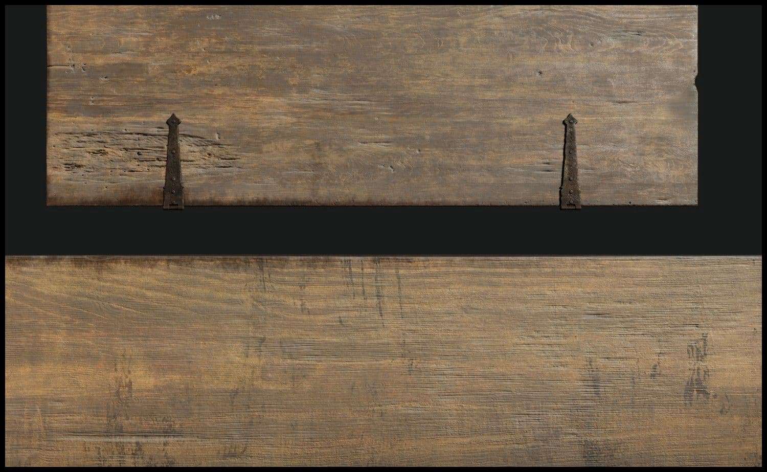
The interior needed some work since that woodworkers rarely restore the inside. All I needed to do was use the same JRO brushes. I combined them with Mallet Fast and TrimDynamic to make the damage look old.
At the end, I was happy with how the layering looked. It looked like I was heading towards the right direction.
Restoration: Restoring wood furniture takes a lot of time and is quite messy. Depending on the desired look on the restored furniture piece, some steps can be overlooked. In my case, I wanted the asset to preserve the major part of damage, with cleaned areas, before the new varnishing. You can check the steps in this article and this video.
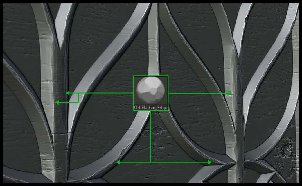
For this step, I’m going to use some brushes to add some sanding and polishing effect. To be precise: OrbFlatten_EdgeProtect and hPolish brushes. I used hPolish to polish some of the worn-out edges and damage I did earlier. Using this brush needs to be subtle. It can remove or smooth all the work you’ve done on the previous steps and it will make the model look washed out.
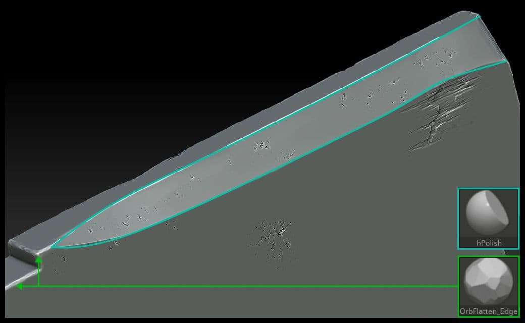
After that, I used OrbFlatten_EdgeProtect to add the sanding effect on the ornaments.
The layering was finished. I needed to add some final details and polish everything to push the quality further.
I used NoiseMaker to add some directional noise to the asset.
The way I made my noise looked like wood fiber tearing, which was exactly what I was looking for. Because when wood ages, wood veins and fibers begin to tear apart. And sanding doesn’t heal these issues sometimes.
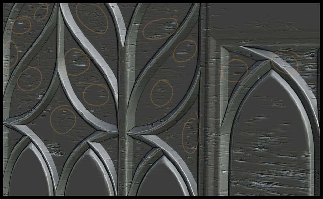
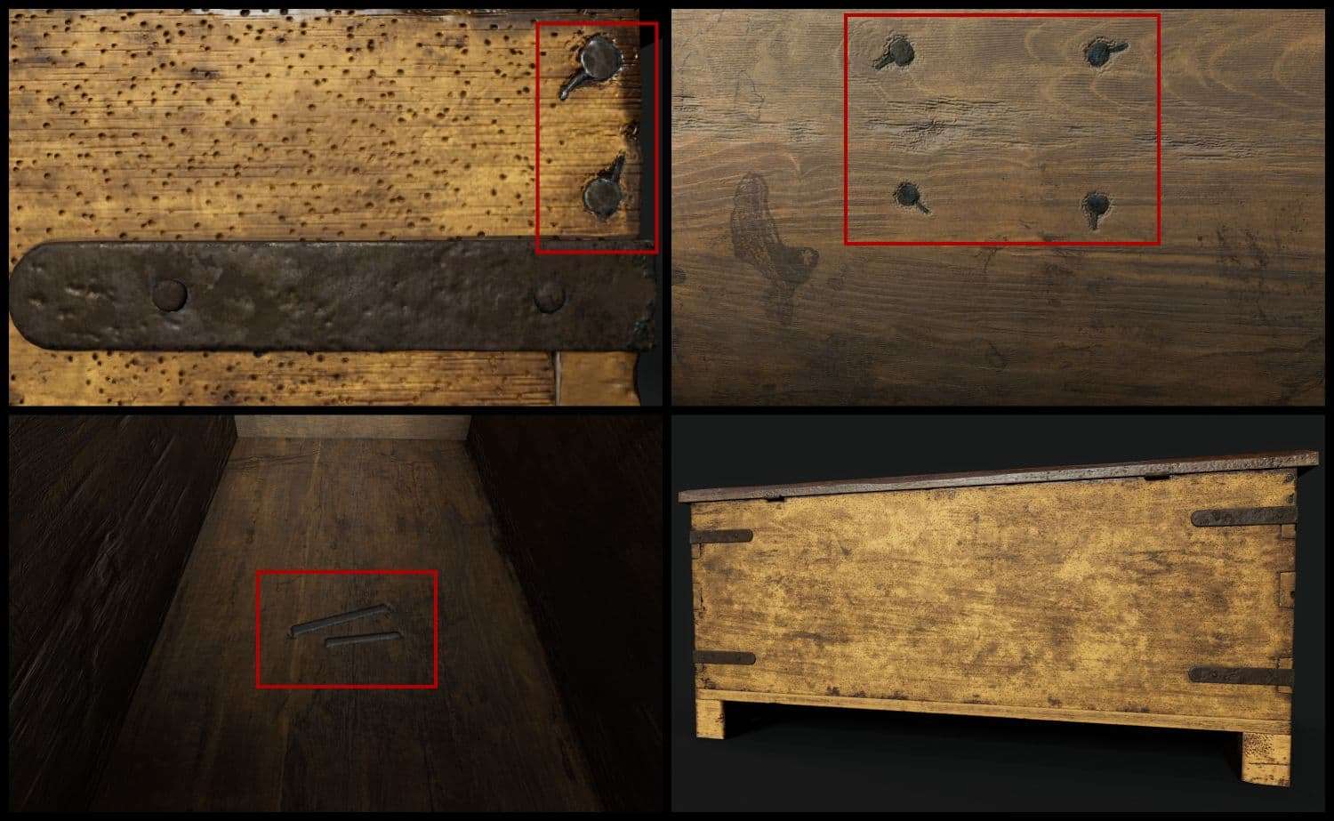
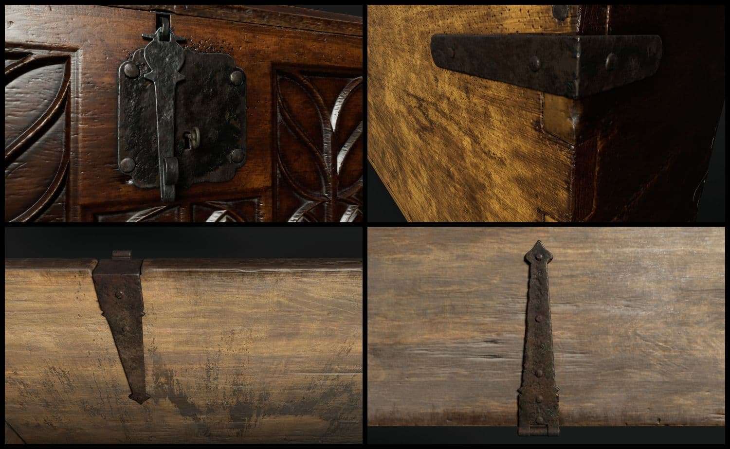
Another thing I wanted to do was adding screws. For instance, the lock receiver plate is hammered into the front panel with 4 screws. I did model the ones on the metal plate, but not on the inside of the chest. I used JRO screw brush from the same pack to add them. This is the attention to detail that add more sense and logic into the whole asset. I added 2 more to the top right spot of the back of the chest. They added more storytelling to the aging and restoration of the asset.
I proceeded with adding some unique details on the asset. I combined all the tips I mentioned through the whole process to add storytelling to the asset. After that, I went on to polish some spots.
I was finally satisfied with how the wood looked. Now was the time to move onto the metal parts: hinges, lock receiver, key.
For the hinges and front plate, I used FREDO metal brushes. I dragged them on all the surfaces. I dragged them on all the surfaces. Then, I trimmed the edges to add dents in interesting spots.
For the bolts, I inverted the steps. First, I used OrbFlatten_EdgeProtect on the to trim and polish the edges then I used Fredo’s brushes. The reason I inverted the steps on the bolts is because bolts are first hammered into the plates and hinges. Then with time, rust builds up on them.
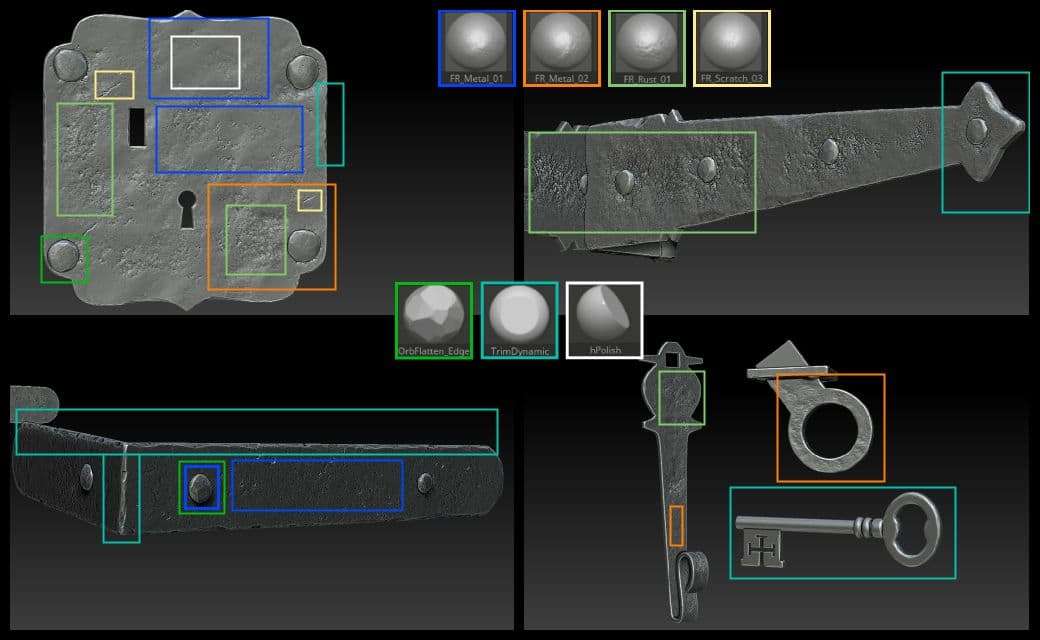
To break the repetition of drag brushes, use a combination of hpolish and TrimDynamic brushes. This helps smooth and add structure to the spots on interest.
The HighPoly was pretty much done at this point.
Before decimating the mesh, I wanted to assign some Material ID for baking purposes. I masked the areas I want, then went to Polygroups -> Group Masked. Then I decimated the mesh and exported each part alone for retopology and baking.
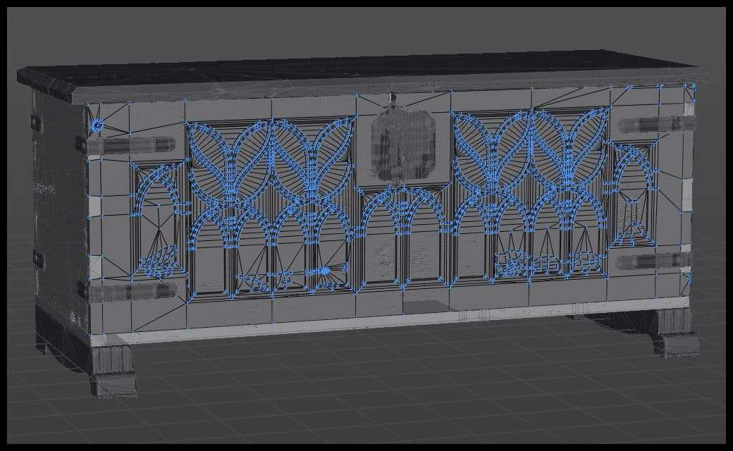
Organic and heavily sculpted assets need, in the most part, full retopology. It’s not a usual hard surface prop so topology needs to be redone from scratch in some places.
I use Topogun 2. By the time I was working on this project, Topogun 3 Beta was out. Georgian Avasilcutei made a great introduction video showcasing the new features. I used the new tools to speed up my retopology workflow. And I ended up finishing the process in 2 days, rather than 3-4 days with Topogun 2.
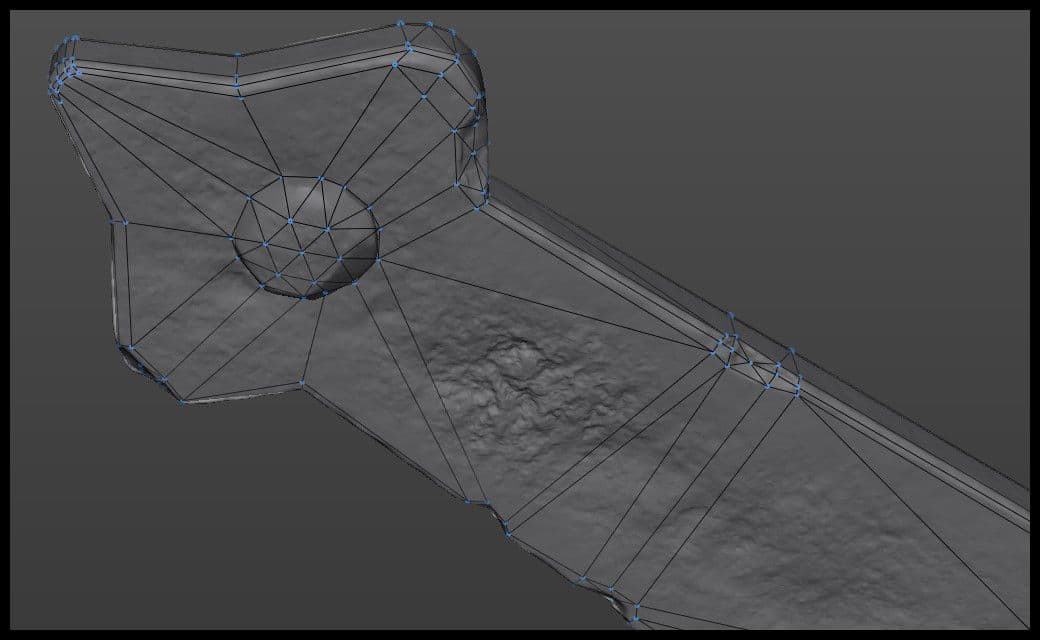
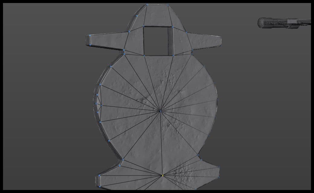
As I wanted to create a hero prop as photorealistic as possible, wanted to keep deep details in geometry. In fact, I retopologised by hand the areas of interest which would always be visible. For instance, I decided to retopologise the wood damage on most of the front ornaments, as some of them were too visible.
I could have left the ornaments the way they were in my initial model.
I would have obtained about the same baking result. Also, depending on your budget in production, you could end up not adding geometry to the ornaments at all, and leaving as a plan. Yet, as said above, since this is a hero prop for next gen games, I wanted to include as many details as possible.
I followed up with the same thought process. I added geometry to the deep dents, cuts, corners, spots with noticeable damage.
I decided to retopologise the nails into the mesh itself. You can have the option whether to retopologise everything alone or if you do them together. Again, it all depends on the level of details and on your polycount budget. Sometimes, having everything in the same mesh will increase your total polycount.
Also, as said in the beginning, you could leave the nails and bake them on a flat surface. You can assign a Material ID for them for the texturing phase.
Contrary to what some school instructors say, triangles aren’t bad. You need to know to what extent the asset will be used (static, animated). Also, in the end, when imported into the game engine, the asset will be triangulated.
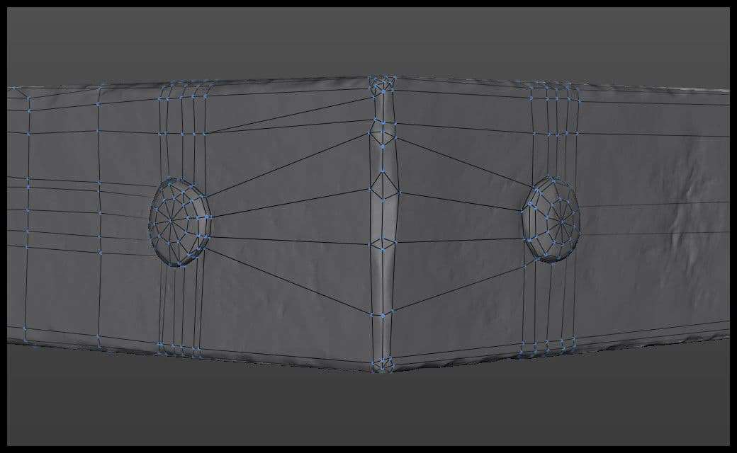
You can always use your base model to skip some steps while doing retopology. I imported my ornament panel, hinges and legs as bases then added on them to have the final game-ready model. This could save hours, if not days of work.
I followed the same process everywhere, and finished retopologising the final game ready mesh.
I use RizomUV to unwrap my assets. It’s fast and easy. The tools are so advanced compared to other UV tools in the industry.
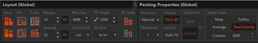
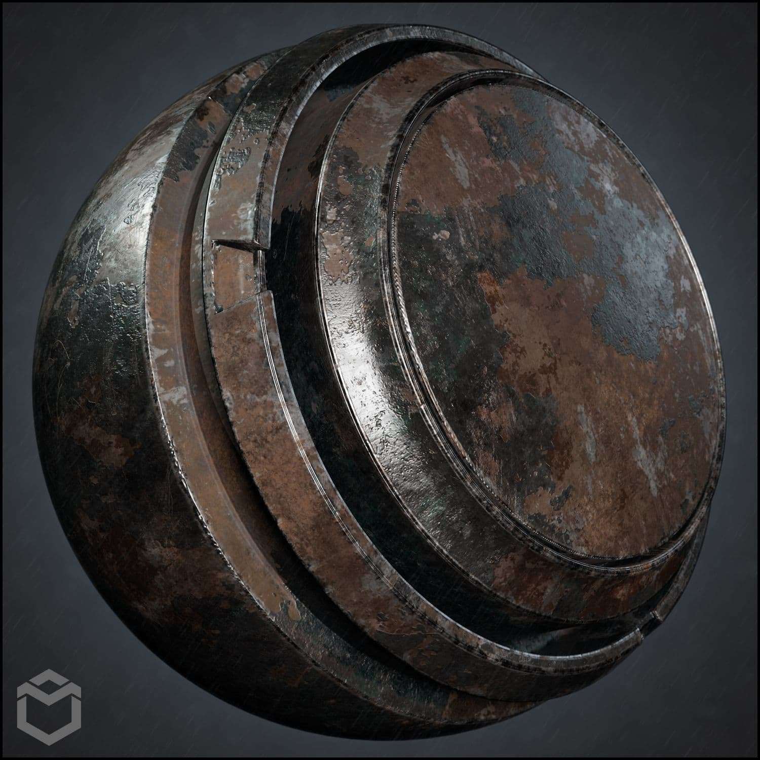
First, I started by defining the Texel Density (TD) of my model, as well as the texture resolution. Since this is a personal project to benchmark my scene, I wanted to show quality rather than current gen standards, which can vary from 256 px/m to 1024 px/m. I decided to go with 2048 px/m for TD at 4096 px texture resolution. For personal projects, sometimes I don’t want to limit myself with technical constraints. I prefer to leave that to actual studio production.
When you decide the TD and texture resolution, RizomUV automatically defines the Margin and Spacing between UV islands/shells.
For the unwrapping part itself, it goes like this:
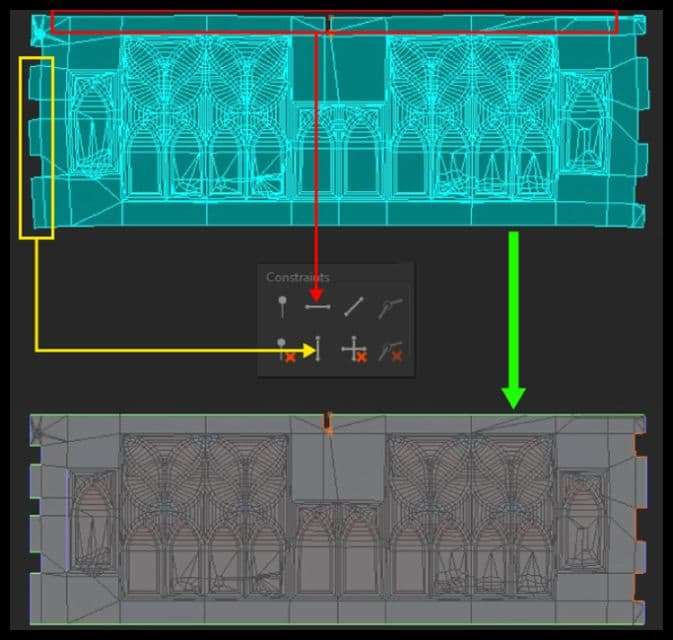
That is all. The asset was unwrapped. However, the ornaments island never came out straight. It always had a U shape to it, so I needed to use Constraints:
After finishing the unwrapping process, it was time to pack them.
After assigning the TD, I changed the UDIMs to 2 by 2. I wanted parts I selected to be packed together.
Packing options wise, I went with “Ultra” and 128 mutations. These 2 options define the number of iterations RizomUV takes to efficiently pack the islands while using the most out of the UV space. The more mutations you use, the more accurate the packing will be, but the longer it will take.
I ended up with 4 texture sets. Had I used a TD of 1024 px/m; I would have ended up with 1 set. There are spaces in each texture set. But do not worry. Since I am using texture atlas workflow in my scene, these UV spaces are already used by other assets, that I’m not showing in this post.
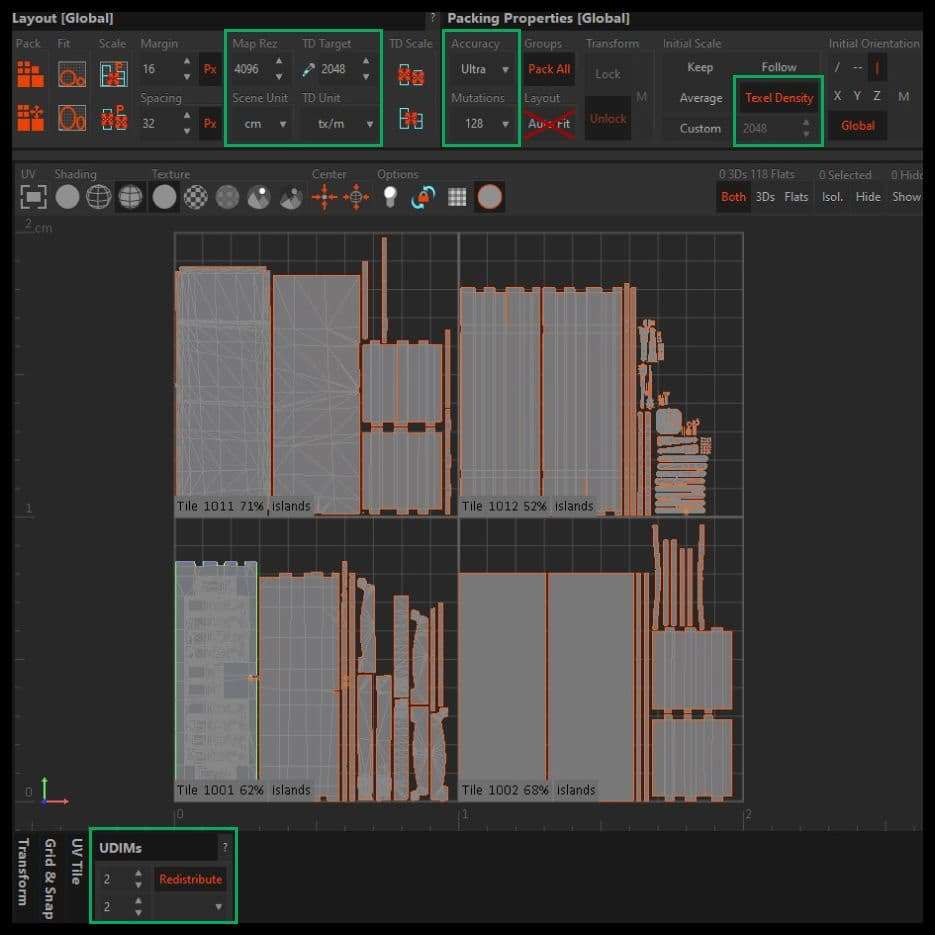
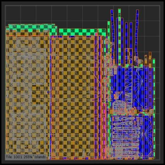
The packing was perfect for me. But since you need to make sure that all UVs must bed in the 0 to 1 space. Anything outside this area will not be baked. So, after packing in RizomUV you need to select each UV space and move it to 0-1. To do so, select the UV tile, then use the Shift + Arrow to move the selected tile into the Tile 1001.
UVs step is over. Now is the time to bake the asset.
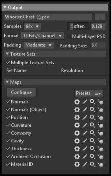
I used the naming conventions with suffix _high and _low for both my HighPoly and GameReady meshes before importing them into Marmoset.
In Marmoset Toolbag, I used the Quick Loader. This creates Bake Groups for each part of the mesh and fills the High and Low areas with the corresponding meshes, following the suffixes I mentioned above. If you don’t use this method, you can drag and drop your files directly in the scene, then assign the parts manually in the different baking groups.
Do not forget to check the “Multiple Texture Sets” if you have more than 1.
You need to do some baking tests, at low resolution and low samples count, to check if there are any baking errors. If some normals or skewing need fixing, you can fix that by painting the skews. That is what makes Toolbag such a great baking software.
When I was happy with the results, I decided to crank up my baking parameters and wait for everything to process.
The baking was perfect. I had no baking errors; everything was sharp.
Now it is time to texture everything.
The most challenging part for me with this project was the texturing part itself. I always struggled with wood material creation. Wood is hard to master due to its numerous variations in albedo and roughness. So, I took upon the challenge to practice it.
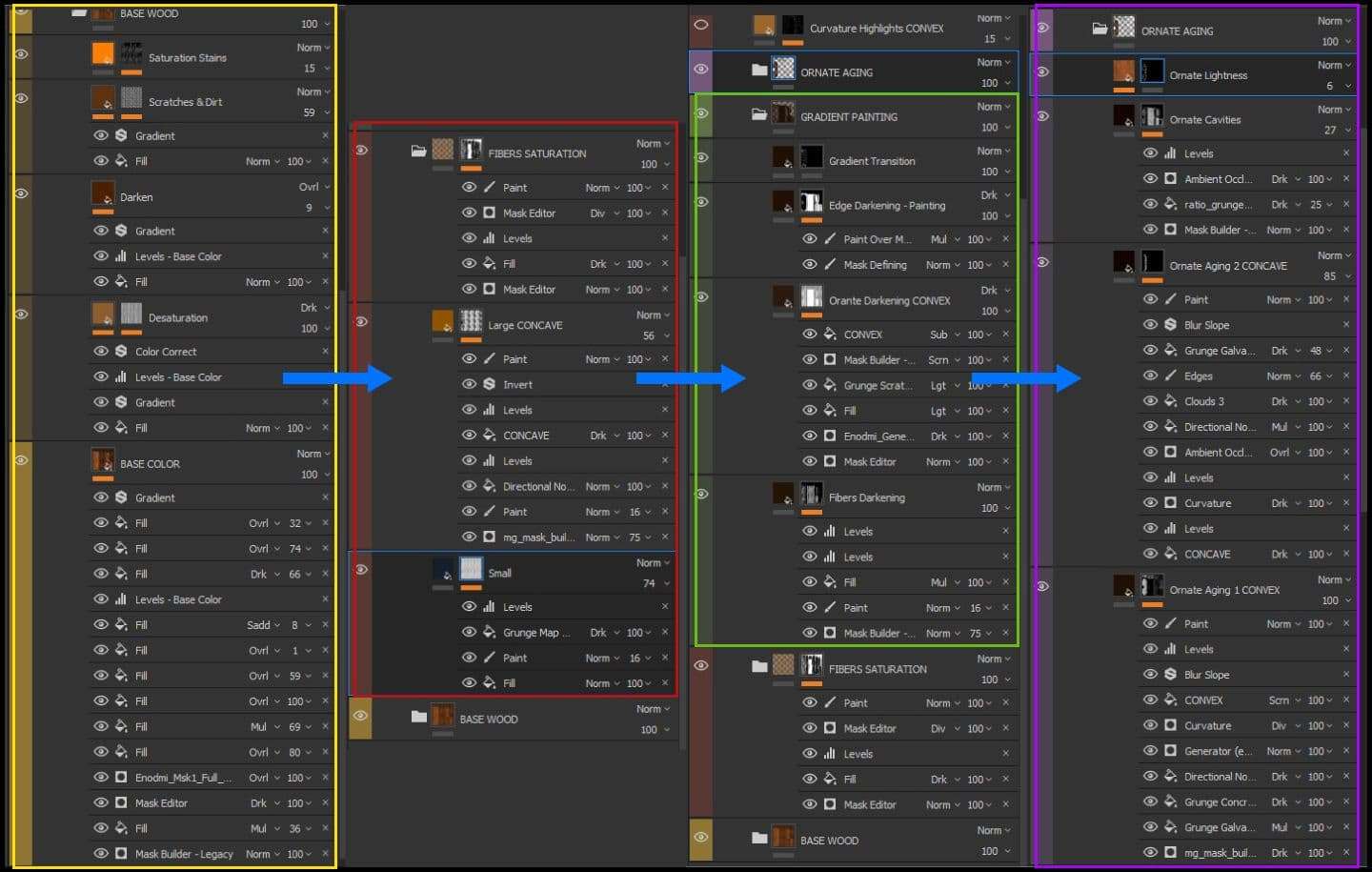
For a successful and organized texturing process, I build-up 3 folders as followed in order:
I try to breakdown color into a couple of layers:
I spent a couple of days trying to nail the color variations in the reference, but I couldn’t achieve it. I asked Kevin Brunt again to help me. We had a call where he showed me some techniques I have never known about. It was a very helpful chat.
I started creating the varnished wood smart material by working on the albedo first. I decided to try out the color gradient filter. My workflow in Painter used to be like this: add a folder with a black mask, then add fill layers with hand painting and generators.
With the color gradient filter, I needed to work directly on the Fill Layer by adding the fills and generators under it. It changed my whole perspective about my workflow, so I had to adapt. It became more intuitive to create my color variation layers this way. I built up my layers and was finally happy with the rendition.
Afterwards, I needed to correct the color grading and add more noise to the base color.
As I said earlier, even though the asset is revarnished, it aged after that. I needed to analyse my references and determine where the varnishing darkens with time and where it softens/fades away.
I decided to approach this step by hand painting it completely. I used the Dirt 2 and 3 brushes. Also, I used 4 brush opacity values when painting: 0.25, 0.5, 0.7 and 0.85 along with various hardness values. This helped a lot to add a natural color blending with the previous layers. Had I stayed with the same hardness and opacity values; I wouldn't get a good blending.
When hand painting specific details, make sure to adjust the brush’s opacity and hardness for a better color blending.
First, I worked on the overall panel’s variations. I decided to create a mix of generators, procedural textures, and a lot of hand painting to clear the repetition.
Afterwards, I needed to work on the ornaments because they looked clean and washed out. The goal was to focus on the edges, the aging and color correction.
I ended up with this layering system:
It is quite hefty, but it shows the logic behind my texturing process for this kind of assets.
When I finished the albedo, I needed to work on adding imperfections to the areas I had sculpted. Also, I needed to think about where dust and dirt would be cumulating.
I always use Convex and Concave maps that I baked in Marmoset Toolbag for these tasks. The convex map picks out the smallest details from the HighPoly. Think of it as a more precise and tight curvature map in black and white. Concave is the opposite. On top of that, I used the Enodmi generator, which is a better mask generator that offers more control.
For the edge curvature, I started with a fill layer with a black mask. I mixed a couple of grunge and procedural maps blended with the concave and convex maps. Then on top of them, I added a paint layer to erase some obvious procedural details and add some hand painted spots to the mask.
I followed the same process for the damage and dirt/dust areas with a layer for each.
Don’t overcomplicate things by trying to do everything in 1 or 2 layers. Try to always break-down the layers, group them by “type” and stay organized. This will help you when you try to polish the material by changing the values and parameters.
I was finally happy with my albedo, so it was time to start working on my roughness.
I started with a basic roughness variation mask with directional noise. Then, I used the first color mask layer I used for the Base Color as a reference to add roughness on the actual wood veins. Along with some masks and effects, I ended up with the variations I wanted to get. The roughness map was comparable to the ones of Megascans. It was a good indicator for real life references.
Download and inspect Quixel Megascans props to see how the different maps look and interact with light. It is a good practice to give an idea about how your maps should look like for the different materials.
I used the curvature and ambient occlusion maps to add some height. Next, I added some height values to the same veins used in both albedo and roughness. Finally, I added a fill layer with a black mask, where I added 4 layers of procedural dots, each with different scales. I blended the layers together then hand painted on top of them to keep only the interest spots.
I decided to add on the wood tearing I mentioned in the Zbrush part. I found that the boards and columns didn’t emphasise this part of the asset. So, I made a quick paint layer with a directional noise and masked out the interesting spots to get this result:
This gave me the varnished wood smart material. I used it on each part, while adapting the scale of veins and orientation. Also, I changed the color separation hand painting to make it look realistic.
For the interior, I carefully studied Walid Kaskhoussi Perrussel’s tutorial on Marmoset’s site. He discusses wood creation and texturing in a great way. I used his techniques, especially how he used Anchor Points. It was helpful to create both the base interior wood material as well as the dusty version that I ended up using.
For the back parts, I decided to use the varnished wood smart material without the varnishing layers. Then, I added a layer with the convex map to show more of the damages.
I talked earlier about using Polygroups and baking details on flat surfaces. I baked the Material ID Map in Marmoset based on my Polygroups to use inside Substance Painter. I used one of the JROTools Smart Materials and adjusted the parameters to get the rusty effect I wanted.
For the plates and hinges, I used one of the JROTools I mentioned above. I varied a lot of parameters to make the interior hinges look too old and rusty. For the visible hinges, handle, and lock receiver plate, I wanted to make a peeled metal material. On the same smart material, I added a layer with albedo and height channels with a black mask. Then, I painted out the areas where the metal paint is peeling. It’s a simple procedure and it gives the result that I was looking for.
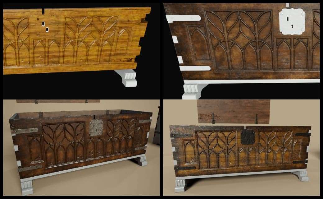
With the metal parts polished, the texturing step was over. It was time to move the asset into Marmoset Toolbag 4 to render it.
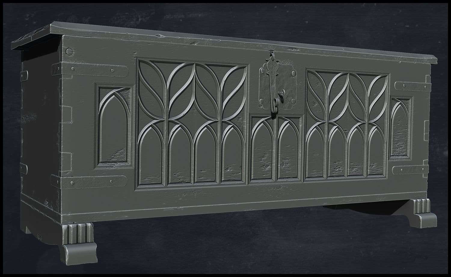
I had two ideas for my thumbnail’s composition: a baroque interior, or a more intimate interior. As you can see in the baroque render, Only the top 1/3 part of the composition caught the eye. The focus was rather on the mirror and lamps, rather than on the chest itself.
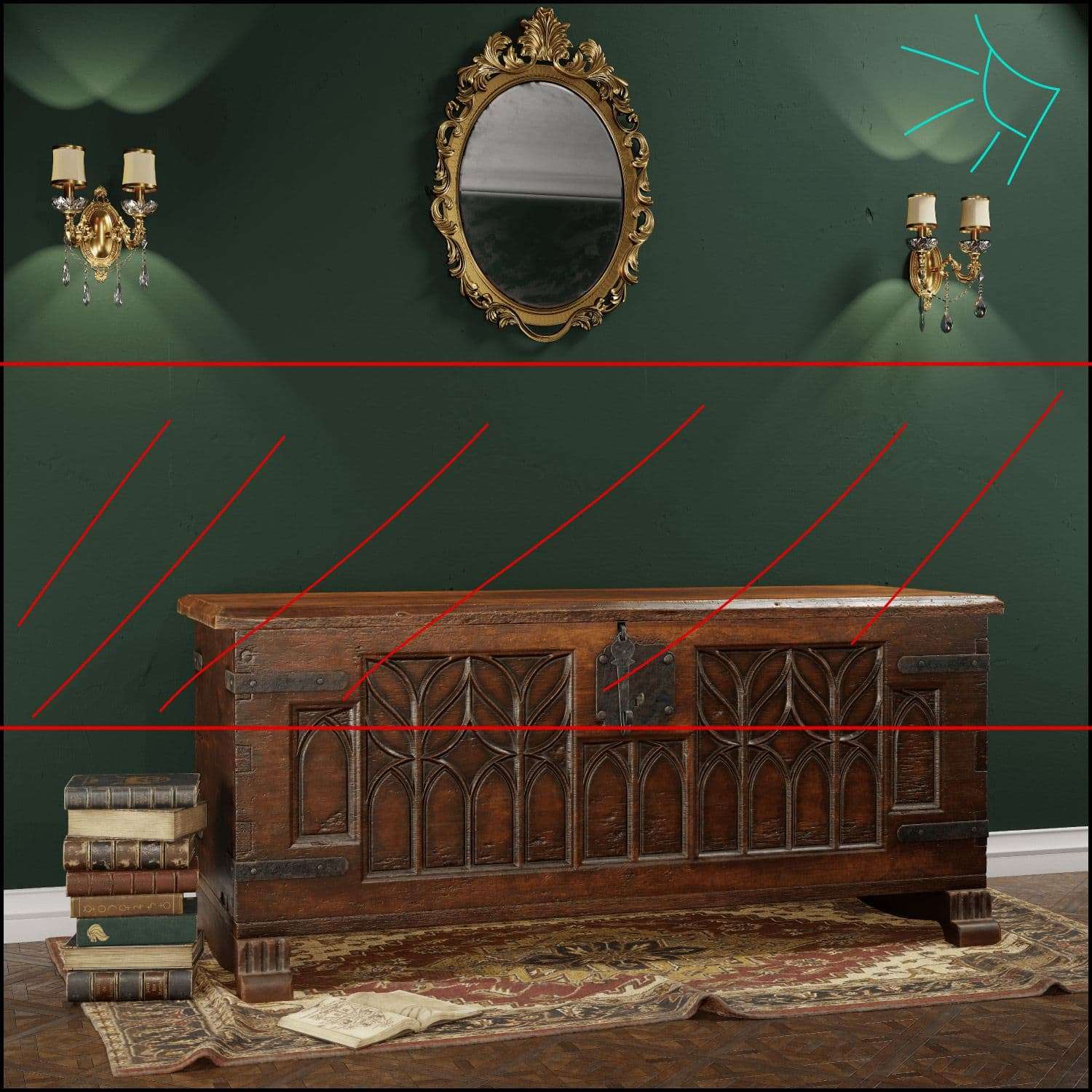
Also, since the asset is quite large, I couldn’t get any closer without cutting parts of it. I had to drop this option and think about something else.
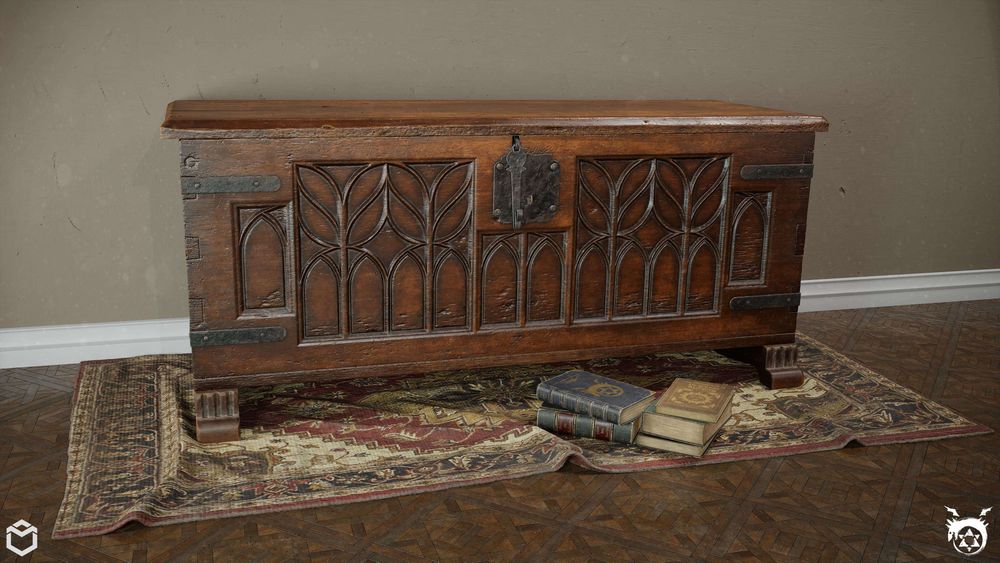
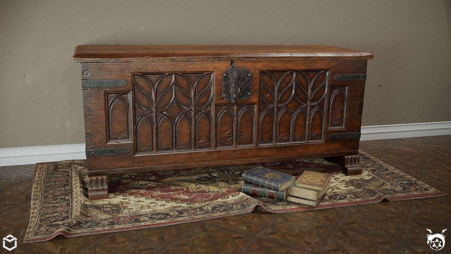
I had the idea of reusing the books I modeled earlier to add storytelling to the scene. And I thought about adding a Persian carpet to add depth. I made one quickly in Marvelous Designer, Zbrush and Substance Painter. It added so much color depth to the scene, it was the missing element for a good composition.
I rendered about 28 thumbnails, with different angles. I ended up choosing the one below. I wanted something to show some close-up details, but that doesn’t show the whole asset at the same time. This will attract the viewer to click on it and see the whole project.
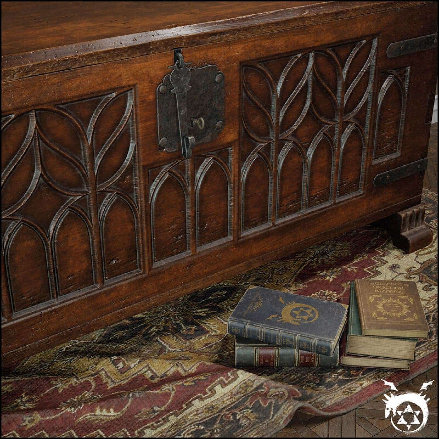
Make sure that your thumbnail is quite attractive and doesn’t show everything. A good thumbnail will grant interest. A bad one, even if the project is good, will not give you clicks.
First, I set-up my scene to match the color grading profile. I always work with ACES color profile. Next, I set my Environment HDRI brightness to black, because I want to only use the lights I set-up. Then, I played with Post-Process to get the look and mood I was looking for.
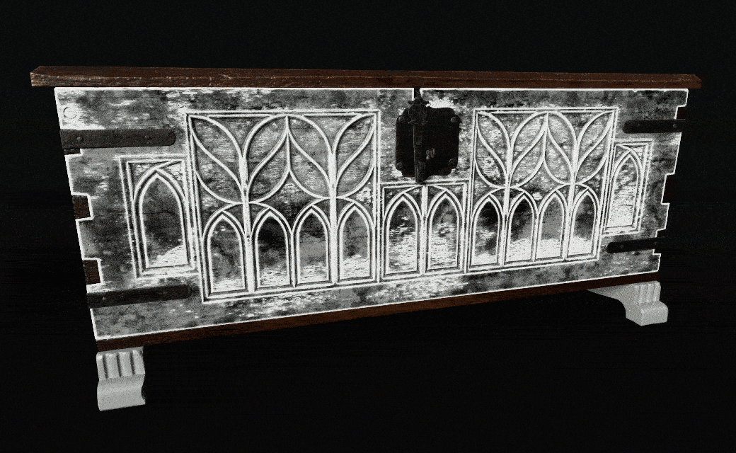
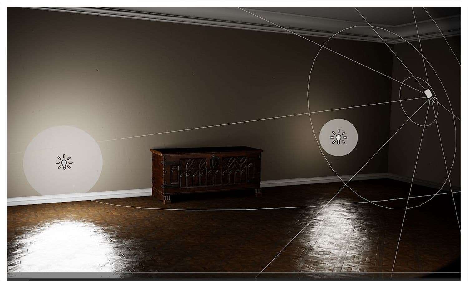
Lighting was such an easy part thanks to the new RTX render system inside Marmoset Toolbag 4. For the main composition and thumbnail, I began with a 3-point light system to highlight the asset
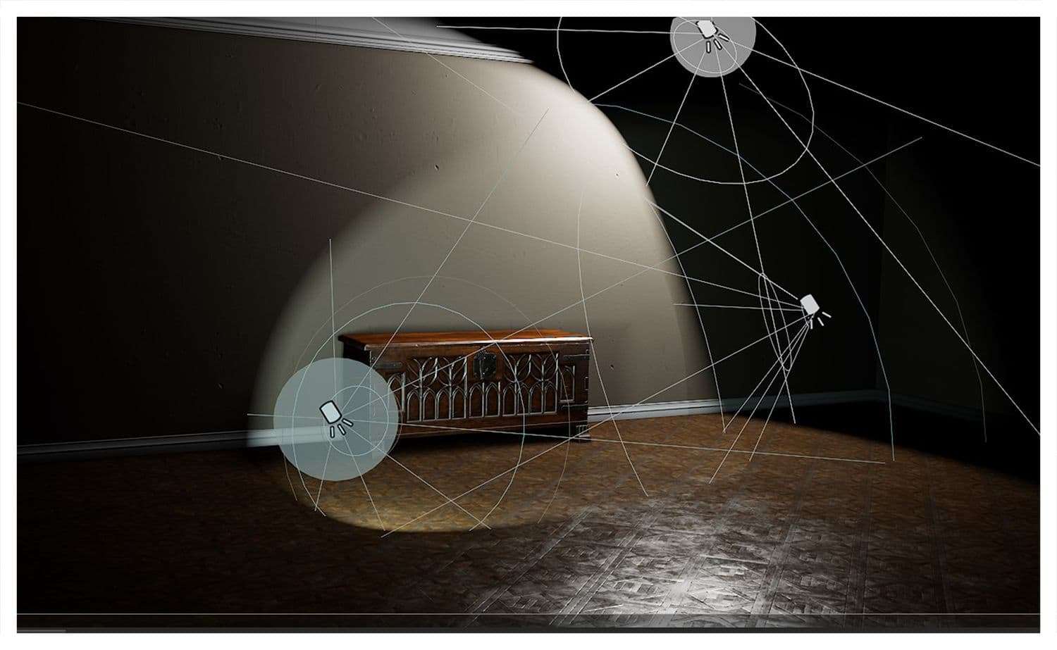
Then, I proceeded by adding fill lights for some areas of interest, also to light up the room.
One of the most exciting features of Marmoset Toolbag 4 is the Raytracing render. Without going into obvious details, RTX makes lighting more accurate, physical and bounce wise.
Here’s my scene with RTX OFF vs. RTX ON
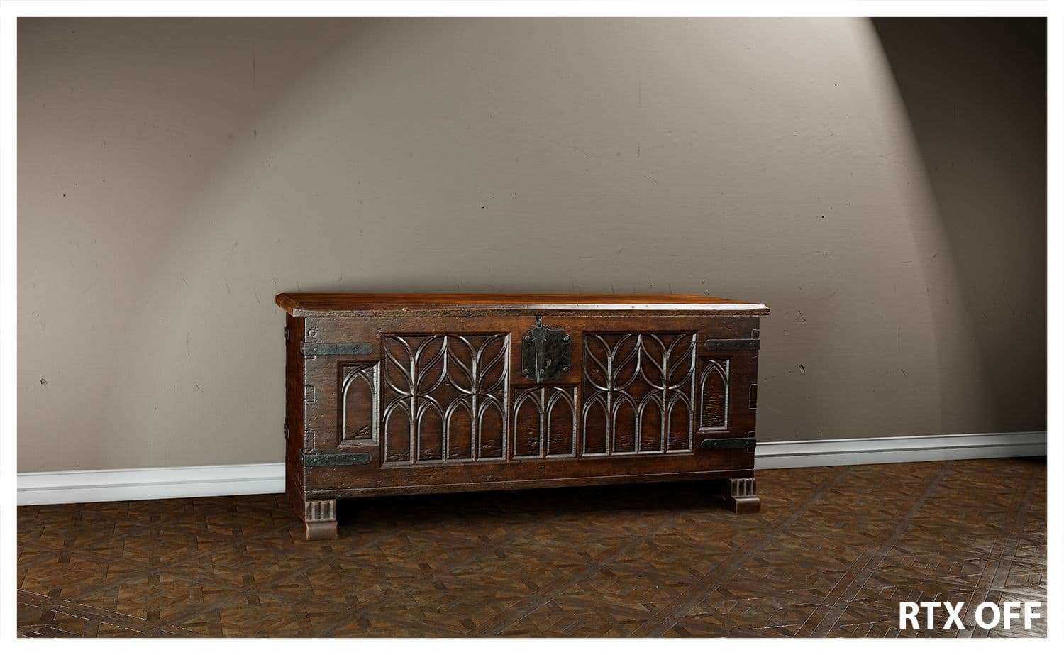
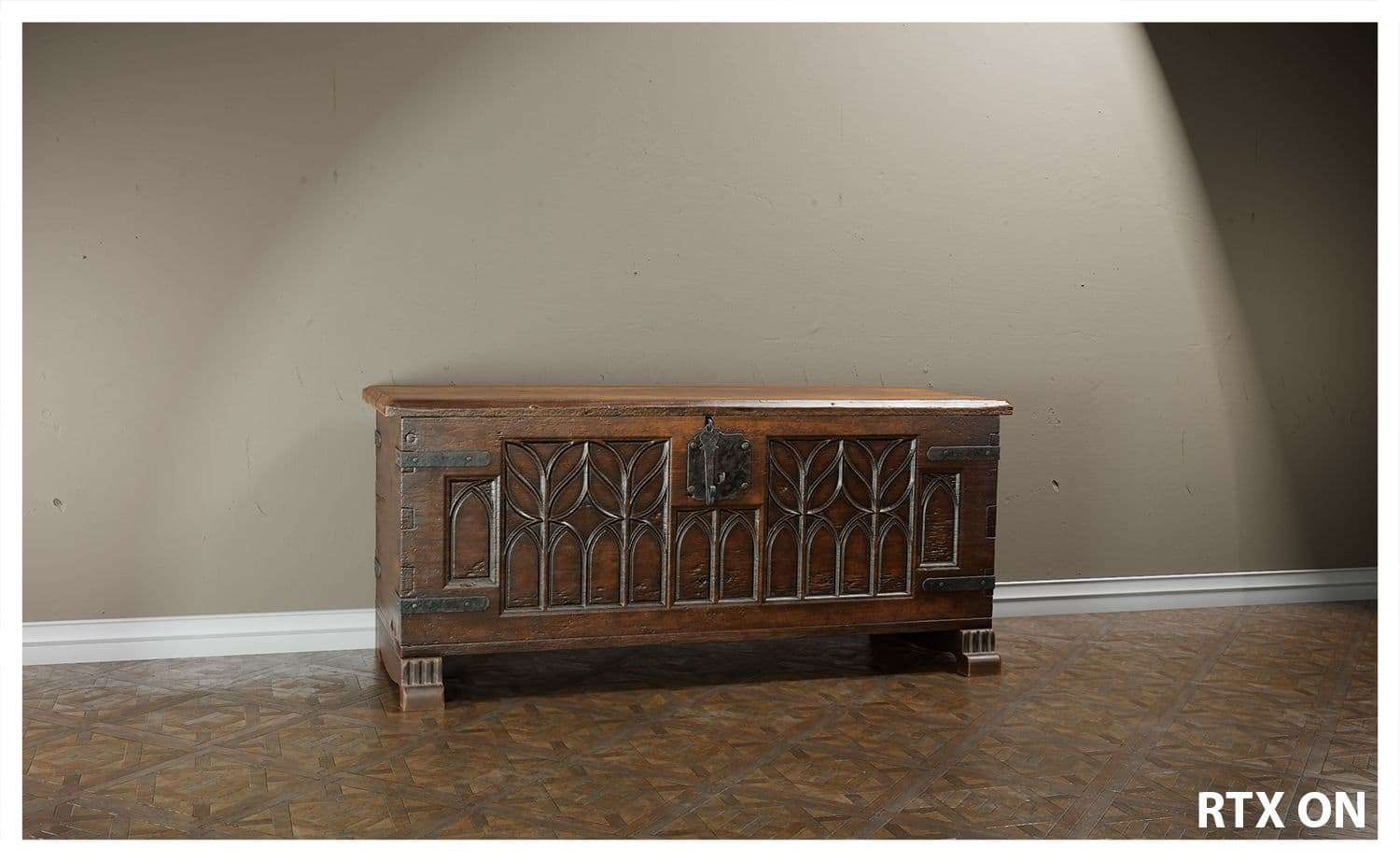
The scene and prop look much more realistic and the materials respond amazingly to the physical accuracy of RTX. It was mind-blowing to see the results on my screen.
For the other renders, I used a simple 3-point light system: 1 key highlight and 2 highlights on both back corners.
I played with the animator in Marmoset TB4 to get some interesting compositions. It is a step I enjoy a lot because this is where you need to showcase your asset in the best way. I analyzed my areas of interest and adjusted my lighting to take each image and animation. It was satisfying to see the finished results.
For this scene, I was inspired by Denis Dailleux and his sense of sincerity due to his composing and usage of colors. It is important to study lights and colors.
Always look up interesting composition and lighting references. Sites like Instagram are have a lot of good photographers who teach good lighting and composition.
A good asset is bad if it’s not lit properly. A bad asset can look better if presented correctly.
Personal projects are a way to learn new techniques that you might not have the time to acquire in studios. In studios, you have tight schedules for production. You may not get much time to explore new workflows and pipelines.
I began this asset back in 2019 and abandoned it for a long time because I hated how it looked. Nothing worked for it, from block out to the finished result. It looked nothing like the references, the sculpting was not realistic, and it didn’t have any logic to it. The only solution to fix it was to start over.
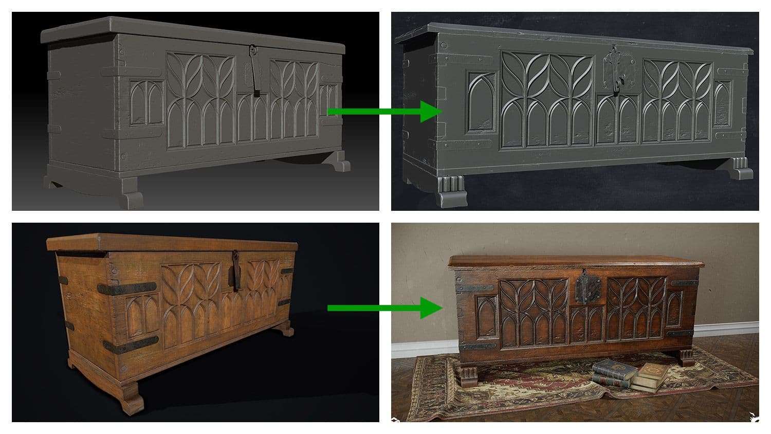
This is why I stated that it is important to find good references and to have a solid blockout. A bad one won’t help you move forward.
Do not hesitate to take your time doing the essential steps. Only move forward when you know that everything is correct.
Always ask for feedback. We are lucky today to have such good communities with both rookies and professionals. They are willing to give solid feedback and tips that would not have thought of. It is eye opening to ask for advice and feedback from someone who's not familiar with your project.
Do not hesitate to ask for help when needed. Sometimes we feel like we are too good to ask for help. Other times we feel like we are bothering people for help. Asking for help will get you to move forward and not waste your time.
It is highly important to drop your ego when asking for the last two lessons. Being able to accept feedback is a sign of maturity and professionalism. It is an important skill to have.
Do not be too perfectionist. We will always learn from each project, and no project will be perfect. Know that there will always be room for improvement. But sometimes, it is time to call a project done and move onto the next one.
Finally, be proud of your work and do not be too hard on yourself. This will only give you headaches and your mental state will degrade.
This project was a big challenge for me, especially during a year where nothing was certain. It was a mentally challenging one, with more downs than ups. I have had incredible support from my peers. And I would like to thank them all, mainly Georgian Avasilcutei and Kevin Brunt.
This project did define the quality to reach for my big scene and I cannot wait to share more updates about it with you.
I would like to thank The Rookies for giving me the opportunity to write this hefty article. It may be a long read, but I hope that those who read it will learn a couple of tips and tricks; and the way they approach prop creation will be improved.
You can find more of Mohamed's work on ArtStation and Instagram.