How to Master Shading and Lighting for a Still Life Scene in 3D
In this post, Laura Ludwig, a 3D Animation & VFX Graduate from PIXL VISN Media Arts Academy, shows how to create rich and detailed lookdev and lighting for a 3D still life scene.
In this post, Laura Ludwig, a 3D Animation & VFX Graduate from PIXL VISN Media Arts Academy, shows how to create rich and detailed lookdev and lighting for a 3D still life scene.

In this post, Laura Ludwig, a 3D Animation & VFX Graduate from PIXL VISN Media Arts Academy, shows how to create rich and detailed lookdev and lighting for a still life scene.
Laura has always enjoyed watching movies with all kinds of visual effects that make unimaginable things seem real. The moment she saw her first VFX breakdown she realised that this was an industry she could really make her mark in, and so, decided to become a part of it.
If you are embarking on your lookdev and lighting journey like Laura has, then this article is for you!
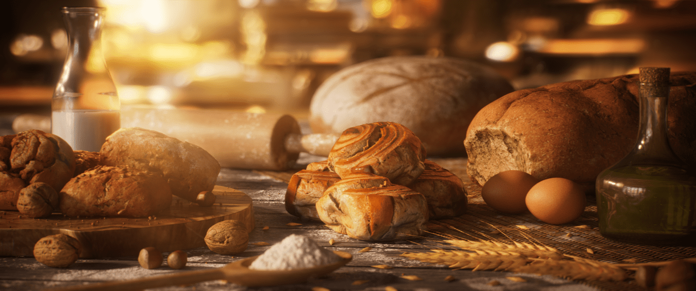
When searching for ideas for this project, I immediately thought of a scene full of bread and pastries. For the mood of this artwork, I had two scenarios in mind: A darker, moody scene, which you can often find in paintings, or quite the opposite – a sunny, bright scene. I decided to go with the latter, but I will dive further into this a bit later.
Having decided the look for the scene, I searched for inspiration for my layout. For this, I looked at a lot of photography of exactly this kind of scene and tried to figure out which parts I liked and which I didn’t. What many of these had in common and what I think worked kind of well to create an artistic scene, was having everything quite messy. Flour, grains and crumbs spilled over the table, slices of bread and buns lying on top of each other, but still often centering around an object or central point.

When I created my layout, I tried to keep these points in mind. For my focal point, I tried to choose something different from the other assets. Whereas most of my assets were either some type of bread or some kind of ingredients like the wheat or flour, I chose to set focus on the curly buns, as I imagined them to be some kind of sweet pastry compared to the neutral bread. Also, considering an emotional approach to composition, we tend to crave sweet things rather than plain ones, so I wanted the viewer to really feel the focus - to crave the rolls in the centre.
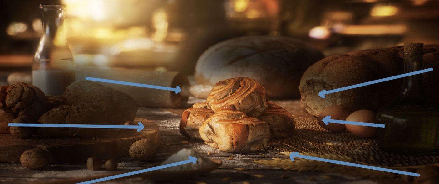
As most parts of my scene are Megascans from Quixel, they are already shipped with texture maps. Despite that, they weren’t just ready to go, so I took every asset into a separate lookdev-scene, in which I shaded them until I was happy. For this process I used a lookdev tool made by Dusan Kovic, which allowed me to easily check my asset with different lighting situations and environments in Maya.
For me, getting the shading of organic objects right is especially important as we tend to recognise any discrepancies with the 3D a lot easier than, let's say, a stylised asset.
With that in mind, I collected a lot of references for each object and tried to get the shading as close as possible.
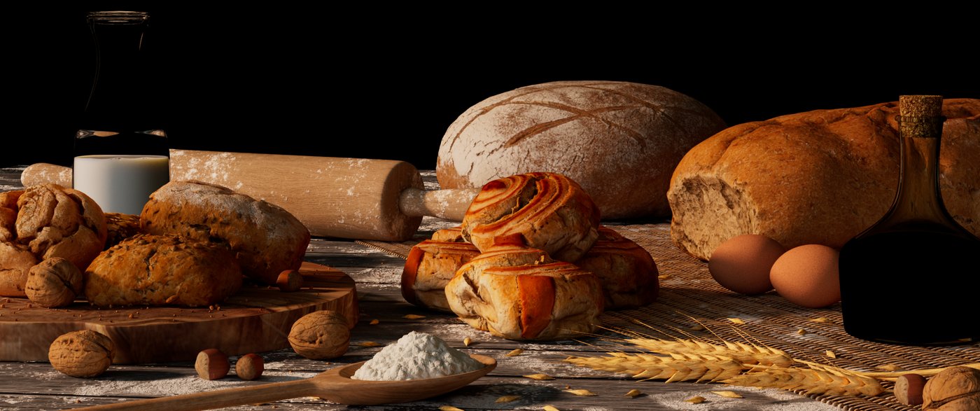
The hardsuface props I either textured in Substance Painter or shaded them procedurally inside Arnold. I tried to add some nice breakup to the textures, especially the diffuse and roughness map, as nothing in the real world is perfect and this is the key to realism.
For example, on the glass bottles I added fingerprints and scratches in the roughness since these are things that happen to them when they are touched and used everyday. Aside from the imperfections that are being added by human influence, no bottle comes out of production perfectly, so I added a broad noise to the bump map which resembles slight changes in the thickness of the glass. This results in the reflection not being a straight line (which would look very CG) but a bit more broken up. To get the flour patches all over the table without having to choose a super high resolution, I created a tileable texture which I then layered on top of my base texture.


As I explained earlier, lighting-wise, I decided to go in a sunny, warm direction. Again, I collected references to guide me getting the right colour, position of lights, contrast and overall feeling.
I started with the sun – for this I used a directional light which comes from a low angle to achieve nice, long shadows since I wanted the scene to take place rather early in the morning. As the sun performs as the key light in this scene, I spent a lot of time to find the perfect position. The scene is more side-lit, so I got some nice shaping. Catching all the small details from the grains and crumbs and the general displacement was important to me, as it makes everything look more interesting and was also something I noticed in most of my references.
It’s not only about the light, but also about the shadow in an image, so I also tried to get good shadows, hiding things partly, but not too much.
After I was happy with the sun, I moved on and added a skydome light with a soft interior hdri to fill the shadows, and to have an overall ambient light. To get some even nicer shaping and highlighting that I wasn’t able to achieve with the sun, I added a warm and sharp rim light to the buns on the screen-left side as well as a broader rim light to the right side of the curly rolls. This helped to match the backlight from the footage I added later and to make the rolls look more interesting.
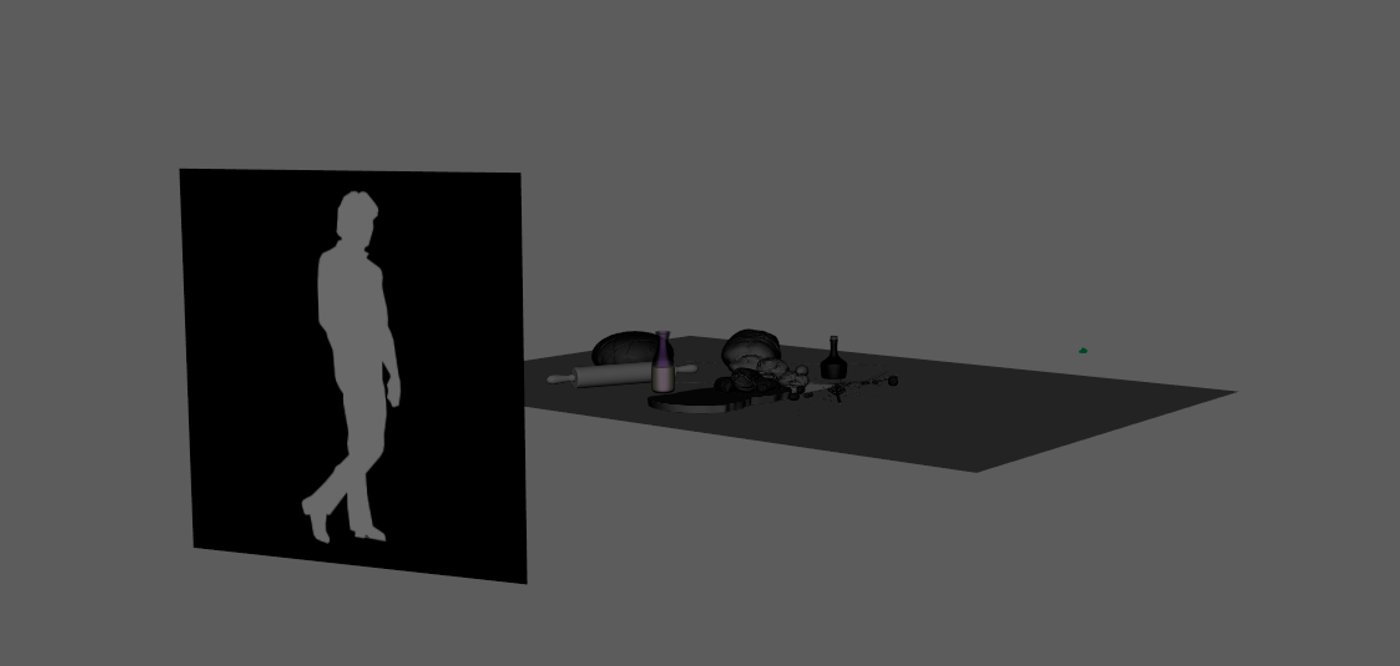
As my background footage contains people moving, I decided to implement that into my light and make it a bit more dynamic by having an animated plane functioning as a light blocker. I also added an alpha map of a man to it to mimic a person walking by. This also helped to better show how my shaders and materials interact with light.

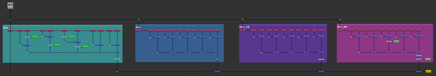
After that, I was happy with the lighting in Maya, so I rendered everything out. I rendered this project, as well as all of my other ones, in ACES colourspace to achieve richer colours with a way higher dynamic range that wouldn’t be possible in srgb, but also, to work as closely to industry standard workflows as possible.
With my renders finished, I took everything into Nuke to do the compositing. I rendered out my lights on seperate AOVs as well as all the direct and indirect shading events for each light group, so I could use them to recreate my beauty and have total control over everything.
First, I tweaked the lights and did a bit of colour correction. Then I added my background footage, which I stabilised, defocused and graded to match my render. To bring the light blocker from my render in a better context, I got green screen footage of a man walking from the internet, keyed it out and adjusted it a bit to merge it onto my footage after. I projected everything onto a card, merged my render on top and integrated it a bit more with an edge blur and light wrap.
One of the problems I had to face during the compositing was to get the refraction of the background which you usually would get from the milk bottle since it was just 2D footage, and I was adding it without any distortion or refraction. What I ended up doing was to create a STMap inside Maya, project it onto a plane in the background with my glass bottle in the foreground (which refracts the values of the STMap correctly), and to use this to drive the UV channel of my iDistort node in Nuke. This allowed me to adjust the distortion of the background with the correct refraction.
[Taking on this project] was a good opportunity for me to not only learn and test out new things but also to develop and strengthen my workflows.
At the end of this process, I utilised Nuke's particle system to create some particles floating through the air. In a 3D scene I combined them together with my geo which I cached out as an alembic beforehand, to have some particles masked depending on their position in space, so it felt like they were really part of the scene. To finalise everything, I added volume rays and some lens effects to make everything feel more real.

Creating this project was a great process, starting with a certain idea in my mind and pushing it even further - making my very own artwork out of it. As this was my first bigger project and went over a longer period of time, it was a good opportunity for me to not only learn and test out new things but also to develop and strengthen my workflows.
Experimenting with doing things differently, testing out tools as well as - and I think that’s most important – just being open to new ideas, feedback, and another perspective on things have proven times and times again to be some of the most essential parts of the creative work.
I hope that this breakdown helped to get an insight into my process on this project and that you enjoyed it.
You can find more of Laura's work on The Rookies and ArtStation.