
How to Create a Compelling Real-Time Fantasy Character
If you are embarking on your first real-time character, this article is for you! Vanessa Mai takes us through her process of creating compelling real-time fantasy characters for games.
If you are embarking on your first real-time character, this article is for you! Vanessa Mai takes us through her process of creating compelling real-time fantasy characters for games.

Vanessa Mai is a 3D Artist at VestGames in Datteln, Germany. She has always loved computer games. Since she started playing them as a child, she has been creating her own little worlds first on paper, but soon that wasn’t enough anymore. She then started to dream up projects in 3D and eventually found herself working in the Games Industry after graduating from PIXL VISN media arts academy. In this article, she walks us through her process of creating compelling real-time fantasy characters.
As I describe my process for creating real-time fantasy characters, I may go into more detail in some areas over others as I am more specialised and experienced in certain topics. Still, I wanted to cover every part of the pipeline in this article for those of you are starting out on your creative journeys in character creation, as it can sometimes feel overwhelming when you are figuring the process.
I will share my thoughts about the limitations with Real-Time renderers and what you should consider. Here and there I will also give you some small tips and tricks. Hopefully, beginners and more advanced artists can both find something here they didn’t know before.
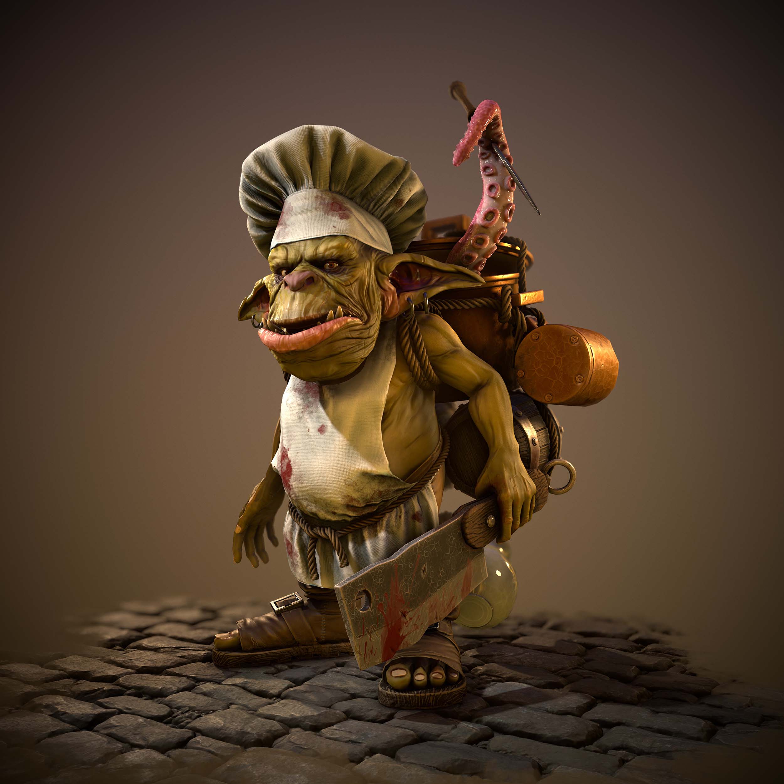
I was searching for inspiration and ideas for my last demo reel project for which I had 3 months left to complete. My main character in World of Warcraft has been a Goblin for almost 10 years. So, when I stumbled over this Goblin-Chef concept I was like: ‘Yep, that’s the one!’ Choosing a subject you’re passionate about is super helpful to stay motivated.
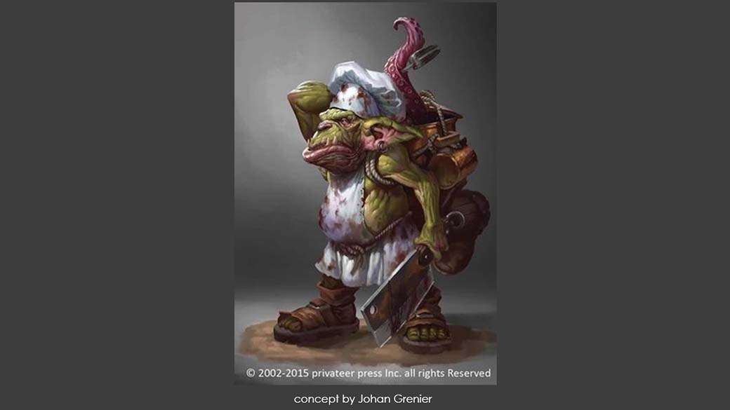
I loved all the details of this concept. The artist made him so authentic and interesting by giving him his own story and so much to think about. For example, why does he look so grumpy, or why does he carry around almost a whole kitchen? And what about this tentacle…is it still alive? and so on...
When creating fantasy creatures and characters, the story is a very important aspect of the design.
As you are creating a fictional being you have to make it believable yourself. Give him a personality and background!
The first step for me is always collecting references. I split the character in my mind into small parts. Through this, I have a better overview of how many individual objects, and what references I need. The latter helped me with my time management too.
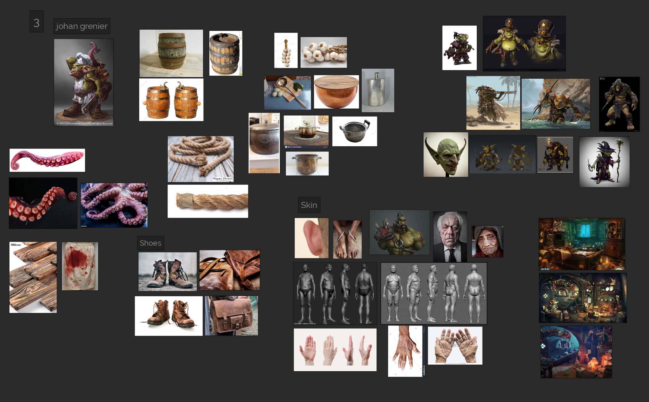
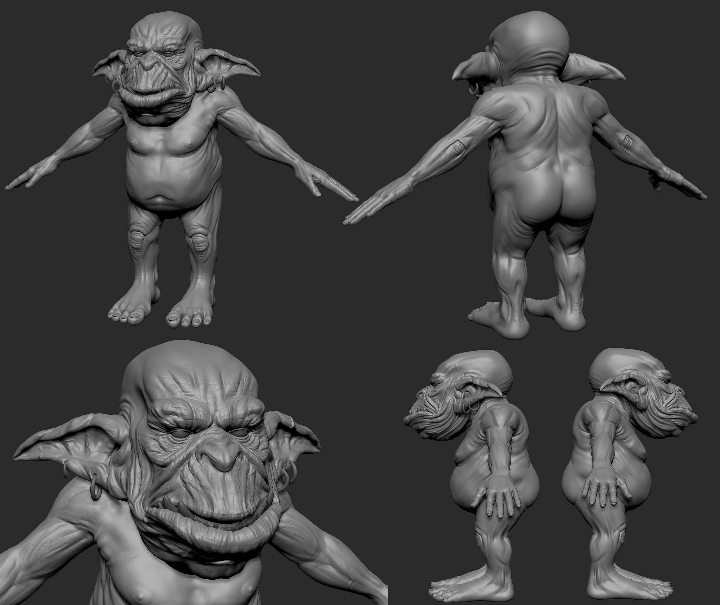
Next, I planned how I want to approach the character. Usually, I start in ZBrush with organic meshes. But because there was a lot of hard-surface stuff on his back, I went with a block out in Maya first.
In the blockout, I defined the shape of the body and backpack. In my case, you can only see one side of the concept. So I had to experiment with different objects and shapes for the kitchen supplies.
When I was sure about the backpack design I added the ropes holding it together. For that, I used 4 circles that I extruded along a curve and added a twist to them.
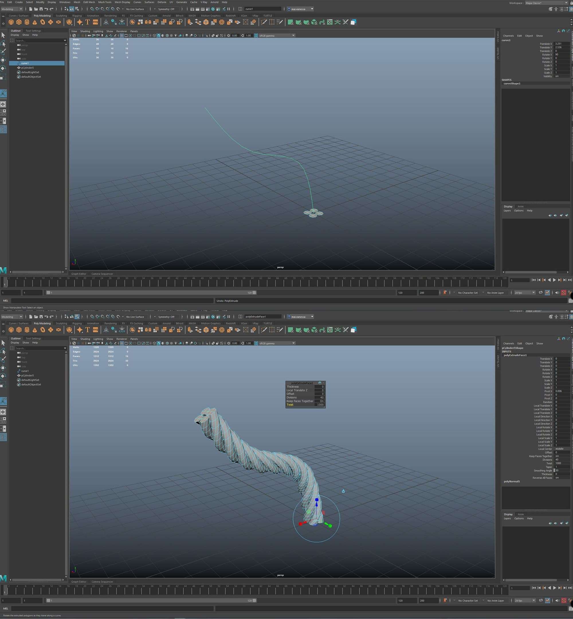
This rope has many triangles. So for a gaming character, you might want to have a low poly mesh. To create this you extrude a circle with a slightly smaller diameter than the rope along the same curve. Later, you can bake the twisted rope onto this tube in Substance Painter. In my case, I stayed with the twisted rope though.
I worked on the Blockout until I was happy with the proportions, silhouette, and shape. It’s important to be able to already recognise the character even in this early stage. Only then, did I move on to ZBrush.
In ZBrush I started adding more details like muscle definitions and larger wrinkles. Keep in mind that even though it may be a non-existing creature, it still needs to have believable anatomy.
Concentrate on larger shapes first and make your way to the smaller ones after. To not get lost in tiny details too early I only subdivide my mesh if necessary. For example, when I realise that I can’t get any further with the current polycount.
At this point, I sculpt only details and shapes that change the silhouette of the mesh. Everything else I will sculpt after making the retopo and UVs.
These are the brushes I mainly use in Zbrush:
‘ClayBuildup’
‘Move’
‘TrimDynamics’
‘Smooth’
‘DamStandart’
For more stylised sculpts, I can also recommend the Orb-brushes pack from Michael Vicente.
Before I added the tertiary details like the pores, I retopologised the meshes in Maya. Since I already started modeling in Maya before, I hadn’t that much work with retopology. At least the body already had a quite good one.
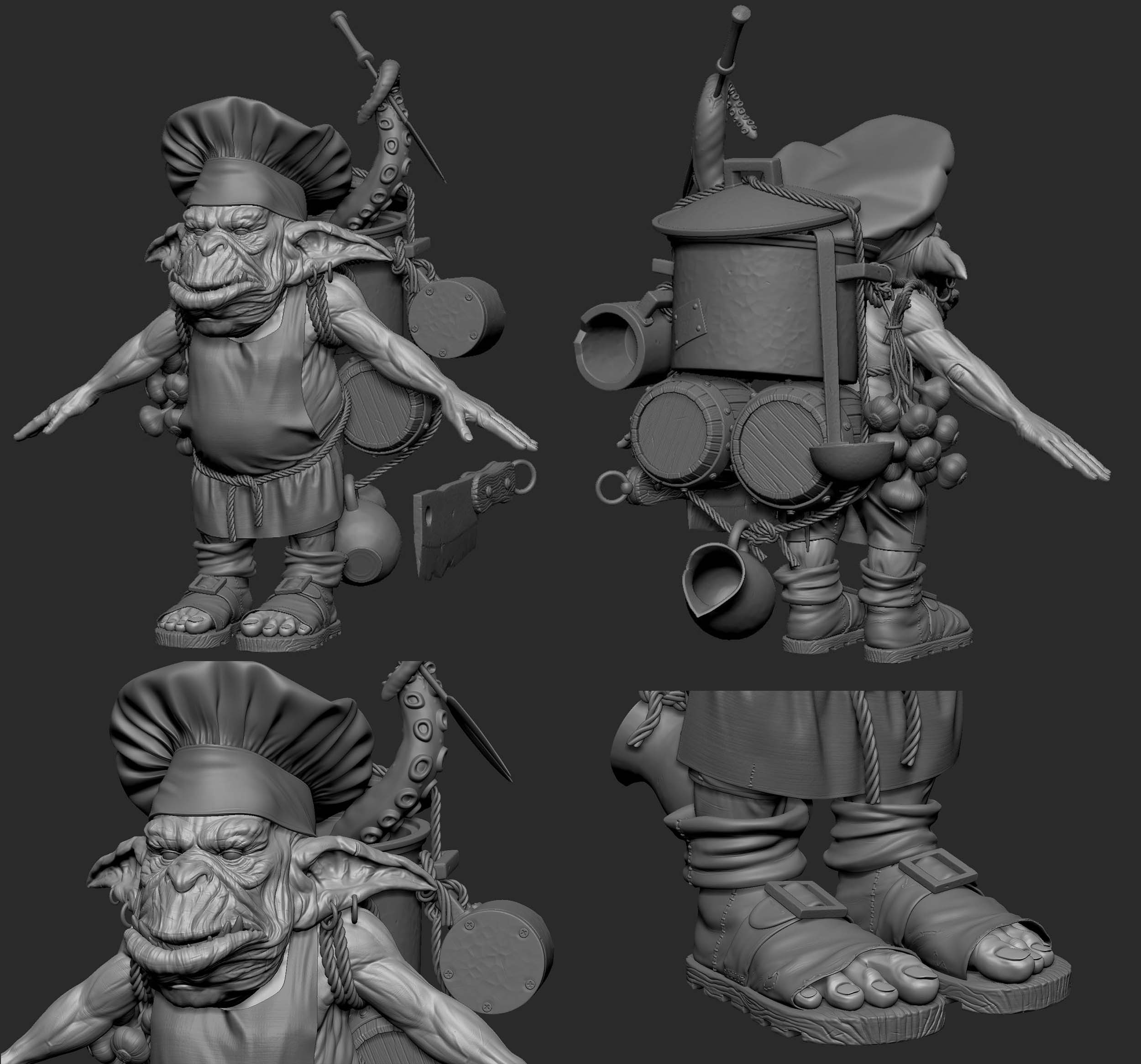
Furthermore, the goblin still needed clothes which I made using Marvelous Designer. Here it helped to take some time to search for patterns online, as I’m not an experienced tailor. I also made myself some kind of mushroom-shaped sewing doll for the chef hat to work with.
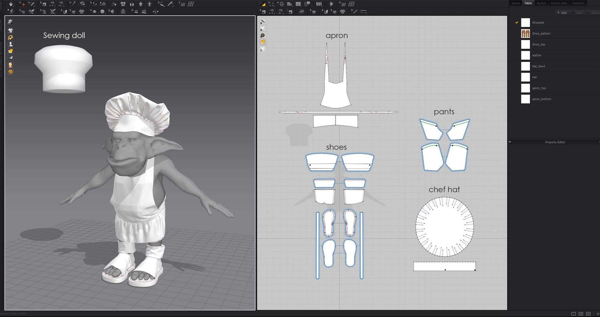
As you can see I made smaller details like the shoelaces later in Maya, since that was a lot faster for me.
The retopology of the clothes I made in Maya too. For that, I exported the 2D Pattern out of Marvelous. I first retopologised the flat 2D version in Maya. Then used the transfer attributes option and the UVs to bring them into the simulated shape.
There’s a useful tutorial on YouTube from Flipped Normals about this. And Sergi Coca also made a quite detailed breakdown of this process in his article for The Rookies.
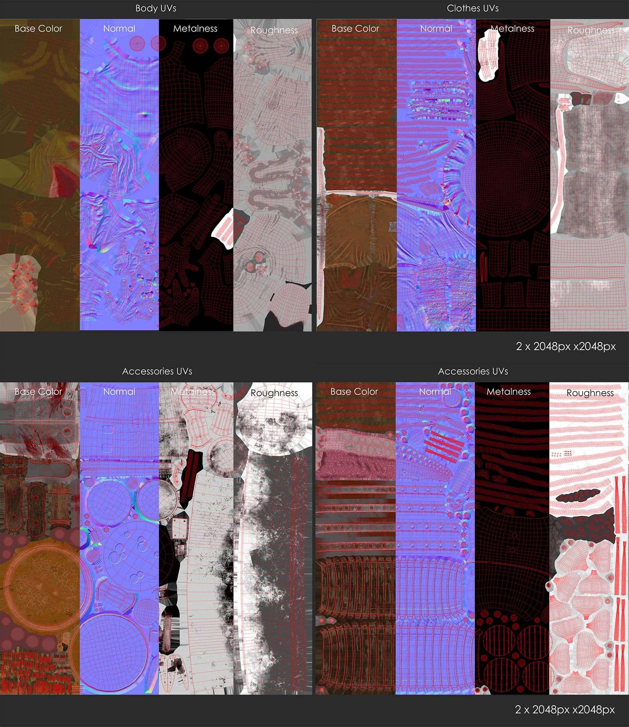
When I had all parts retopologised in Maya I unwrapped them and made the UV Layout. I limited myself to 4 UV Patches here: one for the body, one for the clothes, and 2 for the accessories.
Even though making the UV Layout may be boring to many people you should take some time there. By experimenting with the UV Layout a bit you can save a lot of space and resolution. Which is very important especially for game models.
I imported the retopologised meshes with UVs back into ZBrush. There I first projected the existing details back on. Then, I sculpted the finest details (small wrinkles, pores, scratches, fabric patterns, etc.). I also added thickness to the clothes in Maya before I made the over sculpt in ZBrush.
I textured the whole character in Substance Painter. Because I had many objects, I had to use the ‘bake by mesh name’ option to get a clean bake. For some of you that might be a matter of course, but as I didn’t know this option before, it was a lifesaver.
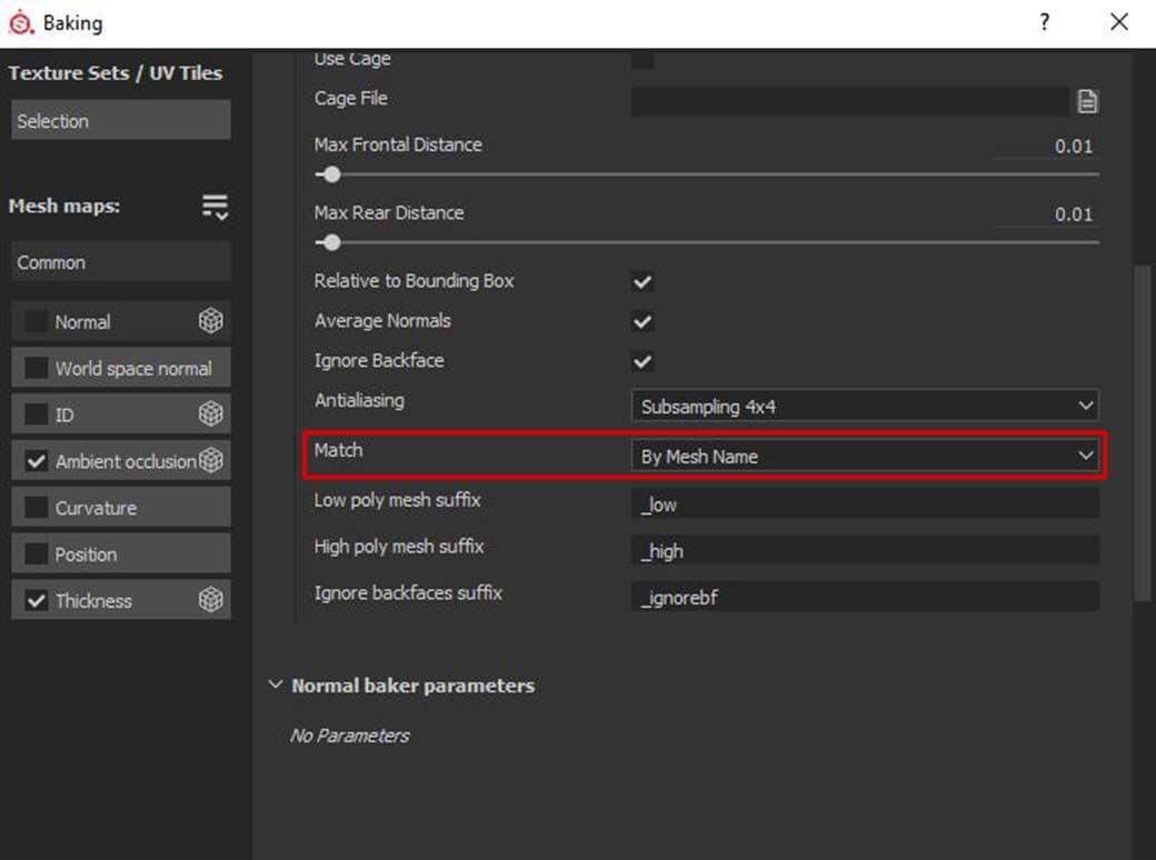
For baking by name, it’s essential to have your meshes named properly. Only then does Substance Painter know which high- and low-poly meshes fit together.
ExactTheSameMeshName_low
ExactTheSameMeshName_high
Style-wise, I tried to make the textures a touch more realistic than the concept. I added a bit more surface details and colour variations. Still, I wanted to keep the stylised look.
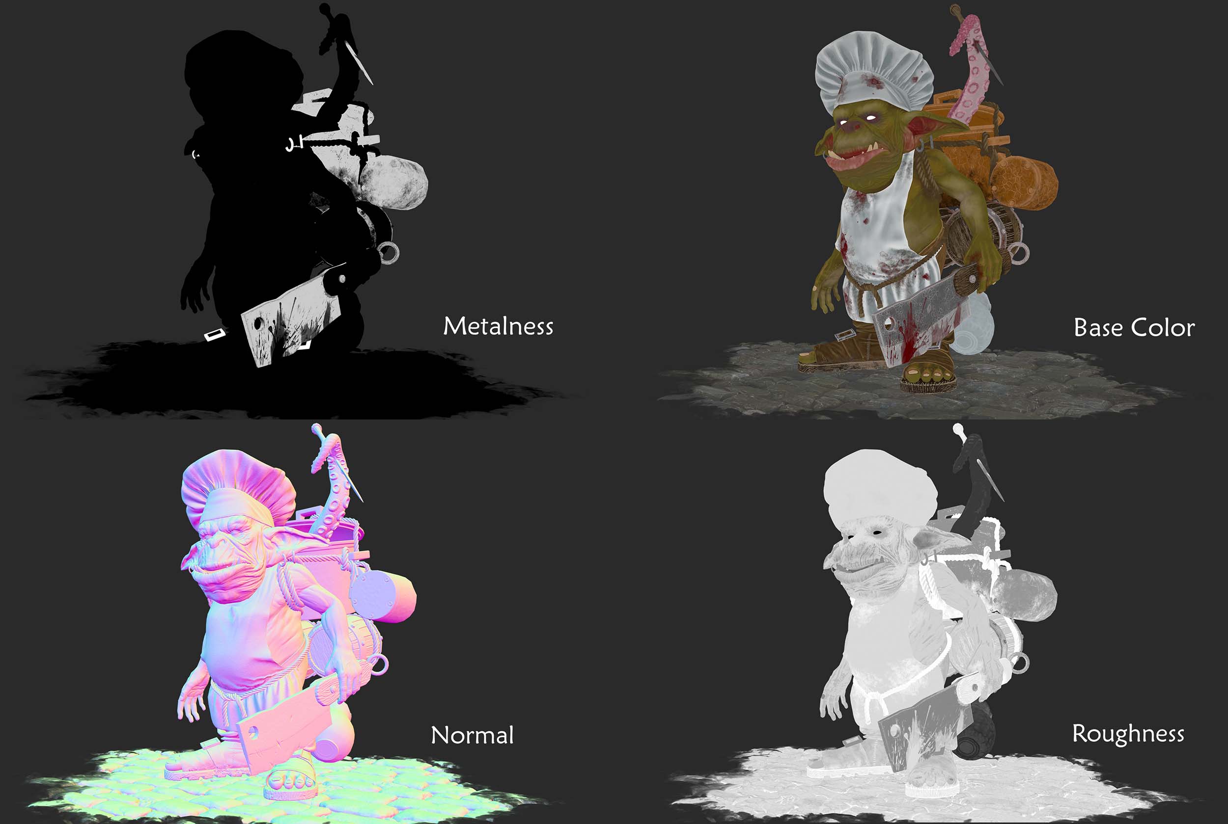
I always start with the colour layers. For stylised textures, I mostly take masked monochrome colour layers and play with opacity. For the skin, I started with this as a base:
1st layer: Main skin colour (in this case grass green)
2nd layer: Violet (the area around the eyes and nose)
3rd layer: Red (in parts that are well supplied with blood, f.e. cheeks, nose, and muscle areas)
4th layer: Blue (creases, male mouth area)
5th layer. Yellow (bony parts like knuckles, knees, cheekbones, etc.)
I adjusted the opacity for the different layers until I was happy. Most of them had only a very subtle effect, but still, they made a huge difference. I added layers with blue and red veins, darker and lighter green, and played again with opacity. Now I had a quite interesting base on which I could build up adding details, scars, dirt, dust, blood, etc.
Using a curvature mask to brighten up the edges of an object is also a quite simple way to get a stylised look.
When you have a lot of layers it can get quite difficult to keep an overview over the different channels. In this case, you could make f.e. separate layers only for scattering and roughness. By doing this, you can adjust them independently from the colour layers.
For skin scattering, I can recommend using the inverted thickness map as a base. Through this, the thinner body parts already have more scattering than the thicker parts.
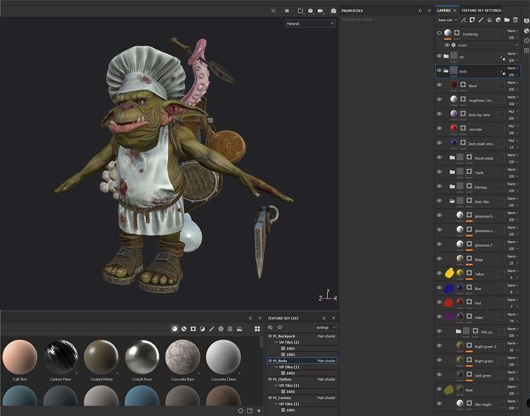
Keep in mind that you can’t use UDIMs in Real-Time renderers like Marmoset Toolbag. So, if you should have any, like me, you have to assign a separate material for every UV patch before.
In my case, I had to assign two different materials to the backpack. I also decided to assign a separate material to the iris and cornea. Now I have more control in Marmoset Toolbag.
After assigning the textures to the mesh in Marmoset it was a lot of back and forth. I adjusted values and changed things in Painter until I was happy.
For the eye cornea, I used only the refraction, glossiness, and colour channels. The colour channel I used for an extra static white highlight, which I cut out of the refraction with a mask. Through this, the eyes looked a bit more ‘alive’.
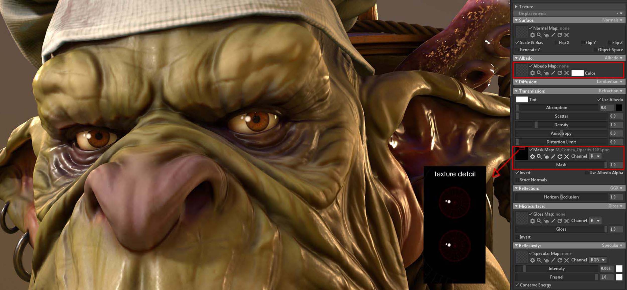
If you’re using Direct X as normal map format in Substance Painter it might be that your normal maps look strange in Toolbag. In that case, you have to invert the green channel of the normal maps. You can do that by ticking on the ‘Flip Y’ box for the normal map in Marmoset Toolbag. (You find the Substance Painter normal map format in the project configurations.)
At this point, I still had to define which texture resolution I wanted to use. First I set up my cameras and defined how close they will be. Then I tried out different resolutions. For Real-Time renders it’s more important to save capacities than for offline renders. So you should use as much resolution as you need but keep them as low as possible at the same time.
For this character, I went with 4 2K Textures, which is still quite a lot I guess.
For the ground, I created a simple plane, since I didn’t want to distract the viewer with too much background stuff. To make the ground plane look more 3 dimensional I used the parallax option for the normal map. It takes the heightmap to create a parallax effect without adding subdivisions.
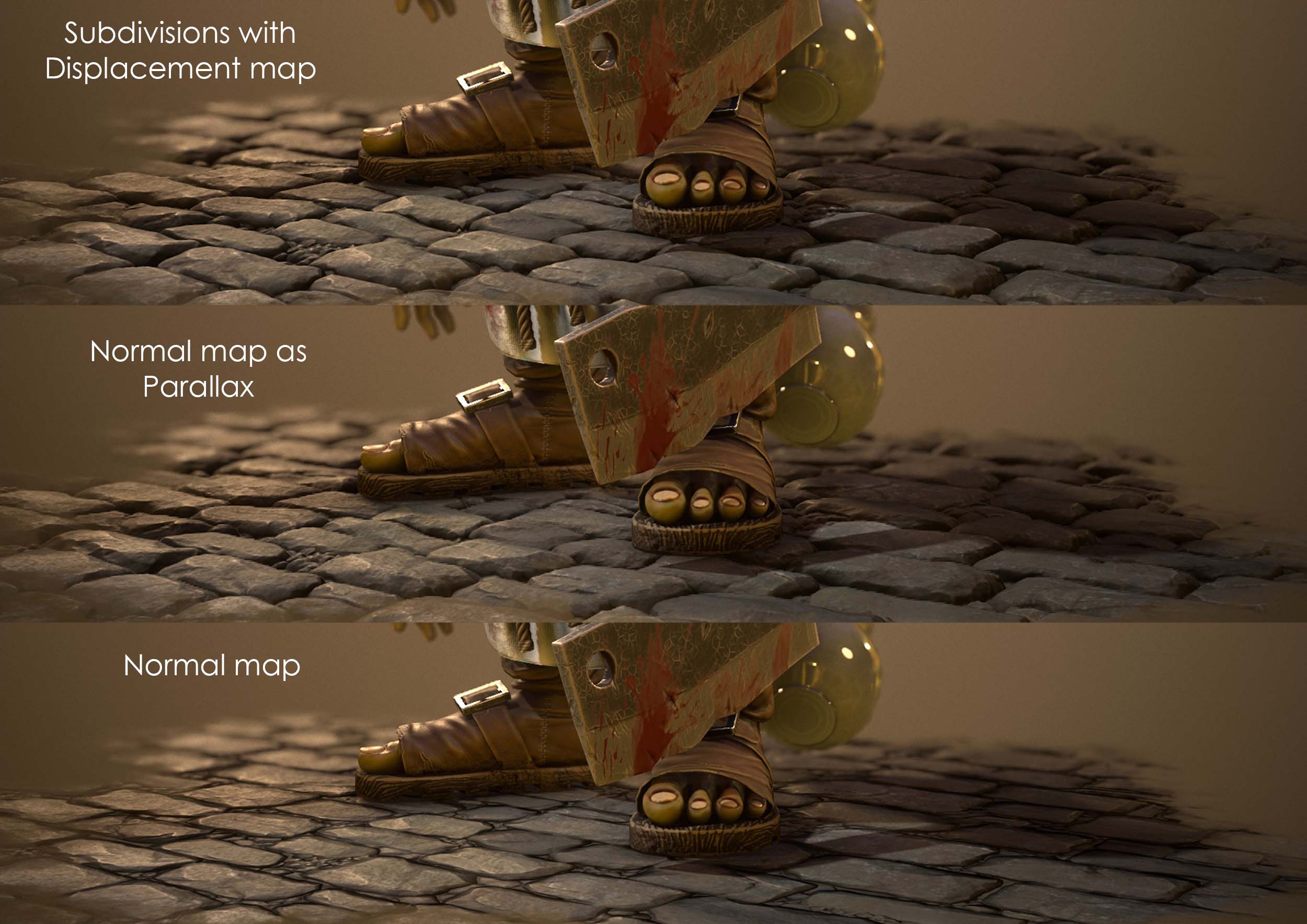
The same technique I used for the body itself. Here I also added some subdivisions and a subtle displacement. By doing this, he looks a bit smoother in the final render. But of course, you usually can’t do that in production for games as it consumes way too many resources.
Because I didn’t want the goblin to be a static statue I also put some time into rigging and animating him. For the body, I first made a ‘standard’ rig. There I included joints and controls for the chef hat, the belly, and the ears. They’re all very large and need to move too.
Rigging the tentacle took me a lot of time here because I made the mistake and modeled it posed. This made it super difficult to animate a fluent motion with overlapping. So always make sure to model your meshes in a neutral pose.
Instead of modeling the tentacle again, I decided to uncurl it manually, and rig it once again. The tentacle’s mesh looked a bit messy then but in the final animation, you can’t see it anymore.
I also made a simple rig for the backpack with the kitchen supplies. It would have looked strange if they were totally stiff while walking. For that, I made controls for the big rope, the mug, the barrels, the garlic, the soup ladle, the can, and the pot lid. For most of them, I didn’t need joints though, only for the rope going around everything.
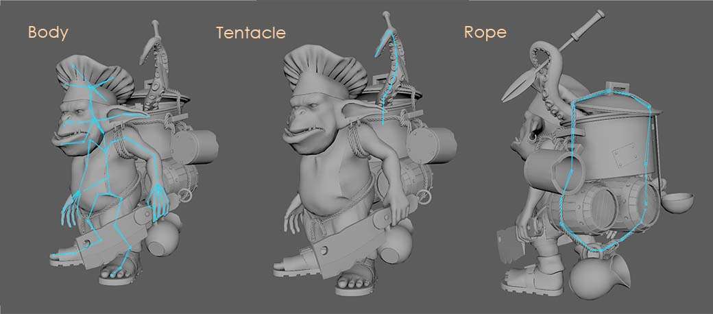
The most difficult part with this whole rig was to get the hierarchy right. Without that, some parts move twice or even don't move at all. But here I can’t give general advice since it depends on your character and rig.
To save a bit of time with the animations, I didn’t want to make something too difficult. I decided to animate a walk cycle and a loopable idle animation. The walk cycle I also needed later for another project where I included the goblin.
Because I rarely found good references for goblins I used humans as reference. Here I can recommend the book ‘The Animator’s Survival Kit’ by Richard Williams. To get a more cartoony look I exaggerated the movements a bit and added overlapping actions. The backpack and hat I simply let follow the movements of the character with a short delay.
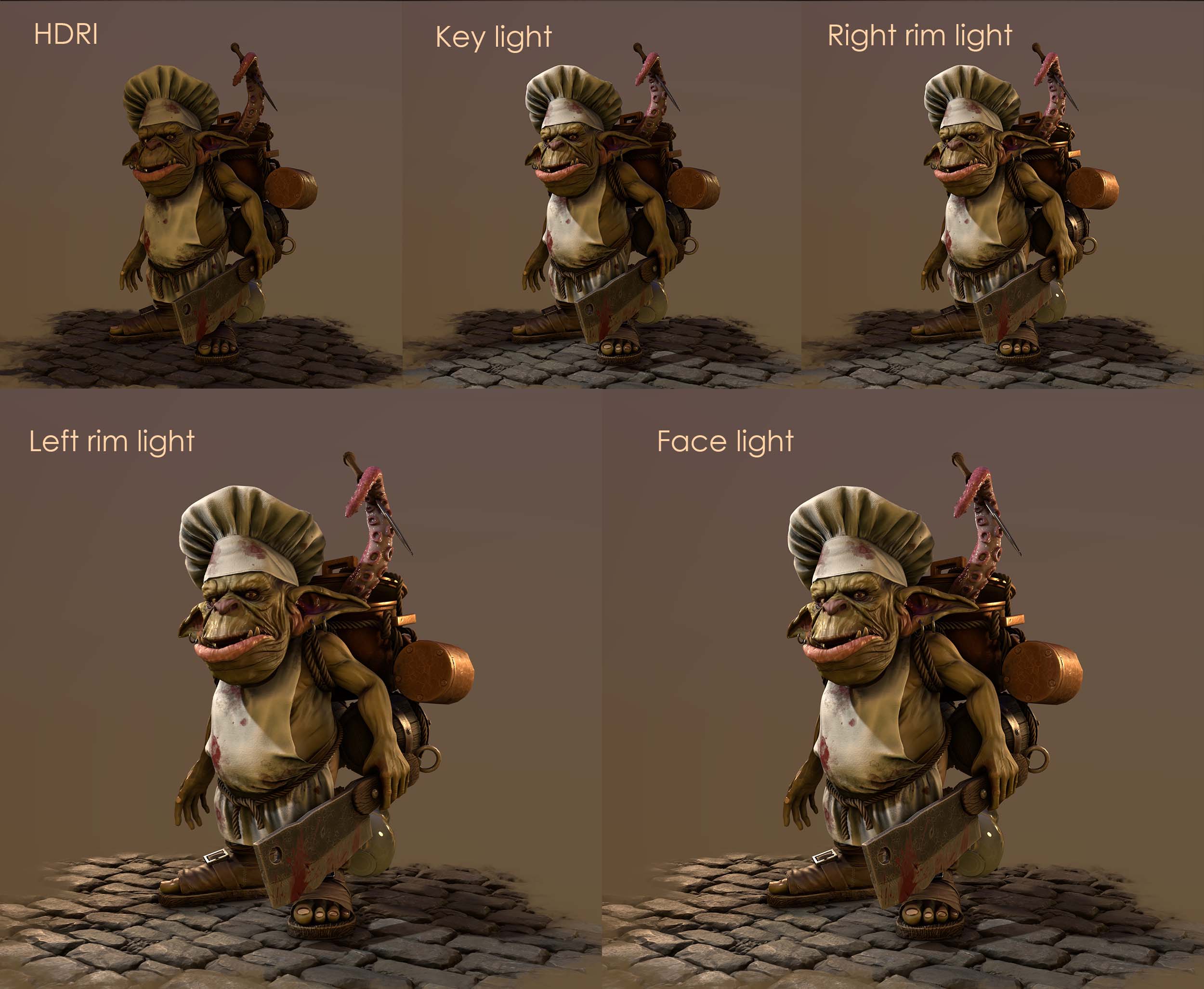
For my light setups I always start with these 3 light sources:
Fill light: HDRI Sky
Key light: Main light that lights up the most important areas
Rim light: Light from behind to separate the character from the background
To get the nice warm reflection on the copper I added orange rim lights from both sides. I also created a small light next to his face, to brighten up the area around his eyes.
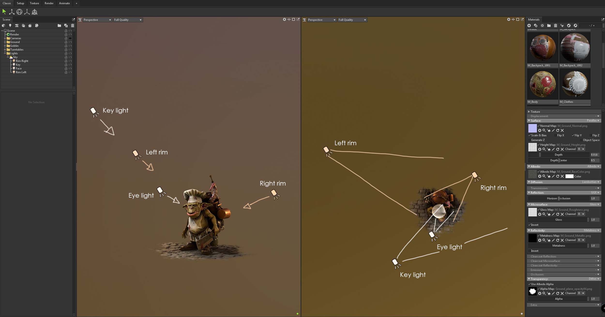
As you can see on the screenshot above I decided to use spotlights except for the HDRI.
Since there is no light linking in Marmoset this was the easiest way to limit the light to certain areas. The right rim light for example I wanted to light up only the character but not that much the ground. With the key light, I left his right arm in the dark and lit up only the torso, legs, and face. Through this, I tried to add a bit more depth to the image.
Post Effects I did completely in Toolbag. First I added some Depth of Field. The near blur I turned off since I wanted everything in front to be sharp.
Next, I turned up the flare and bloom. By doing this, the extreme dark parts of the character get brighter and the image gets softer. The vignette frames the character and brings it more into focus. I also added some grain. Without it, the render would be too clean which makes it look unnatural.
Last but not least I colour graded the image a bit. Here I only turned up the exposure and saturation a little.
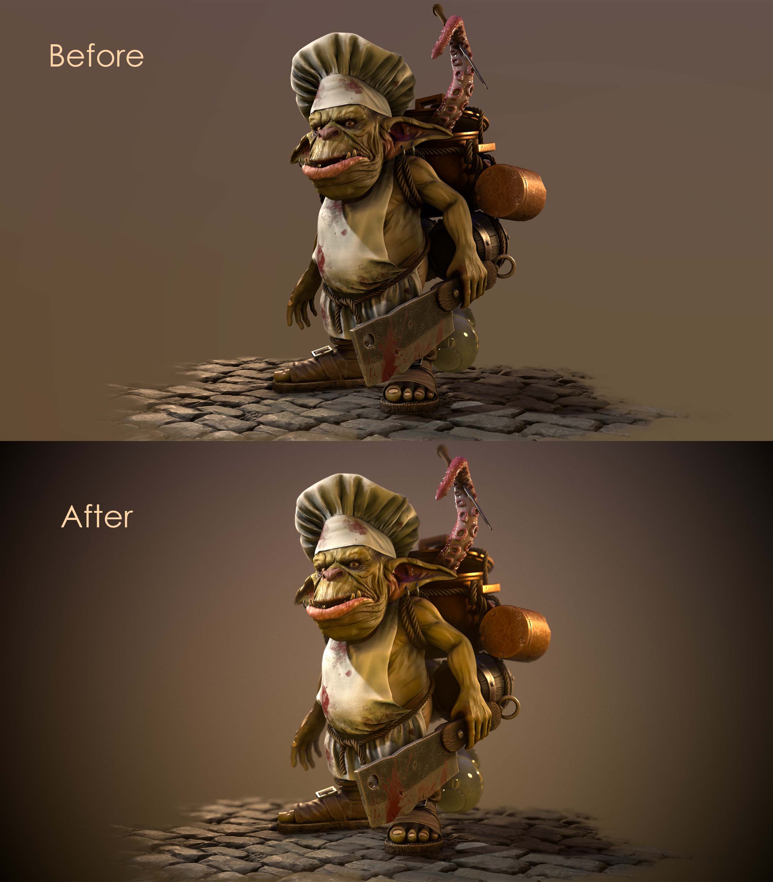
Especially in fantasy scenes, it can look quite nice if the lighting and post effects are a bit overdone or unnatural.
In the end, I’d say proper planning is the first step to get an awesome project.
Also, as a beginner, it might be easier to start with an existing character concept. Especially if you’re not familiar with concept art and design. Details, proportions, and composition are very important for an interesting and aesthetic result.
Furthermore, make sure you’re happy with your model and UVs before you move on to texturing. It can be very time-consuming to make changes there afterward.
And like I already said, choose a project you love working on! (Because there might be situations you’d rather want to quit when nothing is working as it should.)
Finally, I want to thank everyone who made it this far. I hope you have found something helpful in this article! And of course a big thanks to The Rookies for giving me the opportunity to write this article.
You can find more of Vanessa's work on her website, Instagram and ArtStation.