Modeling, Texturing, and Rendering a Hero Prop for Games
3D Game Environment Art Student Rana Hanbazazah, was tasked with creating a hero game-ready prop from scratch during her intermediate term at Think Tank. In this article she shares the story and concept behind her piece, and her process of modeling and texturing this incredibly detailed asset.
During her intermediate term at Think Tank, 3D Game Environment Art Student Rana Hanbazazah, was tasked with creating a hero game-ready prop from scratch. In this article she shares the story and concept behind her piece, and her process of modeling and texturing her game-ready hero prop.
We had an assignment to create a game-ready hero prop from scratch. I gathered references for the prop I wanted to create and wrote the story behind the prop to create textures based on story and meaning. The project was broken into phases. We started with reference gathering and blocking out,high-poly, and retopology for low-poly, UV and bake, and finally texturing and rendering.
The story
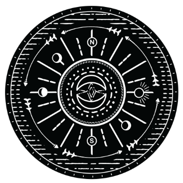
This compass will be a part of a player's experience throughout the game, and the player will have to check it in the game constantly to pass a mission, solve a riddle or receive quests. The writings on the compass revolve around the main story of the protagonist and the game's environment. The player will get to know more about those phrases, the meaning of them, and what they symbolise throughout the game. The textures hold parts of the story, which I will discuss later in the texturing phase.
References and Preparation
Before starting modeling and texturing, you have to gather as many references as you can for the prop you would like to design, or re-create in your own way. For gathering references, I started looking at sundial compasses to study for size and materials. Then, I looked at leather, brass, velvet fabrics and photos of latches, boxes, and different compasses to help me further, during the texturing and modeling process.
During this stage, I planned the sizes and software I will use, and how I want to achieve details.
It's essential to search the dimensions of the objects you are planning to design or recreate, in order to obtain realistic and optimal results. So, I started looking for the size of each part on a sundial compass to be able to start blocking out.
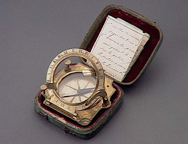
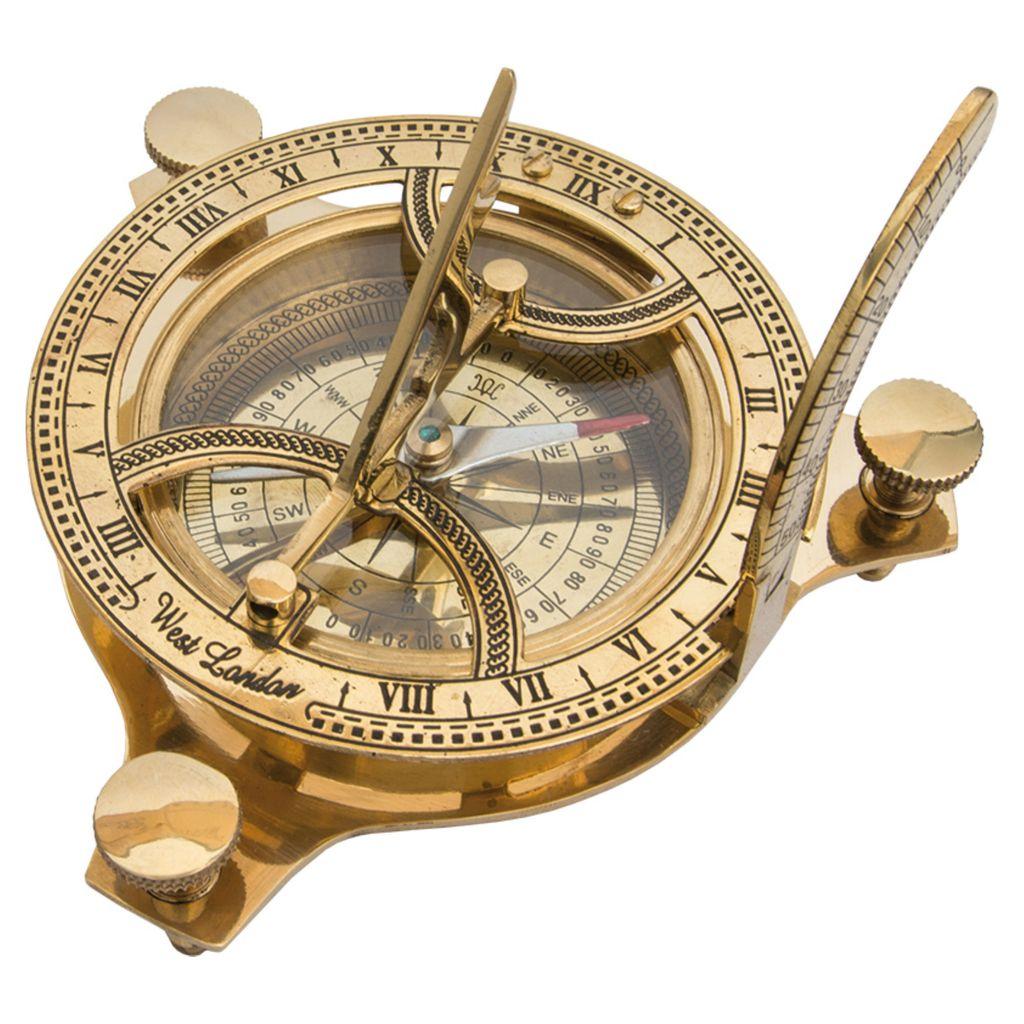
I was inspired by a sundial compass made by Étienne Lenoir around the period of 1774-1792. The piece is presented at the Louvre Museum. You can check it by visiting this link.
I wanted to mix the Sundial compass designed by Étienne Lenoir, with more modern designs pictured centre and right.
For the textures, I focused on looking at the materials when they are new and clean, as well as when they are weathered, to understand the layers of the weathering more. It gives me an idea of how fabric, brass, leather, and other textures can weather over time.
After finishing the research and getting all the information I needed, I started planning the blockout.
Blockout
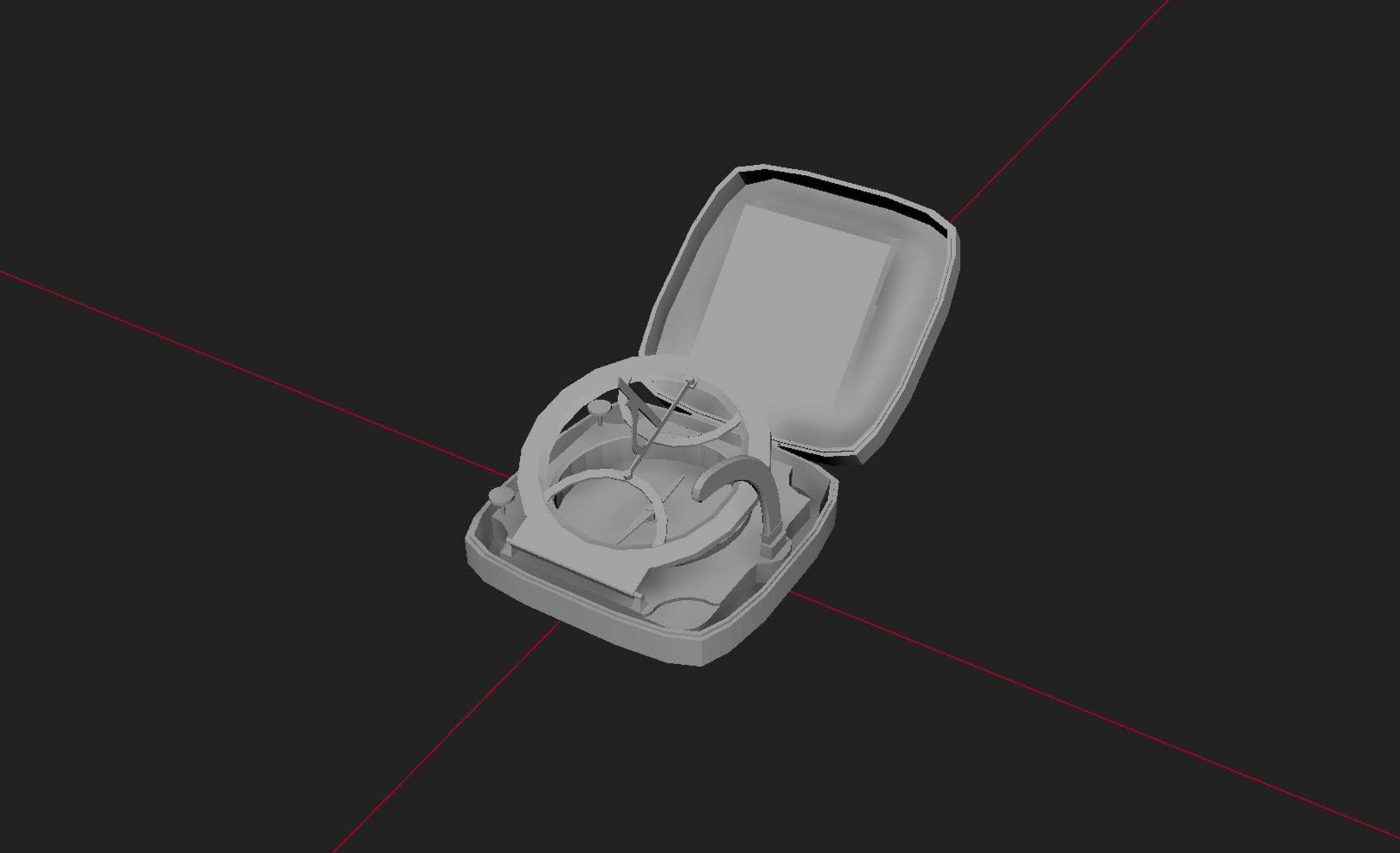
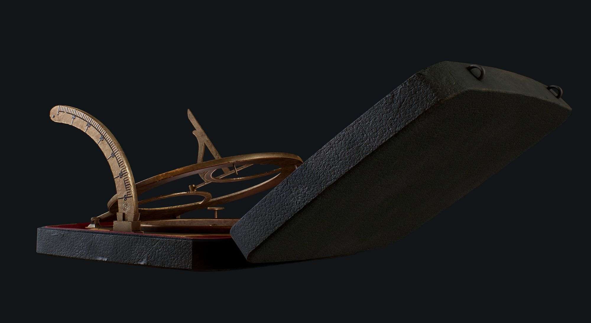
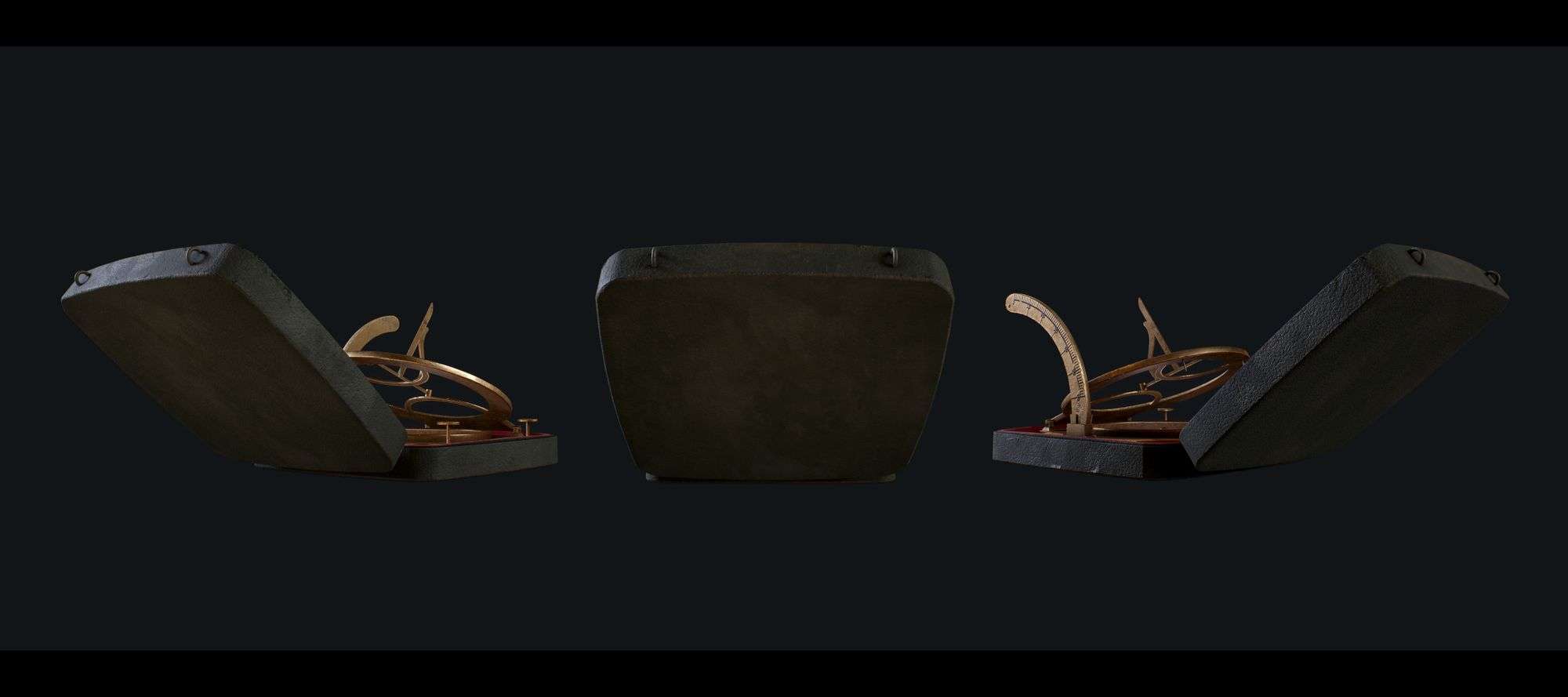
In the blockout phase, I started creating the shapes and ensuring all the dimensions were correct. Then, after modeling the blockout, I started folding every piece in the prop to make sure they all fit perfectly and are folded how they are supposed to fold, and the dimensions of the box and the sundial compass were correct so I could close the box.
Low-poly and High-poly Modeling
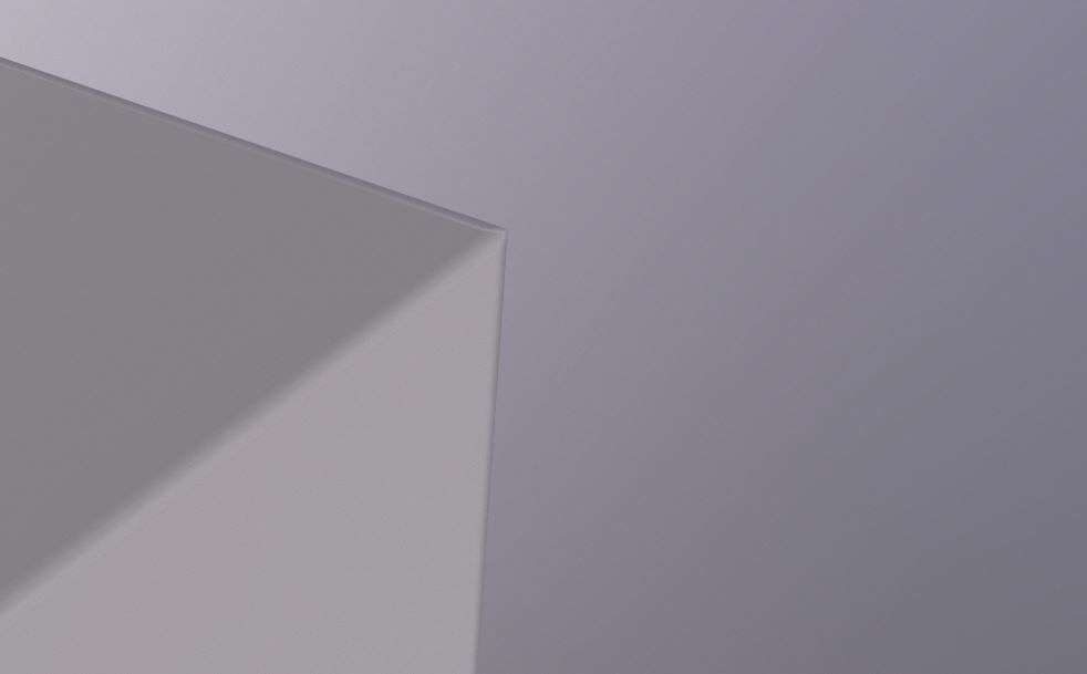
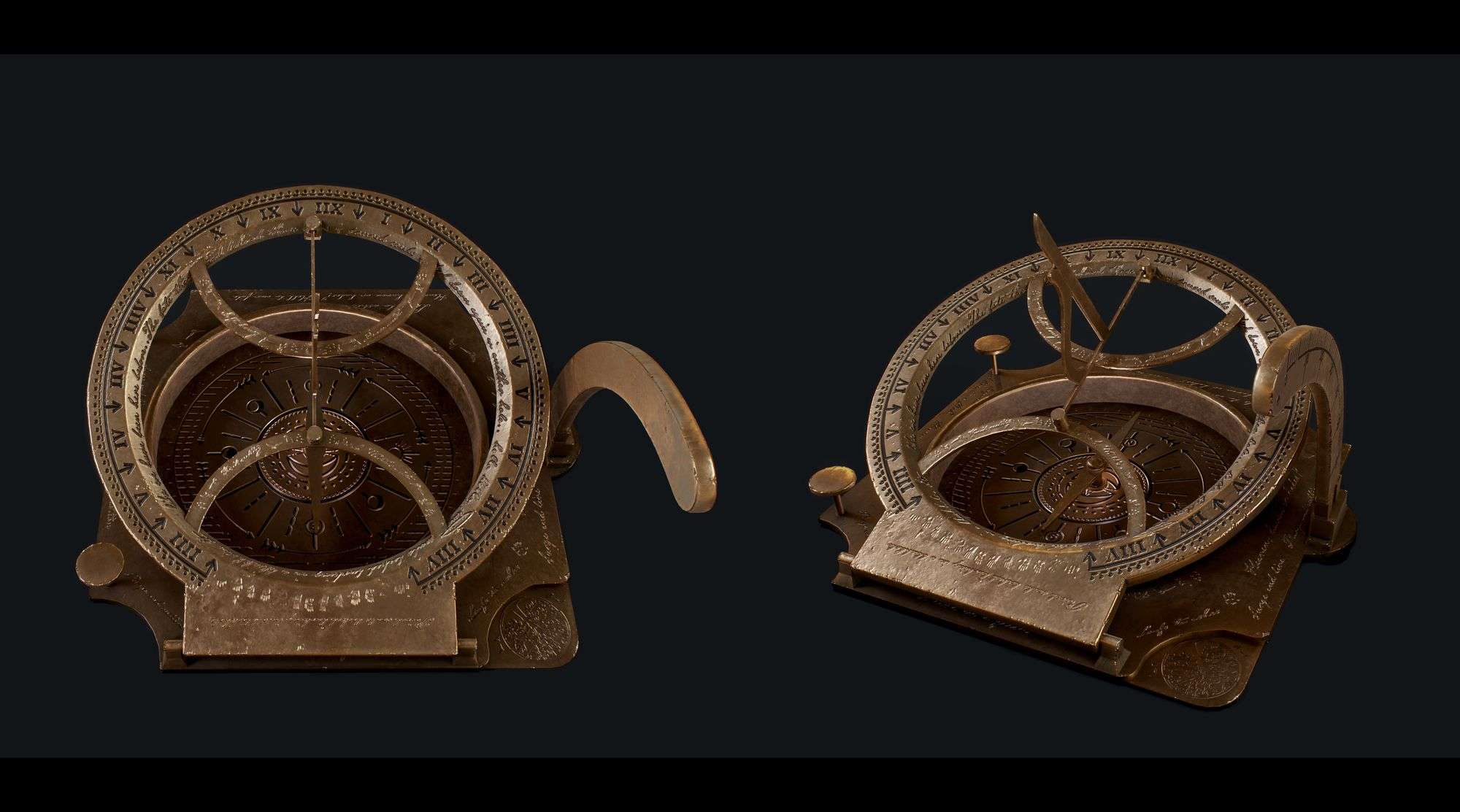
I started modeling low-poly and getting as low as possible while maintaining the circular shapes and the curves. It was very important for me to keep those circles looking as smooth as I could since it's a hero prop, and it is something the player will use throughout the game and will be a considerable part of their experience. I ended up with 14k tris for a hero prop. I saved a low-poly version and slowly added bevels for the baking part. I kept the model clean and added details later in the texturing phase.
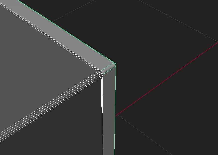
In this phase, I used floaters, which are extra geo floating around the primary model. Floaters are used in the latter stages of the low-poly modeling to allow for extra information and details. This stage caused some issues I will be discussing in the baking phase.
The Finalised Model
After finishing the high and low-poly, I assigned materials to identify which parts were meant to fabric, leather brass, and metal. It's important to rename the materials accordingly to use material ID as masks later in the texturing phase.
The low-poly and high-poly for the prop were not so different due to the simplicity of the prop shape. I wanted this stage to be as simple as possible, wanting to add details later in 3D Painter.
One tip is always to ensure your low-poly does not have extra unnecessary edges or faces. If it is not going to show to camera, delete it. If it is an edge in the middle of a face and does not add any noticeable change, delete it.
Try your best to optimise the model to the maximum possibility to avoid any waste.
My low-poly had around 25k before trying to lower it to the minimum amount possible, which is 13.7k. Keep in mind that if your prop has more circular shapes and forms and they are the most visible, you will likely have more tris count than any other squarish models, and that is ok.
UVs
This phase is crucial for successful bakes and textures and is very important for optimal performance later in the game. You need to make sure you use the right texel density and map size for the UVs. Also, during the unfolding process, it is essential to keep an eye on the UV shells and make them 90 degrees straight or as straight as possible.
This is important for two main reasons: The first is related to baking. Have you ever had the issue of pixelated edges and faces in your bakes? Check your UVs and make sure they are as straight as possible to avoid pixelation. The second reason would be space. If you have straightened UV shells, you will have extra space that you can optimise to your needs, and there will not be a lot of wasted percentage in the used UV space.
Baking
Baking is when we translate high-poly information and details into a low-poly mesh with fewer details than the high-poly. It will take the information from the high-poly and translate it into a texture. The details will be on a normal map that will guide the engine's lighting and fake depth. From baking, you will also get AO and curvature for shadows and highlights, and other maps like material ID, position, masks, and more will add a lot to the texturing process. This stage is crucial to get the best results possible, when texturing.
Before exporting the geo as FBX and starting baking in Marmoset, make sure to rename your mesh correctly. Use Suffixes like _low and _high and group them accordingly. In my hero prop, I separated some low-poly parts to avoid artefacts later in the baking process.
For example, you have rivets in your model that are small and close to another part in your model; you would separate that to get more freedom in controlling the cage later in Marmoset. If you know that you have a piece that will intersect with another piece, separate them to avoid any issues.
Since this was my first model to bake, I faced many issues that I had to troubleshoot. During the troubleshooting process, I learned a lot, and I will share some of the points with you.
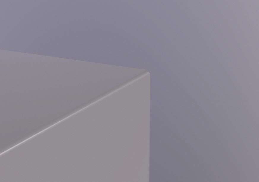
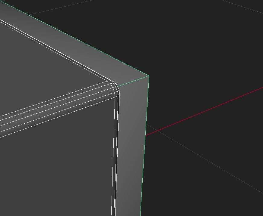
So the first tip is if you have a 90-degree angle or a hard edge, cut it. Always triangulate before exporting and importing to Marmoset or any other baking software to avoid artefacts or any other issue. Bake on the highest resolution possible and reduce the size later when baking. This will give you crisper and better bakes. Make sure your low-poly and high-poly are perfectly aligned from all angles, and the edges in the low-poly are merged and there is no extra space between the parts to avoid baking issues later in your geo. To make sure you have smooth bevels, check your high-poly and have its bevels on a larger fraction and more divisions. It's always better to have your high-poly smoothed, and a bit exaggerated to have good bakes.
Smooth edges to get better baking results and try to chamfer it too. Baking is not friends with overlapping UVs, so avoid having them and make sure your UV's do not like random zigzags. In addition, make sure your shells do not have a random cut in the middle.
One tip to make baked holes look better in the baking process is to scale the taper to fake depth.
Here is why floaters were not friendly to my geo during my baking process: while baking, floaters were pixelating a lot and were not looking as detailed nor crisp as they should. After asking around, reading, and trying to troubleshoot my bakes, I realised that floaters would not work well on my hero prop since it was small and the number of pixels was not high enough. No matter how large my bakes were, I would still face this issue. This is due to the nature of bakes. When baking, you are translating information into the low-poly UV's, and if your resolution and size are not high enough, the details will not transfer as expected. Do not get me wrong, floaters are great, but on larger models. So, I decided to save those details for the texturing phase.
Texturing
I broke down the materials I would need to make sure I had a base for each part of the hero prop:
Brass
Wood
Velvet fabric
Metal
Paper
Before I start texturing in Substance 3D Painter, I always go to display settings > tone mapping > function [log] > activate colour profile and chose ACES UE4 Log. This will show how the textures will look in Unreal Engine, or at least close to it.
I started with the base materials as a first pass to picture how every texture would look and to get the best colours and hues. While texturing, I needed to make sure I have PBR Validate always on top to make sure I am choosing the right colours and enabling it and disabling it every now and then.
Masks are so helpful when texturing. I use masks either on layers or groups, depending on my needs. Since I had my materials identified in Substance 3D Painter, I created an ID material map which later helped me in masking. To use the material ID, right-click on the layer and then "Add mask with colour selection." You can also mask using polygon fill and choose the fill mode that suits you best.
First, I started with the brass material. Substance 3D Painter already provides brass material in their library. I used that as the first pass and then started altering and adding more to the base material. Before diving into the brass details, it is essential to search brass and how it weathers and oxidises to get the best results possible. After adding the base material, I added layers and layers of details, including dust, damage, oxidation, scratches, and more.
The second material is leather. I used a fill layer, masked it, and then applied a leather texture and adjusted its height. Cell maps are great for leather, but you will have to adjust to them to look more like leather. I tried to add damage details until I found the optimal way for my prop. I used a mask editor, played around with the settings until I got the details where I wanted them to be, and then used another generator for the damage with height information. I also painted some using a very smooth brush. It is like sculpting but in Substance 3D Painter. I also tried using MatFx Peeling Paint generator and painted over it to give it the look of damaged leather.
Third, the velvet fabric. I started with a base colour and added layers on top of it. I started with the fabric pattern and adjusted the height information to fake the texture of the fabric. Later, I added another fill layer with noise as a mask and white as the base colour. The white noise (blurred random dots) will fake the velvet effect even more.
I then added a masked layer to fake the dark and light spots we usually find in the velvet fabric. Lastly, I added the folds through a masked fill layer with a crease map, blurred it, and played with the settings until I achieved the desired results. For the roughness, I applied a mask to have different roughness to fake the reflections. After finishing the fabric, I started adding dirt, stains, and more.
For the paper material, I started with faking creasing, damage, and other details. Then, I hand-painted the ink damage using a brush. Later, I enabled opacity to paint paper edge tears and damage and chose the colours, dirt, and stains that would suit the story the best.
For the metal, I used a base material for metal and added surface details and dirt details.
When it comes to the extra details and the story in the prop, I used the alphas I painted in Adobe Illustrate and projected them into the UV space. It's very important to check alignment and choose UV instead of Tangent | Warp, to avoid getting parts stamped around the mesh.
Disable everything on material except height to get the best height information you desire and then enable the rest. Add anchor points to get AO and curvature for painted heigh. There is another way which is to export the normal map and re-import it as a texture. Apply the normal map to mesh maps and remove all other maps. Uncheck the normal map and check AO and curvature. The painter will read the normal map as the high-poly and get all the new details on the AO and the curvature.
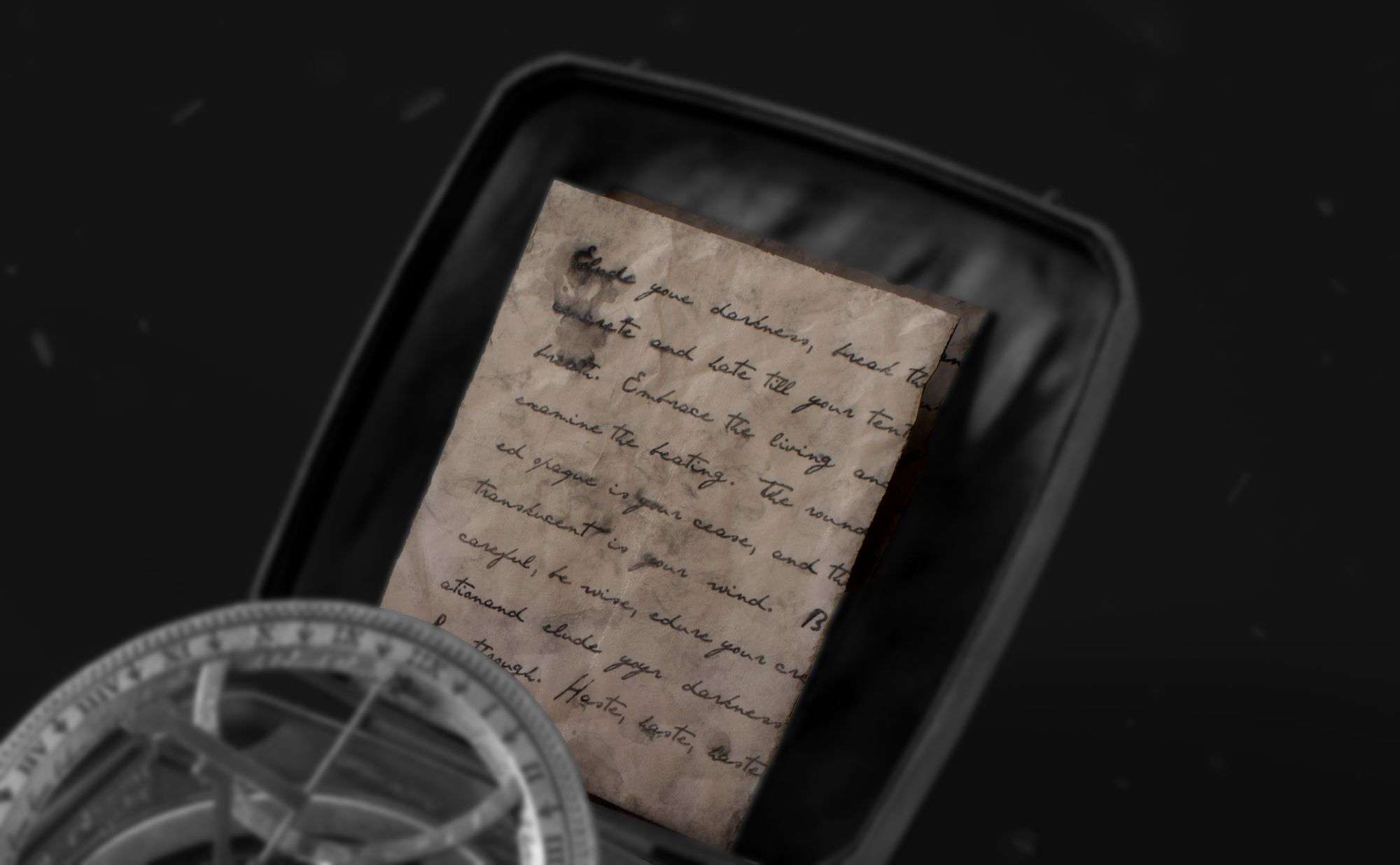
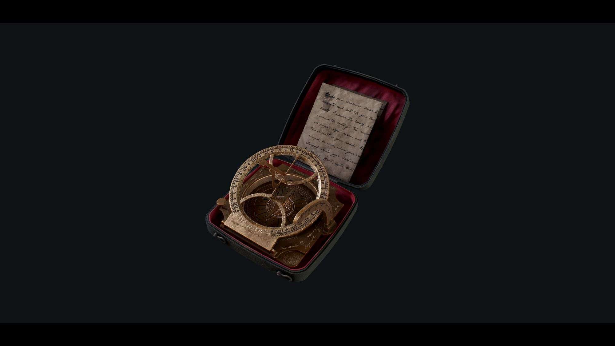
In the final prop, if you look closely, you will find small and large fingerprints and smears, and that is because this compass is not just about this one grown-up protagonist. It is linked to a past, and it is still constantly affected by that past in the present days. The folded paper is weathered, and it has dried water drops affecting the ink to symbolise the protagonist's mission.
Every texturing detail is connected to the environment, the quest's nature, and the riddle the player is solving.
The compass has the protagonist's eyes and the sun and the moon. The phrases placed on the prop are not random. Each phrase is connected to the story, and here is what some of them say:
"Paired souls locked lurking down in a black-hole."
"The fate they found behind those doors is paired souls locked down again in another hole."
"It feels like we have been here before."
"Soft breeze"
"World's mist"
"Purge and outlive."
“I live in a flesh” and more.
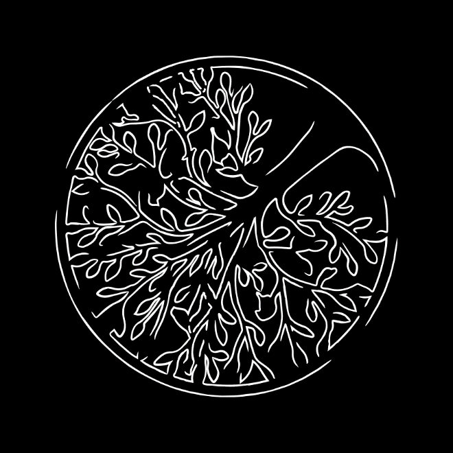
The tree on the compass is where the thumb usually goes and it’s a print of life. The quest was to solve a riddle before getting into one of the main boss fights in order to be able to defeat it. The boss’s backstory influenced the textures on the paper and how it’s displayed.
Tips While Texturing
Try to break the procedural look by hand painting details. Like that, you will give your prop a unique look and have more freedom with the details. If you use a mask builder or editor, paint over it to break the curvature continuous lines and AO. Hand painting details is one crucial step in texturing. It breaks the look of proceduralism and adds so much to the project. You can exaggerate damage, shadows, highlights, and add more with your brush that you will never get with procedurals.
There is so much to learn about Substance 3D Painter. It is a very powerful software! You can add filters and play with a gradient to get different results, you can import brushes and use them for adding Height details, and you can do more and more stuff that will blow your mind every time you experiment around.
It is best to relax the eyes every now and then to make sure your eyes do not get used to your work. As an artist, sometimes your eyes will get used to what they are seeing, and you start not seeing mistakes, missing critical details, or not noticing what is there to improve. That is why it is always essential to have a second pair of eyes to critique your work.
During my intermediate-term at Think Tank, Sergei Panin, an environment artist at remedy, was my supervisor. He supervised my work and guided me throughout the entire process. He is a fantastic artist with great experiences, and I learned a lot from him.
Rendering
I used Marmoset in rendering. It is one of the best tools for rendering and baking and gives you a lot of freedom and options. I imported my finalised geo into Marmoset as FBX and the textures from Substance 3D Painter. Then I created materials in Marmoset and added the normal map, albedo, roughness, metallic, and occlusion maps.
When importing the normal map, make sure to flip Y, so you don't get inverted normals. First thing after applying the textures, I placed the lighting the way I wanted it to be, added a sky, and changed the backdrop to colour to make sure the focus is only on the prop. Then, I looked at the rendering settings and experimented with the settings to get the preferable rendering results. I enabled ray tracing, experimented with the diffuse intensity, shadow quality, and occlusion. Then, I selected the camera and started adjusting the lens and post effects. Under Lens, I adjusted the Barrel/pincushion and chromatic aberration, and under post-effect, I adjusted the exposure, contrast, saturation, sharpen, bloom, and sharpen.