Spakenburg Shipyard: A Real-Time Environment Showcase
In this article, Guillermo Rodríguez Benavides, takes us through his latest challenge of creating a purely realistic daytime exterior scene based on a real-life location.
In this article, Guillermo Rodríguez Benavides, takes us through his latest challenge of creating a purely realistic daytime exterior scene based on a real-life location.
Guillermo Rodríguez Benavides, hailing from Madrid, Spain, is 3D Environment & Prop Artist. Guillermo specialises in the productions of 3D scenes in Unreal Engine and Unity, as well as the creation of realistic, high quality video game assets.
In this article, Voxel School alumnus, Guillermo, takes us through his latest challenge of creating a purely realistic daytime exterior scene based on a real-life location.
This has been an extremely challenging and demanding but super fun project to work on. Up until this point, my work was pretty much focused on night scenes and/or very colourful neon-like environments; generally mixing mild stylisation with realism.
For this project, I wanted to challenge myself and make a purely realistic daytime exterior scene based on a real-life location with some touches and interpretations of my own.


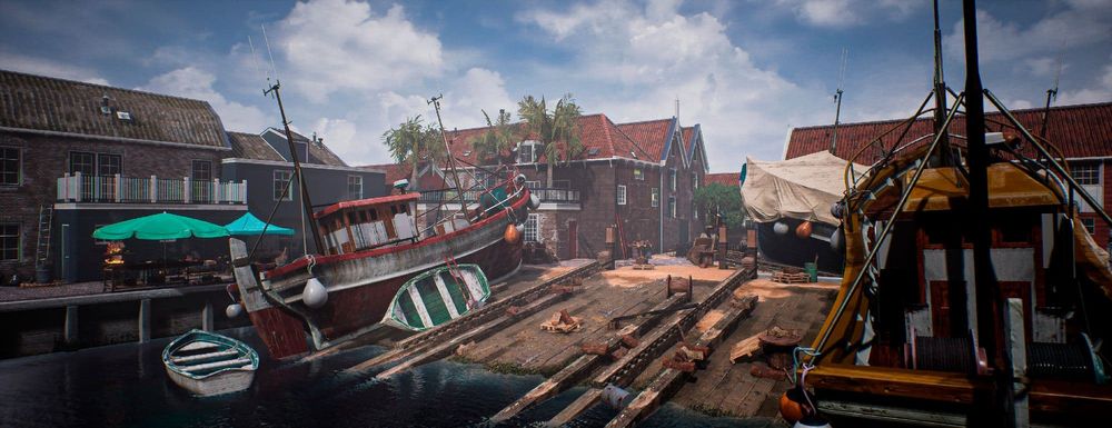
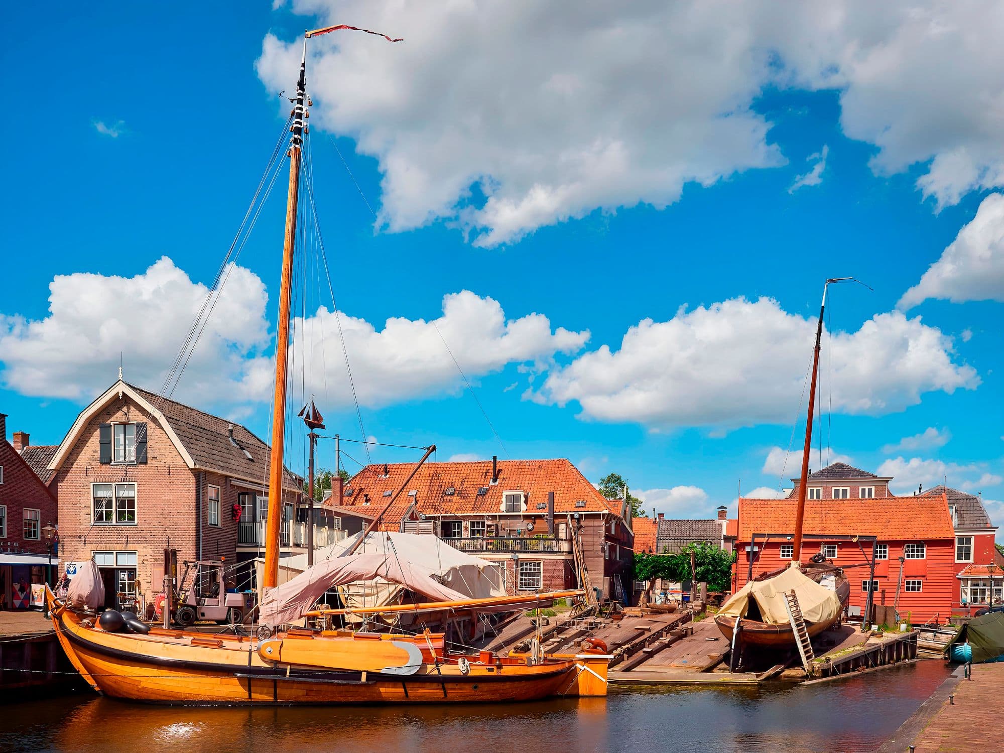
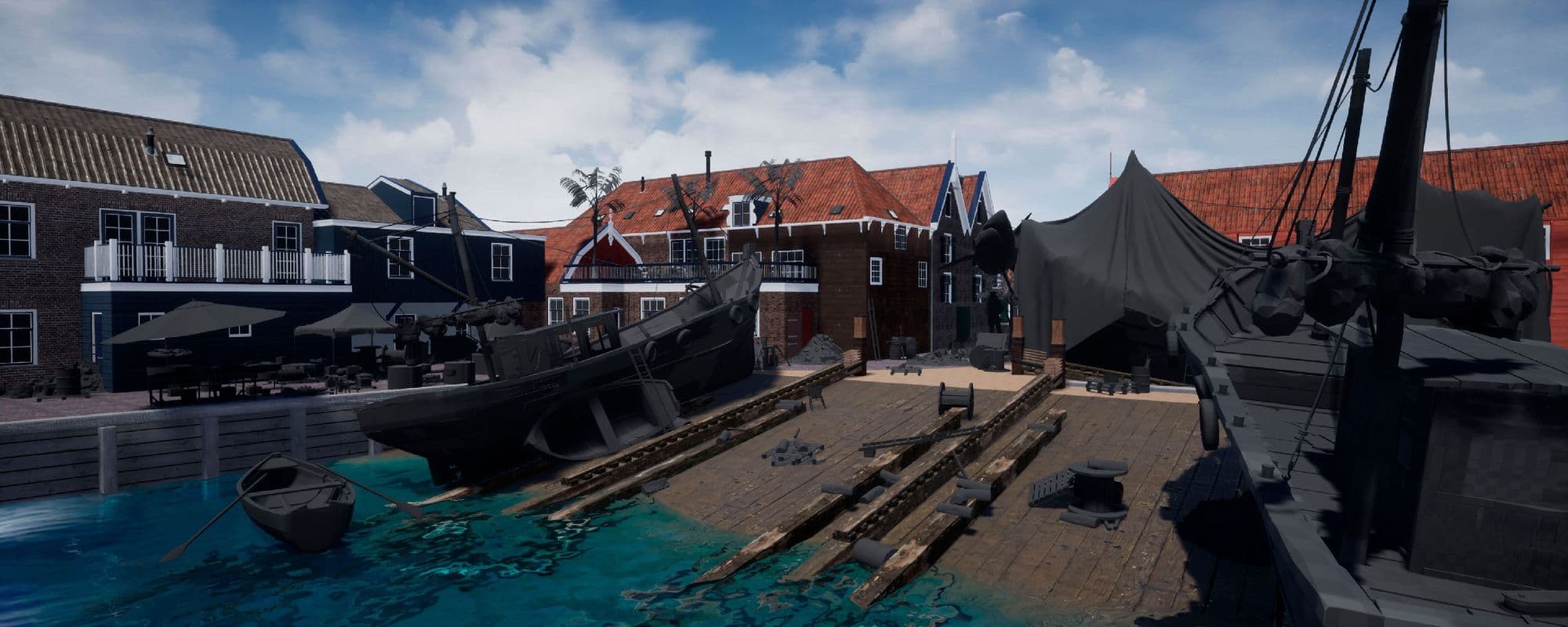
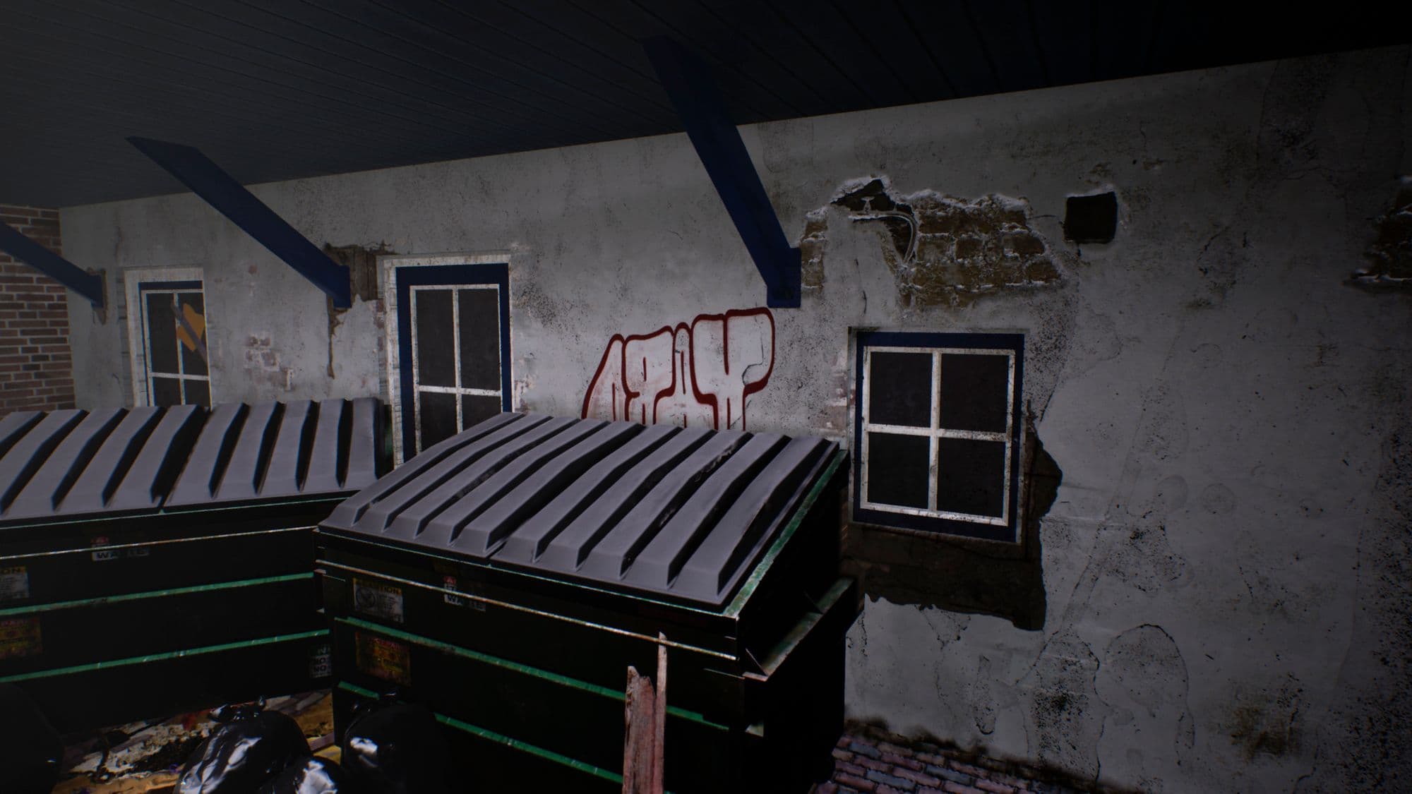
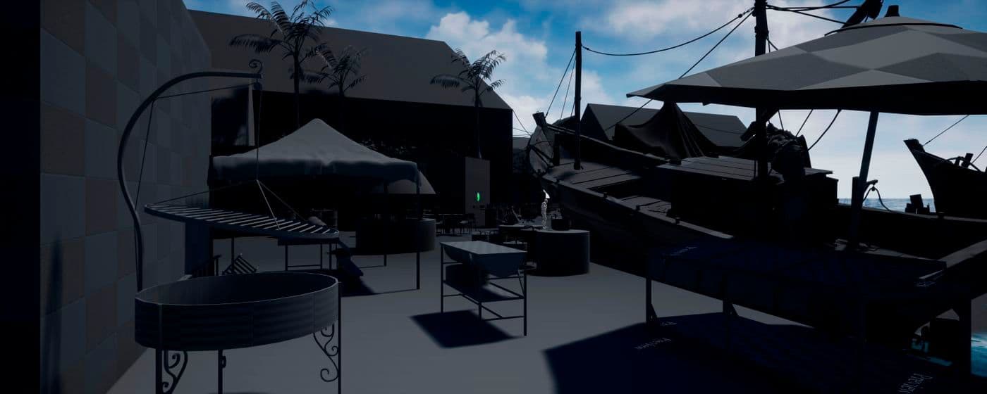
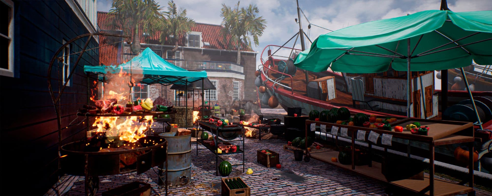
I was certain I wanted to make a maritime-themed scene, so I searched for harbours, fishing villages and anything related, but nothing really caught my attention until I found the Botterwerf graving dock - an old but sturdy and still very active shipyard located in the Dutch village of Spakenburg with a long history which dates as far back as 1750.
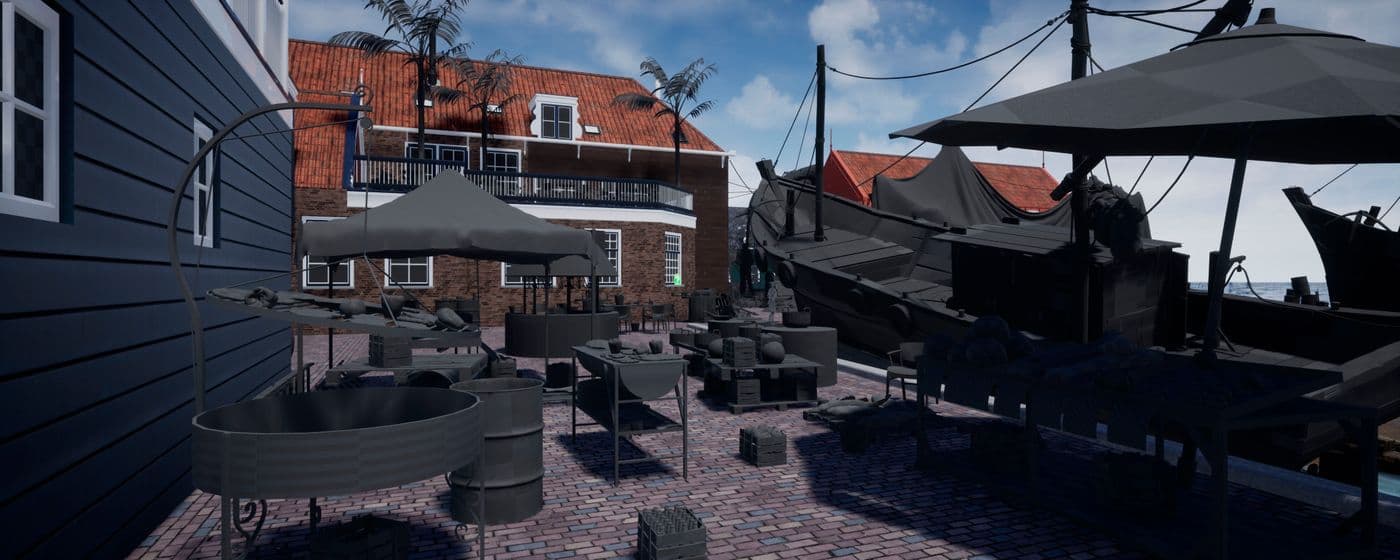
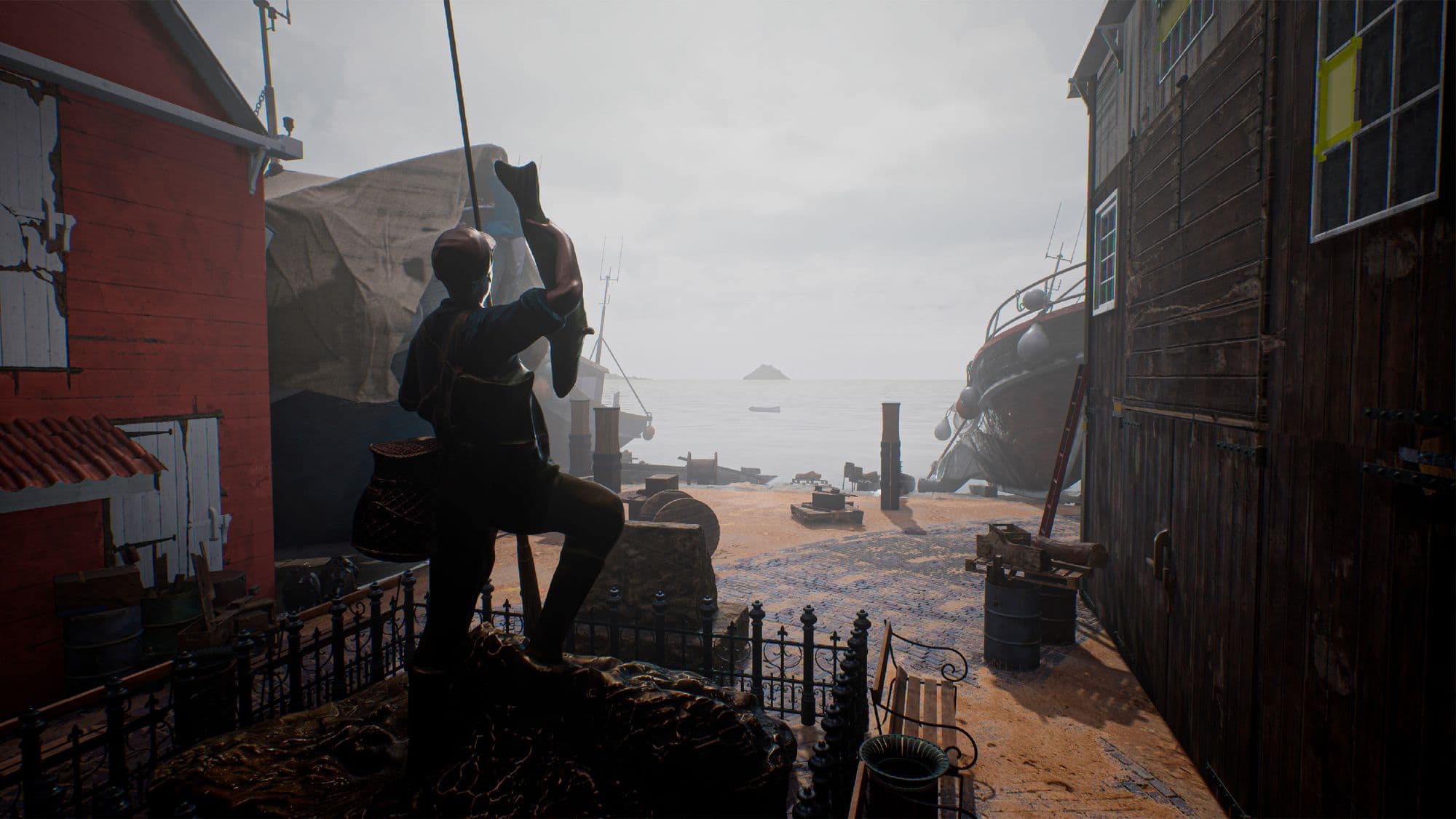
I’ve taken the creative liberty of furthering the already massive location by adding a local food market and a small park with its very own commemorative fisherman statue.
As I always do when taking on a new project, I started by studying the history of the location, learning any and all detail that might come in handy later down the line, recompiling as many pictures as possible and maybe the most important and yet simple action imaginable; looking, observing, being able to truly know the location.
Even if you have all the reference in the world, you need to familiarise yourself with the subject you want to portray.
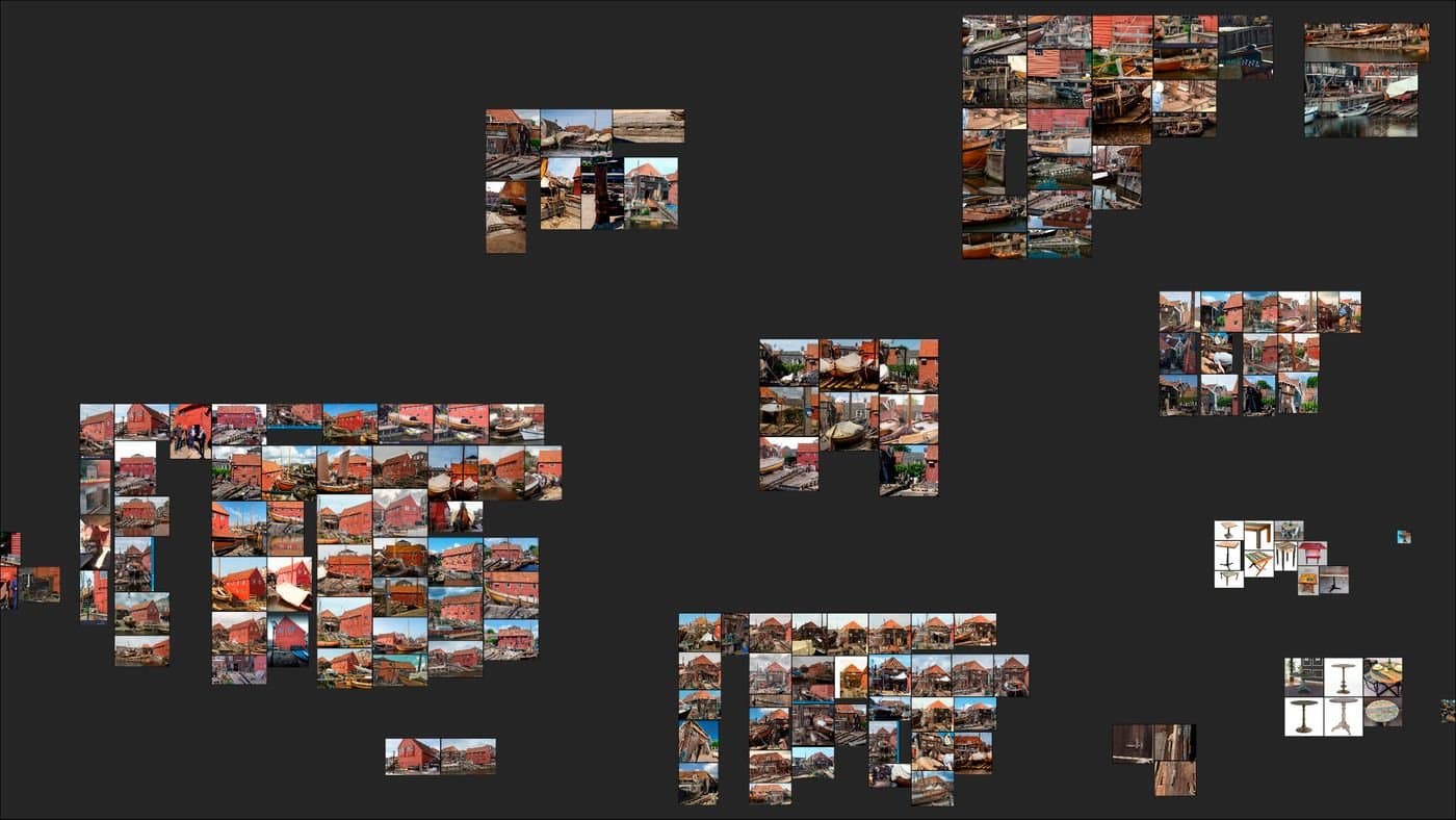
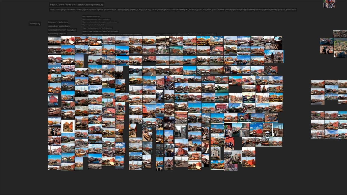
The way I went about compiling images was by dividing the location into zones, taking each building as a landmark and including its surrounded area. In layman's terms, I started big, searching for the location as a whole, then I went smaller and smaller little by little, first smaller areas, then architectonical features and finally fine details like textures or objects.
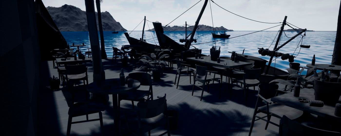
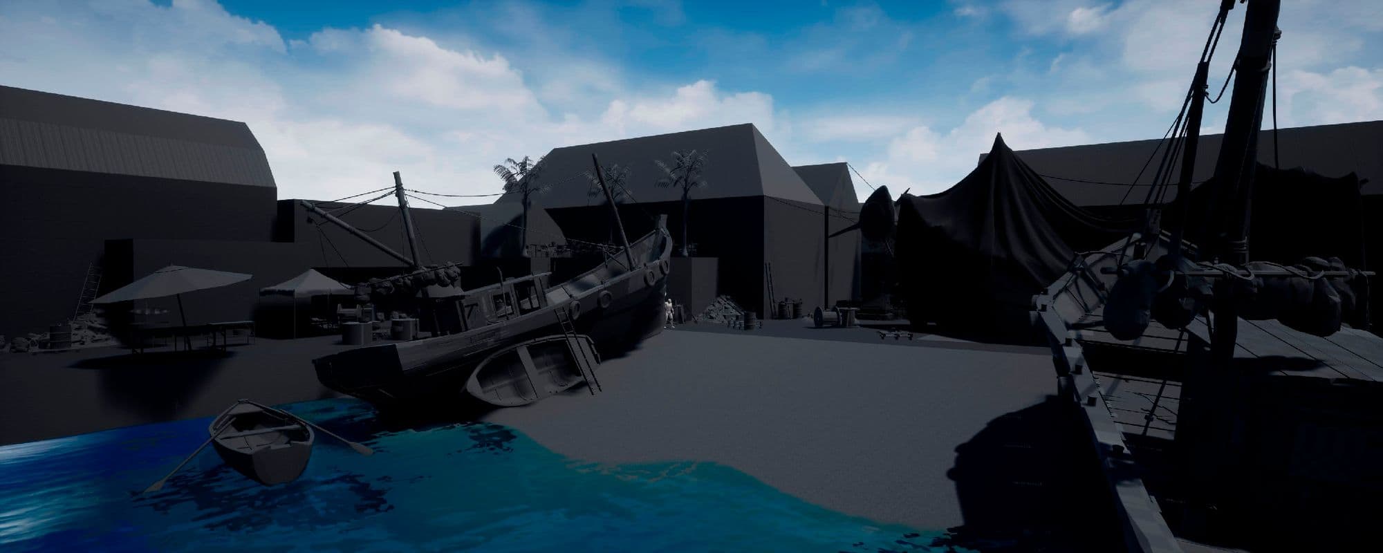
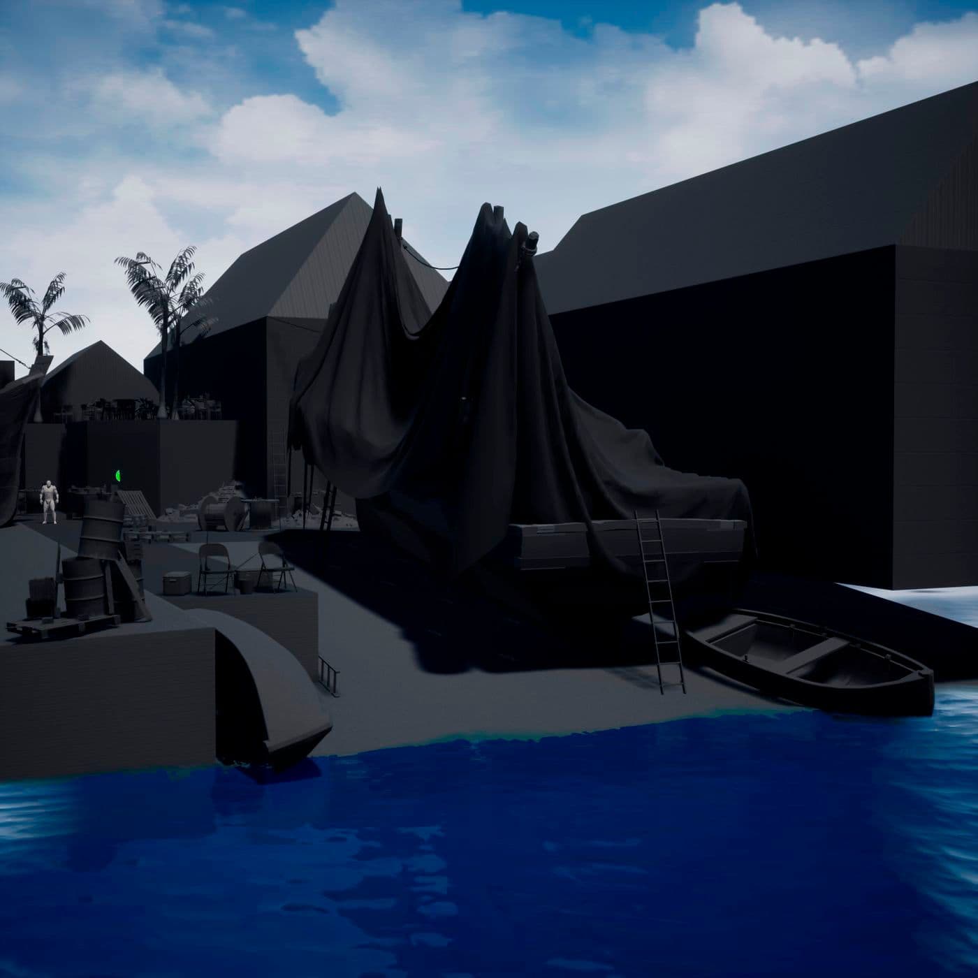
Once I felt I was knowledgeable enough of the location and backed by enough reference, I started blocking out the scene with very basic geometry and the help of both public and self-made placeholder models.
Looking back at it now, this might have very well been the phase with the most back and forth and fine-tuning of the whole project. I was engrossed in getting the perfect proportions and the most compelling composition possible, something I didn't really pay much attention to in previous environment projects, where my focus was on making all the assets and then putting together a scene with them. This time, things were different; my main concern and compromise were with the shots, everything needed to work by, and for the camera, they couldn't be separate entities.
It is essential to take as much time as you can to invest in this part of the process. The more you define and narrow down your scene and everything within it, the better results you will get. If you are not satisfied with how your environment looks this early on, chances are you won't be once the project is finished.
It doesn't matter how much coat of paint you put on, if the composition isn't appealing, the result will suffer.
I spent approximately a month just playing with different compositions and camera shots; each project is unique, and you will not always have that much time to compose your scene but try to make the most of what you have.


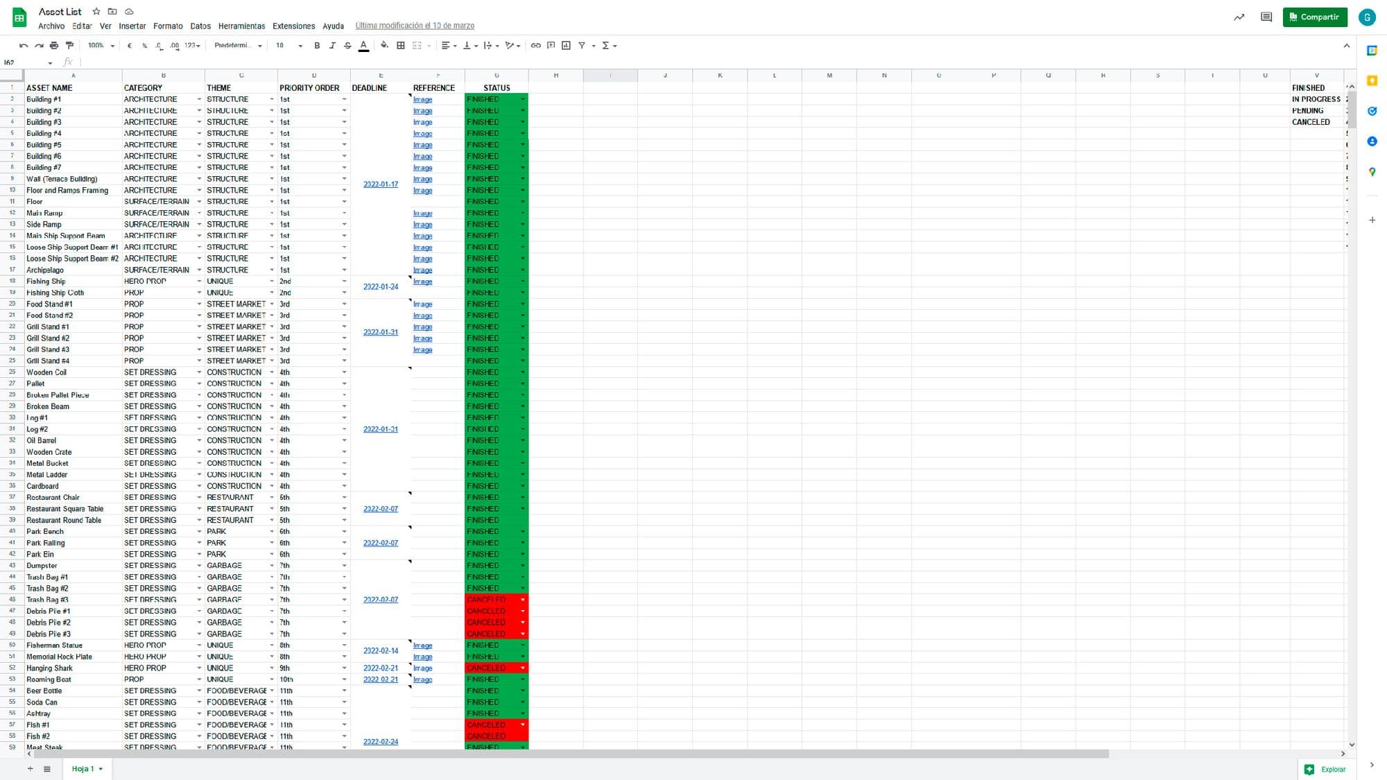
Once my gray boxing was set and done, I was exhilarated and eager to begin modeling and texturing to truly bring the scene to life. There was only one more thing left to do before getting to work: making an asset list. I had over 70 models to make (62 after some deliberation) and time wasn't on my side, so, if I wanted to finish the project, I needed to track down what exactly need to be done each week, without delays or mistakes.
Organising yourself and tracking down everything you need to get done is crucial. You might think you have everything listed in your head, but you don't, which may cost you valuable time.
An asset list will not only help you to have a clear picture of what needs to be achieved, but it will also make it easy to keep momentum and work efficiently.
It's easy to get lost in an endless concept with no apparent limits which can lead to procrastination and ultimately can result in the abandonment of the project as a whole. So, define what needs to be made, by what deadline and get started.
Once the list was finished, I started by modeling and texturing all the major architectural elements of the scene, those mainly being buildings, floors, ramps and the like.
Due to their scale, this first model was tiled on its own UVs, rather than during the texturing process to guarantee the highest fidelity texture quality possible. In other words, each of these assets' textures expands across multiple texture sets, which meant that I couldn't possibly texture them in a traditional fashion, but more about this later.
The textures used in these architectural assets are modified versions of Quixel Megascans materials since I was very particular about my colour palette, not only tone-wise, but regarding values as well. I tweaked every possible aspect of these materials until I was satisfied with them, both on their own and as a whole.
These texture modifications were made primarily in Adobe Photoshop using the Raw Camera Filter, especially regarding base colour and roughness adjustments. However, other corrections were performed in Adobe Substance 3D Painter and Substance 3D Designer, particularly those related to height and normal maps.
As I mentioned before, the architectural models UVs expanded across various texture sets which would prevent me from recurring to traditional texturing workflows in software tools like Substance Painter. This was, of course, intentional, as my plan was to set up a vertex painting system within Unreal Engine 4 to texture these massive models. Not only would this technique offer me a higher resolution on my models, but it would also mean that I wouldn't need to switch back and forth between the game engine and the texturing software whenever I needed to make some changes. Instead, I could simply tweak and look and the result right then and there.
But before we configure our vertex painting set-up, there's one more thing we need to do, and that is subdividing our geometry. Why so? Well, as the name may suggest, for the vertex painting to work as intended, we need a sufficient amount of geometry within our models, otherwise, we won't see the results. This is because the vertex painting technique relies not only on the asset UVs, but it's vertices; the more vertices our model haves, the more precision we will get when texturing the assets.
There are two things to keep in mind when subdividing our models. The first one, and perhaps the most important, is keeping a clean and uniform geometry. You want control over your texture work, and having an irregular geometry might prevent you from achieving it. The second one is knowing when enough geometry is enough; unless you want to paint every crack and corner to a tee, you don't need to subdivide your model times infinity.
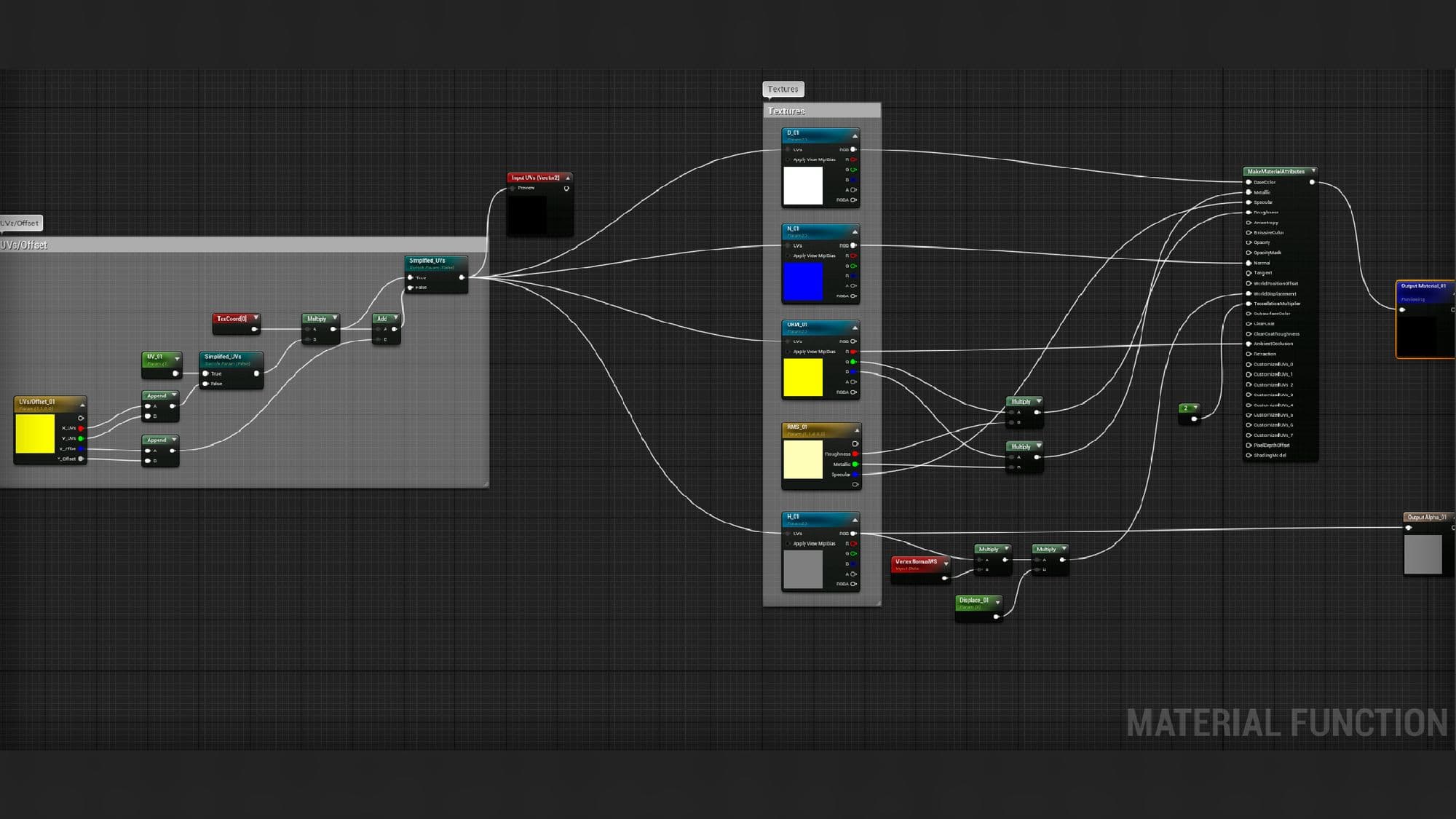
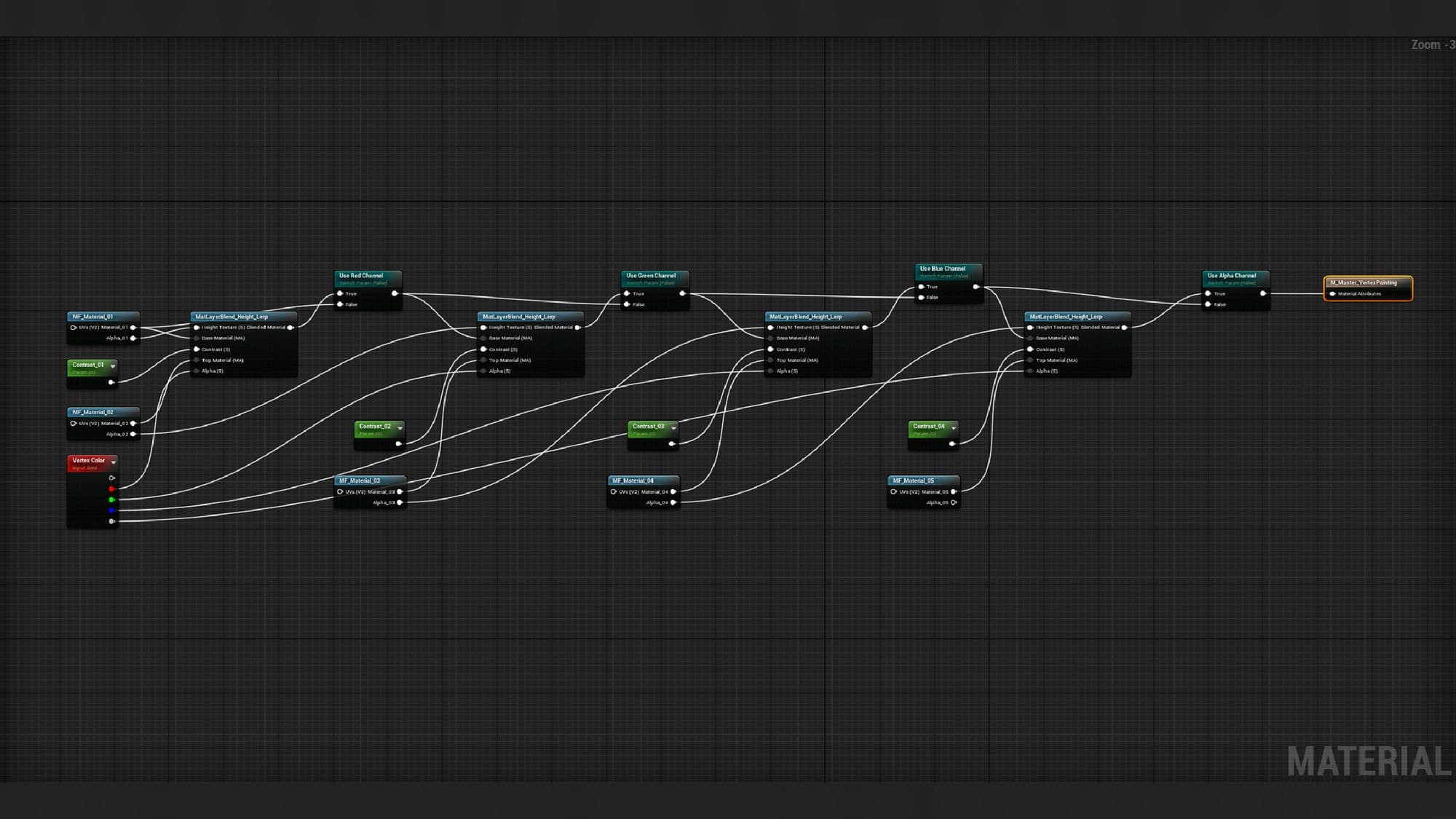
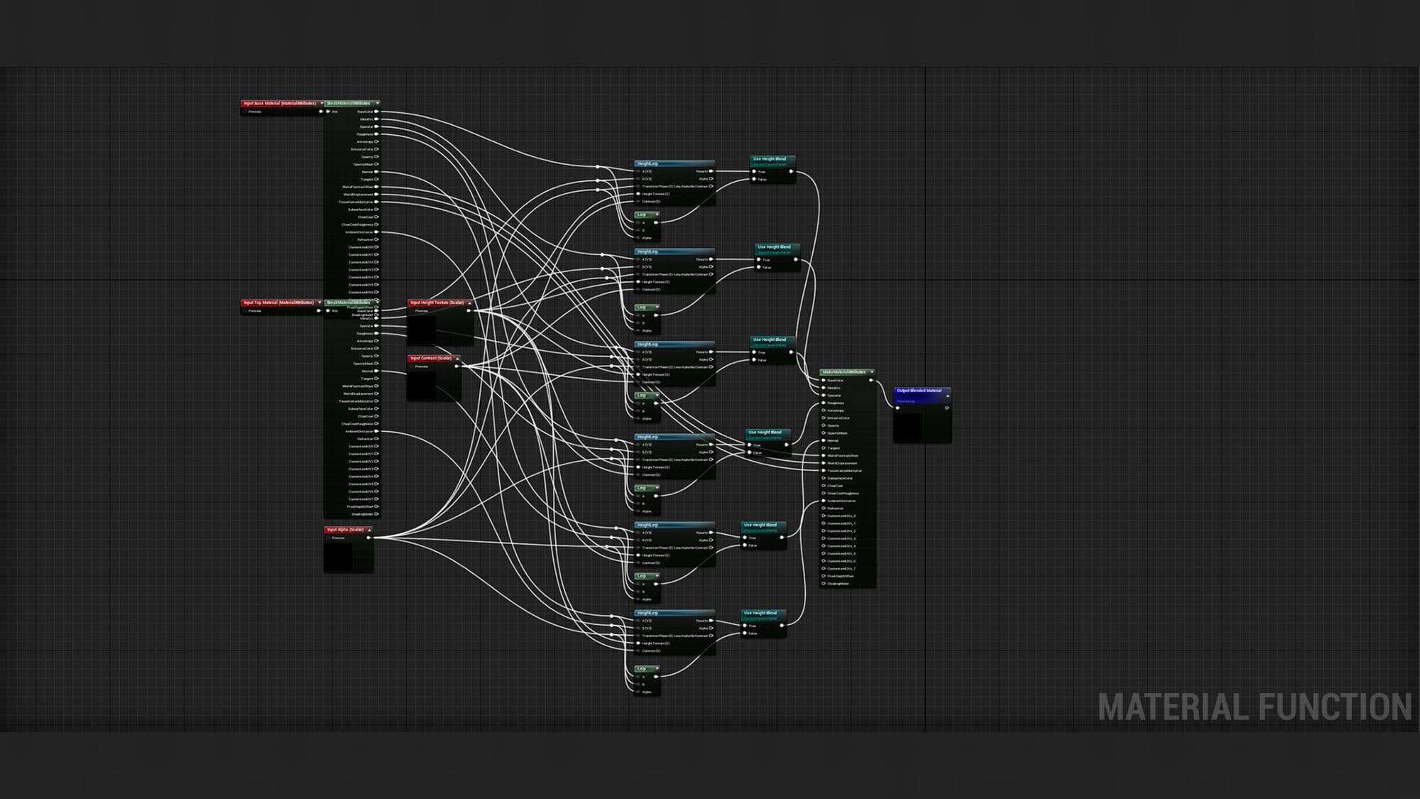
Not only does this technique offers us a higher resolution for our models, it also takes away the hustle of switching back and forth between the game engine and the texturing software whenever we need to make any modification. Instead, we can simply tweak and look and the result right then and there.
We can also take advantage of the combined force of tessellation and height maps to give our assets additional volume. A clear example of this technique present in the scene would be the use of a subdivided plane and the consequent application of a displacement map to get a roof tiled shape. This way, we can avoid modeling and placing every single slate.
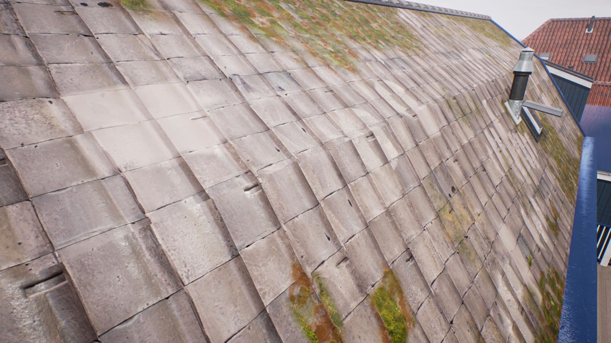
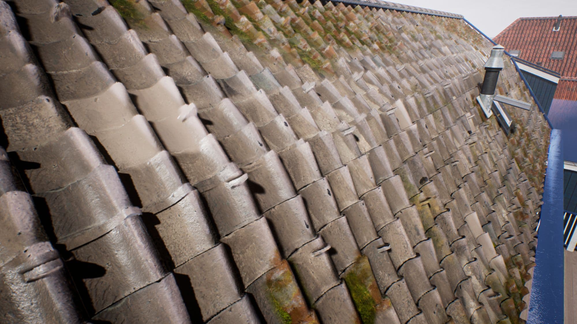
It's a good practice to combine height maps with models to give a more robust perception of depth and shape; for example, when making a brick wall, don't limit yourself to the texture work; place a few modeled bricks, see how the illusion of realism gets more grounded.
Another factor to consider when texturing is the intersection between assets with each other and the floor below them. For example, when working with a building and the surface it rests upon, you may want to consider adding grime, mud or mold to its intersection to make it feel like both elements collide and interact with each other rather than merely being there; it helps to make things more believable.
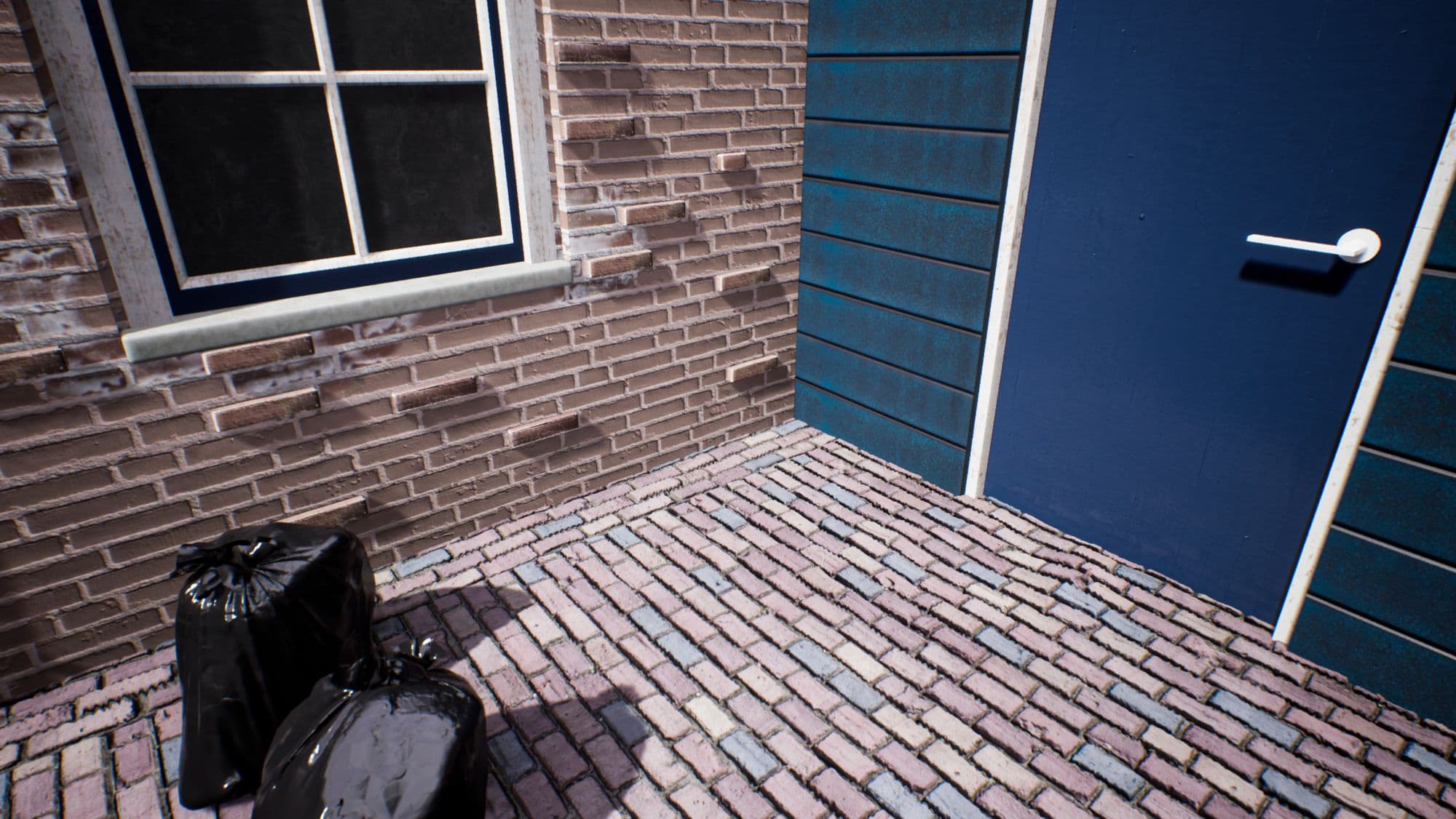
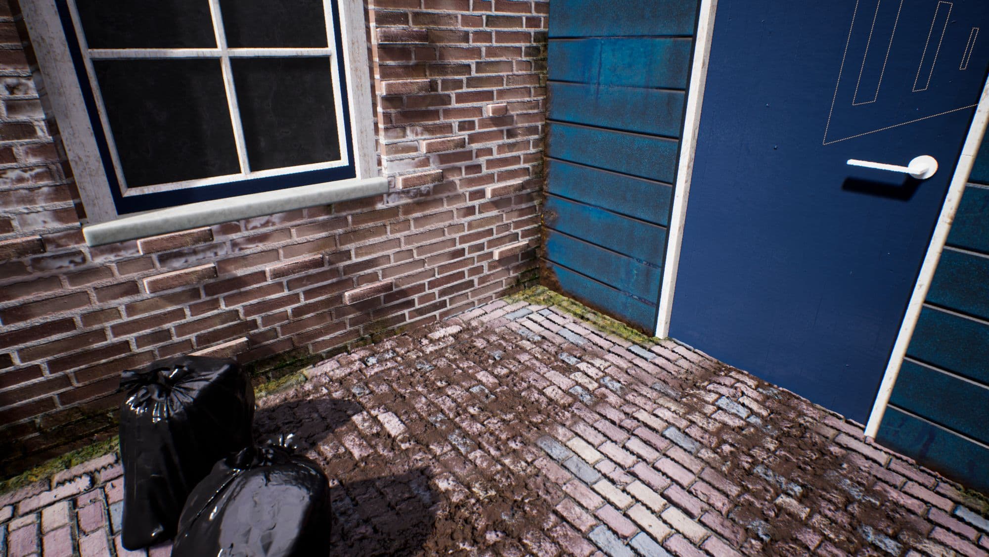
Another thing we can do to enrich the texture work further and break repetition is using decals. Think of decals as a real-life sticker but with the added benefit of utilising normals, diffuse colour, roughness properties, and any other map we deem fit.
In this case, I recurred to the Quixel Megascans decals and modified them by hand to better suit the colour palette and blend more harmonically in the scene.
Vertex painting and decals work beautifully together, so don't be afraid of experimenting with different combinations and see how you can make your scene feel more alive.
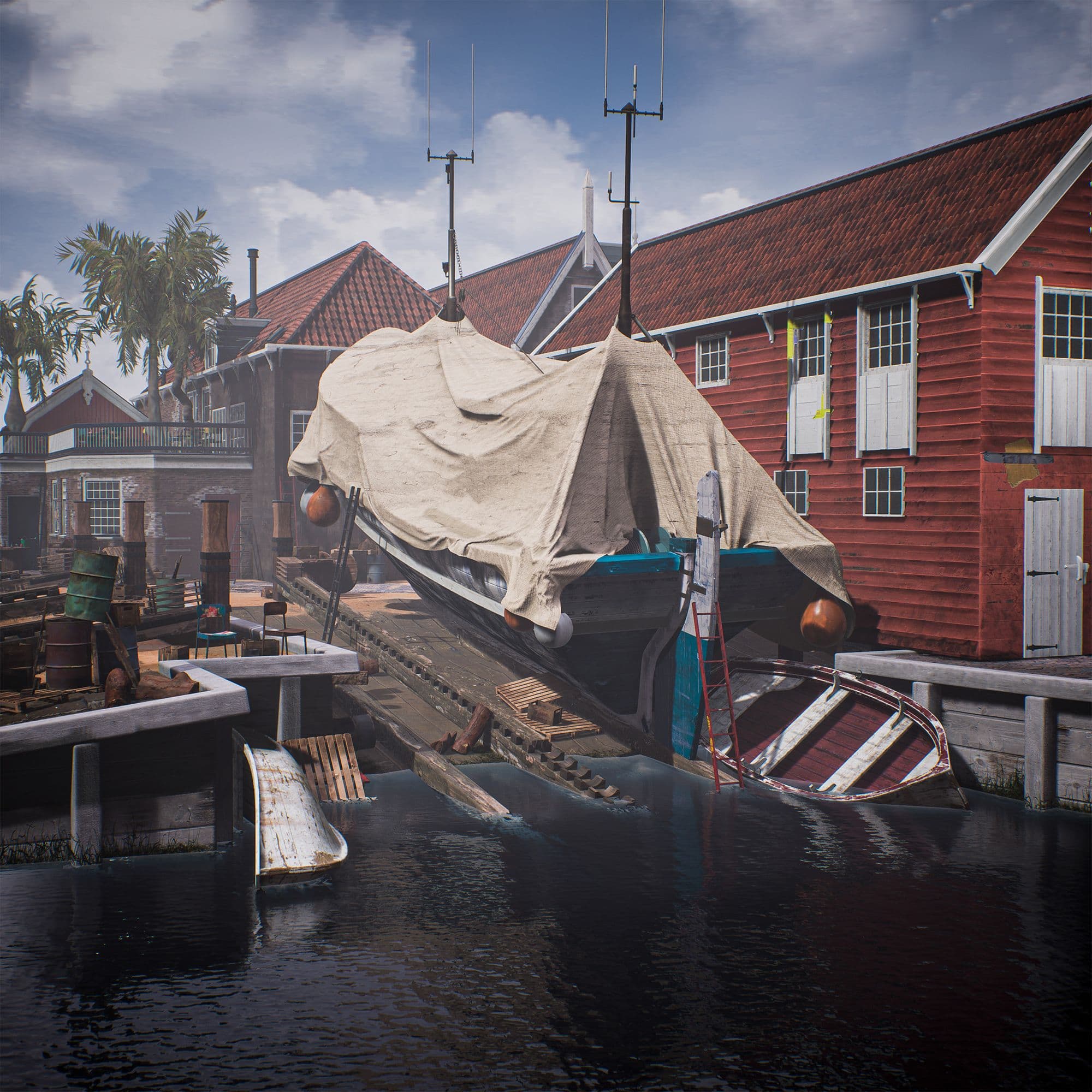
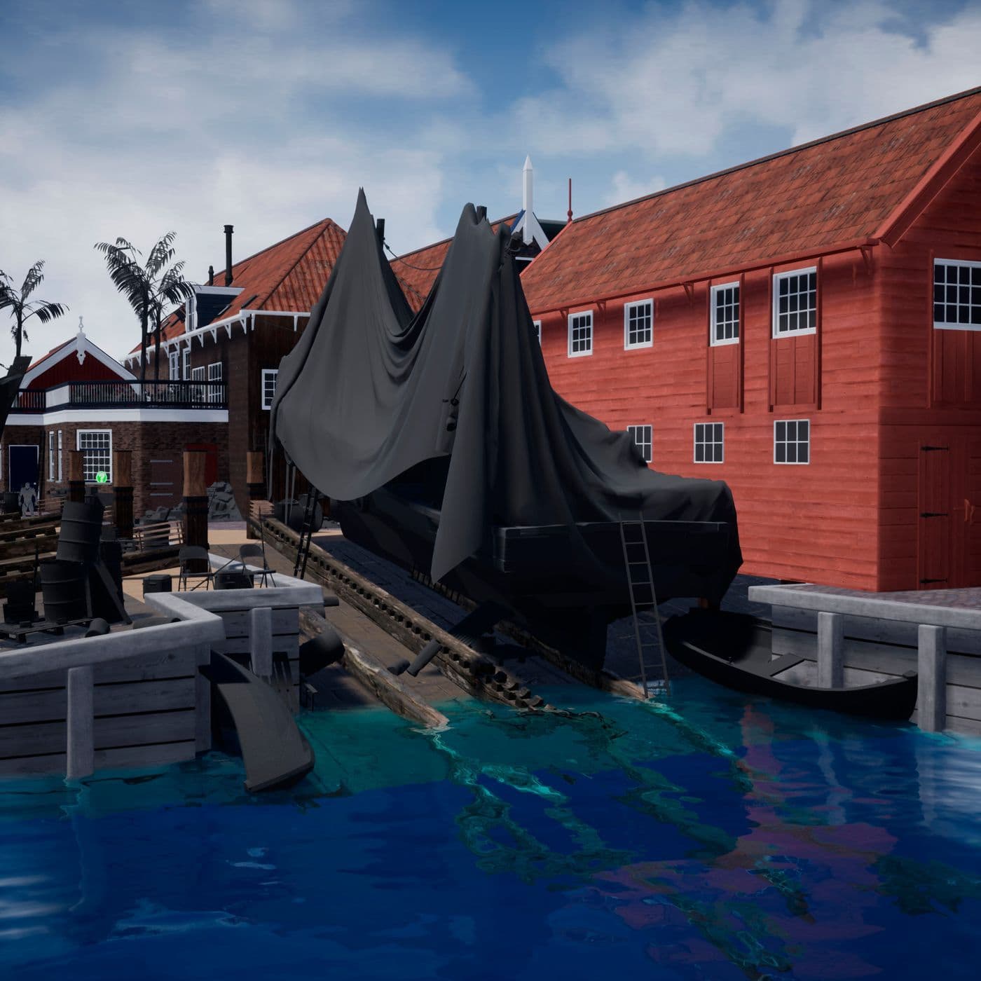
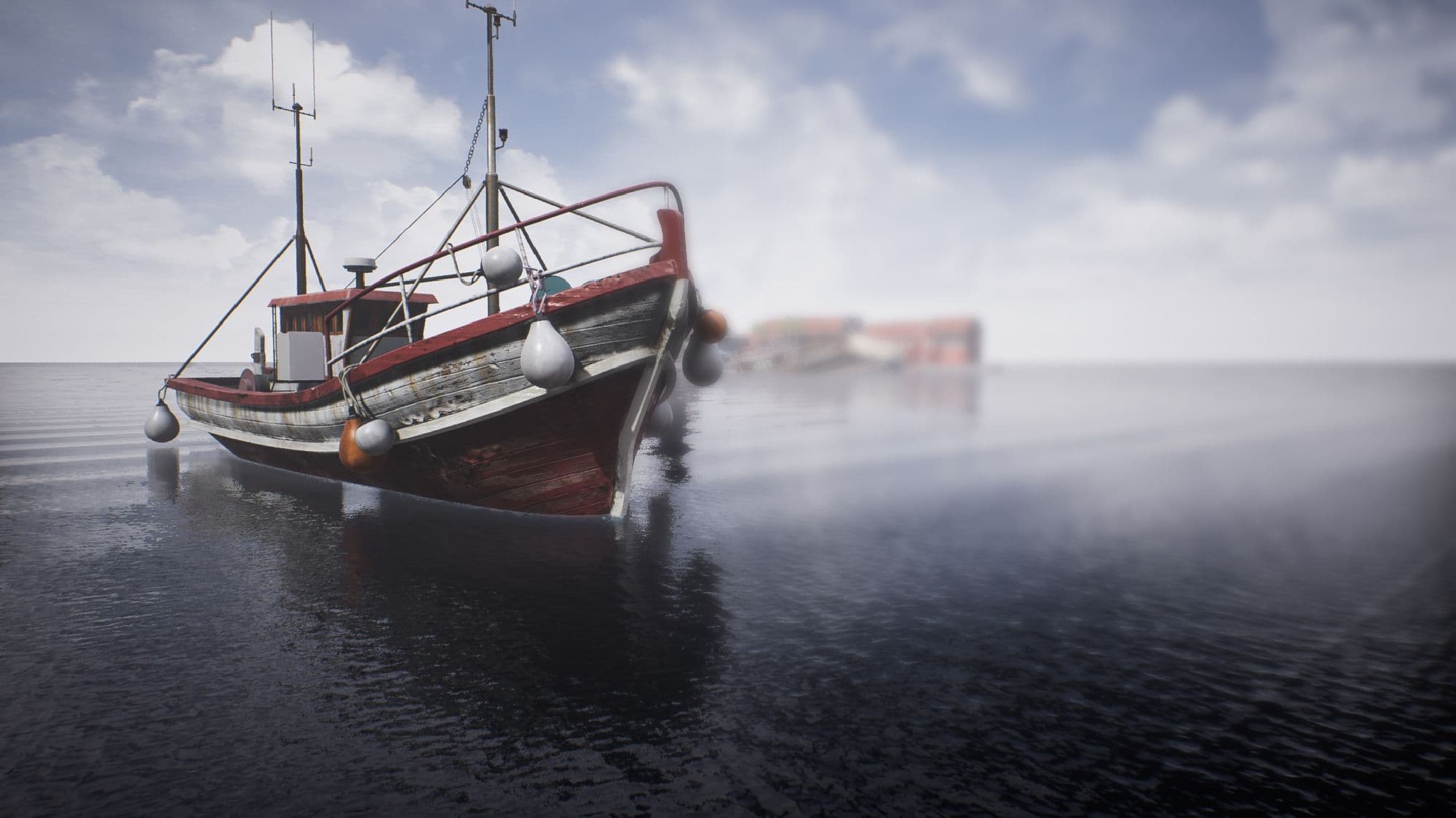
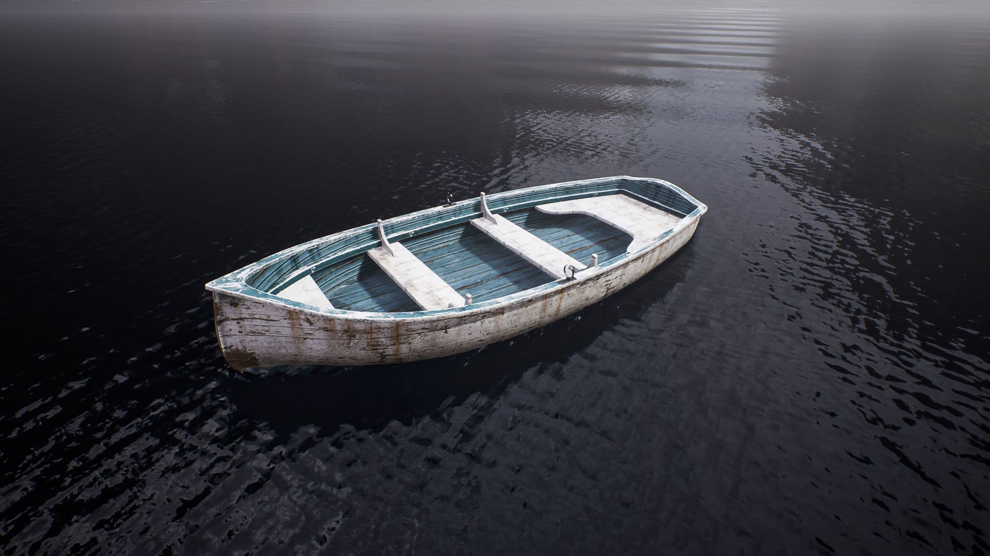
The way I went about modeling the main body, frame and floor of the ship and the smaller boat was by working with a low poly model of the asset and a high poly one simultaneously.
Let me explain. By using the modifier stack of 3ds Max, I could have the bare minimum poly count version of the ship in a lower layer while having a subdivided and well-defined arrangement in the upper parts of the stack. This meant that I could adjust the shape and length of the boat easily without having to deal with an exhausting amount of geometry.
A very useful modifier used in this part of the process was the FFD Box Modifier, which let me project a square-shaped box with as many vertices as I needed, so that instead of modifying the wireframe directly, I could work on this overlayed box and get a smoother result. Once I was satisfied with the result, I proceeded to clean up the geometry to decrease the high geometry resulting from subdividing the mesh.
The overall intention of this technique is to maintain greater control over the shape while also getting cleaner curvatures.
I also UV'd and unwrapped these more significant parts of the boat on the lower poly count model to have greater control in exchange for the minimum texture deformation.
The remaining parts of the ship, those being masts, the captain's cabin or the buoys, to name a few, were modeled more traditionally and straightforwardly since the shapes were not troublesome enough to merit the use of this technique.
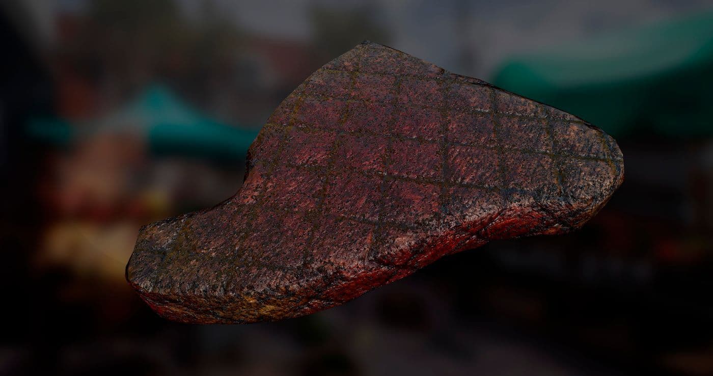
One of the complications that occurred while texturing these assets was adjusting the flow of the planks to the curvature of the ship; since the UVs weren't arranged in a way that allowed this naturally, I recurred the use of warp projection inside Substance Painter, which allowed me to change the texture flow via the use of vertices.
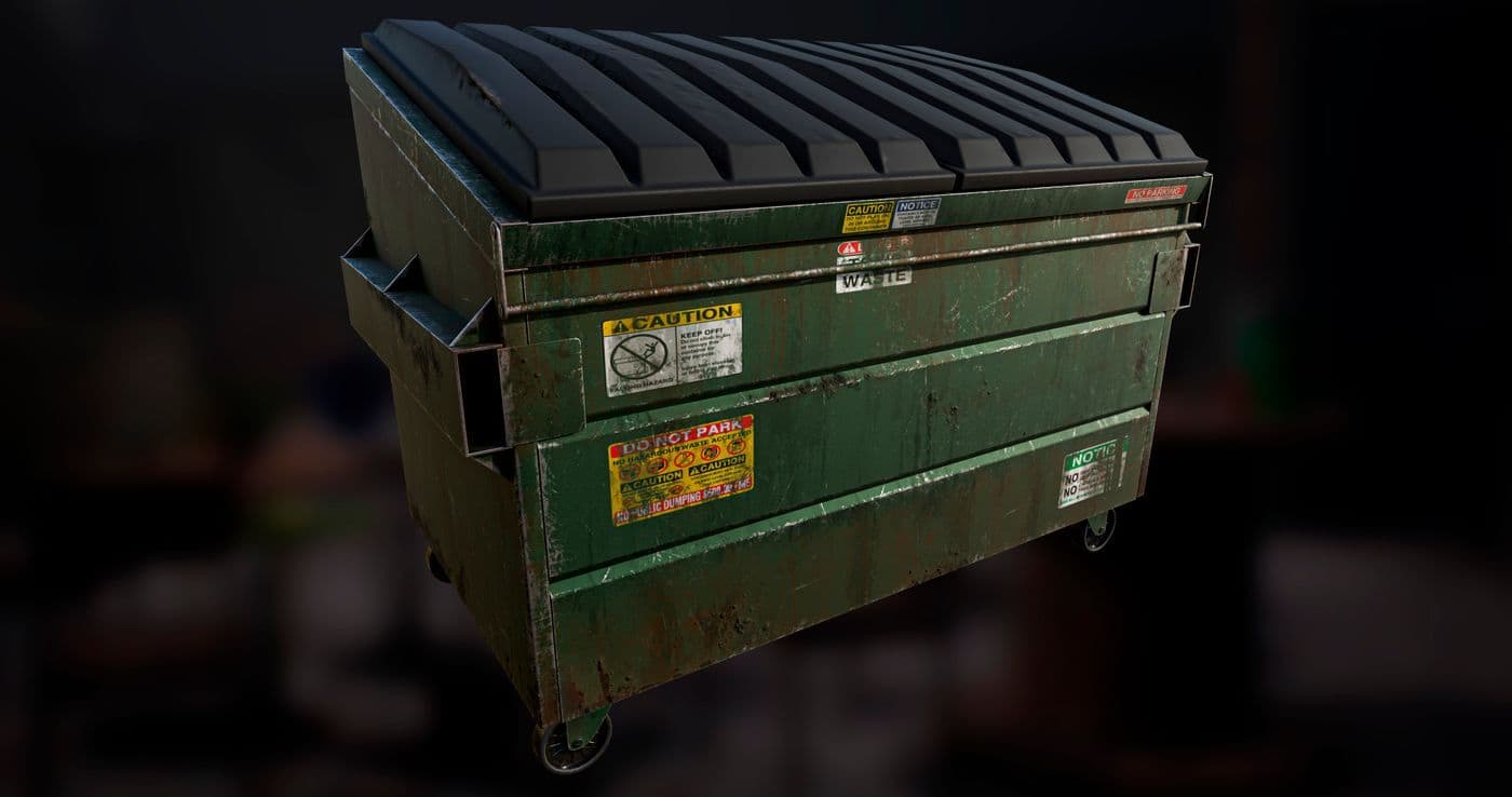
Once the large assets were modeled and textured, I began working on the rest of the assets, small and medium-size props. I left aside the employment of multiple UV sets and transitioned to using one tile UVs and texture in Substance Painter.
As I had previously divided my models into batches with established deadlines, it was a matter of working as fast and efficiently as possible.
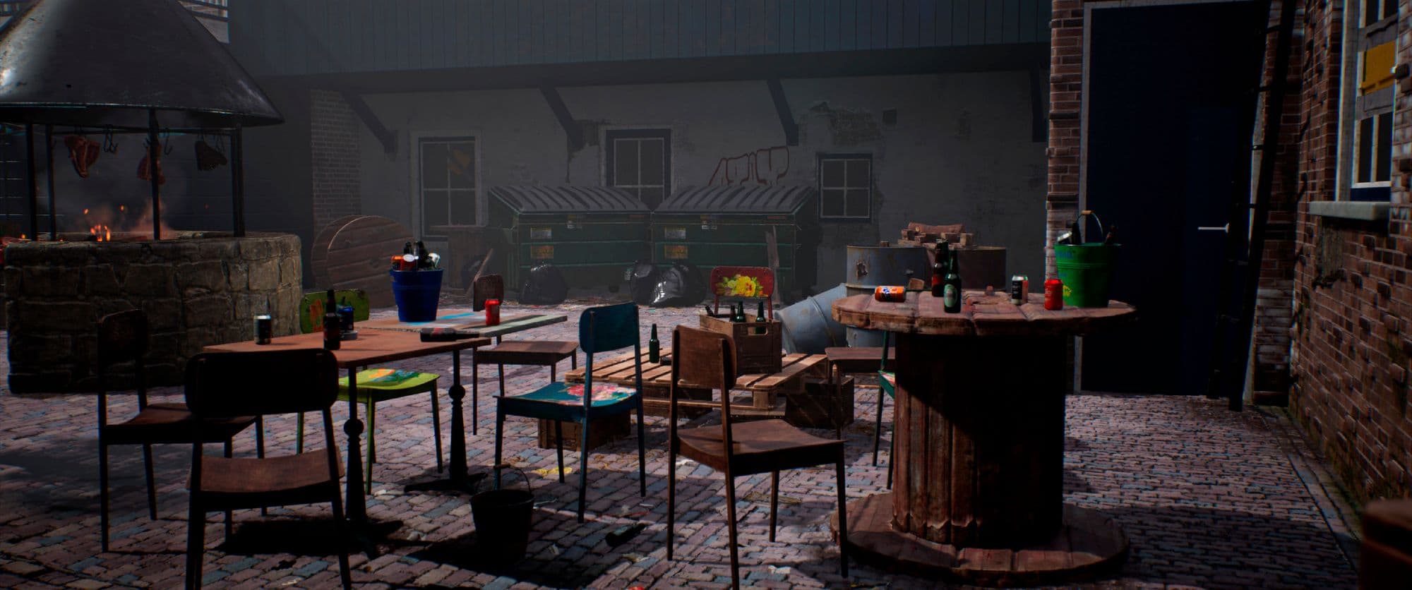
When making a big scene with many props, one thing to remember is how vital and how much presence these props have in the grand scheme of things, and the scope and amount of detail we deliver. It's always essential to provide the best quality asset possible. Still, there are deadlines, and some assets may have more importance than others, so work smarter, not harder; if a prop is not going to appear in the foreground but rather at the very back of our scene, give it the necessary detail without overdoing it, it's crucial to manage our time efficiently.
Also, don't forget to consider the state of the prop you are going to make - take into account how old that asset is, where it has been or is currently, how its surroundings are, and how the weather affects them, among other inquiries. The more in-depth you go with this questioning, the more coherent your texturing and your scene will appear.
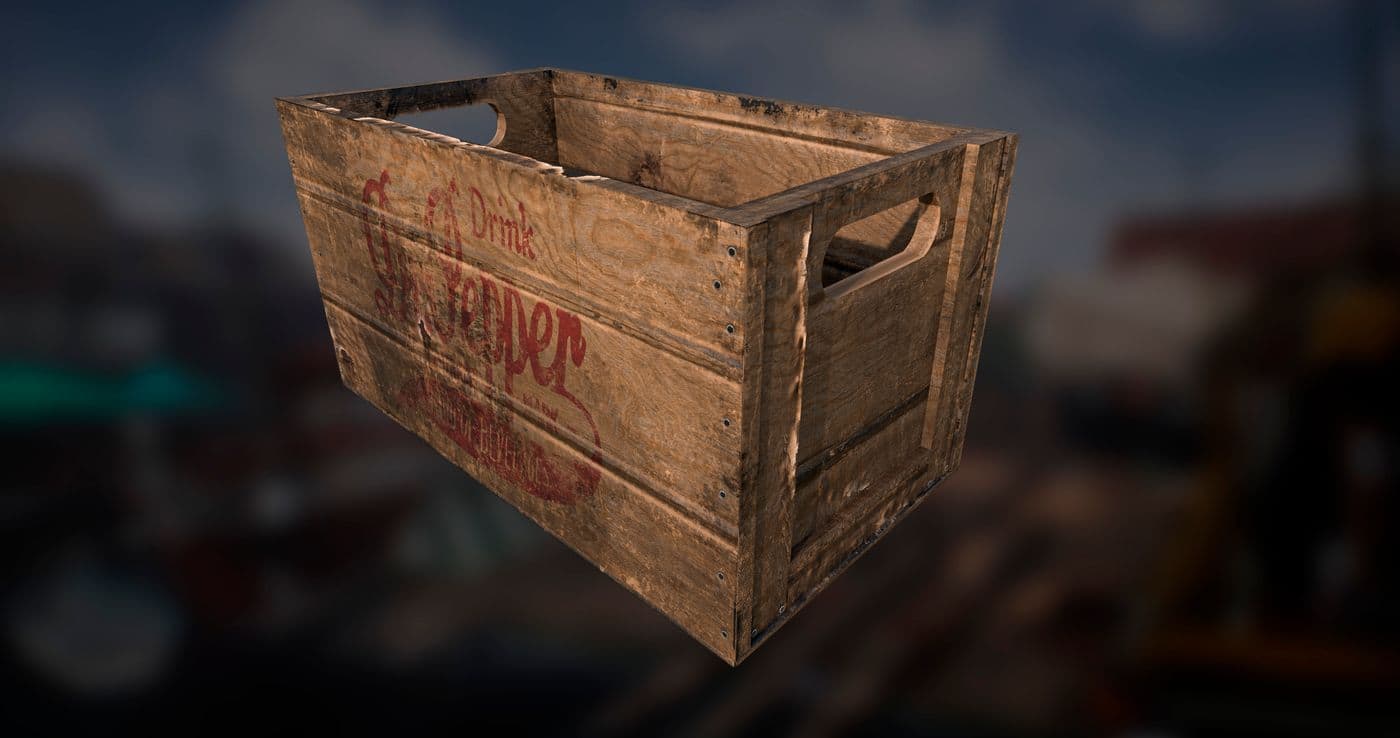
For props that would end up scattered multiple times across the scene, I made a minimum of 3 and an average of 5 texture variations for every model, this way I could avoid repetition and give the scene a more natural feeling. Colour swaps are also a good and quick way of breaking repetition in your scene.
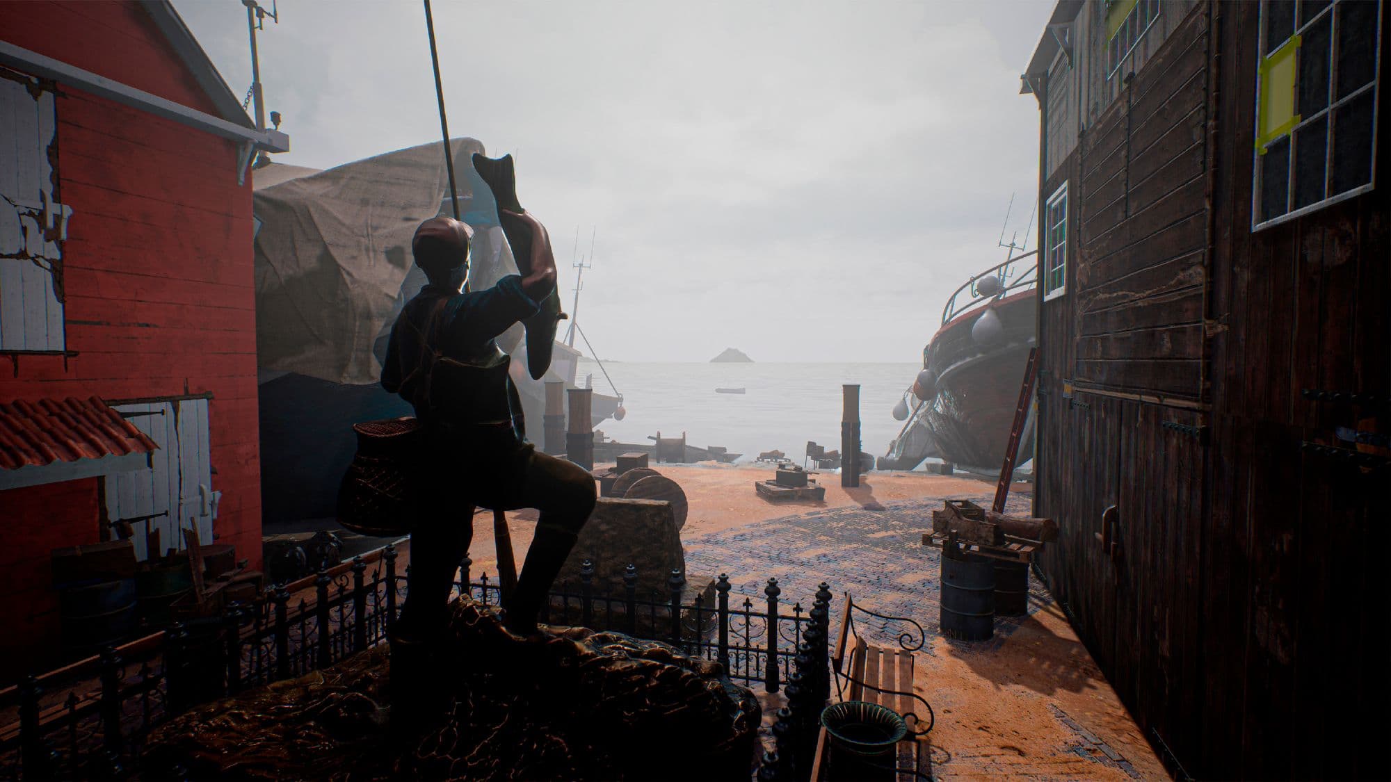
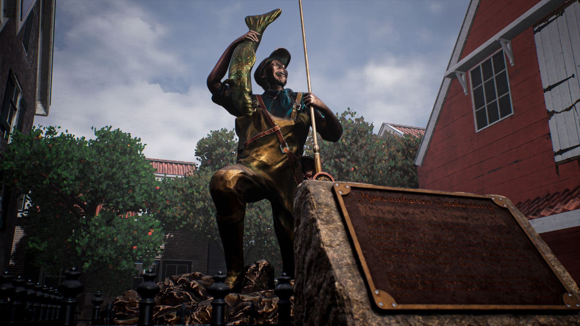
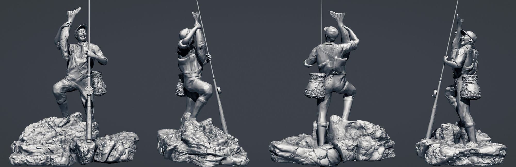
One of the things I had the most fun with during the making of the environment was creating The Fisherman statue. I wanted to make someone who you could look at and feel the soul of the Spakenburg shipyard; an embodiment of an old place with a large history and many stories to tell, someone who's proud and happy of their roots and what they have achieved.
As I had previously found a reference I was in love with, I gave it a twist and made my own version of it.
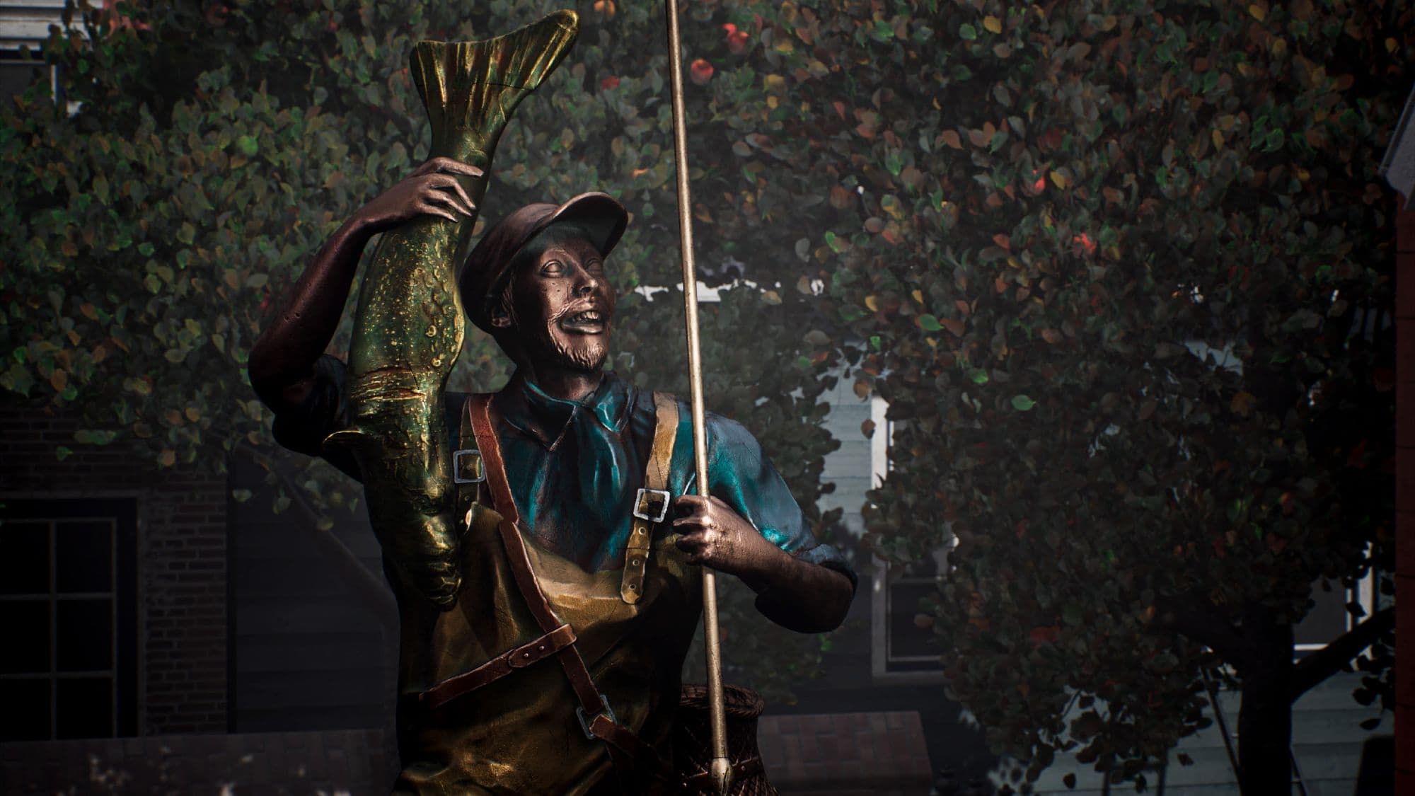
I started by blocking and posing the body in ZBrush; when working on this stage, it's crucial to get the body language and posture right, don't rush it, or you will get stuck with an uninteresting and maybe even anatomically incorrect pose. Take your time; if you fail during this first step, you can define every cloth wrinkle and face muscle with surgical precision and it won't matter since the viewer will be appalled first by the wrongs and won't care for the rights you have made.
For the rock, the fisherman is standing on and the hip basket, I used a blend of techniques to get the desired result, mixing hand-sculpting, mapped height maps and alphas.
Getting back to the character, once the posing was done, I started working on the clothing. I began by masking the shapes of the clothes and then converting that masked area into a separate mesh. I made the overalls into one big mesh, boats included, but left the straps and accessories like the cap and the basket as individual meshes.
When detailing things like clothes or muscle, anything really, it's important to start big and then go smaller and precisely. If you get hung up on the small details first, for example, a wrinkle, you might lose focus of what's important at this moment which is making things look right. First, you have to place that wrinkle logically and tastefully. It doesn't matter if you make one big blob, if the feeling is correct, you can always refine it later. What I am describing is a similar principle to the one I have talked about during the posing state.
Up until this point, I've only used the clay buildup brush. It is a very versatile and powerful tool, and it goes to show you don't need to switch between more than a handful of brushes to get your sculpture right. It is still alright to experiment with as many brushes as you feel inclined to, just know that one brush may be helpful for a bunch of tasks. Don't feel obligated to use a new brush for each job.
Once the sculpture was finished, I added micro detail and gave the statue a more roughen-up and rocky feeling. I used the trim dynamic and planar brushes to get harder edges and sharper shifts between faces. It's recommended to work with layers to be selective when tweaking already placed strokes or details and to regulate or erase them.
Lighting your scene can be quite challenging; it's easy to get lost using too many lights or going crazy with the colour palette, getting ourselves in a tonal mess with no apparent rhyme or reason. Still, sometimes, less is more, so try keeping your lighting simple and clean.
For this scene, I started by choosing an HDRI that would fit the atmosphere I was going for, in this case, a not too overtly cloudy overcast. I then set up my directional light and began tweaking different settings without going too extreme with any of the values, especially colour and intensity-wise.
When adjusting the colour of our lighting, it's recommended to use temperature rather than light colour to achieve a more natural and grounded look.
To achieve a more atmospheric result with a slightly denser ambiance, I used volumetric fog and exponential height fog inside Unreal Engine. Both components work magnificently together and can give our environment a huge boost, but it's essential not to overdo it. Unless we want to recreate the looks of a particular horror franchise, it's better to tweak each value carefully and maybe even compromise with a little less fog that we would want to.
If certain parts of your environment are underexposed or pitch black, try placing additional lights to complement your directional light. You can also use this technique to highlight specific details of the assets within your scene. In my case, I used point lights to show more details on the statue's face.
It's vital to place your lights in a way that makes sense. Think about its source and how reasonable it is that your light is there and if the way it affects its target or surroundings is logical.


I have learned a lot during the last past months, and I have had a lot of fun (admittedly, a healthy amount of stress too, but it greatly pales in comparison to everything else). I'm deeply thankful to all my teachers and classmates for making this amazing experience possible, I can't wait to see what the future has in store, and I hope to meet again all the amazing people I have come across in my journey to become a 3D artist.
Many thanks to the Rookies team for granting me the opportunity of talking more in-depth about my process; it's been a pleasure collaborating with you!
And to you, thank you for reading! I hope you have found it interesting.
You can find more of Guillermo's work on The Rookies and ArtStation, and you can also contact him via LinkedIn.