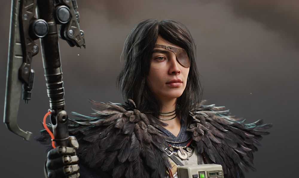
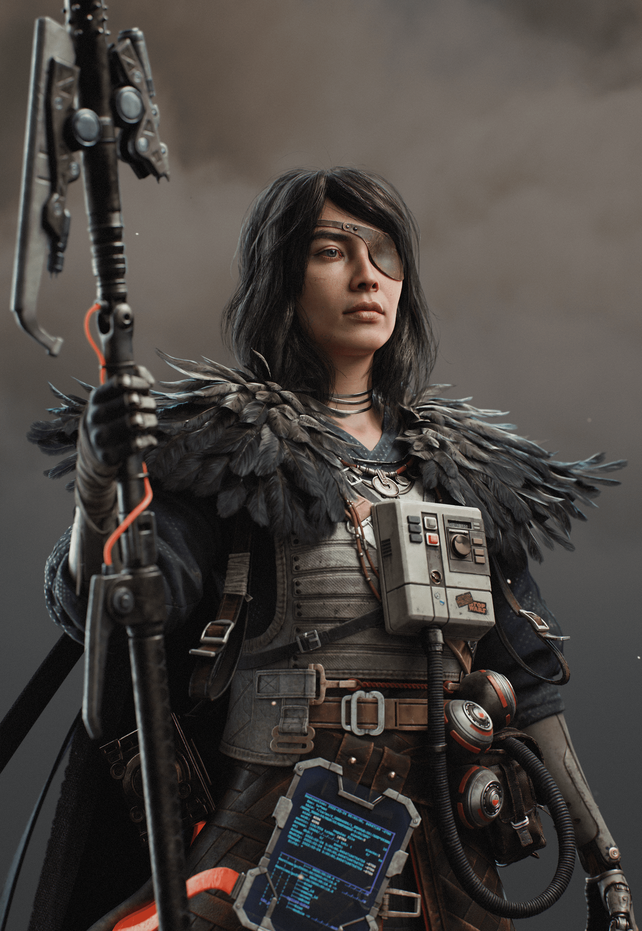
Recreating a Sci-Fi Character Concept in 3D using a Real-Time Pipeline
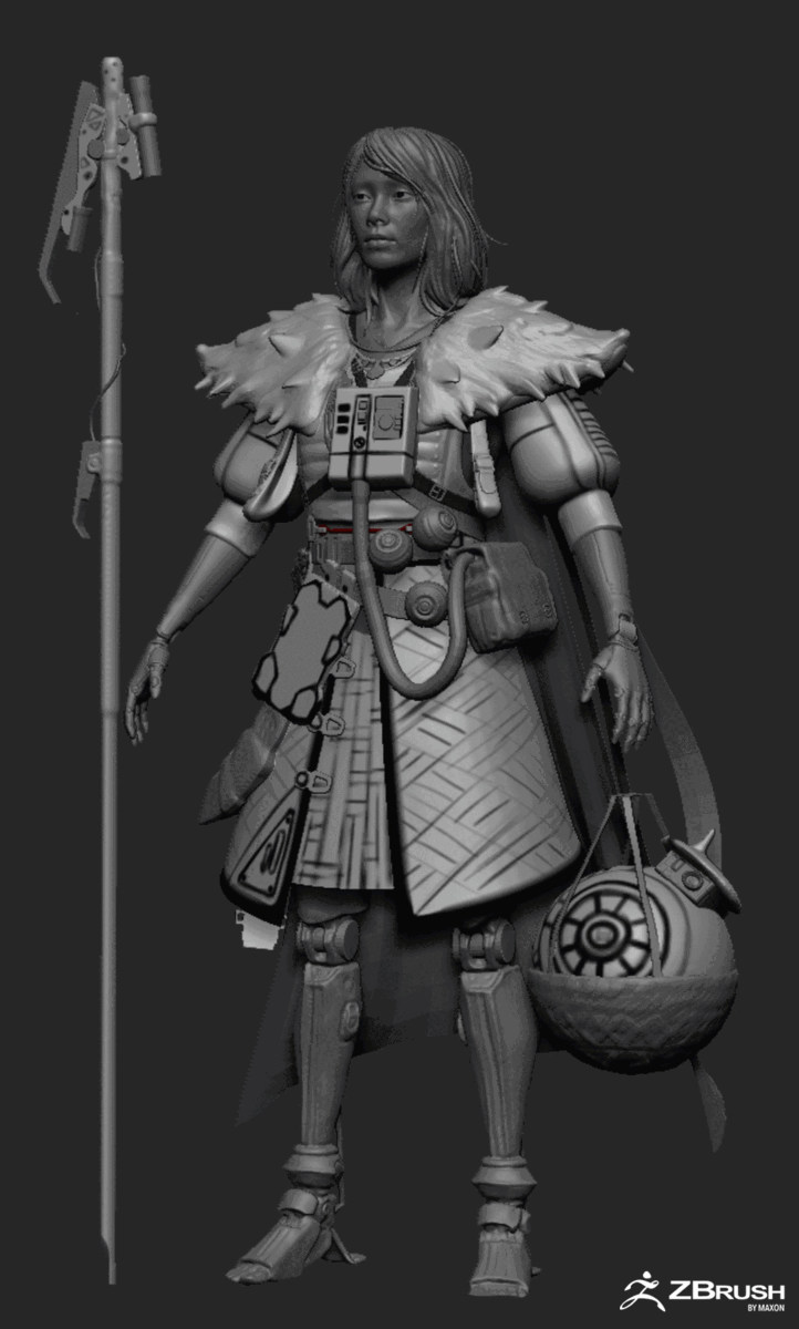
In this article, Alsu Rakhimova explains how she created her recent piece “No home left to love” based on the concept by Jude Smith; covering the main steps she followed from gathering references and sculpting, to rendering.
Alsu Rakhimova is a 3D Character Artist from Vancouver, B.C., and a recent graduate at Think Tank Training Centre.
In this article, she is going to explain how she created her recent piece “No home left to love” based on the concept by Jude Smith; covering the main steps she followed from gathering references and sculpting, to rendering.
Introduction
Hi everyone! My name is Alsu and I am a 3D Character Artist based in Vancouver, Canada. My journey in 3D started in 2020 when my friend told me about the 3D industry opportunities in Vancouver. Then I decided to learn more about the pipeline by following tutorials by Tobias Kepp and Yulia Sokolova.
I was studying daily and enjoyed every moment of it. As a result, I created a couple of stylised 3D pieces. However, I knew that it would take me years to achieve the desired skill level if I kept studying on my own. Thus, I decided to enrol in 3D school and picked Think Tank Training Centre’s online program. Based on The Rookies ratings, it is one of the best CG schools and it has an intensive online program. While studying at school, I created such pieces as “Swordfish Shack”, “SWAT Warrior”, and “No home left to love”, that got recognised by well-known 3D online publishers.
In this article, I am going to tell how I created “No home left to love” based on the concept by Jude Smith. My mentors were Kestutis Rinkevicius and Karamjit Chahal. They taught me a lot and gave me valuable feedback throughout the project.
I will cover the following steps:
Gathering references
Sculpting the outfit and face
Retopology and UVs
Texturing and Shading
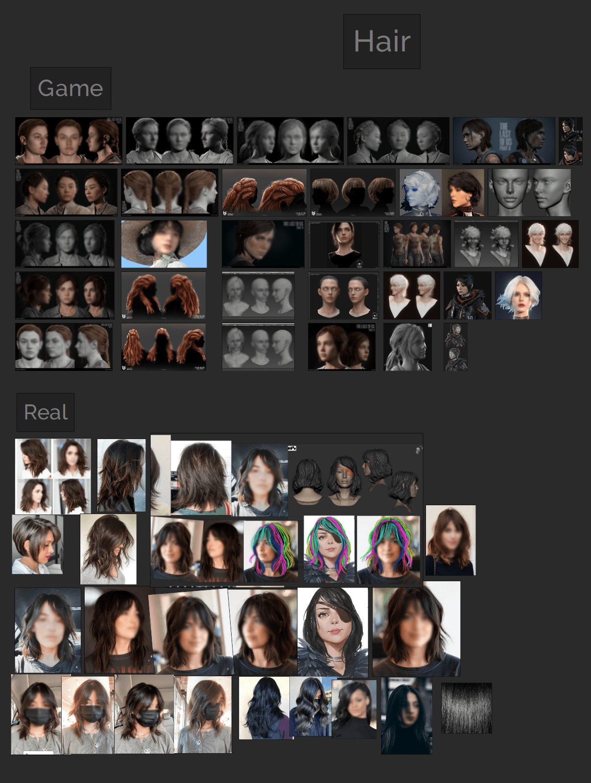
Hair
Feathers
Animating the cape
Rendering in Marmoset
Planning and References
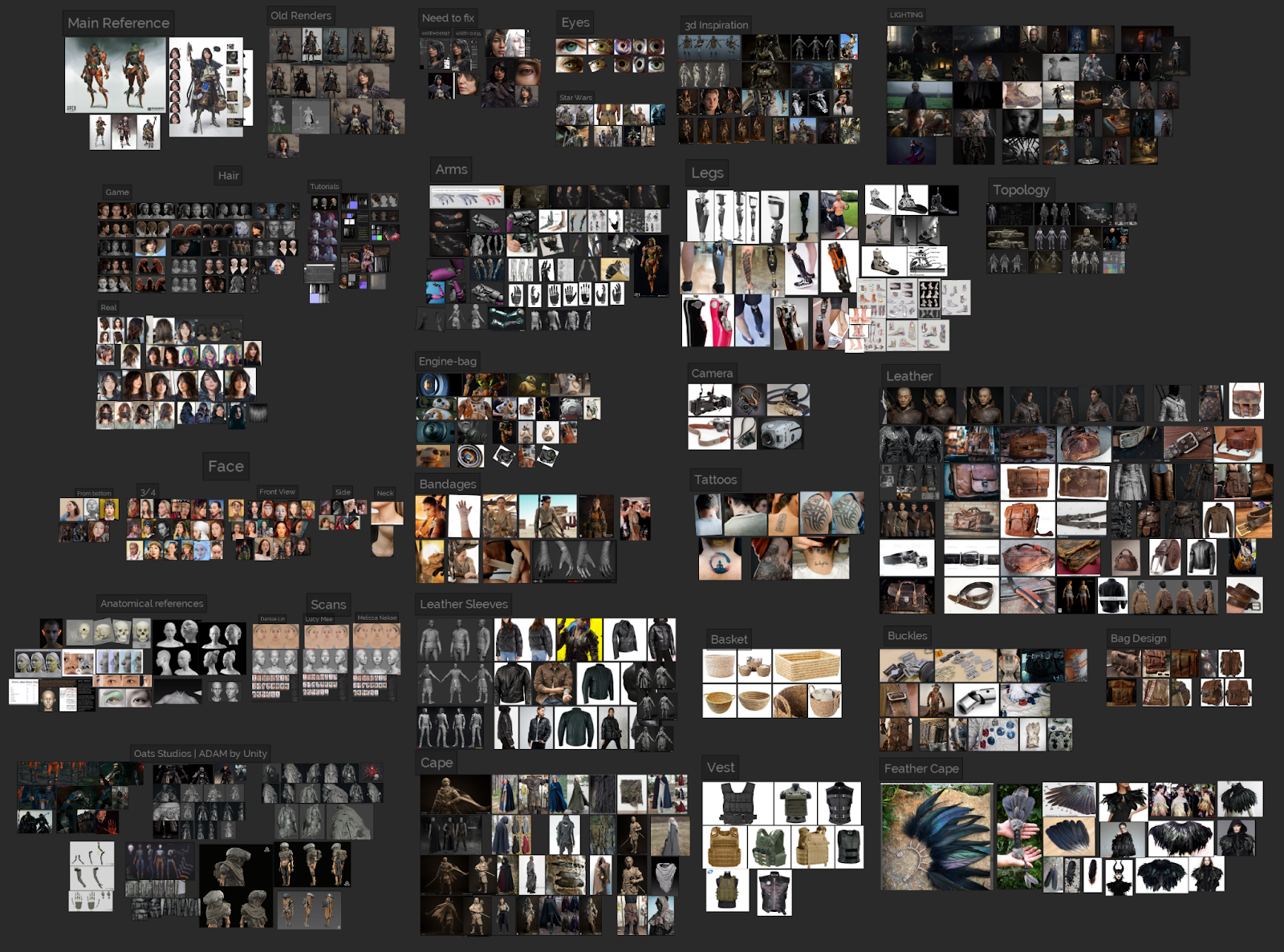
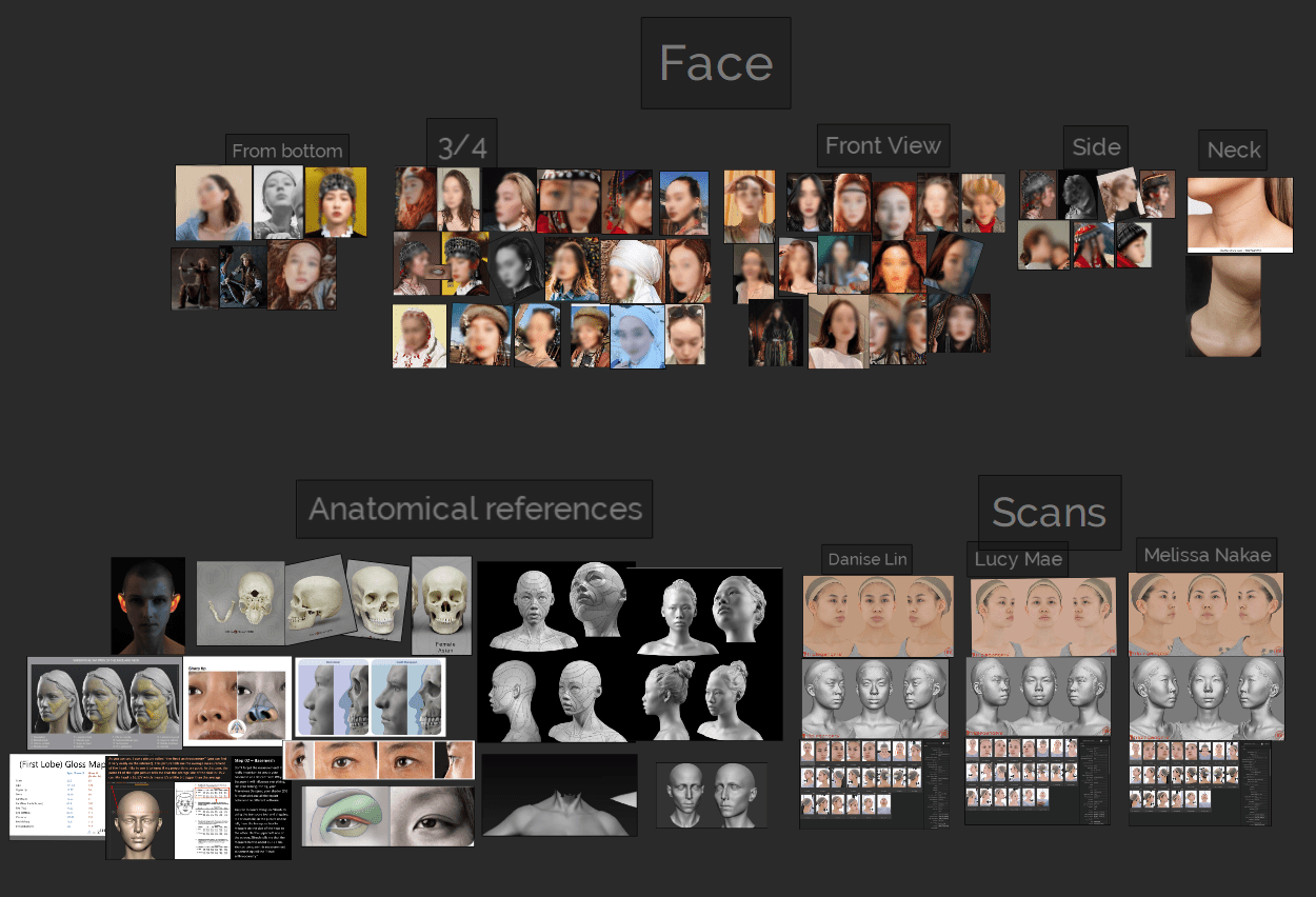
Having a reference board is a must if you want to create a believable character. I had several groups of references:
Real-life references. Those are crucial for creating a realistic-looking character.
Concept reference. Sometimes the concept has ambiguous outfit elements or some parts are hidden. For example, in my case, the character had robotic arms that were not very clearly drawn. Thankfully, the artist had other character concepts that had clearly drawn robotic arms. It helped a lot while “concepting” the arms design.
Texture references. To get the imperfections and details that the real material has.
Works of other 3d artists. They set the quality bar you would like to achieve. Besides, they show how artists tackled particular elements of the character’s outfit. For example, I had a lot of references from ”Horizon Zero Dawn”, ”Ghost of Tsushima”, and ”Adam” by Unity - they had similar feel.
Lighting references. I like to have references from old masters’ paintings or beautiful movie screenshots. It helps to see how the colour balance and lighting are used to create a certain atmosphere.
Planning is a very important step as it allows you to break down a complicated project into smaller simpler parts.
Blockout
I created the blockout of the character in Zbrush. I called it ready when every single detail of the character was created. It could be made either by a simple form, dynamesh shape or with pen brush. At this stage, finding the right proportions and size of each element was the priority, thus, I kept every object simple and as low poly as possible. This way, I could change the shape / size / location so that it matched the concept as closely as possible.
Do not rush the blockout as it will be harder to make the big changes later.
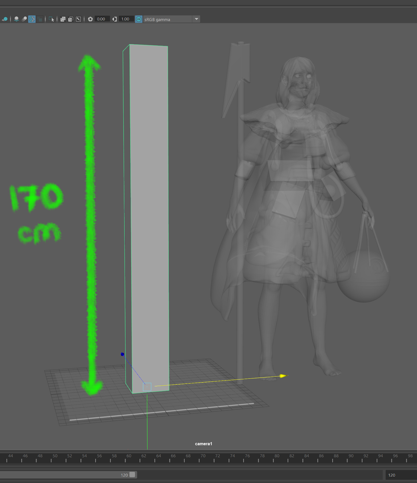
Setting up the right scale of the character is also better to do early - you want it to be a real-life scale. A simple trick for that is to create a 160-170cm height shape (average person’s height) in Maya and to import it as an obj file into your Zbrush scene before starting the project. It will automatically adjust the brush sizes. Having a real-life scale is very important for sculpting details, texturing, and shading.
Sculpting the outfit
After the blockout was ready, it was time to clean the shapes and add details in Zbrush. To create nice and clean shapes, I relied on the basic Zbrush features like Zremesher, Booleans (to merge or cut out nice shapes), Zmodeler, and Masking. Below, I will show the main steps I followed for different elements of the outfit.
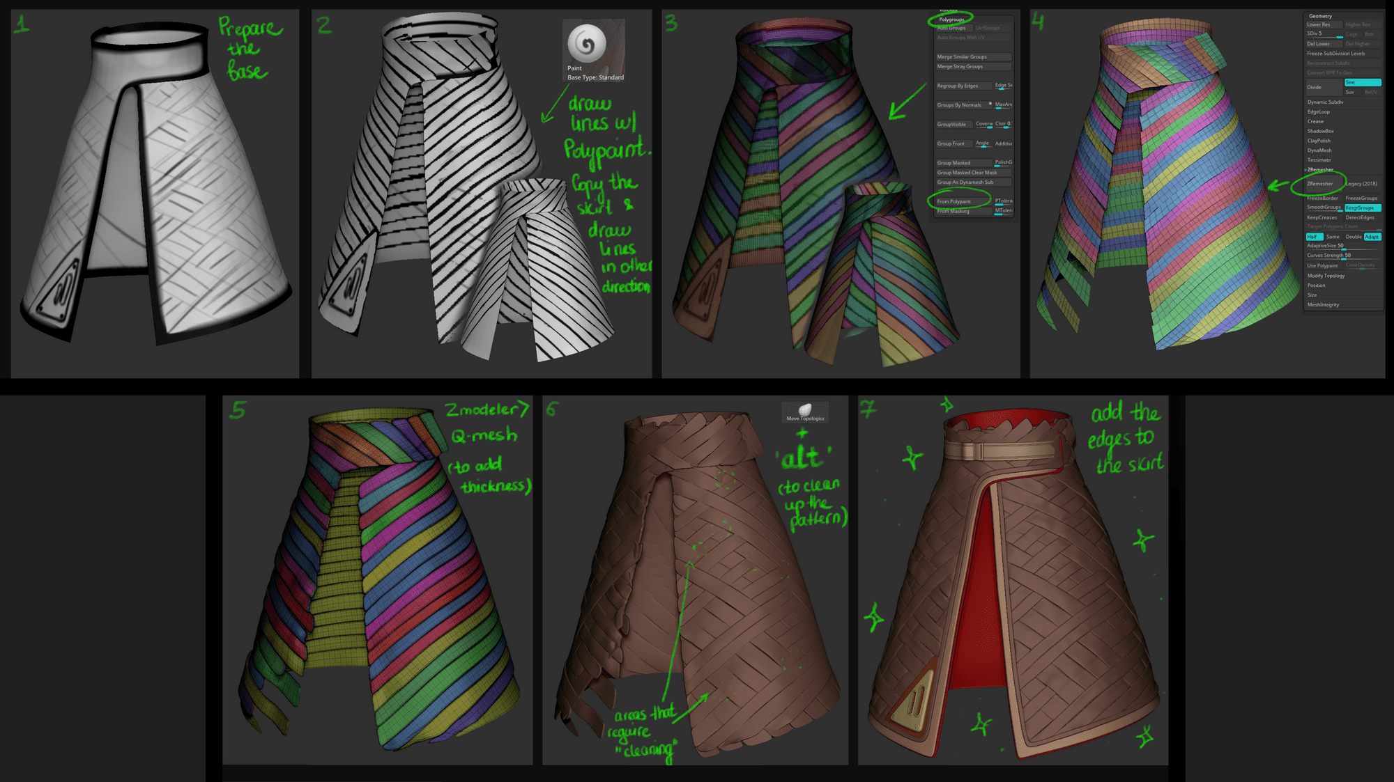
Skirt
To recreate an interesting woven pattern on the skirt, I divided the skirt into even stripes. Later I “weaved” the stripes into the pattern with the Move tool. I got this idea from the work of Daniel Bystedt, who was creating characters for “Adam”, a short film by Unity. You can see the main steps in the image below.
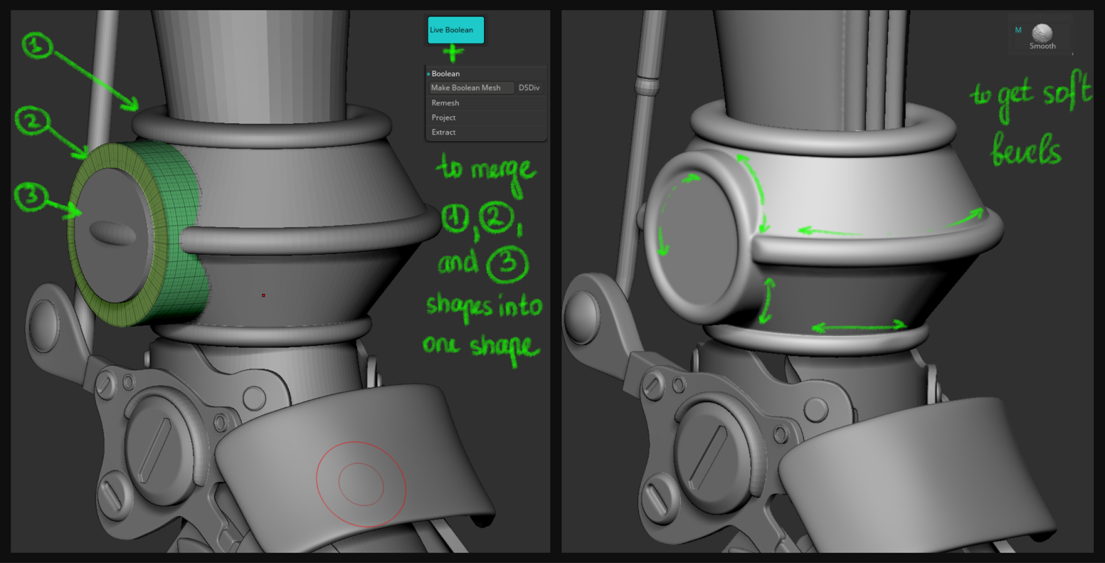
Arms and Legs
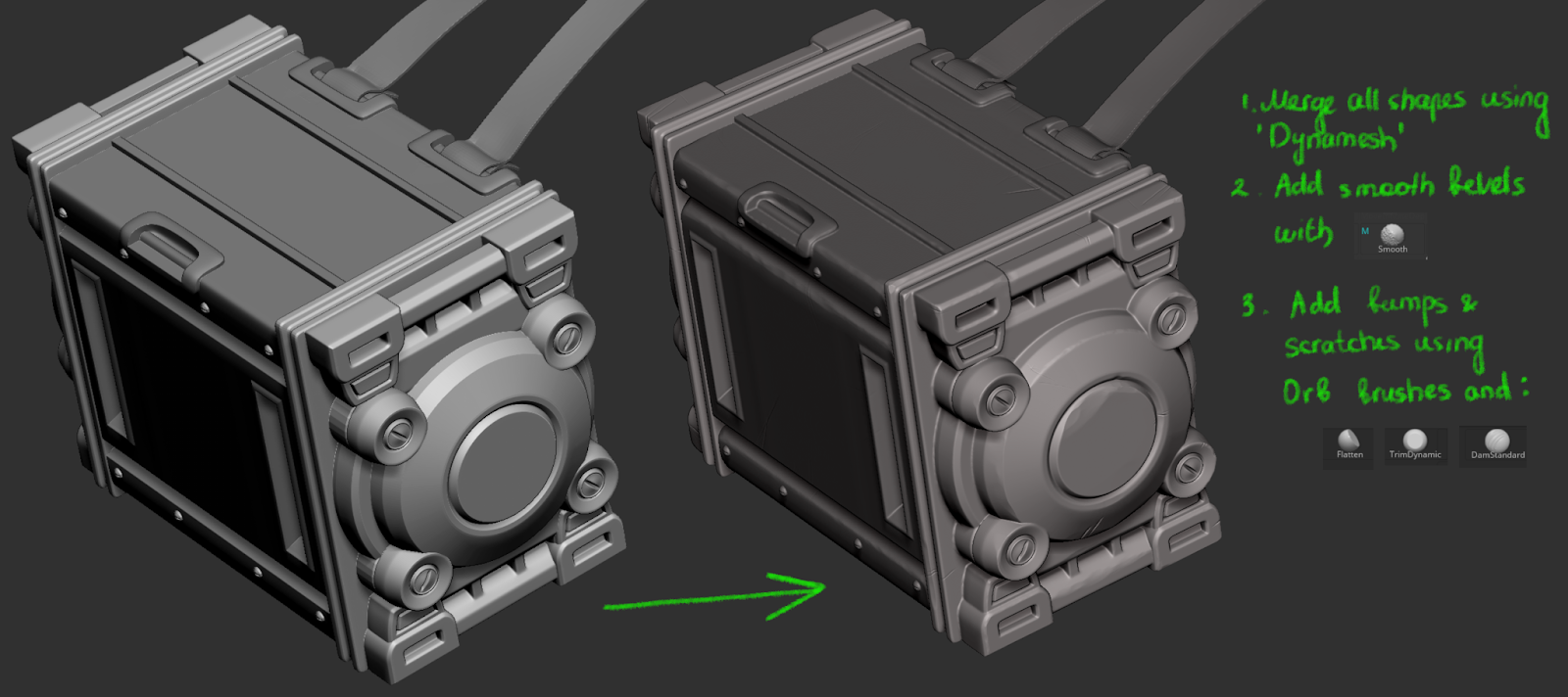
Before sculpting the robotic arms and legs, I wanted to understand their mechanics. I studied a lot of references from other 3D Artists, and photos of prosthetic arms and legs. It helped me to understand the working logic of these assets and to create a more or less believable look. As soon as I finished the primary shapes, I cleaned them up and added details. I applied the following techniques for that:
Use booleans and masks and a cut tool to create complex shapes.
2. Add bevels for smooth edges - avoid sharp ends as it creates a very artificial look to the armour. The nice round edges will catch more highlights.
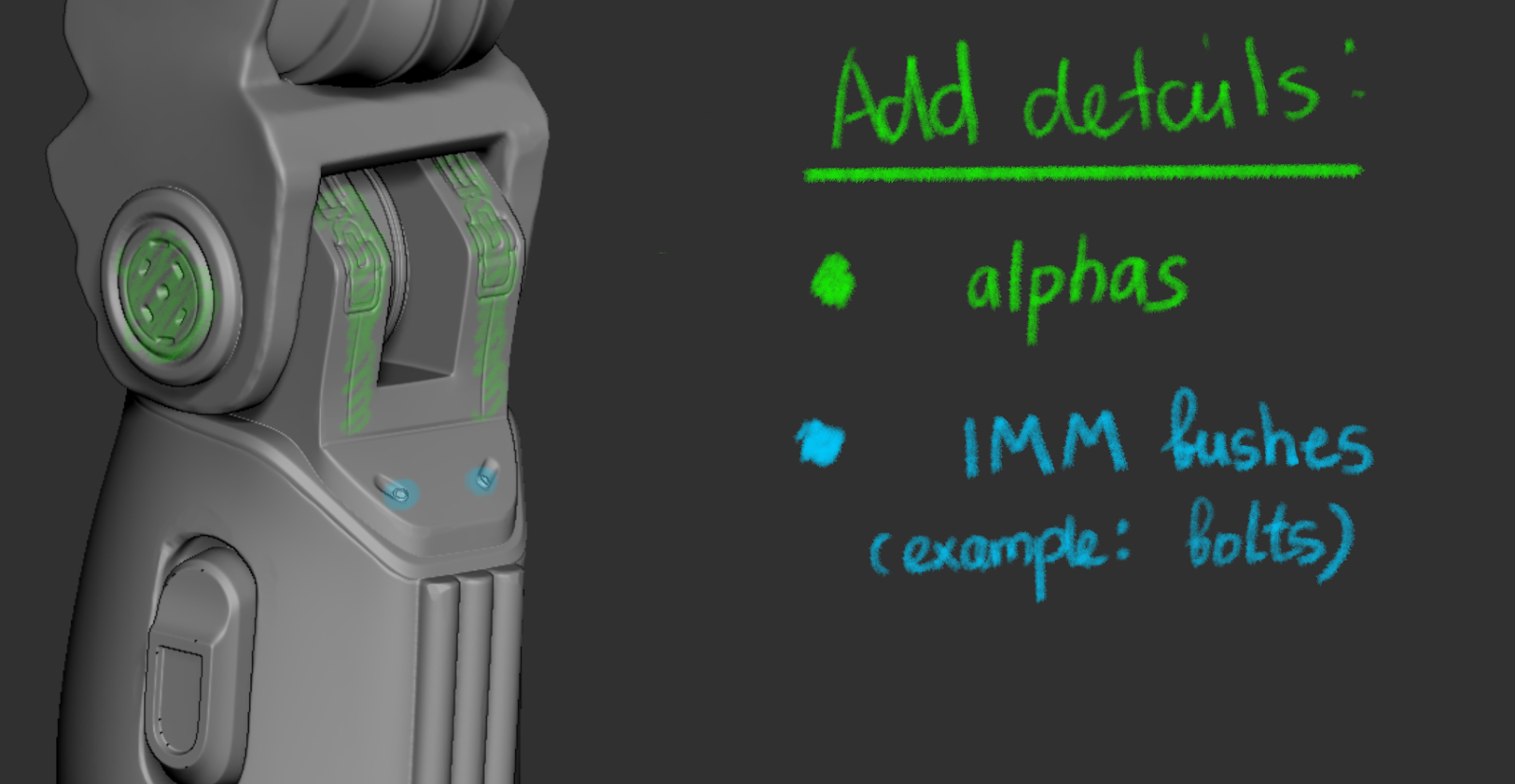
3. To give your hard surface a finished look, add small details using alphas and IMM brushes.
Don't be afraid to slightly deform the armour, add scratches and bumps - it will add a lived-in look
4. Make sure to keep the balance of details on your hard surface object. Don’t overload one area with details, while keeping other areas untouched.
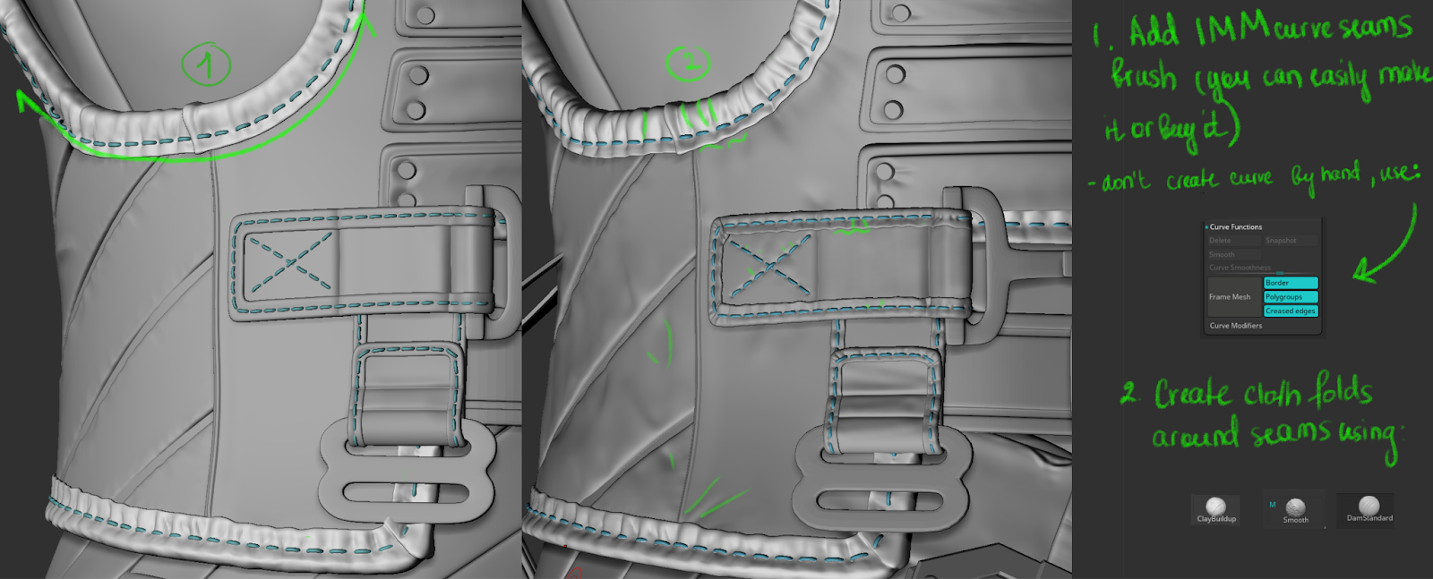
Cloth Seams
To add a seam pattern to the vest edges, I created a simple seam brush and added it to all my edges using the “Frame mesh by Polygroups” function. You can learn how to create a seam brush from this tutorial on Zbrush YouTube. After, I added folds around seams to add the interaction between the cloth and the seam.
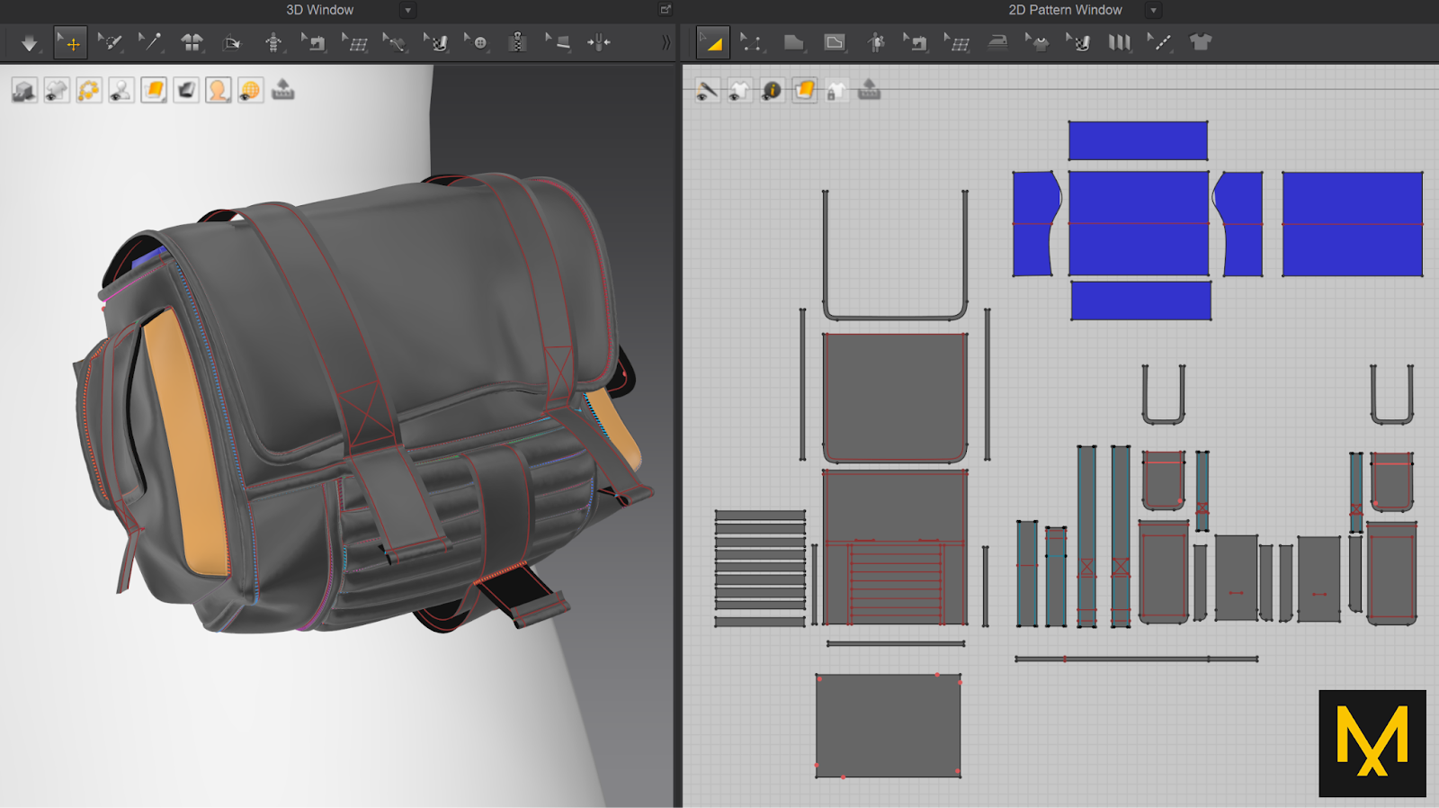
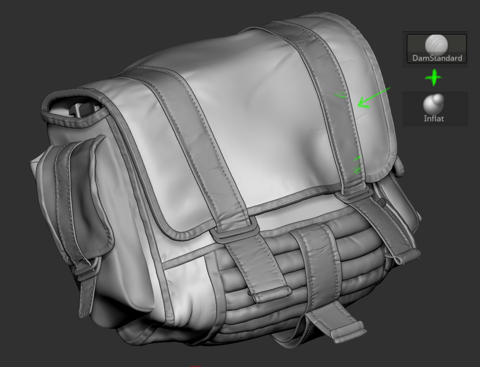
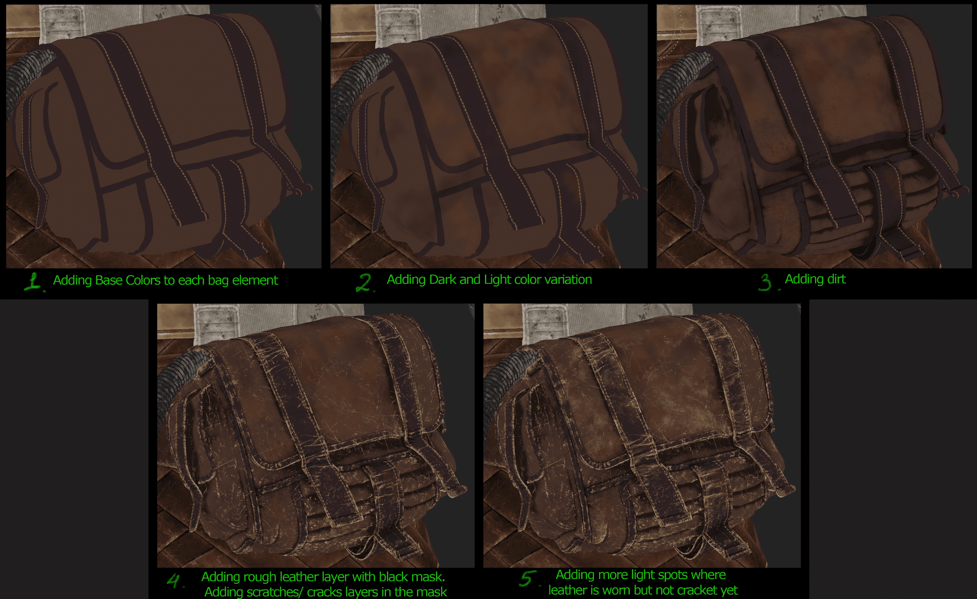
Bag
I created a bag in Marvelous Designer to save time on sculpting big folds. To give the bag volume, I made a blue “pillow” and placed it inside the bag.
Once the bag was ready, I exported it back to Zbrush to add more details, like creases and buckles.
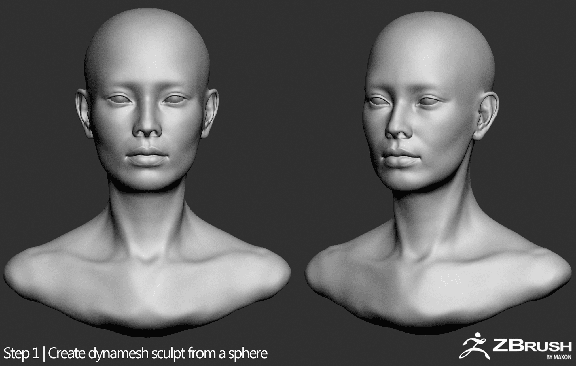
Sculpting face
Before I sculpted the face, I gathered a lot of references from Pinterest. I collect photos of the face from different angles to attempt likeness. I also gather skull references to make sure that the anatomy is right.
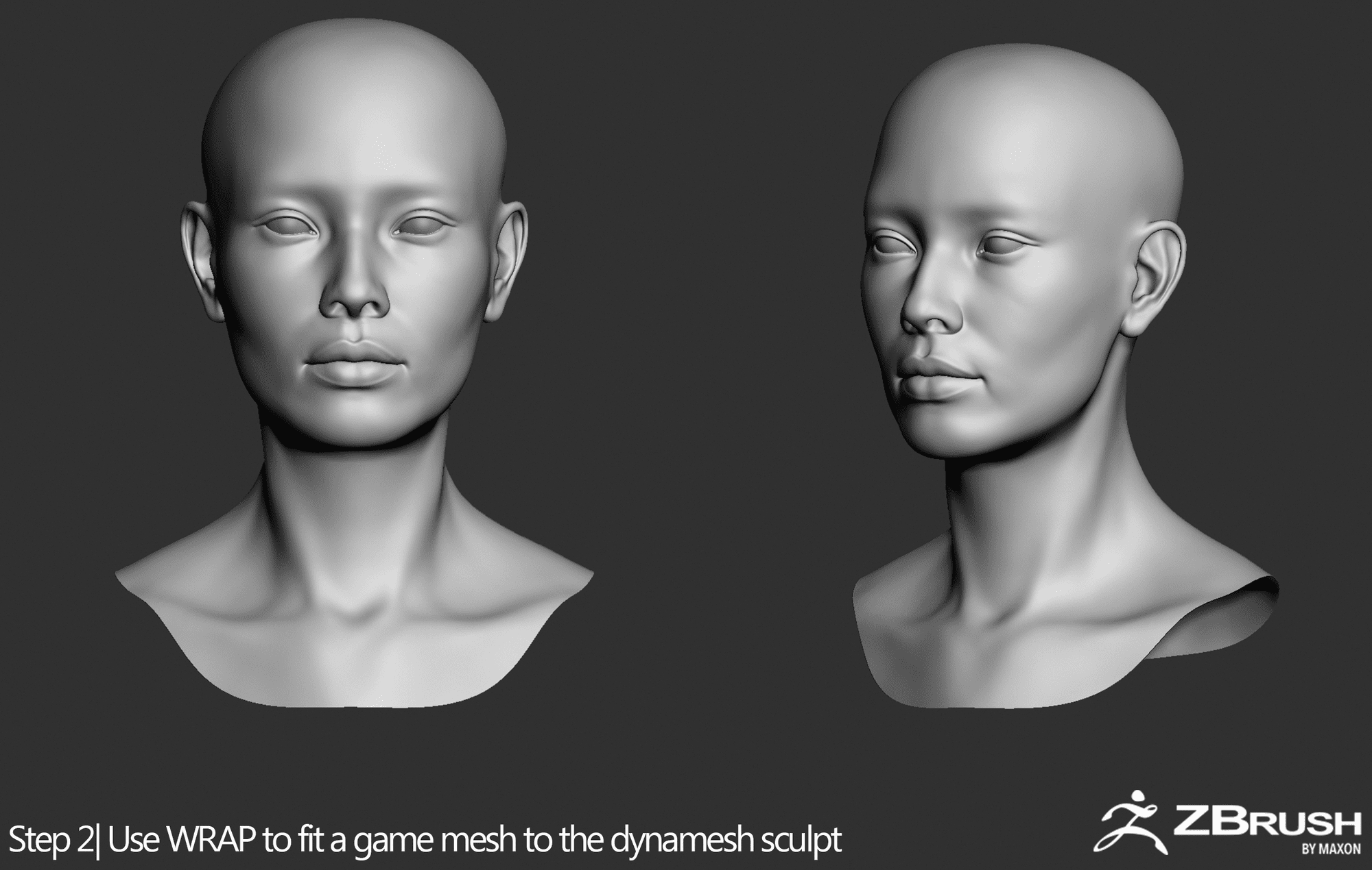
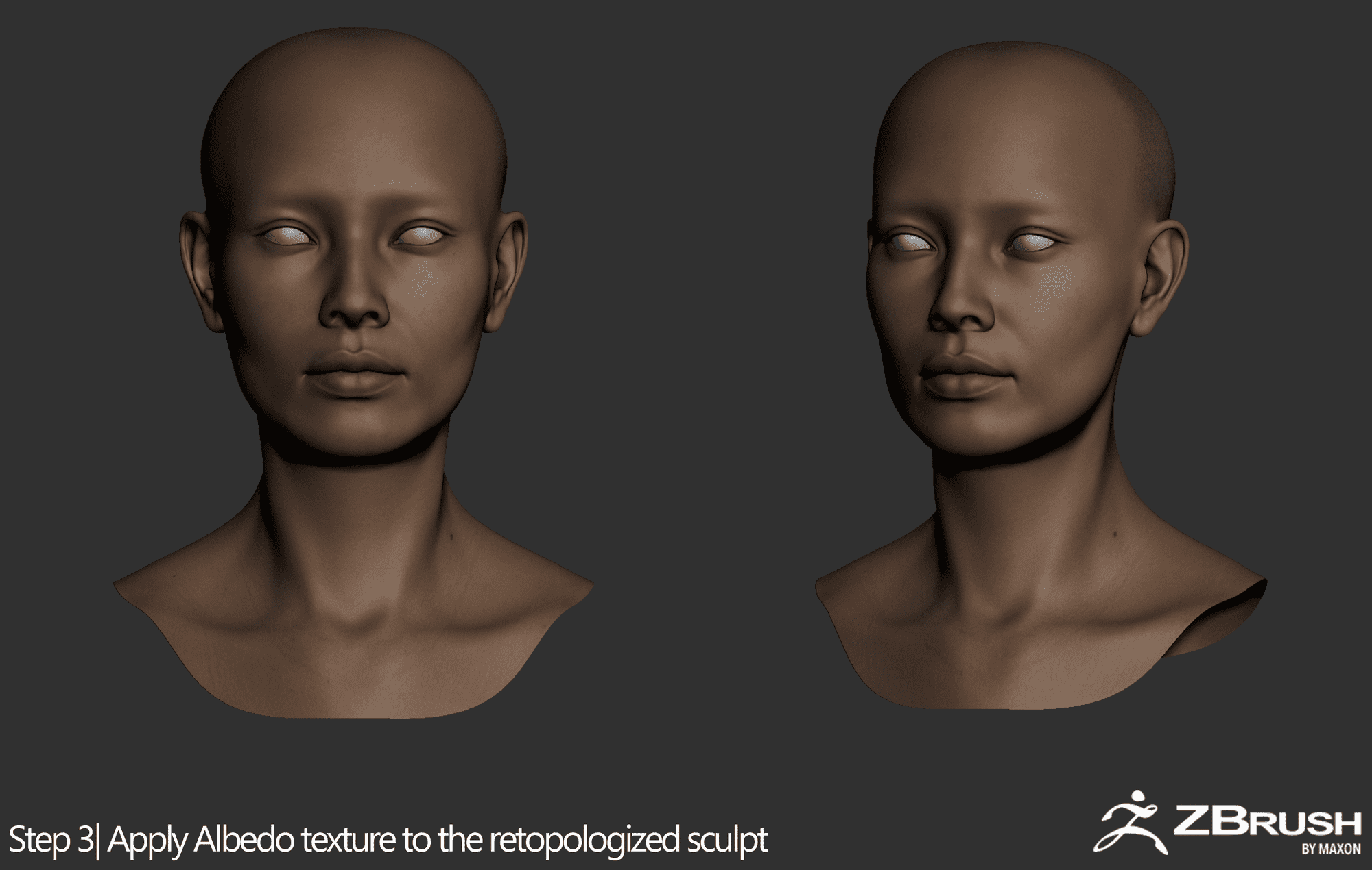
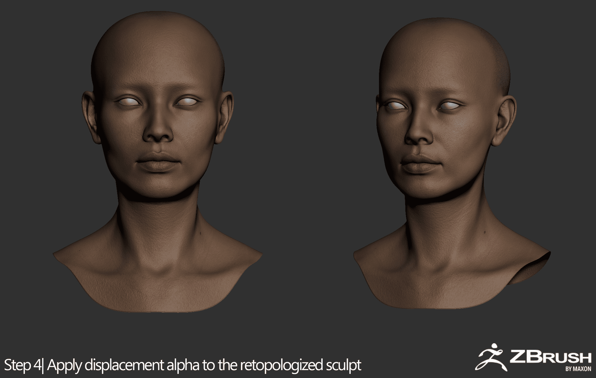
I usually start from a sphere for practice and to also have the freedom of changing the big shapes. Once I am happy with the result, I use WARP by R3DS to wrap the proper head topology around my dynamesh sculpt. For this project, I decided to use a displacement map from 3D scan store. The advantage of this map was that it provided a quite clean displacement and albedo map. This way, you could project topology, albedo, wrinkles and pores in one action.
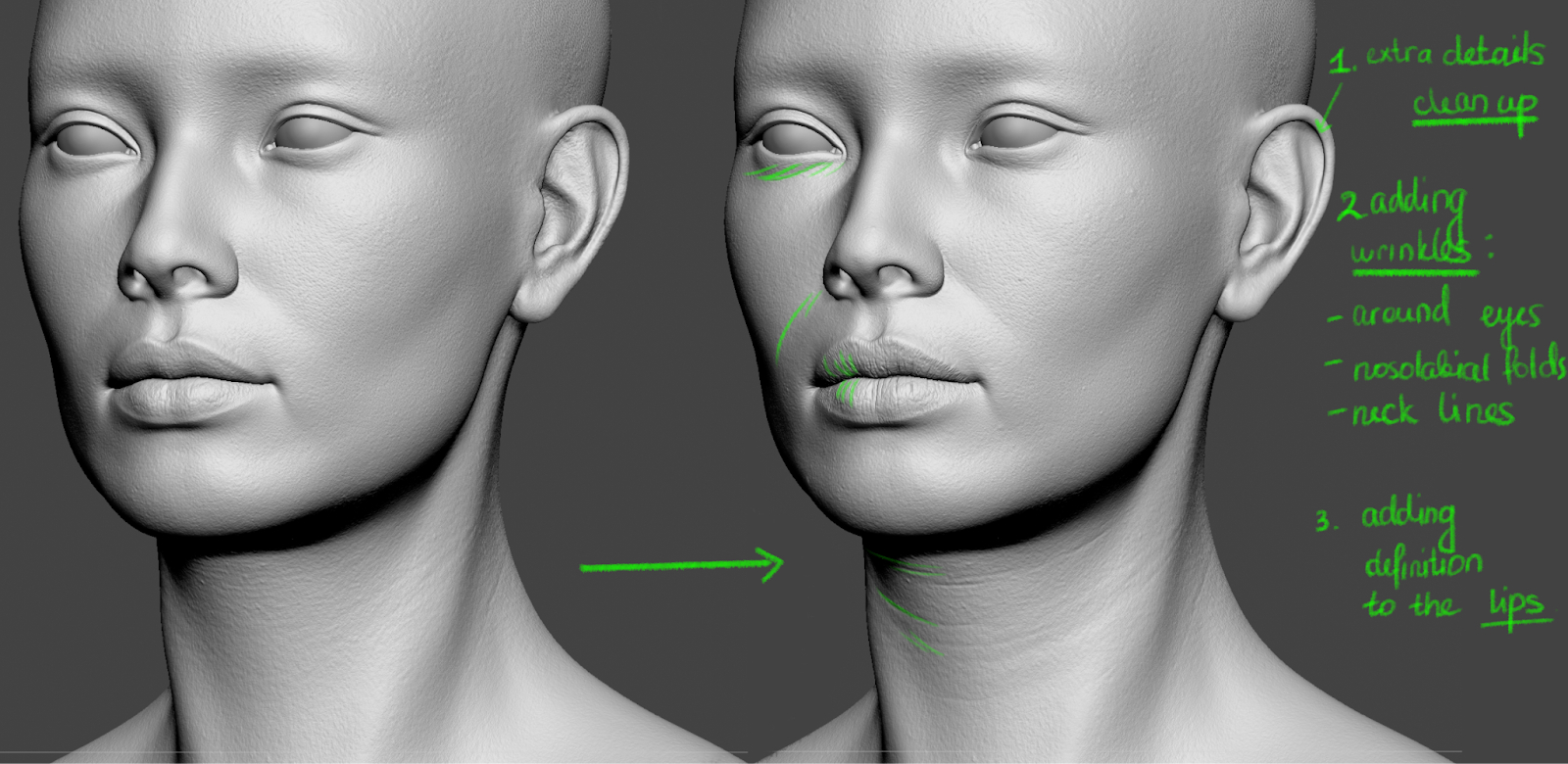
After a displacement map was on, there were still areas that needed manual adjustments. They needed cleanups and definitions. Zbrush’s layers system and morph brush were very helpful for that. I used Daniel Boschung’s high-resolution photos as references for pores and wrinkles.
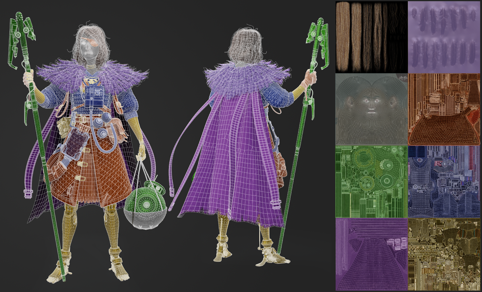
Retopology and UV
I retopologised all objects in Maya using the Quadraw tool. I decimated my highpoly sculpt, exported it to Maya, made it “Live”, and then used Quadraw tool to draw the low poly mesh on top of it. There are no shortcuts in this step. I just started with big polygons trying to get the shape and flow and then added subdivisions where needed. The goal was to get an even retopology and get the proper silhouette that will be easy to rig later.
I unwrapped my UVs in Rizom. This app was great as it straightened and optimized UVs very well and it had very convenient cut tool. As I result, straightened UVs were very easy to pack. The publishers have a discount on Rizom UV Virtual Spaces for students and YouTube tutorials to get new users started.
Texturing and Shading
General principles
Here are the main principles that I learned while texturing the character:
While texturing the character, you want to give each detail an equal amount of attention. Though the focus should be on the areas that are more visible and closer to the face.
When it comes to colour and roughness variation, you want to start with big-scale adjustments and then move to the smaller ones. I sometimes tend to over-focus on small details first. As a result, when looking from afar I might not even see the tiny changes I’ve made. The key is to zoom out to see the bigger picture from the distance. This way I check if colour/roughness/specular variation is good enough.
Use the combination of procedural and hand-painted approaches. There are advantages and disadvantages to both approaches. For example, the procedural method might lead to a very generic-looking texture. But hand painting can be very time-consuming and inflexible. The combination of the two approaches will give unique look to your textures and will save some time. I use a “Dirt” brush for almost all my hand-painted fixes.
While sculpting the character, I use a very neutral environment map (Display settings > environment settings > environment map: “Soft 1LowContrastFront 2Backs”). It helps me to avoid any colour reflections on the textured object.
As soon as you have the base colour for the character - put the character in the rendering engine right away and confirm that the scale is right.
Substance 3D Painter files can become heavy very fast. The tips that I followed to improve the performance of my texturing files:
Divide Substance Painter projects into several sub-projects. For example, I had separate .sbs files for clothes, props, face, etc.
Click ‘File > Save and Compact’ from time to time to optimise the file size.
Keep your layer system organised - have separate folders for each independent object. This way, whenever I work on a piece, I move its folder up in my layer hierarchy. Note - do this only when you know that this will not affect the texture of other objects.
Below, I am going to share the main steps while sculpting different materials.
Leather
Leather is a very interesting material that has a lot of colour and roughness variation. I try to show the different degrees of worn-out leather: from small scratches to cracks. The latter ones are usually at the places where leather tends to bend a lot (e.g straps). Don’t be afraid to draw big scratches, but make sure to use references so that you don’t overdo it.
My character had several design elements that were made of leather. To avoid repetitiveness, I made sure to play with the texture, tones and colours, and the level of wearing out. This helped to distinguish leather objects into separate interesting pieces.
Texturing the albedo map of a bag
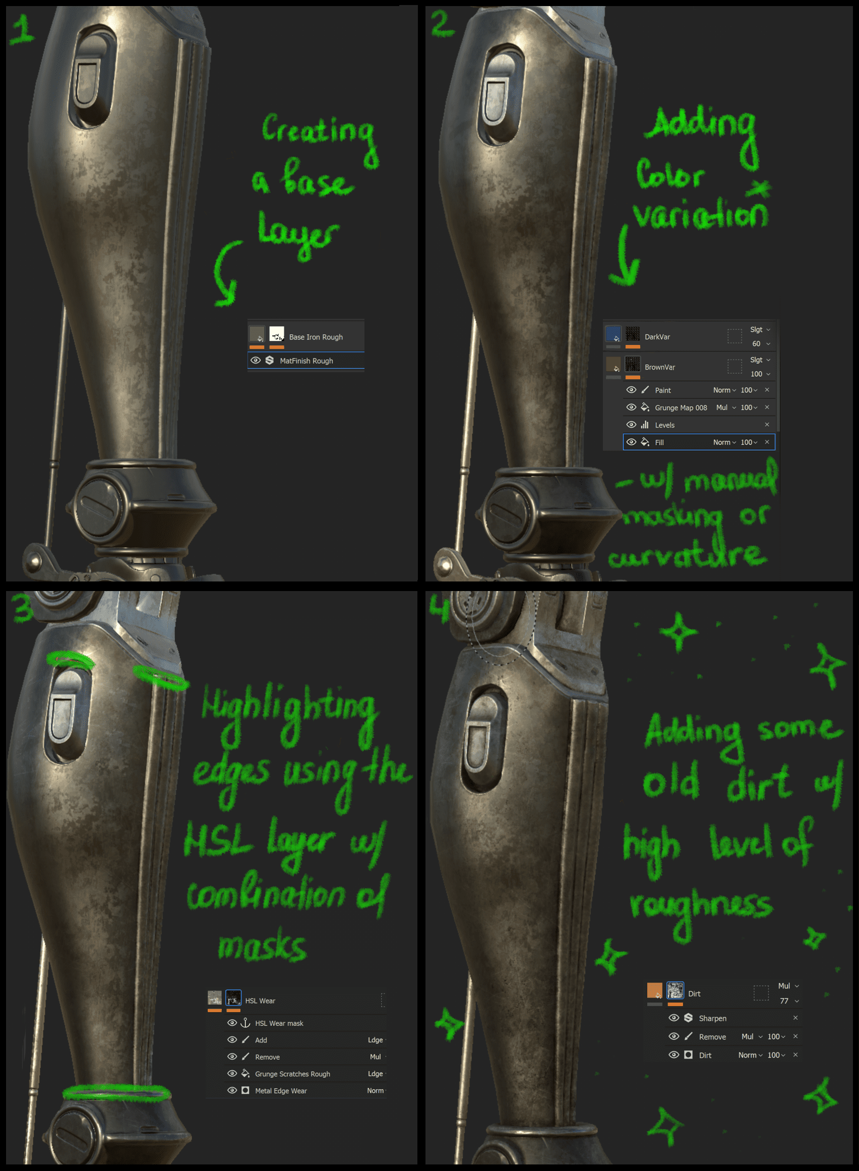
Metals
While sculpting the metals, I tried switching between environment maps (my favourite one is “panorama”). The reason was, that a neutral environment map didn't show the metal texture properly. As with leather, I tried to add as much colour variation to the base colours as possible to make them interesting. To give the metals worn out feel, I applied several effects:
Add lighter tones to the object edges. This is the time when bevels that you’ve added in the sculpting stage become super useful - you can use ‘Curvature map’ as a nice mask for metal edges.
With time, metals get oxidised - this effect can be shown by adding an orangey look to certain places.
Scratches and bumps.
Fabric (cape)
To create the effect of torn edges on the cape, I used an Opacity channel in Substance Painter. In this channel, I drew the torn edges with a ‘Pencil' brush.
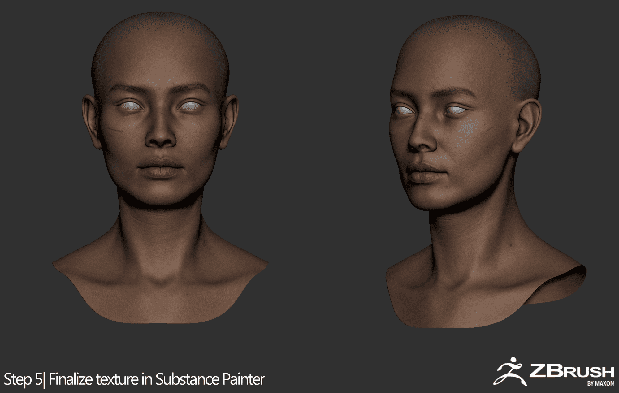
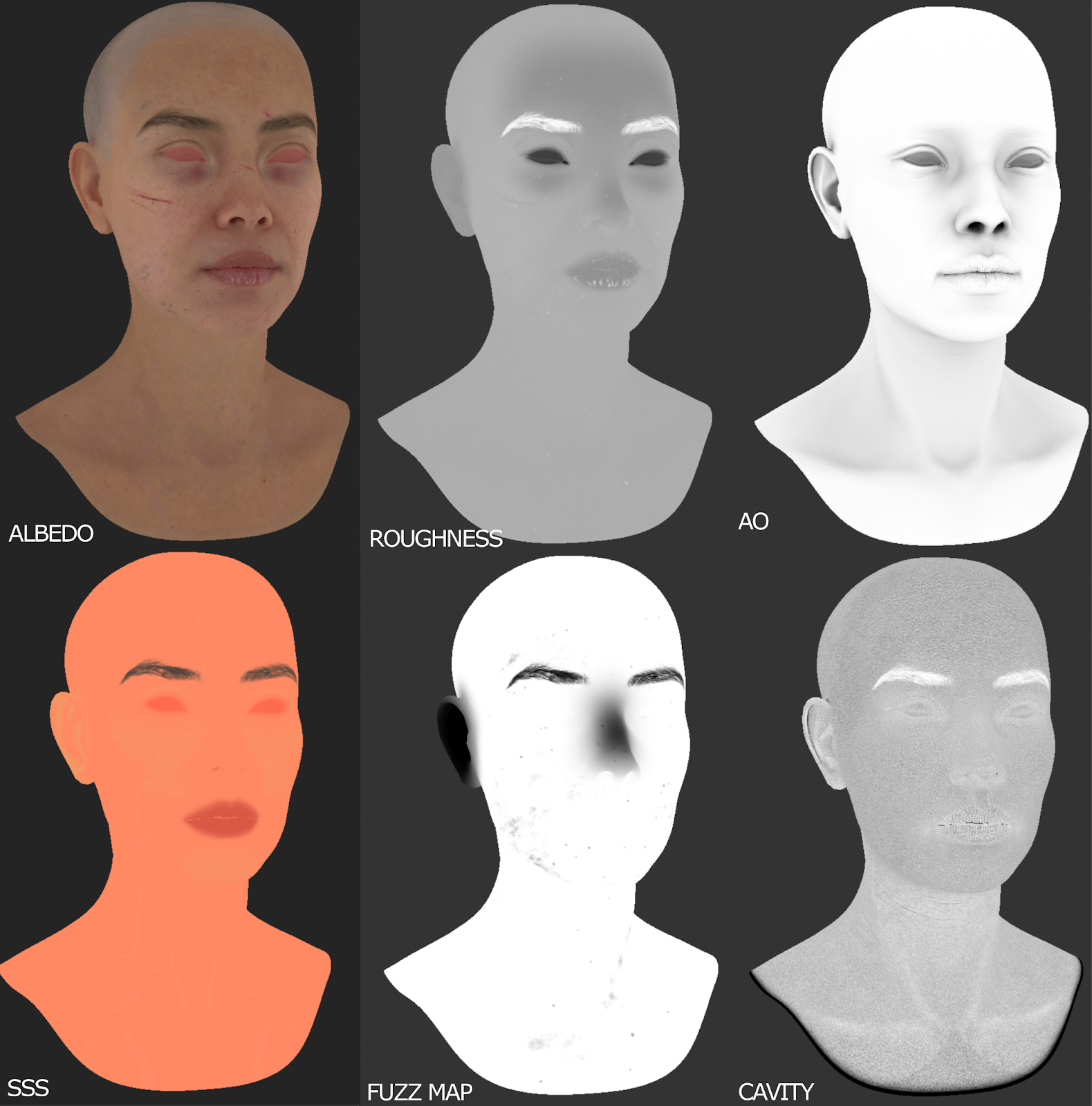
Skin
To create Base Colour for the skin, I used a lot of procedural layers in Substance 3D Painter. I had different layers for the skin blemishes, tonal maps, veins and arteries, freckles and sunspots. I completed the skin texture by adding small dirt spots and scratches.
I like adding skin imperfections as they make the character look more alive. For this project, I wanted the character to have a tired and worn-out look. Therefore, I added dark circles under her eyes, dry flakes and cracks to her lips, and small scratches on her nose and cheeks.
Below, I am showing some of the main texture channels that I used to create the skin shader in Marmoset:
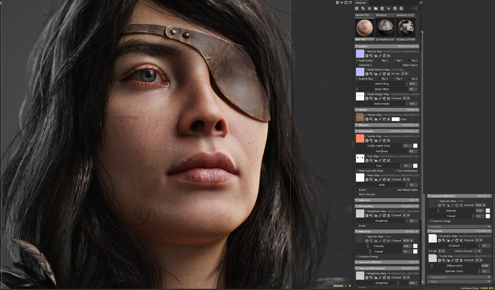
I then exported all my texture maps to Marmoset and created the skin shader. You can see the parameters on the screenshot attached. To add more details to the skin, I added skin micronormals from Texturing XYZ. While creating the Subsurface Scattering map, I used the default marmoset Colour as the base. As mentioned before, having the character be a real-life scale is very important as the SSS settings are controlled on the mm scale.
Skin shader settings depend on the character you are trying to make. I tweak the texture maps and shader settings a lot before I achieve the desired result.
Hair
Before creating hair, I gathered a lot of references. I also created a ZBrush sculpt to understand the shape, hair flow, and the main hairstyle sections. This helped a lot with determining what types of hair strands had to be created.
For hair creation, I followed a real-time pipeline using hair cards. In short, I created hair cards in XGen, rendered them on one plane in Arnold, and then manually placed them on the character’s skull. While working on hair, I followed the class provided by Think Tank Training Centre. I also consulted with a lot of articles explaining real-time hair workflow, including:
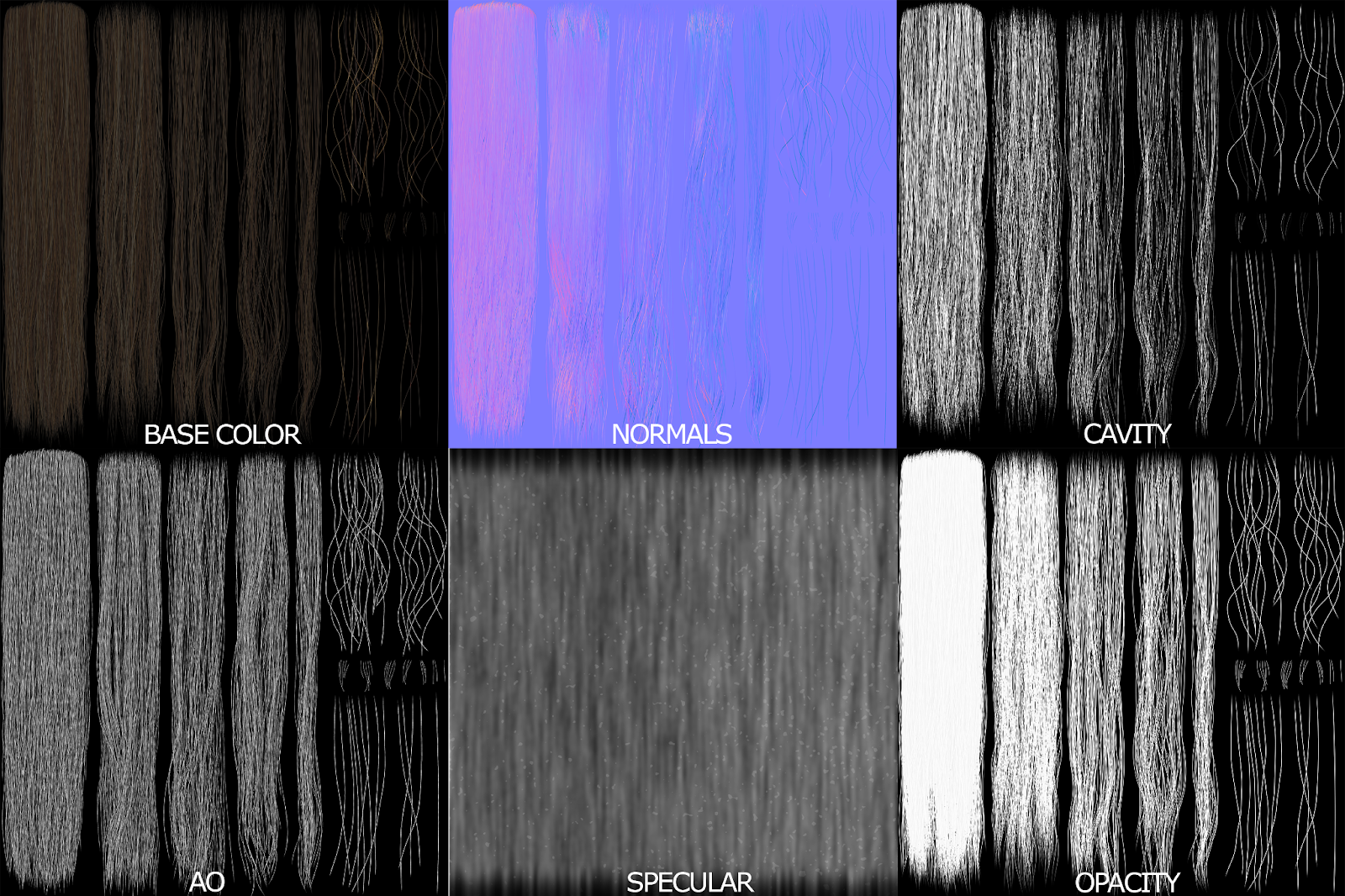
I created the following hair texture maps (you can see them below). I am going to explain how I created each of them:
Base Colour: This is the standard albedo map that got from Arnold render.
Normals: In order to get more contrasty normals, I exported the hair geometry and baked it on a plane using xNormals.
Cavity: I baked an ID map in Arnold. I increased its contrast using the Levels function in Photoshop. Cavity map is really important as it creates the illusion of volume for the hair cards.
Ambient Occlusion (AO): I created AO map in Arnold and then added a ‘Motion blur’ layer on top with ‘Multiply’ blending setting in Photoshop.
Specular: I created the texture from scratch in Photoshop. I created a white layer and added Gaussian Noise filter (Amount: 400%), Gaussian Blur filter (10.0 pixels). Then, I increased the contrast by adjusting layer’s Levels (min: 124, max: 167) and added a Motion Blur (Distance: 280 pixels). I also added some noisy specs on top by adding another contrasty Gaussian noise layer with ‘Linear Dodge’ belnding setting. The resulting map created an illusion of slightly uneven hair texture - which was more realistic.
Opacity: I created the texture in Arnold.
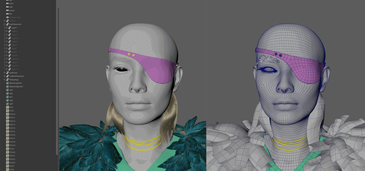
To place the hair cards layer by layer, I used the Hair Grabber tool by Alex Sizov for Maya. I started with thick and dense hair cards to cover the scalp and to create a general hair shape. Then, I moved to thinner and sparser hair cards to add breakups and finish the hairstyle shape. In the end, I added a lot of flyaways and separate hairs to hide the ‘gamy’ feel of the hair cards. Adding these cards was crucial to creating the so-called ‘halo’ effect when a lot of separate hairs are coming out of their main hairstyle.
While placing hair cards, I kept them in groups (layers) - it allowed me to easily control and fix the hair layers when needed.
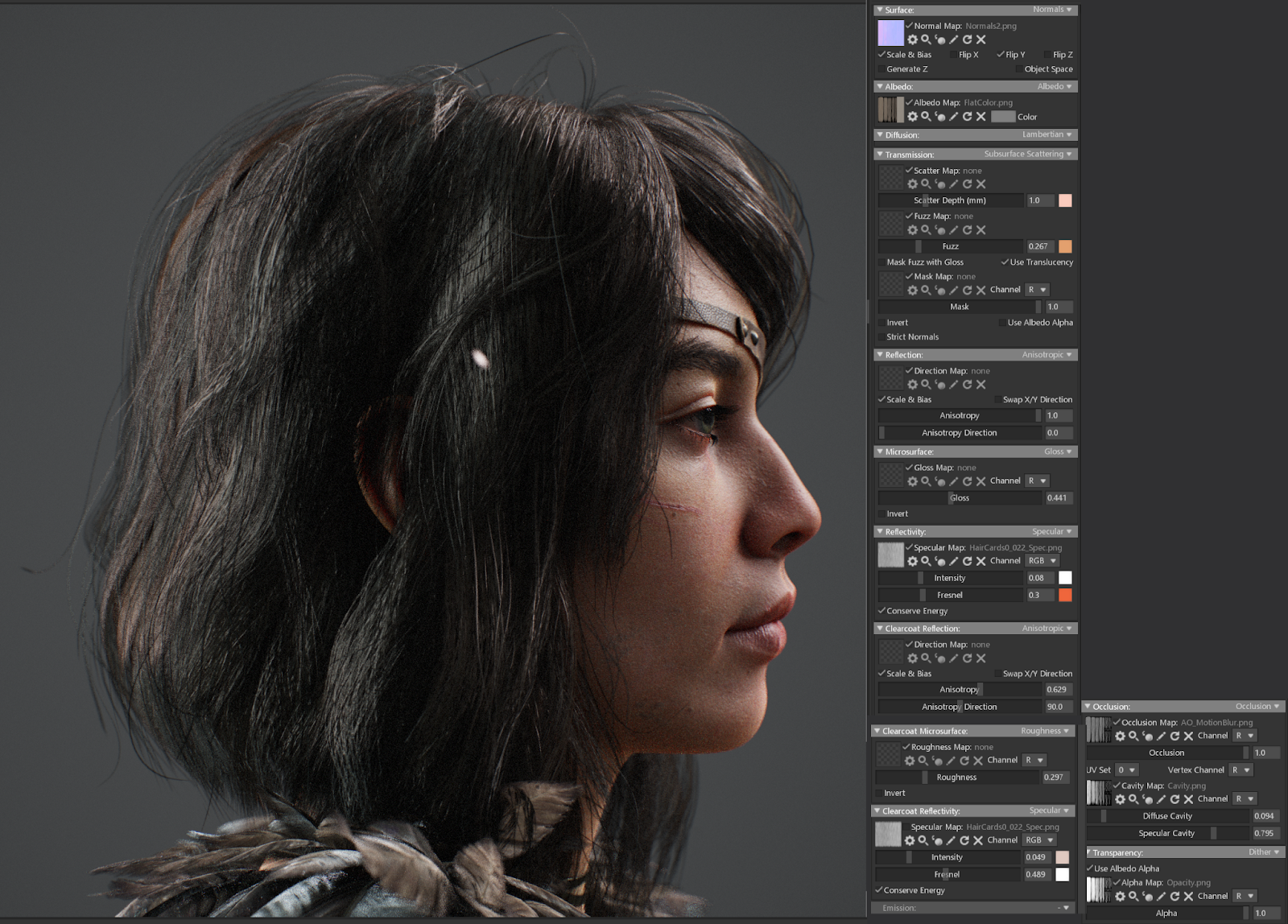
Once the hair placement was done, I tested the hair shader in Marmoset. Using the trial and error method, I set up the hair shader with my hair textures (please see the settings below).
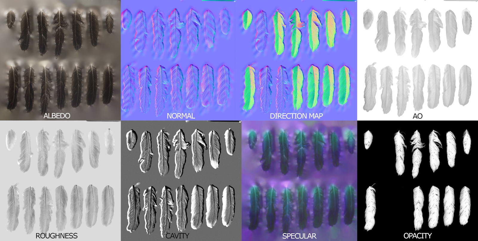
Feathers
To create believable feathers, I decided to use photo scans of real crow feathers from Quixel. The Scan had albedo, roughness, normal, opacity, and ambient occlusion map. I slightly adjusted them and also painted the missing ones (please see all the textures in the image below). Below, I will explain how I created/edited each of them:
Albedo: I did not change the Albedo texture, but I turned on the ‘Vertex colour’ settings. It allows you to add different colour effects like the custom gradients to your geometry. For this, I exported my feathery collar to Zbrush and painted a gradient on it. This feature let me create a slight gradient transition from darker colours on the bottom to lighter colours on the top of the feathery collar.
Normal: I slightly corrected normals in Substance Painter - I drew the wavy pattern on the feathers using a basic paintbrush in the Height layer
Direction map: I painted a direction map in Substance Painter using this great tutorial
Roughness: I increased the contrast of my roughness map using Levels in Photoshop
Cavity: I adjusted the levels and contrast of the roughness map
Specular map: In order to achieve this typical ‘rainbow’ shine you might see on the crow’s feathers, I created a Specular map. I just added a layer with different colours on top of the albedo and adjusted the blending settings to ‘Overlay’.
Opacity: I made the opacity map slightly blurry to create an effect of feathers being semi-transparent.
The final feather textures can be seen below.
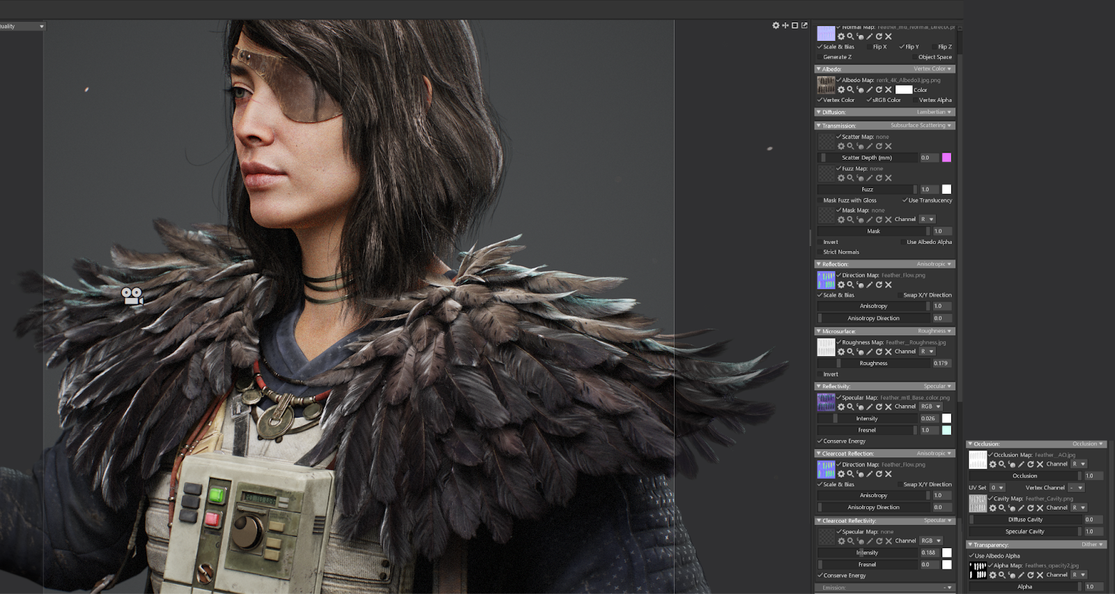
I used these textures to create a shader in Marmoset (please see the screenshot).
Feather shader in Marmoset
I manually placed all the feathers on the character’s left shoulder. Then I mirrored them and manually tweaked the feathers on the right shoulder to get rid of the symmetry. I started with the bottom feathers and then moved up layer by layer closer to her face.
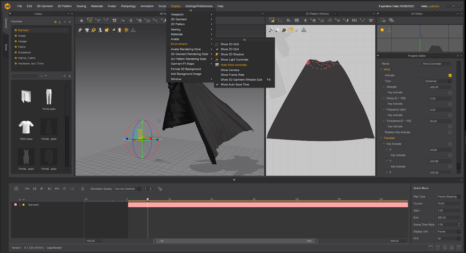
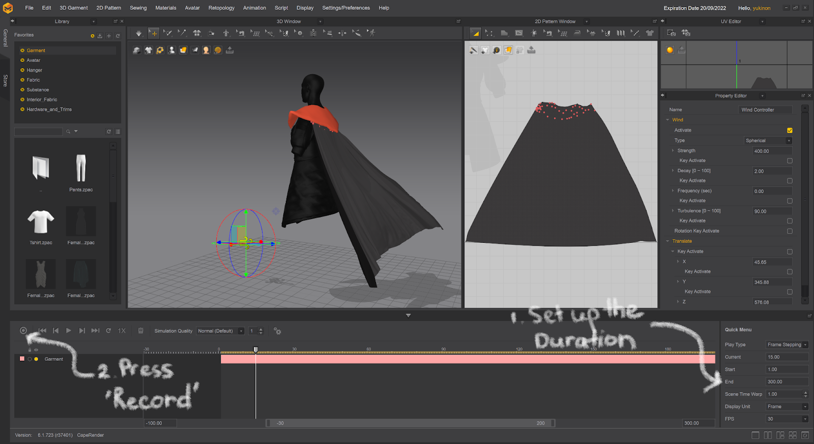
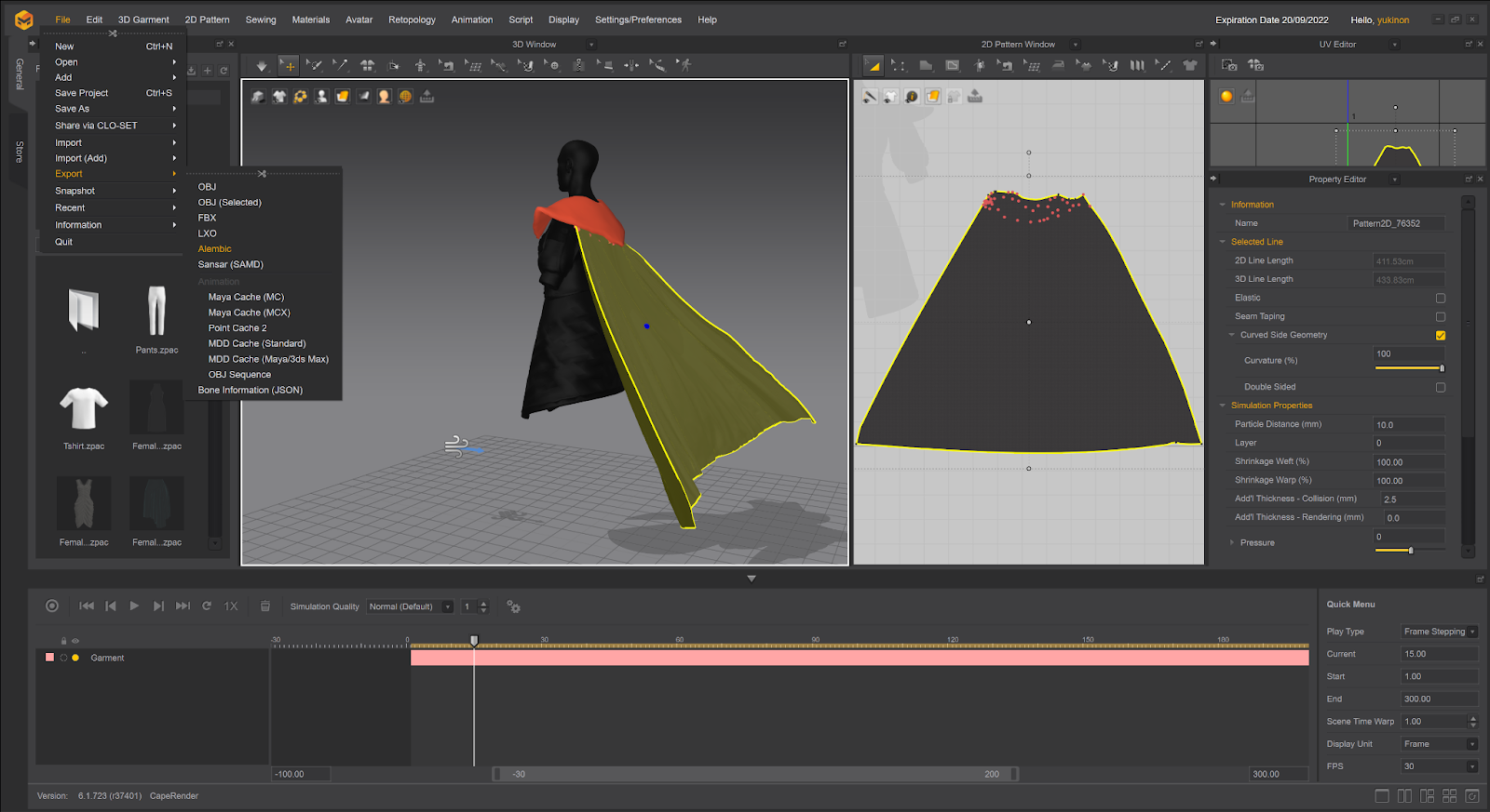
Animating the cape
Besides photo renders, I decided to create a small video and animated the character’s cape in Marvelous Designer. I did it using ‘Wind controller’. I followed these steps:
I imported the character as an avatar and imported the retopologised and UV'd (!) cape as a garment. I made sure to add a lot of pins to the top of the cape to keep it in place
I added Wind Controller and adjusted the parameters like wind direction and strength.
I recorded the garment simulation with the wind controller turned on.
I selected the animated garment and saved it as an Alembic file
I exported the file into my Marmoset scene.
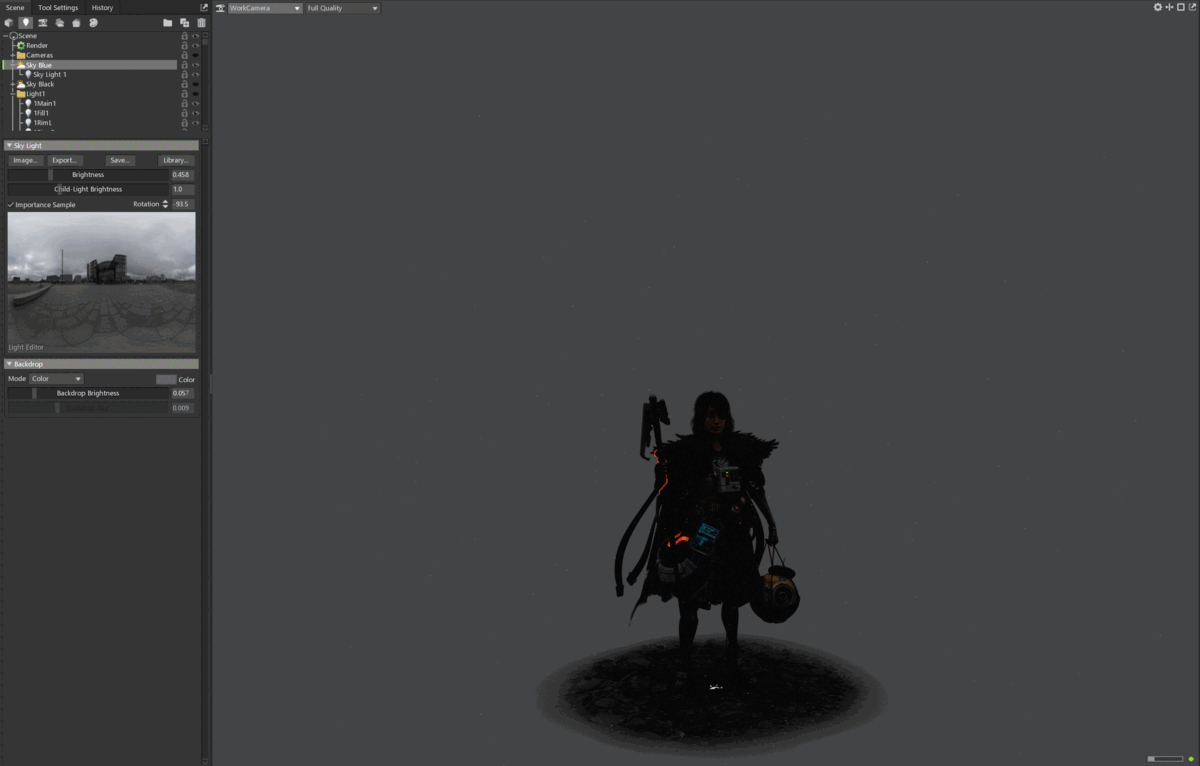
Rendering
I created a quite simple lighting setup - I used very big rectangular lights for my main, fill, and rim lights. I also added several lights drawing attention to the face and outfit elements.
As soon as I created very basic textures, I loaded the character in Marmoset Toolbag 4. This way, I could see how my textures would look in the final render right away.
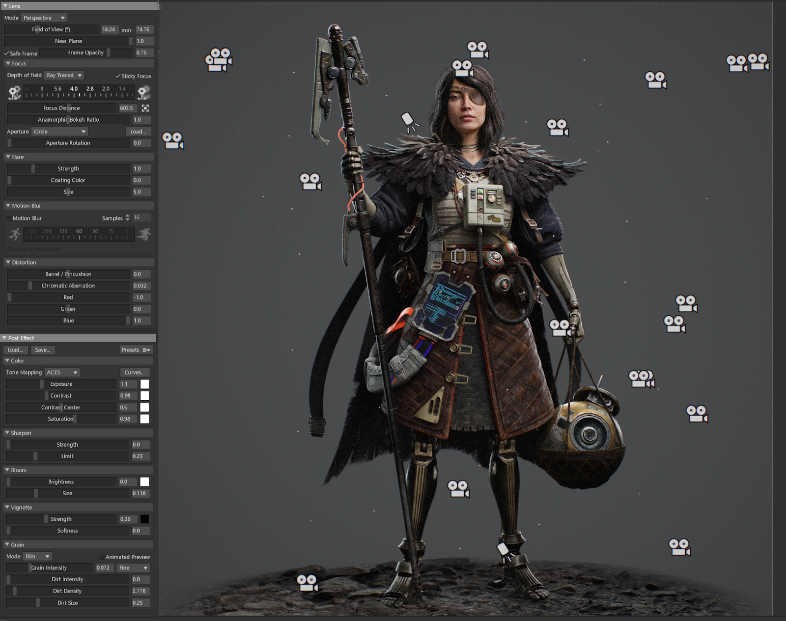
For my camera settings, I used the following setup (please see below). I used the recently introduced ACES tone mapping. It adds more depth to shaders even though makes the scene look darker. I slightly increased the brightness of my lights to compensate for this effect.
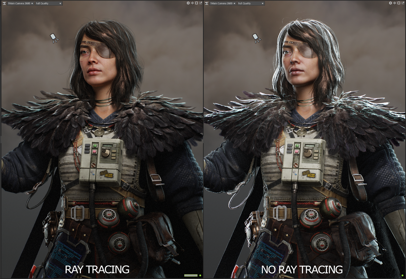
I kept my rendering settings standard but turned on Ray Tracing. It is a great feature that made the interaction of surfaces with light more realistic. Though rendering takes more time, it is definitely worth the result (please see the image below to compare).
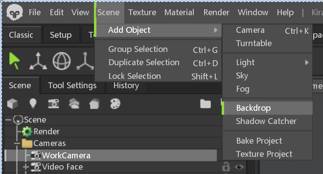
I also added a simple background using the ‘Backdrop’ feature.
As a touch-up to the scene, I also added some floating particles to make the background more interesting. I used this Youtube tutorial to add animated particles.
Conclusion
I learned a lot thanks to my mentors and the feedback from my classmates at Think Tank. It has been a challenging yet rewarding experience that helped me to further improve my 3d character artist skills. I hope this article is helpful for someone who is also learning the pipeline for creating real-time characters.