
Creating an Epic 3D Environment for your Game Portfolio
In this article, Sebastian Bubu-Oppenheimer, an Environment Artist at Rocksteady Studios, will share how he created his dark soul's inspired environment for his portfolio.
In this article, Sebastian Bubu-Oppenheimer, an Environment Artist at Rocksteady Studios, will share how he created his dark soul's inspired environment for his portfolio.

Sebastian Bubu-Oppenheimer is a Junior Environment Artist at Rocksteady Studios and a recent graduate of University of the Arts London (UAL).
We were so impressed with his Rookie Awards 2022 entry that we asked Sebastian to share details of his Highly Commended project Siege of Ponthus, inspired by some of his favourite games, and which we think, will inspire other fellow artists who want to create an epic 3D environment for their own portfolio.
For my Rookies 2022 Entry and my final major project, I wanted it to have a goal and purpose. This is important as it allows you to set a baseline and a strong direction for what you want to achieve. These goals can be anything, from testing a new skill or trying a particular style. This will give your project a sense of purpose that will encourage you to complete it, or at least experiment with something new.
This was particularly important for me, as this project was to be one of my final portfolio pieces. I wanted this project to radiate my passion and creativity for environment art. This encouraged me to research the games I enjoy playing and the environments I aspire to create. As a result, I decided to create a medieval environment inspired by the Dark Souls series.
In this article I'll be breaking down parts of my process and what I have learned throughout this project.
Research and concepting are one of the most important parts of the pipeline. Having good references and an idea of what you want your project to look like will help guide you. It will also help you plan out the upcoming weeks and months of your project.
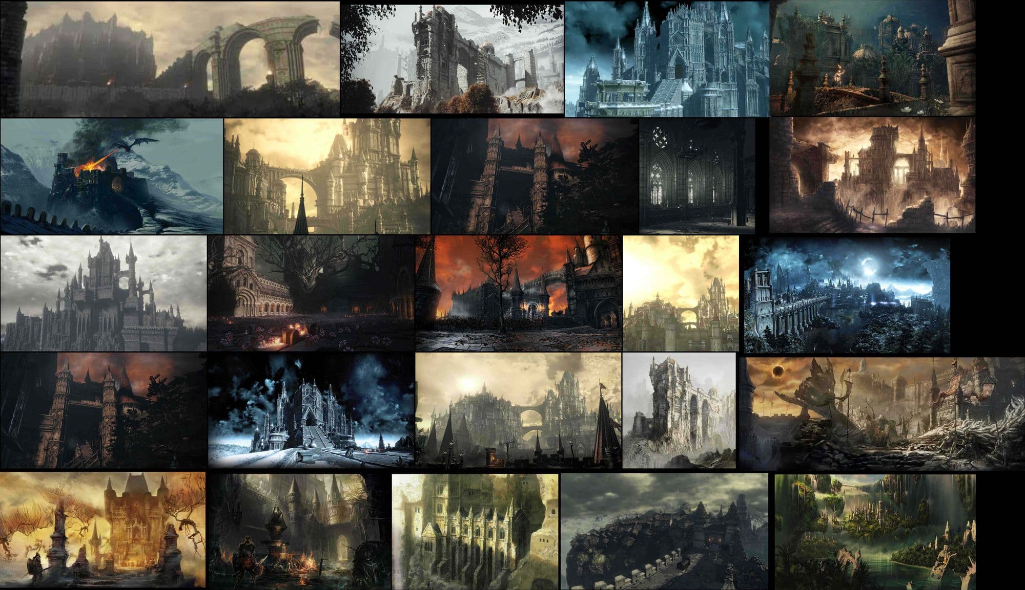
I started by researching the source material of my idea. The main aspect of Dark Souls I wanted to capture is the dream-like atmosphere. This can be seen in an area called Lothric Castle In Dark Souls 3. The intense bloom and heavy fog create a haze effect that covers the bleak environment. This helps create the surrealist and threatening atmosphere that inhabits the world.
Another element of Dark Souls I wanted to capture is the colour palette. The primary colour theme for Dark Souls is cool, desaturated, greys and blues. This represents the empty and deprived nature of the dangerous environment. There are also bursts of warm colours such as the bonfires that signifies a safe space for the player.
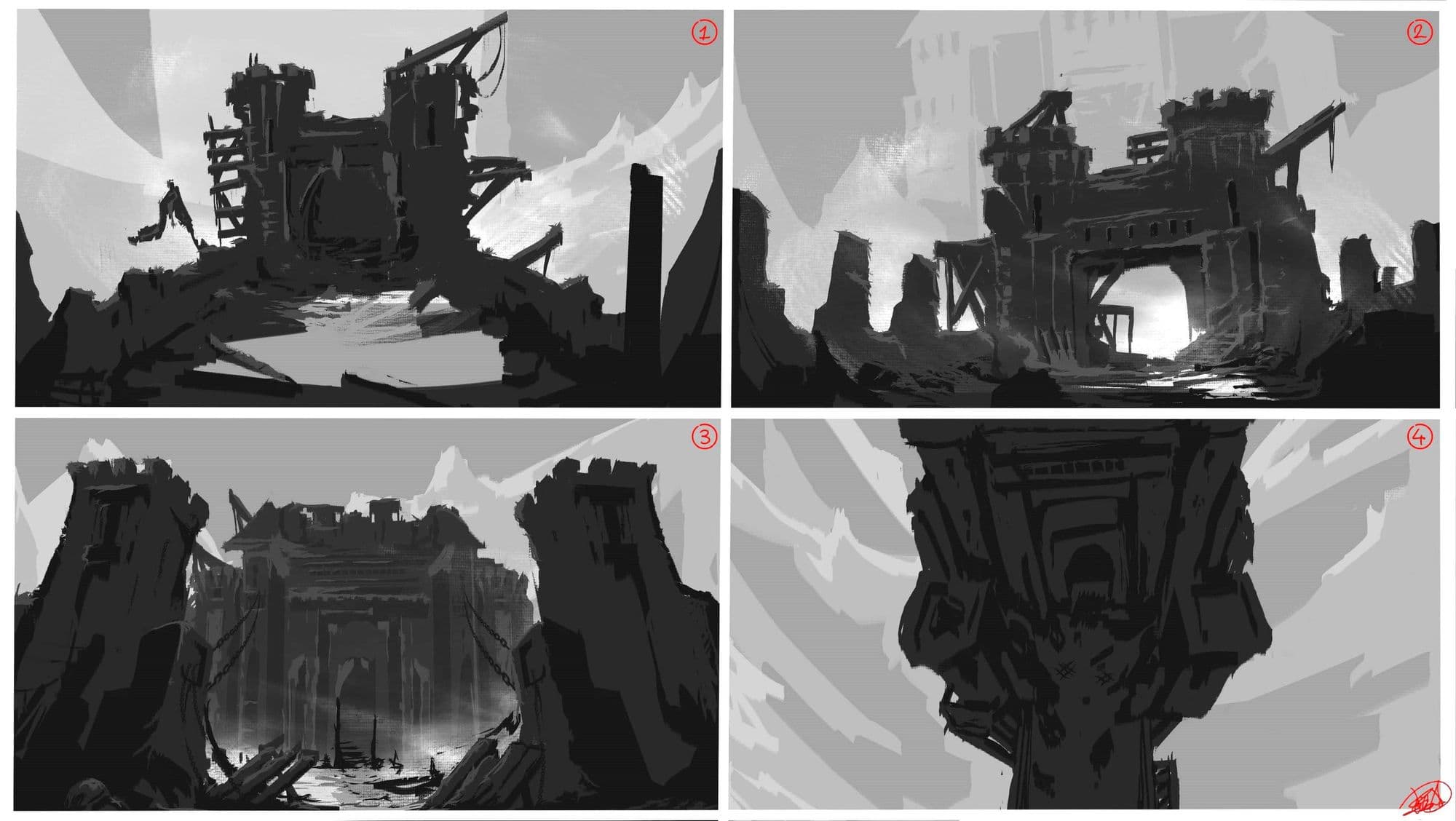
Next was concepting. Concepting can be helpful when you are struggling to visualise your project. This was particularly useful for me, as the scale and scope of my project were something I had never tackled before. Concepting can be daunting as I tend to fall into the trap of feeling obligated to spend hours when it’s not necessary. A concept only has to convey enough information about your environment, this can be a simple sketch or a few silhouettes.
To Begin with, I did a rough block out to gain an insight into the scale and proportions of my environment.
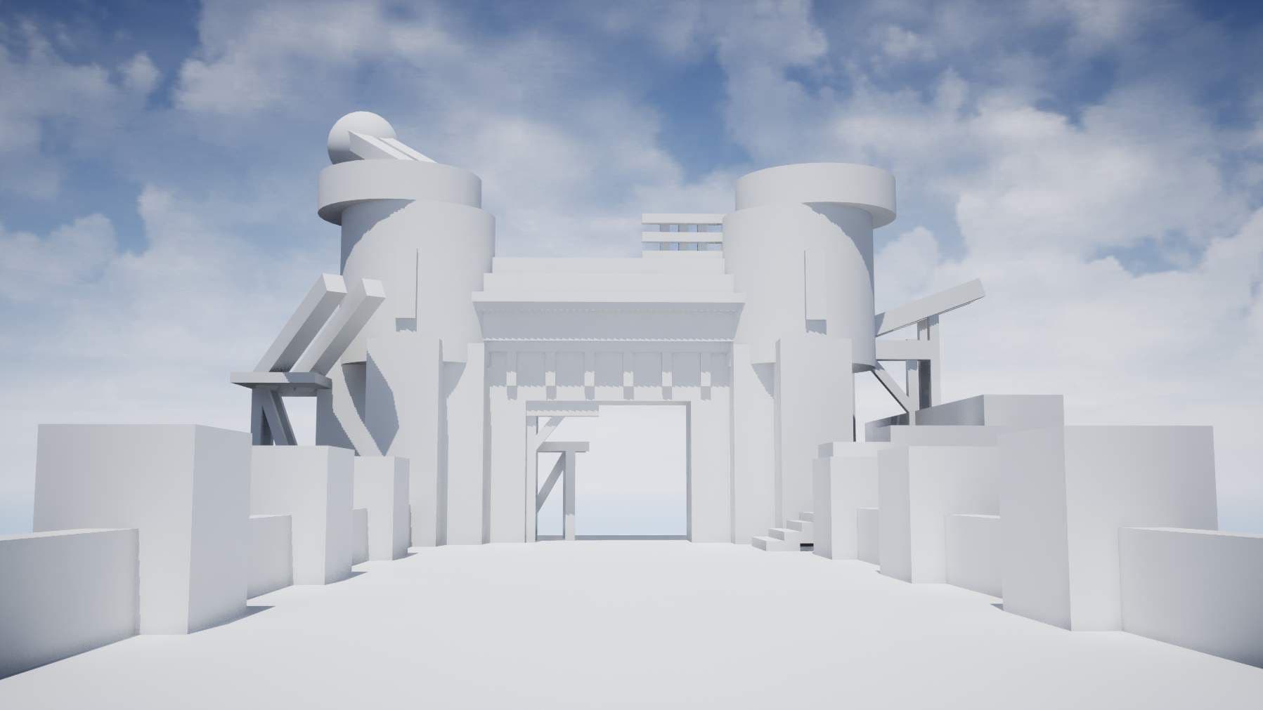
I wanted to give myself some bearings and an idea of what needs to be modular and what doesn’t. I did this all in Unreal Engine 4 as I didn’t want to be going back and forth between software. I tried to incorporate various elements from my concepts and my reference.
I highly recommend experimenting and creating something you are satisfied with. Making big changes later down the line can be harder to implement and can cause a lot of frustration.
Once I was happy with my block out I decided I would tackle my materials. I am still new to Adobe Substance 3D Designer so making four materials was a big challenge. However, through trial and error, I was able to create some decent-looking materials.
I tend to approach Substance 3D Designer as if I was sculpting an asset: first creating the shapes and any variation in the pattern and height, next cracks and surface detail, and finally, any distinct qualities that apply to my material. Since I used the same thought process for all four materials I’ll only be breaking down one in this article.
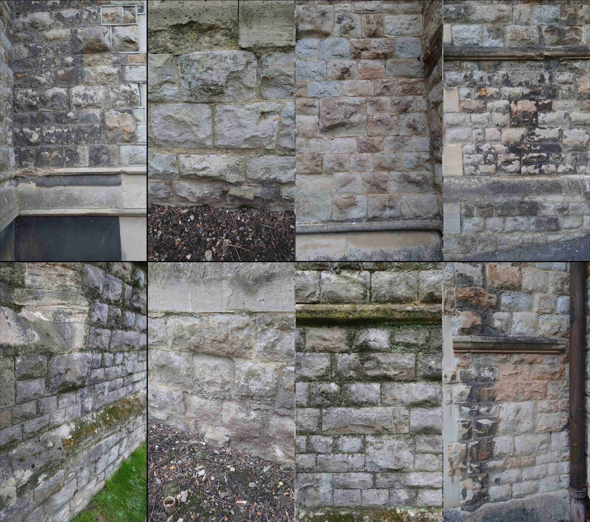
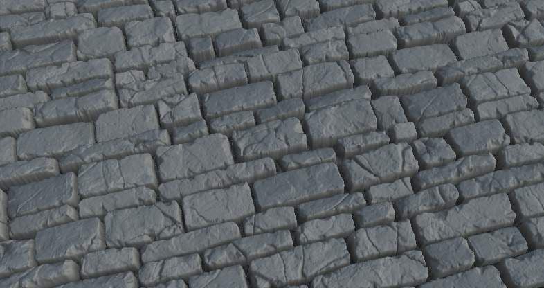
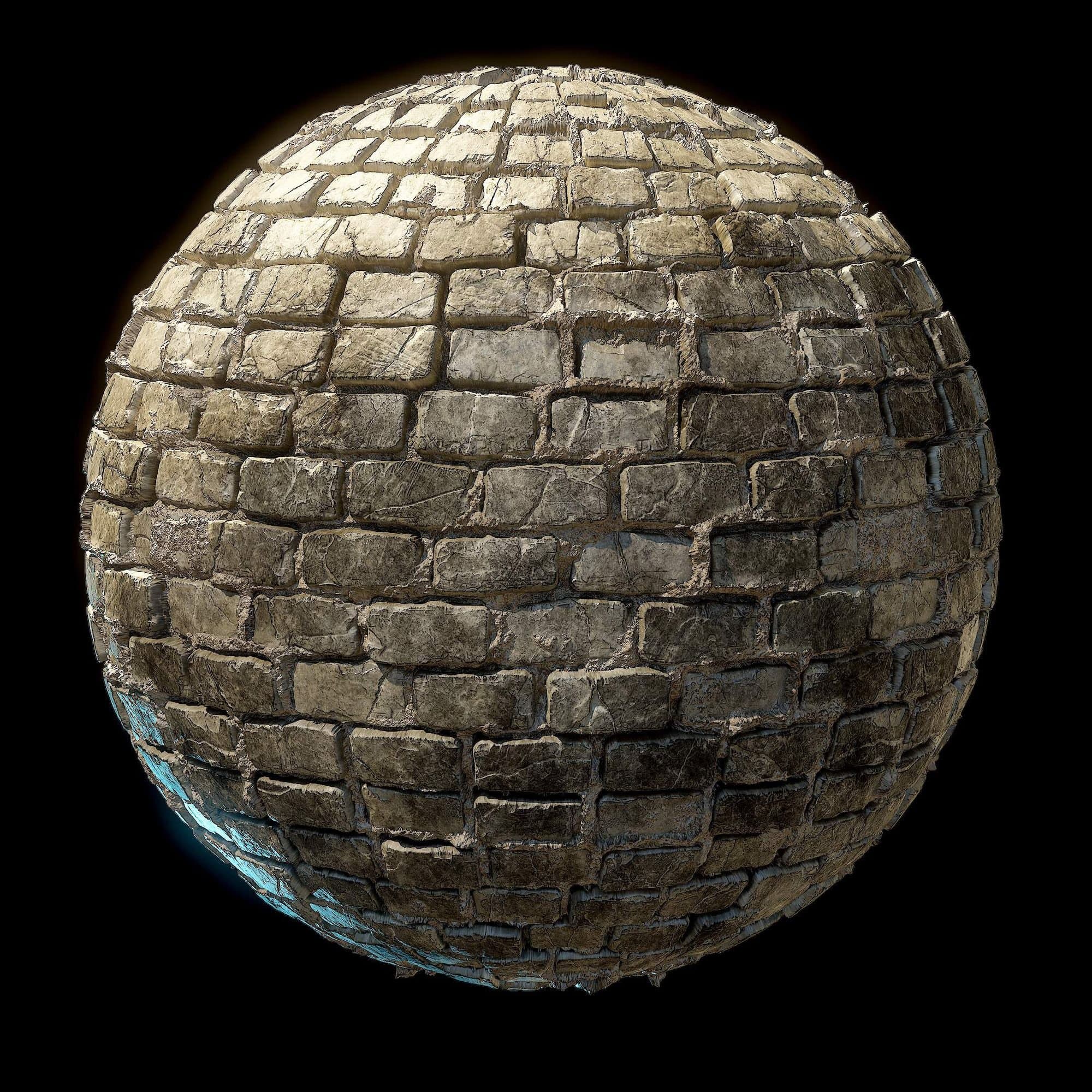
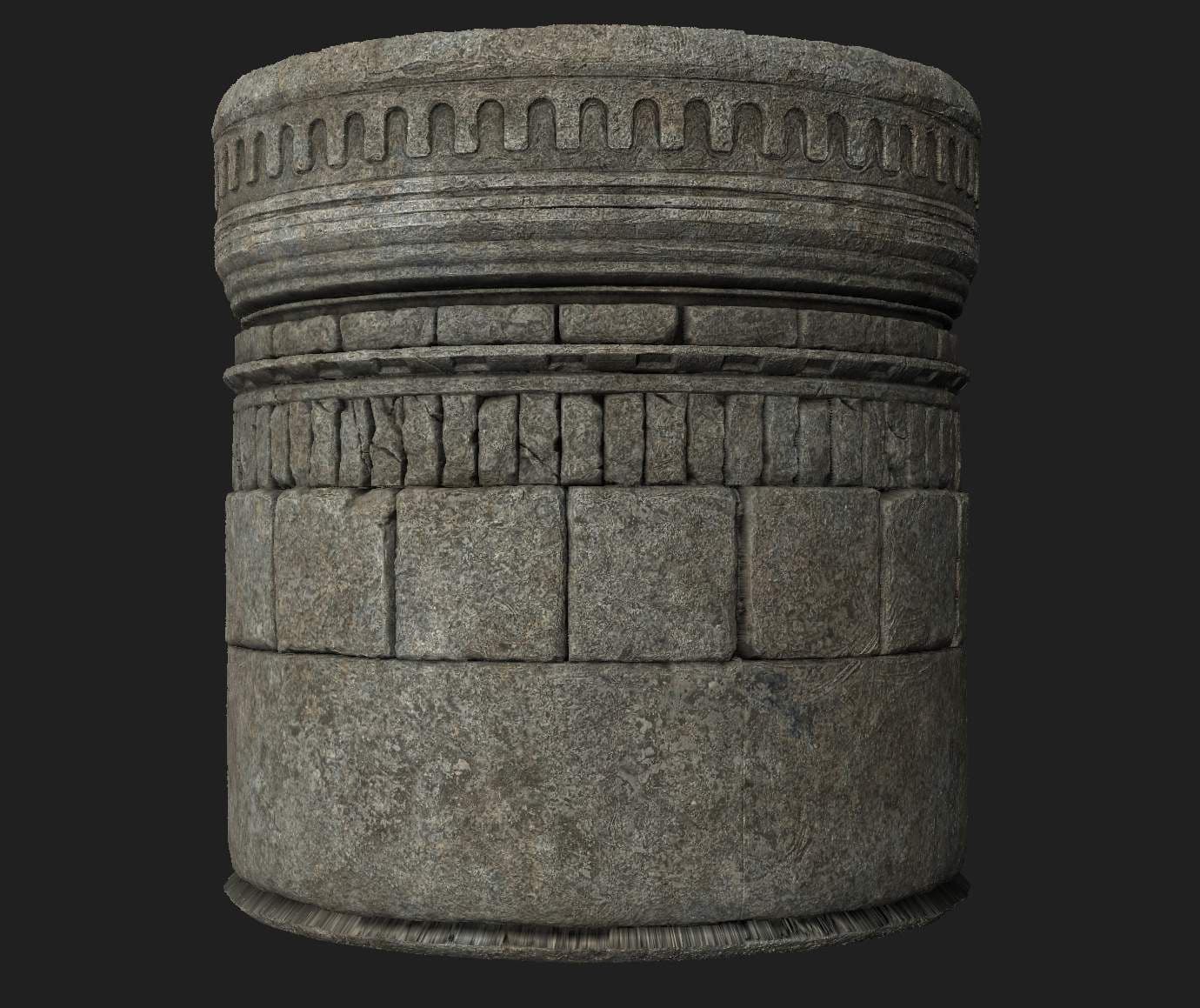
For my Brick material, I wanted it to be damaged and worn with indications of contact from battle. For my reference, I used some primary photos I had collected from a local church. This was particularly useful as it provided me with a tone of ideas for shapes and patterns on old Bricks.
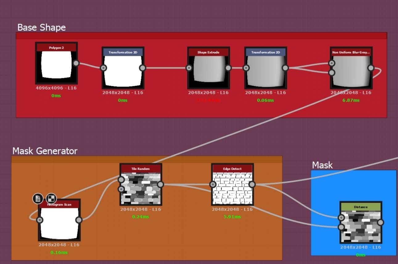
To begin with, I created the base shape for my bricks. There are a few ways to do this but I like to use a shape node with a shape extrude. This adds a gradient that translates into a tilted or knocked brick.
I then use a non-uniform blur to soften the harsh edge. I used a histogram scan for a bit more control of the gradient. In the end, I removed it as the tiling of the brick felt a bit too noisy for what I was going for. This technique also allows the option to add another shaped brick if you would like to have more variation.
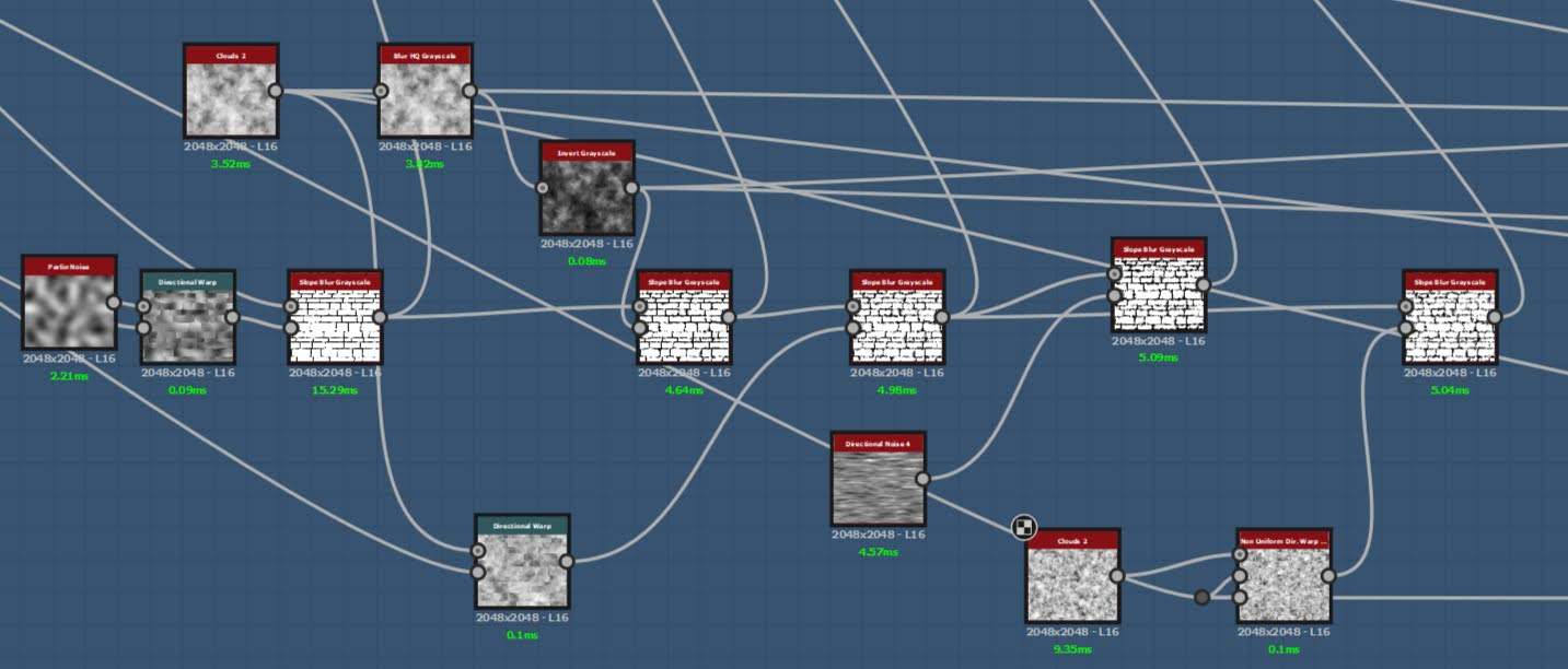
For the Edge break up I wanted to achieve an organic and sculpted feel. I used clouds 2 and directional noise 4 and passed them through a directional warp and slope blur. I then multiplied them on top of my brick, this achieved a chipping effect that I found worked well.
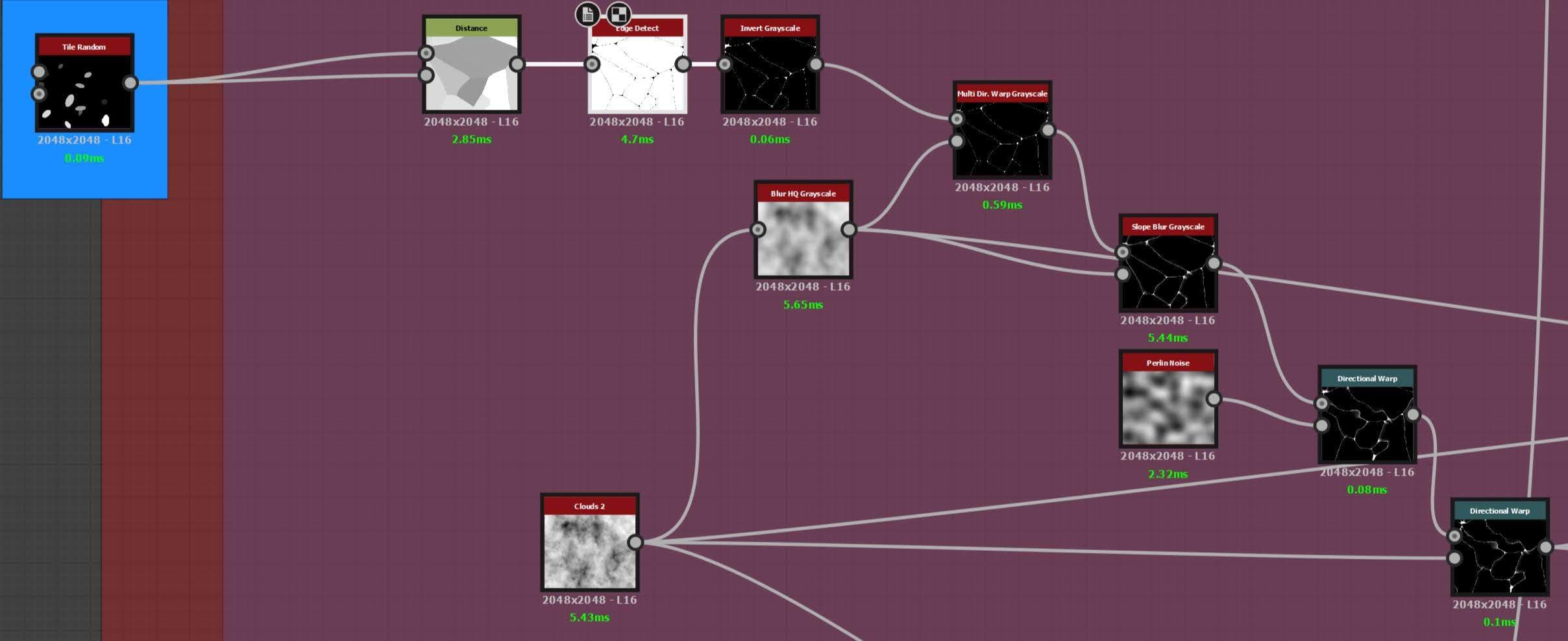
For the cracks I use a method I like to call the “Baked bean.” I used a Tile generator, Distance and an Edge detect to create fractured lines. I added a directional warp to help deform the angular lines. I then repeated the edge breakup process on them, this created cracks with subtle damage.
Finally, the surface breakup: I used older noises and slope blurs to create larger shapes. I then multiplied them on top of my bricks.
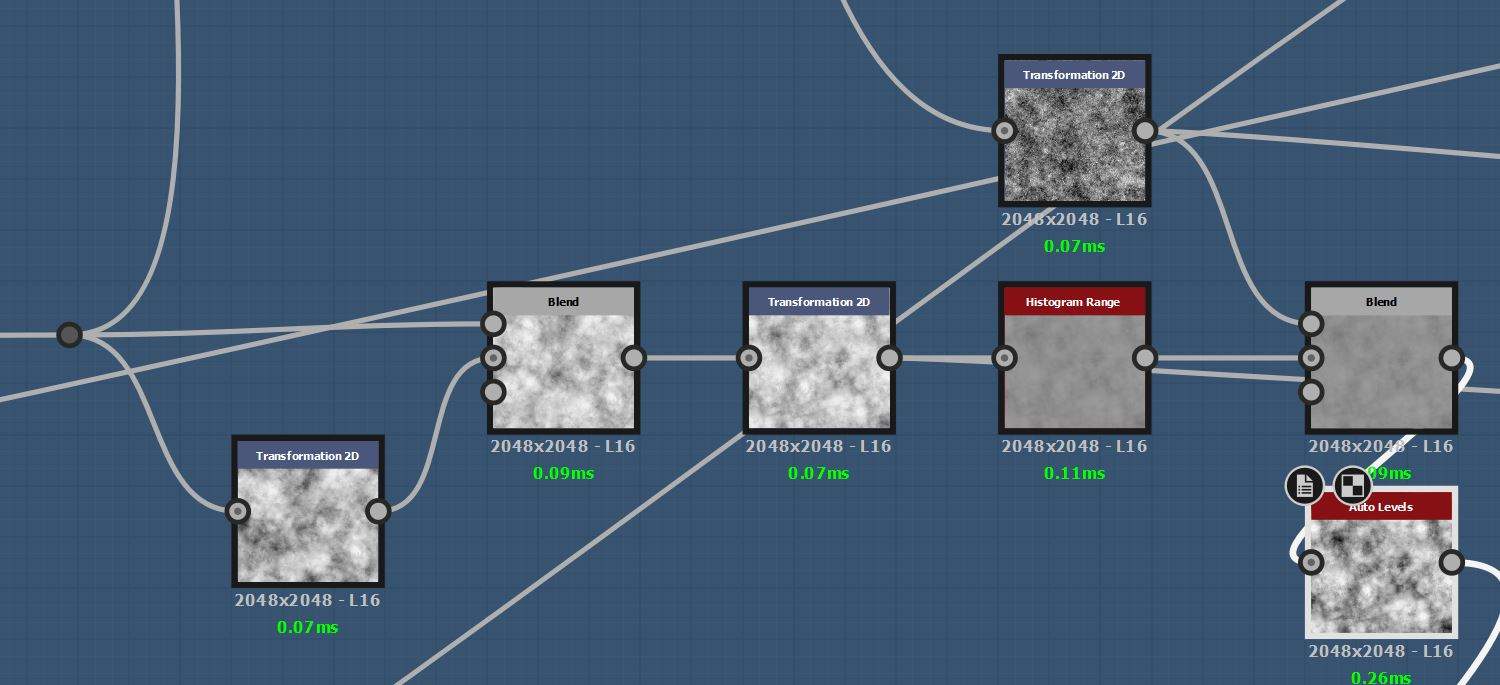
Next, I added the mortar. Using Prior maps such as clouds 2 and Perlin noise. I blended them together to create a heightmap that looked similar to my reference. I did use a histogram range to flatten the mortar so there was less angulation. I then introduced it into the graph with a height blend. This allowed me to control at what depth the bricks and mortar met and how strong the blend was between the two. I also blended an inverted mask of my bricks to help push the detail into those areas.
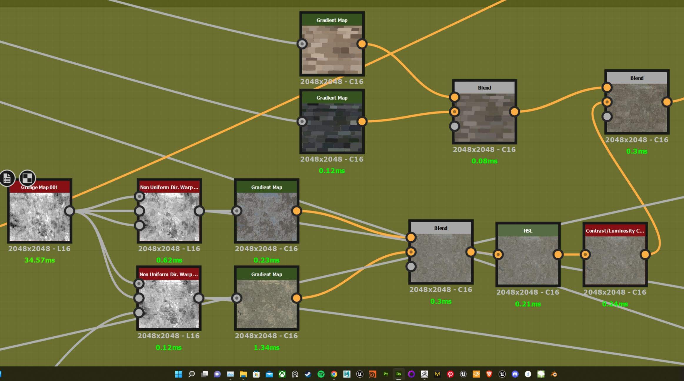
Next was the Albedo. I used the same grunge map as both inputs through a multi-directional warp. I then colour-picked from my reference and blended the two together. To give some colour variation between the bricks I also used my flood fill mask and a gradient map. This provided each brick with undertones of a random colour and I blended them all together. I then did the same with the mortar.
I created two trim sheets in total for this project. The first was my caste trim and the second was my wooden trim. I used the same process for both starting in Maya. I created the mid-poly based on the scale from my blockout. I then made shapes I thought would be interesting, whilst still being accurate to my reference.
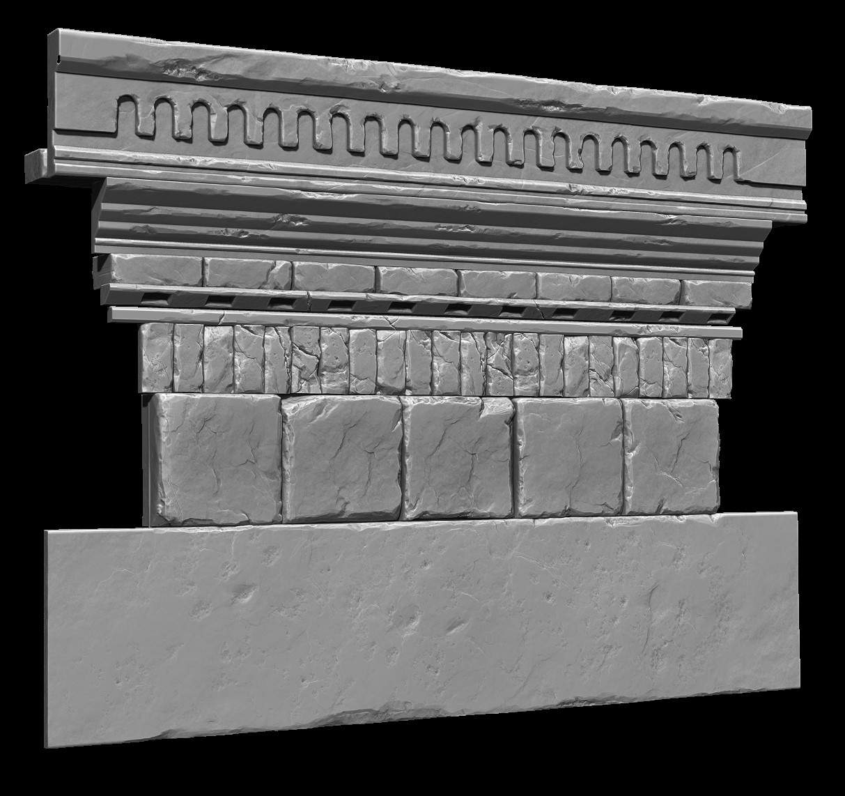
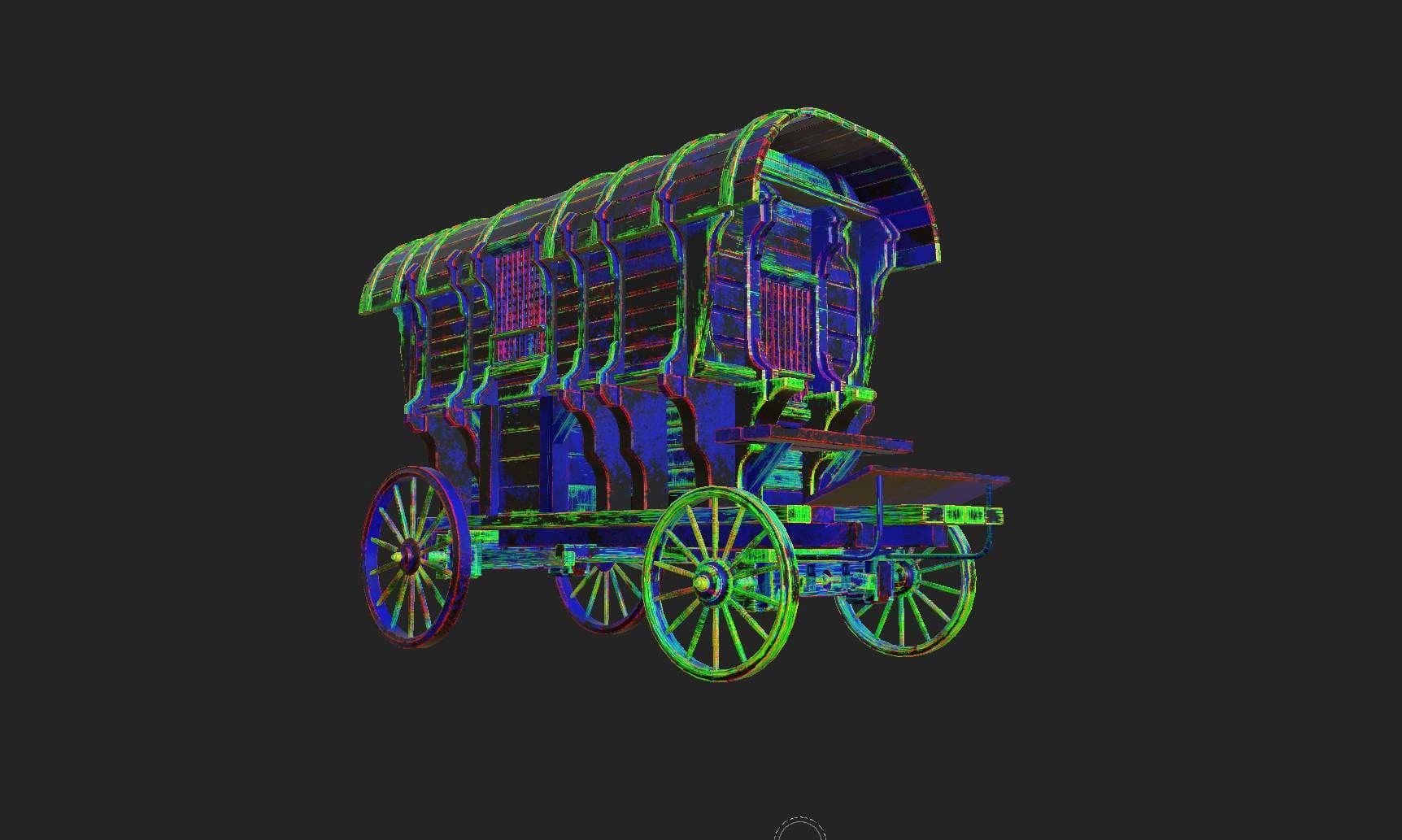
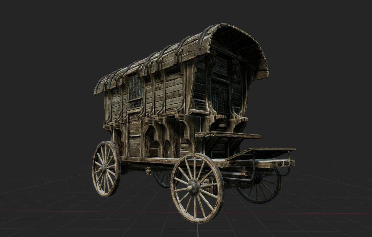
I then did a ZBrush pass using the same methodology from my Tiling materials. I began by looking at my reference and decided what details I should sculpt or texture. The larger details such as broken parts, chipped edges and cracks were sculpted. The surface grain and subtle angulation were textured later. These details can be a lot harder to sculpt and tend to need a lot of tweaking and adjusting. This can slow down the pipeline and fluidity if done in Zbrush.
I began by using boolean shapes on meshes to create large and sharp damaged sections. I then went over the edges with the Trim dynamic and Trim smooth border to beat up the other edges. For the cracks, I used the orb cracks brushes as well as the Dam standard. For the surface detail, I used a few noises from ZBrush's library. I played with the parameters till I found something I liked. I also used the clay buildup and flatten brushes. This created a layering effect that stone bricks or tiles tend to have.
Next was the base colour, for the castle trim sheet I used Substance 3D Designer. However, for my wooden trim, I used Substance 3D Painter. Both software can achieve amazing results. I tend to use Designer if I need to add more to my height map or if I want to use a large range of colours. Yet I do prefer Painter when my trim sheet has a range of materials as it can be a lot faster to achieve a good result.
I added on top of my height map two grunge maps through a directional warp to add some subtle noise to my trim. Finally, for the Albedo, I used the same process from my bricks.
Once I had finished my materials, I made a rough prototype of my castle. I didn't go into too much detail as I didn't want to commit to anything yet. I started to plan out the composition and began to build the atmosphere and lighting.
Although it was still early in the project I wanted to get a second opinion.
I recommend reaching out for feedback as soon as possible. When you have worked on something for a long time you tend to become pessimistic about the project.
This was the case for me and I didn't feel confident with my starting point. However, seeking out advice helped me understand that this is completely normal. Having doubts is part of the process and is always a good sign.
This was also where I began testing my materials in engine. This was to see how they interacted with each other and if any normal information was too strong. However, at this point, the materials were not final. Throughout the project, I was constantly going back to Designer to tweak parameters or try something else. This is one of the advantages of creating materials exclusively in Designer. The freedom of going back and forth is extremely fast and allows you to easily iterate. Whereas with Zbrush, this can be a bit of a hassle and takes a lot more time.
The Majority of the kit was achieved by using a mid-poly workflow. I mainly relied on trims and decals to achieve details.
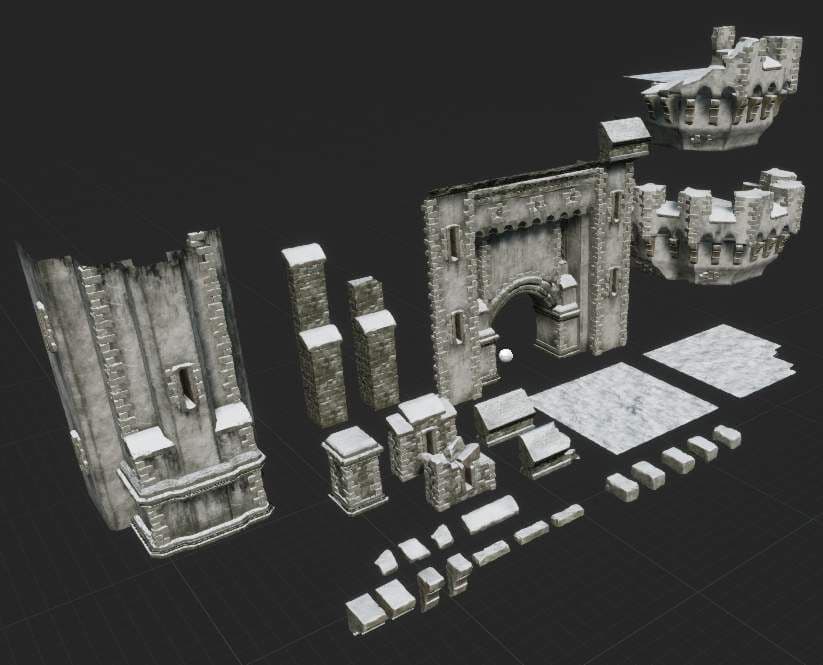
Some parts of my kit such as the bricks, arrow slits and machicolations were made using the standard high-to-low poly workflow. When making the parts of Gatehouse I knew I wanted them to be reusable and modular. This was because I didn't want to make a separate kit for the castle. So I made a few rules that I wanted all my parts to follow. First, they would snap to 50cm or 100cm. Second, the height would be either 2, 6 or 12m per part and finally be mirror friendly. I then created a few broken variations by breaking parts off.
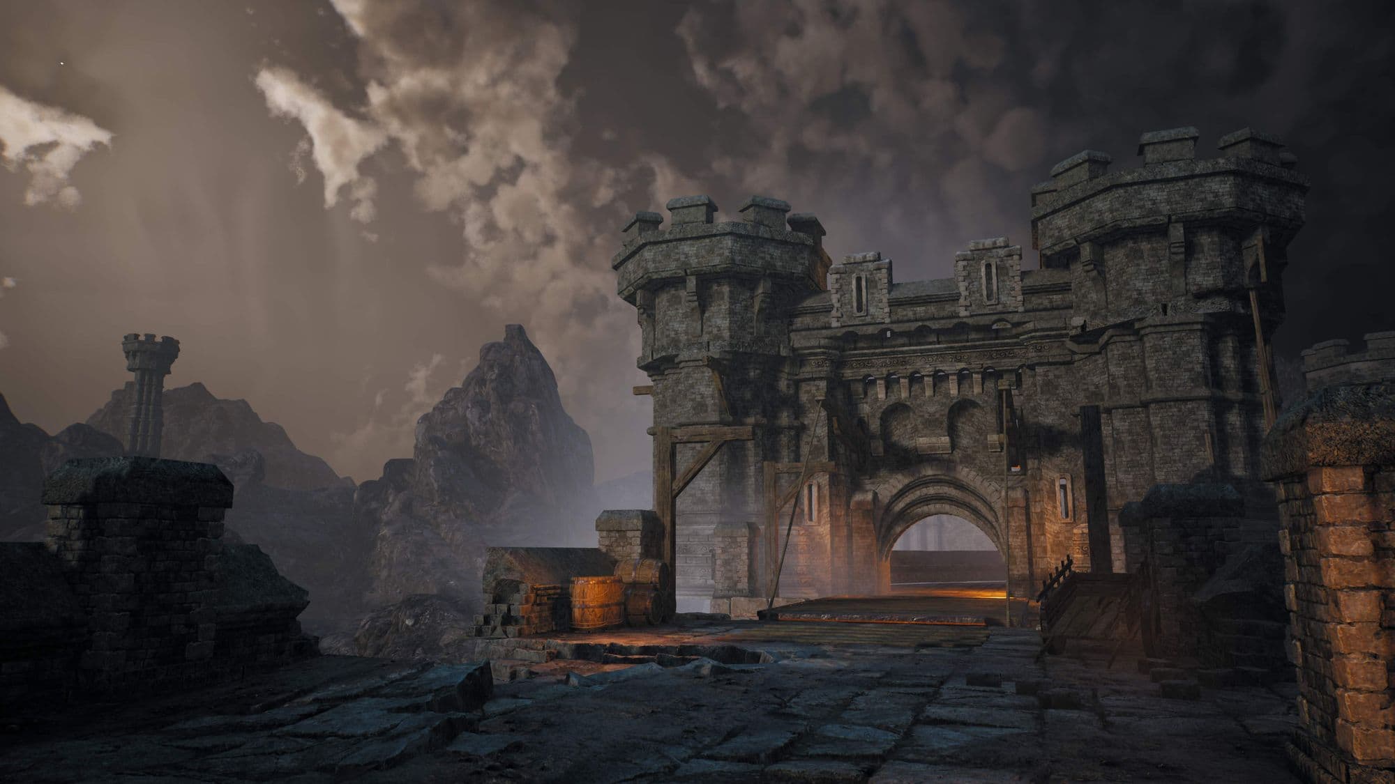
Once I had established my Castle design I moved on to the second pass. I started to cement the direction I wanted my project to go in and the overall mood.
I referred heavily to my reference and asked for some insight from Angelo Tsiflas on how I should approach my lighting. I went ahead and analysed the values and realised I wasn't using the full exposure range. Additionally, my values were not consistent; the sky and background mountains were much darker compared to my gatehouse due to the light grey tones of the bricks. However, this made the environment feel flat and hard to distinguish the mountains, sky and gatehouse.
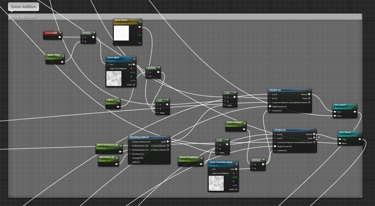
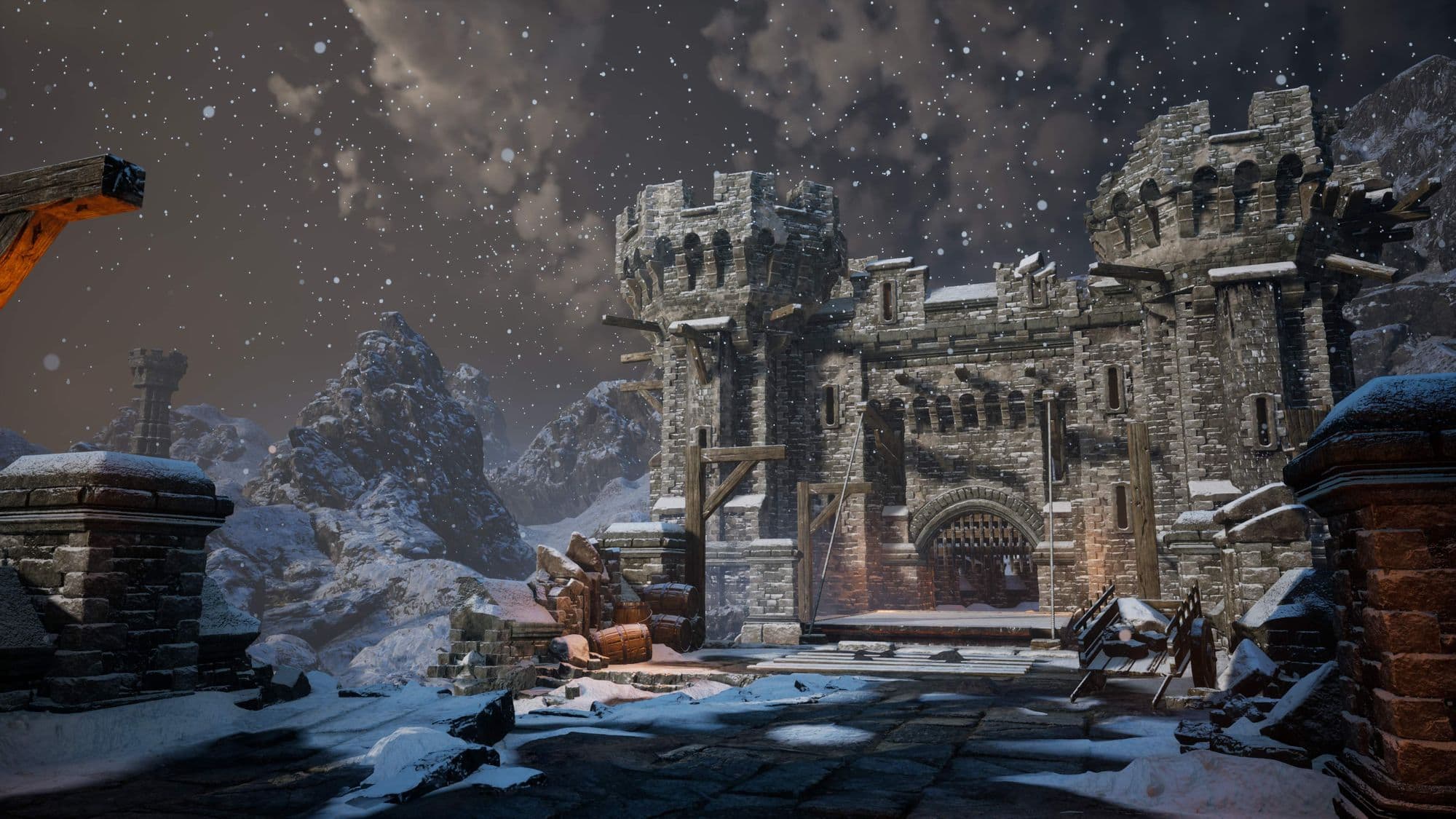
This is also where I added the snow shader to all my master materials. I reused my dirt normal as the base for my snow and added some colour variation with a few masks. The main driver of the snow is the world-aligned blend node that sets the position of the snow as well as the blend strength. I then height lerped it into my other textures.
Most of my props used a mid-poly workflow and used my wooden trim as the main texture. However, in order to remove the appearance of all the assets using the same texture I created masks in Substance 3D Painter.
Each asset had a mask that was then exposed in the shader. This meant I could add bespoke details that would reduce the repetitiveness. It also meant I could add a bit more variation to the asset such as dirt edge wear or damage. I also made sure to fully utilise my texel density by mirroring where ever possible. This was particularly important for some of the larger assets.
Finally, For my composition, I paid close attention to a few rules that are commonly used in art. First off, I wanted to lead the eye to the main focal point which is the castle.
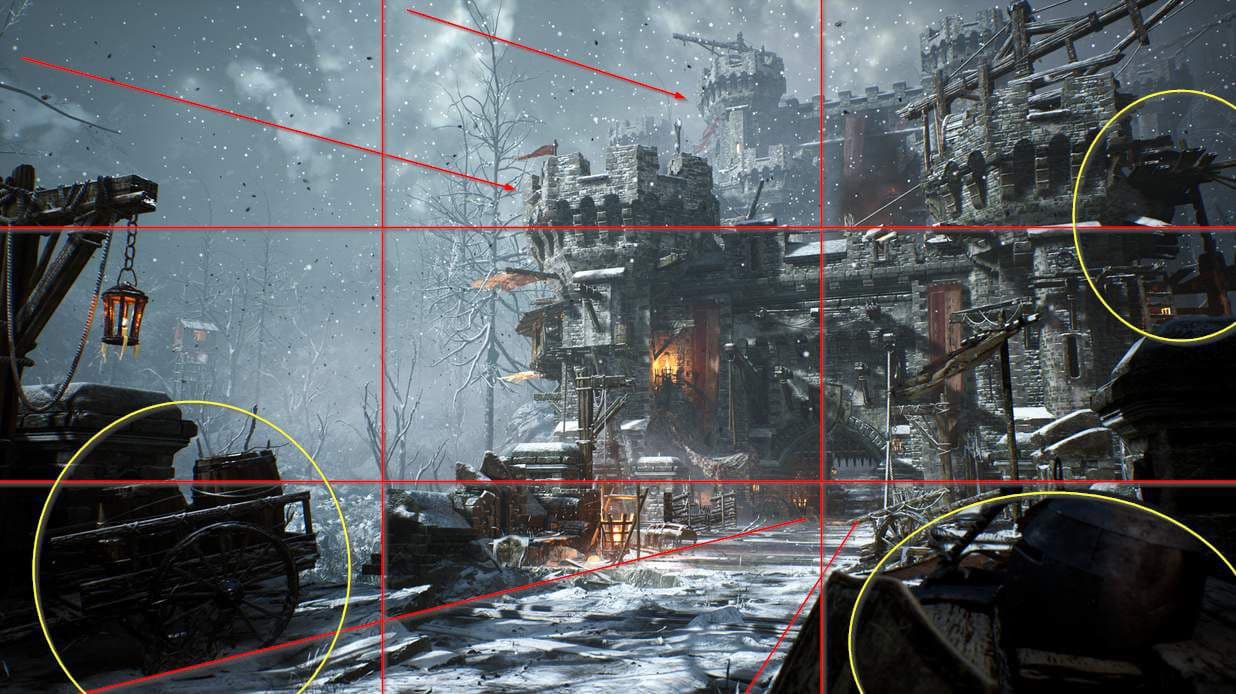
Having subtle directional flow to my asset placement and density helps direct the eye. I also used the rule of thirds and offset the focal point. I added strong silhouettes to each corner to increase the feeling of depth. This illustrates a story that allows the viewer to dissect and appreciate all aspects and subtleties of your project.
The final post process and lighting pass are where you get that last 20% that can push your whole project. This is where I added a few key lights to help certain areas pop. I also added some FX, such as fog cards, smoke, fire, sparks and ash. I used the base unreal particles and tweaked a few of the parameters till I was happy. The fog cards were incredibly powerful as they helped separate a lot of the background. They also separated areas in the scene to provide a subtle ambience and mood.
For my lighting, I drew a tone of inspiration from God of War. The blues, greys and greens create a mystical but barren atmosphere. The addition of saturated reds and oranges adds bursts of life.
I Played a lot with the most Post Process volume and adjusted each parameter until I was satisfied with the result.
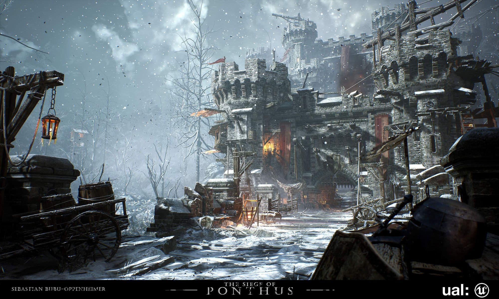
Here is The Final Result! I hope you have learned something new or at least enjoyed reading. A massive thank you to The Rookies for giving me this opportunity as well as creating a platform where aspiring artists can learn and progress with fellow students.
If you have any questions feel free to send me a message on ArtStation or LinkedIn.
Thank you for reading,
Sebastian.
You can check out the cinematic here too:
You can find more of Sebastian's work on The Rookies, ArtStation, and reach out to him via LinkedIn.