
Creating a Believable Atmosphere by Lighting a Self Made Concept
Sascha Bähr is a Junior Lighting/Shading Artist at Pixomondo. In this article he shares his tips how to build a concept and create a believable atmosphere by lighting the scene.
Sascha Bähr is a Junior Lighting/Shading Artist at Pixomondo. In this article he shares his tips how to build a concept and create a believable atmosphere by lighting the scene.

Sascha Bähr is a recent graduate of PIXL VISN and now, a Junior Lighting/Shading Artist at Pixomondo, one of Germany's leading VFX studios for Feature film and television. He has always had a keen interest in 3D, drawing and virtual storytelling. A career changer from print advertising, he decided to move into the 3D entertainment industry to follow his passion for 3D.
After watching and analysing countless demo reels, Sascha shares his tips how to build a concept and create a believable atmosphere by lighting the scene.
As a 3D artist specialising in lighting, in this article I want to share with you what I learned about lighting a scene with a concept I created myself for 3D Animation.
Wacom Cintiq + Pen for Paintings and sketches in Photoshop and sculpting in ZBrush.

For the basic planning of the scene, the following questions helped me:
The questions also helped me later in the lighting, for example, to set a time to determine the position of the sun and the angle of the shadows.
During the planning I also thought about the size of the project and the number of cameras needed. All the work had to be done within a certain time frame. As a creative person, it was an important point for me to keep the megalomania in check during the conception: creative people will always want to do more to make the project better. If you know this trait in yourself, it is important to draw a line early, for example, to avoid creating more models later and jeopardising the schedule.
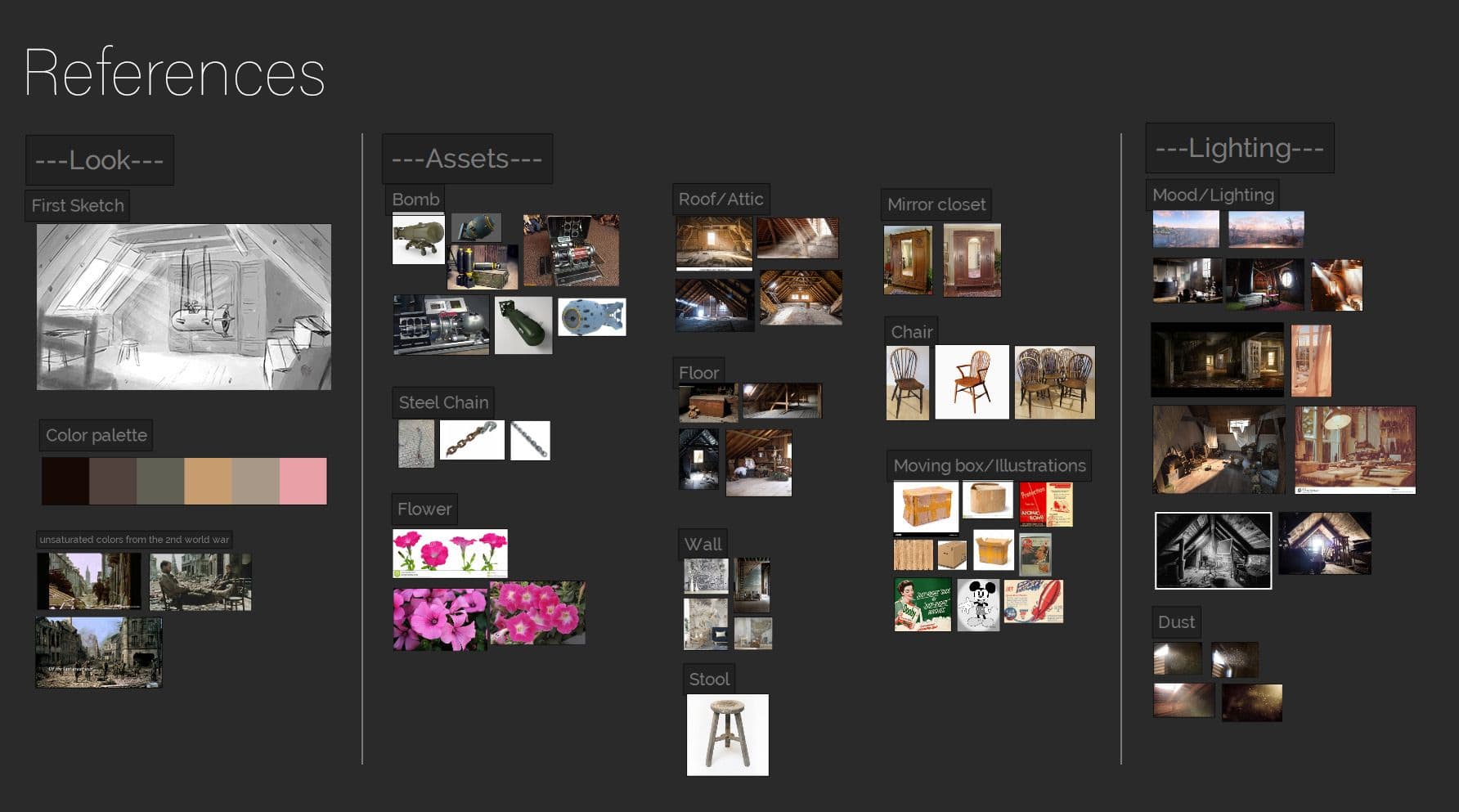
As a source of inspiration I used ArtStation, Pinterest and the keyword search on google.
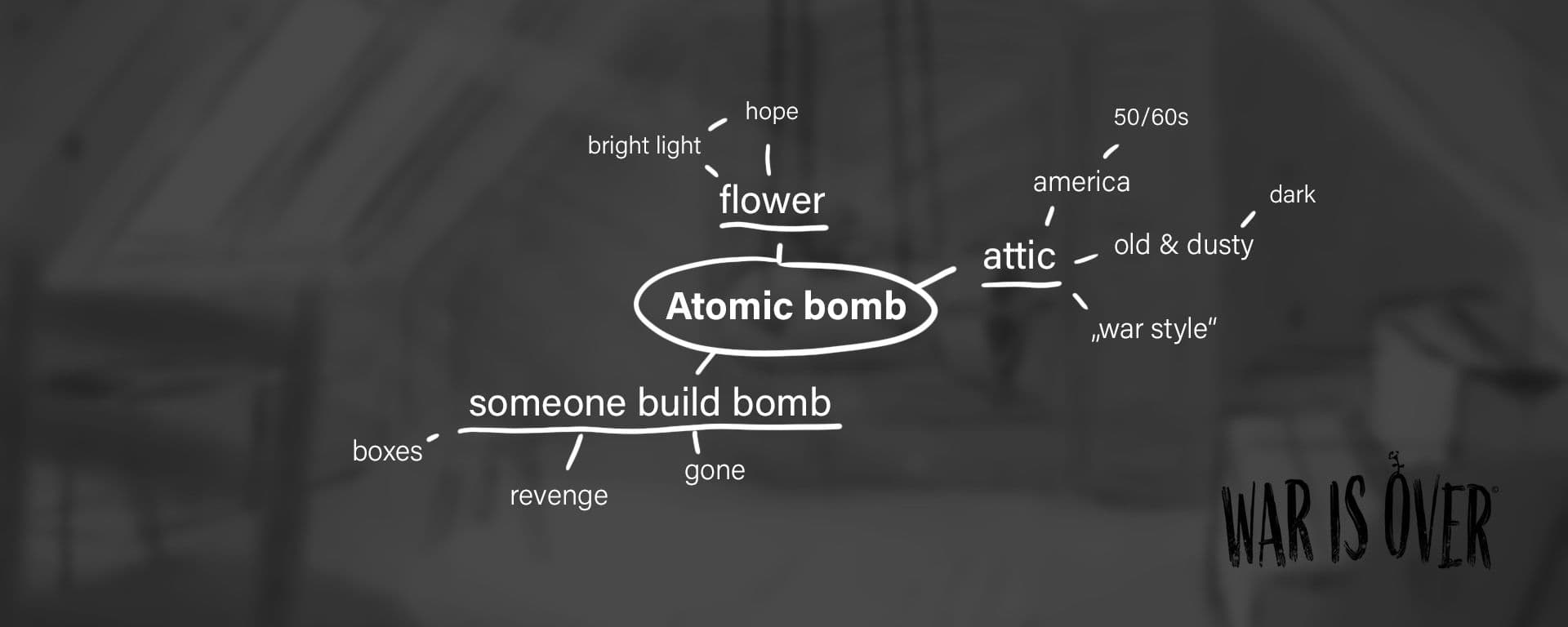
The idea was found. The following things helped me a lot in the further planning:
Also in blocking I was able to decide which items I would need. To avoid spending too much time modeling assets from this time, I decided to create different sizes of boxes that I could repurpose by printing them differently.
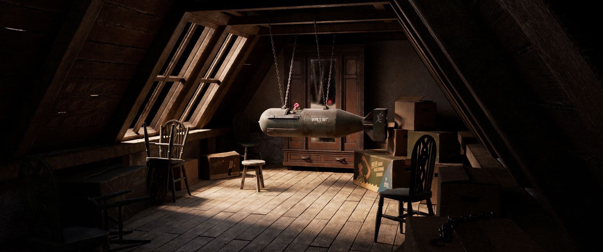
Since I decided on a style of the 50/60s and wanted to pick up the mood of that time a bit, I thought of some ideas for the packaging which could subjectively pick up the mood.
After the initial planning stage, I needed to take the next stage seriously, so therefore, I created a schedule, a list of required assets and a buffer zone! The buffer was important for me to deal concretely with problems that will occur in any case! It's important to be honest with yourself about what you can definitely do.
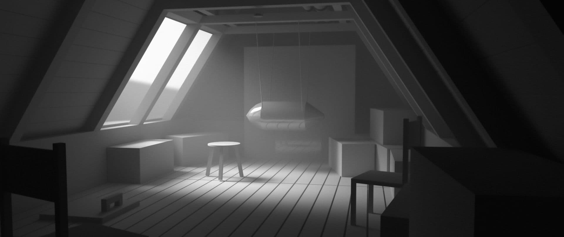
It helps me early on to position the lights after creating the camera in the blockout of the environment. I pay attention to a good composition and in the case of this project, to a clear focus. I create a render layer for a clay render and use it as an overwrite early in the process so that I don't see the textures and can focus on the light and shadow.
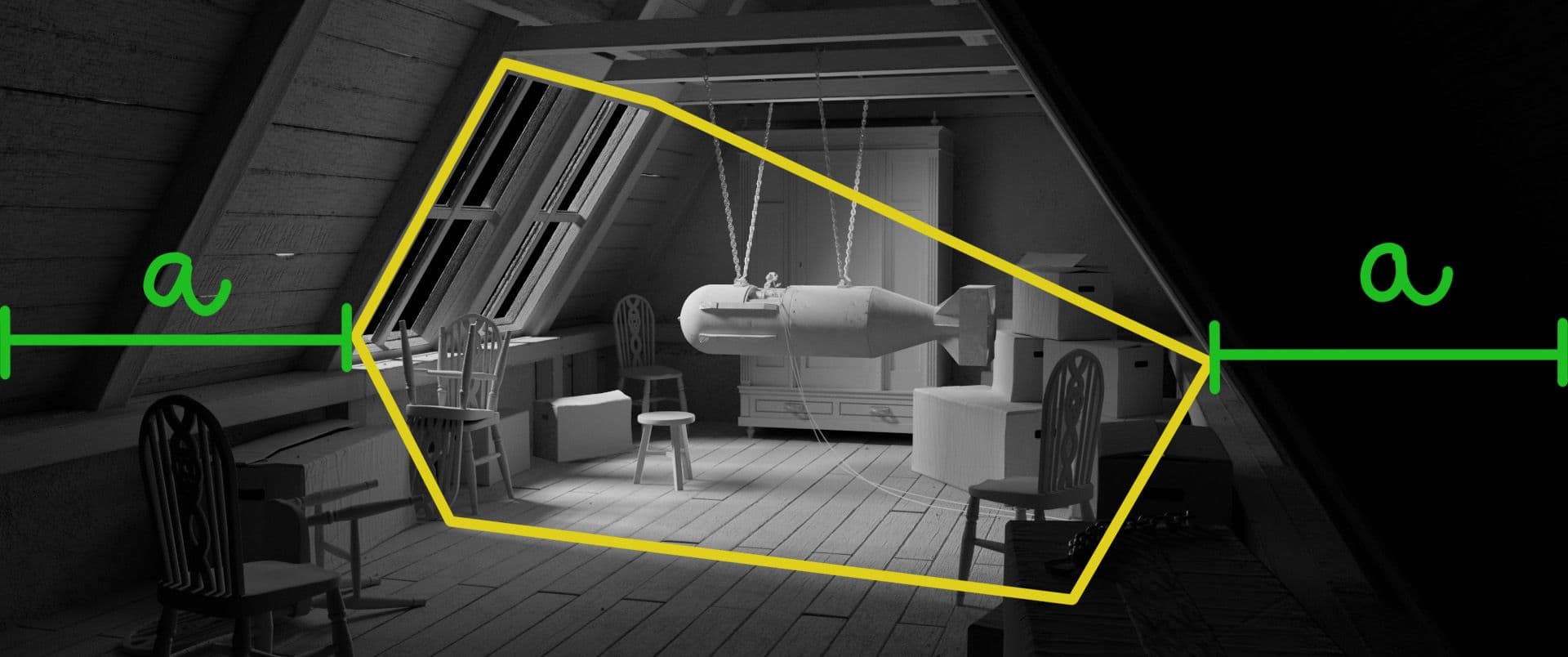
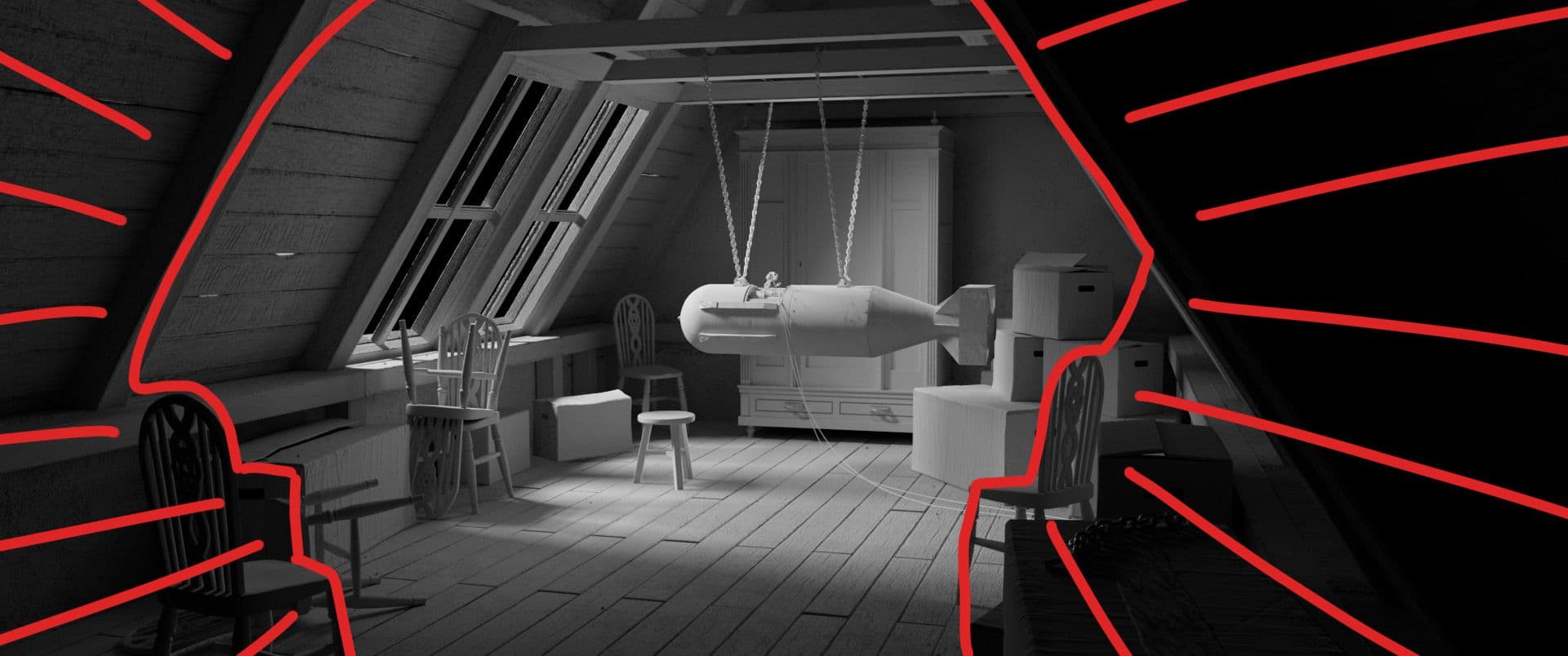
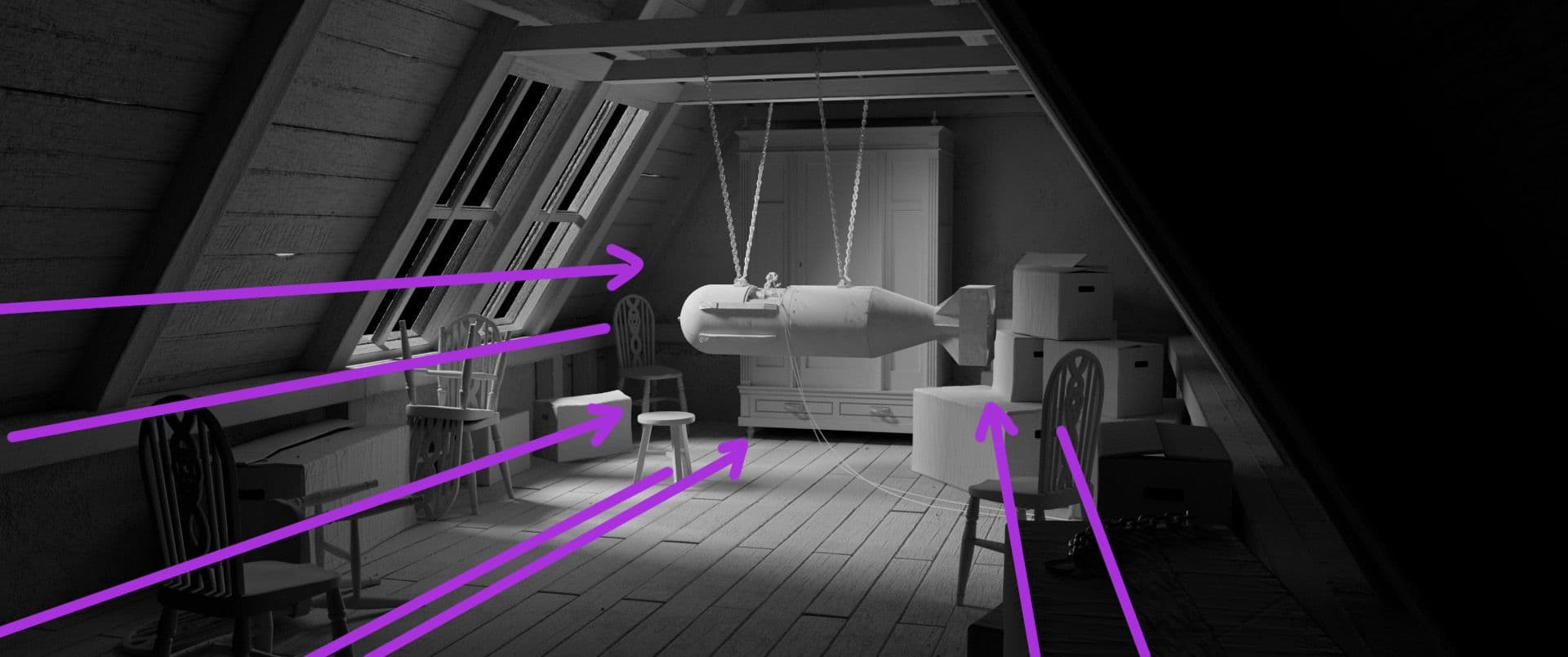
This allowed me, for example, to move the assets so that they created an artificial vignette in conjunction with the light at the end. Among other compositing rules, this setting further increased the focus on the Hero object.
In conjunction with the environment and the camera, I built the scene in such a way that guidelines are created, which increase the focus on the hero object. This makes it easier to add a "focus" later during lighting and comp.
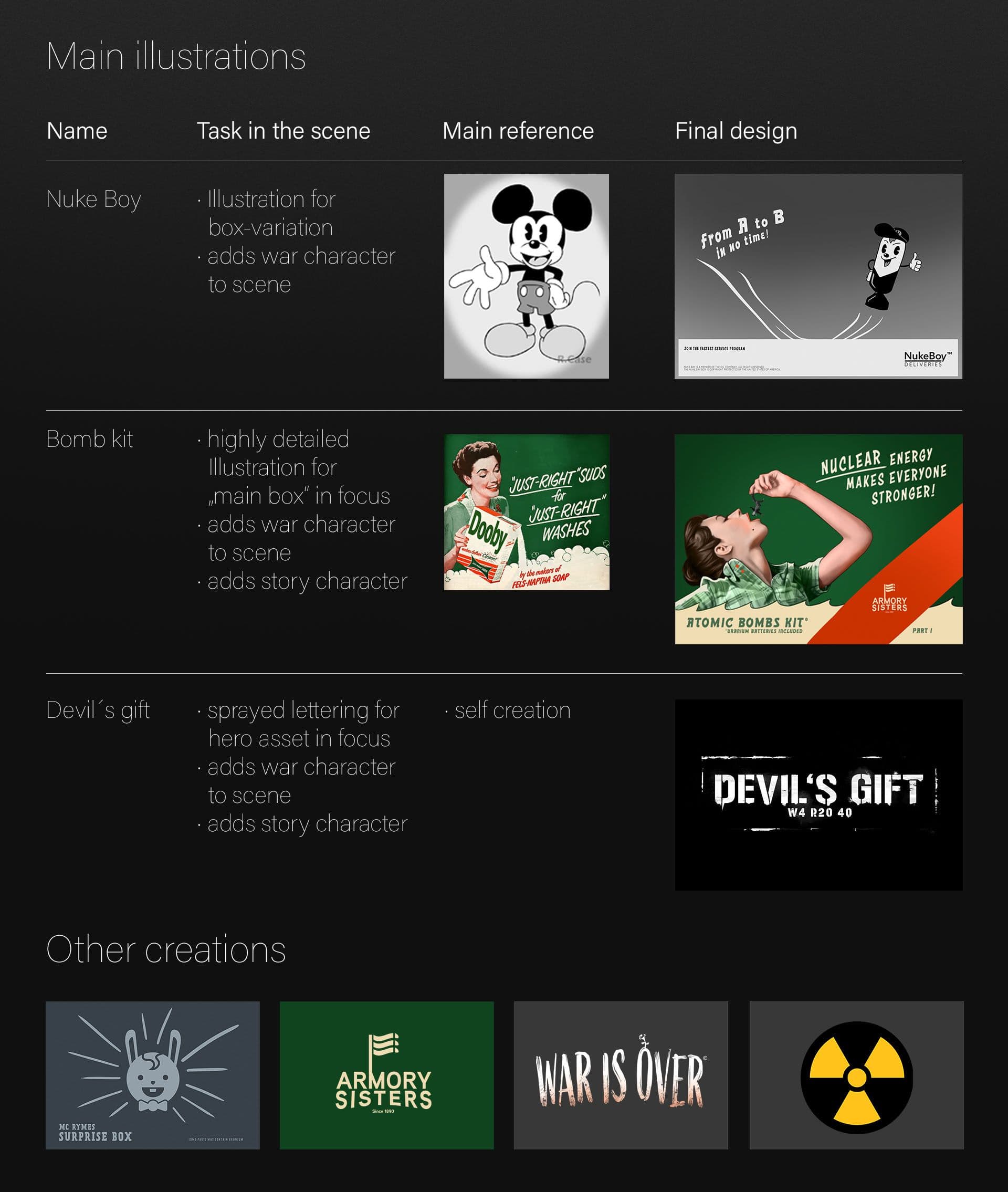
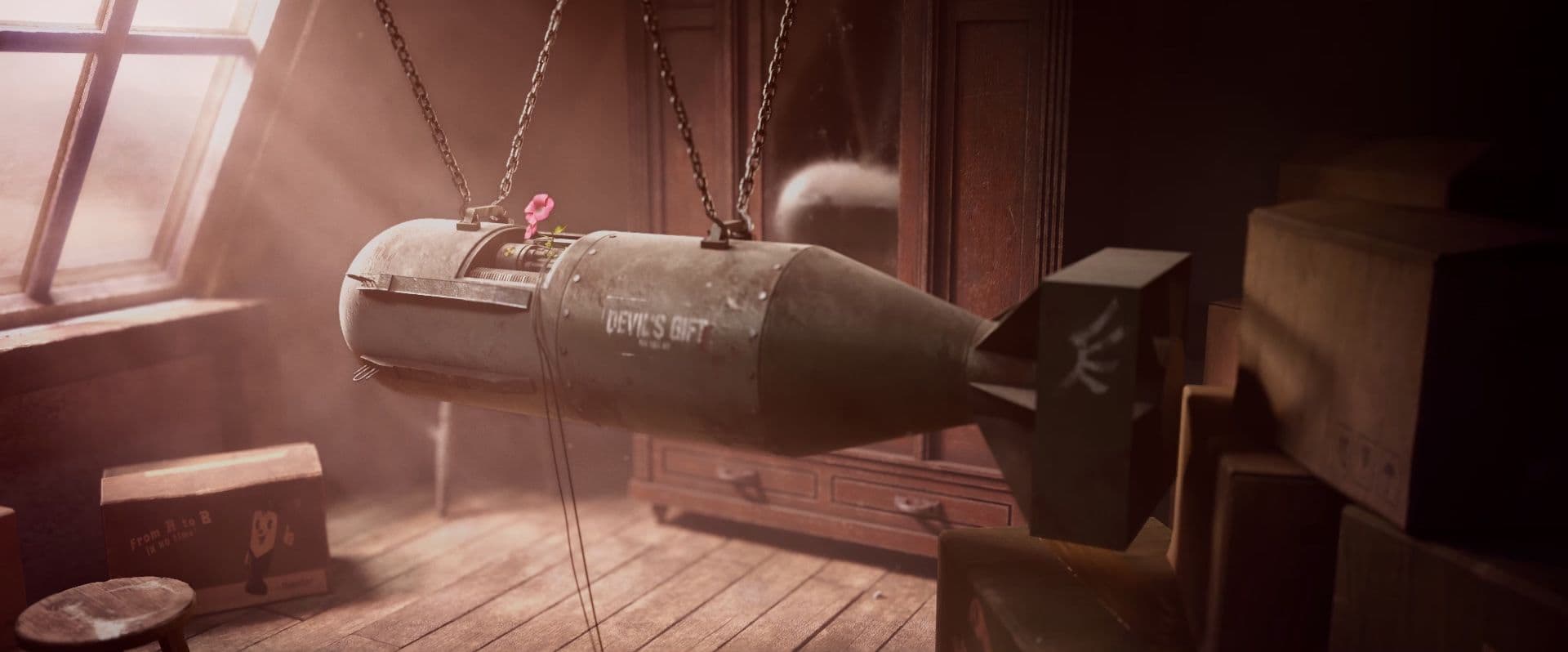
After modeling, UV unwrapping and sculpting, I baked and textured all the assets in Substance 3D Painter. To make some textures look more interesting I created logos and drawings with Photoshop and Illustrator and integrated them into Substance. The drawings should pick up a bit of the era and mood. I decided to use the poster style of the American war/industrial posters from the 50/60s (well known are for example Duck and cover).
For the most difficult objects in the scene, I created a lookdev turntable and looked to make the surfaces behave as realistically as possible to my references. I used a lookdev turntable setup from Cave Academy.
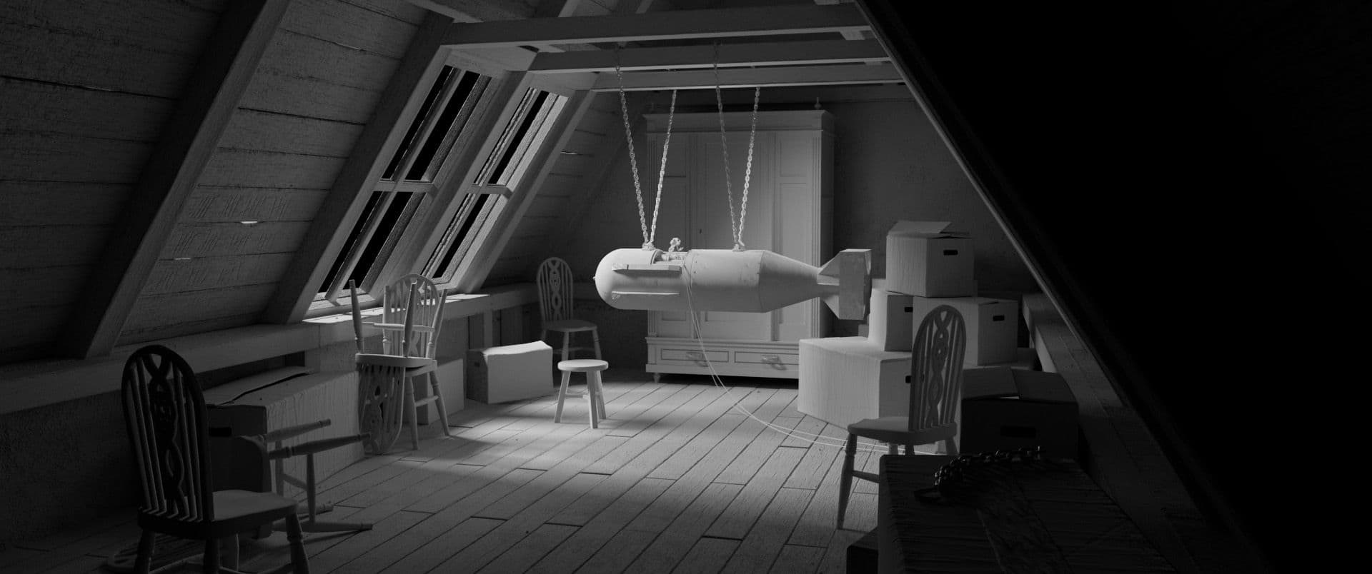
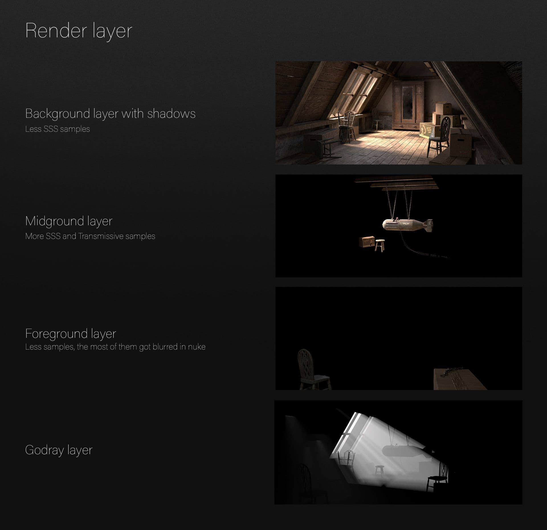
Exposure in blocking allowed me to test and plan the focus of the scene early on. After the textured assets were loaded and I started the first render, I noticed that everything was calculated much slower. One solution was to place frequently reused assets as stand-ins. So I loaded the whole room assets of the attic as a standin. Assets that were further away from the camera got less subdivisions and instead of a displacement map only a bump map. Furthermore I built up the scene in 4 render layers (foreground, middle ground, background, godrays). Dividing the scene into different layers had many advantages for me: samples could be set specifically, switching off the displacement maps for invisible objects that affect the respective layer. These presets of the layout sped up render times and avoided crashes due to overload.
This tutorial by Arvid Schneider helped me a lot with these steps.
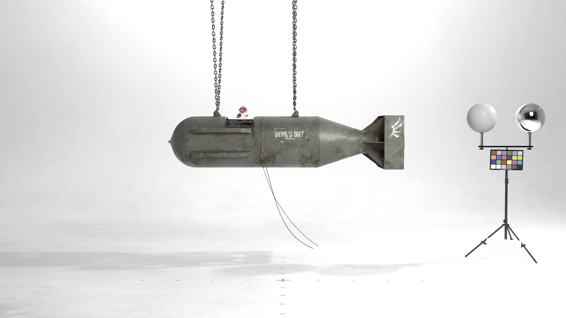
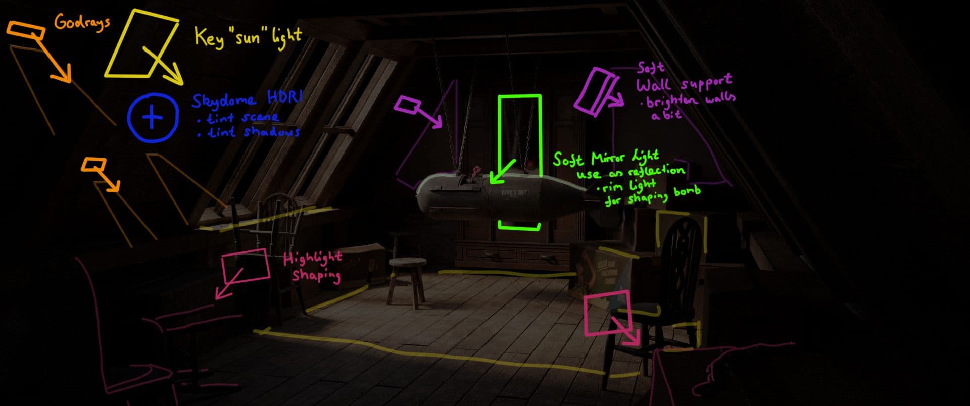
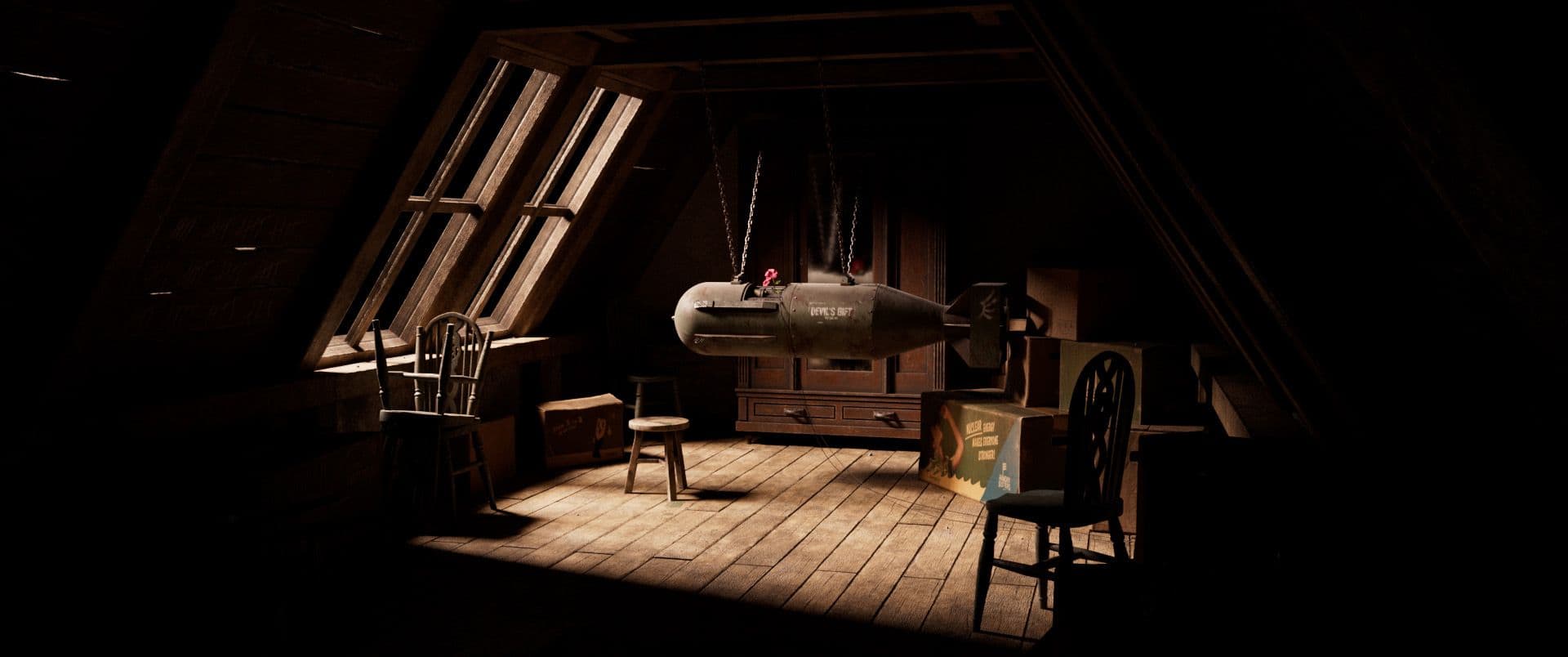
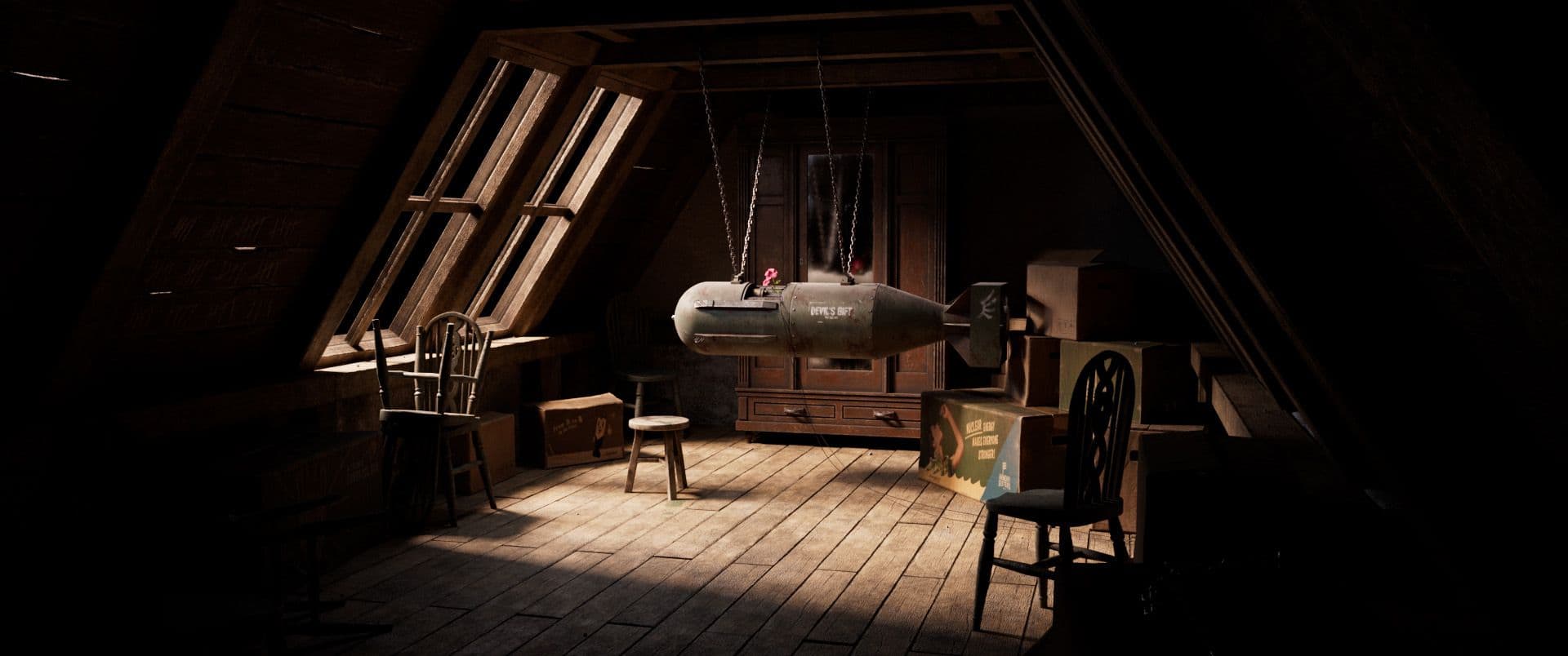
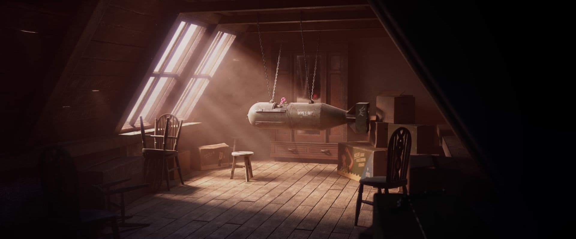
The colours from this era, or much more the colours from WW2 were drab and not very saturated. The desaturated colour palette of the assets, helped me get the menacing "war character" into the scene. The only "saturated" colour should be the flower growing out of the bomb. My goal was to convey the feeling of hope with light. For this I chose warm colours for the light entering through the window. The environment outside the light should seem more threatening. For this I chose a cold colour temperature.
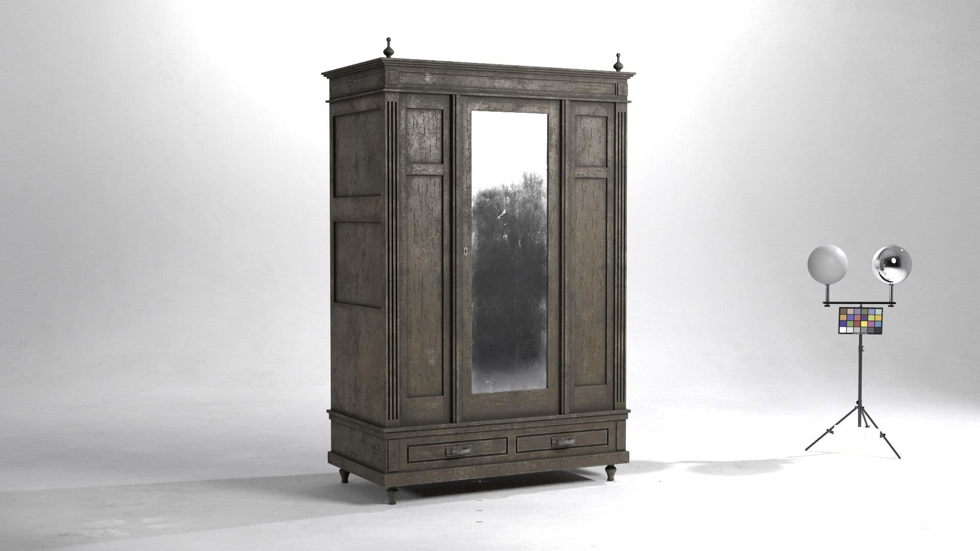
The keylight was already set by the blocking process and should illuminate the center of the image. To emphasise the bomb as part of the hero asset I placed the cabinet with mirror directly behind it. The mirror reflection allowed me to set a Rim-Light behind the bomb, which separates the outline from the dull background. As HDRI I used an attic interior and adjusted it from the colours in Arnold to the hues of my scene. Then I gave the dark tones in the HDRI a slight blue cast. The HDRI should create the cold-coloured shadows in my scene.
For control I checked again the set values for the Ray Depth in the render settings. To avoid unnecessary reflections, I went through the number of light reflections needed for the surface-complexed objects in the room. After some render tests with a small number of frames I was able to determine the optimal number of samples and light samples.
I was able to build up the beauty, render layers, light groups, Z-Depth, volume rays set in the lighting process as a light slap in Nuke early on to better assess the possible end result. In this process, I was able to decide well which AOVs one really needs in the end to possibly save render time. The Z-Depth channel was a great way for me to get the depth of field I wanted on the one hand, and some atmospheric depth on the other. With the light groups I was able to adjust the individual groups in Nuke with an Exposure node.
I integrated the dust particles into Nuke using the particle system and linked them to different shapes, so as not to always show a repeating dust particle or just a sphere.
As for the global colour corrections, I tried to stick to my concept. The shadows should have a bluish cast, while the light area is bathed in complementary light.
This was my first demo reel project and it was a good way to think about the story of a shot and how to support it with composition, lighting, texturing, etc. Also, I think it was a good way to further train my eye for quality and aesthetics. On the other hand, it would be more time-saving for a first project to take up an existing concept.
I also learned the importance of following references and studying them in depth. If everything was textured and shaded correctly according to PBR rules, the surfaces usually behave authentically in the Lookdev Turnable and in the Shot.
Thank you for reading this article. I hope you enjoyed it and I was able to give you a bit of an understanding of my work. Feel free to contact me if you have any questions.
You can find more of Sascha's work on Instagram, Artstation and Linkedin.