
How to Create a Highly Detailed Interior Diorama for Games
Environment Art Intern and The Game Assembly student, Adam Dencker, shares how to plan, iterate, and execute a highly detailed diorama from concept to final render.
Environment Art Intern and The Game Assembly student, Adam Dencker, shares how to plan, iterate, and execute a highly detailed diorama from concept to final render.

Adam Dencker is an Environment Artist and current Game Art student at The Game Assembly in Malmö, Sweden. As the final step of his studies he is now doing an internship at IO Interactive.
In this article, Adam takes us through his process for creating a highly detailed game environment for AAA games. Read on and get inspired!
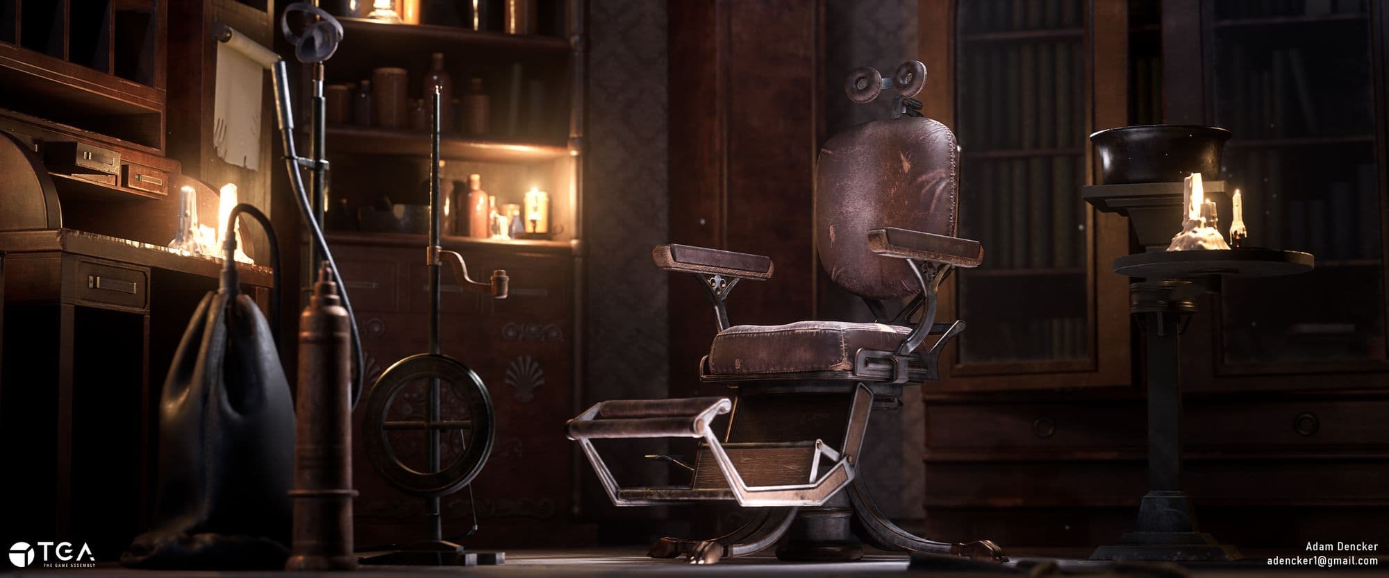
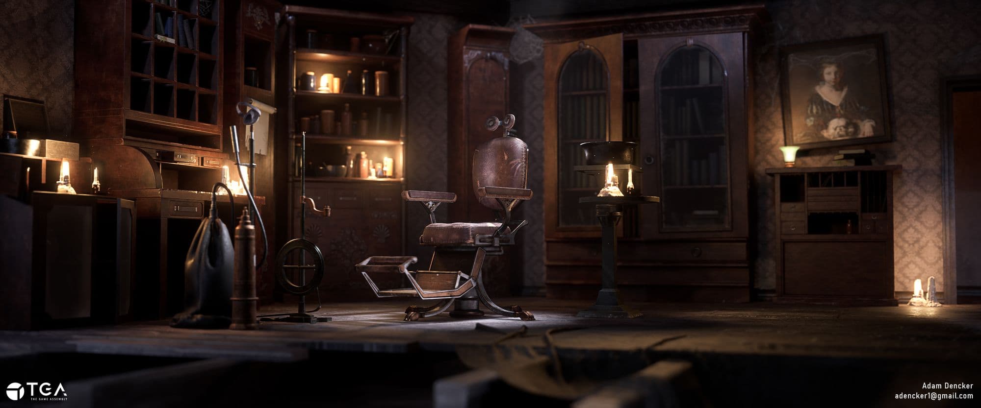
To the date of writing this article, the Dentist Office is probably one of my most impressive pieces in terms of visual fidelity and artistry. Which is why I was really excited when The Rookies contacted me to write this article! Here’s what we’ll be covering in broad strokes:
Before starting your project you want to make sure you have a clear goal ahead of you. My goal was to get better at creating highly detailed assets and telling a story through their textures. I knew that creating an epic composition from scratch wasn’t on my goal list, so instead I opted to contact a Concept Artist and ask for their permission to use one of their pieces. For me it ended up being a sketch from Dai Nguyen.
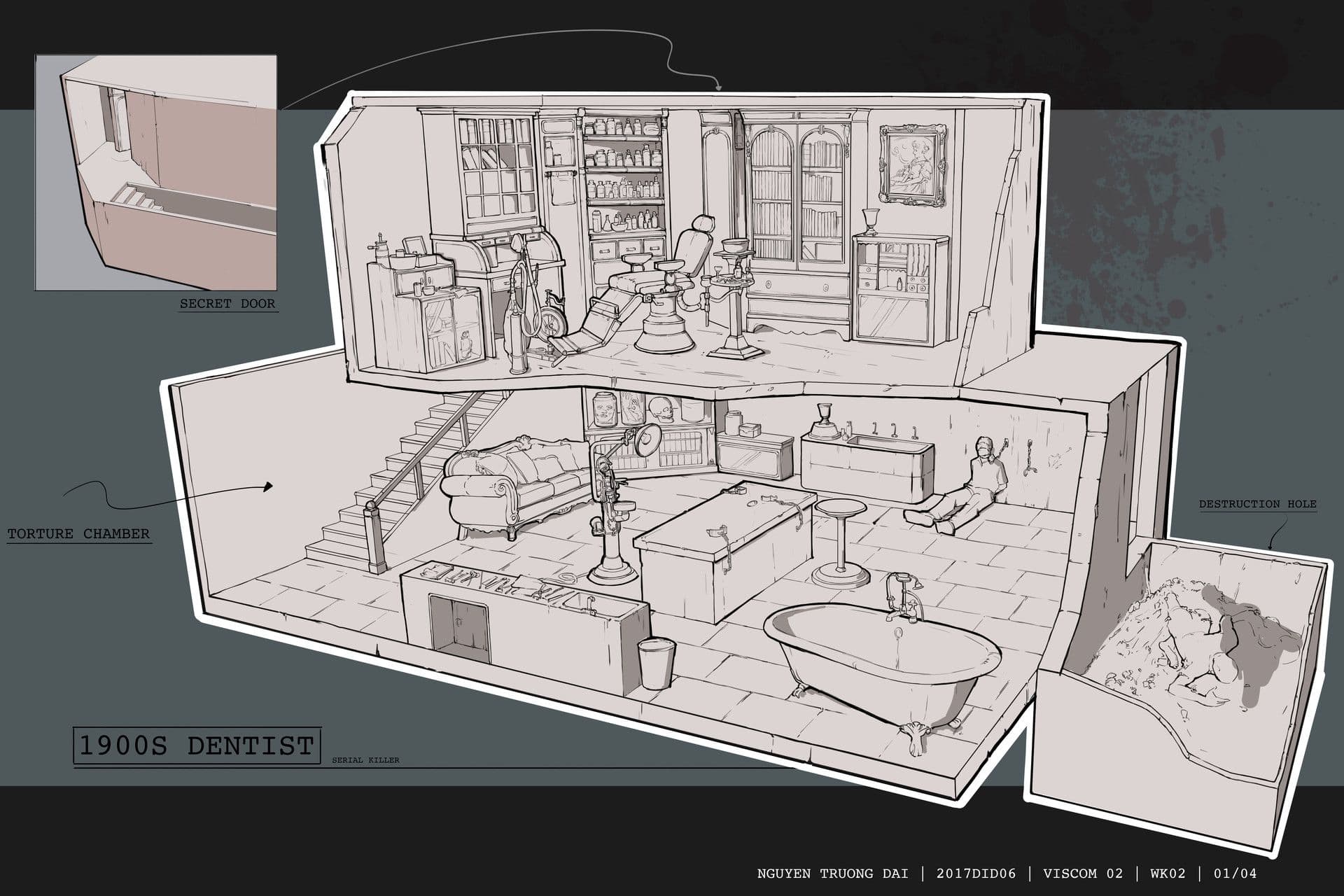
At first I did feel a bit intimidated by the scale of Dai’s concept, so I decided to split it in half, literally. By only making the upper floor I essentially cut my work in half, without making the concept feel weirdly cut off. The original concept covered two separate floors and in essence, two separate environments. Another great thing with Dai’s concept was that it was small and had a three-quarter perspective, making it into an ideal small yet manageable diorama. After deciding on a concept, it was go-time…well, almost.
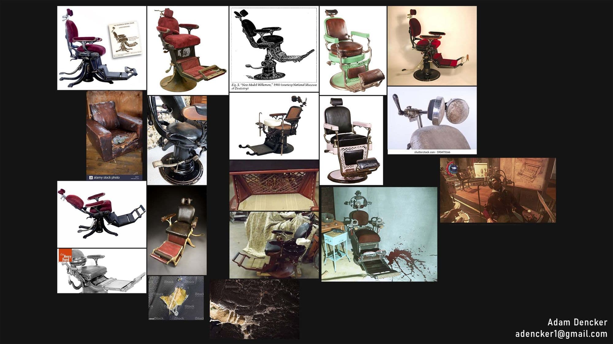
Once I had the scope of the project set, it was time to start testing my skills and measure the time it would take to create an asset. For this I settled on the centerpiece of the scene: The Dentist Chair. Naturally, I decided to overscope by making my chair more advanced than the one in the concept.
There were a lot of unknowns for the project ahead, and a lot of things I didn’t have much experience with. Working with ornaments and more organic man-made shapes was the main point on that list, along with making my textures more believable and alive. How could I tell a story through textures?
Another big question was how to sell functionality. The answer to this question (and most of the questions that followed) was to simply test it! I started looking at functionality very early on in my blockout. Moving parts around, making mockup animations, etc etc. This really helped me to understand how the thing functioned, and thus how it was constructed! From there on work quickly progressed until I had a nice midpoly ready to bring into ZBrush!
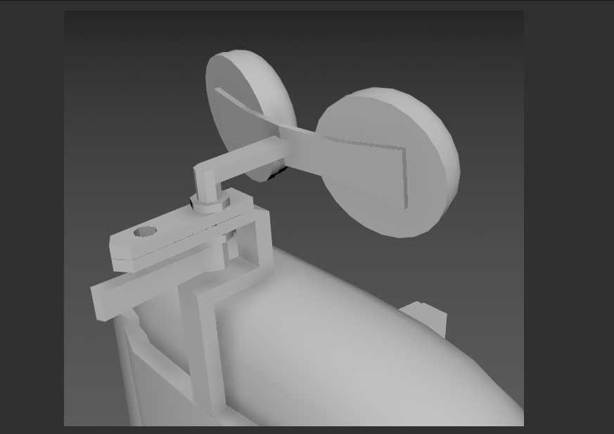
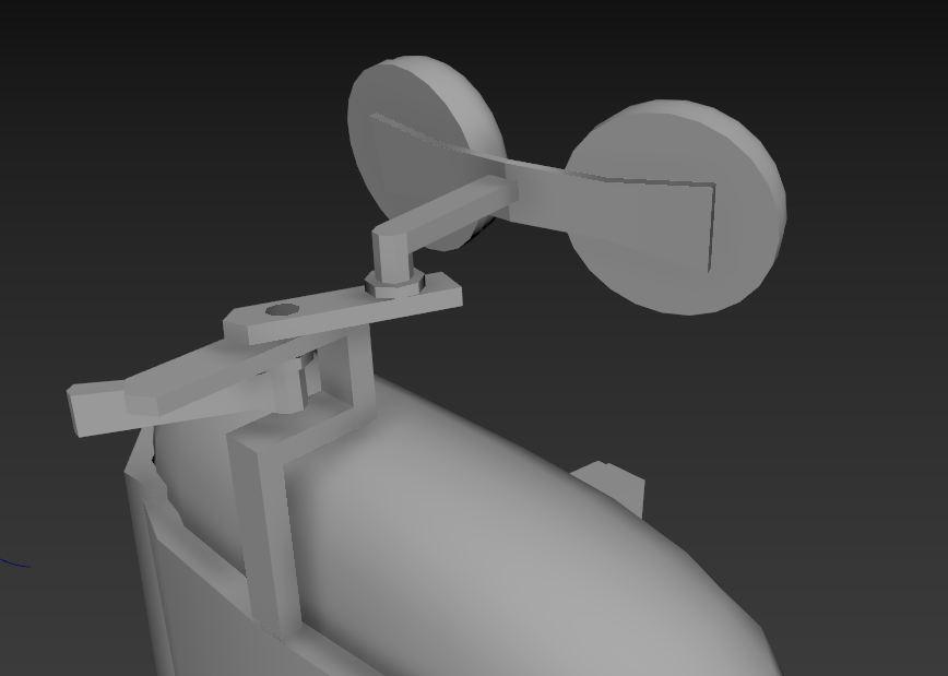
When in ZBrush my process for the hard surface parts was nothing special compared to anyone else. Simply creasing the polygroups based on angles and then applying a polish deformer to them did the job! The key takeaway here was masking edges and inflating them to get some nice extruded edges in the highpoly.
From there, I worked on the wood based on a tutorial by Ivanna Liittschwager and finished off working on the cloth by using a couple of alpha trim brushes, the Slash2 brush, and a lot use of the Dam Standard and Standard brushes.
The main thing is to keep your eyes on your references, as good references will do the heavy lifting for you!
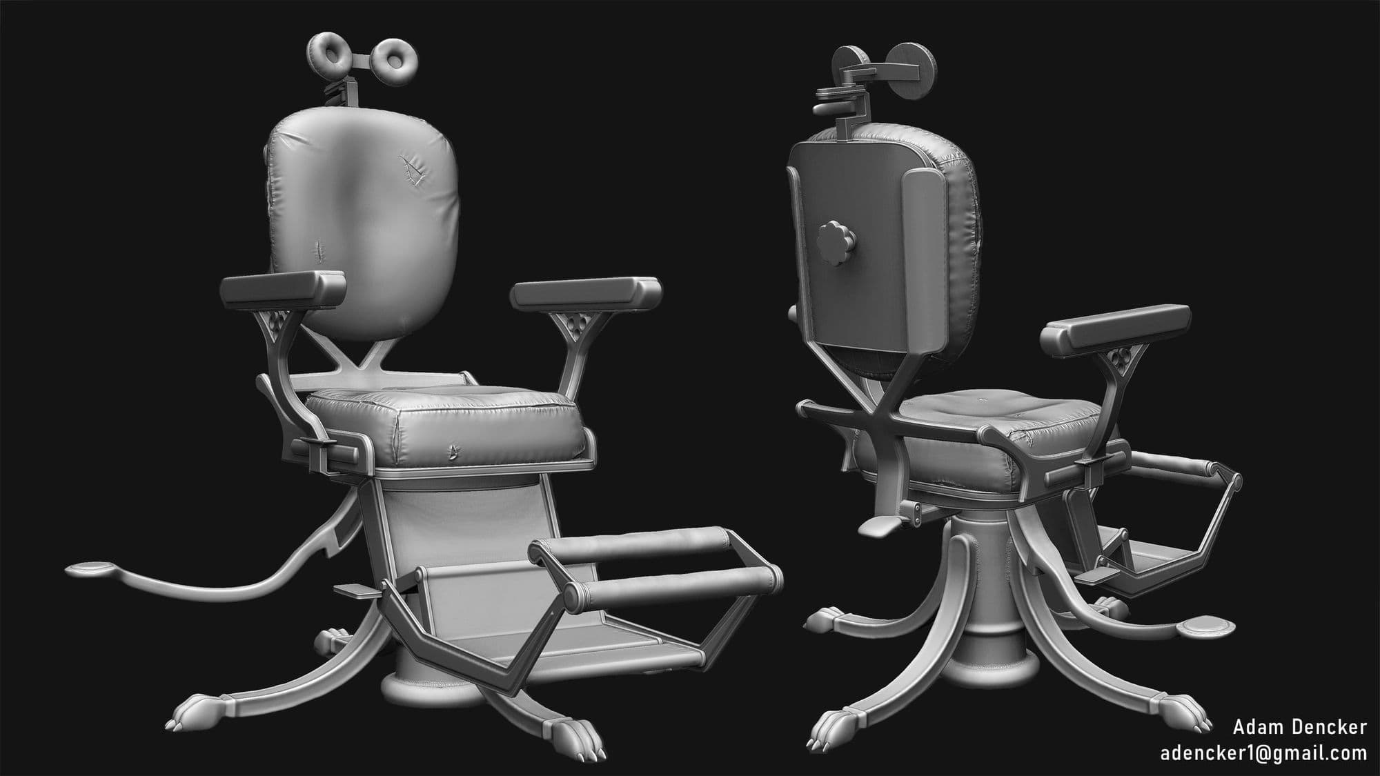
After I felt the highpoly was “done” I went back to Maya to optimise and finalize my game-ready mesh and do the UVs. (I also went back into ZBrush later to add further details and reworked the highpoly to get more details into the normal map).
When I work with UVs I always try to stack and mirror as many of my shells as possible. This helps a lot to reduce the size my UVs take up and thus letting me get a lot more detail into my textures without sacrificing the amount of texture sets.
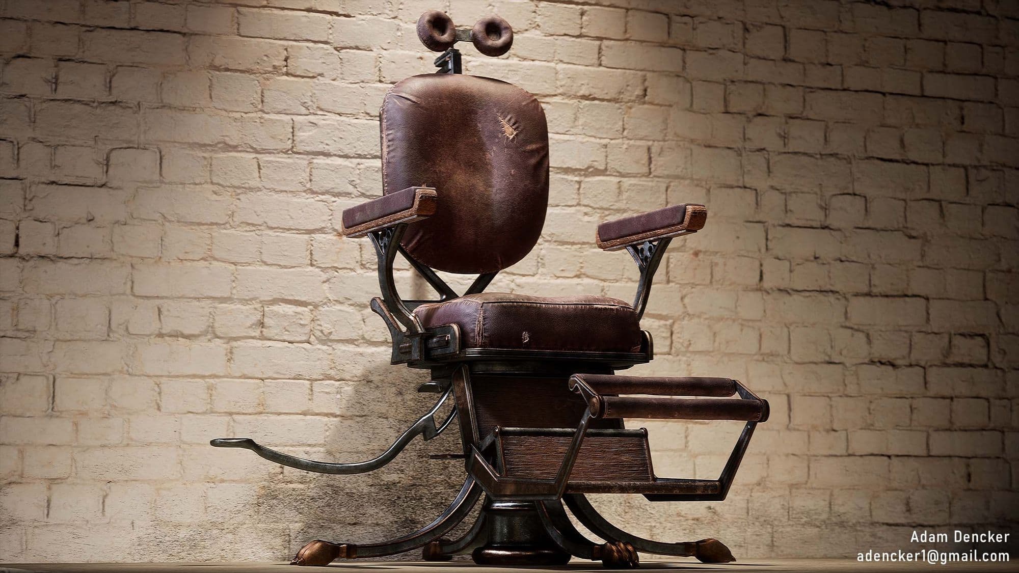
I ended up with a 15px/cm texel density using a 4k texture which I was pretty happy with. Although the chair definitely holds up in 2k as well, and even 1k depending on how far you view it from! Baking went relatively smoothly in Marmoset Toolbag, and from there I started the texturing process in Adobe Substance 3D Painter.
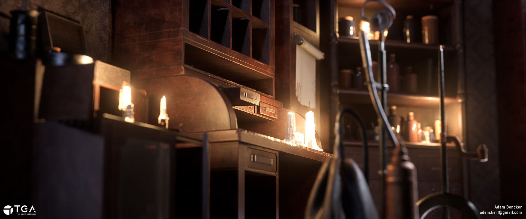
The texturing itself was going to move through many different iterations before I found the right direction. It also helped exploring the final feel I wanted for the whole diorama. Furthermore, I started my lighting around this point in time, making sure to start with it early in the texturing process. For my render engine I initially used Marmoset Toolbag, but later moved to Unreal Engine 4 as I wanted to get better at lighting in an actual game engine.
For the chair’s textures I first went a bit more modern, but eventually settled on an older more ornate look. The texturing process itself is based on an awesome texturing tutorial by Jason Ord. That along with good references got me where I needed. Finally I added detail normals and got the chair set up in a standalone scene with a simple yet fitting backdrop. This is how I got my final renders! All other props in the scene followed the same workflow, aside from the chemical tank and pump, which used Marvelous Designer for the pump bag’s highpoly.
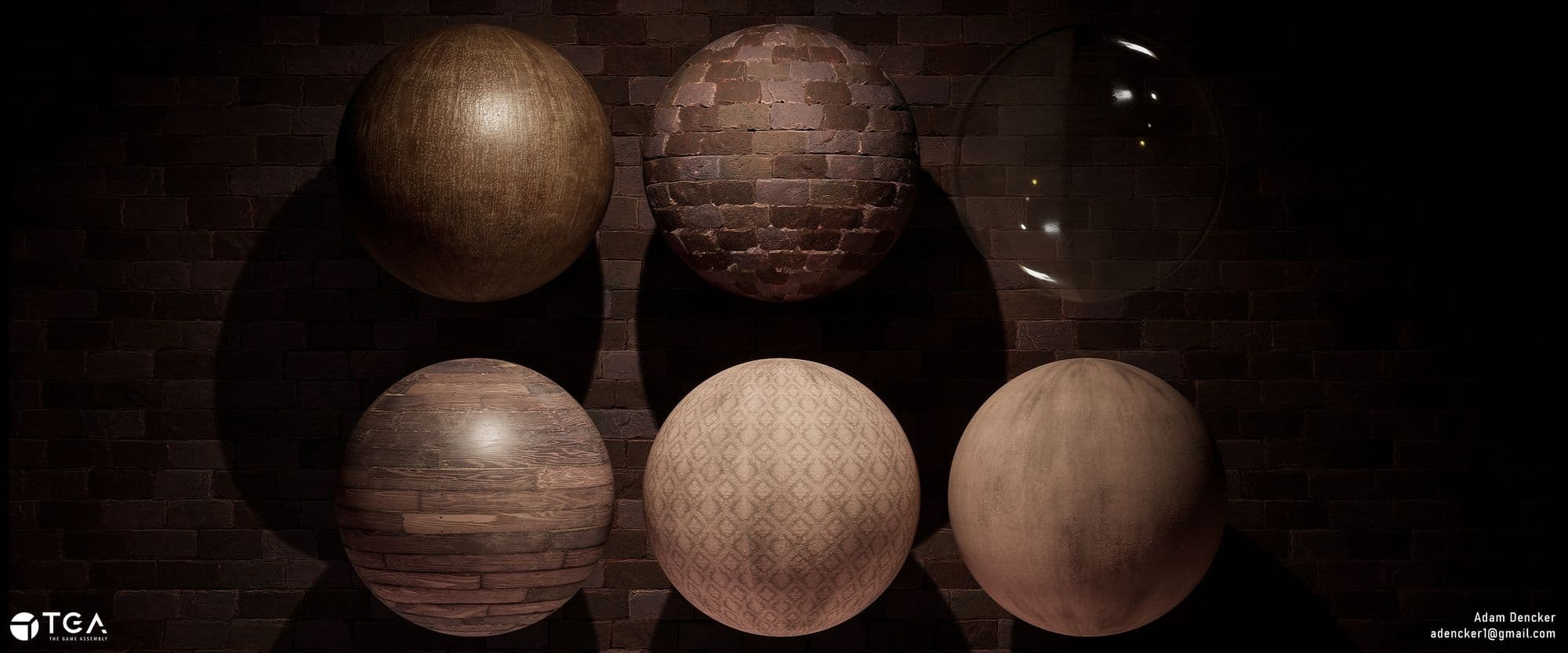
There were of course some things that didn’t use this workflow, namely the tileable textures for the floor and walls. For most of these I opted to use a more traditional workflow using ZBrush to sculpt a highpoly, bake it down and add textures in Substance 3D Painter.
Later during the project when I had gotten more familiar with Substance 3D Designer, I decided to experiment. Using a pattern I found online I converted it to an alpha, and then overlaid that on a tapestry texture I created in Designer from scratch. Both these approaches are completely valid, and you should go for the one that feels right to you! Nowadays I go for either one depending on the scenario, even though I’ve since this project gotten more comfortable in Designer. Of course, using Designer is less destructive than spending a lot of time on a sculpt that might not end up to par with your benchmark, but if you feel that ZBrush is easier, do it!
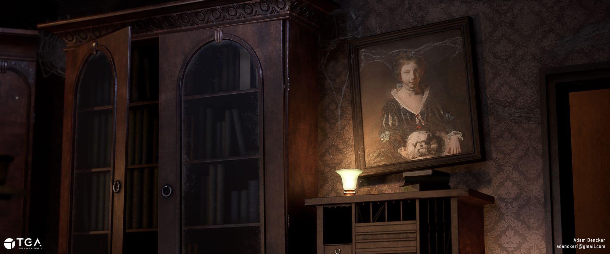
I’m not a good painter by any means, but I really wanted to get a painting into the scene, just like in the concept I was using. So how did I go about that? After asking around I found out that a lot of museums actually have their collections scanned and uploaded online, most under a public domain or creative commons license. So I looked around until I found a painting that somewhat matched the concept. I downloaded the image, brought it into Substance Alchemist to generate the other maps and then put a frame around it as a mesh!
Alright, so you got a kickass benchmark asset done and you’re ready to make the rest of the scene. Easy, right? Just repeat the same process over and over! Well…yes and no.
I’d highly recommend breaking down the rest of the assets and estimating time and effort needed for them. The same way you’d do in a game production. While this is the most boring part of the process, it’ll be worth it in the end when you know everything about your project.
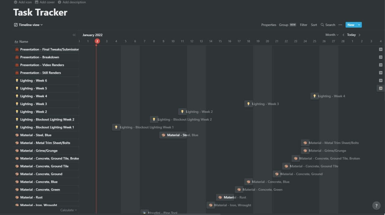
How long it’s gonna take, what your file structure looks like, research needed, etc etc. There are several great free options for this. Notion, Miro and Trello are all great examples for this. I personally prefer Notion as it gives you the most control in my opinion. It might not be the easiest option to get up and running, but it’s worth the effort. While I didn’t start with this properly until the project after the Dentist Office, it would’ve been great to have at the time. Something which I definitely noticed during the projects that followed.
Lighting was by far the hardest part of this project. How could I make the scene look good as a whole while making each individual asset shine as I’d worked really hard on them? Originally the idea was to use baked lighting, but for some reason Unreal bugged out on me. Without a solution I turned to dynamic lights. Dynamic lights did require a lot more lights in order to fake the bounces missing from baked lighting, but in the end it turned out really nice!
Another advantage of building a closed off scene like a diorama was that I was able to use a lot of rimlights to add artificial highlights to help break up the layers of the scene. Thus I was able to make each asset shine on its own while at the same time making the scene look good as a whole.
A lot of credit goes to all the great feedback and mentoring I got from Fumio Katto. I learned a great deal from him about how lighting works, and how to fake it using light function materials! Another great tip I learned from Fumio was to split up my point lights into several spotlights, giving me even more control over the highlights and shadows of my props. That along with clever use of lighting channels really brought the project to another level.
So you’re working through your project, tackling asset after asset. Sooner or later you start feeling like “wait, something is off…” or you might’ve gotten stuck with the project after spending a lot of time on a specific thing. This is where feedback comes in! While I did get some amazing feedback from both my classmates and ex-industry teachers during my studies at The Game Assembly, the majority of the feedback and help I received came from external sources. There are so many great online communities out there, as well as a bunch of kind individual artists willing to help. So my number one tip is to start reaching out to people! Talk to them! Listen to them! And then implement their feedback as you see fit. Getting in touch with people is also going to help you build up a contact network which will be really handy when it’s time to start looking for an internship or a job!
I had the opportunity to learn from some amazing people outside of school, and I wouldn’t have gotten that chance if not for being part of online communities. The worst thing that can happen if you ask is that they’ll say no! (Saving and sharing WIPs is also going to serve you really well when it comes to breakdowns)
A few examples of well known game art communities are: DiNusty Empire and Experience Points, but there are also more specialised ones out there like Beyond Extent which has a focus on environment art and has been an immense help for me with their Environment Art Tips compilation, apart from being a great and small community! For Character Artists there’s Outgang, and while I’m not a part of that community personally as I’m not a character artist, I’ve heard a lot of good things about it via friends!
After getting a lot of feedback it’s common to feel overworked. Maybe things aren’t working out the way you want, or you feel that other people are much better than you. Having imposter syndrome is completely normal, no matter where you are in your journey as an artist. Just remember that everyone learns and evolves at their own pace. So if you have to compare yourself to someone, compare your work to where you were in the last project.
Look at how far you’ve gotten and all the progress you’ve made, and THEN can you compare yourself to others on the same level, because those are the people you’re competing with.
But remember to not forget your own journey. And don’t forget to take breaks!!
After having received all your feedback or having taken a small break from the project it’s important to do some thinking. “What works, and what doesn’t work?” “What do I want to add or remove?” “What feedback do I or CAN I implement within my timeframe (if one exists)?” A lot of these things I got better at over time, and working with others during game projects at The Game Assembly outside of building my portfolio was really useful. This as I got to work cross-disciplinary to evaluate the project together with others and troubleshoot! The same things applies to your personal projects, so take some time here and there to evaluate your own work in order to improve the project and process!
I think the main takeaway for me with this project was that making every single asset uniquely takes time, and that I would've been better off using trimsheets and tileables for the majority of the assets, something that I've learned after finishing the Dentist Office and is using more and more in my newer projects.
Alright, so after finishing the diorama I took a small break for a few days, not touching it. So what now? Well, with WIPs having been posted all over the place, it’s time to upload the final piece! For this, breakdowns are your best friend. The more technical know-how you can show about your work and process, the more you’re gonna show recruiters and other onlookers that you’re well informed and know your stuff! Usually I like to show off at least one wireframe picture, shots of my materials, as well as shader breakdowns in the form of videos demonstrating their functionality. An extra nice thing to show off artistically is your highpoly renders. This as they can help show you have an understanding of what to put in your highpoly versus what you add in the texturing process.
Naturally, the art should always come first. And to show that off for this project I learned a few cinematic tricks here and there. A 21:9 aspect ratio gives you a much nicer and more cinematic look due to the wider frame. Combining that with a focal length of something between 50-55 gave me the look I ended up with. Everything else is just tweaks here and there as I saw fit. Finally, a sharpen material in the post-process settings made everything look extra crisp.
While the cinematic I added to my final presentation isn’t a must-have, it does add some extra immersion, especially if you have movement in the scene.
So what now? Well, you’ve just finished an amazing portfolio piece, so pat yourself on the back! Take a break if you'd like, start up another project, or start applying!
If you did make it all the way through the entire article, thank you so much. It’s a long one and I know much of this has been covered before but I hope you were able to learn at least something new and helpful. It's been a really fun experience and I’m incredibly honoured to have gotten the opportunity to write it. A massive thank you to The Rookies for letting me do this, as well as to everyone else who’s been inspiring, teaching and supporting me over the past years and keep doing it for years to come. Video Games is an amazing industry to work in and I couldn’t be happier getting to work in this creative space. Thanks again, and have a great day!
More of Adam's work can be found on either The Rookies or on ArtStation.