Tips for Writing and Illustrating Your First Manga and Comic
Whether it's for your portfolio or a Rookie Awards entry, creating a manga illustration is a cool way to show off your skills. Here are some tips to get you started.
Whether it's for your portfolio or a Rookie Awards entry, creating a manga illustration is a cool way to show off your skills. Here are some tips to get you started.

With his prior experience in comic books, architectural drafting, along with his recent studies in 3D animation, 2D and 3D Artist Willie Jimenez, is exploring a career in pre-production or part of an art development team in either animation and video games.
In this article Willie goes back to his roots and offers some great tips for writing an illustrating a manga or comic, for your portfolio or contest entry.
After years of working on your craft, probably spending a long amount of time at multiple art schools, and taking many art courses...you get the chance to work on some small jobs. One day, you get a chance to do something bigger. Nerves and impostor syndrome kicks in and you have a deadline. What do you do?
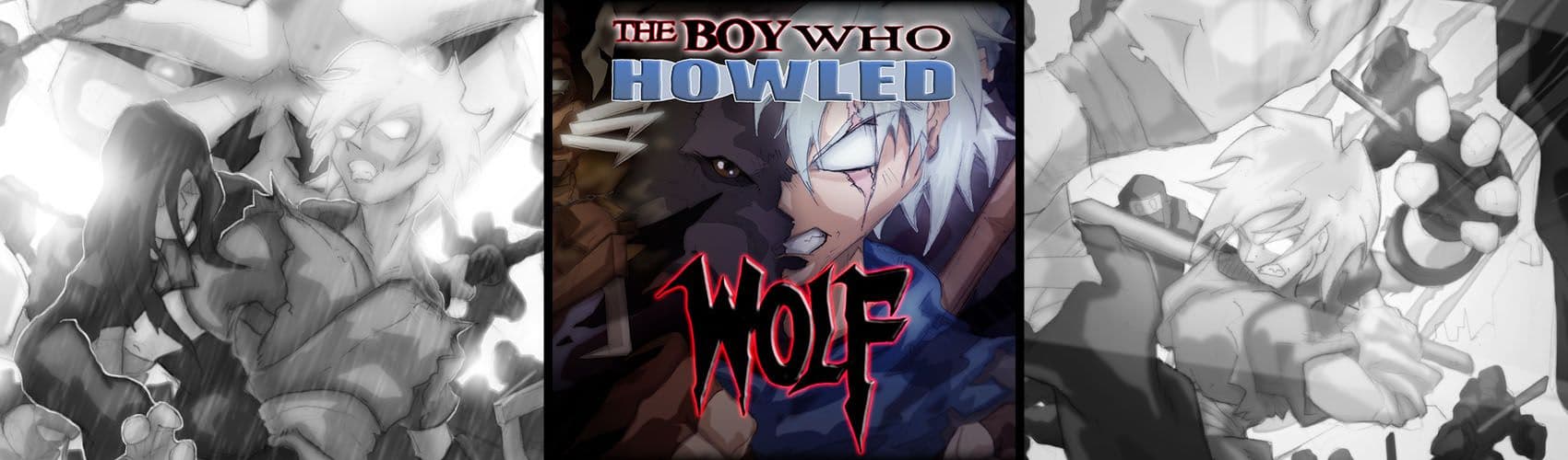
In this article I will share with you my personal experience of working on my comic/manga, that eventually became a prize winning finalist for Tokyopop's 25th Year Anniversary edition of Rising Stars of Manga (RSoM) 2022 competition. And a bit of the process of getting it published by Inkr. Which has now become the number one comic available for free on the platform.
It all started with an email from Tokyopop sharing that the contest deadline was gonna be extended. If I wanted to enter and have something done quick to catch up, I needed to start fast. And so I took an idea I worked on years ago, right before I entered the Navy; a pitch that never got done because the company went under. I always liked the idea and I knew my kids would get a kick out it.
Every decision I made after that was based on how much time I had. And a better understanding of my own ability to get it done. I wasn’t gonna start this pitch again and not have it done. This time around I had years more of schooling, and an understanding of my strengths and weaknesses. I had to make a plan and stick to it. That's how “The Boy Who Howled Wolf”, a 12 page short story got done.
Luckily I had been able to save some of what I had done years ago. First thing I needed to work on was the writing. I rewrote the outline to the script to both fit what I’ve learned in animation school about writing a short script, and added new characters that played to my strength. The story I wrote back then was too simple, and I also didn’t want to retell the same story.
But all I had was an outline. I didn’t have time to type out a full script. I did this the Marvel way, where the art comes first and then, an outline or summary is written and the dialogue added at the end.
This is a quick way to get a comic done (especially if you ever done a 24 hour comic), but has its drawbacks as well. The art might be more fun and showy, but the story takes a bit of a hit, which is why then the art has to be so much better.
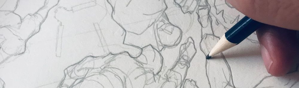
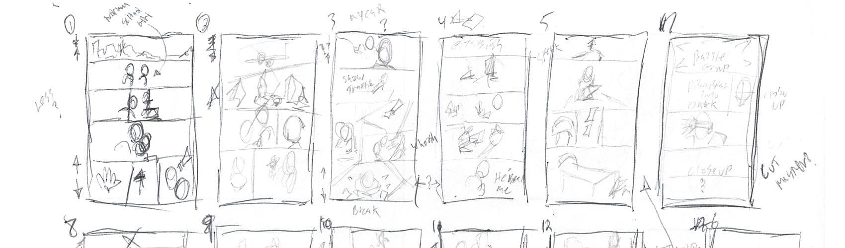
Storyboarding and creating thumbnails is so important. I spent most of my mental energy in this phase. I first told the story I wanted to tell on flat grid like storyboards, with not much time and detail; just enough for me to understand what was going on.
Mind you, except for a few characters that where in the previous version done years ago, I didn’t know what some of the new character really looked like. I just concentrated on what shots I needed and telling the story.
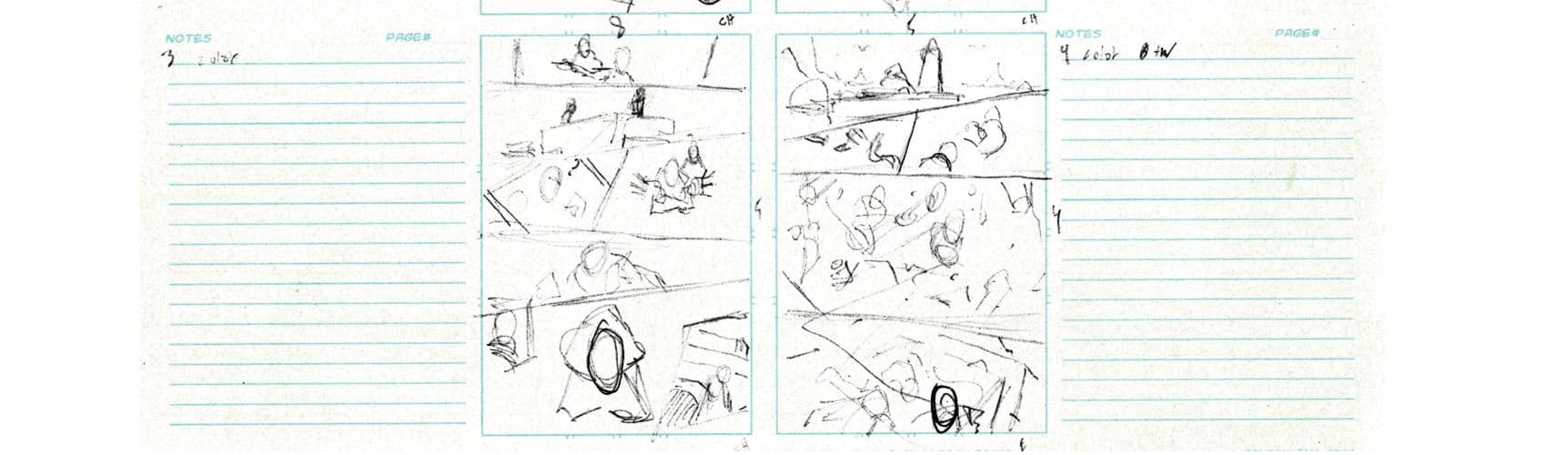
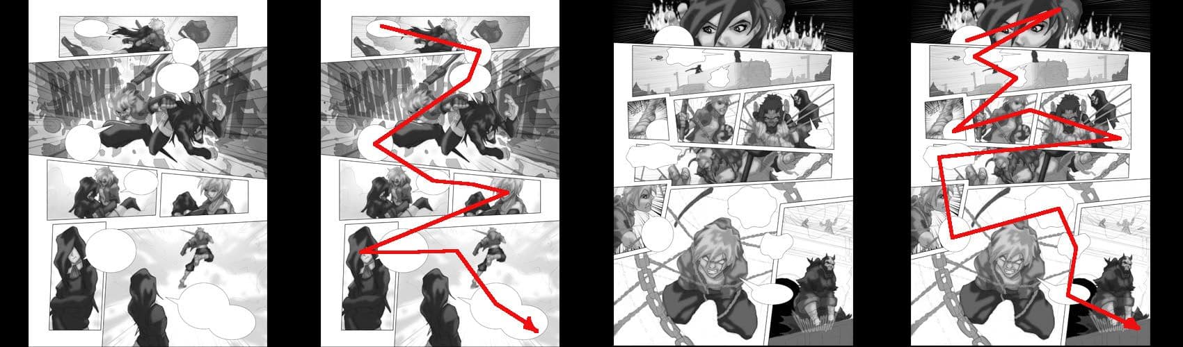
After the storyboards were done, then I worked on thumbnail layouts. Moving the panels around making some panels bigger, some smaller, to make the pages look exciting. Making storyboards and thumbnails might seem like a waste of time. But the work that came after on these thumbnails came about a lot faster because of them.
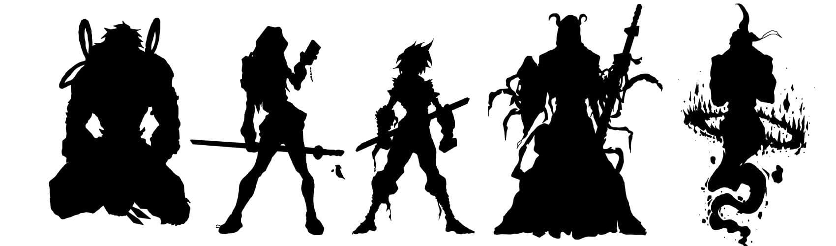
In-between doing quick thumbnails. I quickly sketched out ideas for characters. I didn’t have time to do mood-boards, but I had folders of research of images I have saved for a project like this.
For the comic itself, I kept the designs simple due to how quickly I needed to get started on the pages and get them done. I had ideas of how far I would take the character designs if I had all the time in the world, which I sketched but didn’t finish adding colors and detail until after the comic was done. I added these finishing touches to my portfolio later on.
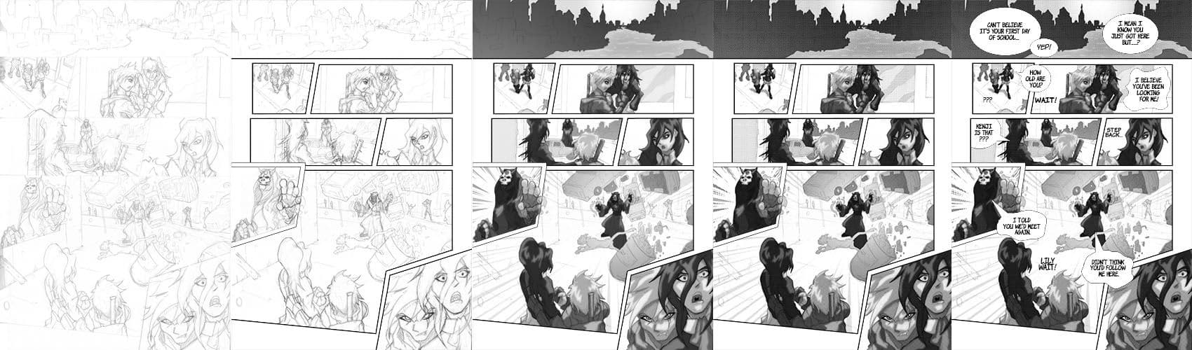
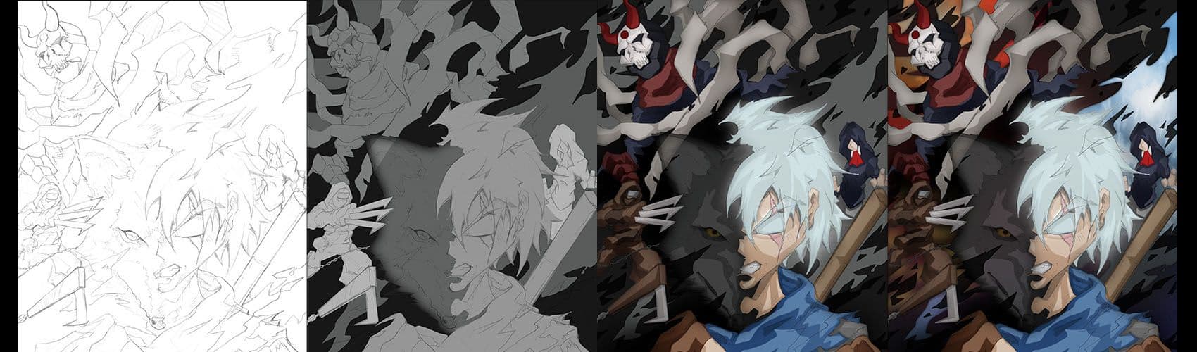
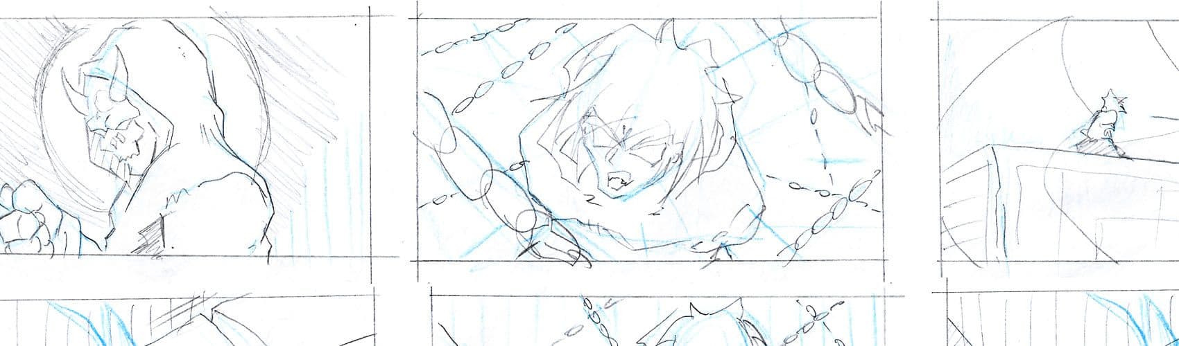
Drawing is where I spend most of my time, and I had to make the choice of not inking this comic completely except for a few flashback scenes, again because of time. I did however test the idea of toning a pencil drawing with mixed results. Essentially two versions had to be made one for print and one for viewing one the web.
Because of the quick character sketches and storyboards and layout, I worked mostly on auto pilot. Most of the big decisions where made at this point and I just needed to grind it out. I made a few changes as I came across little things, filling up empty space and so on. I avoided big changes that would cost me time.
When thumb nailing, the story already went from 10 originally planned pages to 12. I felt like adding a splash page which I felt was missing, but I didn’t have time. Until I worked on promo art later after where I basically did the splash that was missing.
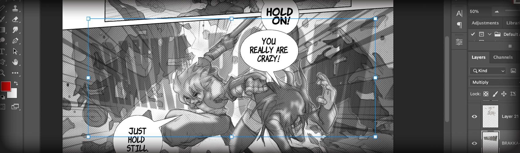
I haven’t lettered anything in a while. But this also had to be quick. This is where I had planned from the beginning to make up time if need be. The lettering part is interesting to me because it's where a pages really begins to really look like a comic. If done right you can use the word balloons to cover anything you don’t like and empty space.
Lettering can add flow to the page, drawing the readers eyes to where you want them to look.
I had never done digital screen tones, and I had to learn on the fly. I Spent a few nights after I was tired from drawing all day watching lessons on YouTube, toning the whole thing in gray then converting the tones into screen tones.
It took a couple tries to get it to look right with penciled un-inked artwork. The digital version is a mixture of the screen tones laying over the gray tones.
After the comic became one of the winning finalists, I reached out to one of the sponsors of the contest and asked if it could be published. They surprisingly said yes. But thats when the real work began. And this time there was more pressure somehow. It went from a contest entry no one will see to working with an editor who wanted to publish it. You can find a version of the comic online here.
I had to rework all the pages and adjust the toning so it could look better digitally. I still don’t like how certain pages look on the phone. But the pages look a lot better on a laptop or tablet. I also had to work with an editor to get a cover and a few assets they needed for their site. I finished up the character designs, which will be added on the back end of the comic. And had to design a logo, credit page and some promo art.
In the end it all kinda worked out. The reviews have been positive. It took a lot of work and skills. But in the end it was all worth it. There was a lot of luck as well. The way I see it is that luck is just opportunity meets preparedness. A lot of the project was done on auto pilot and muscle memory and I succeeded because of a lot of practice.
Hopefully this article helps inspire those out there who dream of doing something similar, and to also give you an idea of how much studying and work it takes.
See you out-there creating and showing off what you got, and reach out if you have any questions or would just like to connect!