Yok Meyer explains how to effectively use VFX to tell a story by sharing her project created during an intensive 16-weeks visual effects course taught by industry professionals at The Animation Workshop in Viborg, Denmark.
Yok Meyer is currently finishing her Bachelor in Computer Graphic Arts at The Animation Workshop. As part of finishing her education, she is doing her internship at TGB VFX during fall/winter of 2020. In this post, she will be sharing the process of how she went about the artistic parts of creating photorealistic assets as well as her journey to discover how Visual Effects could be used to tell stories and visualise a believable world straight from the imagination.
Aim and Focus
This project was created during an intensive 16-weeks visual effects course taught by industry professionals at The Animation Workshop in Viborg, Denmark. In this project, I wanted to expand my knowledge of the VFX pipeline and get a better understanding of how to integrate CG elements into live action footage, pushing my work towards photorealism. However, the magic of Visual Effects lies in the ability to tell a story by creating believable worlds from the imagination. So what is the story of this place? What had happened here? Who lived here before? These were some of the questions I asked myself throughout the pipeline to discover the power Visual Effects has when telling a story.
Concept and References
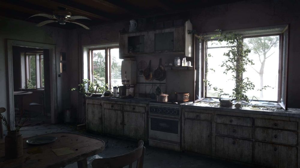
With the goals for this project in mind, I started to do some concepting and gathering of reference. We were given several plates to choose from and I gravitated to the interiors of an old abandoned house that was located by the lake in Viborg.
The chosen plate
I loved how stories could be told through environments in games such as Last of Us and Resident Evil 8, so I wanted to take inspiration from the environments in those games. On top of that, I played with the idea that houses have souls and memories. I thought about capturing a sense of beauty and curiosity in an abandoned place.
For references, I looked at kitchens from abandoned houses as the main inspiration for the furniture and matte painting. Also, I gathered pictures of vegetations in old places to observe the way plants would grow in such places.
Nature and assets references
For the mood, I wanted to achieve a feeling of mystery and beauty as an alternative to horror and fear which would have been a more natural choice. To support the mood I was going for, I wanted the lighting to be glowy and contrasty with god rays and atmospherics.
Lighting and mood references
Photorealism and Observations
Before I started any production work, I took my time to observe my references. When it comes to pictures or paintings, our eyes are really quick to judge if something is not right. Everyday objects have patterns. But when we look closer, we may notice irregularities and small details in certain areas. The challenge then lies in capturing all of these small details because it is from these subtle details that we create our stories.
Also, as I did my observations, I asked these kinds of questions to myself: what makes renders of objects come to life as they do in real life? Where does rust and dust naturally occur? What about damages or discolourations? Those questions helped me to understand the artistic part of creating realistic assets especially when I was stuck.
Close-up render from my look dev scene in Maya that I used for the bigger assets like the ceiling fan
3D Modeling
When I had gathered enough references, I began with modeling. When creating realistic assets, I made sure that the models were not too simplistic even though they were hard surface assets. I tried to add primary, secondary and tertiary levels of details.
I started the models in Maya getting the primary details in place. Afterward, I took the assets that were made of wood and more organic materials into ZBrush to sculpt damages, imperfections and eliminate straight lines creating the secondary details. I mostly used Andrew Averkin’s ZBrush environment brushes for this and they are highly recommended to add break up to almost any asset.
For the tertiary details, I added a bump map created in Mari.
Some areas on the foreground assets that were sculpted in ZBrush
Texturing
Texturing was a lot of fun, and it is my favourite part of the pipeline together with look dev and lighting.
Once the assets had been prepared with good UVs and UV layout, I used Substance Painter to export mesh maps such as ambient occlusion, world space normal and different curvature maps. These mesh maps and masks in general, play a big part in creating my bases for the textures in Mari.
When I was ready to texture, I started with the diffuse map. To make the diffuse map, I went through these steps:
Assigning basic colours to everything.
Breaking up my basic colours with masks or multiply/overlay tileable textures on top.
Adding procedural weathering.
Adding decals.
Adding painted weathering-like leaks and scratches to hide the procedural look even more, in addition to creating more subtle inconsistencies and details.
The final albedo/diffuse
I imported all the assets into Mari as I looked at them as one big asset. This way, I was able to get the overall feel of how the colours worked together and easily share the same materials or masks across different assets.
In general, masks played a big role in my workflow. I ended up creating a lot of channels for my masks which were made using a combination of procedural and paintable layers. These masks were useful not only for the diffuse map, but also for the secondary maps later.
The channel for my rust mask
My process for creating masks is an organic one with a lot of trial and error. However, I always start with the mesh maps, which are then broken up using several different techniques.
Here is an example of my workflow for creating masks:
I had a dust mask that I created from the two curvature maps I got from Substance Painter. I then added an axis mask to mask out the y-axis, so I mask out the top only.
Because I had a lot of objects lying on the counter, I also used the ambient occlusion to include and mask those areas where the objects touch the counter.
The mesh maps I used for the overall masking
The next process was to break up my mesh maps. I ended up using tileable textures, noises, and even a paintable layer to manually add and remove some of the dust in certain areas.
I also used blend modes a lot in this process to mix and match the layers.
The different methods I used to break up the mesh maps
During the texturing class, we also did a cool exercise where we looked at different materials and asked ourselves which mesh maps to use to get this kind of rust or that kind of dirt and so on. The exercise was great for training the eyes to capture the small details and think about how to build them in texturing.
When it was time to do the secondary maps like bump and metalness, I had these awesome masks that I created for the diffuse channel that I could use.
Secondary maps in Mari viewport: bumpSecondary maps in Mari viewport: metalness
I want to mention a quick tip on a particular secondary map that is quite powerful but often overlooked for those just starting out on creating realistic assets, which is the roughness/glossiness map. From my own experience so far, the roughness/glossiness map is just as important as the diffuse map.
Roughness map in Mari viewport
The more variations and subtle contrasts there are in a roughness/glossiness map, the more realistic and alive the material will become.
Look Dev
Look development was where I combined all the maps together and assigned them to the assets. I assigned a shader to every material and took my time to tweak the textures and shaders observing my references until I got the result I was going for. I used the aiRange node a lot when I needed to tweak the maps.
Stove shading network in the hypershade in Maya
Even though I made sure to have a lot of value variations in my roughness map, I still needed to do some further tweaks to it to make the different materials come even more to life. During this process, I asked myself these kinds of questions as I looked at my references: How do these materials react to lights? Where on the asset is it rough, and where is it glossy?
A close-up camera shows how the materials react to a different lighting
Lighting
It is very crucial that the lighting of the CG matches the lighting of the live action footage. Without good lighting, it will be difficult to integrate the CG without it looking out of place once it gets combined with the plate. Here is my process of how I lit the CG.
I started by adding a 50 % grey shader (hue and saturation to 0 and value to 0,18) to all the geometry to get an accurate view of how the light would react. The first light I created was Arnold’s rectangle light which would become my sun. I made it small and gave it a disk shape. I then placed it really far away with strong intensity and a slightly warm orange hue. Next, I placed the pivot of the sunlight on the grid and in the middle of the kitchen furniture. Then it was a matter of tweaking the rotation of the sun until I got the angle to match with the one on the plate.
Sunlight and the settings in the viewport
Besides, when I looked at my plate and lighting/mood references, I noticed this super subtle effect where the sunlight had a soft edge and a slightly saturated colour where it fades into shadow.
Very subtle sunlight effect references
For artistic purposes, I wanted to mimic this effect, so I copied and pasted the sunlight and made it slightly bigger with a bigger spread. I then lowered the intensity and made the orange colour more saturated. I called this light, the soft sunlight. This trick is from Chris Brejon’s book on CG cinematography.
Soft sunlight and the settings in the viewport
The last 3 lights were rectangle lights that I used for more artistic purposes as fill lights. These lights had small intensities in general. To get the mood that I wanted, I played with the spread and hue. Two of the lights were placed by the windows, and one on the floor with an angle in an upwards direction to illuminate the room a bit more.
The 3 fill lights in the viewport
I also used the room geometry to project the on-set HDRI onto. The room was not something that would be rendered out, but rather I used it to get more accurate reflections and colours onto the CG assets.
Matte Painting
Besides cleaning up the tracking markers in the scene I also added more irregularities and subtle inconsistencies in the matte painting step. I added some cracks and dirt to the walls and the wooden frames around the room. It was a challenging process, so I looked a lot at my references and had to find new ones as well.
CG slap before matte paintingCG slap with matte painting
On top of that, I did some matte paintings on the cabinets to add extra leaks and dirt. I also broke up some of the edges so they were not too straight. Normally, If I was not as limited on time, I would have done this in the modeling and texturing/shading stage. However, it was a nice challenge and gave me insight into what’s possible with matte painting.
Compositing
During compositing, I looked a lot at my references to capture the mood I was going for. Once I finished matching the black and white levels, I added extra atmospheric layers and shadow layers, which I graded for better integration.
Even though Nuke is a node-based program and the Nuke script can become big fast, I learned that it was important to still treat compositing as if I was painting a picture with all the color and light fundamentals in mind. It was really cool to push the project with that extra 10 % by adding subtle effects such as light wraps, lens distortion, grains and stock footage of dust particles.
Added CG shadows and atmosphericsFinal picture
There is so much you can do for your project when it comes to compositing. I had the opportunity to have both Hugo Guerra and Josh Parks as my supervisors during this project, and I would recommend checking out Hugo’s Desk and Compositing Pro for resources on compositing.
Conclusion
I hope you enjoyed reading about my process of how I went about the artistic parts of creating photorealistic assets. To bring out the story and make the assets come to life, it was important to observe the references closely and ask the questions necessary to notice all of the subtle details found in everyday objects.
Other than learning the technical aspects of the VFX pipeline from this project, it was a great journey to discover how Visual Effects could be used to tell stories and visualize a believable world straight from the imagination.
Here is a list of the software used for this project: References: PureRef Tracking: 3D Equalizer Modeling: Maya, ZBrush, Speedtree Texturing: Mari, Substance Painter Rendering: Arnold for Maya Compositing: Nuke
Thank you
I want to thank all the amazing supervisors on the course for their knowledge, time and dedication: Carlos Tacón, Magnus Leopard, Peter Anlauf, Giancarlo Gallinoro, Hugo Guerra, Frederik Storm, Gianpietro Fabre, Thomas Bertrand, Marc Tingle, Stoimen Dimitrov, Michael Hansen, Josh Parks and Leigh Russel.