Shakhzaman Kasteyev hailing from Kazakhstan, is a student at Think Tank Training Centre Online. Shakhzaman goes into detail about building assets in Maya and ZBrush, creating effects in Procreate, and Compositing his final 3D scene in Photoshop.
Shakhzaman Kasteyev hailing from Kazakhstan, is a student at Think Tank Training Centre Online. Shakhzaman goes into detail about building assets in Maya and ZBrush, creating effects in Procreate, and Compositing his final 3D scene in Photoshop.
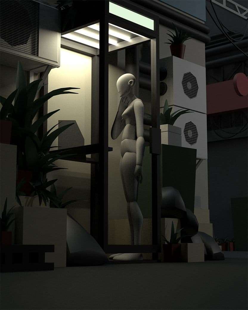
Choosing a Concept
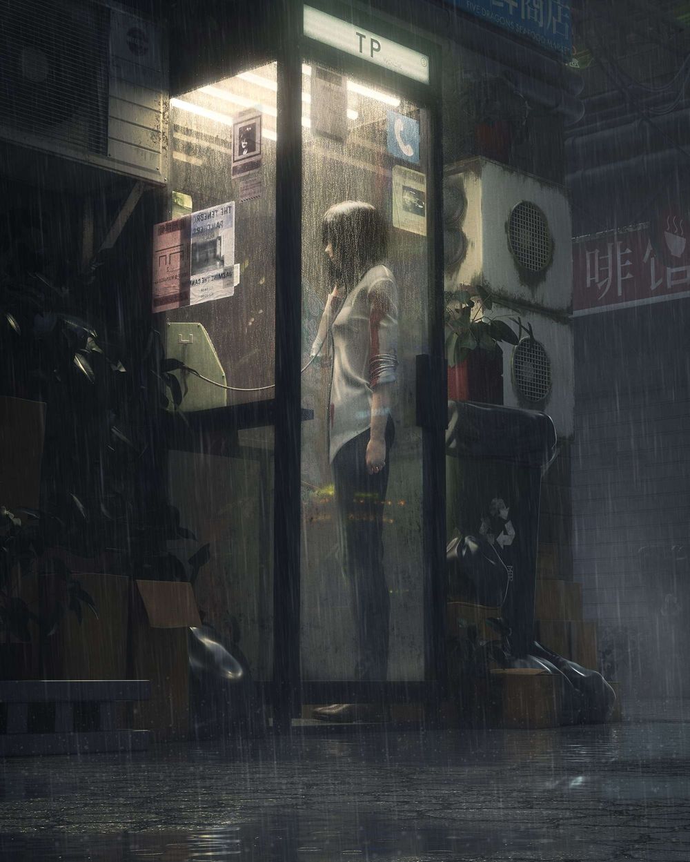
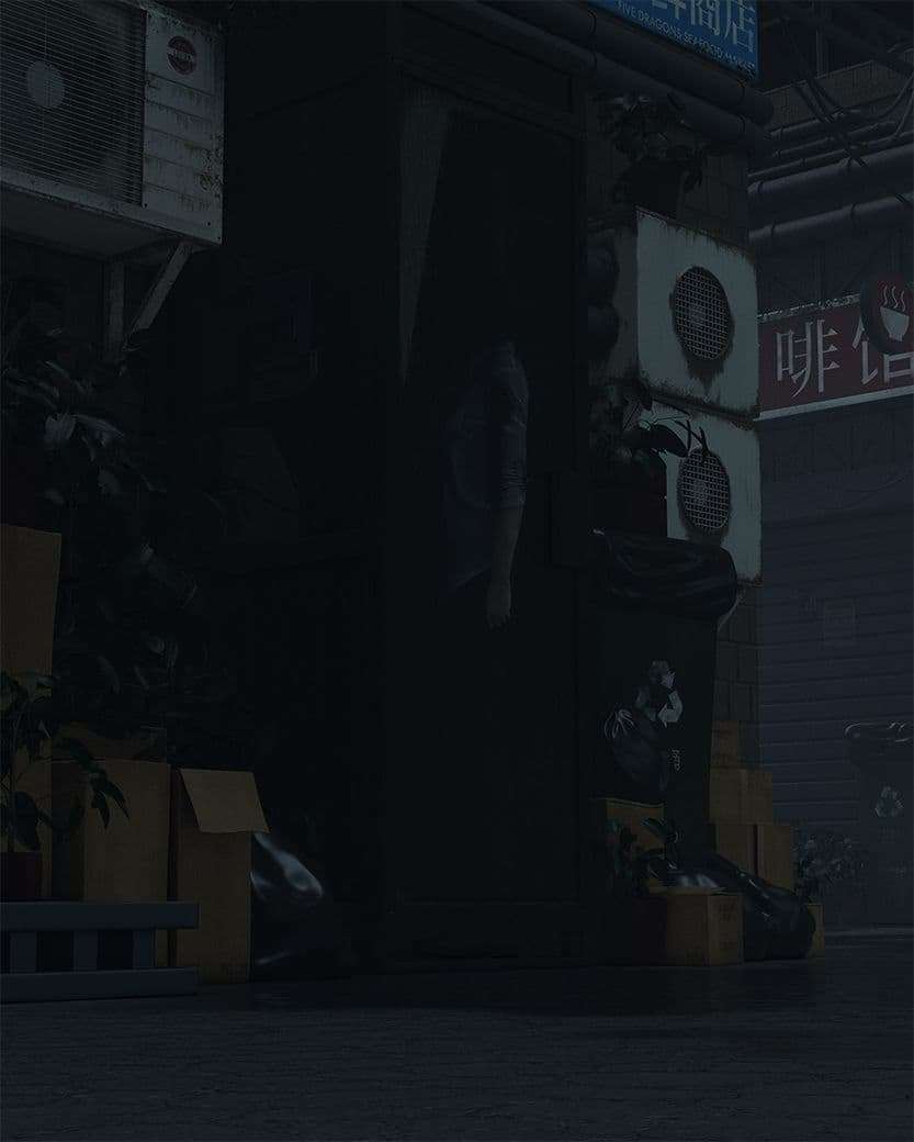
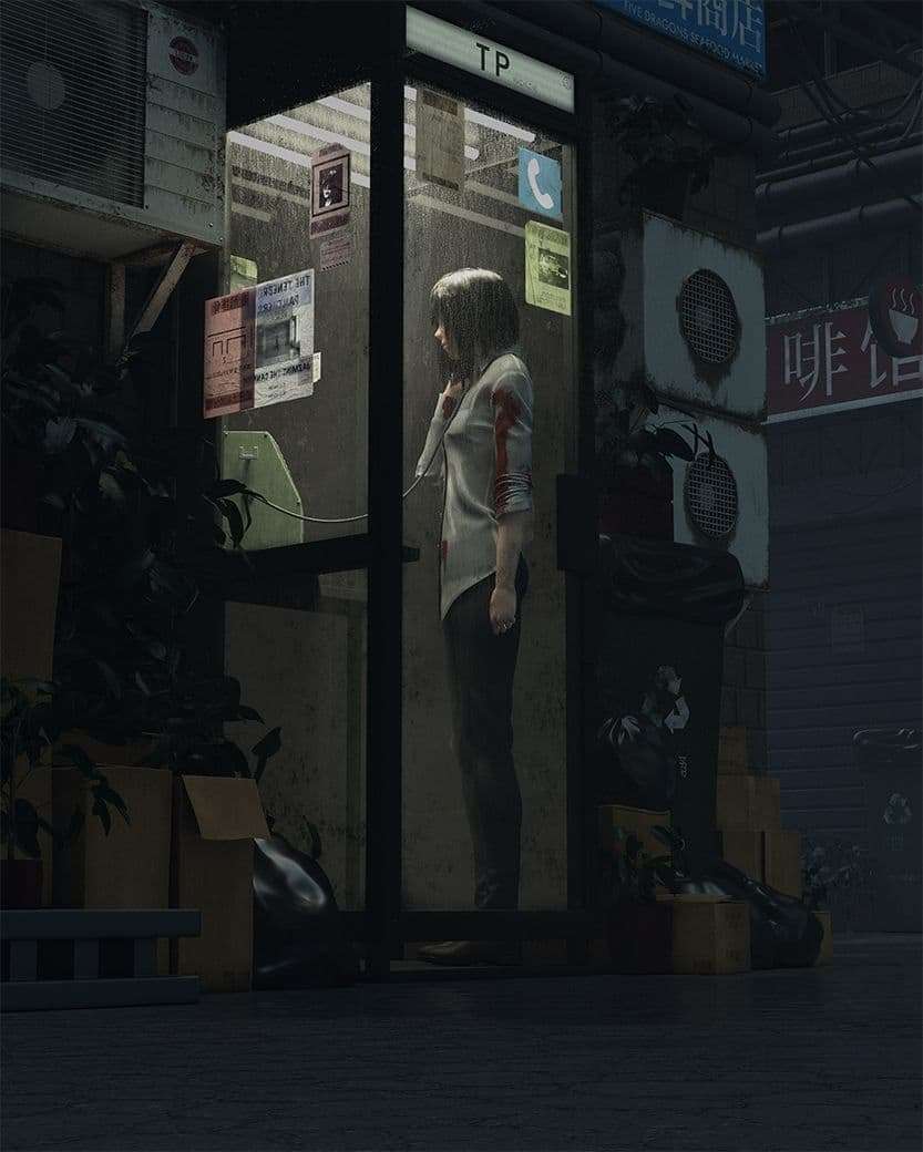
When choosing a concept, my top priority was finding one that spoke to me. I ended up choosing Guweiz’s "Bad Guys 7", one of his many works that inspire me. When analysing his piece, my key considerations were, how could I keep the same mood when transferring into 3D, how detailed can I be, and what can I add to the scene?
When looking at the concept, I found that the focal point of the image was the phone booth. That was my top priority and where I wanted to put more work into.
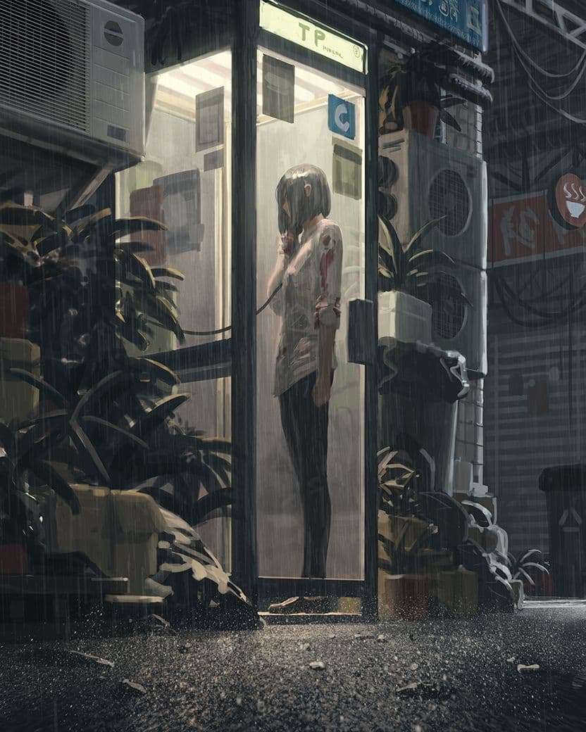
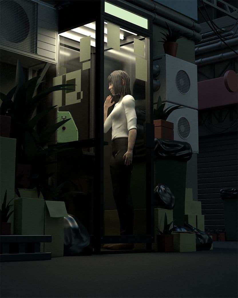
Concept
My fellow student at Think Tank Diego Aguilar wrote a similar in-depth article: Learn the Process of taking a 2D Concept to 3D Render. I will go over my process and talk in particular about how I achieved the mood, created the rain and how compositing improved my scene.
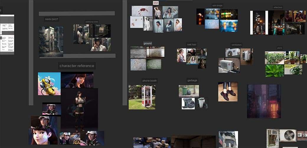
My first step was to gather references, which are very important. There are so many details that I could have missed without them. Make sure to have references for every important aspect of your scene. In my case, I had images of wet shirts, blood stains on them, pipes, boxes, and other key objects. I also found myself going into games like Spider-Man PS4 and Cyberpunk 2077 and looking at how they textured their assets. I wasn’t planning to copy the exact same models or textures, but it was a good way to look at those objects from another perspective and in another media.
References
Modelling the Character and Props
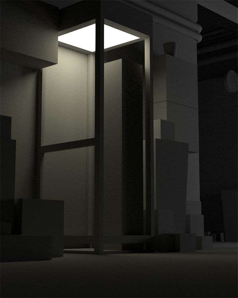
When starting my project in Maya, I didn’t bother matching the camera perfectly, getting close to 95% was fine for me. This allowed me to save time and put it into other important tasks. After that I roughly blocked out my scene with boxes.
My goal was to work on the whole scene evenly, not piece by piece. This helped me see the image as a whole during each phase. Applying general shaders that matched the colours of the concept and lighting early on, was also a beneficial factor to get the mood right. Every night, after I was done, I rendered a 2K image. The next morning I would look at it with fresh eyes and analyse what places were lacking.
Progress
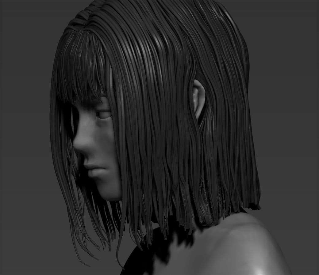
To not waste time on creating the character, I used this basemesh. I imported it in the scene to have as a stand-in, but I worked on it in ZBrush. This brush helped me block out the hair, which I later re-did.
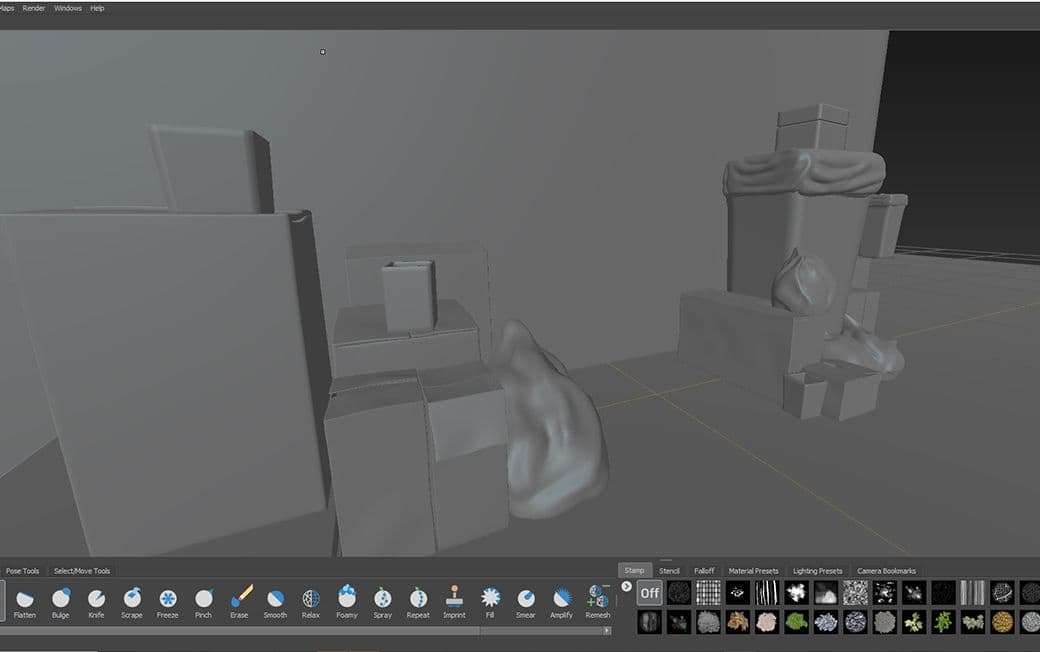
Using Mudbox I sculpted the boxes and trash bags to look wet and soggy. Maya and Mudbox have a great feature where they can quickly send objects to each other. In Maya, select your object > File > Send to Mudbox. You can quickly sculpt and tweak your objects thanks to the programs being linked. When you’re done in Mudbox, File > Send to Maya. It will update your object in the scene with the new modifications. In my case, I sent my ground, walls, and booth, to Mudbox to see where my objects would collide.
Mudbox
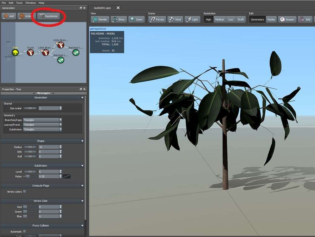
SpeedTree was a great and quick tool to make my plants. Its ability to randomise the plant I made was very efficient and time saving. After I found one that I liked, I exported it to Maya, and repeated as much as I needed.
SpeedTree
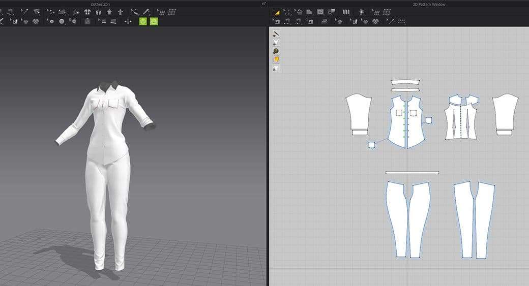
After working more on my character I went into Marvelous Designer. Pants were pretty straightforward, and in my scene they were pretty dark so I didn’t detail them much. For the shirt, this tutorial by UIW 3D Animation and Game Design was very helpful. Back in ZBrush I added some more wrinkles where they were needed.
Marvelous
To achieve a more realistic look, I used X-Gen to do the hair again. I decided to use Interactive Grooming instead of Splines because it was giving me a better result in less time. To enhance the hair, I used multiple Clump and Noise modifiers. This gave me something close to wet hair. As a shader, VRayHairNextMtl worked pretty well.
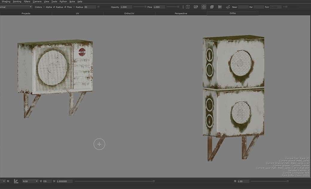
When I began texturing, I was thinking about how rain would affect the objects in the scene, where it would create moss and how metals would rust. I did this to increase the realism in my scene. To keep my image consistent, it was very important to quickly put some textures on without trying to be perfect, I knew I would have to tweak them later on. Thanks to this method I could see my mistakes quicker.
Mari
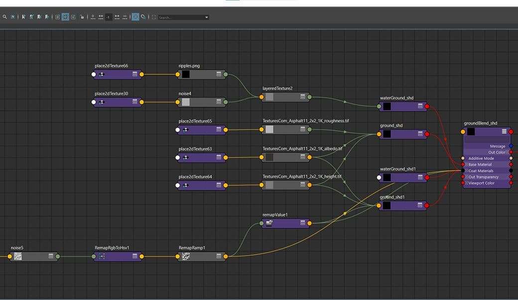
For the ground, I used a Blend material. I went through a few iterations for the asphalt until I got something that worked for me. I decided to go against my concept and add water puddles on the ground. I got my ground texture from textures.com, and made a water shader with a simple VRayMtl. I added a VRayBlendMtl and plugged my ground as a base, and my water on top of that, then used a Noise as a mask.
To make the glass in the booth more evident, I put a lot of dirt on the edges where it’s touching the frame, as well as having my hdr reflecting. Hdri Haven is a great website to get high quality HDRIs for free, make sure to check it out.
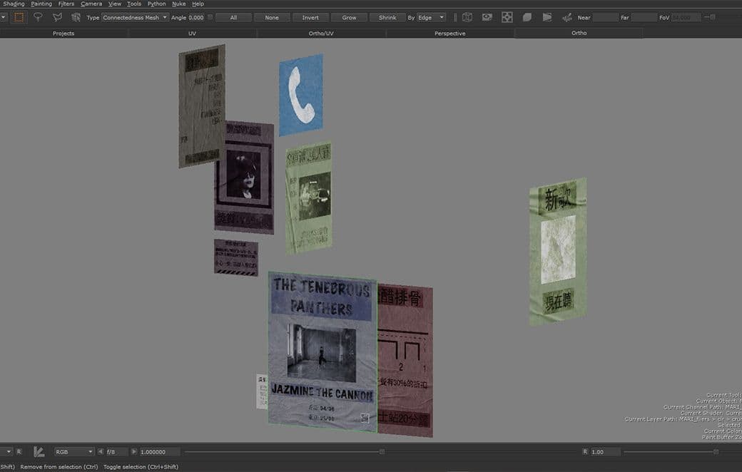
My concept wasn’t detailed on the fliers, so this was where I decided to put references and easter eggs of my previous works. Feel free to add personal touches wherever you can, they can add a lot of detail to your image. Just make sure they work in your scene.
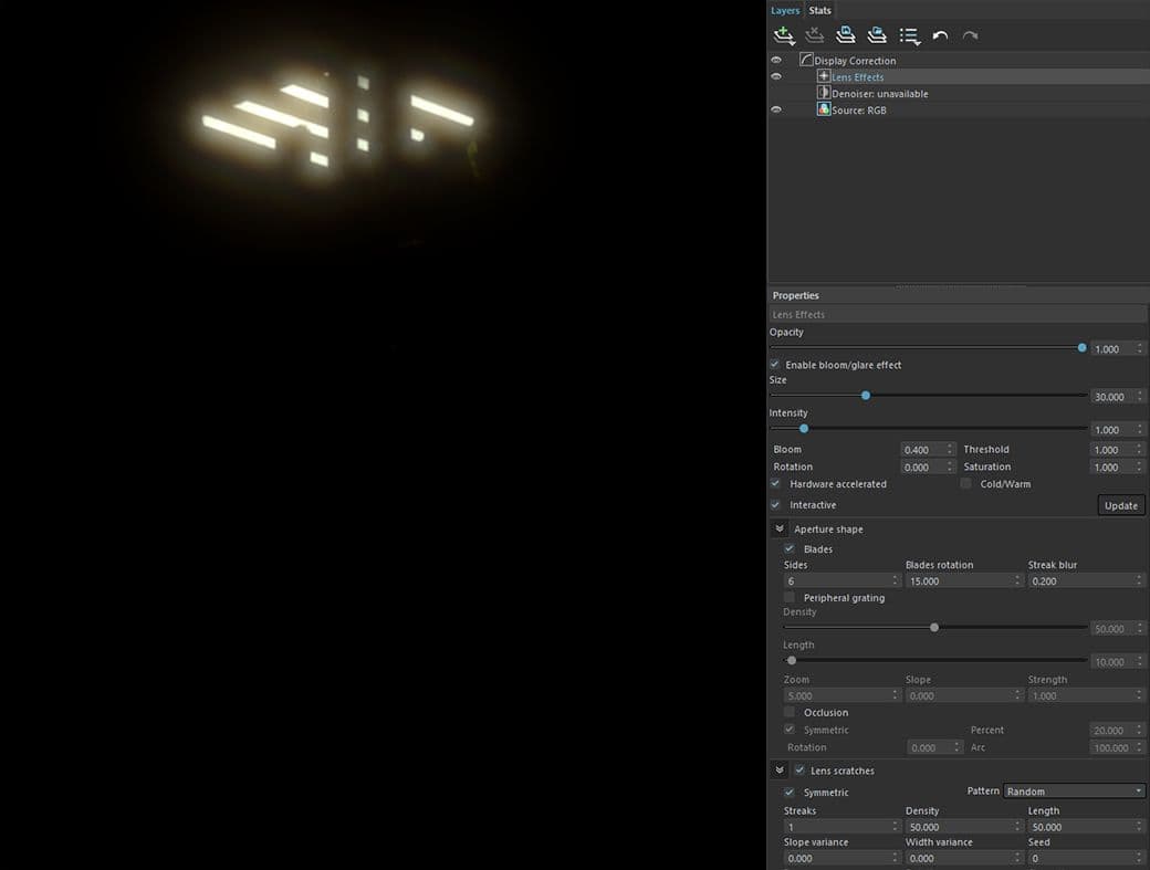
As a final touch after the render, I enabled Bloom / Glare, which you can find in the V-Ray Frame Buffer under Lens Effects. This will give a nice glow wherever there are very bright lights. Feel free to play with the settings to get the result you’re looking for. This effect should be on its own render pass, so you can tweak it later in compositing. If you put the opacity to 0%, your Diffuse layer will render without it.
Glare
Lighting and Mood
I asked myself, what this concept made me feel, and why? What other things around me or that I knew of had the same mood? Guweiz’s concept had this very strong feeling, something I wanted to keep when creating my image.
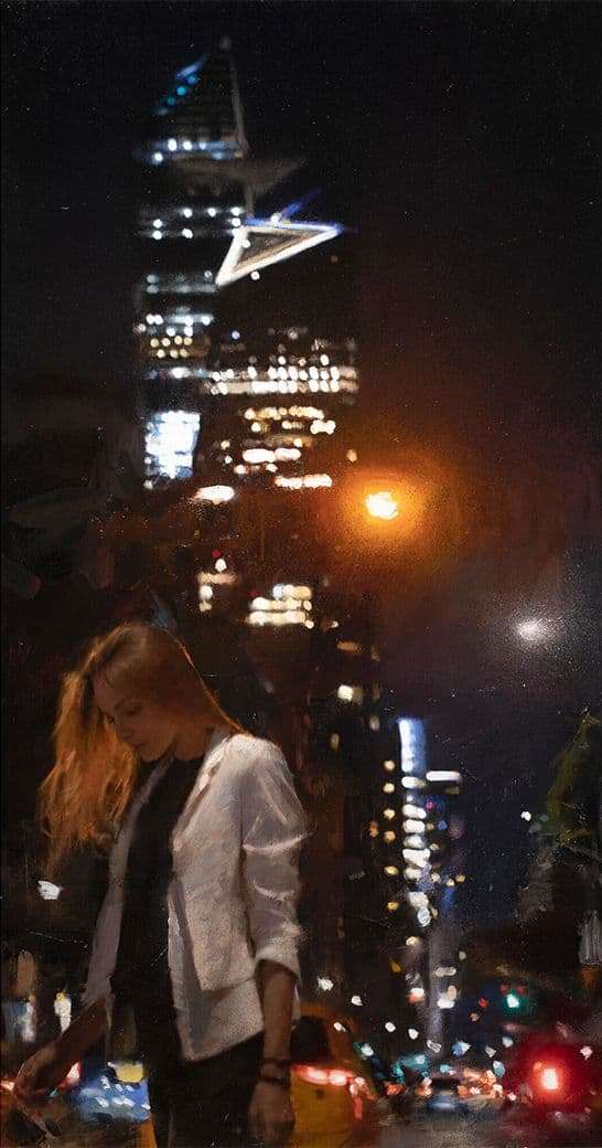
For me, the song My Mistakes Were Made for You by The Last Shadow Puppets, the series of paintings Nocturnes by Casey Baugh, and of course Guweiz’s other works were all a big inspiration, especially for the lights. Pictures of Hong Kong during a rainy night gave me similar vibes. I think it’s a good thing to take inspiration from wherever you can, it doesn’t have to be another 3D artwork. Whatever speaks to you, use it.
Casey Baugh (Left) and Guweiz's (Right) works
Knowing or even creating a backstory for the image was important to my process. I thought about what's going on around the image, what’s surrounding it and the context. Also tried to analyze the artist’s clues they left. Movies like Oldboy and Blade Runner were a great source for that. Sometimes, if I don’t have time to watch a whole movie, The Beauty Of channel is where I look. They make short edits of films while retaining the original style, and also games and anime.
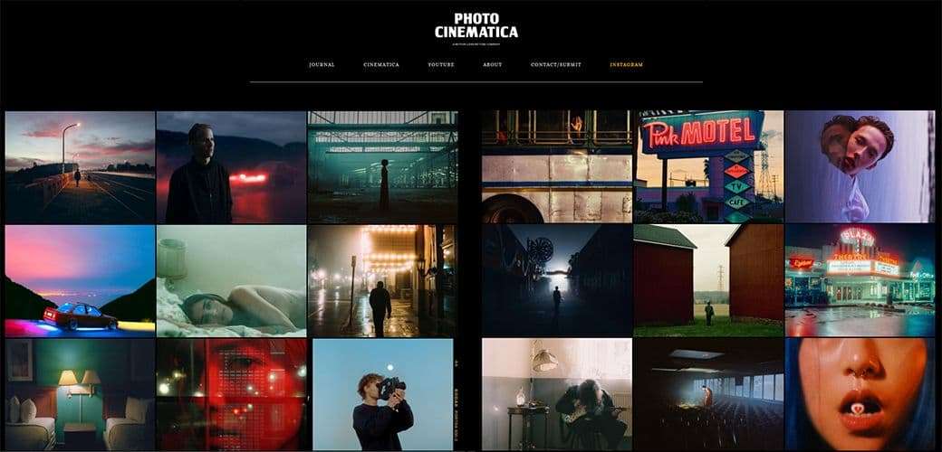
Even though I was going for a realistic look, I wanted to stylise it like people do with a real photo. For that, I always looked at Photo Cinematica for reference and inspiration. All the pictures that they publish had the same mood of the image.
Photo Cinematica
Effects and Rain
The rain was a combination of multiple things. The main streaks were made in Photoshop. This is the tutorial I used: Realistic Rain Effect | Photoshop Photo Manipulation Tutorial. I added more motion blur and rain, then exaggerated everything until it was on the edge of too much.
The water drops on the window were made thanks to this: How to Make RainDrops on Window in Maya. I duplicated my glass, made it into a plane, and let my simulation run until around frame 60, when the drops were covering the whole object. Then I hid the plane.
Note: Every time you close and open Maya, the simulation resets. I tried to cache it but Maya was giving me some errors.
I created a Bump map for the ripples. In Photoshop, on a black background, I drew small circles with different radiuses, then applied a Gaussian Blur to soften the transition. Everything worked together to give that impression of heavy rain.
Without and with rain
Compositing
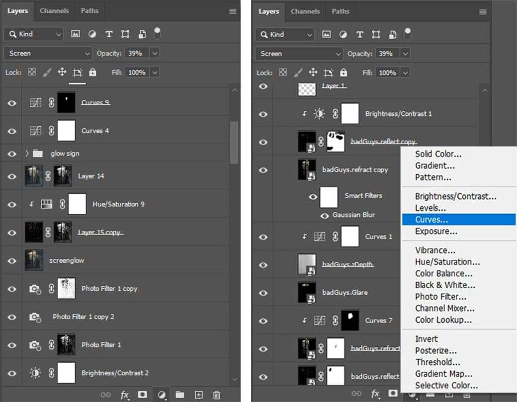
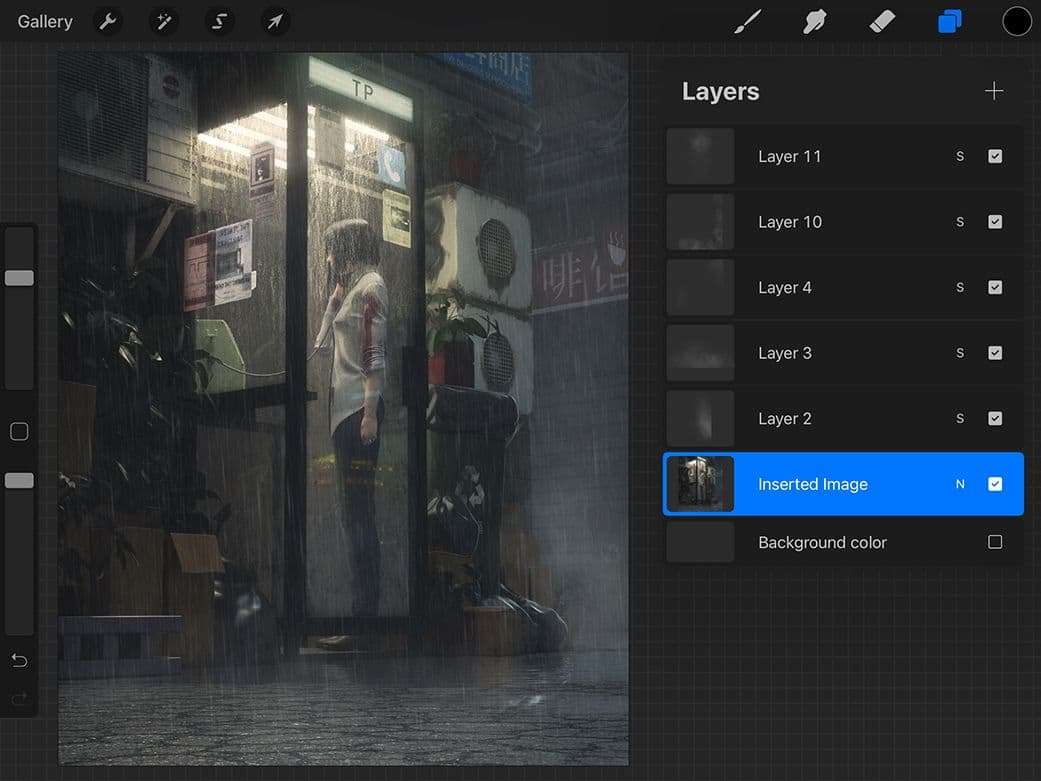
Compositing can improve your art piece by a lot, even fix mistakes. I would recommend using at least Reflect, Refract, GI, and Light Selects. Also in Photoshop, try to work non-destructive as much as you can, this way you won’t ruin your image by mistake. If you use the adjustments under the Image section, they will be applied to your image and can’t be changed later. You can instead use Adjustments Layers, which are on the bottom right corner and look like a half colored circle - they can be changed, removed, hidden, and are very flexible. If you hold Alt and click between layers, the top layer will affect only what it’s linked to.
With Light Selects you can assign one or multiple lights to a render pass. I had one per pass. To assign lights, open your Render Settings > Render Elements > add the Light Select, then go to Windows > Relationship Editors > Sets, select your Light Select on the left tab, and your light on the right tab.
Light Selects
In Photoshop, import your GI and Skylight first, the latter is just ambient light. You can add a black layer with a Normal blend mode and play with its opacity to control the brightness of the ambient lights. Make sure your first layer (in my case the GI) is set up to a Normal blend, while all the other Light Selects are Linear Dodge (Add). You can now import all your other lights one by one.
With everything set up, you can now adjust the intensity of each individual light by using the Opacity slider, and even changing the colors. If by any chance you have a light reflecting somewhere you don’t want, you can easily use a mask to hide it.
Note: When using this method, and having all the Light Selects at 100%, my image wasn’t looking the same as it did in the diffuse. So be cautious and be willing to spend more time in the compositing phase. As powerful as they are, they also require more work.
I used Procreate to add some fog, with the Fog brush. There are plenty of brushes for photoshop, and even other ways to do it, but this is what was faster for me, and worked well in my scene. I’ve imported my render, and in a new layer I’ve painted the clouds with a white color, make sure to not paint on top of your image layer. In the end I had 5 cloud layers, with opacity ranging from 50% to 85%. I then exported the clouds one by one, and imported them in Photoshop. I’ve set them to the Screen blend mode, it didn’t change much but just in case.
Procreate
After I was done with the render layers, I began treating my image as a photo and adding effects. PiXimperfect’s channel is where I always refer to. In my case, Curves and Hue / Saturation were very helpful to adjust contrast and make various tweaks. I’ve added glow by duplicating the image. If you press ctrl + A, ctrl + shift + C, ctrl + V, you can have your whole image as one duplicated layer. Apply Gaussian Blur at 30% and use the Screen blend mode at low opacity, I’ve done it a second time just for the highlights.
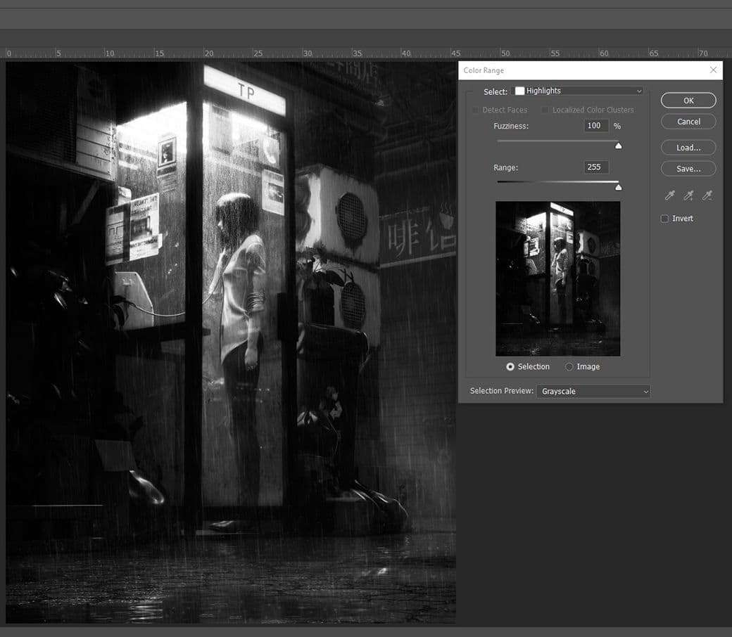
To select only the highlights: Select > Color Range > Select Highlights > Fuzziness and Range at maximum. With this trick, you can use Photo Filters in a better way. Perhaps you’d like to assign a warm orange color to the Highlights and put the mask. Then make a second Photo Filter, perhaps use a cold blue, apply the same mask and invert it.
If you don’t know very well how colors work together, this video by Blender Guru should get you up to speed.
I really liked the reflection on my glass, but wanted to enhance it even more. I ended up using stock photos and some of my own. The most important thing was to match the perspective and colors of my scene, otherwise it would look unnatural. This quick guide helped me get the results I needed.
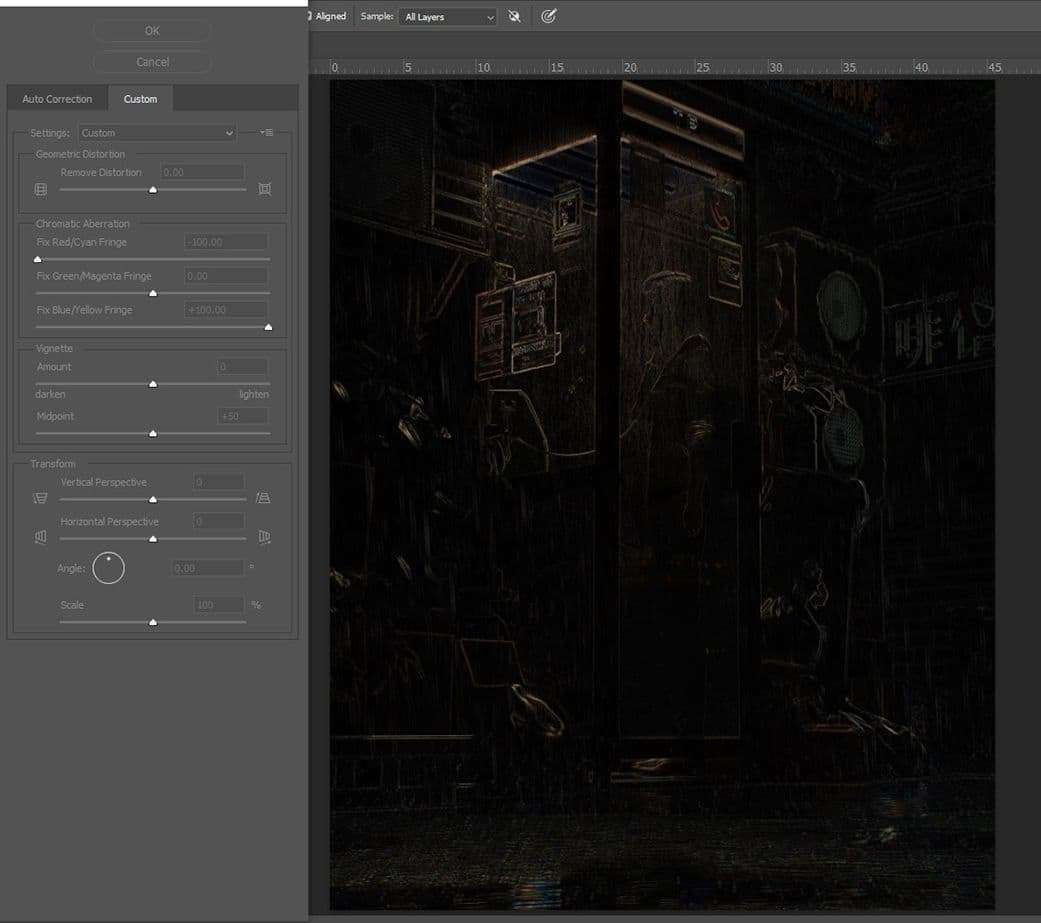
Next, I wanted to add some chromatic aberration to go for a cyberpunk look. To do this, duplicate your image, then Filter > Lens Correction, select the Custom tab, and play with the sliders in the Chromatic Aberration category. If you notice your image scaling a bit, go back to the Auto Correction tab and turn off Auto Scale Image. If you duplicate your image again, without the chromatic aberration, and put it on top of your CA using a Difference blend mode and merge, you can have on one layer just your CA. I used Color Dodge but there are other blend modes that work too.
I did some vignetting to enhance my focal point. On a new layer I’ve painted black with a hard brush the parts that I wanted darker, used gaussian blur, and played with the opacity. Doing that a couple of times got the result I wanted. And in the end I’ve added some noise. Make a new layer, fill it with black, Filter > Noise > Add Noise, around 30%, gaussian, monochromatic. The Overlay blend mode works best for me, also this is going to darken your image, so make sure to have a low amount of opacity.
Don’t forget that the Spot Healing Brush and the Clone Stamp tools are great to fix any mistakes and unwanted things in your image.
Conclusion
At some point your eyes are gonna get tired. This is when feedback becomes very important. You might overlook some mistakes that don’t seem apparent. A fresh look always helps. I asked for opinions from teachers, students and even friends who don’t understand 3D. It’s like doing a screen test of a movie!
Also, whenever you feel stuck, then look at your image from another perspective. Flip your image, make it black and white, apply random filters in photoshop. Don’t be afraid of experimenting.
I want to thank my friends, teachers and everyone at Think Tank Training Centre, for providing knowledge, feedback and support during this project.
If you have any more questions and want me to go in-depth on anything, you can contact me here: